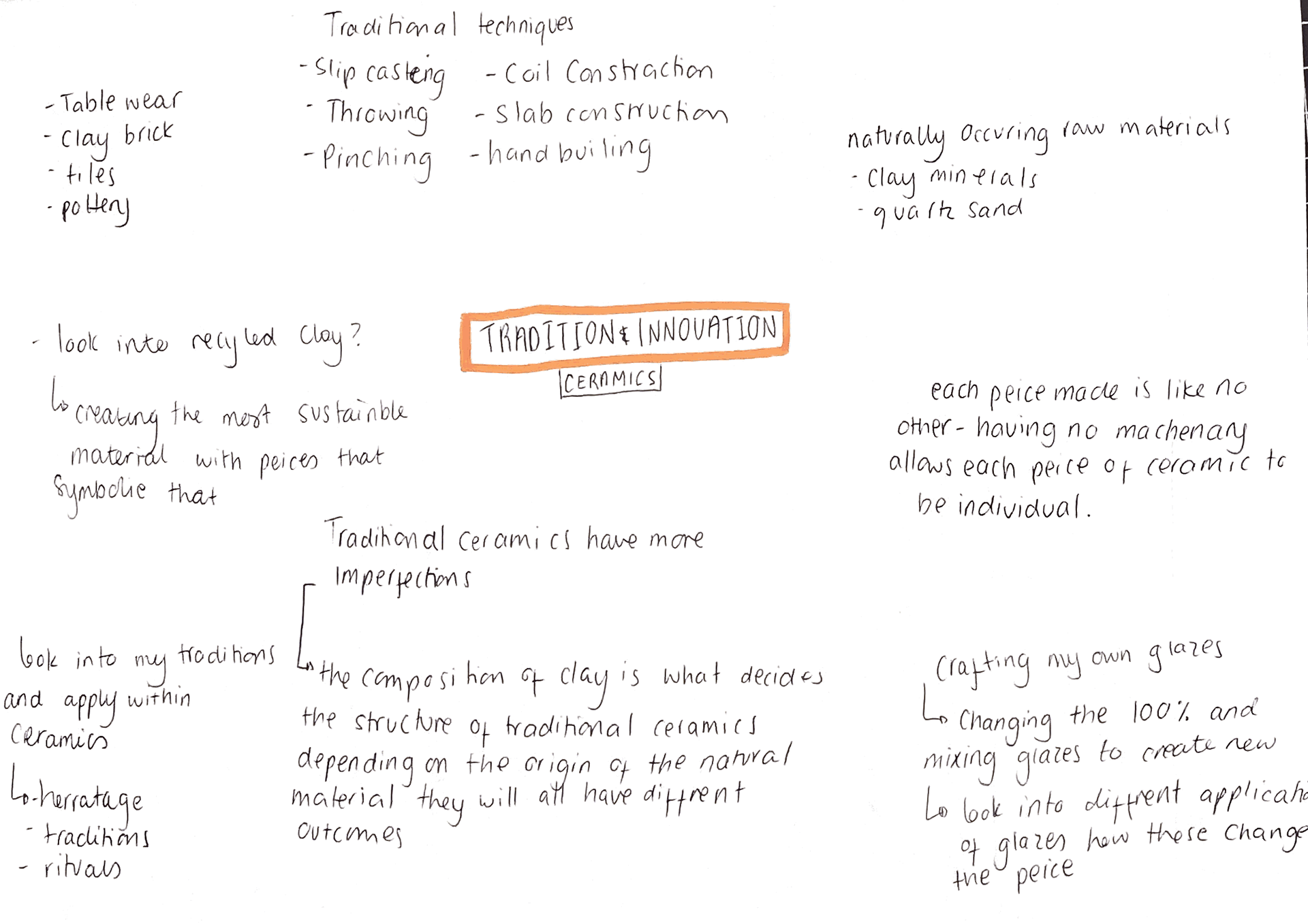
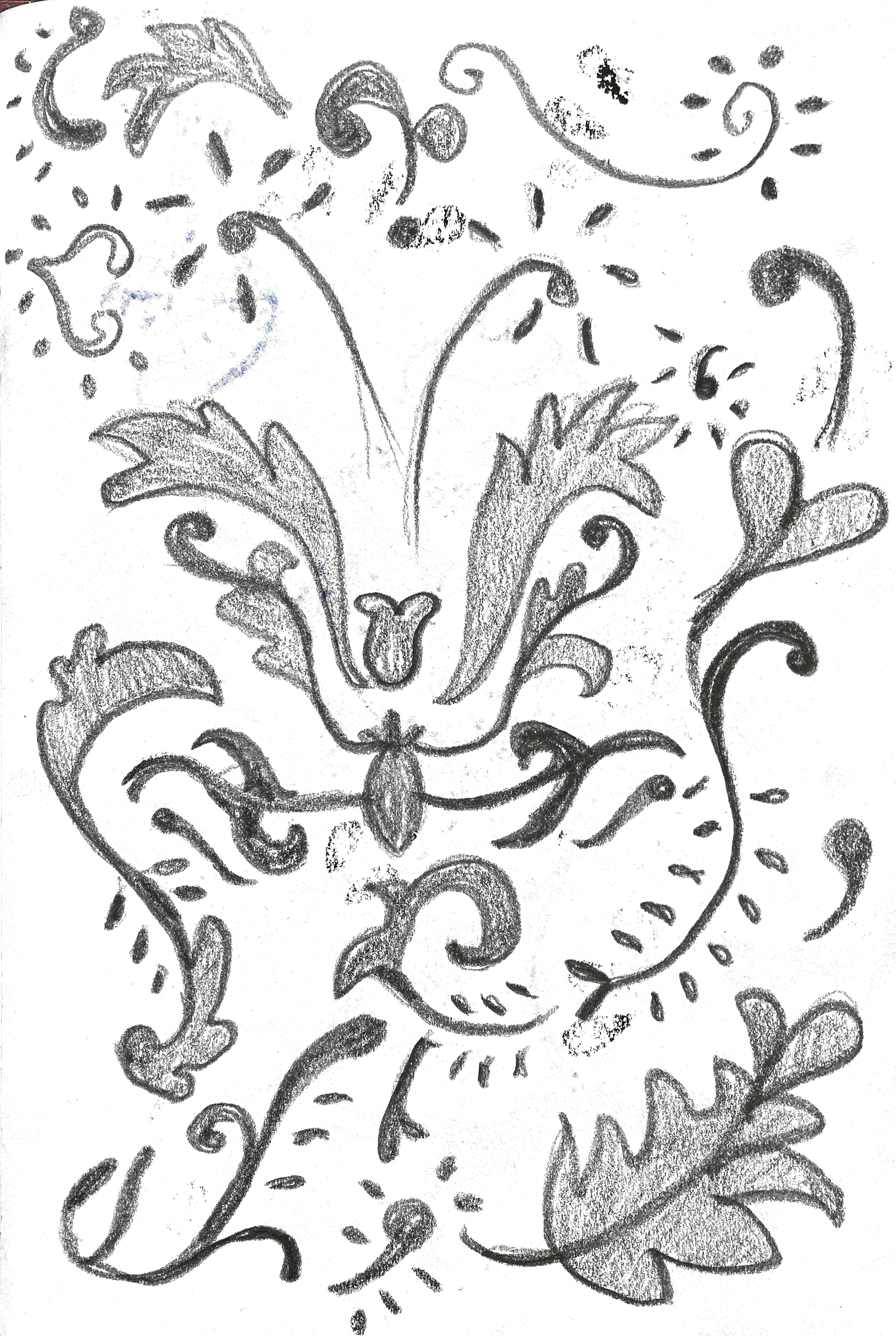
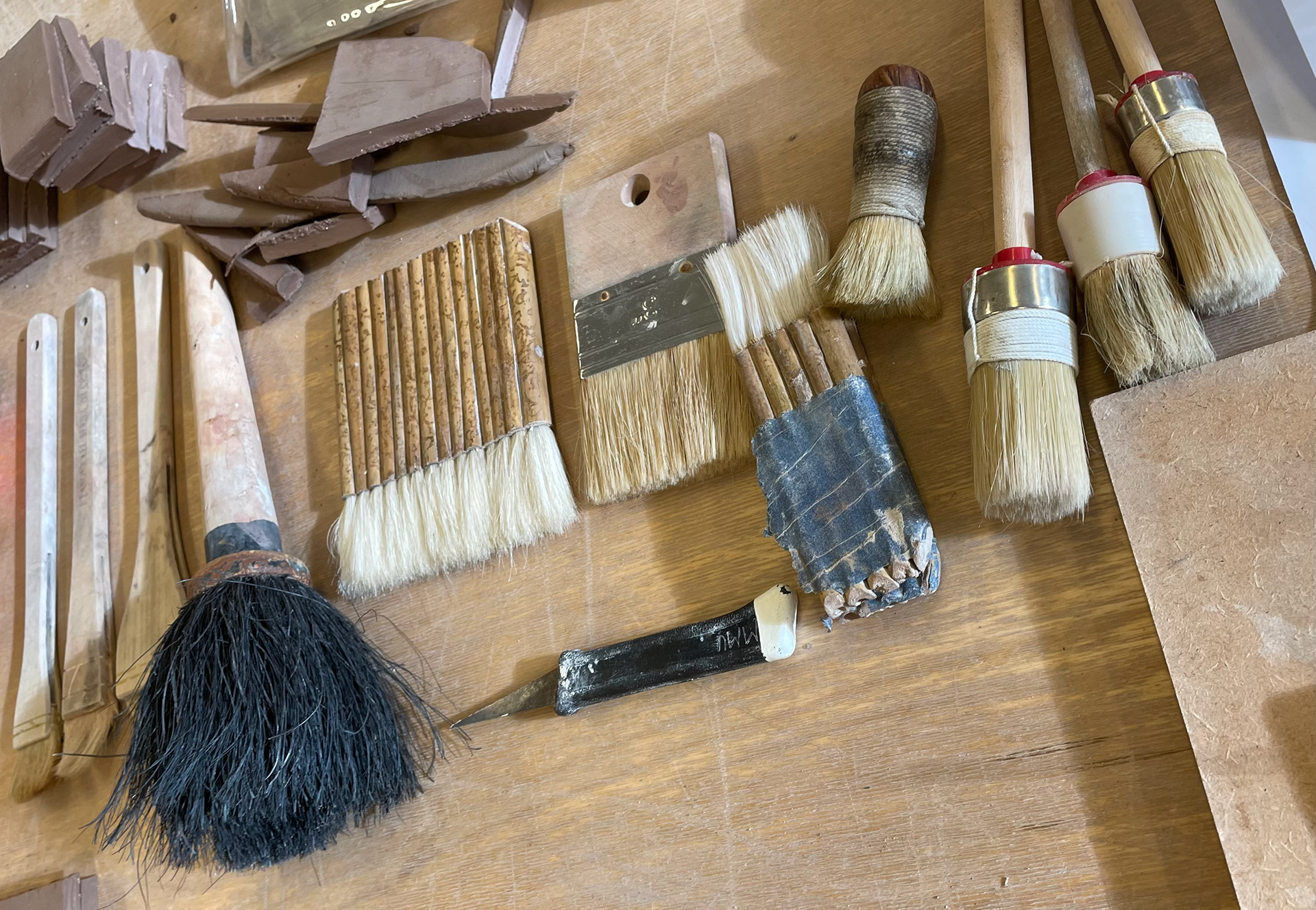
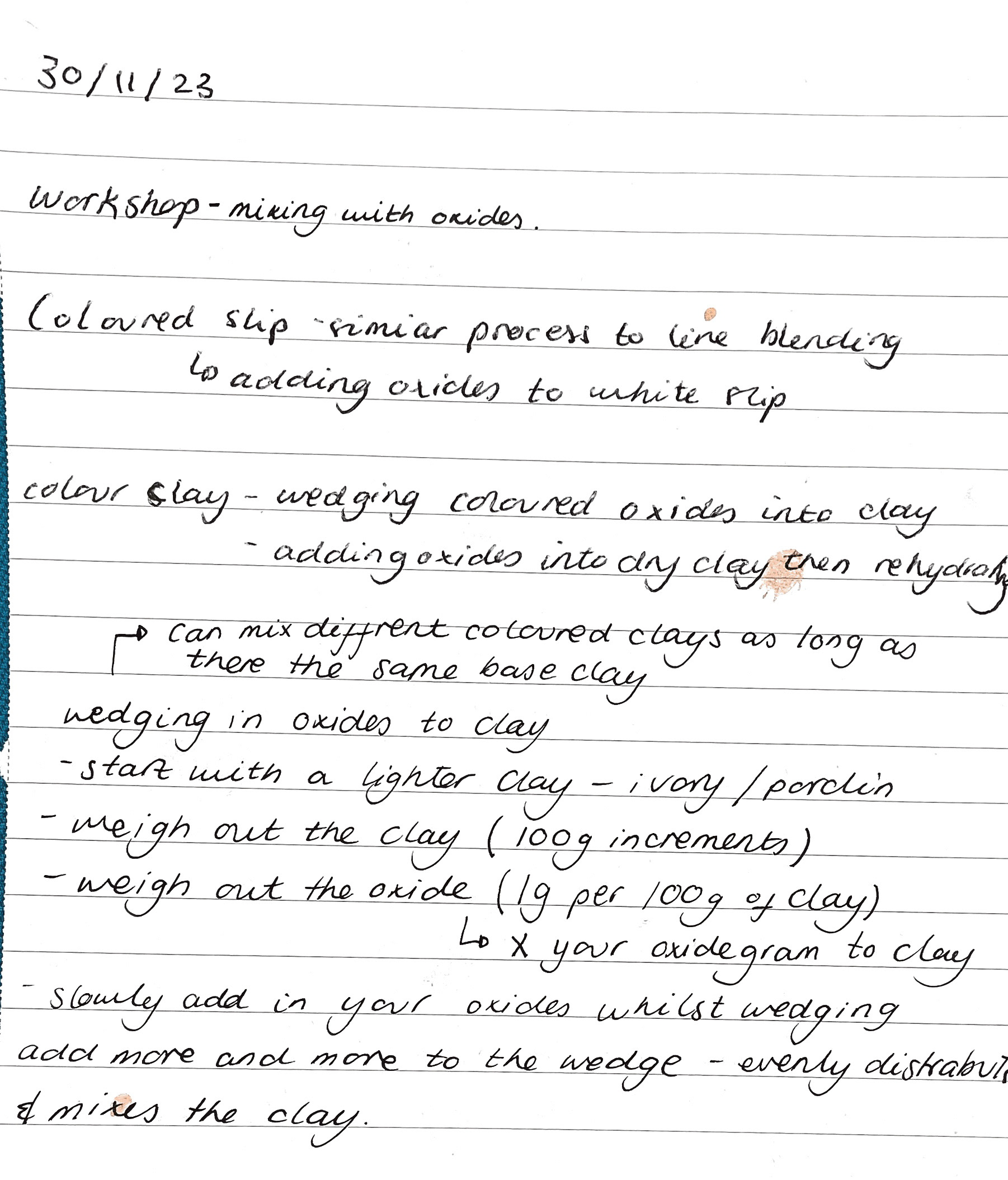
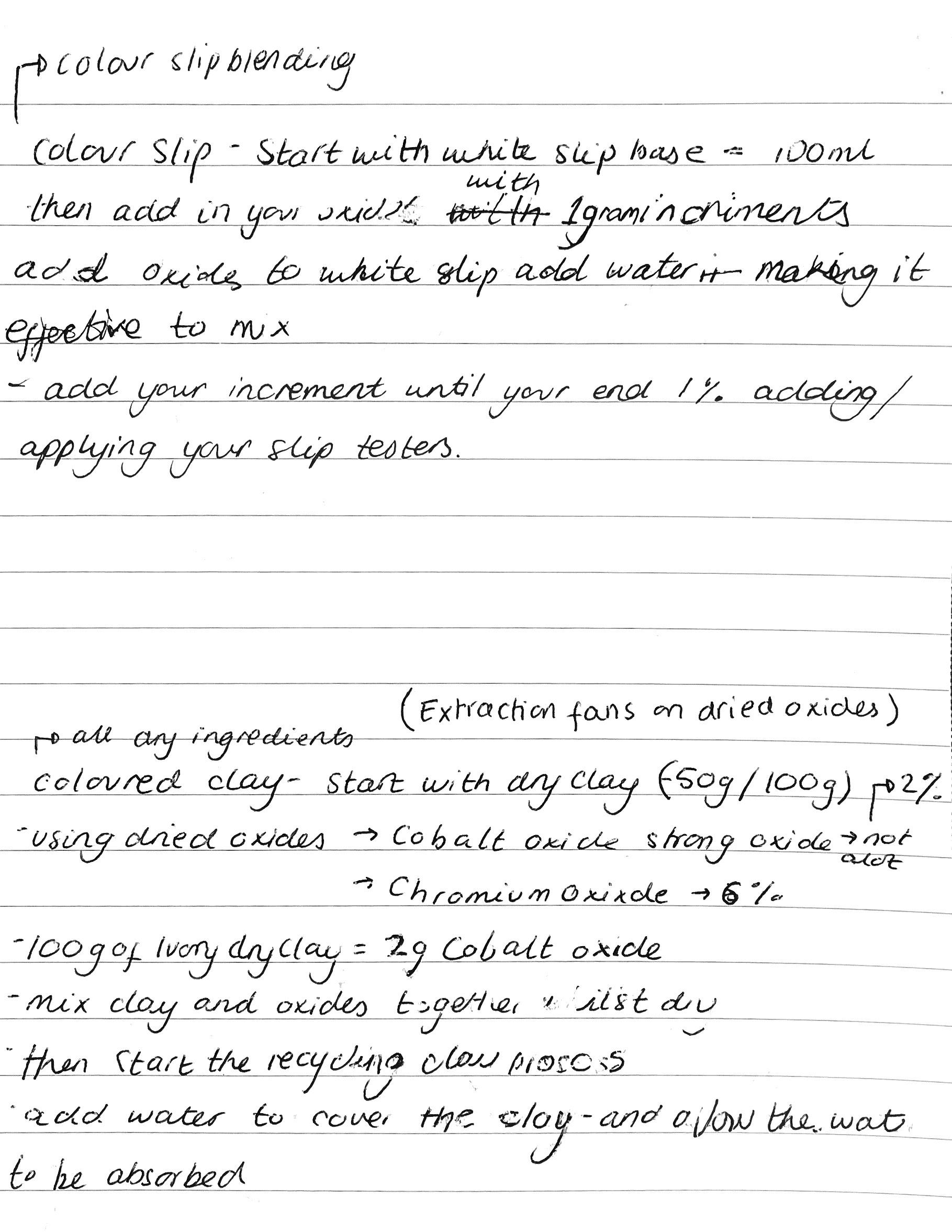
exploring clay
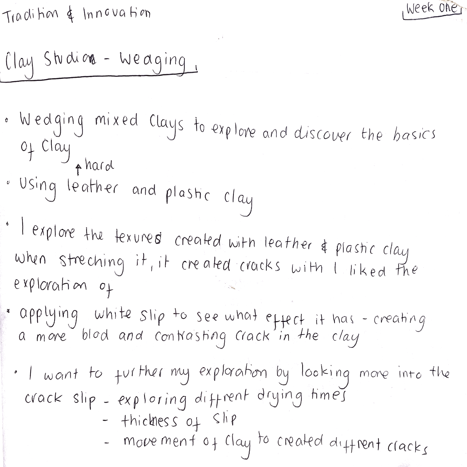
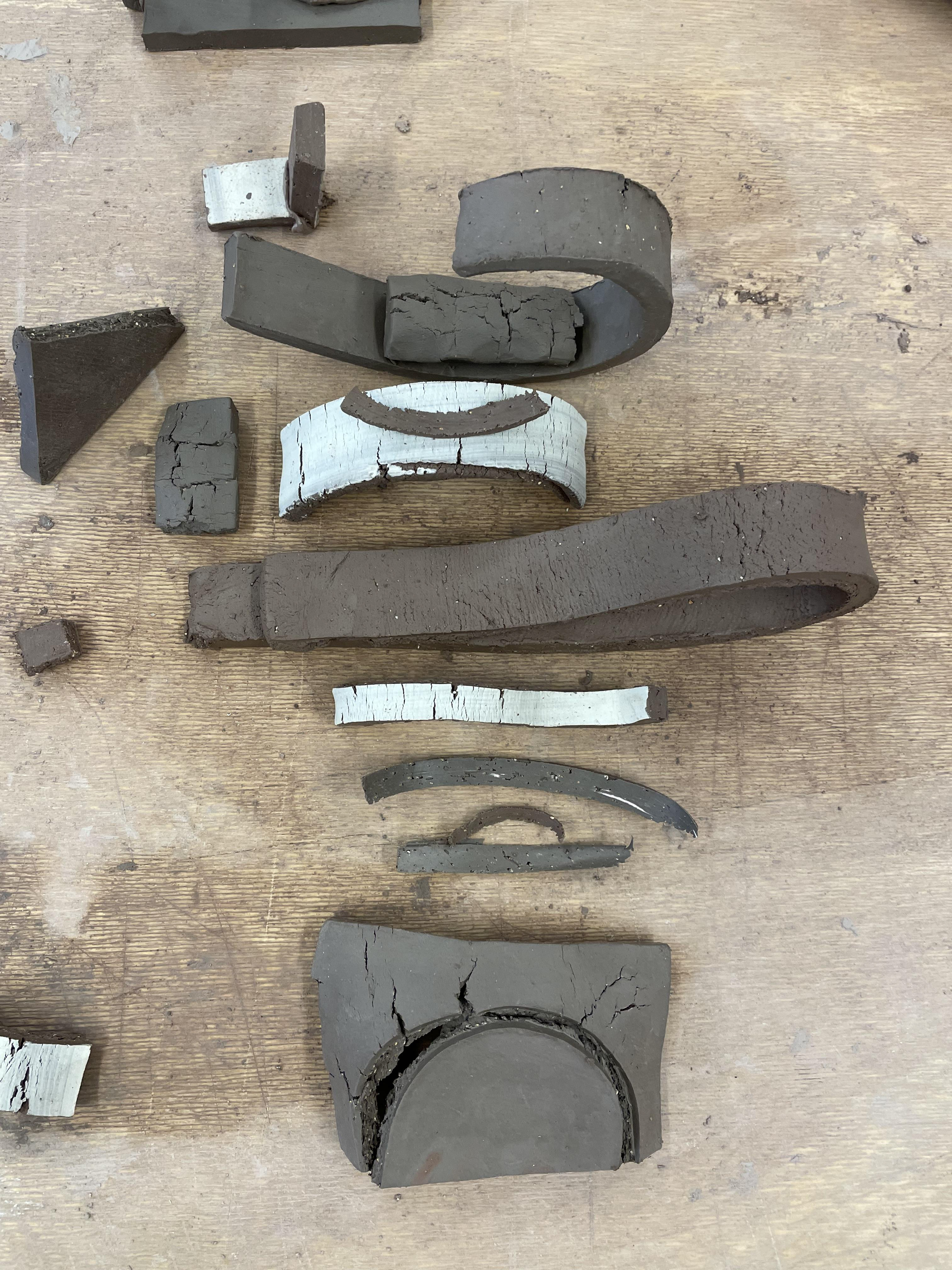
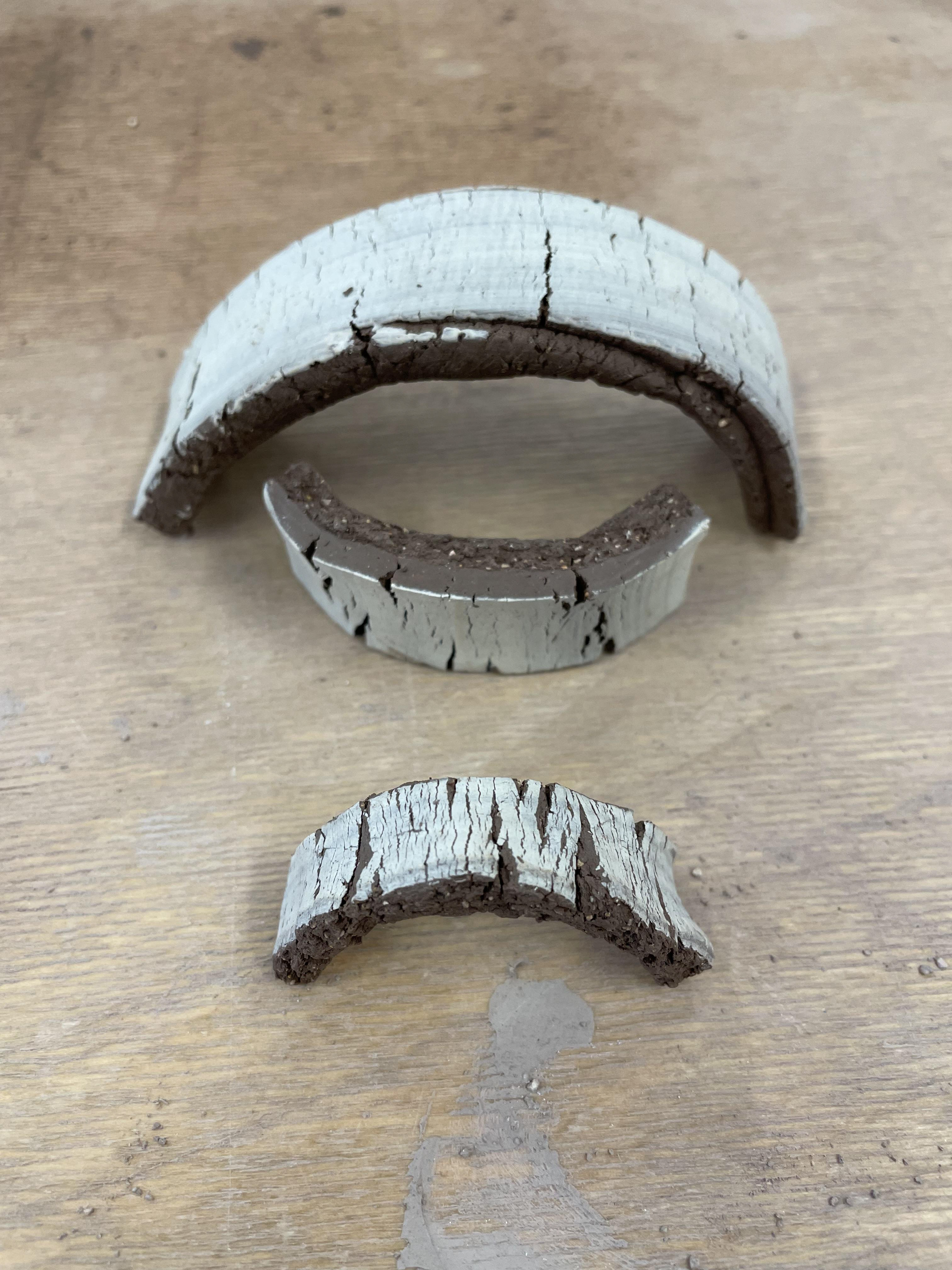
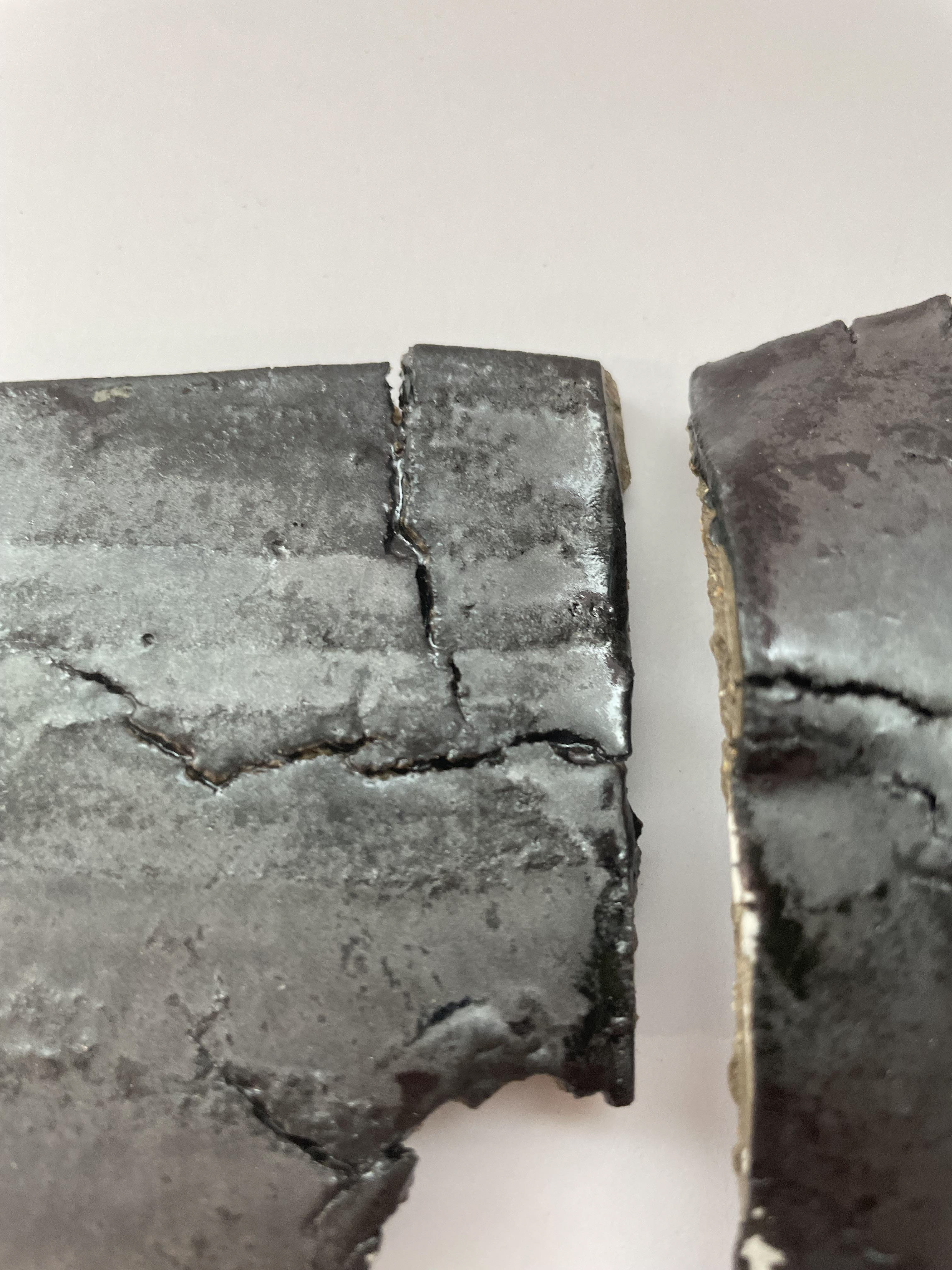
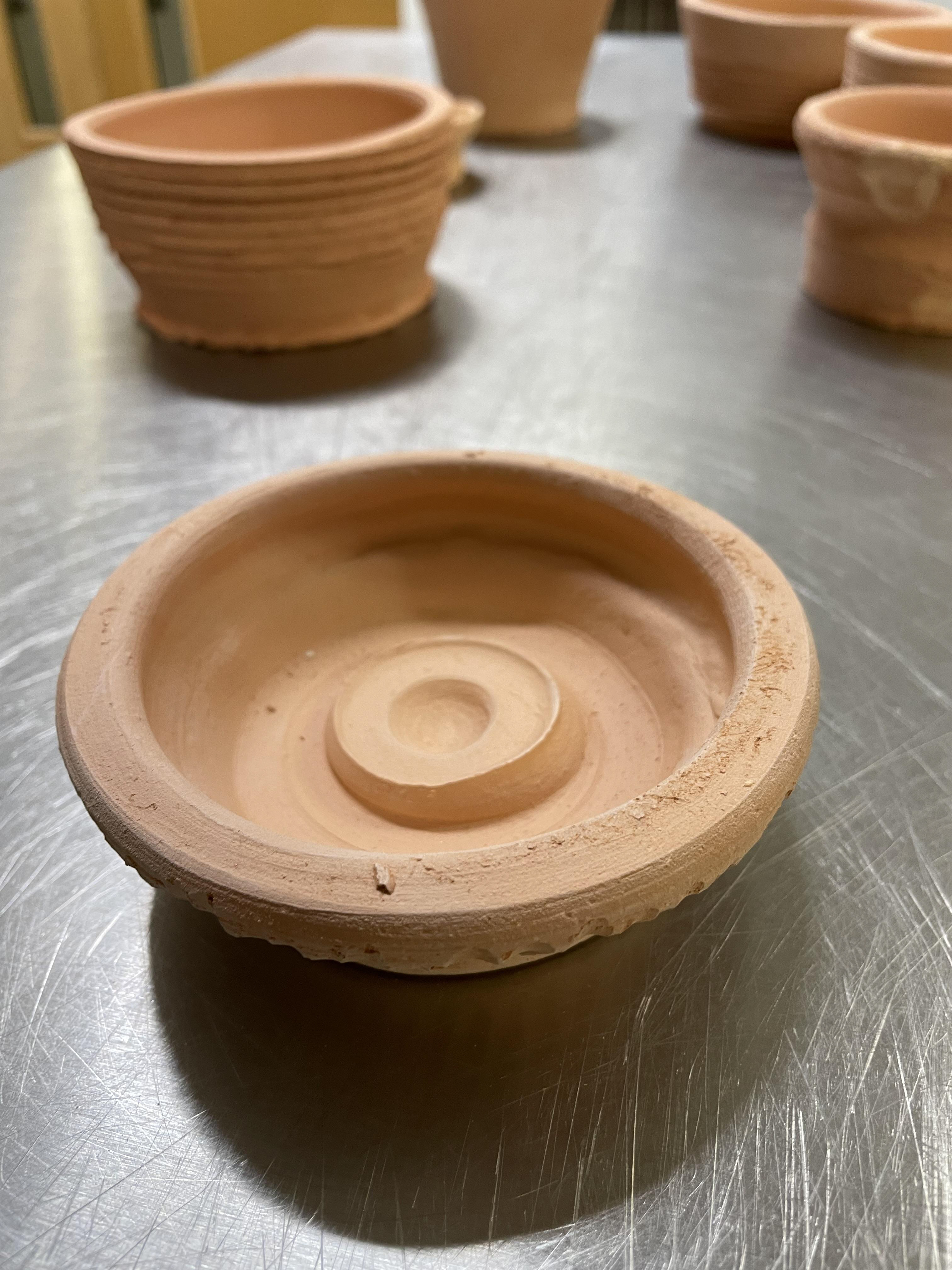
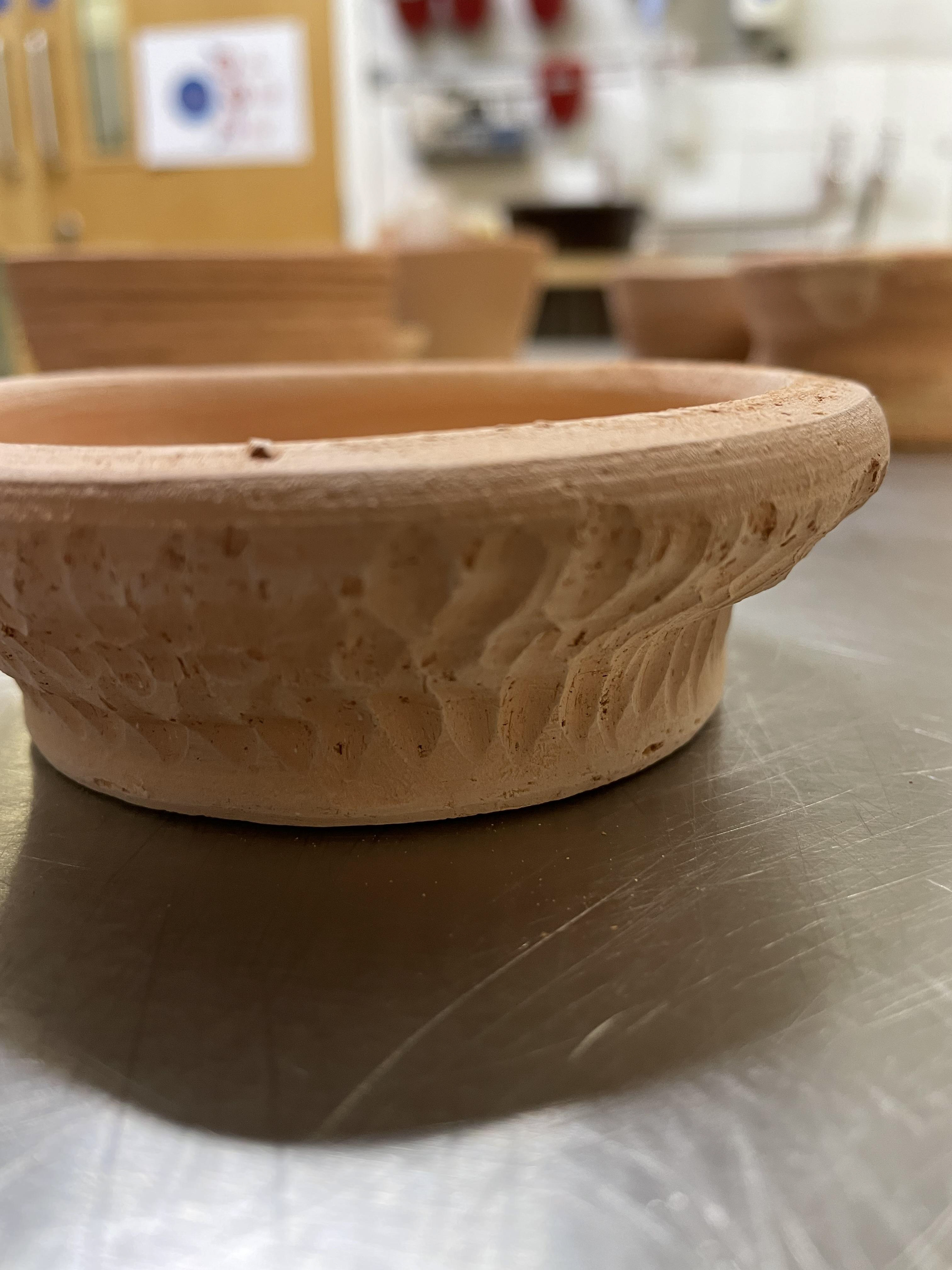
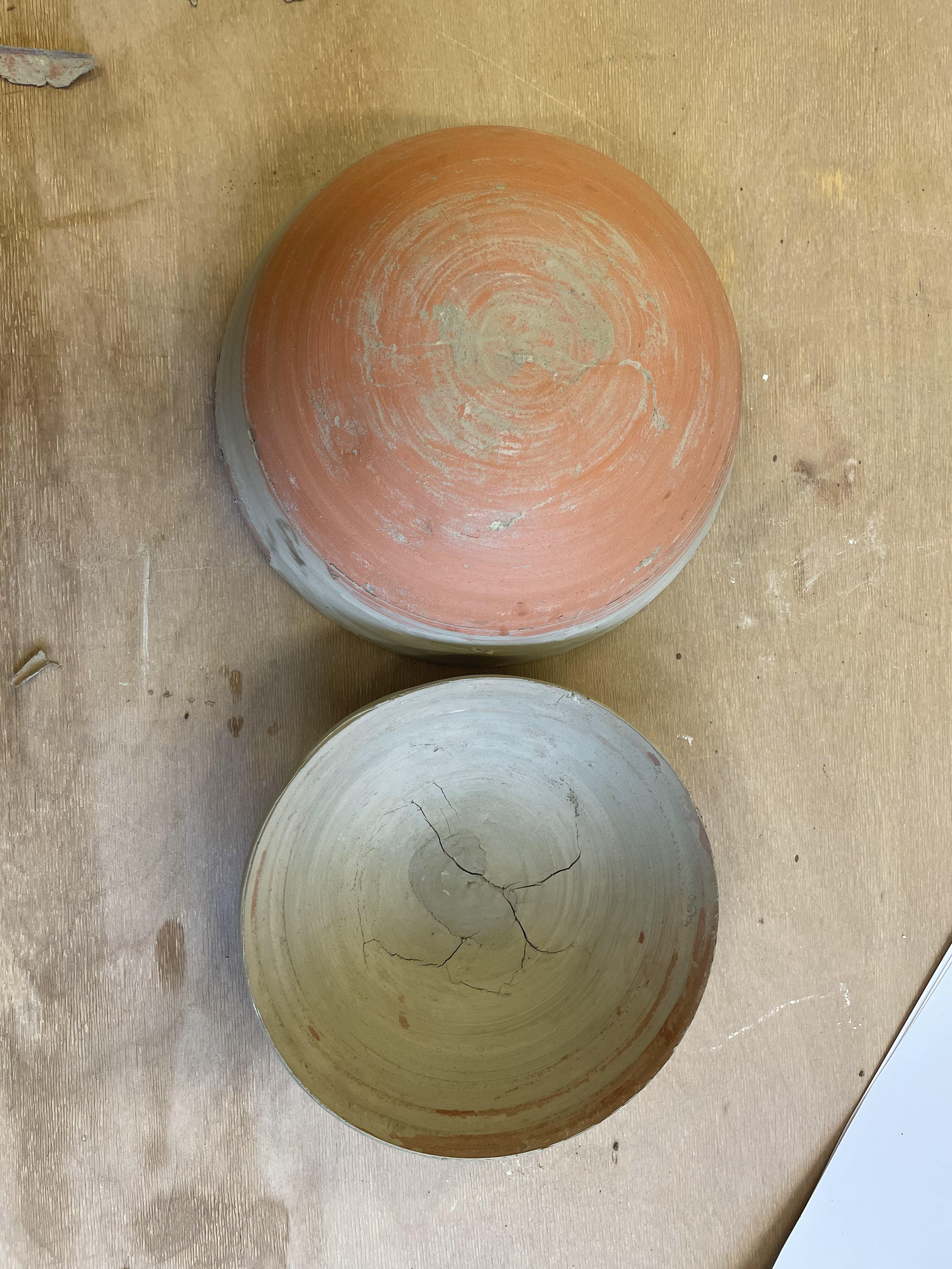
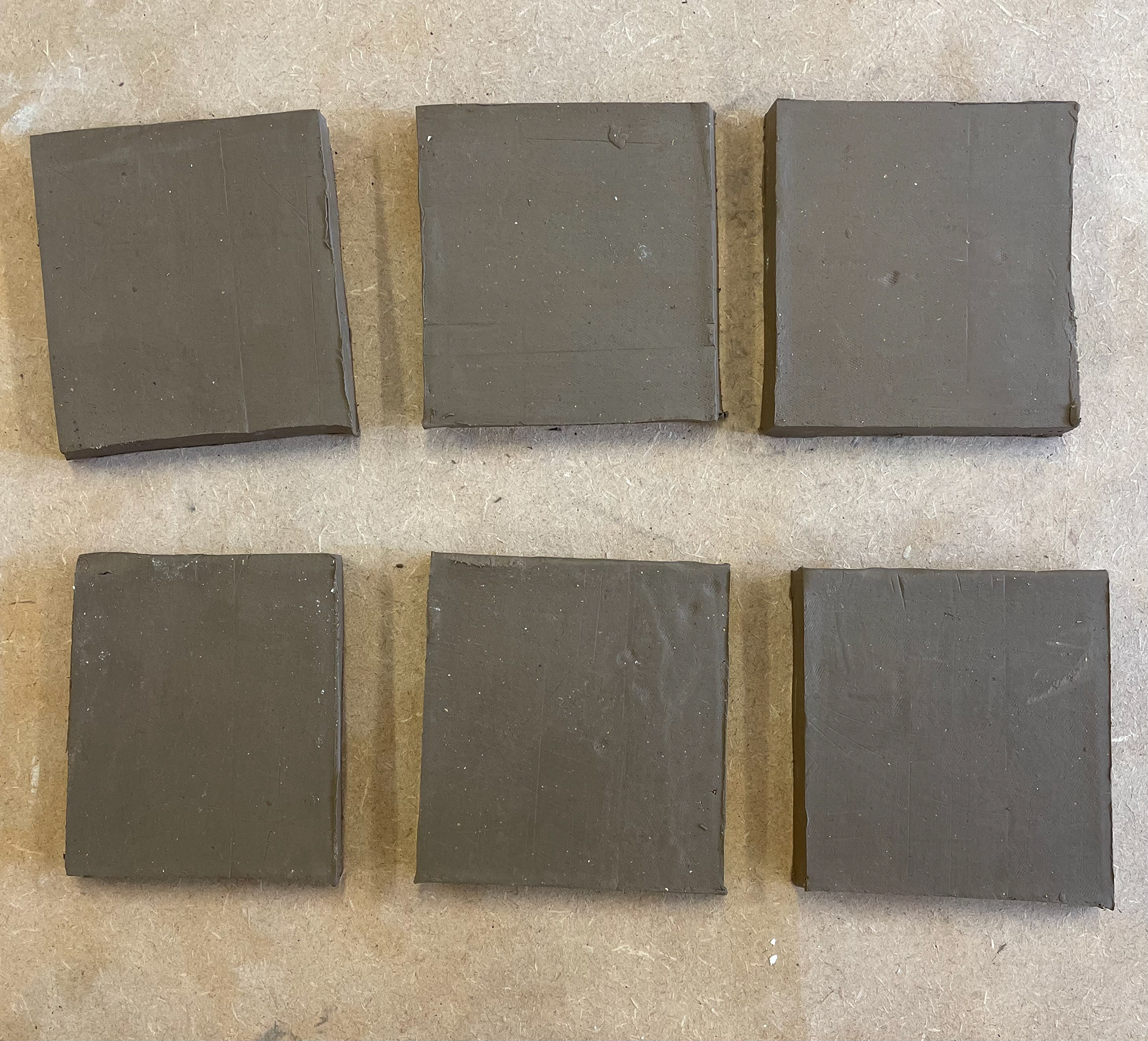
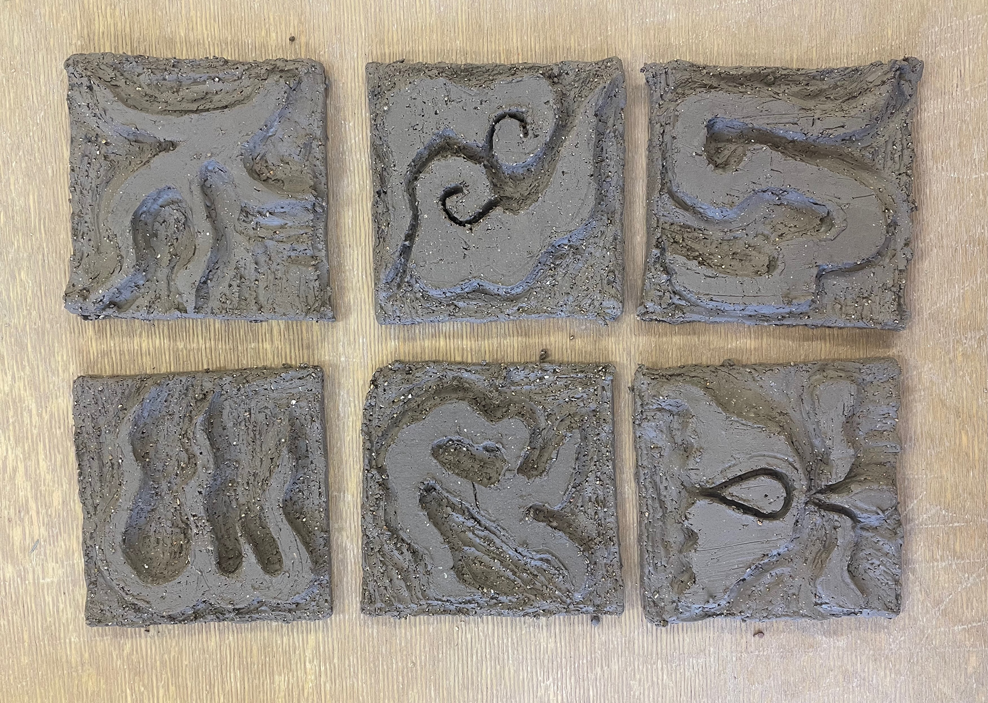
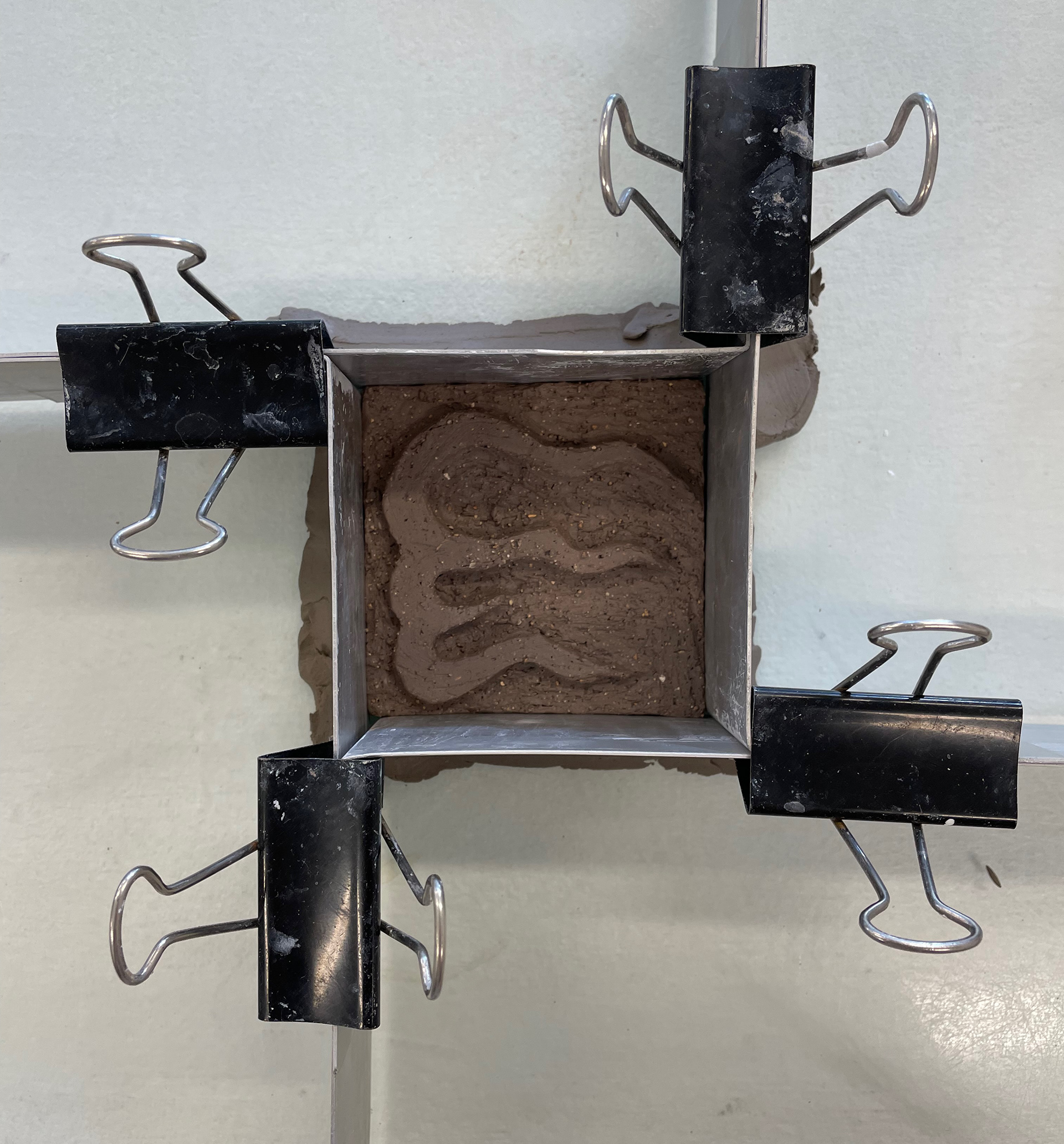
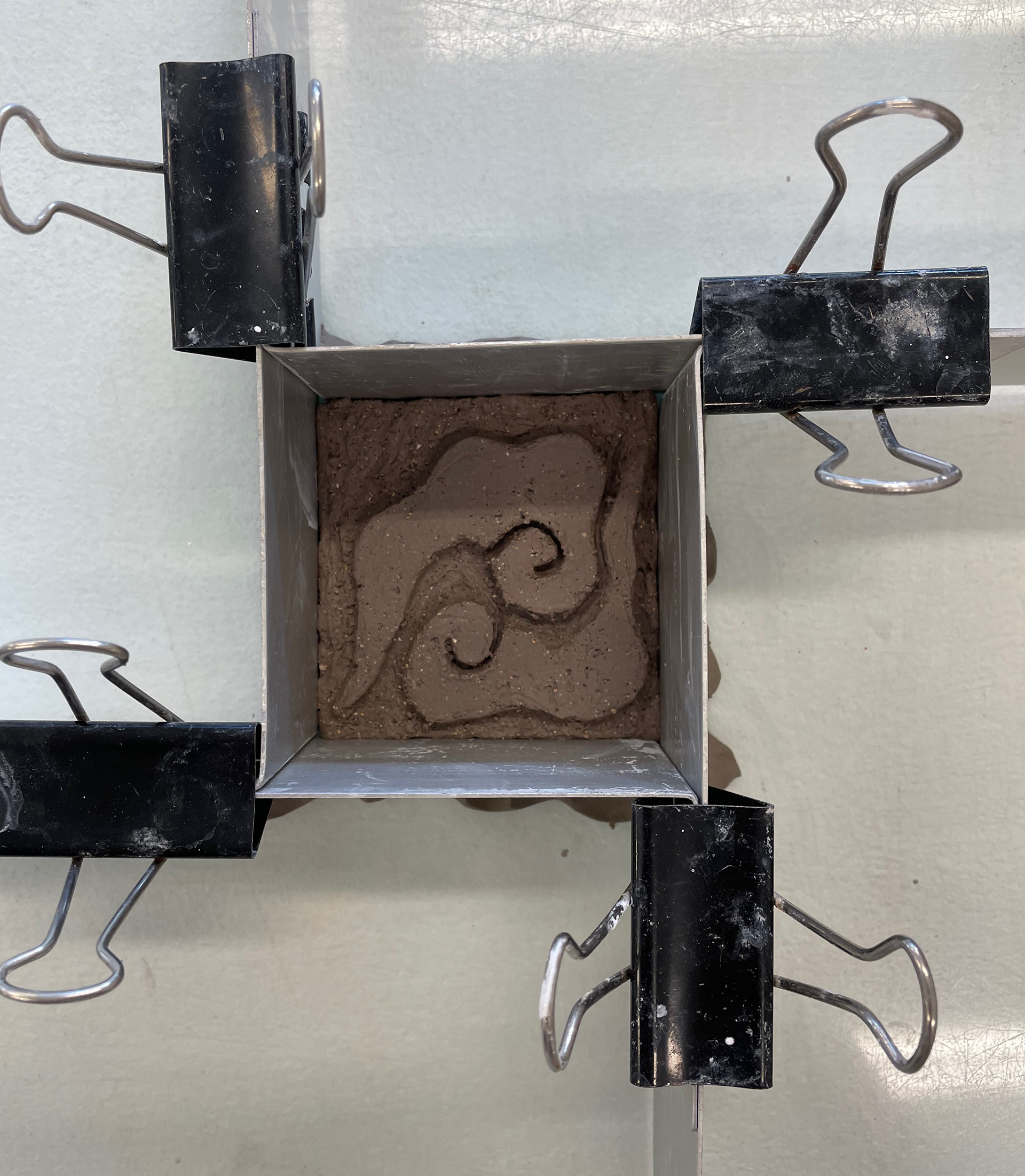
In our first session on tradition and innovation, we revisited basic techniques to be fully confident. We looked into the most traditional slab-building technique: creating a slurry from bone-dry clay, submerging it into hot water, and using it as glue to attach the different slabs. We used a mixture of clays, including grog, which we wedged together, giving the clay a lot of texture. I enjoyed exploring the texture; if you cut it with a sharp knife, it left a clean edge, but if you snapped it, it exposed the grog inside, giving a rough textured side. From this, I then developed primary samples that explored the nature of the clay, looking into the qualities of leather hard clay. I progressed this by being interested in the cracks leather clay gives and the texture created by gently bending the clay. By adding a white slip onto the clay and then cracking it, I felt it highlighted the harsh difference in smooth surface texture from the rough cracks embedded. However, working with leather clay, I found many difficulties manipulating it too much as it would just break, only having so much resilience. Therefore, I would have to spray the clay to rehydrate it, allowing me to give it the forms I wanted to explore.
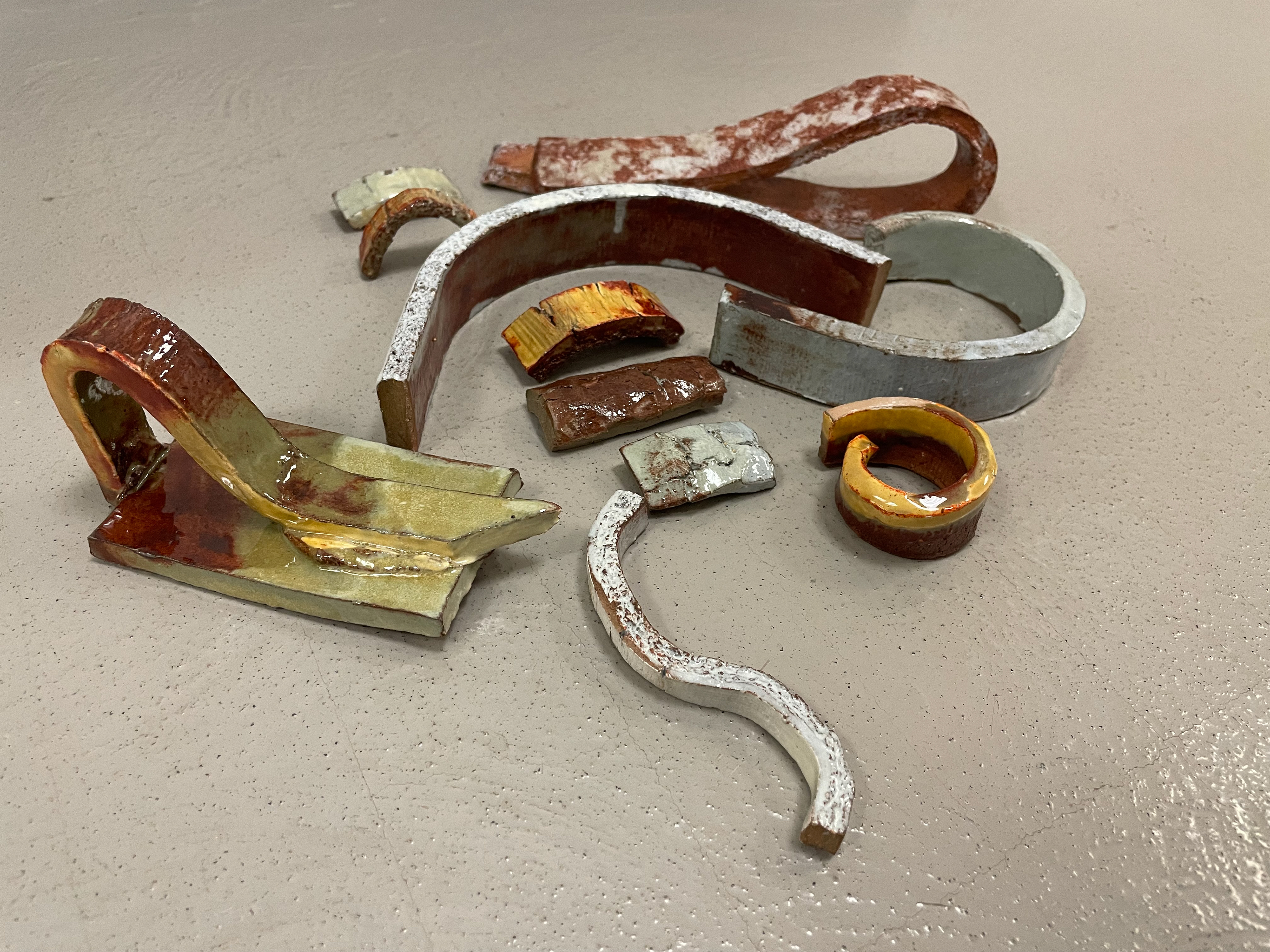
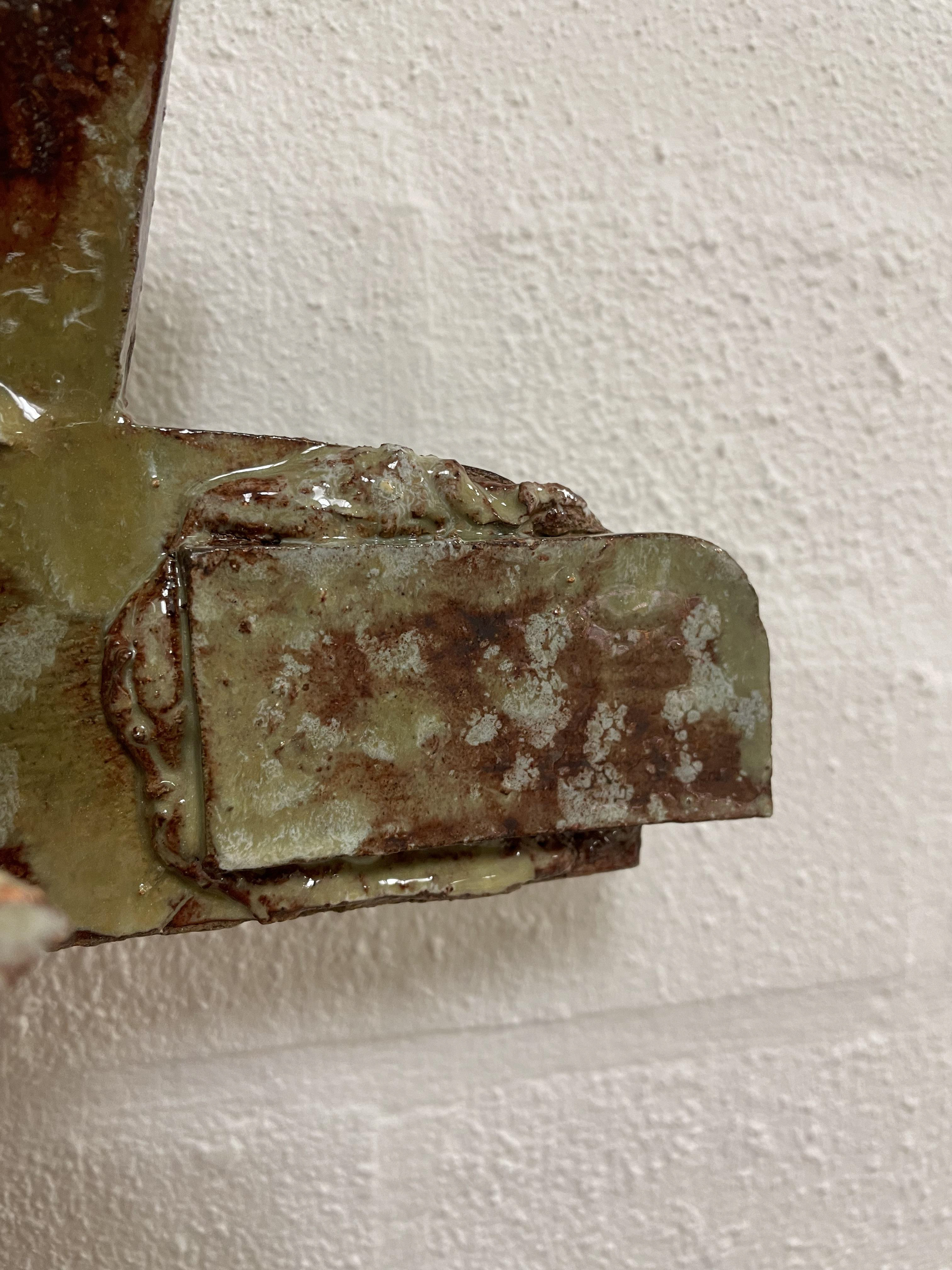
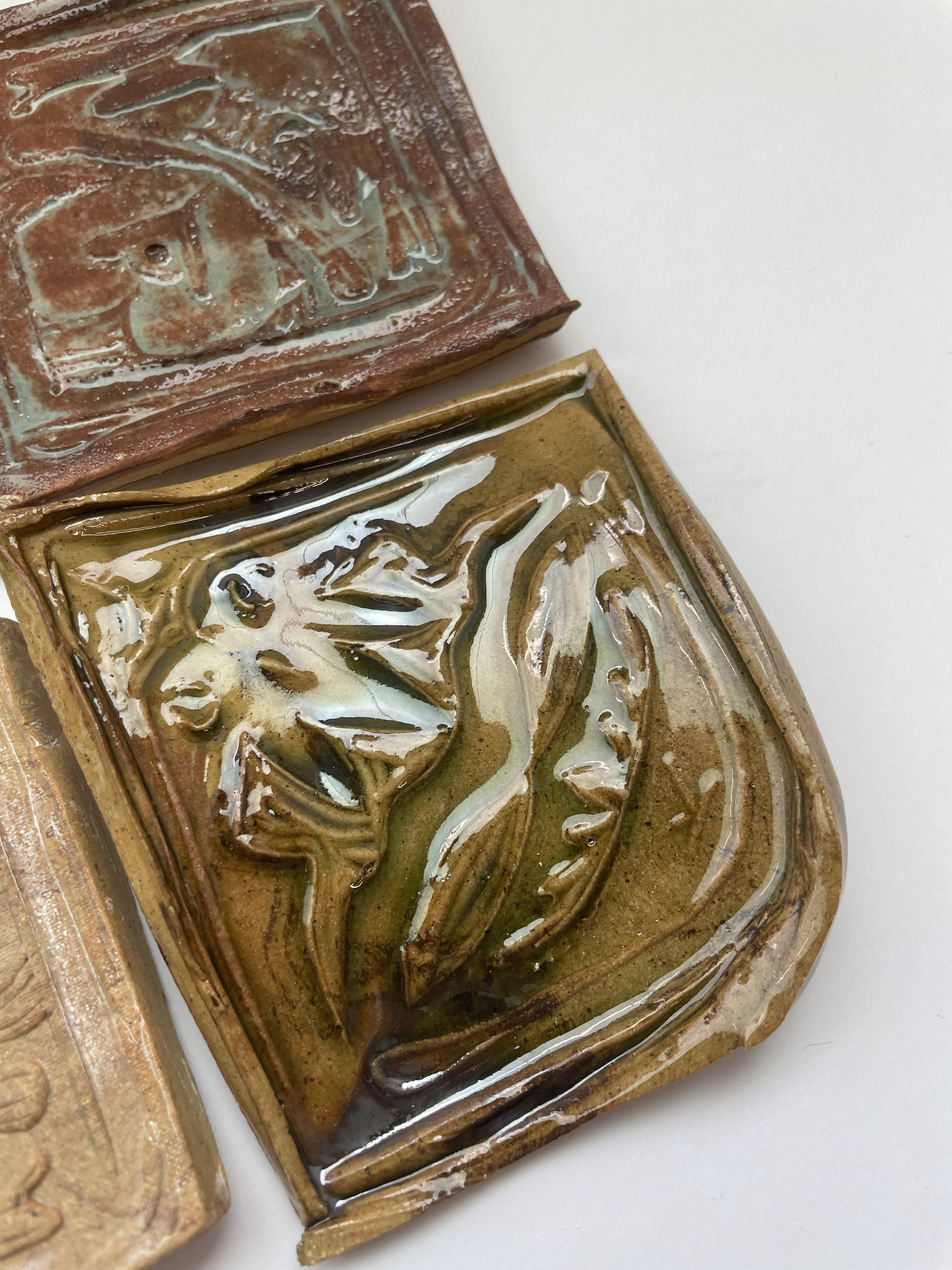
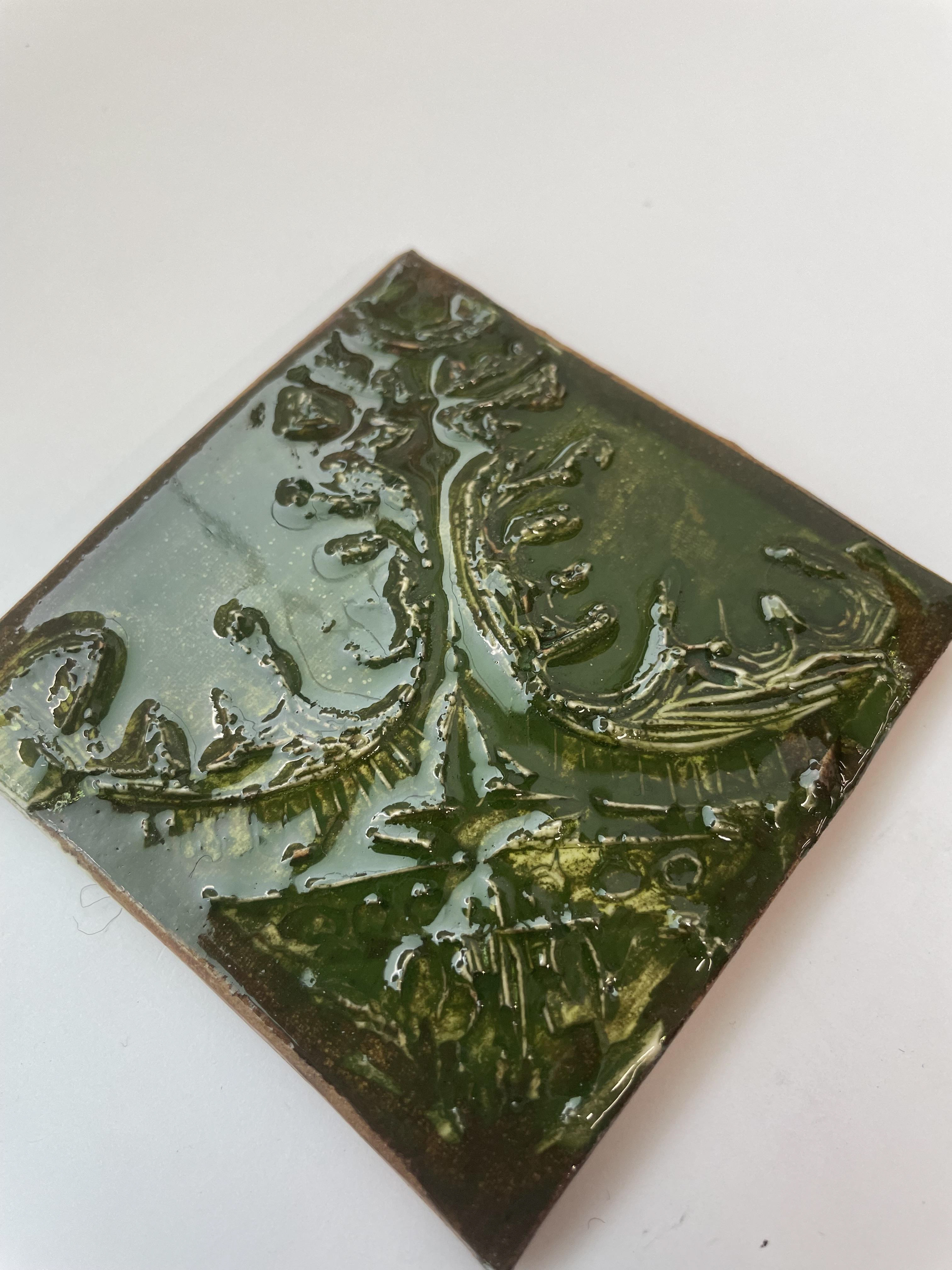
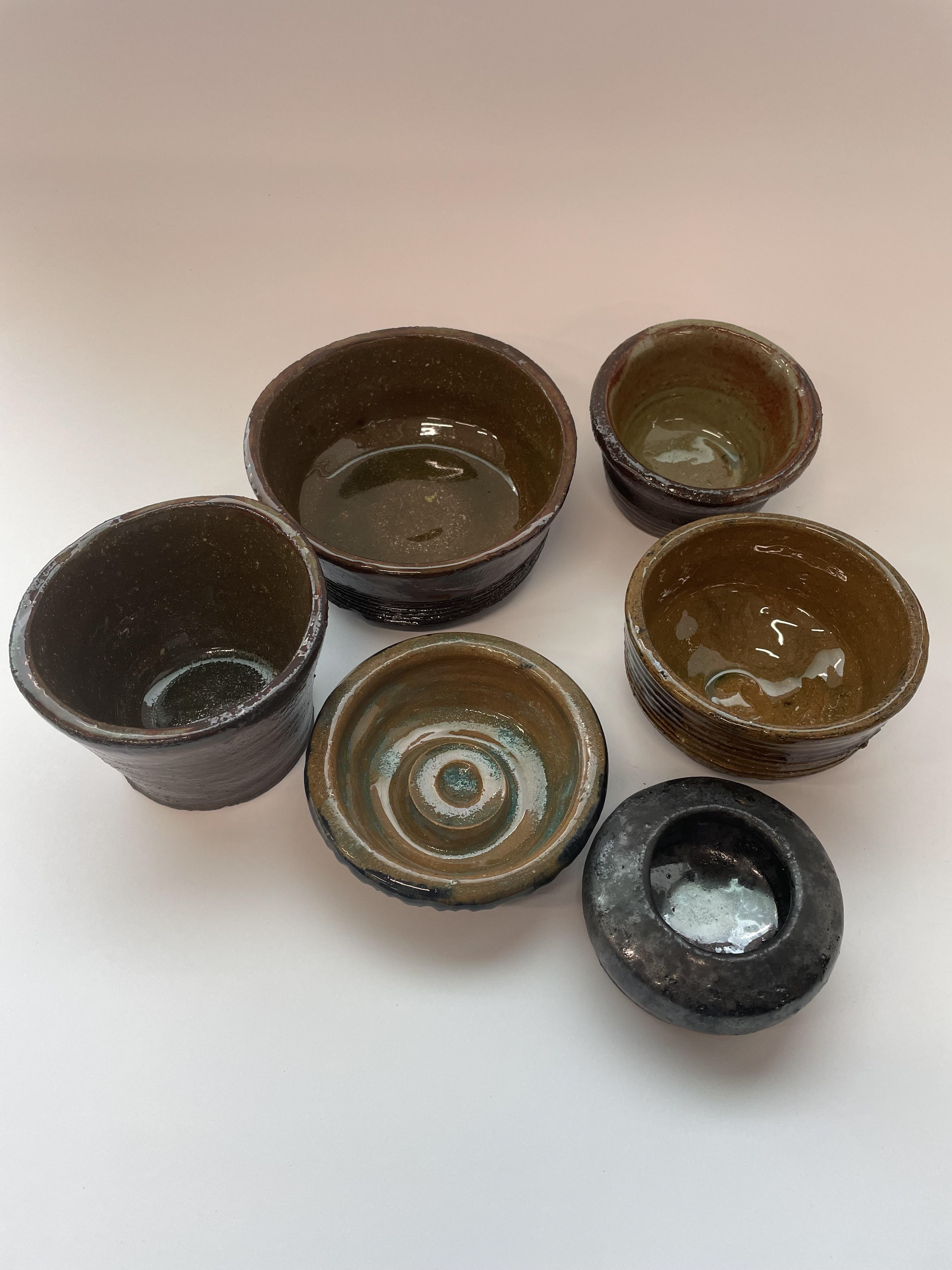
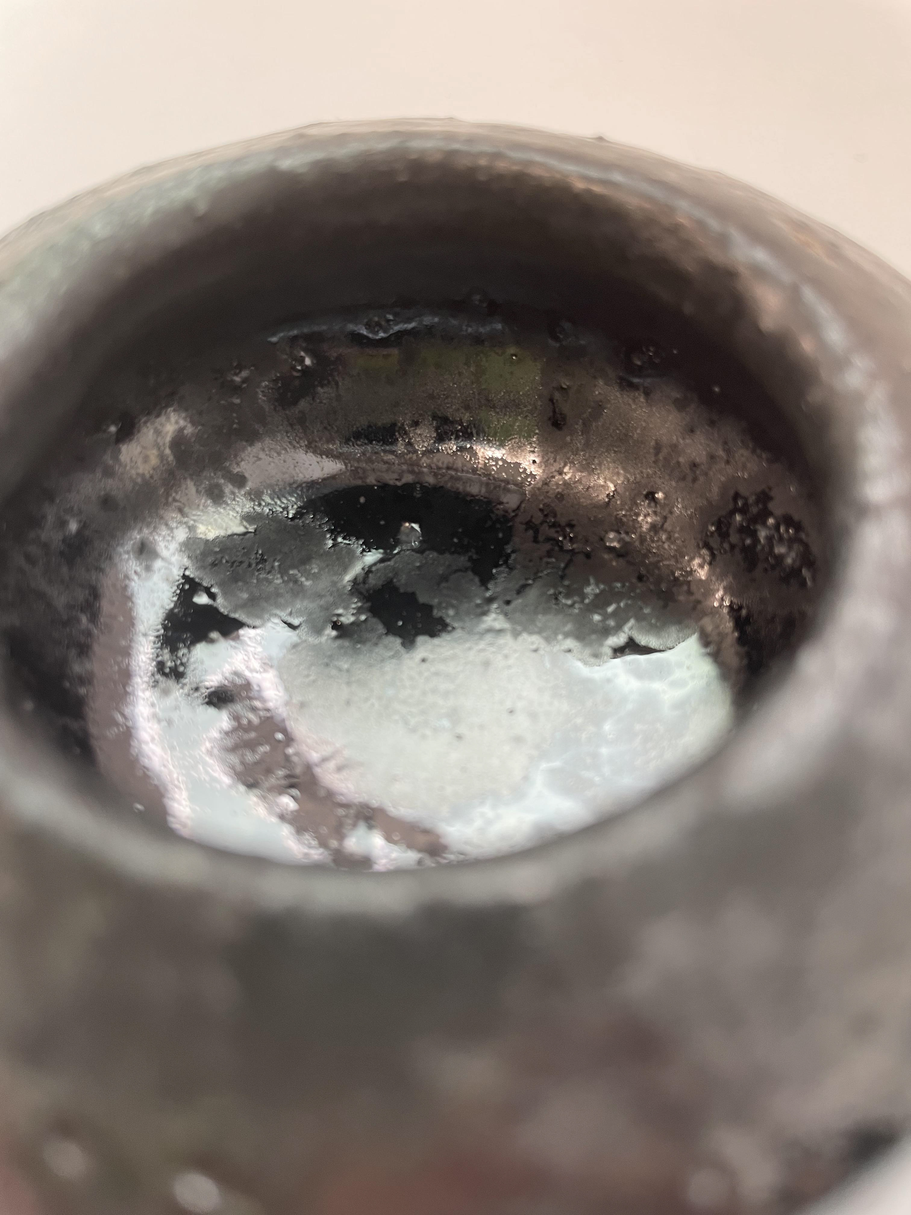
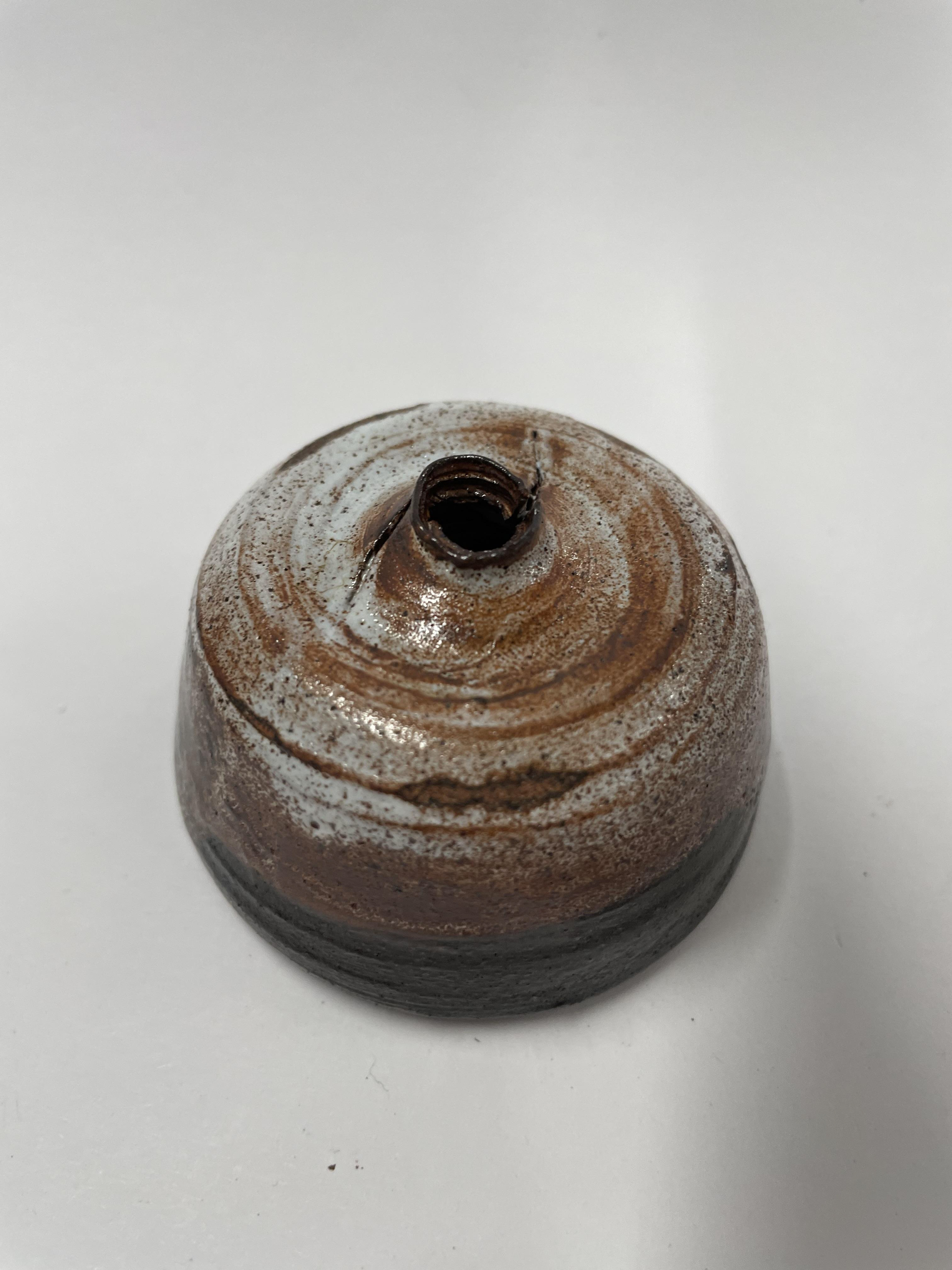
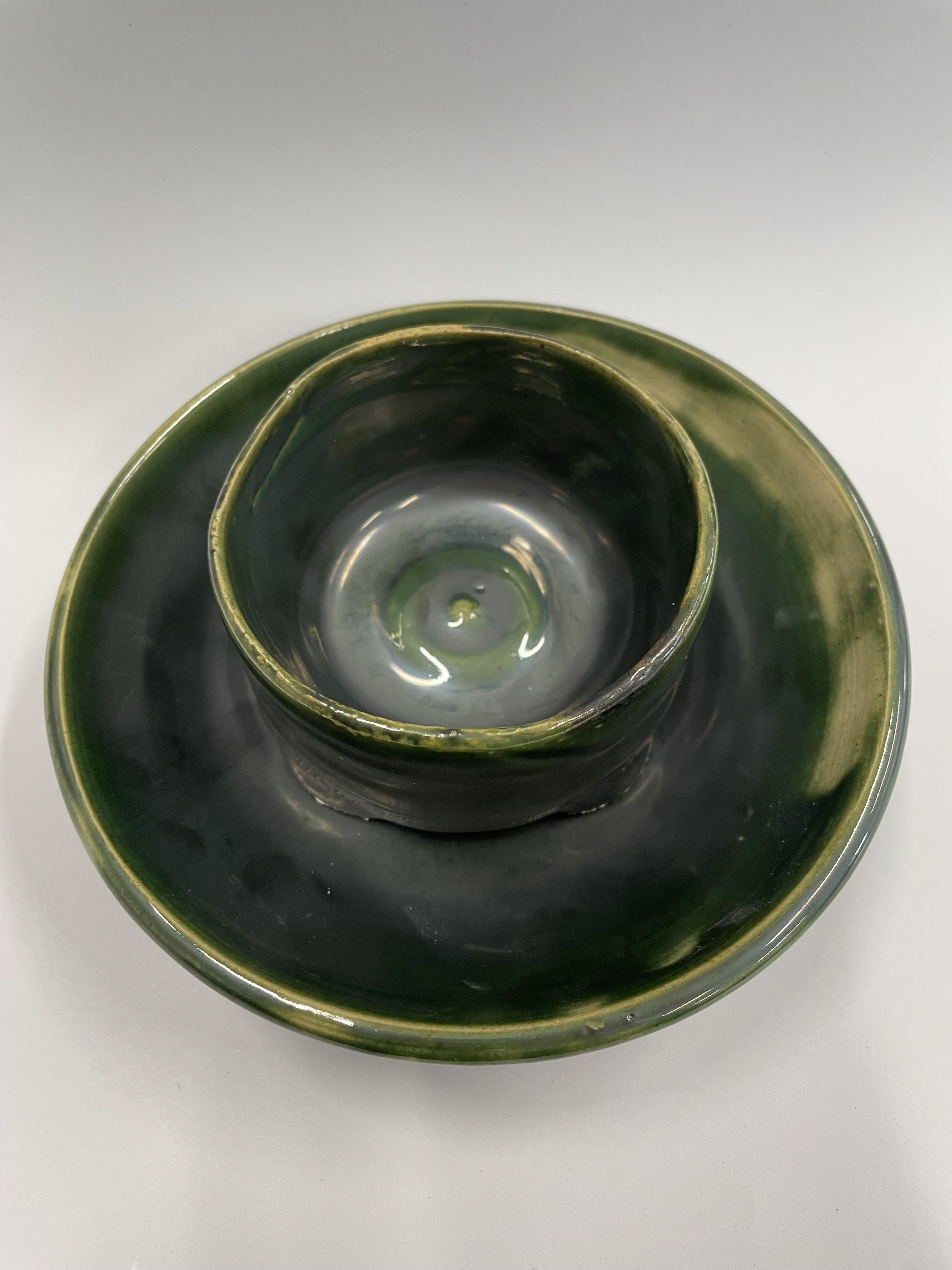
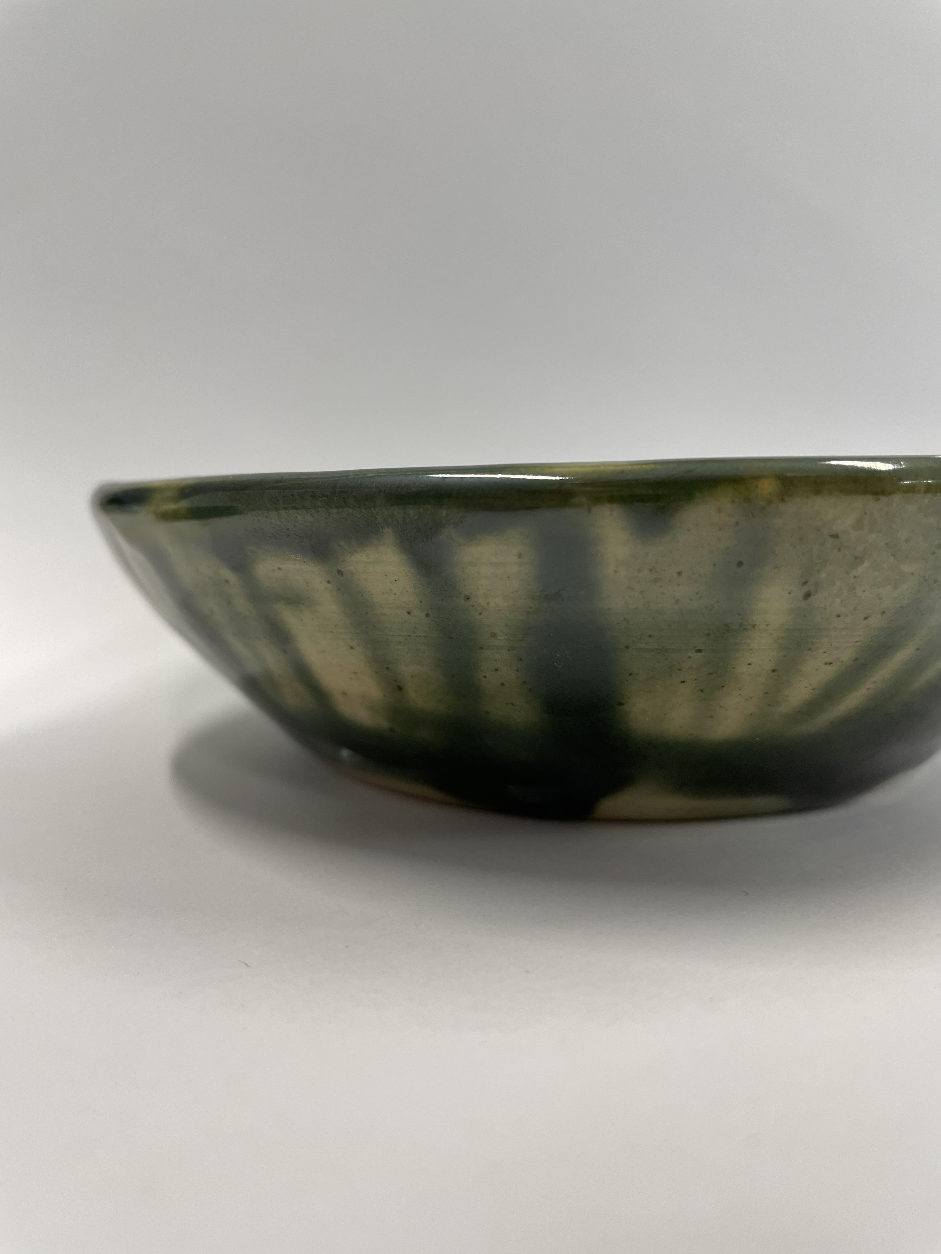
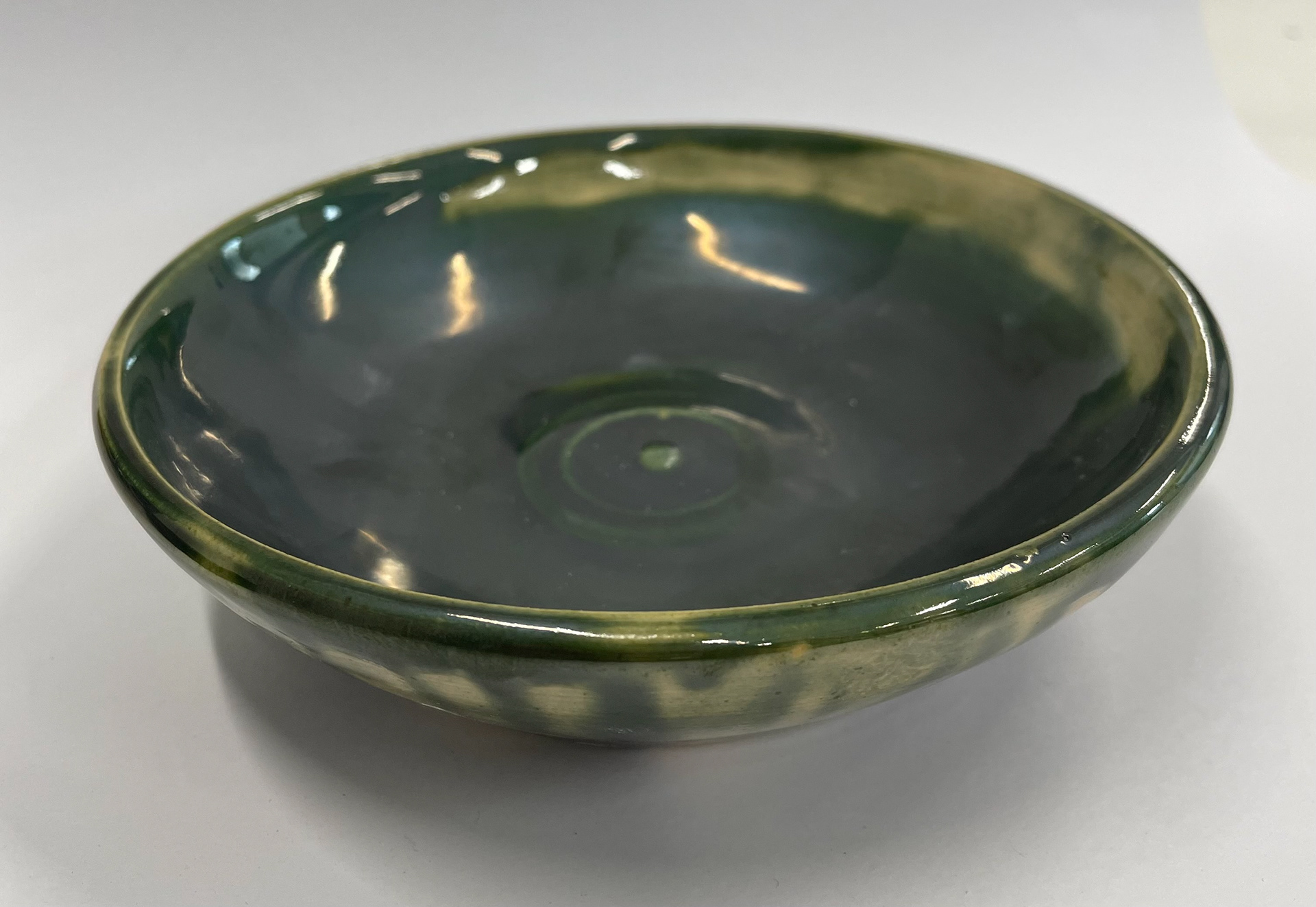
These slab pieces then got fired, and I played around with glazes and patterns created on them; I liked how the glaze was collected and gathered on the fired slurry and the different textures of the clay surface. Seeing the reaction between glazes and the white slip. The glazes used in these samples were a mixture of our line-blending outcomes.
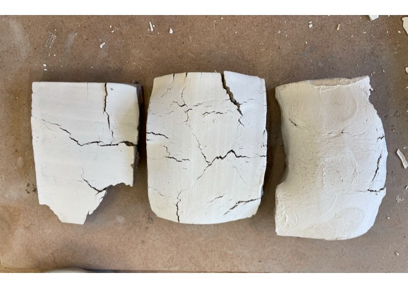
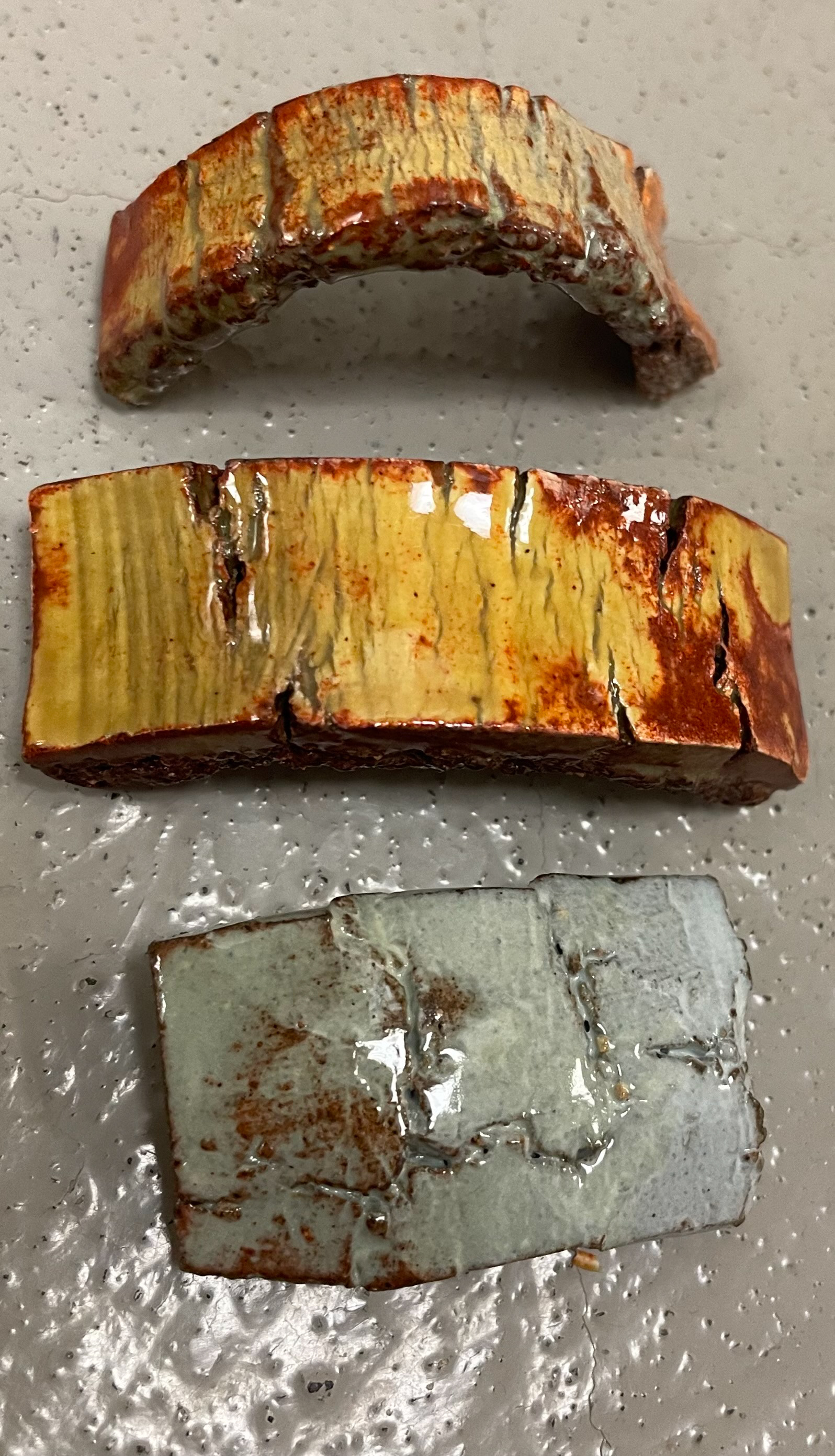
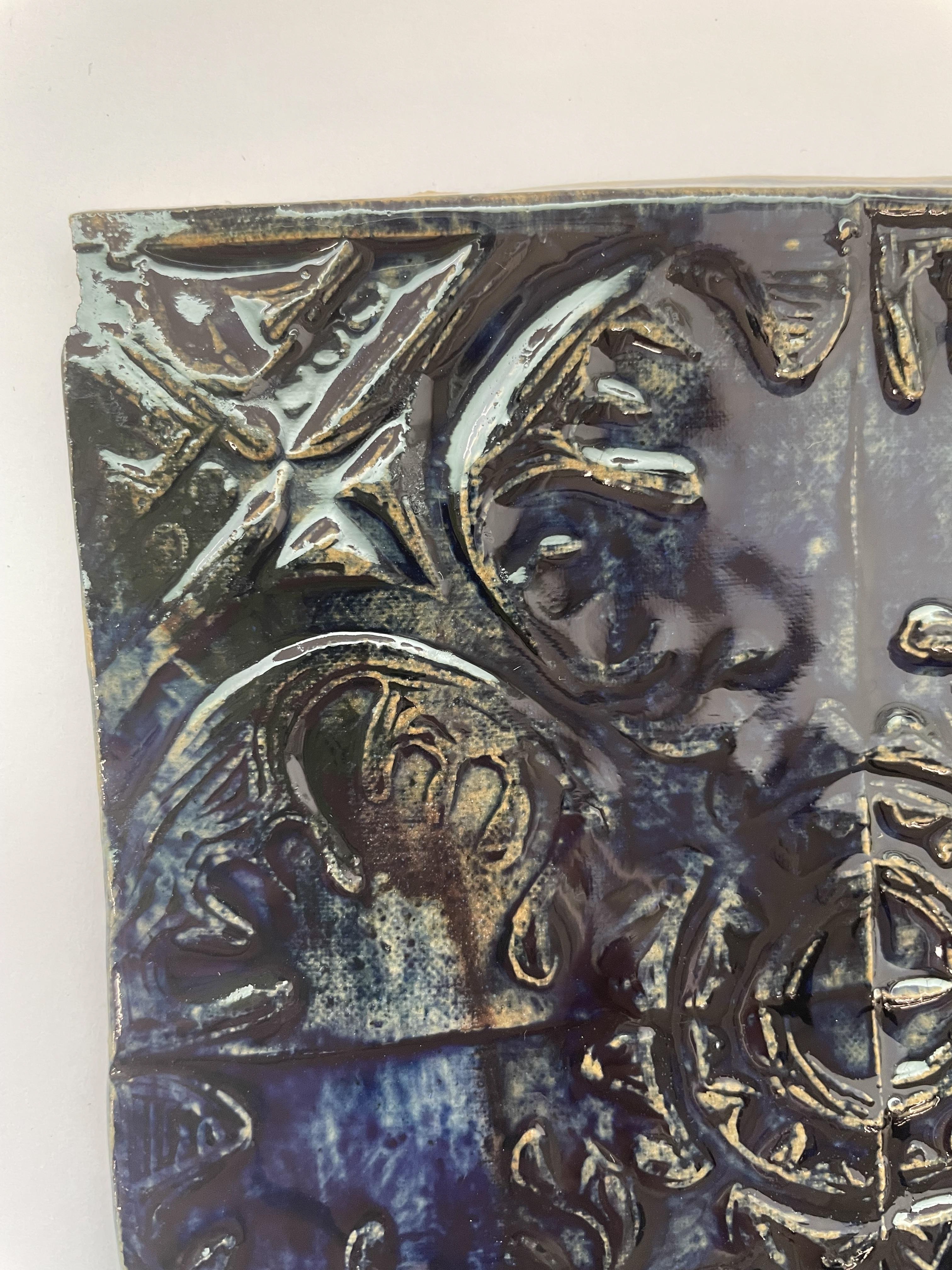
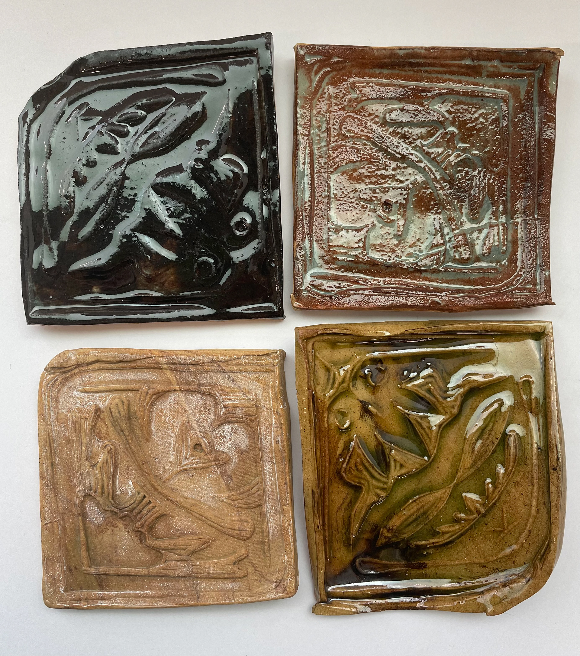
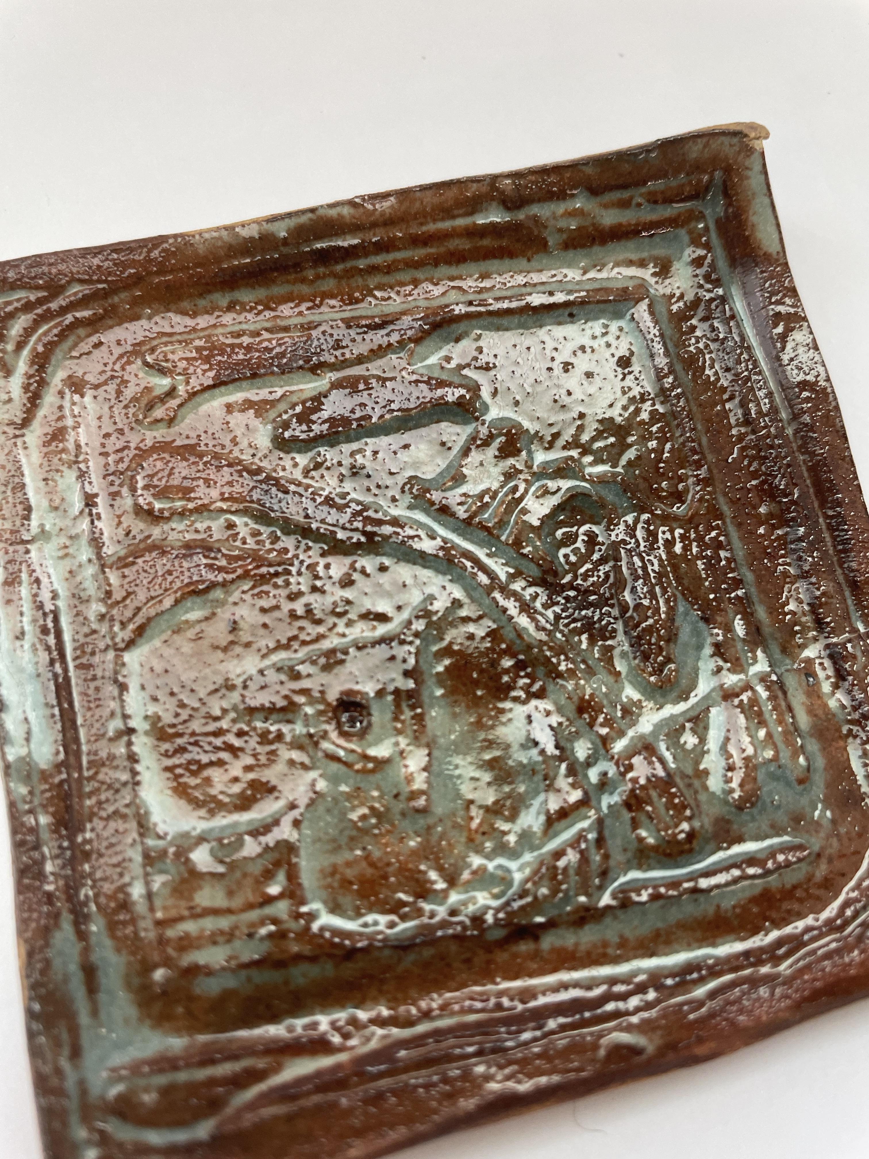
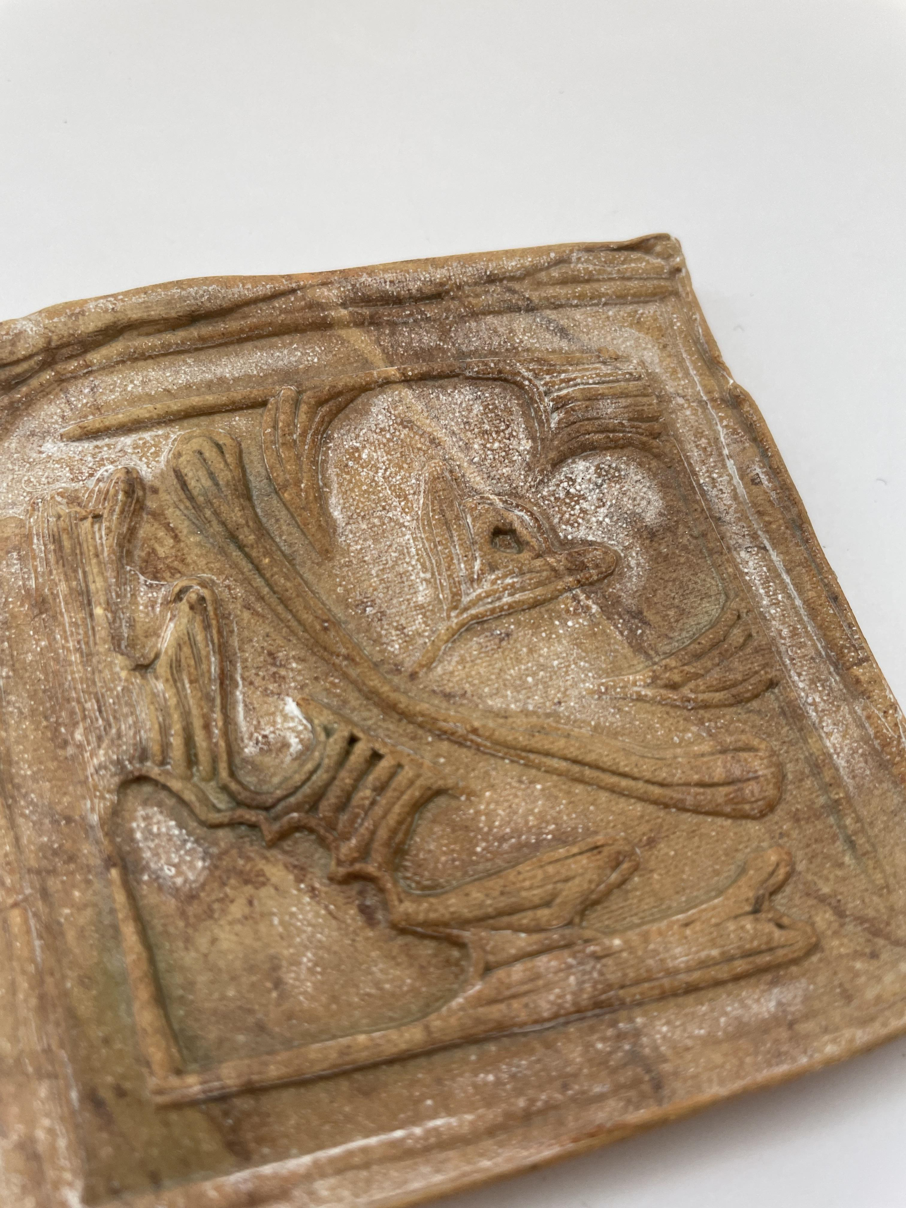
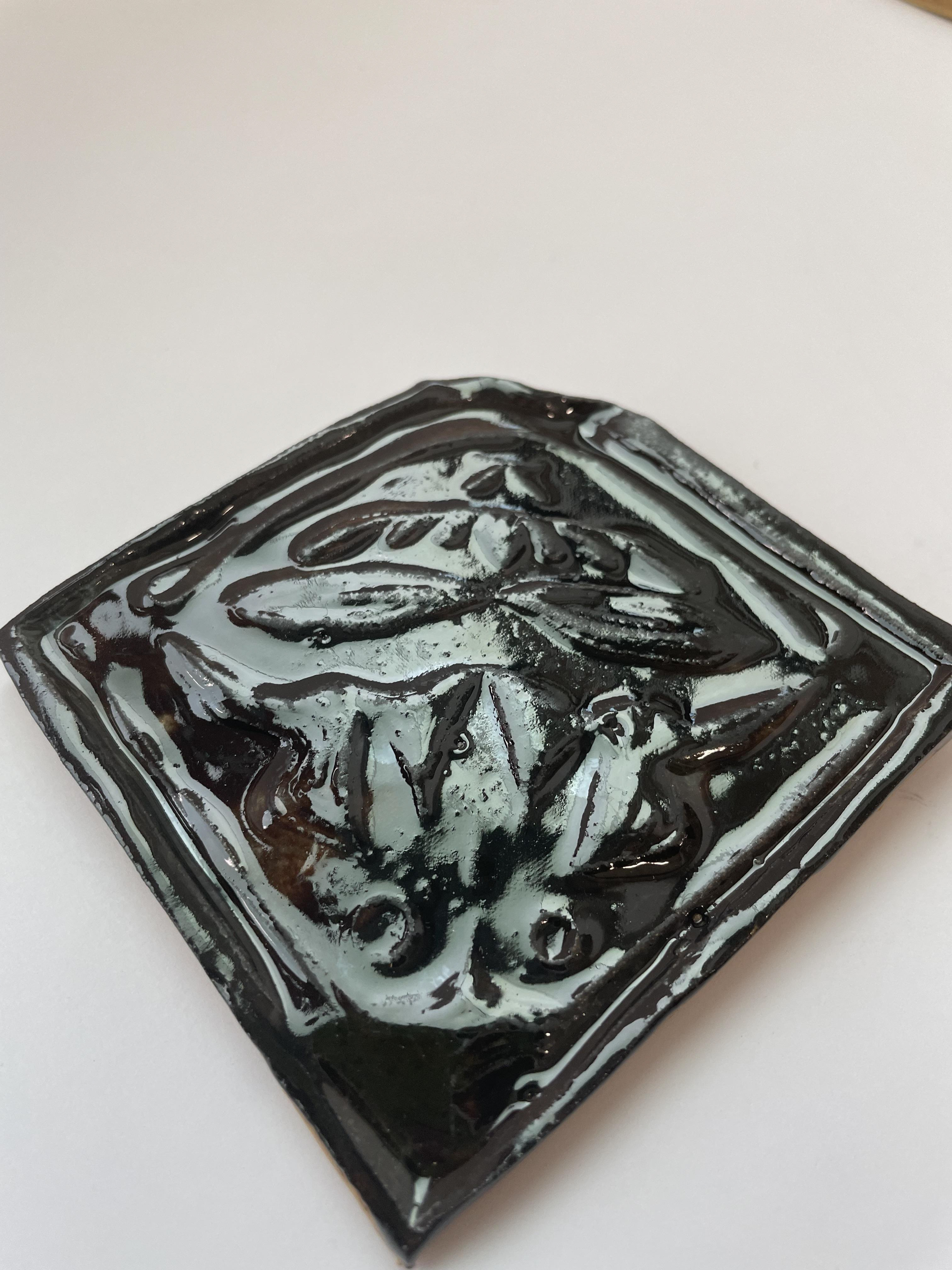
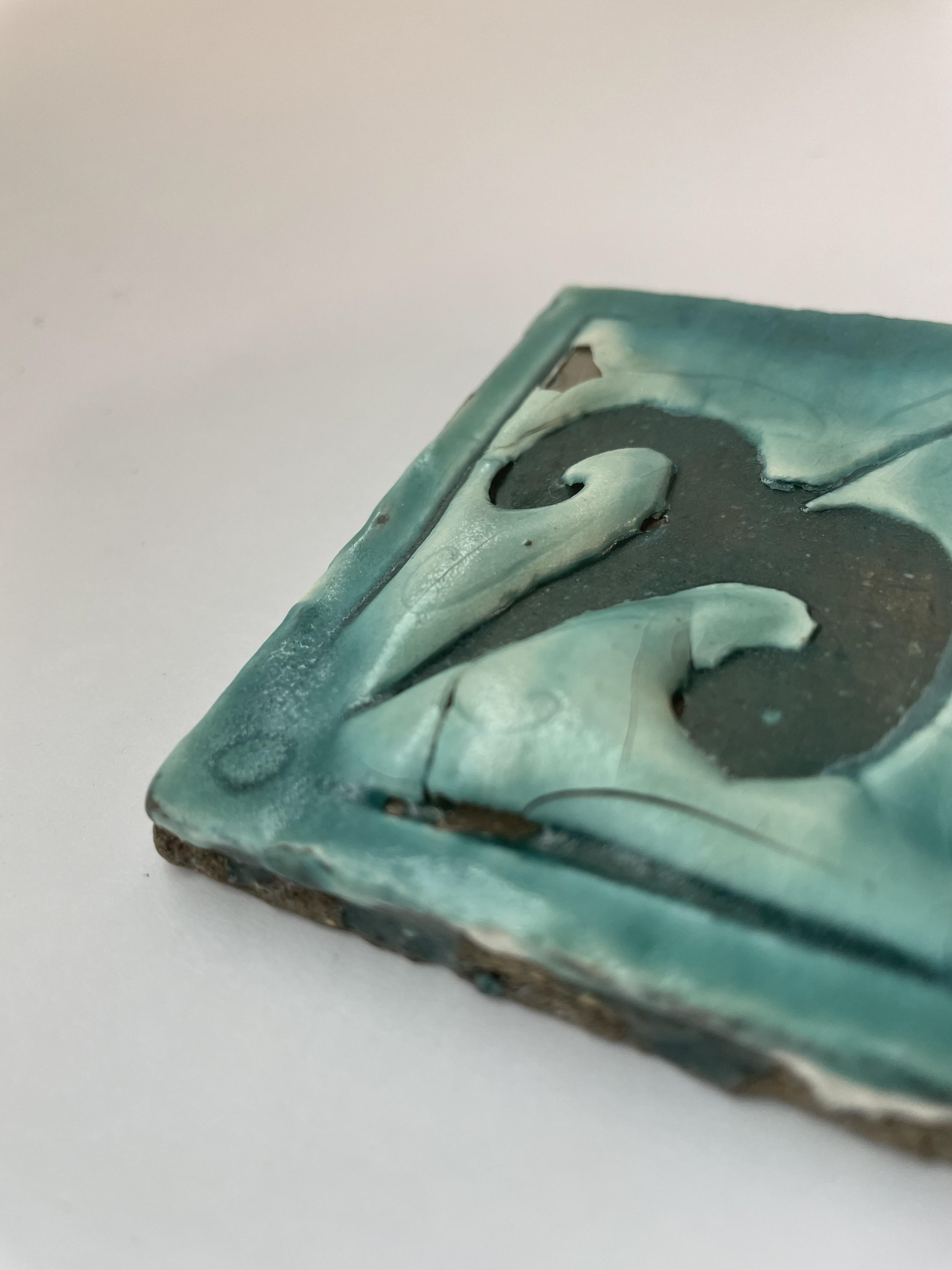
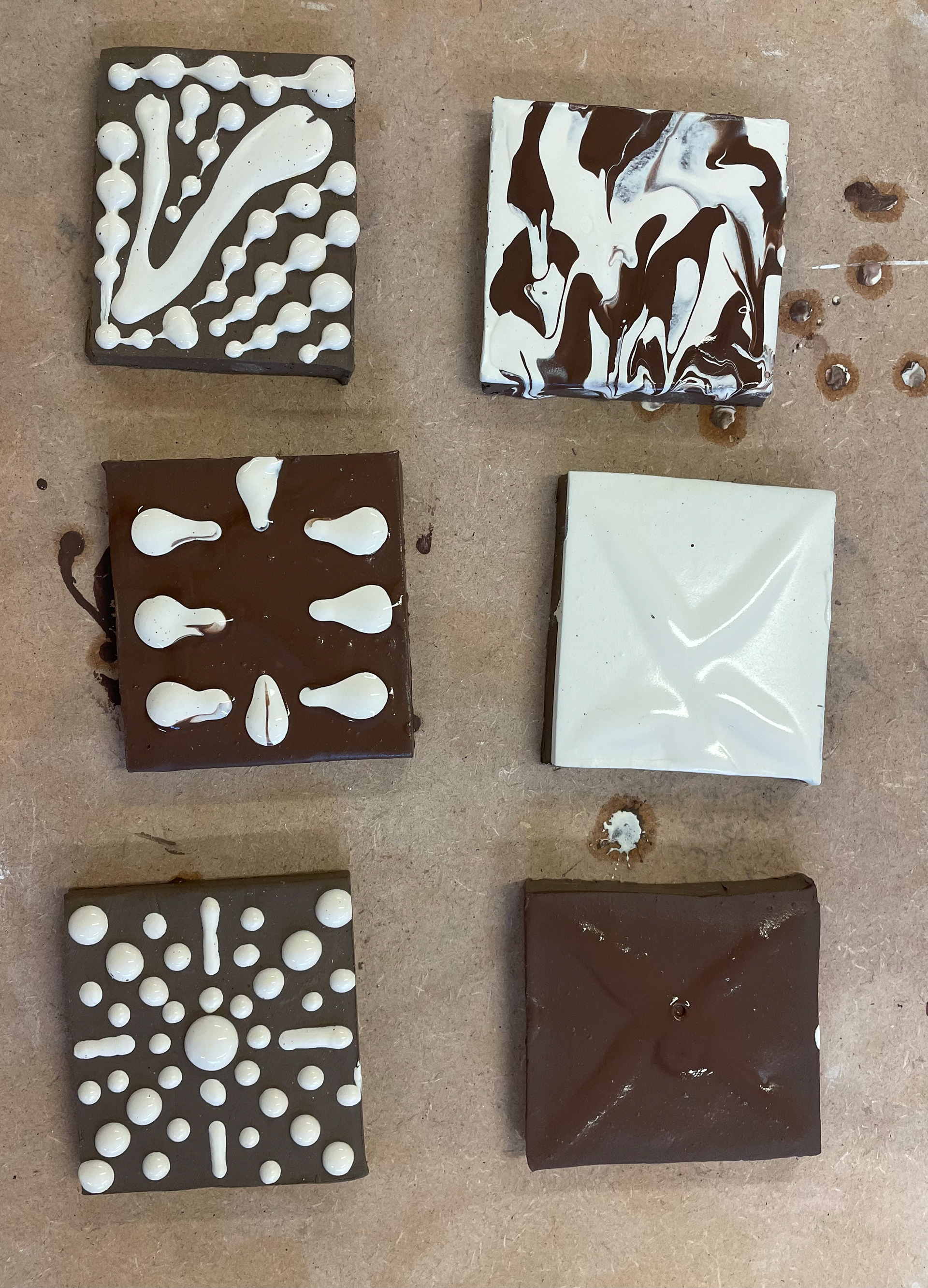
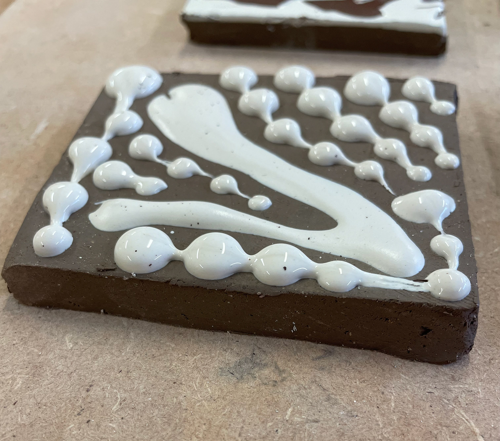
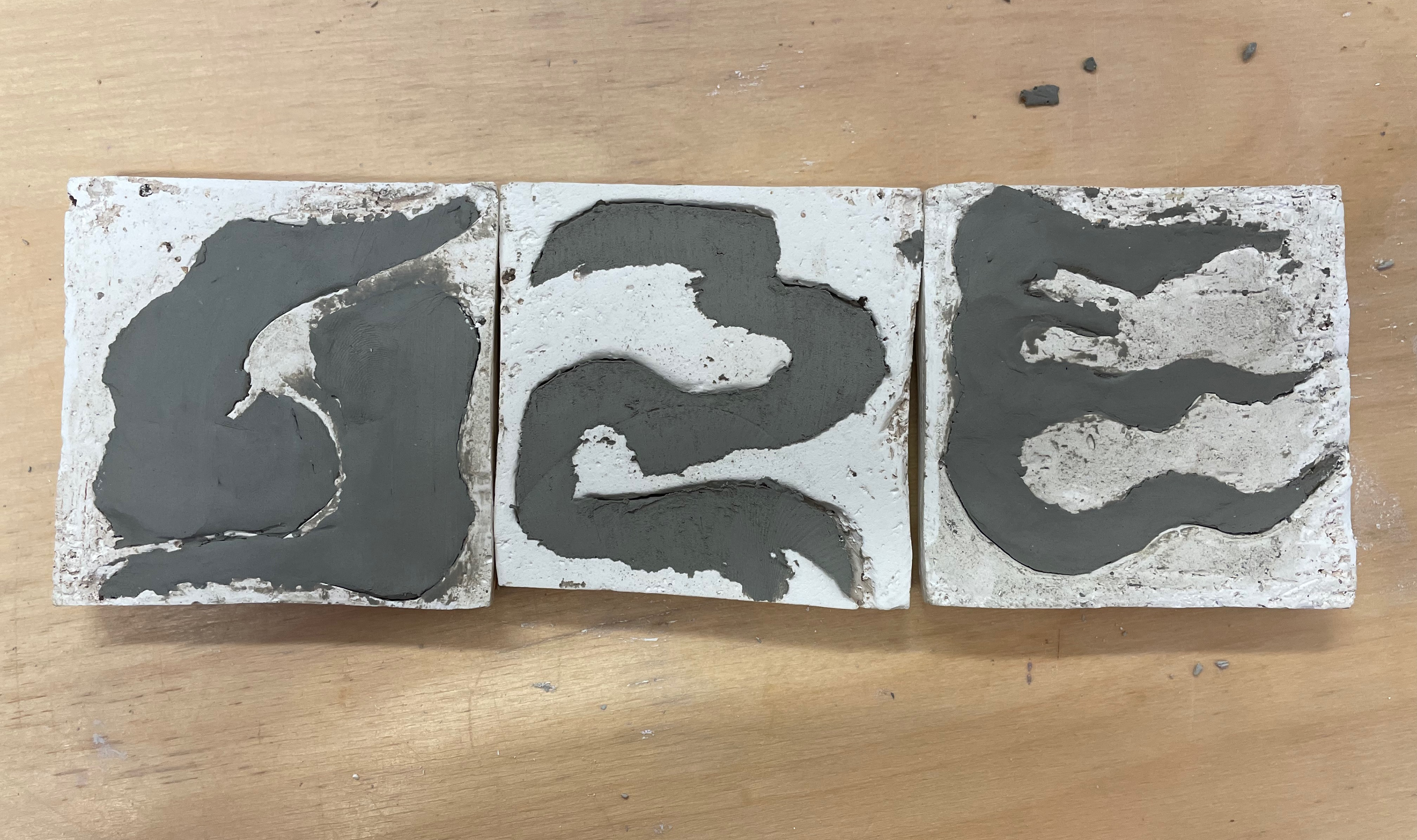
This is an experiment I started seeing the effect of white slip layered on clay and cracked; the 1st tile has one layer of slip, the 2nd has 4, and the 3rd has 8 layers. I then proceeded to bend them, creating cracks in the surface. I'm interested to see the effect these will have when fired, seeing how the slip will interact with the clay.
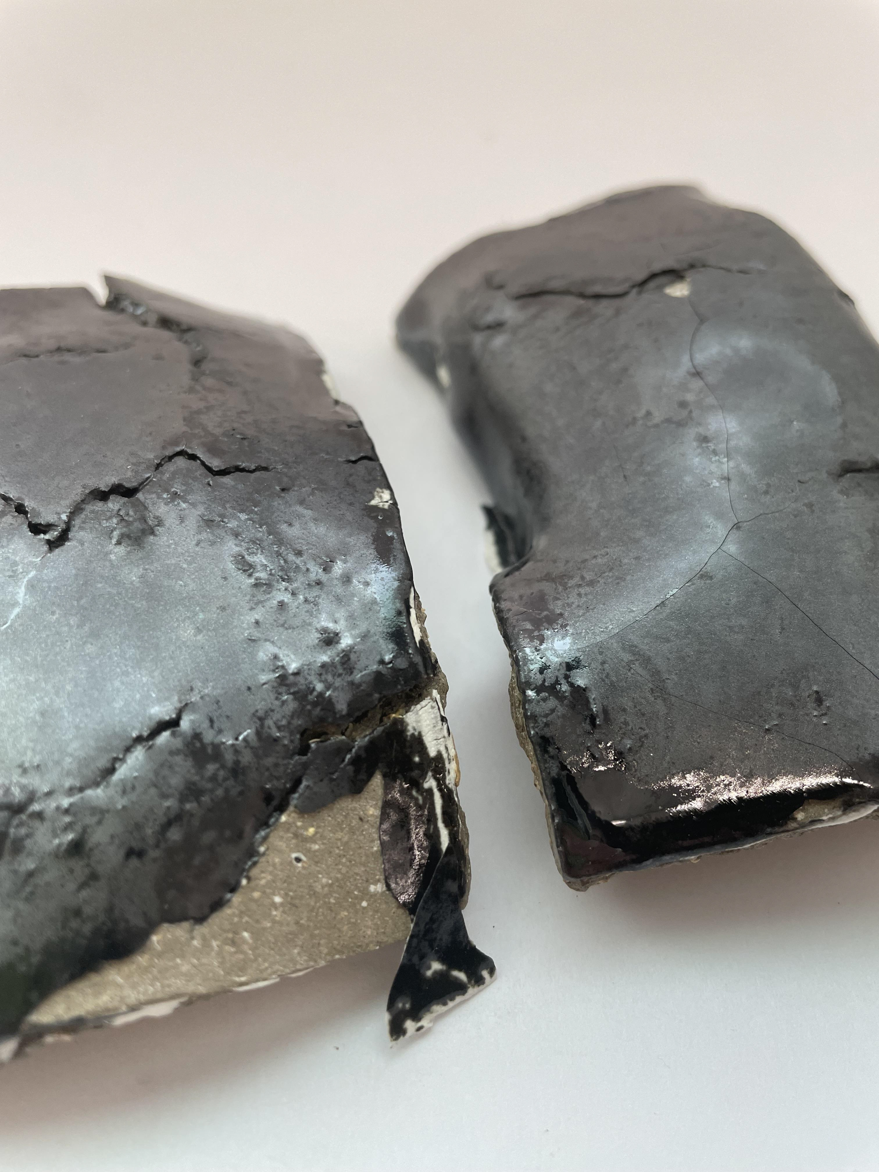
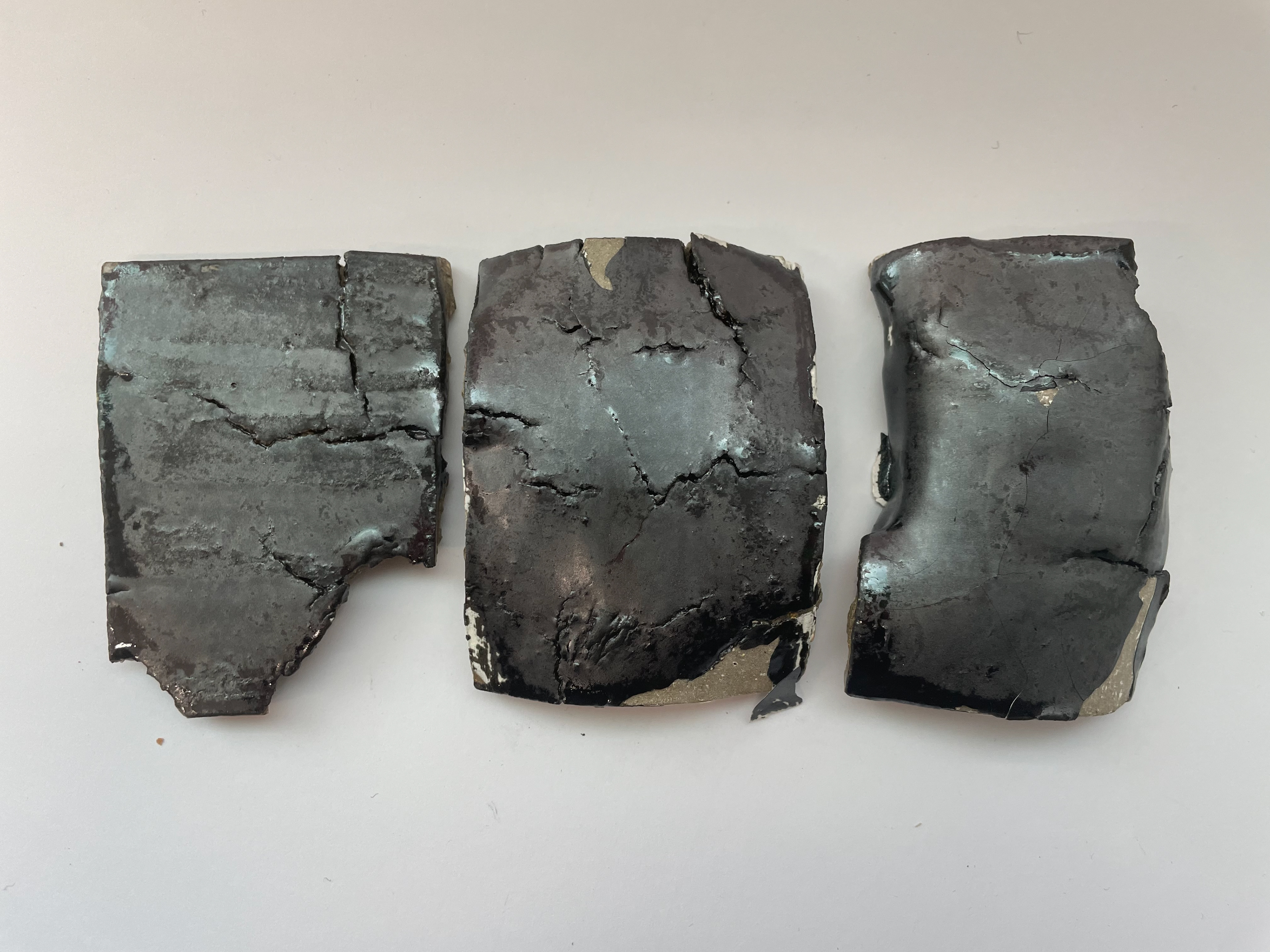
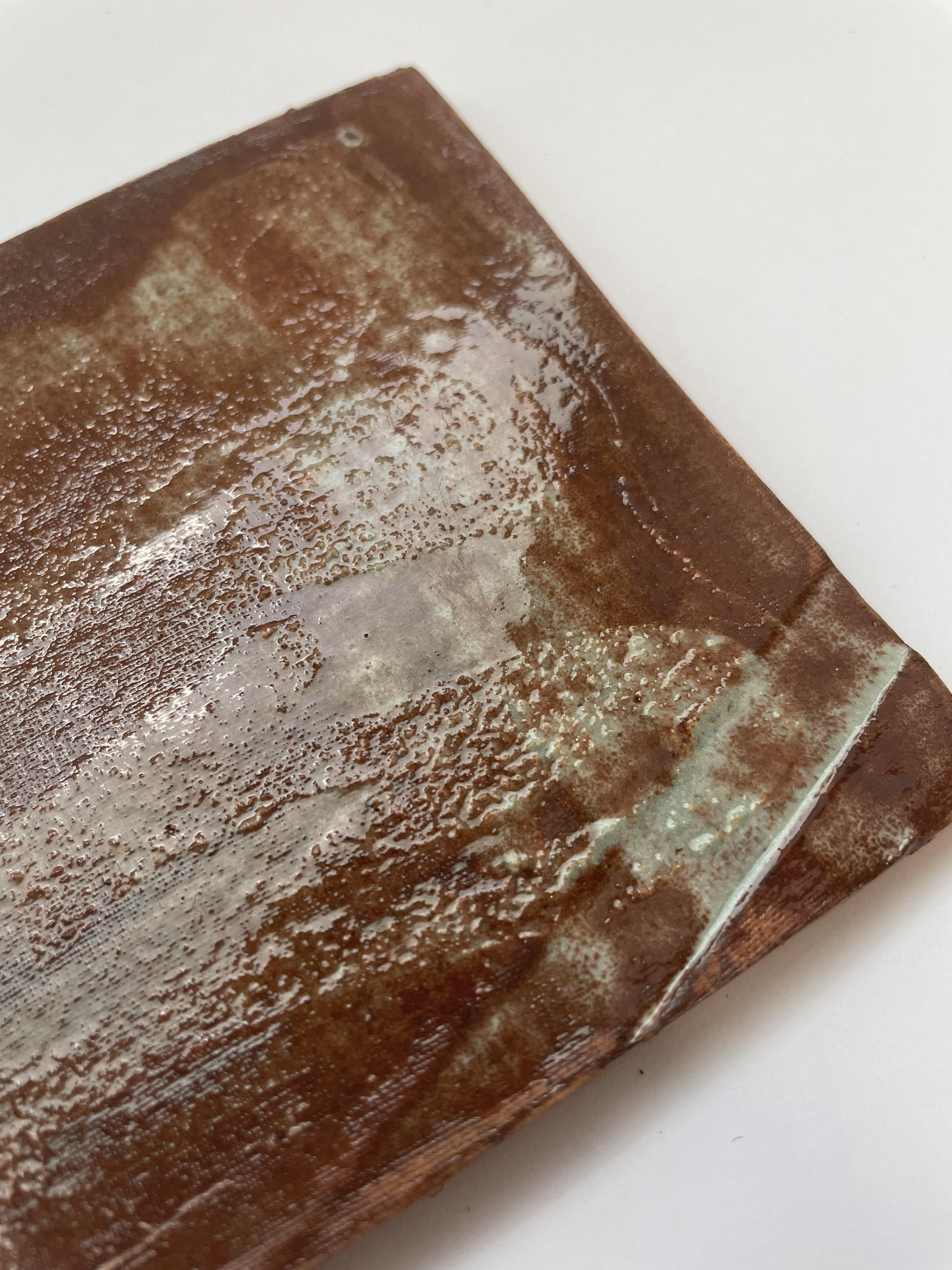
These experimented pieces came out very interesting, and they were glazed with a mix of 50-50 tin shiny and matt black - giving these exciting textures. It was also painted with different amounts of slips, which did have an overall effect on the pieces. The middle was the most bent and cracked; therefore, it was the most damaged, with the glaze peeling off. However, where the glaze is attached to the slip, some textures and cranks are highlighted by the shiny tin glaze. This may be because the slip didn't go into the cracks, so it reacted with just clay, making the glaze shiny. The first experiment went well; it had lots of texture and kept its glaze on; however, unlike the last one, where the slip was just too much for the clay and glaze, it was very delicate and peeled away easily. I believe this is due to the different amounts of slip and glaze in the experiments, as they have all been affected differently, which is interesting when comparing them.
line blending
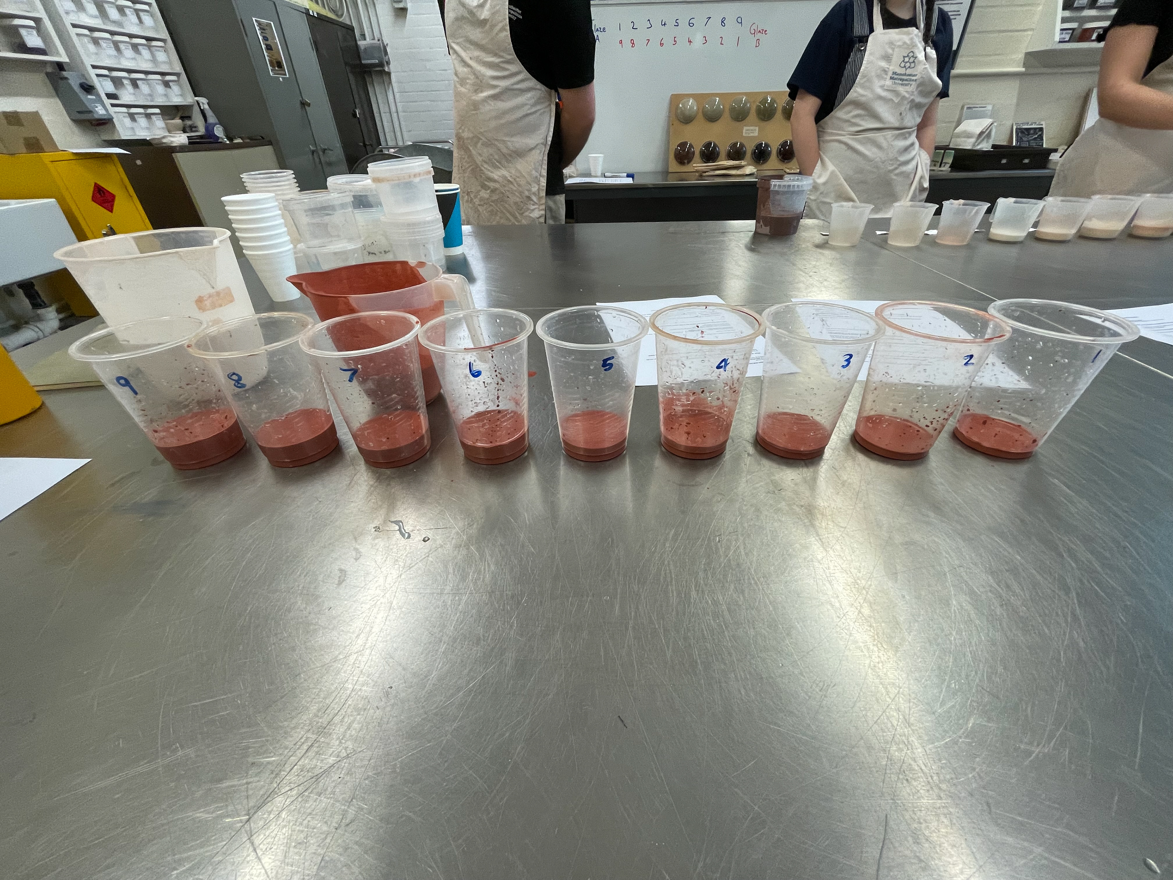
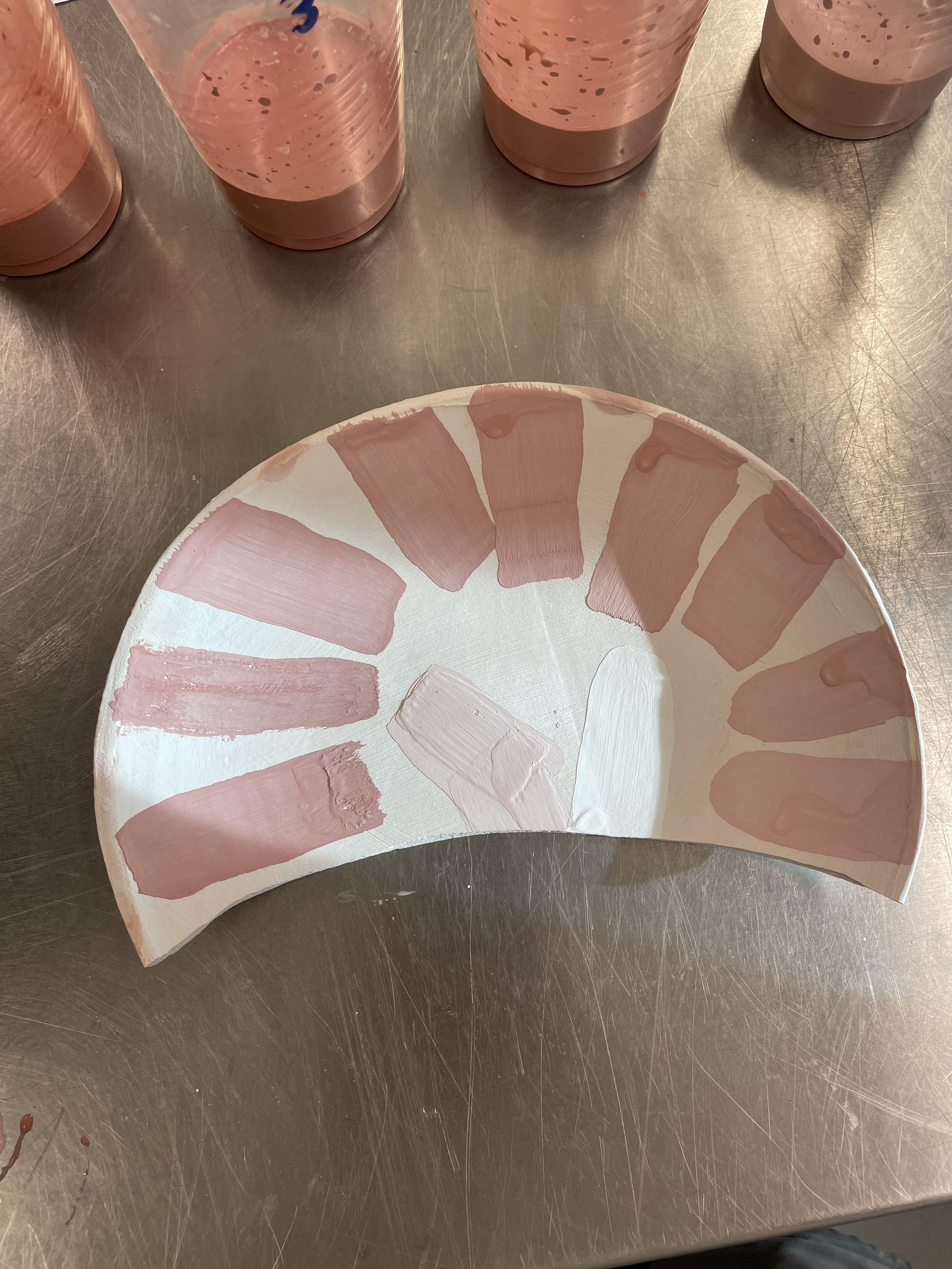
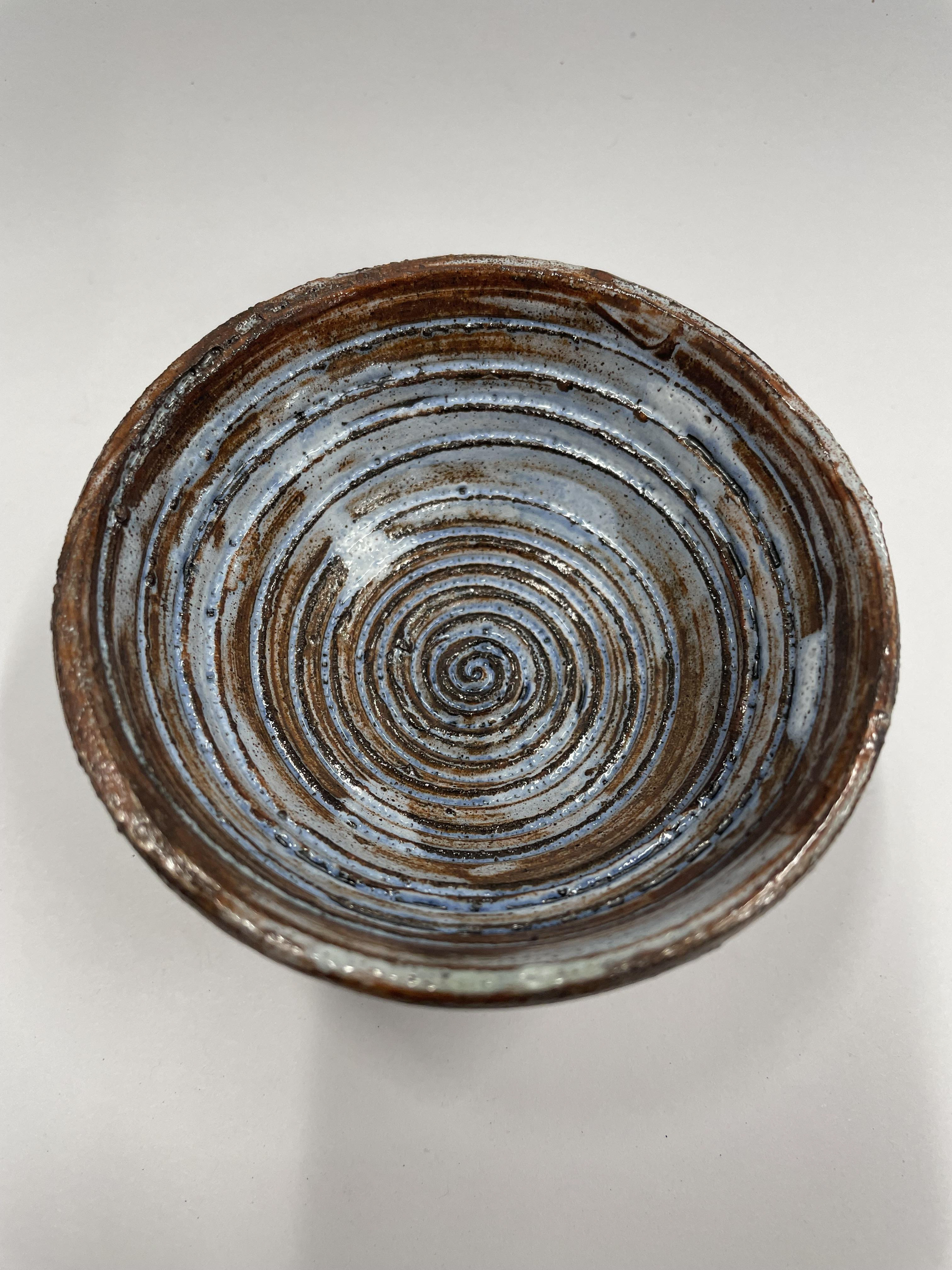
We looked into line blending, mixing two different glazes or adding an oxidant to create a spectrum of quick responses, leaving you with an array of new glazes. To start this process, you have to choose two pre-mixed glazes, both of the same quality. For ours, we chose both stoneware glazes, tin shiny and honey glaze; we then laid out 11 pots as we are creating 11 samples, starting with our original colours and working them in a ratio of 1:9-2:8-3:7 ... with 100ml of glaze in total. Then, you mix the quantity of glazes using this ratio. Leaving you with nine mixed glazes and your two originals. This leaves you with a small gradient of the mixed colours, allowing you to see which ratio of colours you like the most. You can also do this process with oxides in a glaze with the same theory but use one base glaze and one oxide going up in a 1:9 ratio.
I applied my line glazes to my slab-building outcomes.
readings
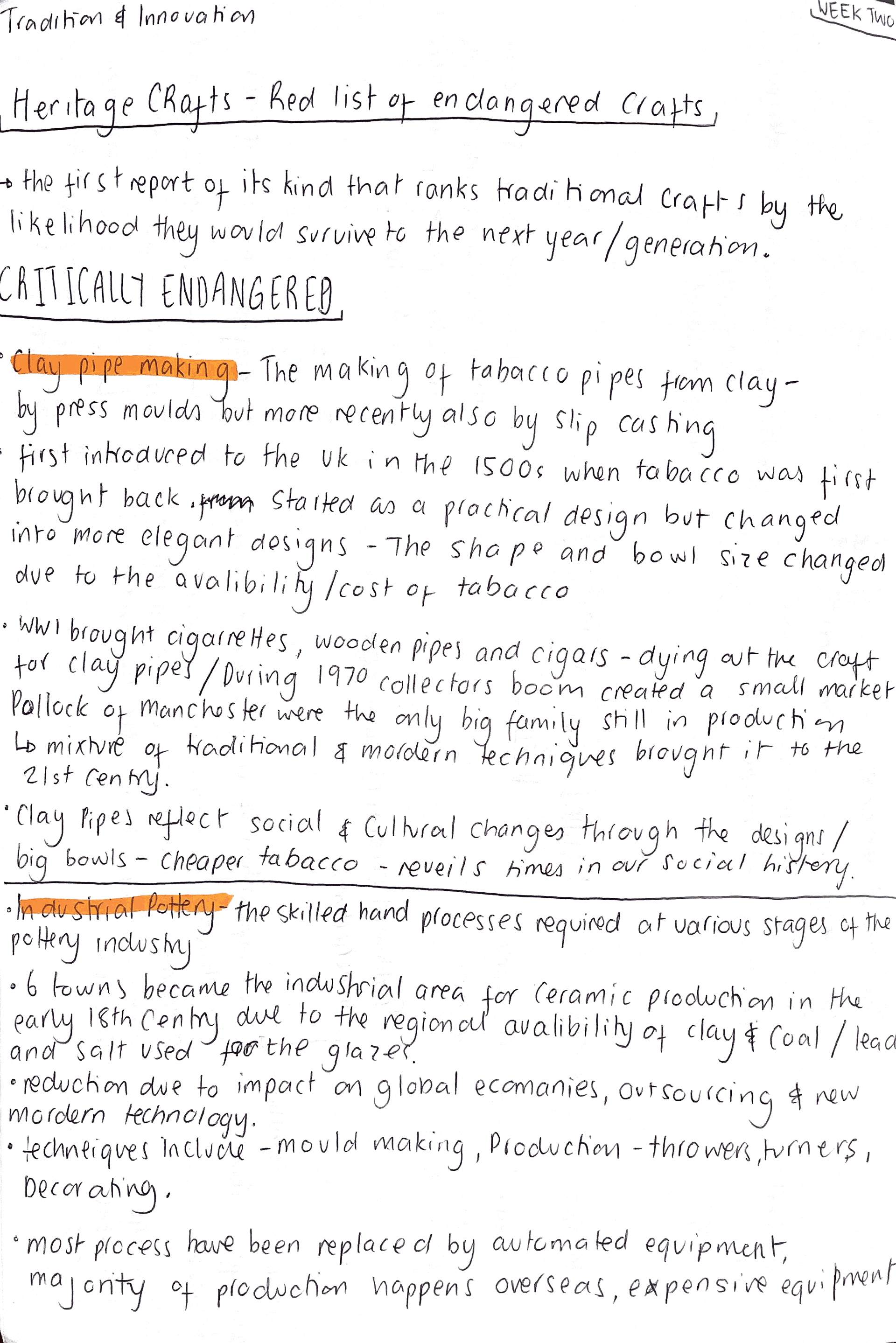
heritage craft
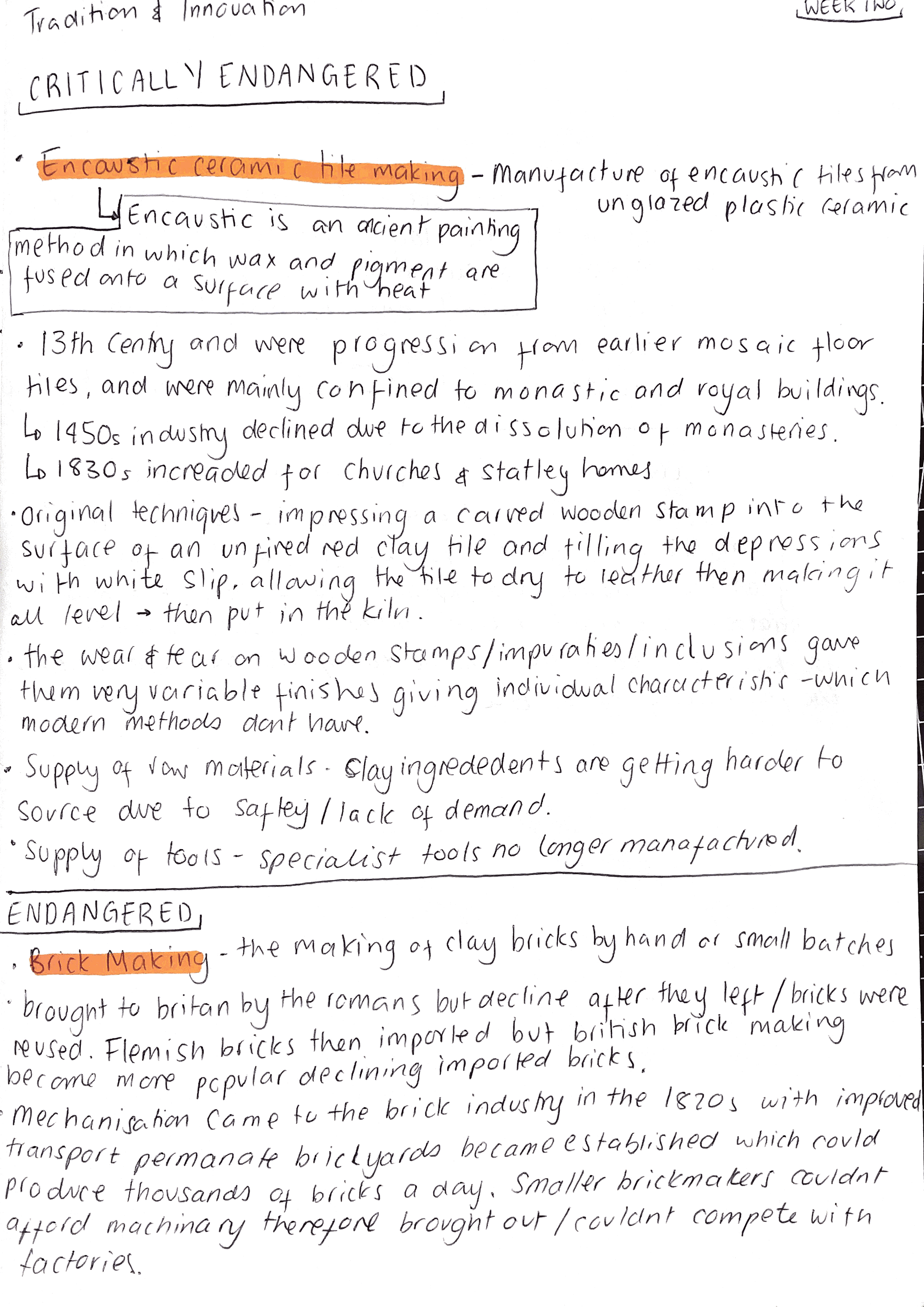
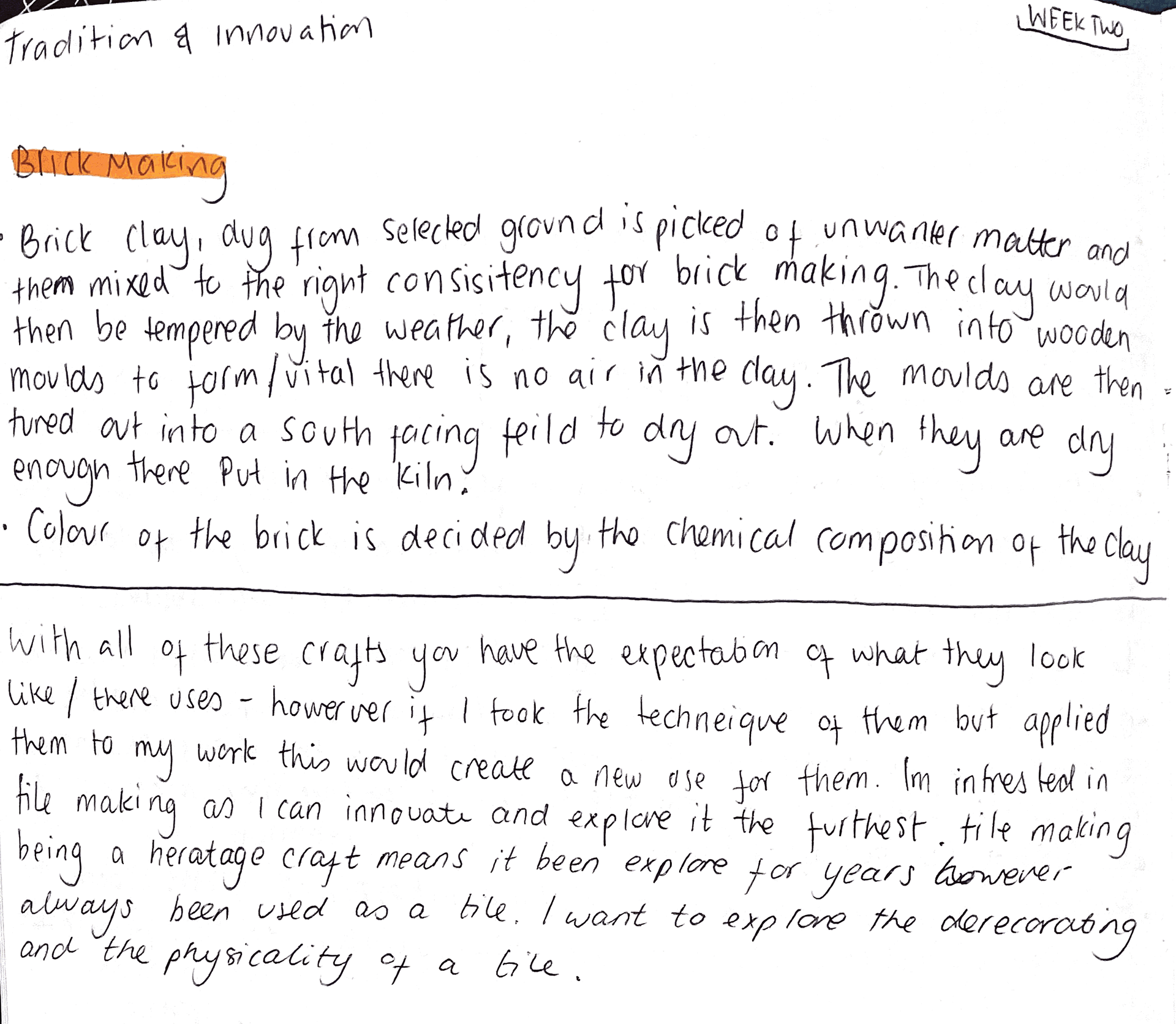
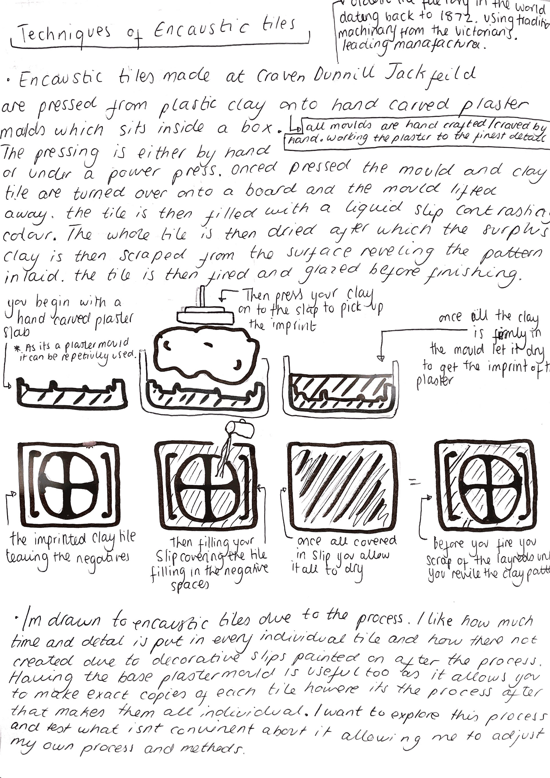
Encaustic tiles have three key aspects- impressing plaster that imprints the clay, filling the negatives with coloured slips, and manufacturing encaustic tiles from unglazed plastic clay.
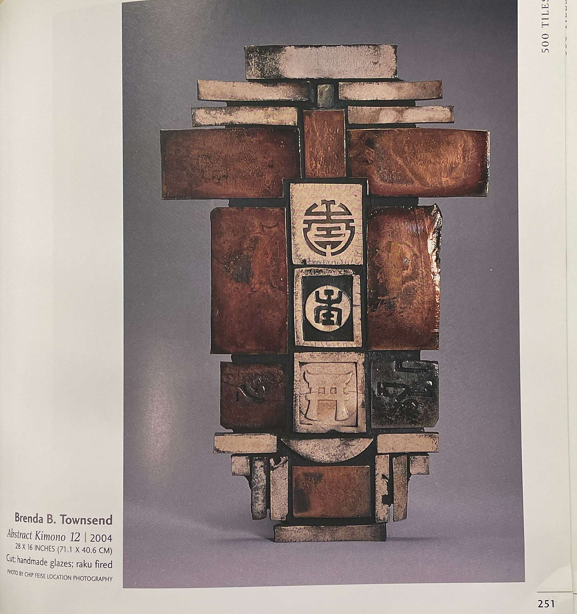
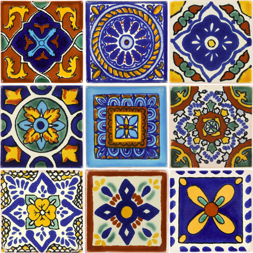
figure 1
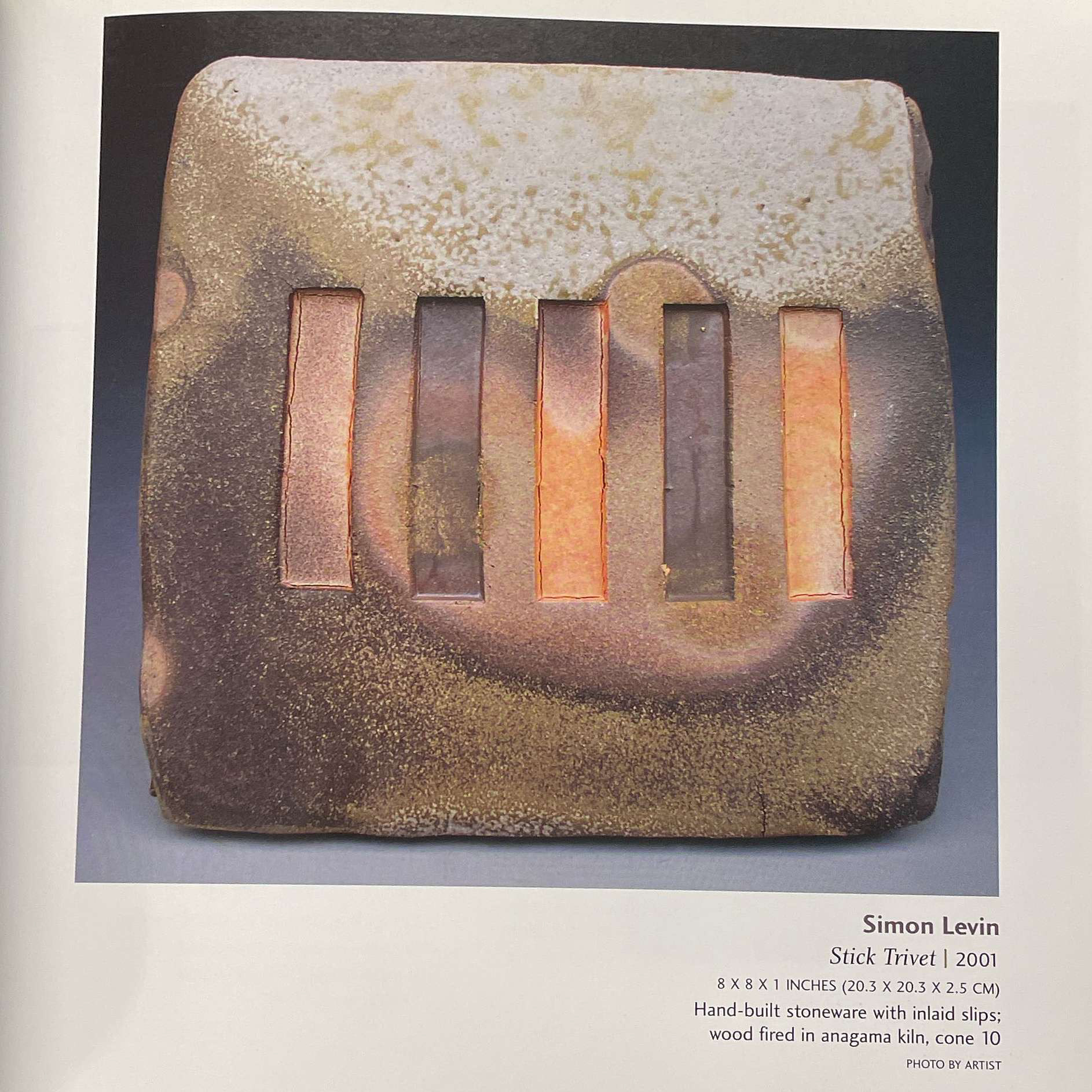
figure 2
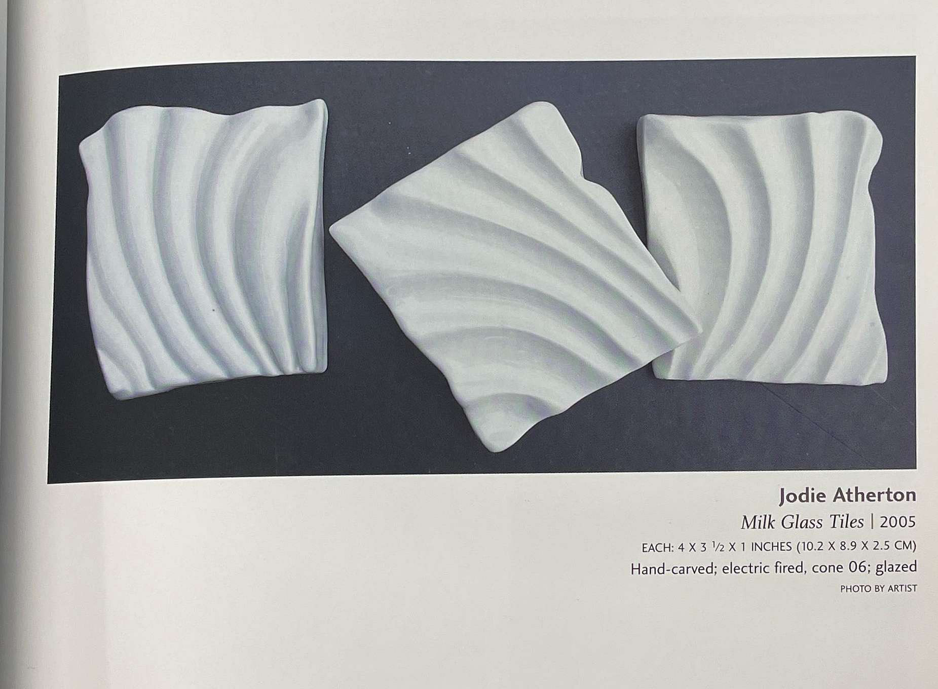
figure 3
figure 4
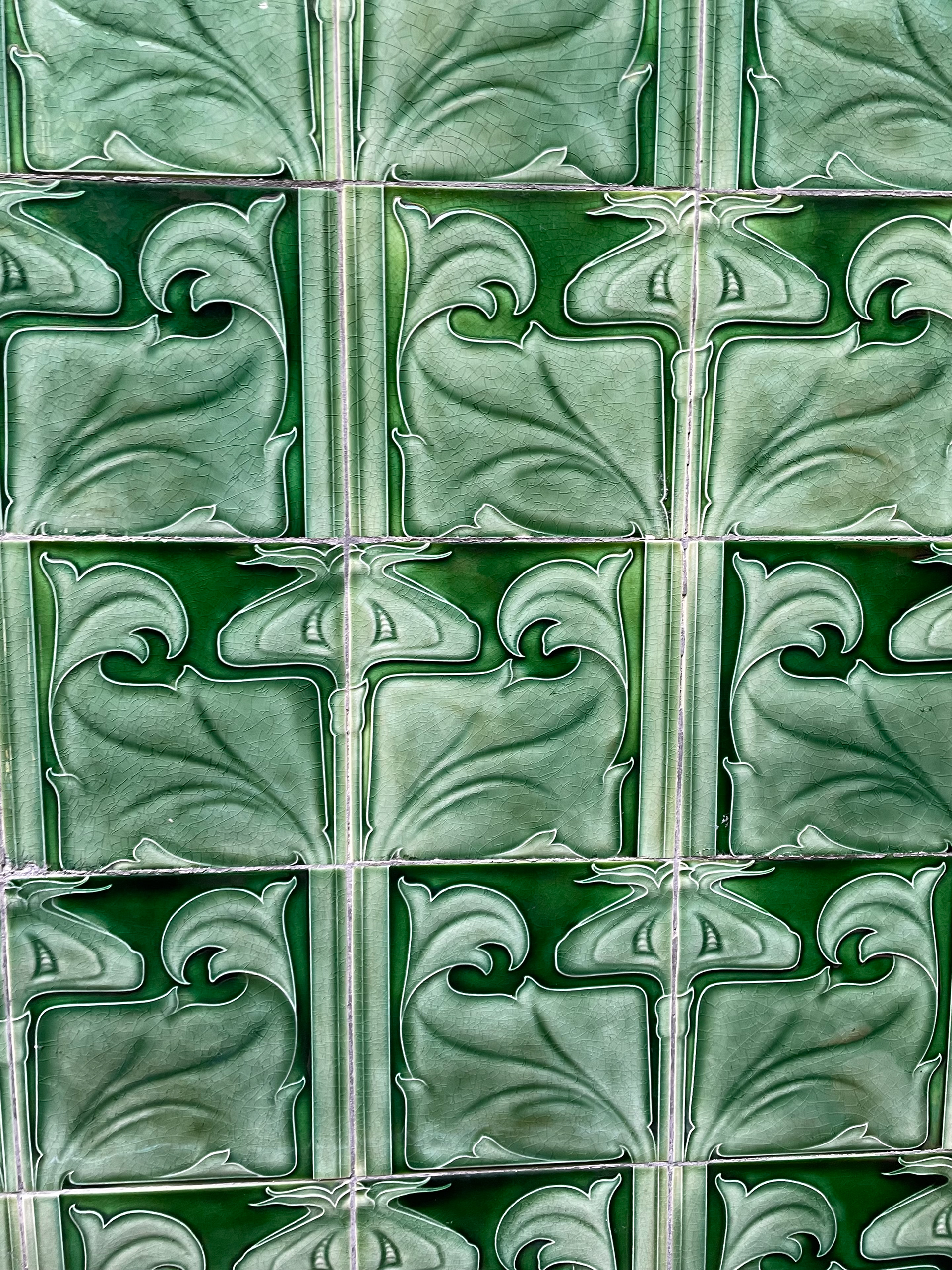
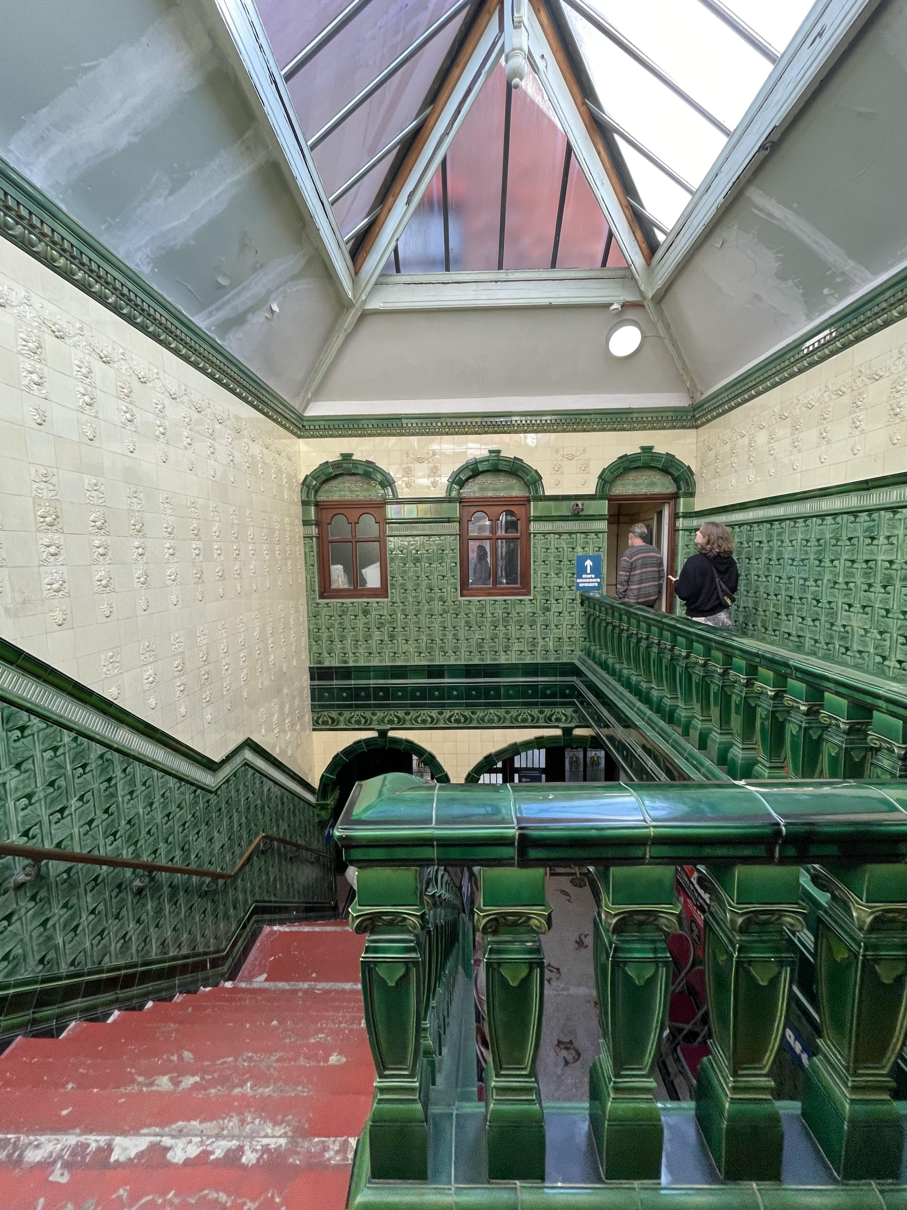
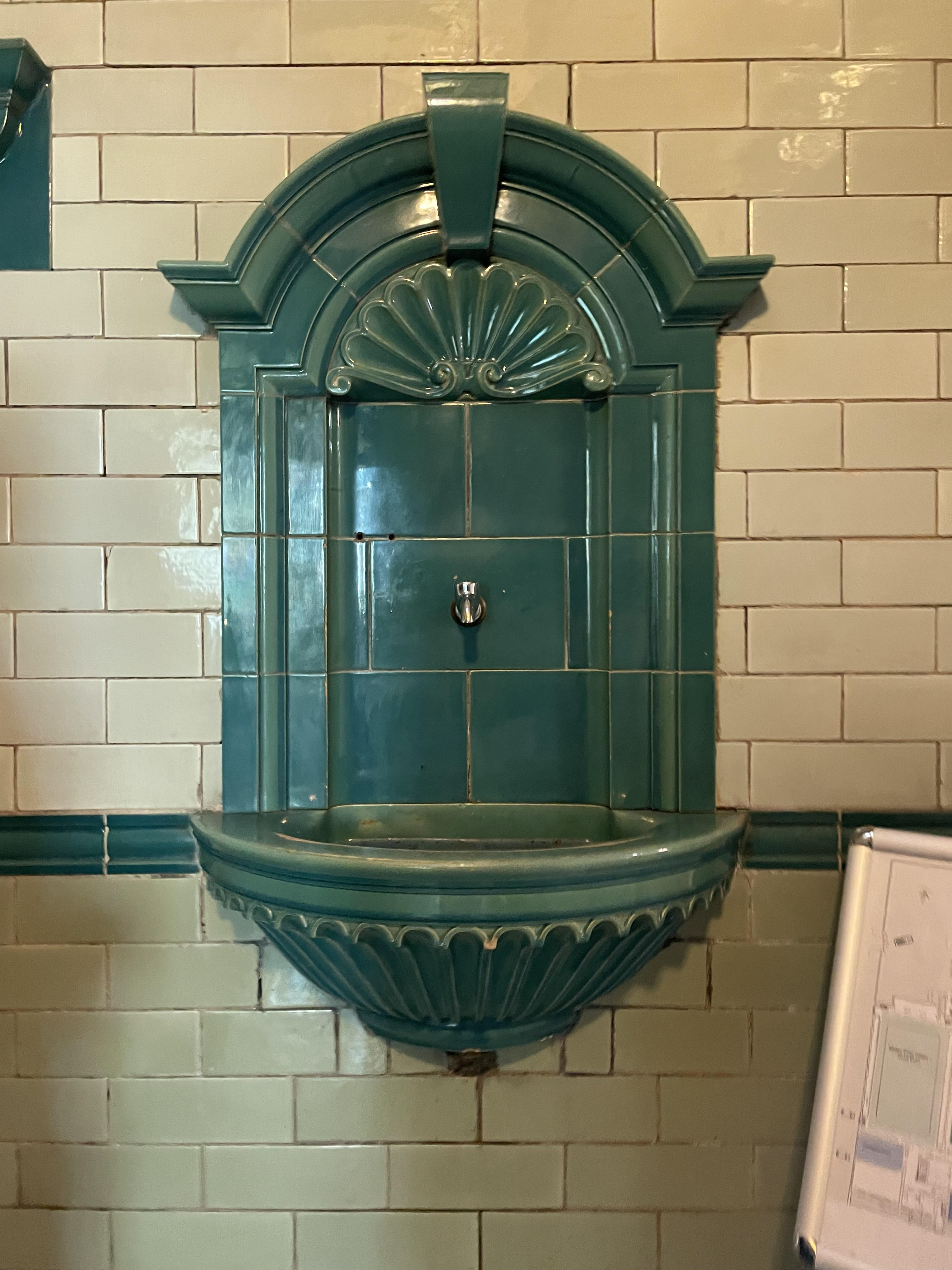
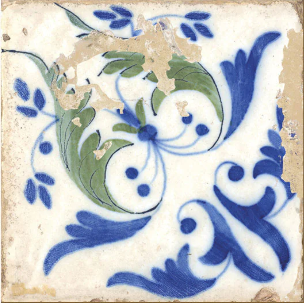
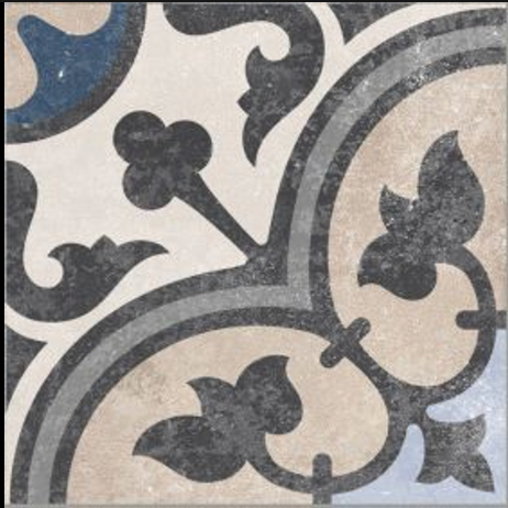
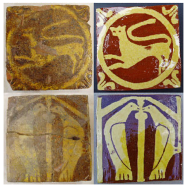
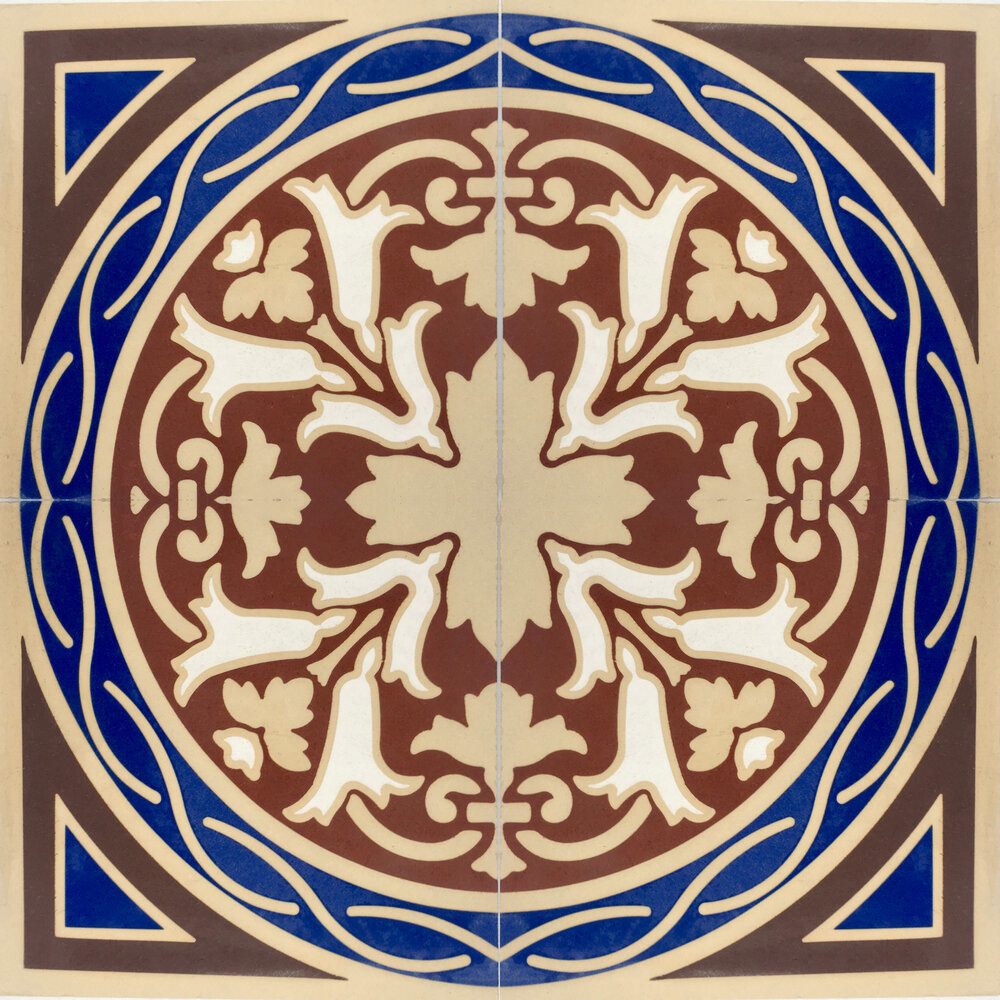
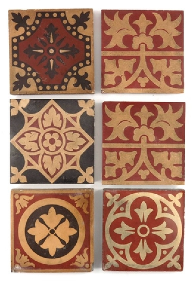
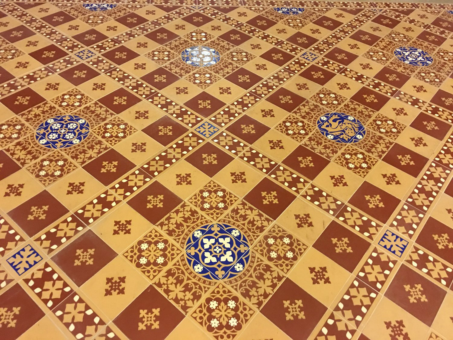
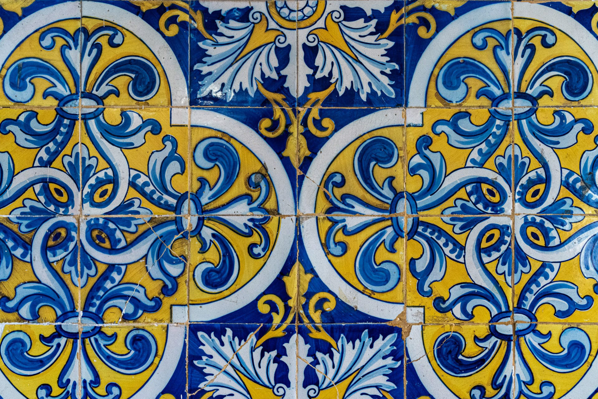
Exploring more into tiles, I found lots of inspiration in a book called 500 Tiles by Lark Ceramics, which explores a collection of international tiles. This book opened my first impression of tiles, thinking they were just decor objects, usually square and with a repeated pattern; however, the photos above show different tiles with different surface designs, textures, and shapes, all holding different purposes. When also visiting Victoria Baths, I was captured by the vibrant green tiles, which seemed to give the 1900s building character, drawing your eye to the fine details in the walls. I like the visual effect these tiles give, but they also draw your audience in, opening the room and making the place welcoming with delicate detail, which I would be interested in portraying in my work.

Ceramic tiles compared to encaustic tiles.
Ceramic tiles are primarily natural clay tiles, which are then fired. Once the base is fired, a glaze is added to the top surface, painting on the decorative patterns.
An encaustic tile consists of layers (usually two) and is inlaid with individual clays of different pigments to create a pattern rather than the patterns being painted; it's layered up, then once dried, the top layer is scrapped off, revelling the intricate pattern below.
It's believed that encaustic tiles last longer as the glazes are worn away and are better used outside as they are more resilient to elements in outdoor use.
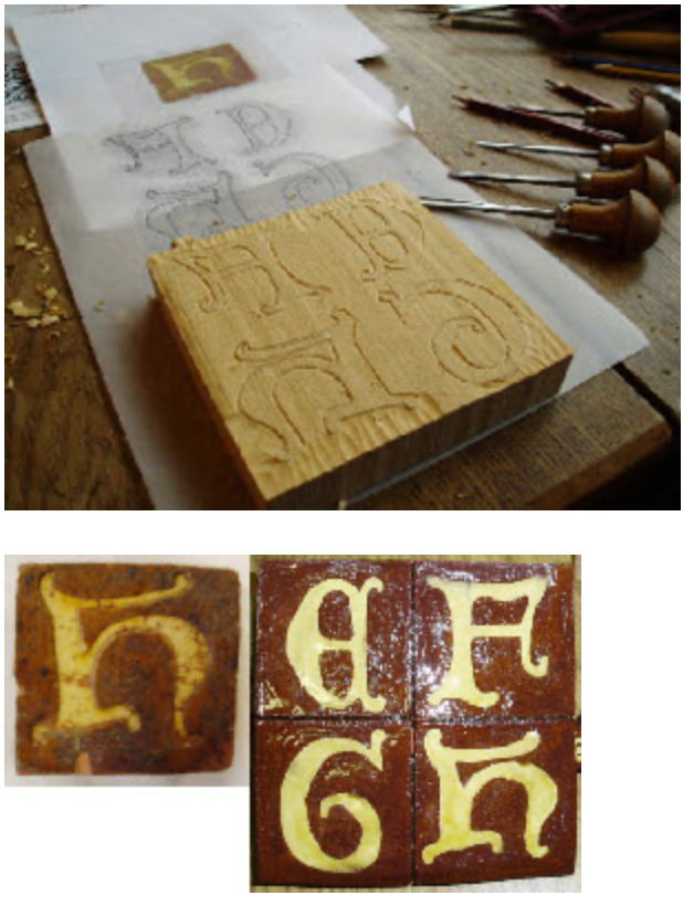
Diana Hall
Diana Hall is a medieval tile maker using the encaustic tiling process. creating an array of wooden moulds, allowing her to replicate tiles. Watching and reading about Hall has informed my knowledge of technique and the process she is allowing me to expand on this.
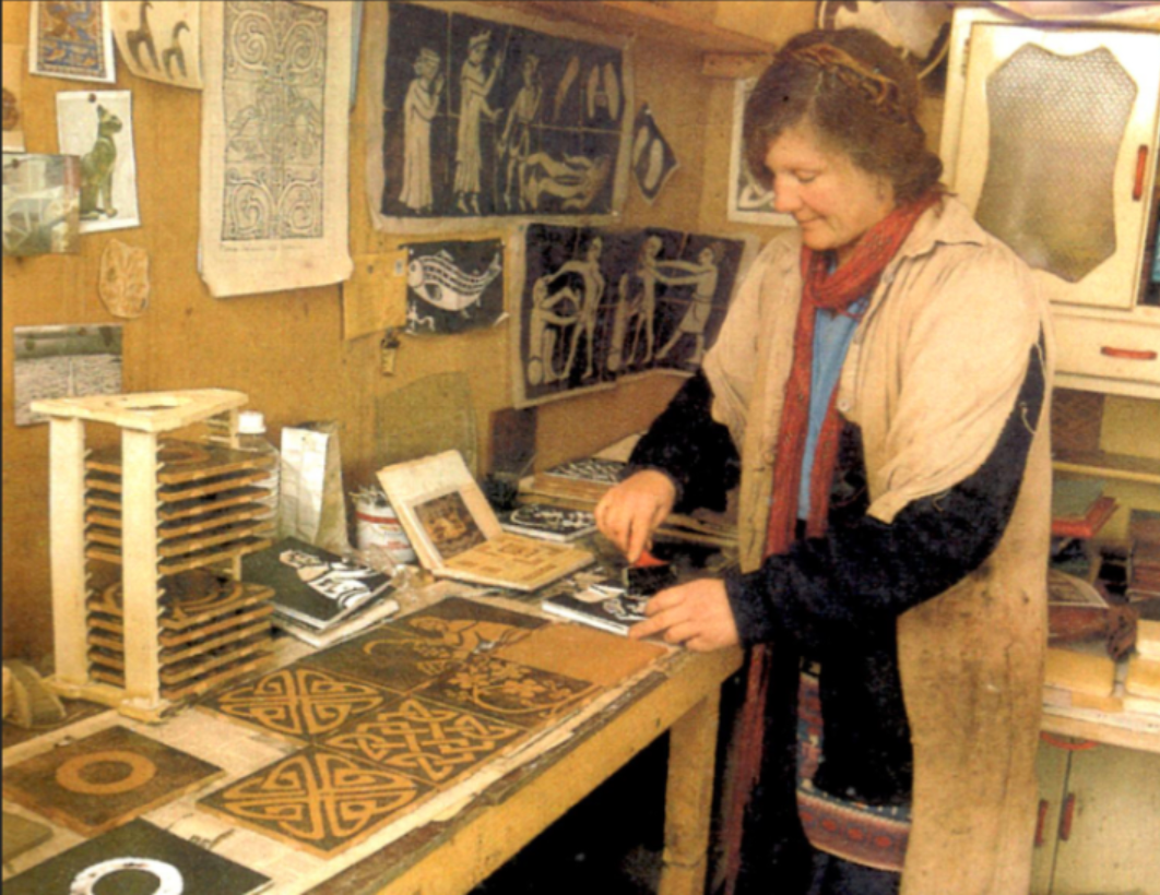
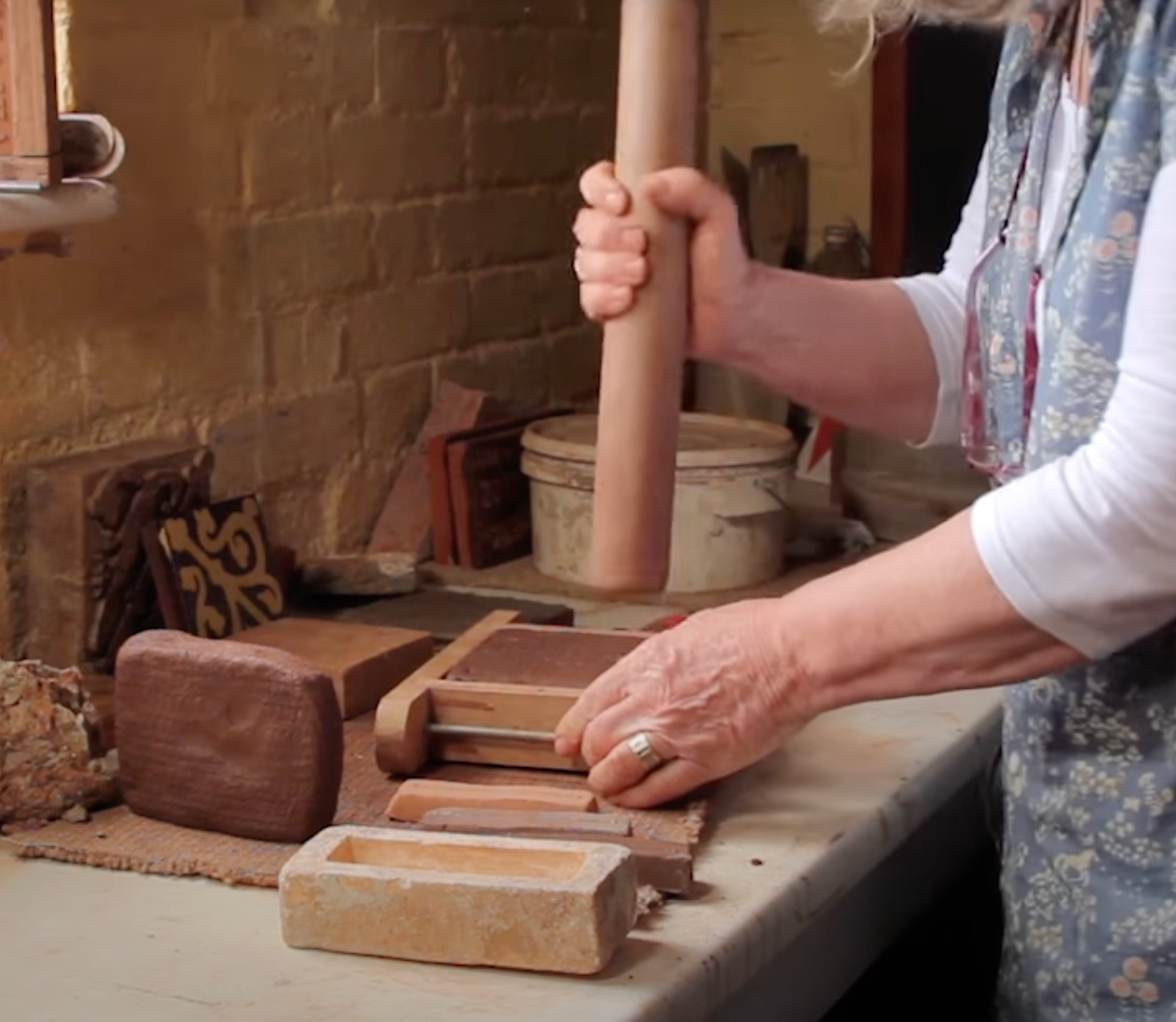
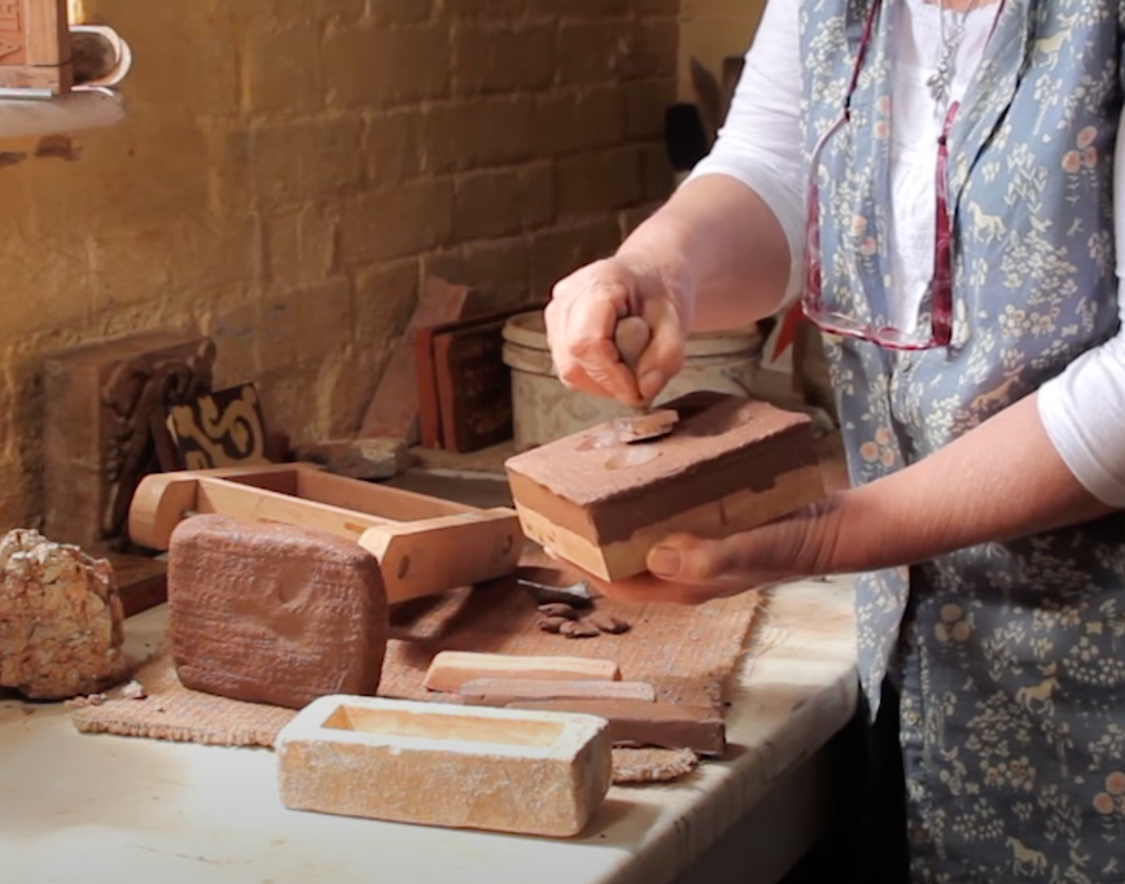
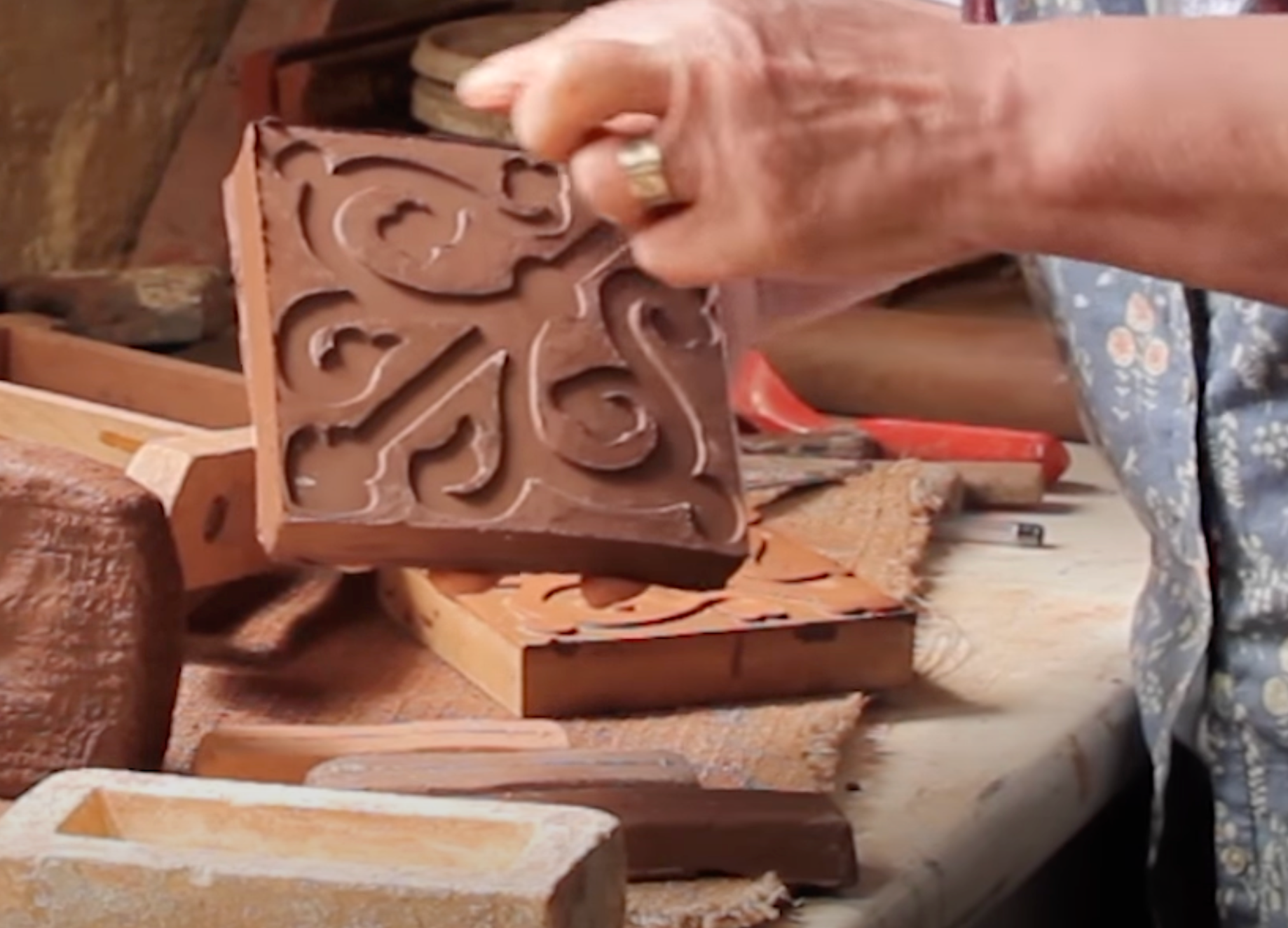
-photos from youtube video- https://www.youtube.com/watch?v=p2hyplcYfBI&t=1144s
ceramic tile
encaustic tile

Karen Slade
http://www.companyofartisans.co.uk/nuneaton-priory-tiles-c-1350/
http://www.companyofartisans.co.uk/category/medieval-tiles-projects/
Company of Artisans was formed in 2008, a business with Charlie and Karen Slade, showing their skills in historic building crafts, Tudor and Medieval demonstrations for schools, tile making, and creating displays for museums. Karen Slade brings her 24 years of experience as an artist trained as an illustrator, then progressed to recreating medieval tiles in 1996. Using replica tools, materials, and traditional techniques allows her to replicate and renew old tiles. Reading into Slade's work, I see she is very focused on her style, which I want to explore more. She is keeping the traditional ways to replicate perfectly.
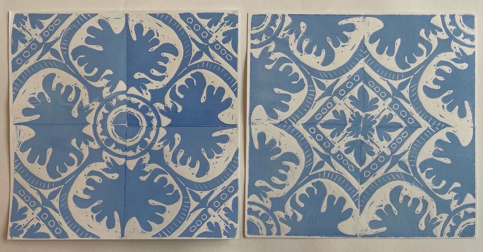
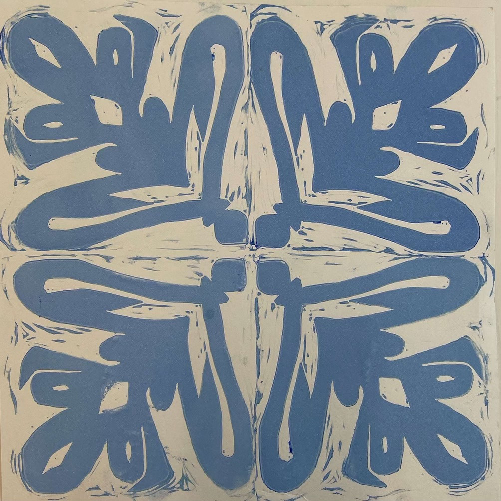
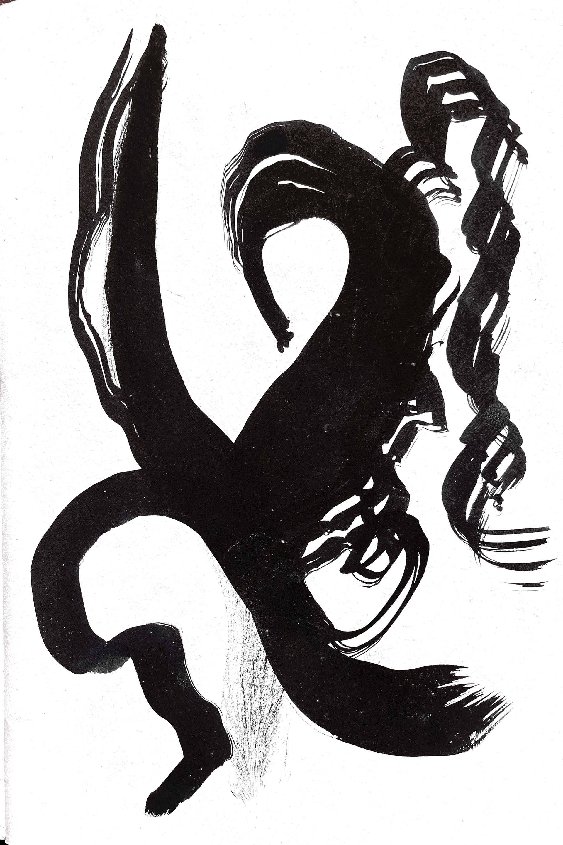
lino printing

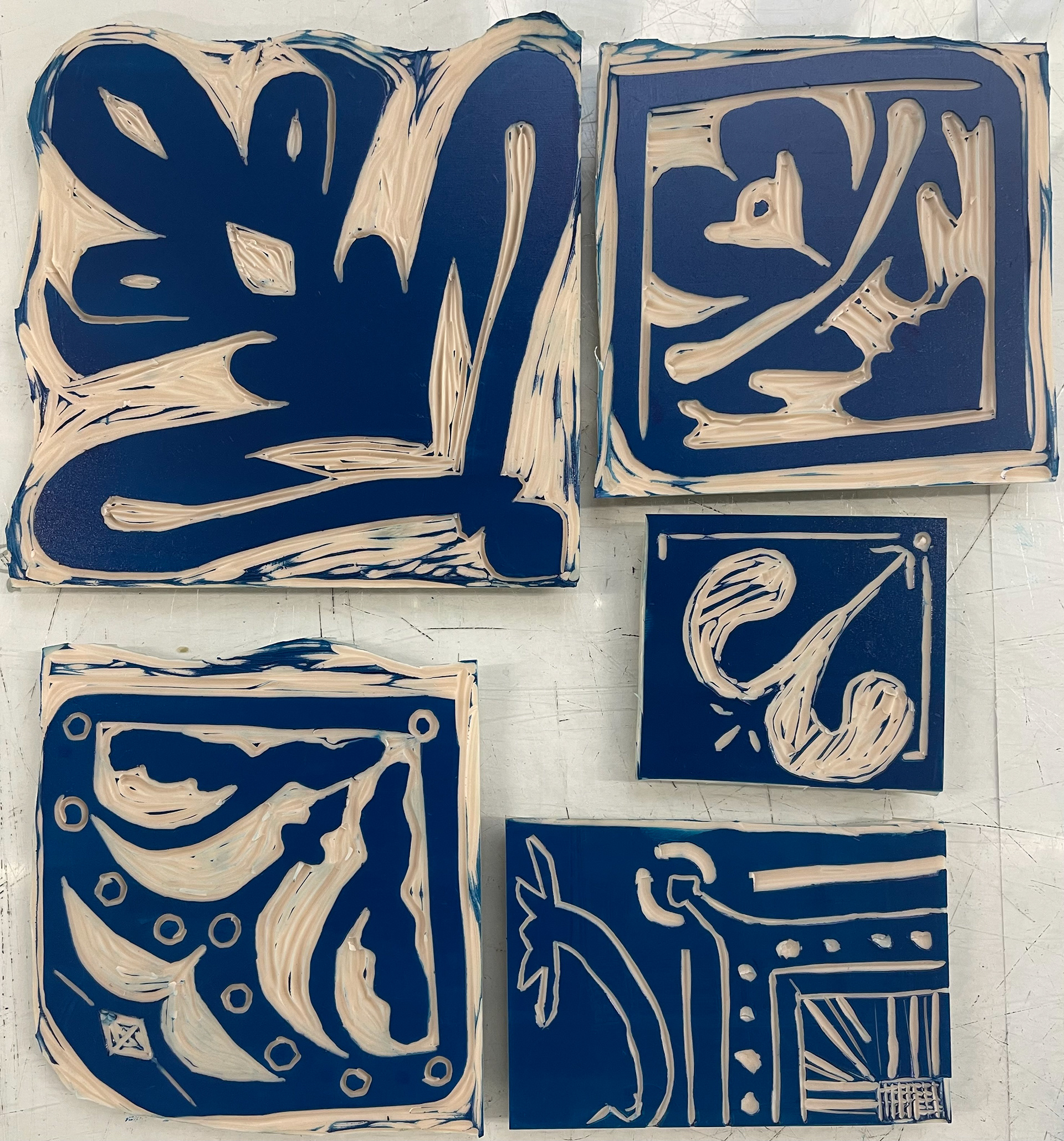
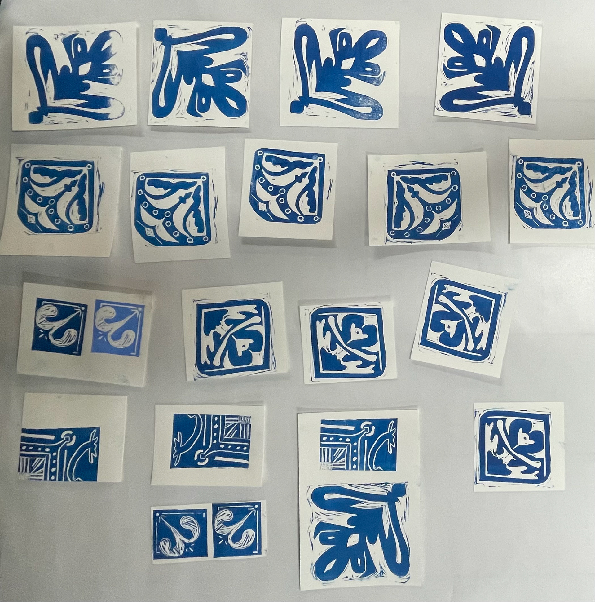
By doing multiples of each lino stamp, I was able to configure them into tile patterns- having a repeat of the stamp four times. I hadn't planned out my first two Lino prints, which led to them not matching up in equal ways. This was due to them being unsymmetrical shapes and the lines I cut leading off the page not being equally symmetrical, so they didn't lie up. From then on, all my other prints were planned on paper first, allowing me to envision them better and line up the patterns.
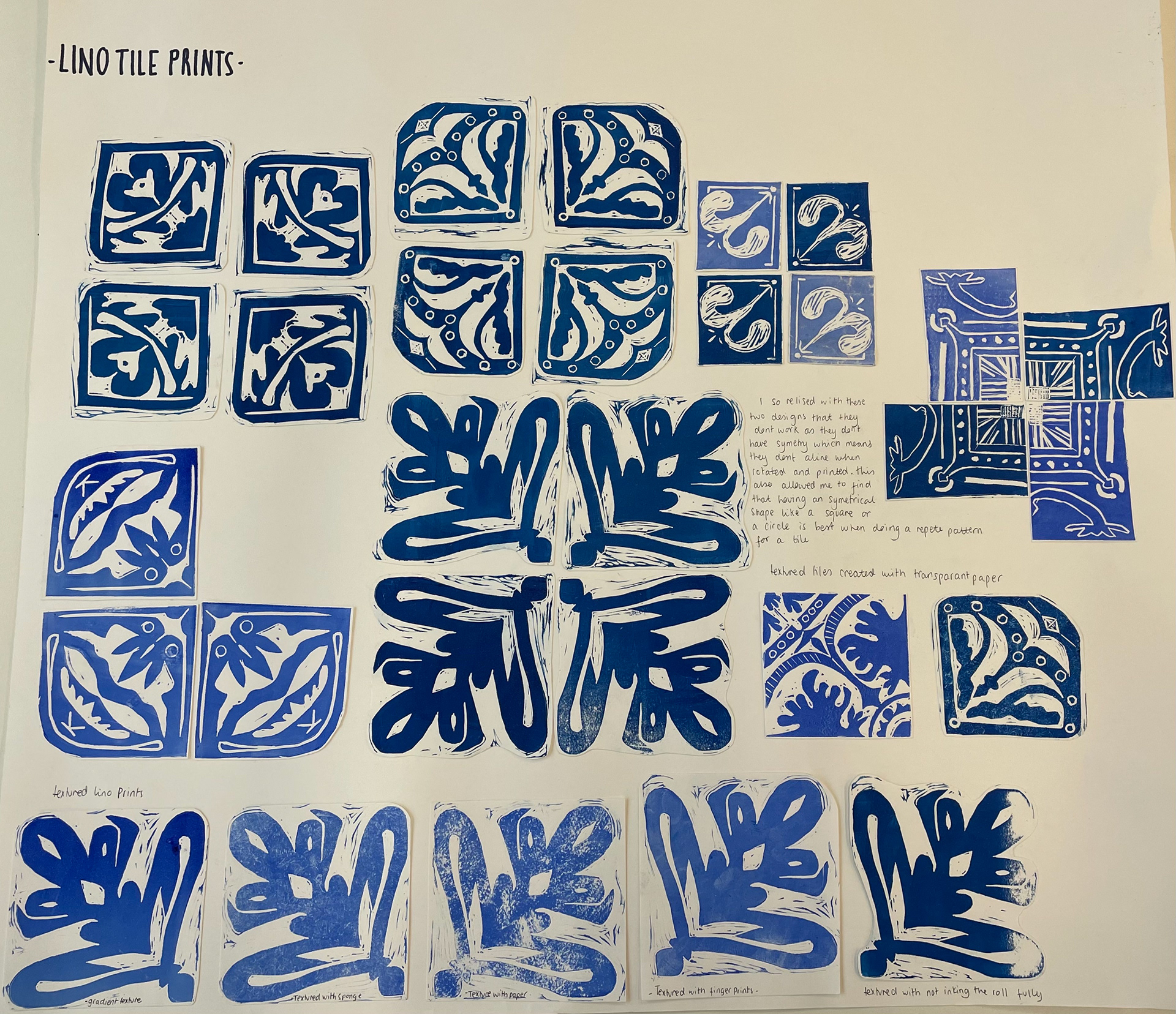
On the bottom row, I used different materials to create different textures on the prints. These included tissue paper, fingerprints, sponges and gradients in the paints. This created depth and density to the prints.
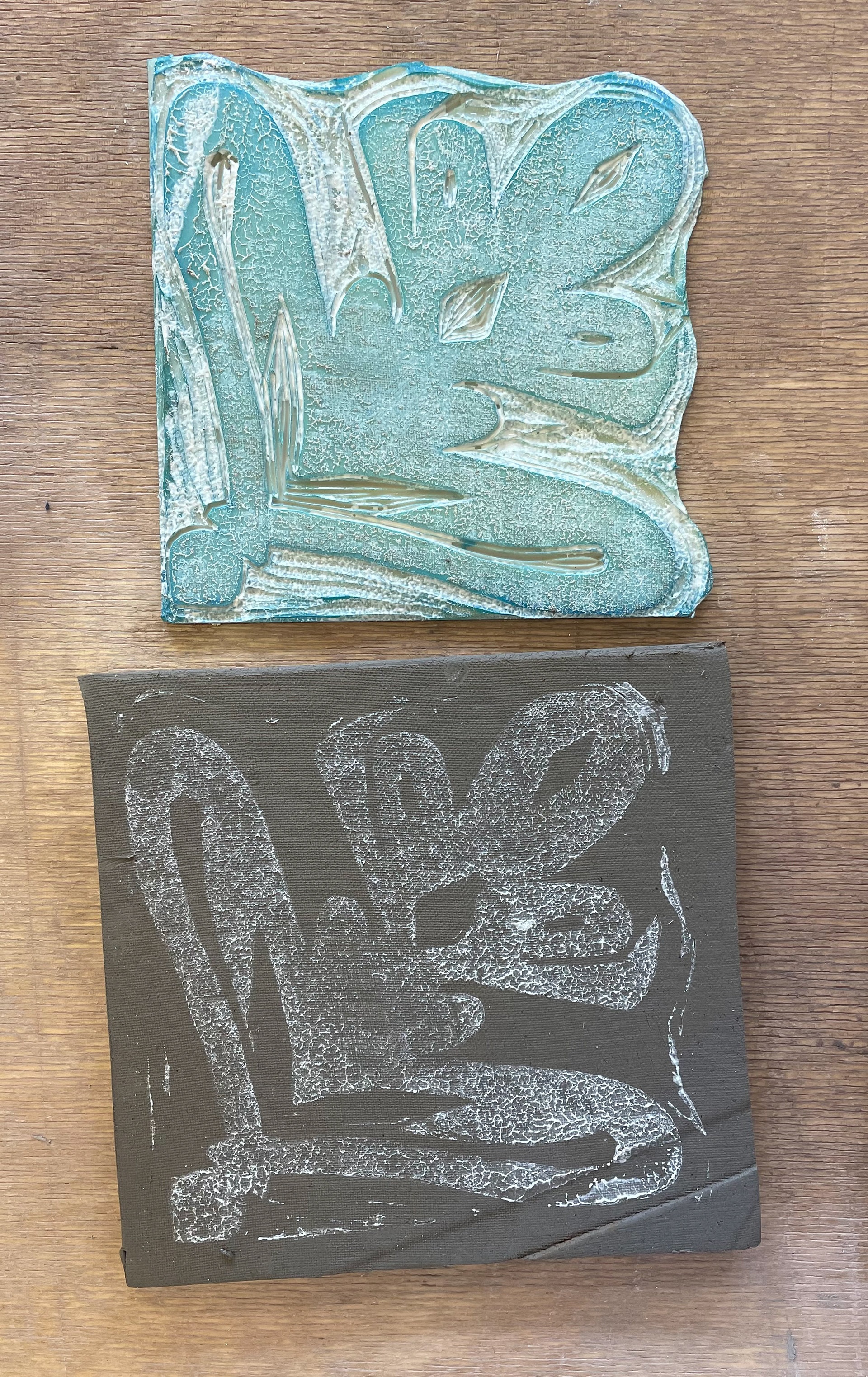
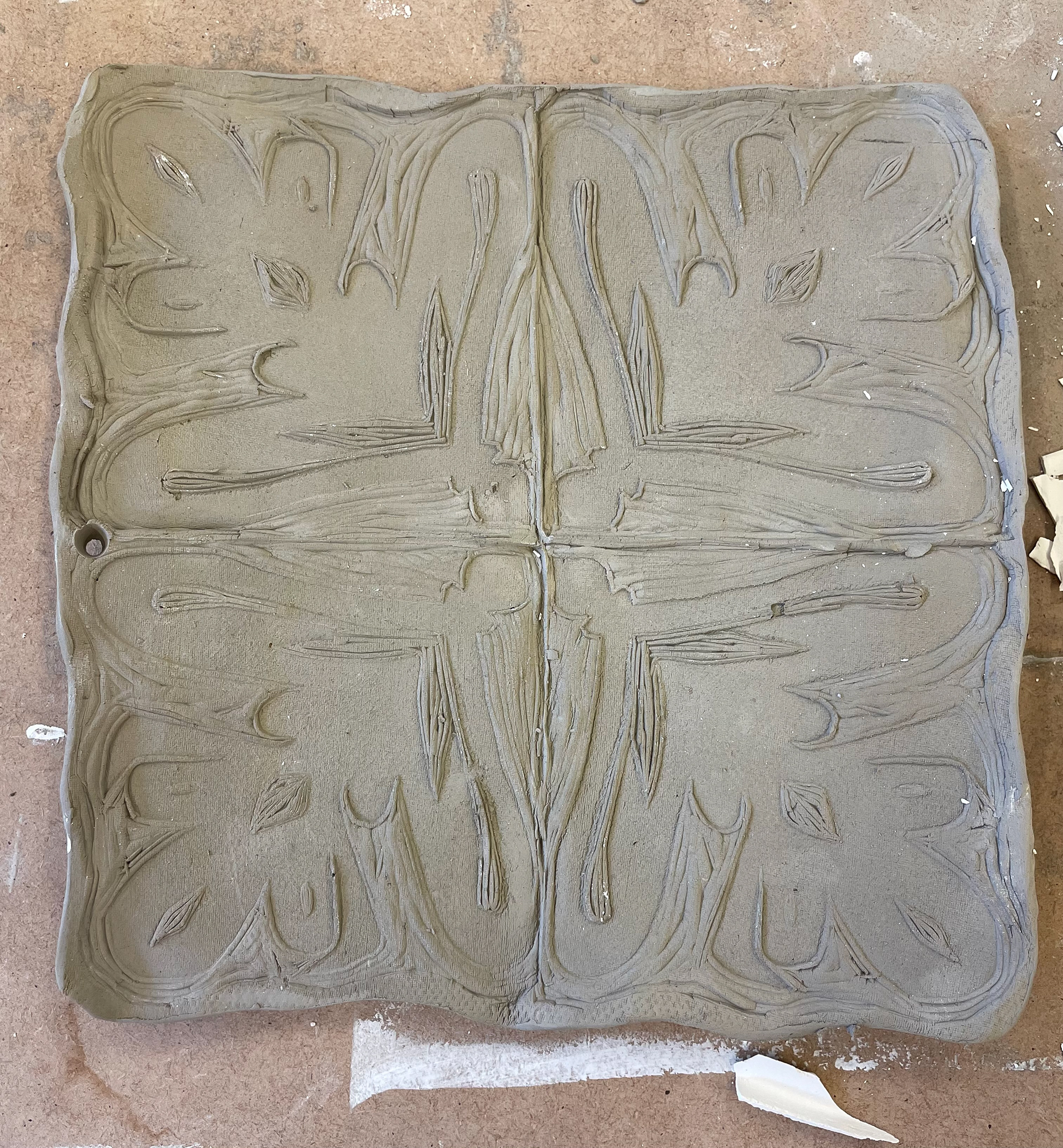
lino into clay
pressing lino into clay
pressing lino into clay
sponge lino printing
pressing lino into clay
slip to print lino
the impression of the negatives
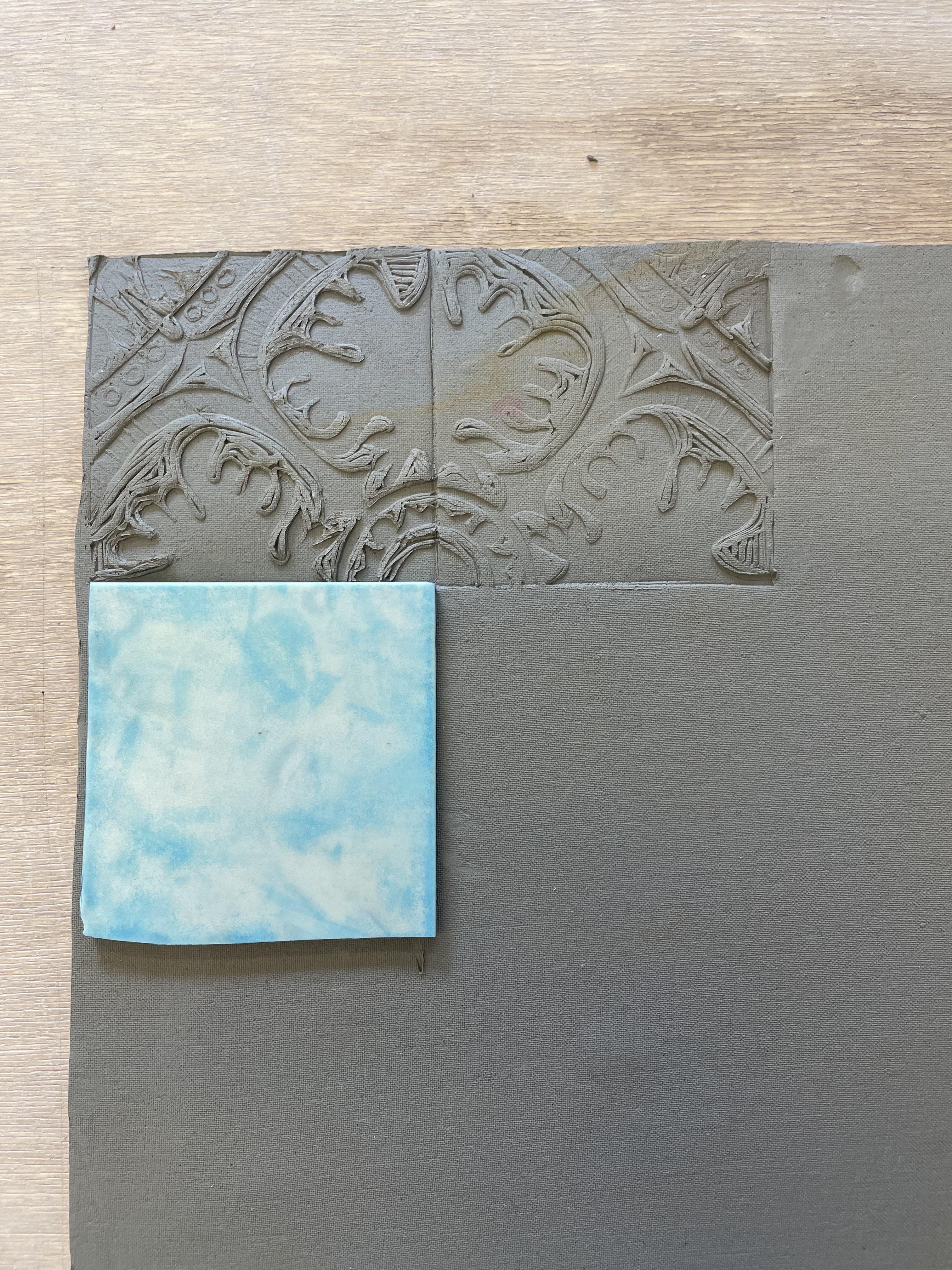
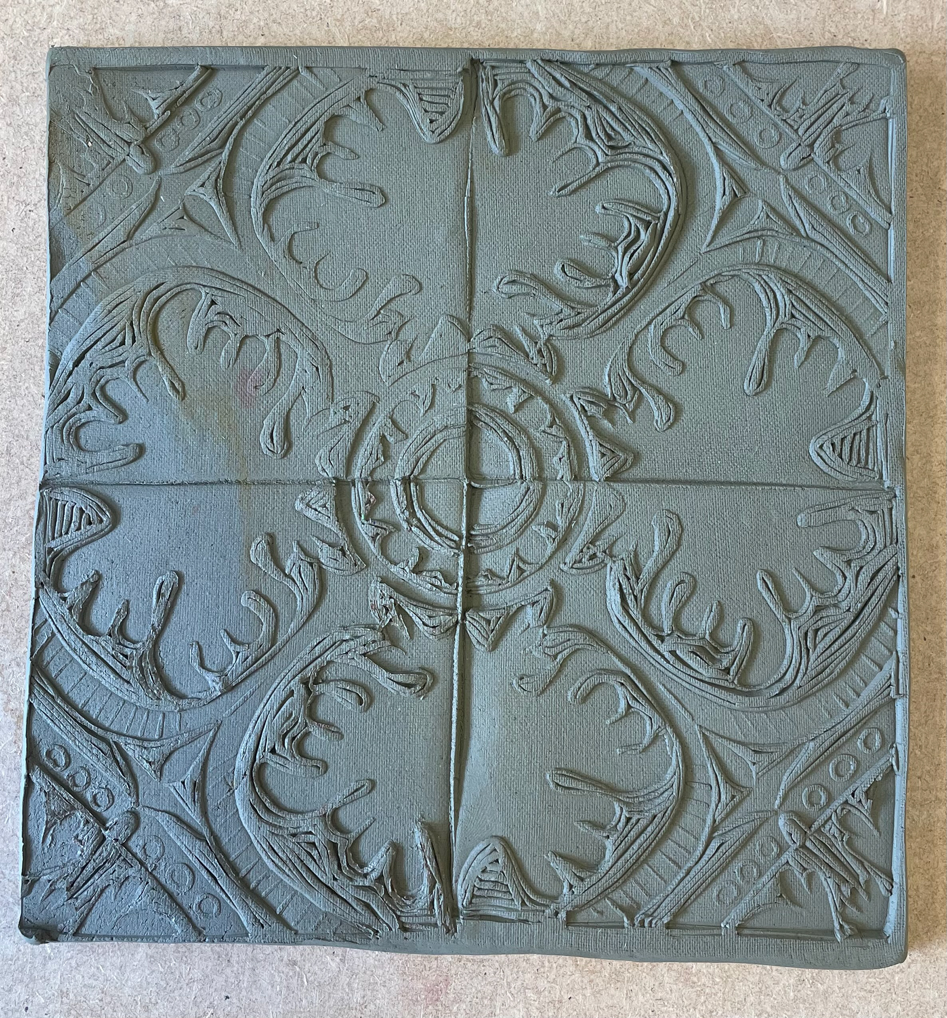
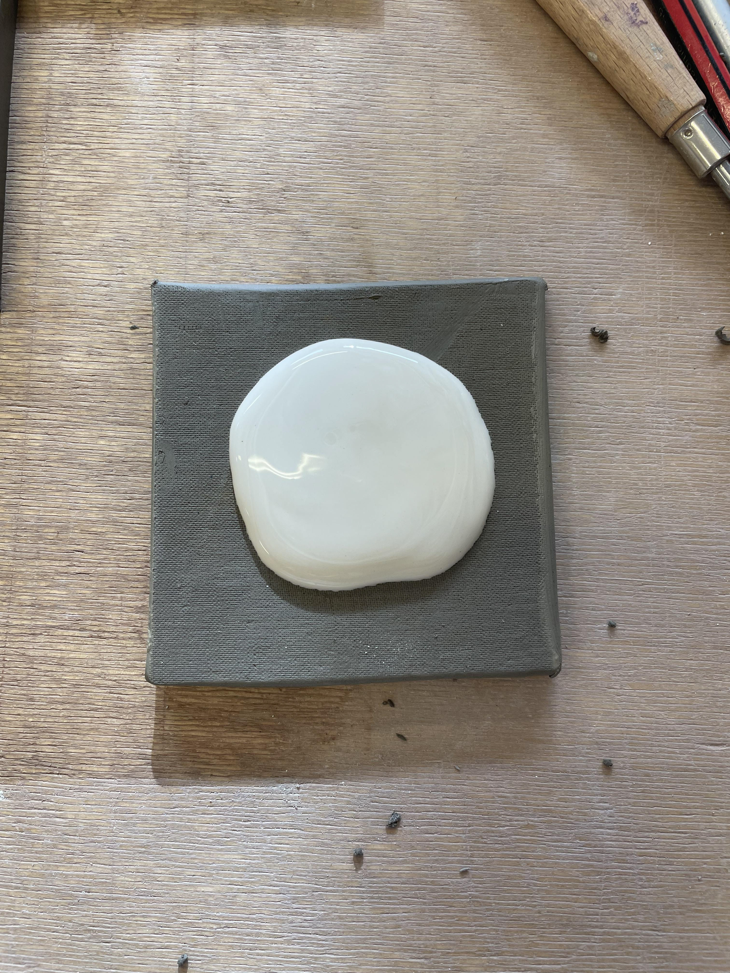
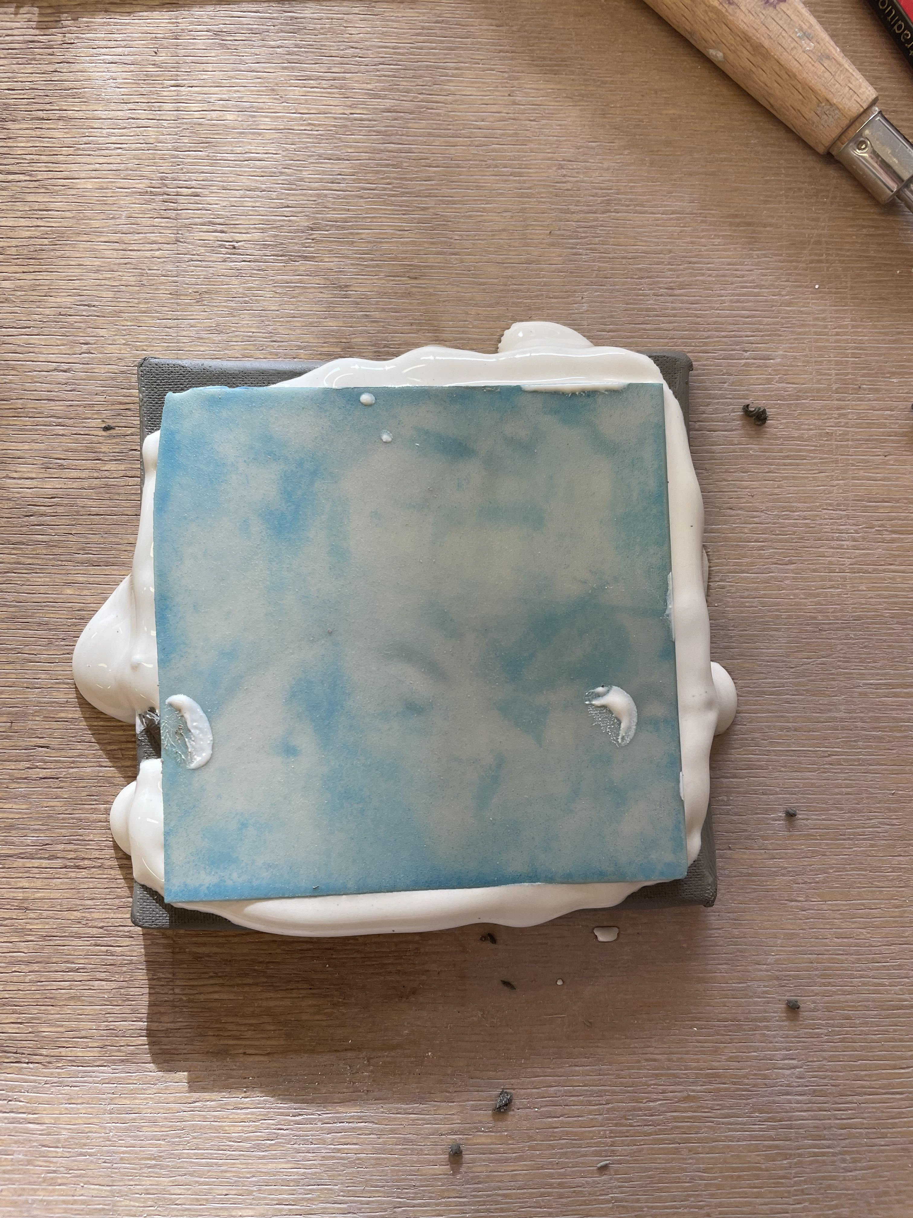
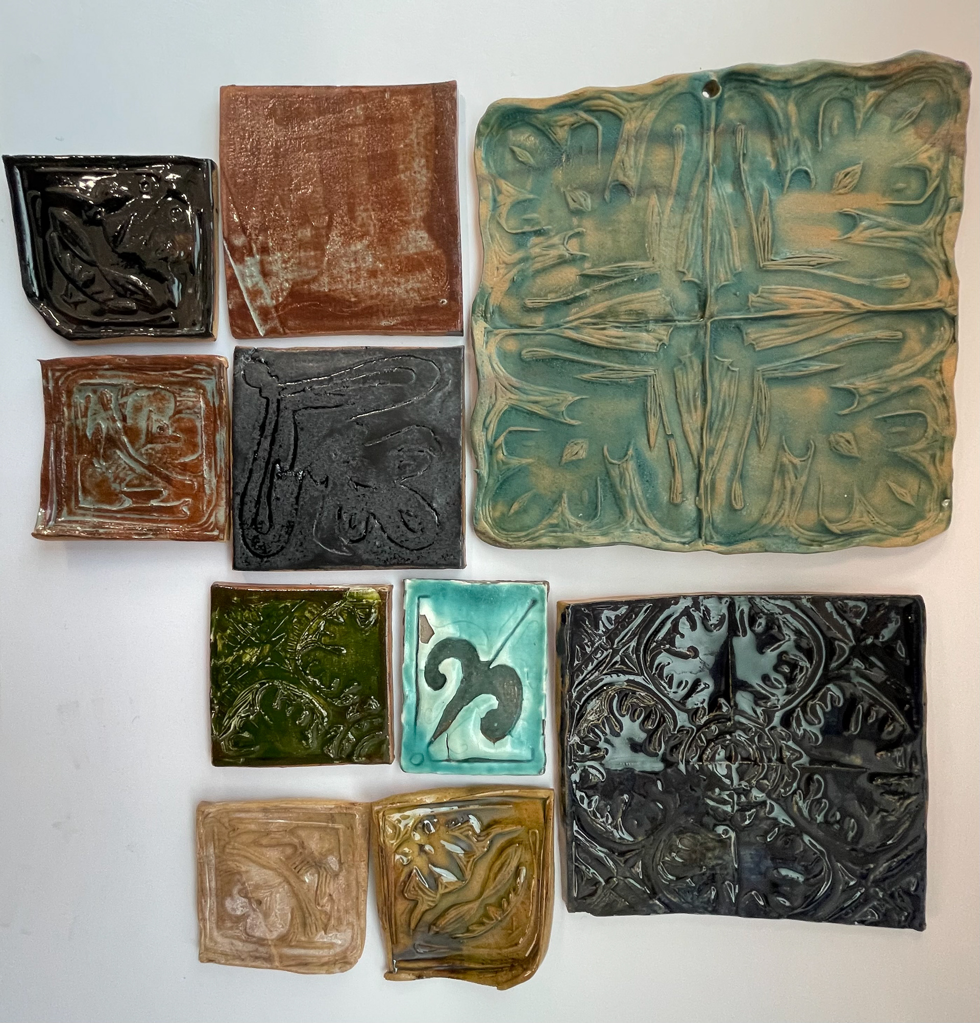
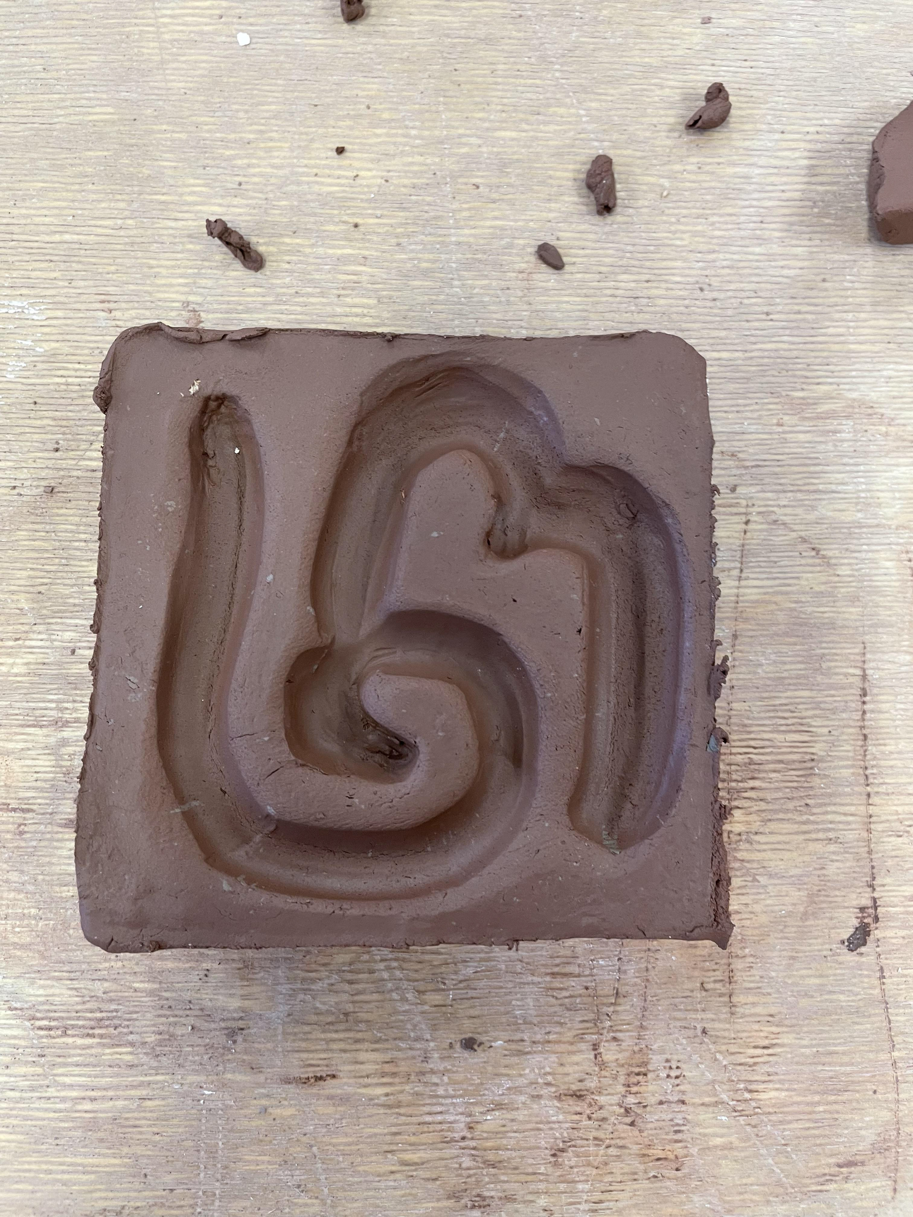
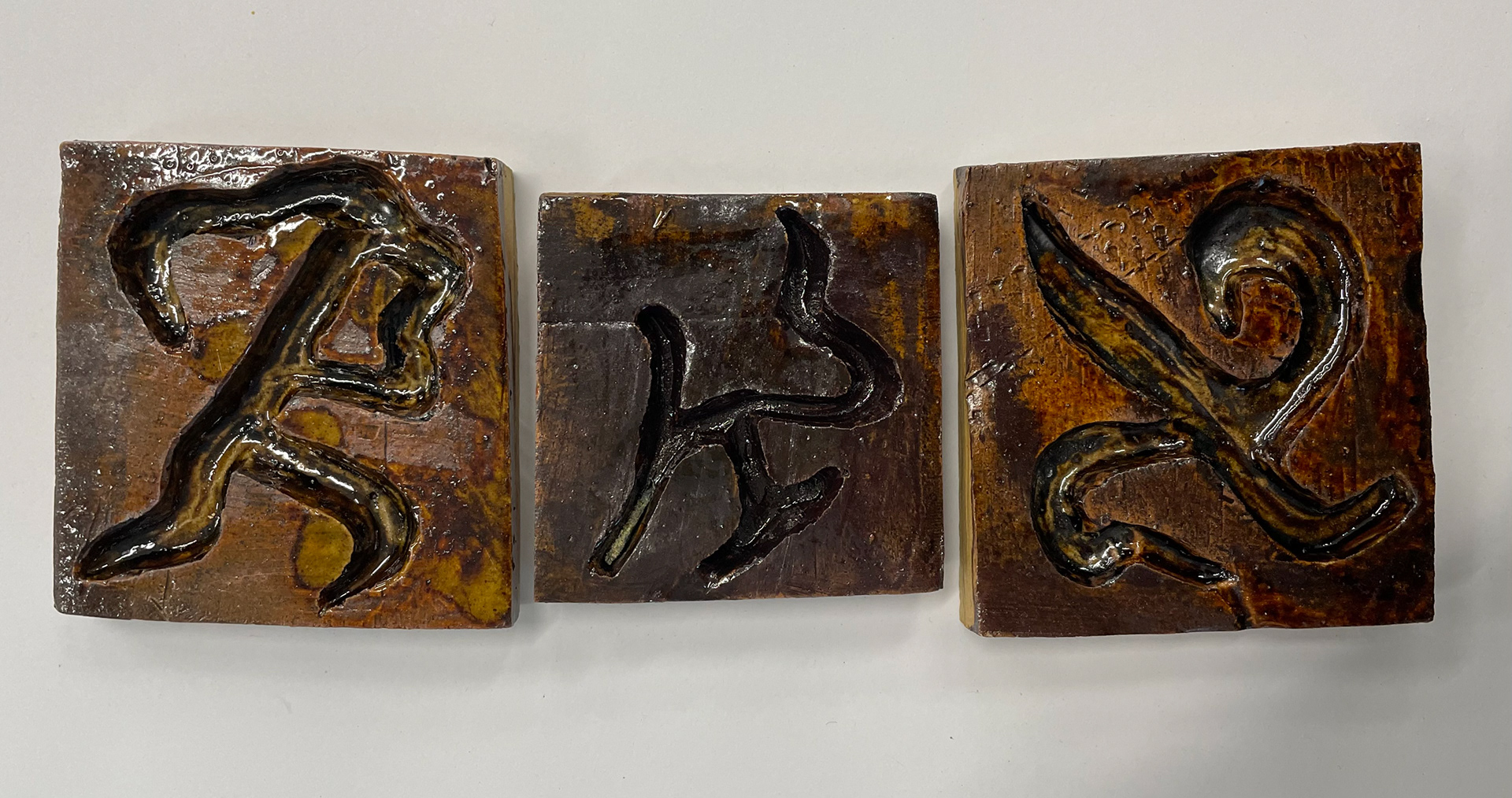
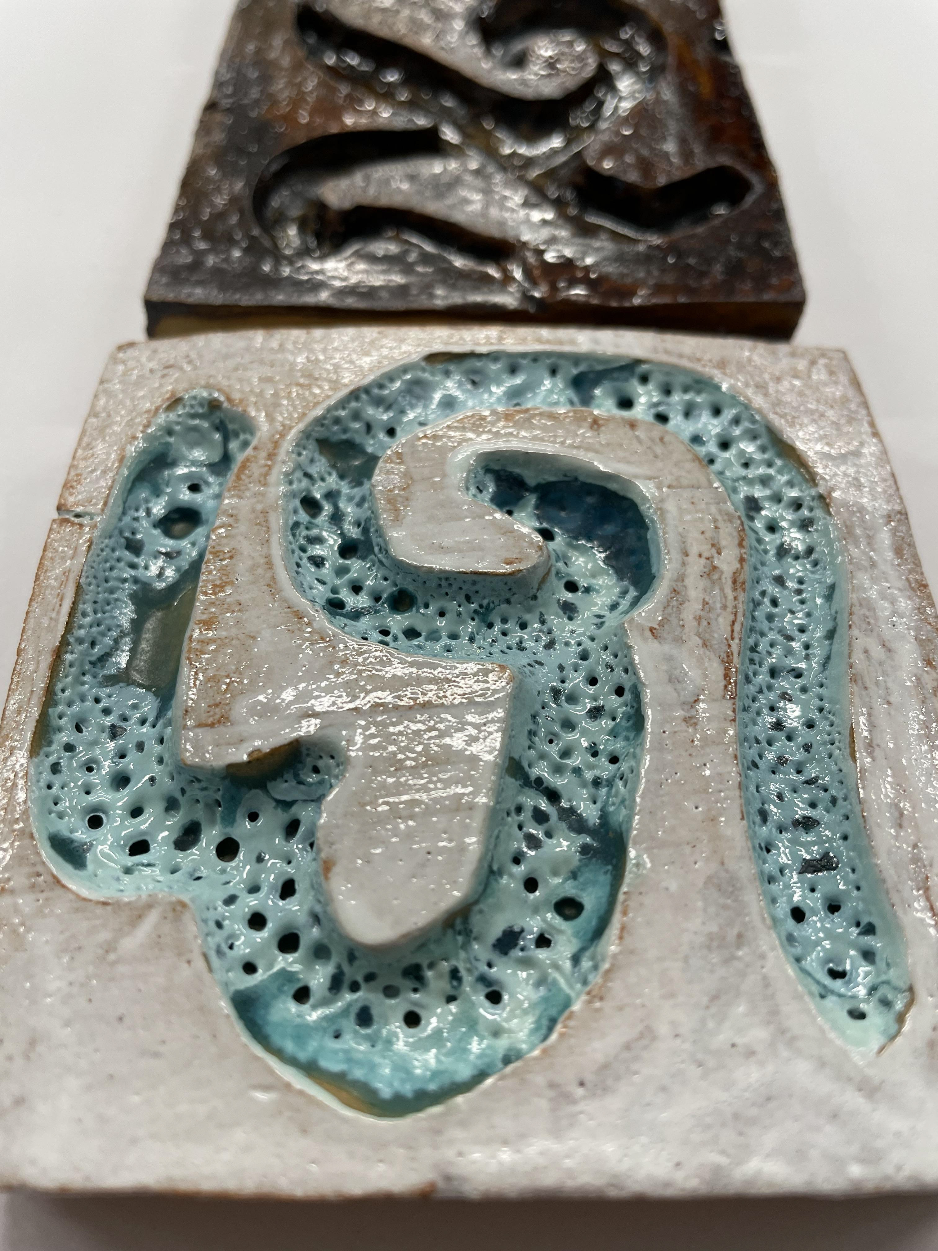
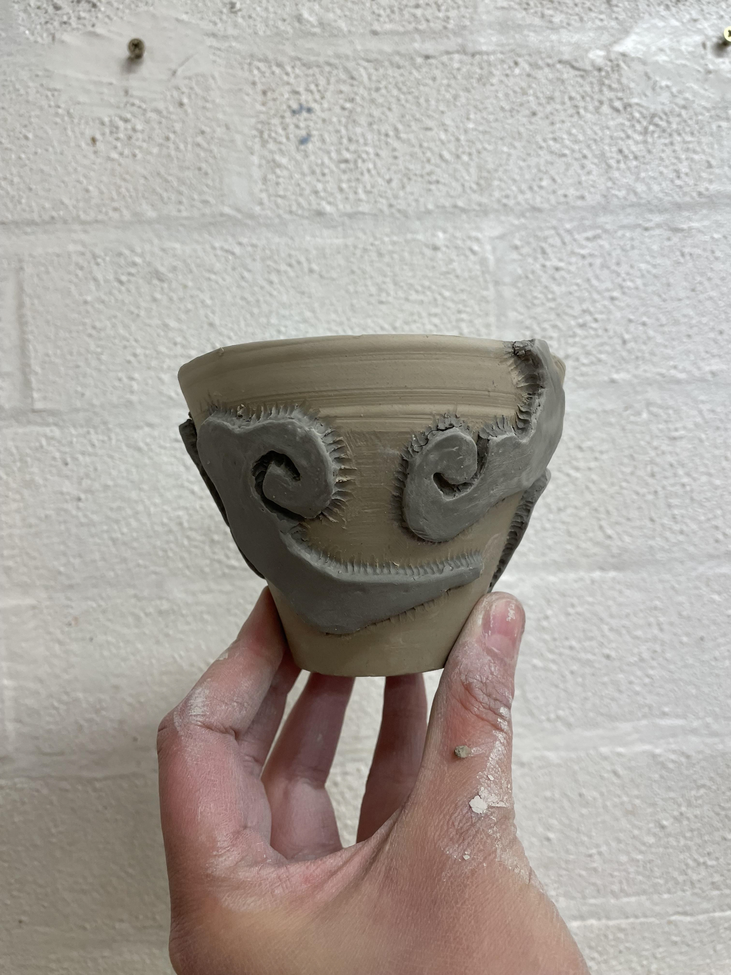
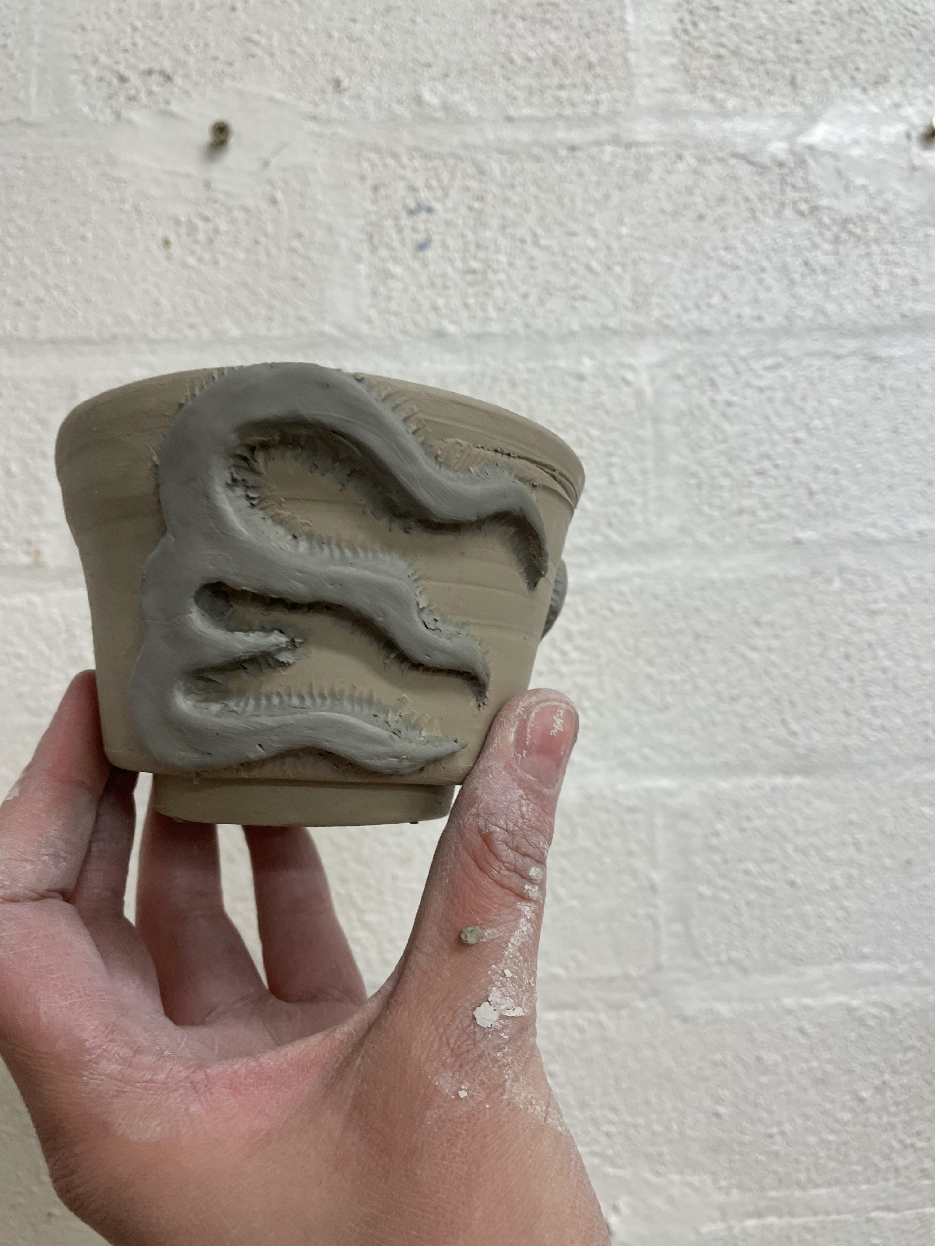
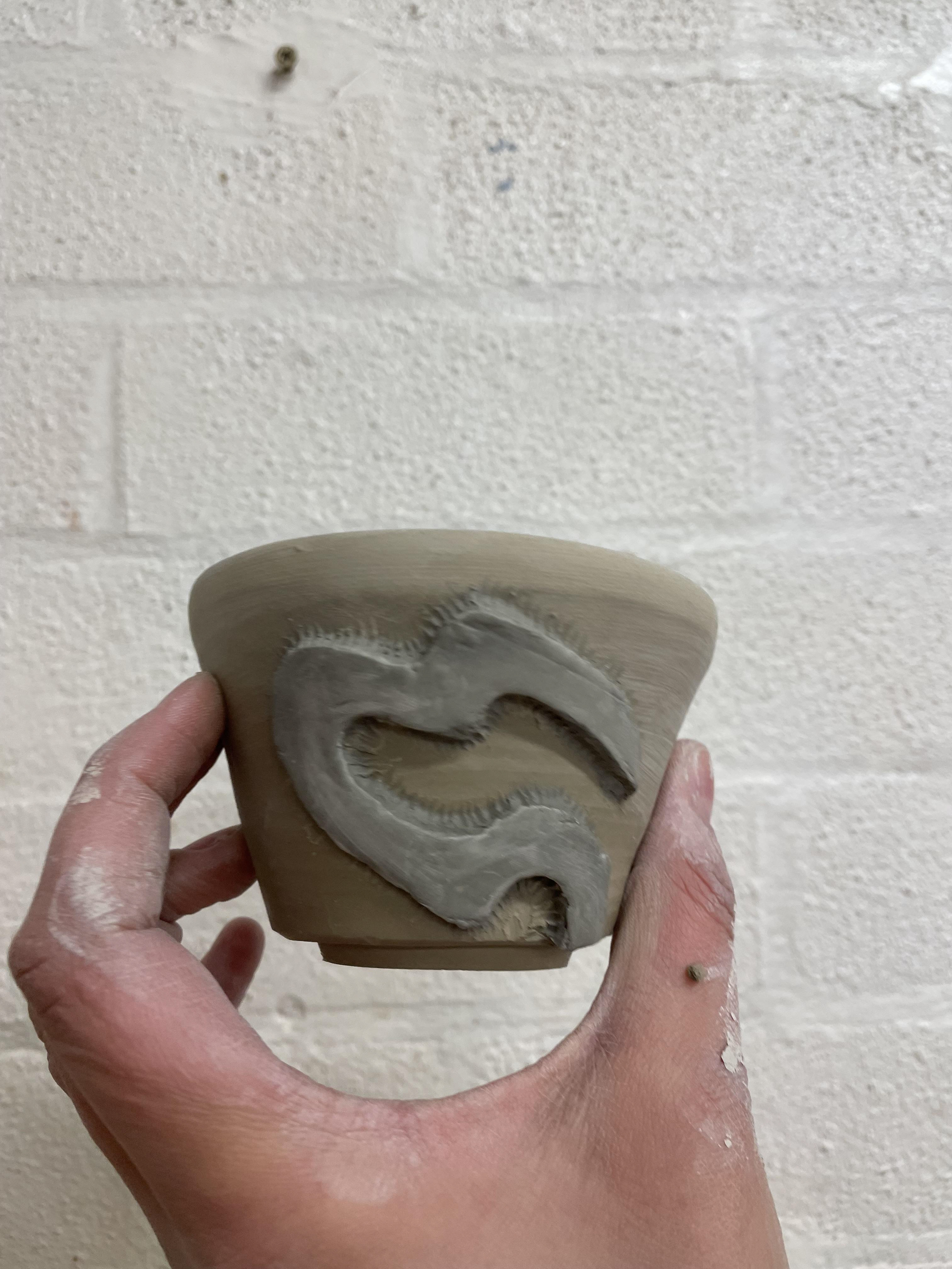
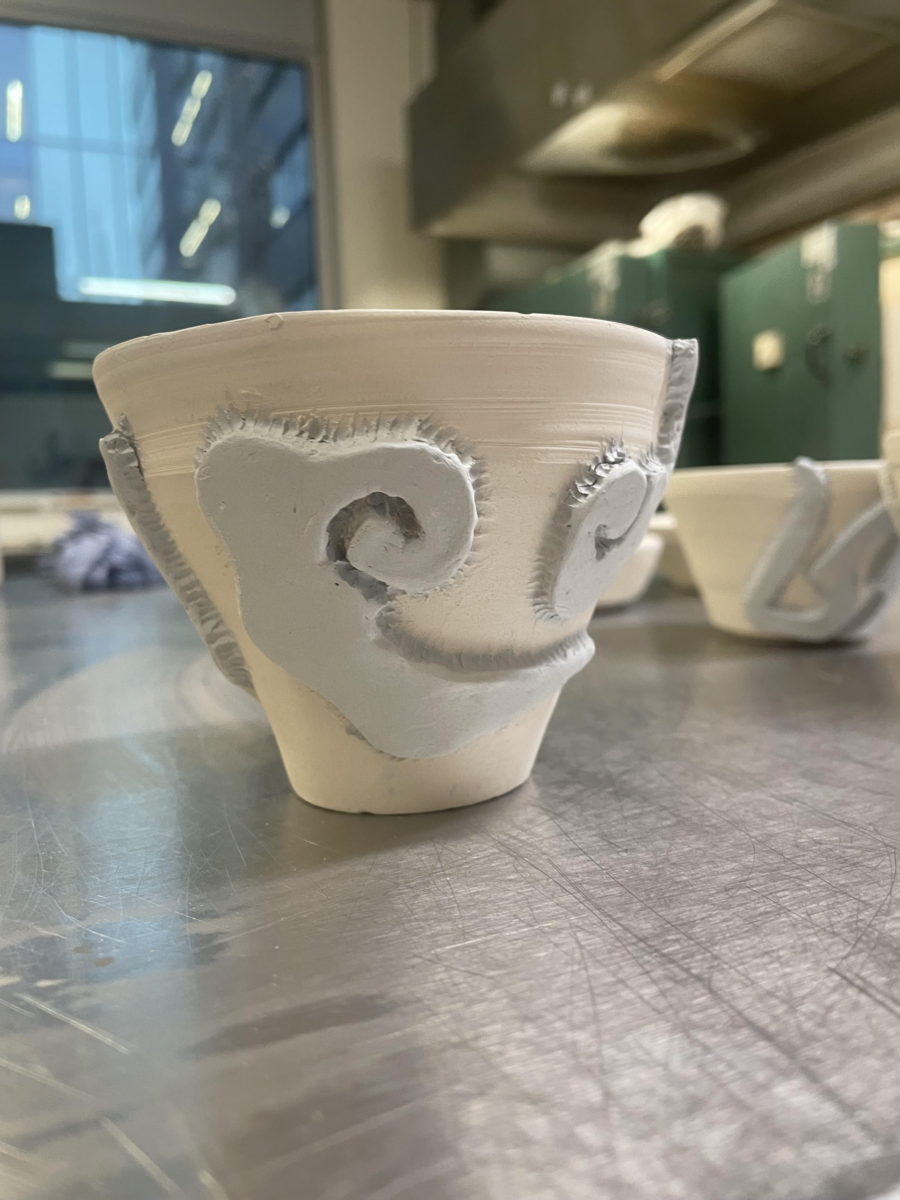
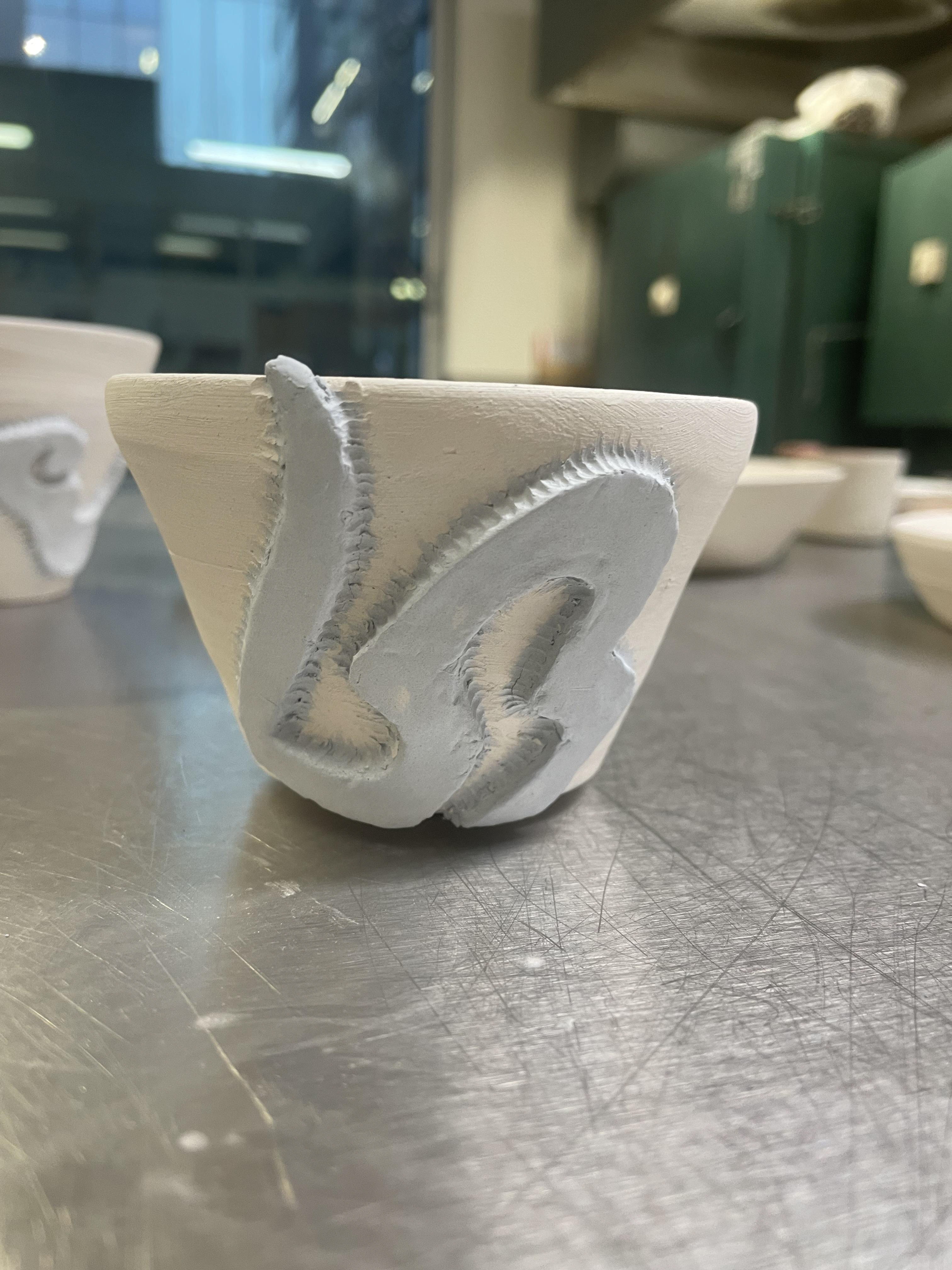
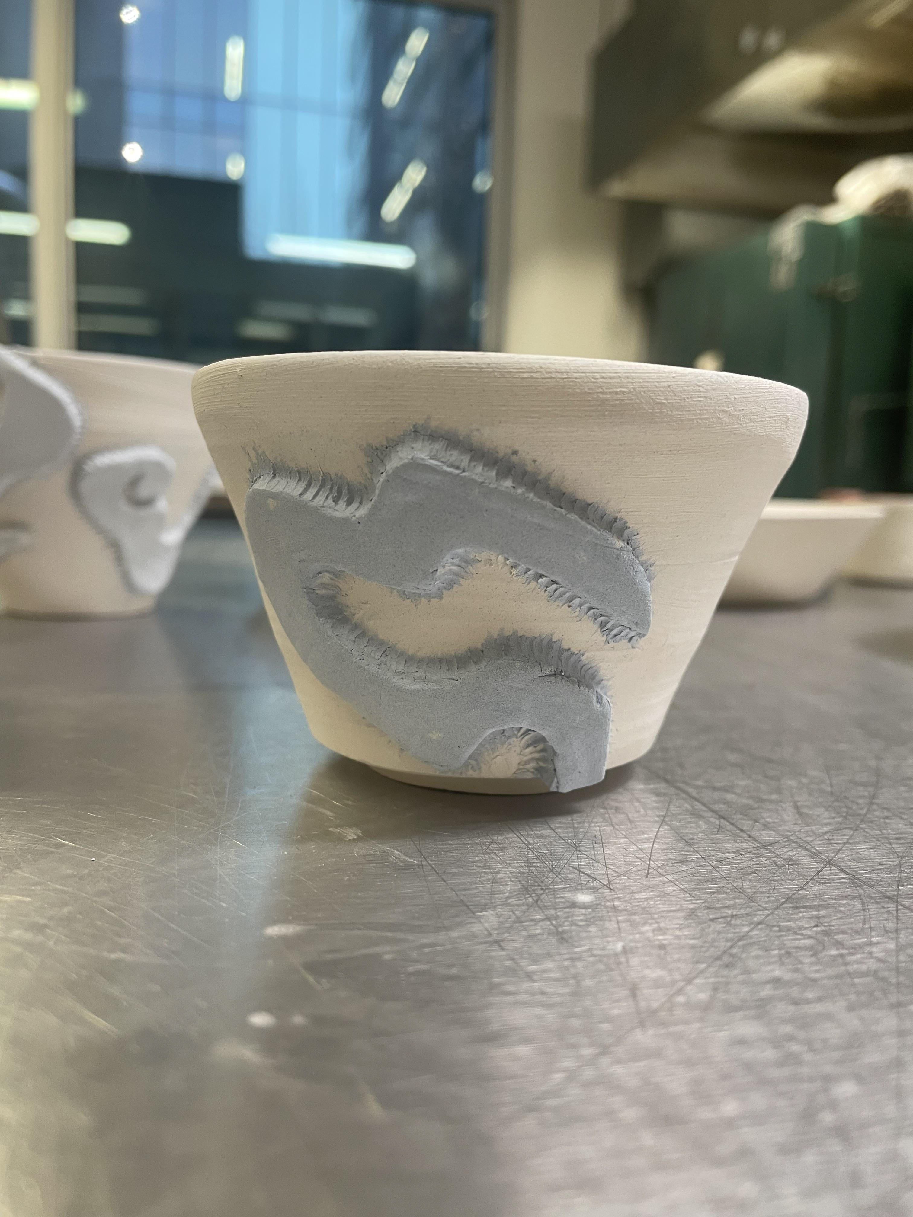
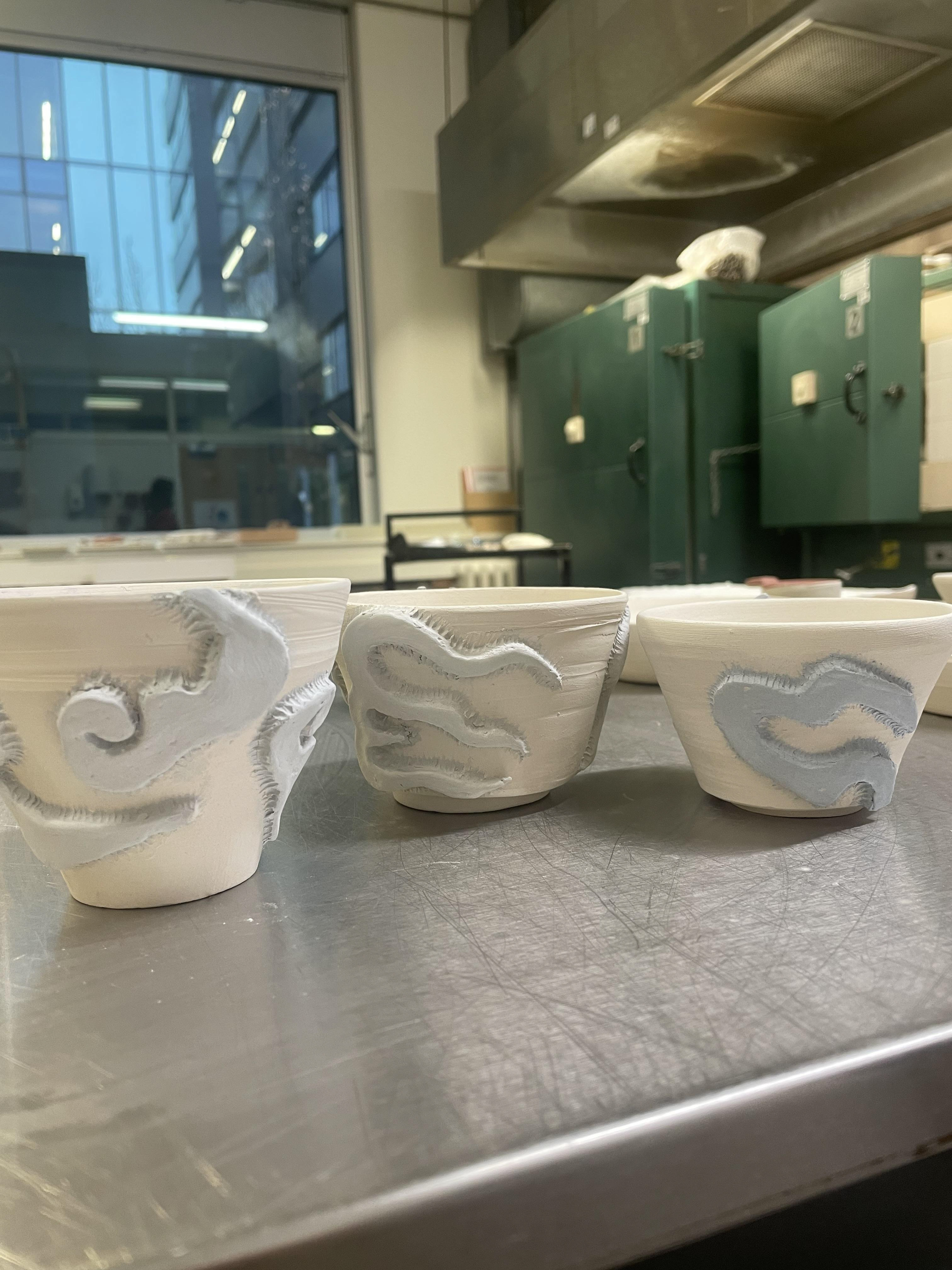
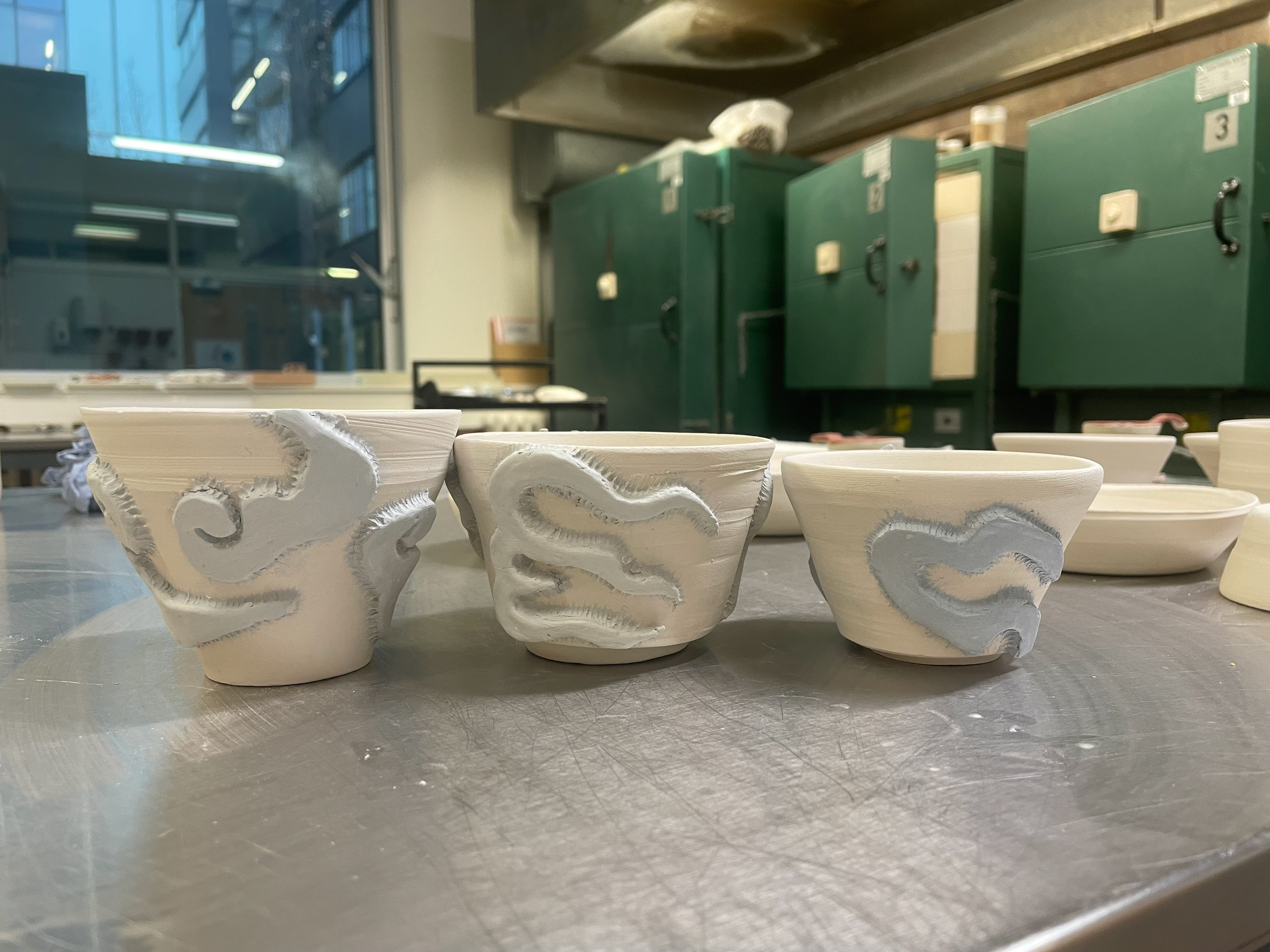
I started working on converting my lino prints onto clay, I explored different techniques to accomplish different outcomes. The first technique I used was pressing the lino directly into the clay, picking up the impression; this was interesting as I used plastic clay, and it picked up on the negative of my lino, taking an impression of all my cut marks. These marks created an interesting texture, like a ribbon. I'm interested in seeing how they will interact with a glaze on top and if they will create small pools of glaze in the dips. For my second experiment, I used slip to print my lino, placing a large amount on the clay tile surface and then putting my lino directly on top. This technique took a long time as the slip had to be fully dry, and I found once I took the lino off, it hadn't perfectly imprinted, missing out on the finer details. For my final tile, I used a sponge to paint the lino and stamped it on the clay like you would with lino printing. I think using a sponge to distribute the slip was the better idea as it allowed the slip to be tacky and not smudge, keeping the print very clean. I'm interested in seeing how the slips will react in the kiln if they keep their place or lose detail.
I glazed most of my lino tiles using oxides- chromium oxide, copper oxide, and cobalt oxide. Oxides are chemical compounds mixed with water and stained on the fired clay, then dipped in glaze to lock them into the clay. I used a combination of a clear shiny glaze, a honey shiny glaze, a matt glaze, a black shiny glaze and our turquoise glaze, giving me a big mix of samples. What interests me is the reaction the glaze has to the surface texture of the tiles where I have pushed the lino in, it gave me my negative cut marks, which were transferred onto the clay, which pooled and collected in their areas, giving darker spots in the tiles and a change in texture where you cant feel the crank but is smooth to touch. Unfortunately, the tiles where I used my slip didn't come out the best except the green one, as the slip held its pattern and texture. However, with my stamped slip tile, I think I used too much of a dark glaze and didn't layer the slip-up; therefore, it has come out almost hidden by the glaze on top. This wasn't what I planned, but I'm happy I went through this process; maybe next time, I will try to add more slips to the clay surface and use lighter clay so we can see the contrast of the patterns. I also had difficulties with the slip that I cut out from the white slip; this proved a challenge, as I cut it when the slip was a bit too dry, which meant when I cut it, it cracked around the area. I was expecting the slip to fall off the tile; however, when I dipped it into our made glaze, I did a very thin layer of it so it didn't break the slip too much. However, it caught air , creating an air bubble and changing the whole texture of the tile, which was fascinating to see and not something I was expecting.
throwing
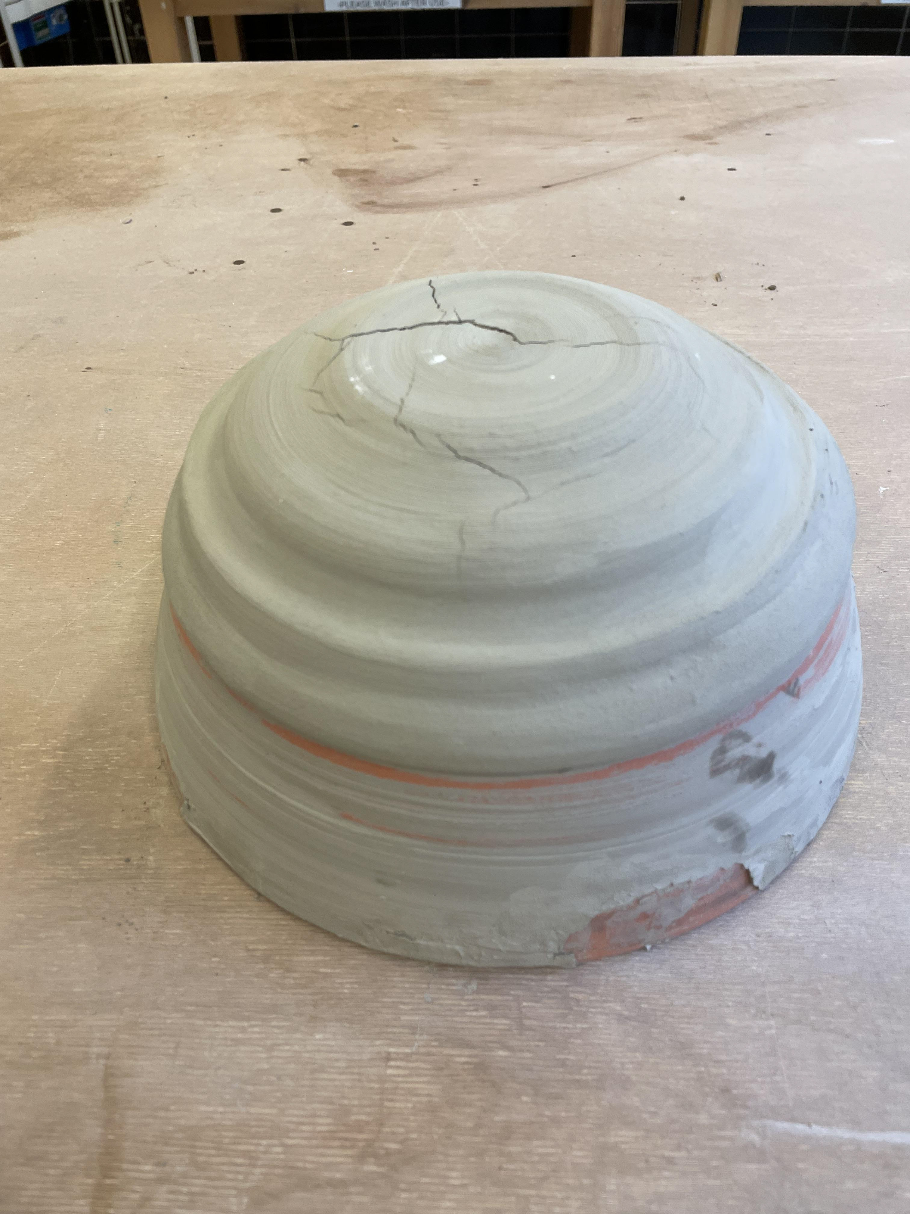
Being my first time throwing, I found this a very big challenge . I was focusing on correcting my technique and playing with the clay, seeing what shapes I could create. This being a mixture of clay, I found it a little more difficult to manipulate as the grains would friction with the wheel, I also found it challenging but very intriguing how slight movement or pressure can completely change a piece, I had lots of trials where I put too much pressure and the clay gave way, finding the balance of pressure is something I need more practice on but becoming more comfortable with.
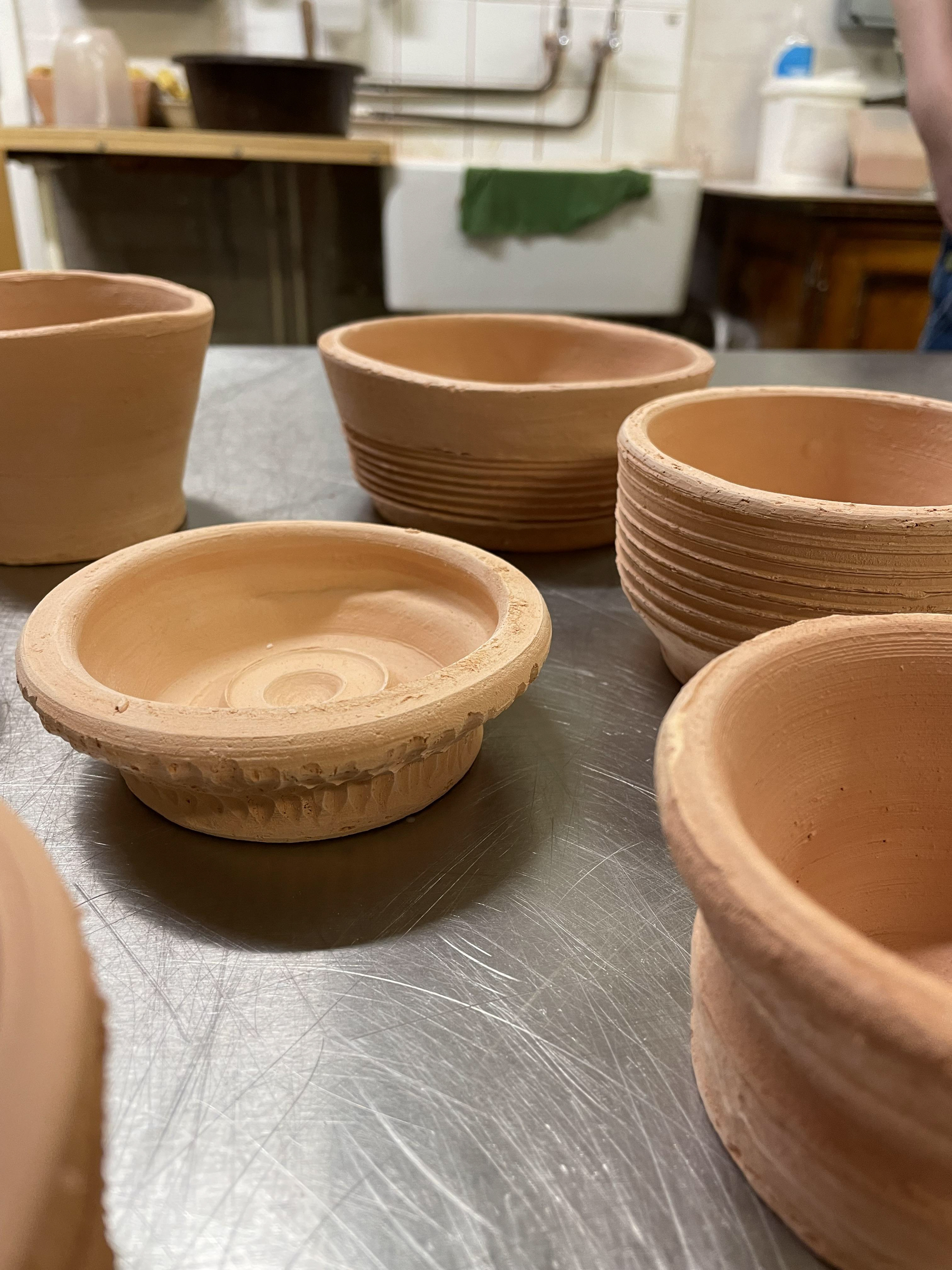
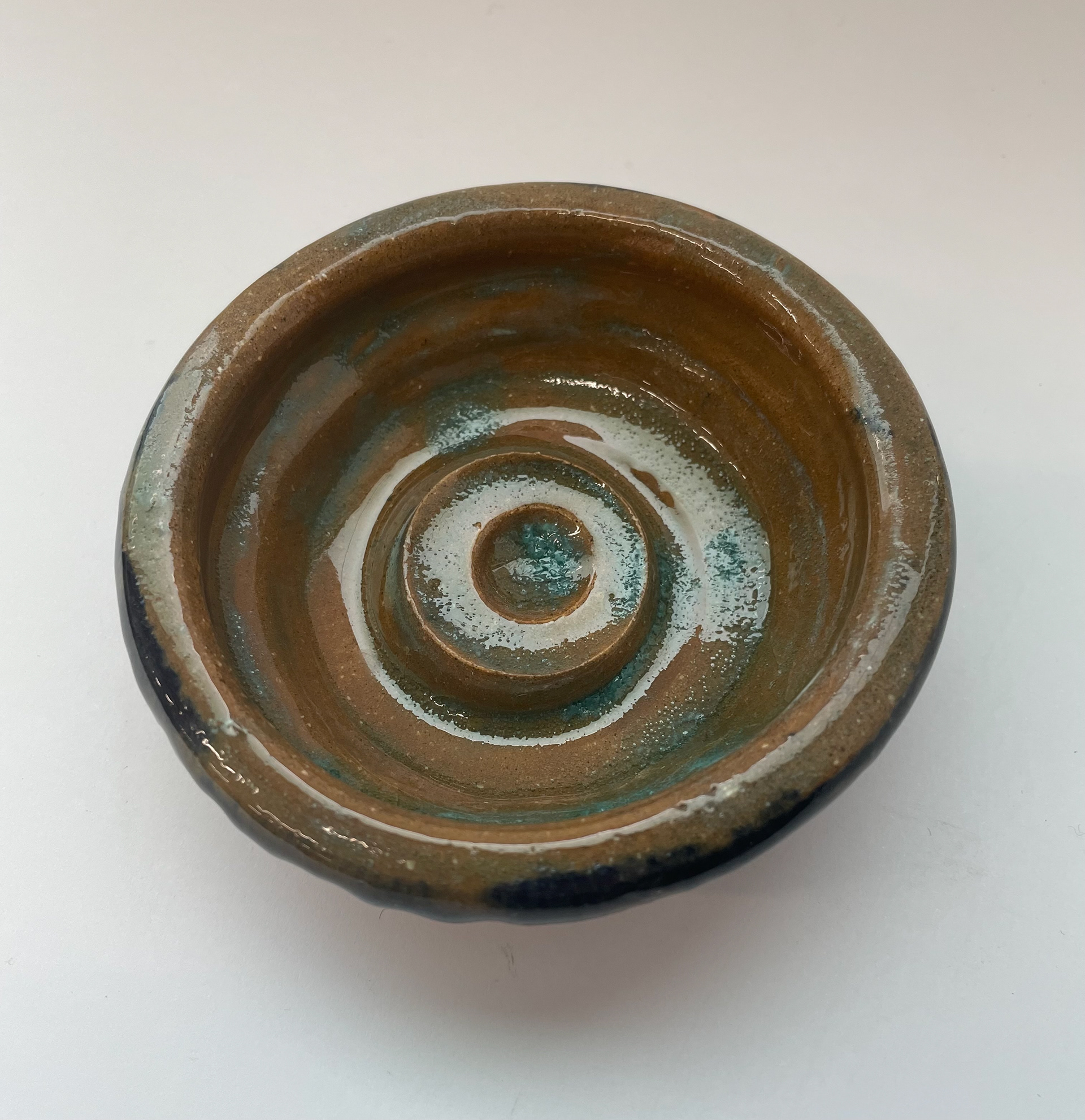
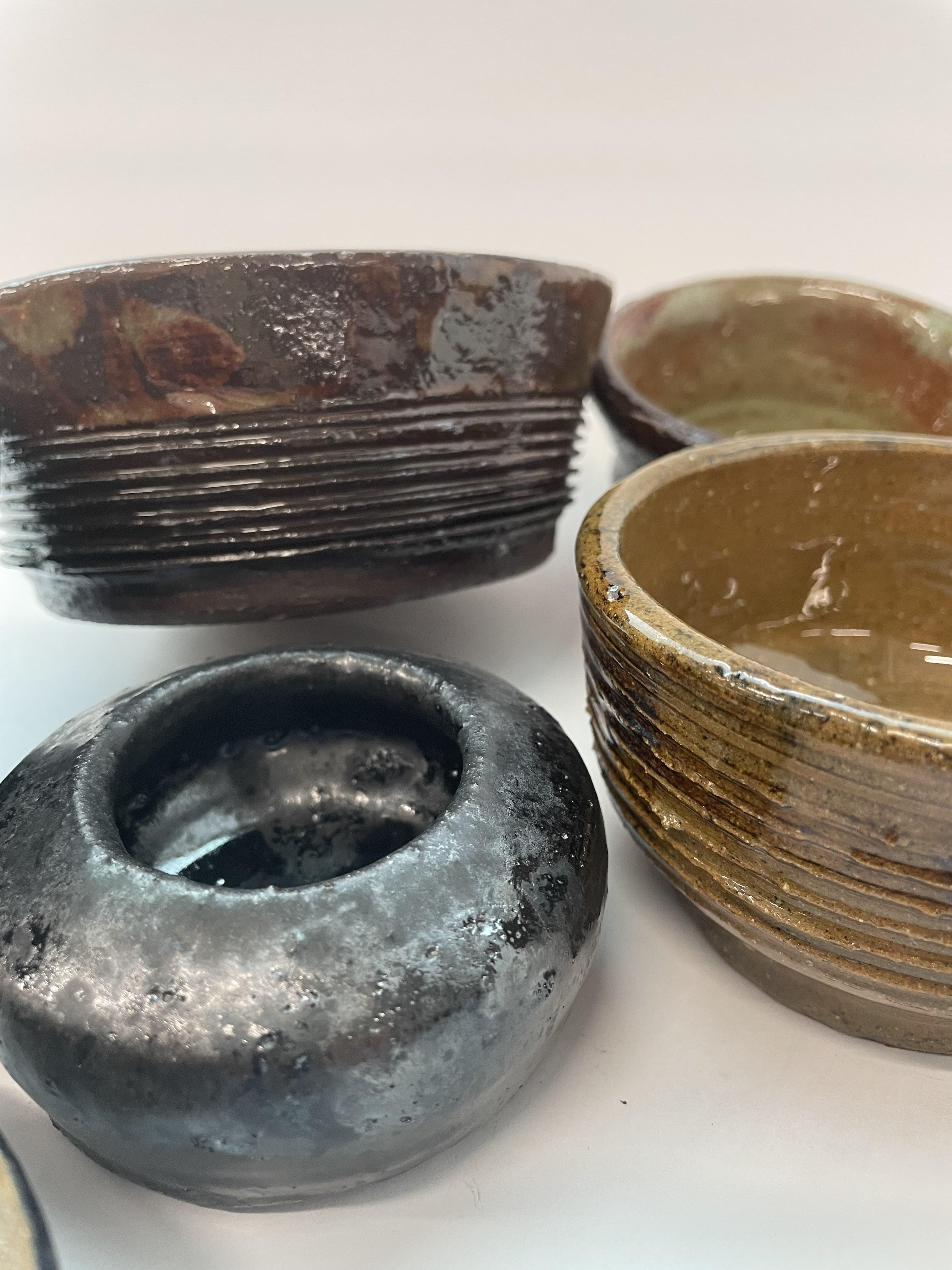
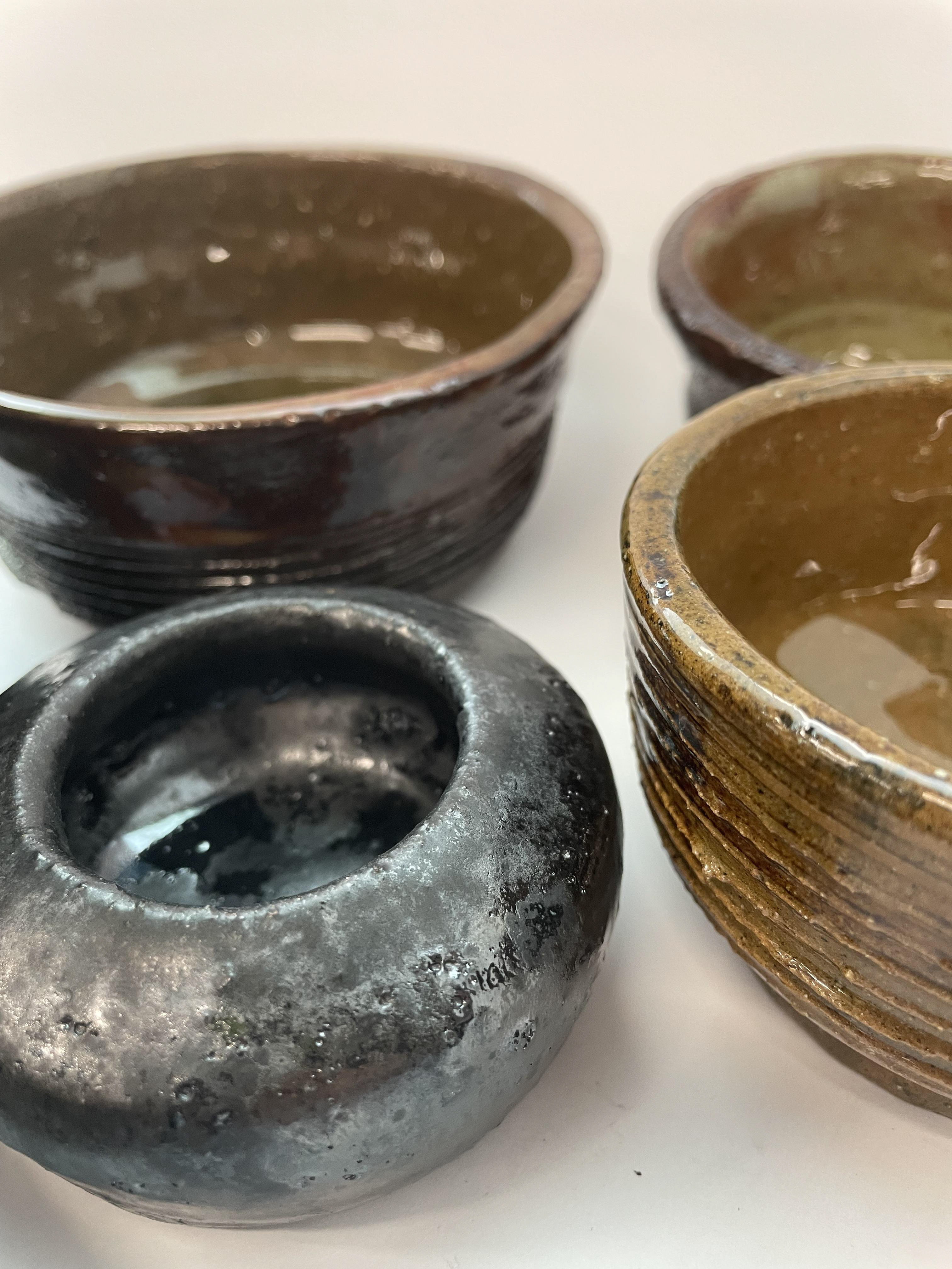
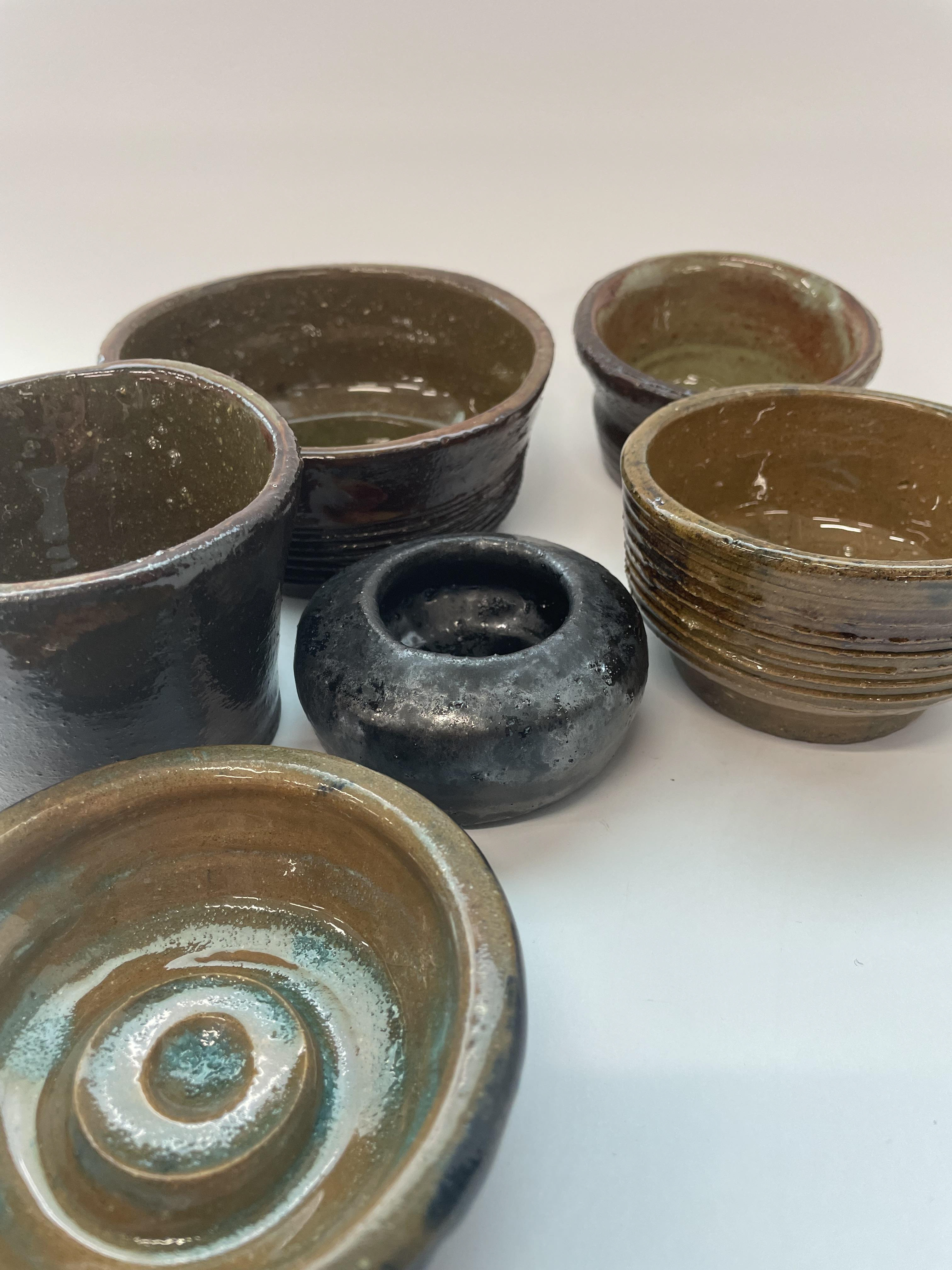
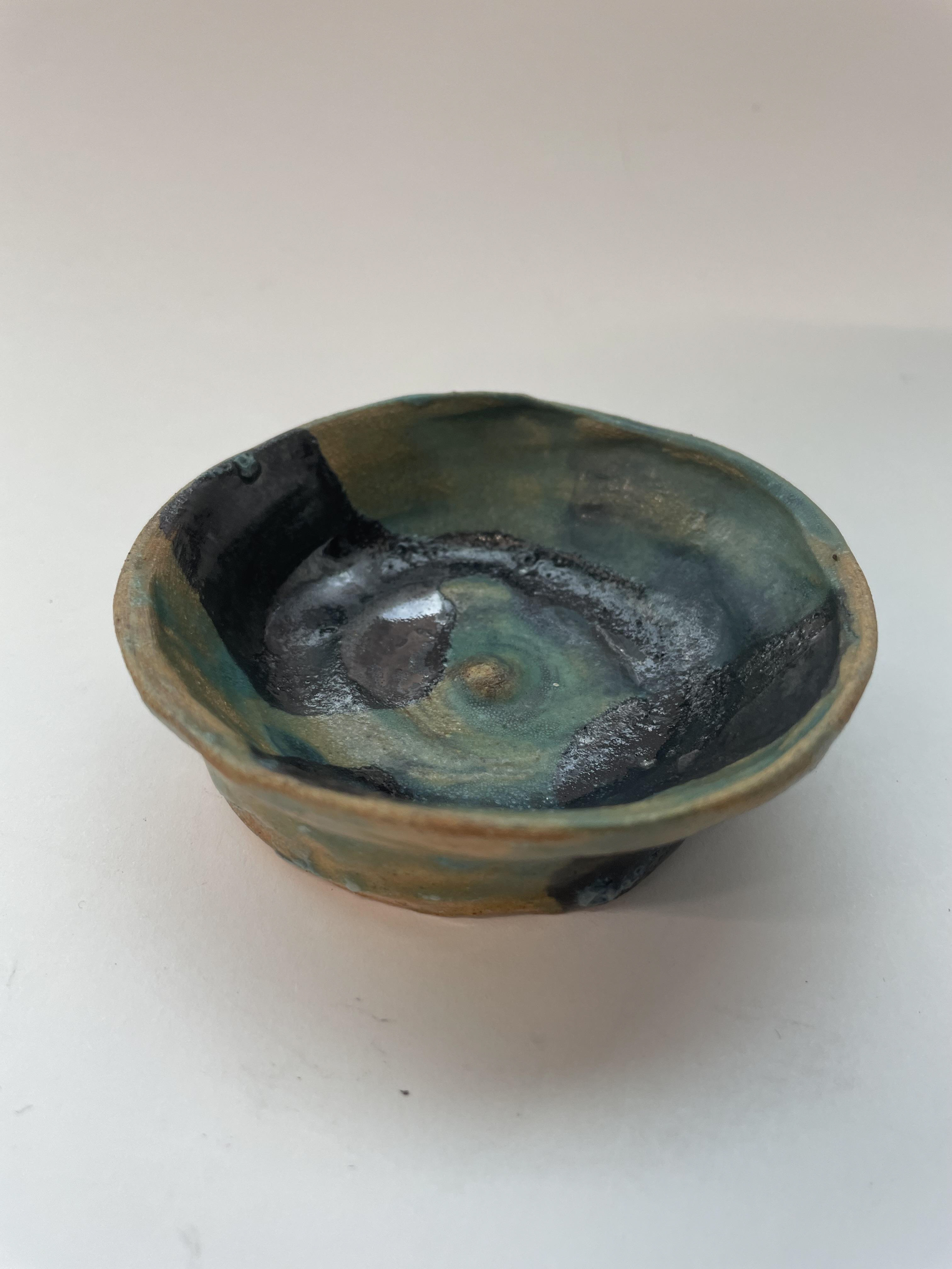
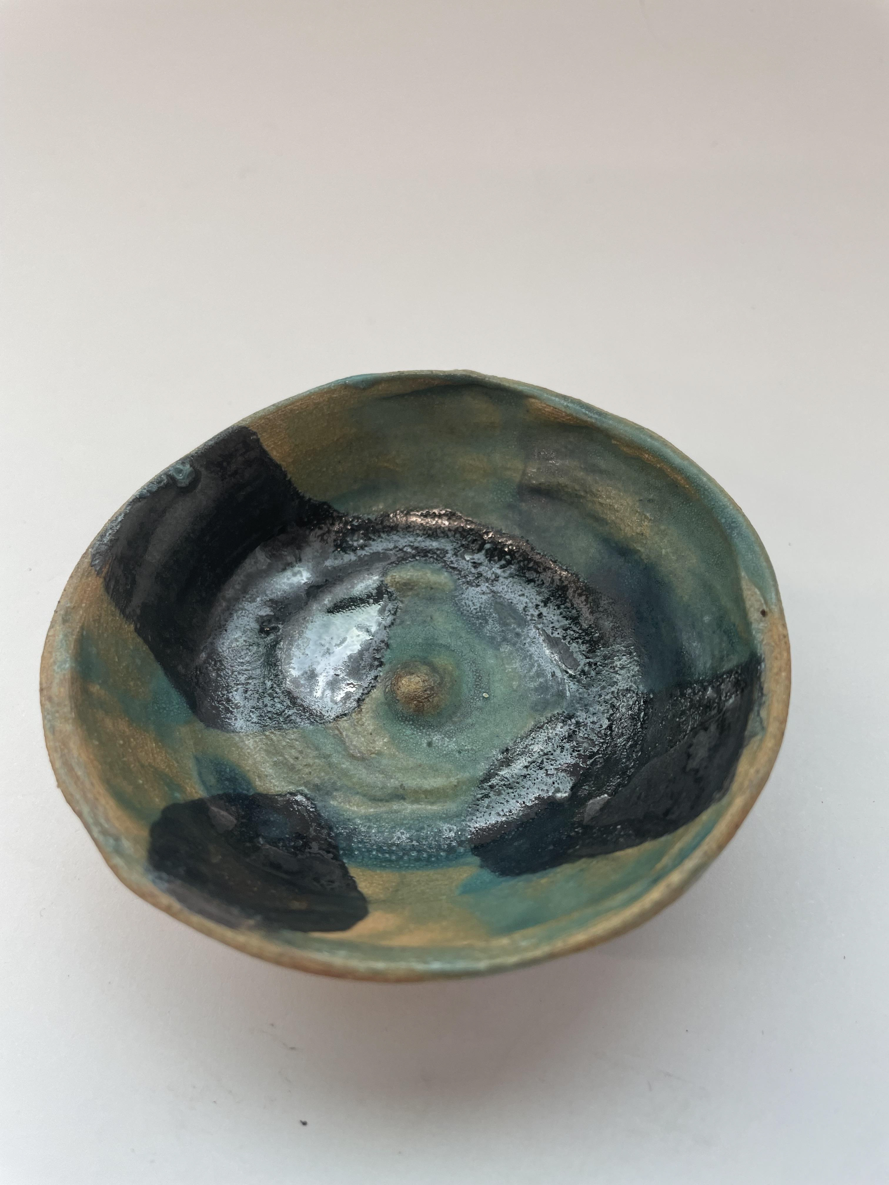
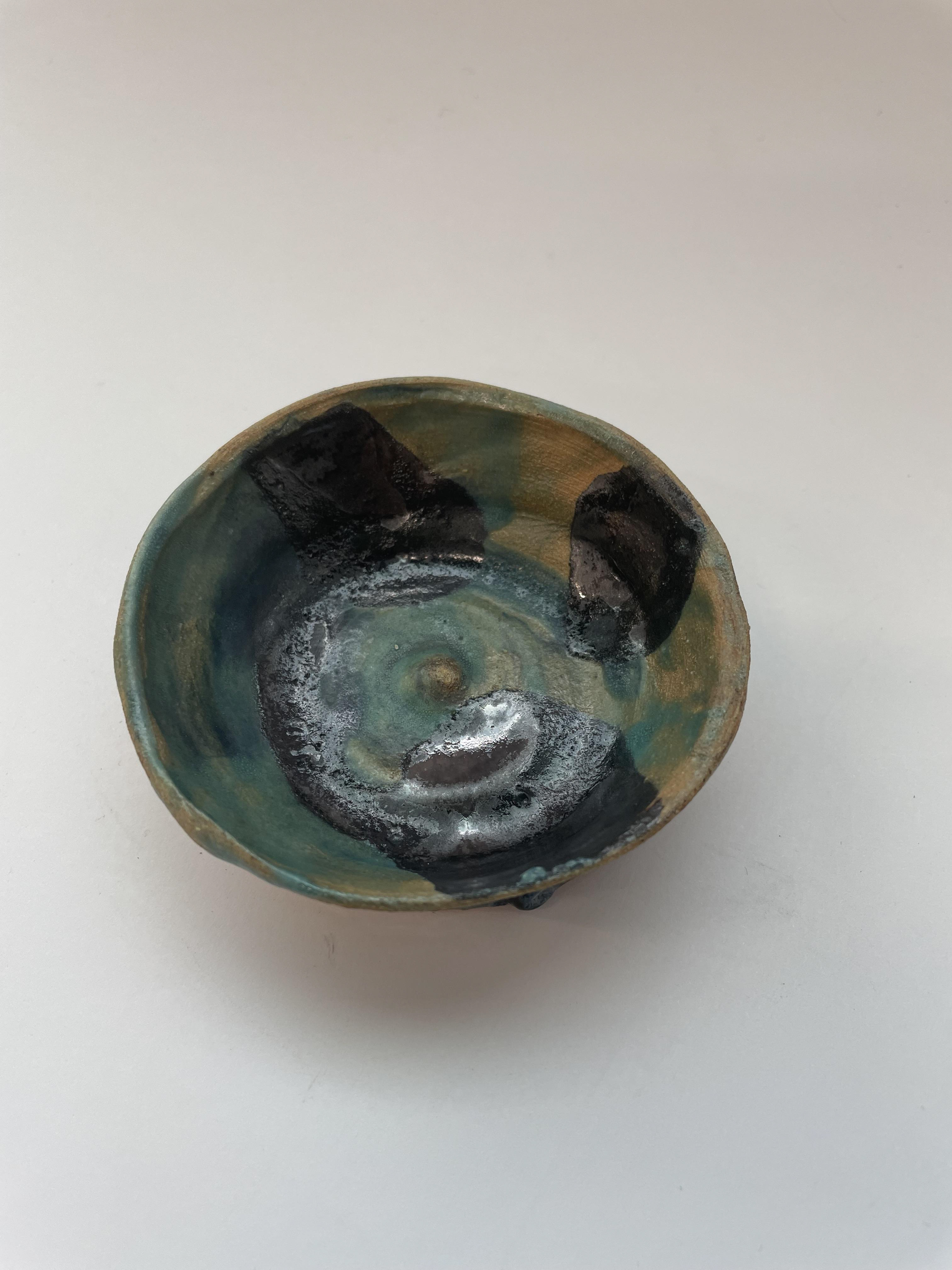
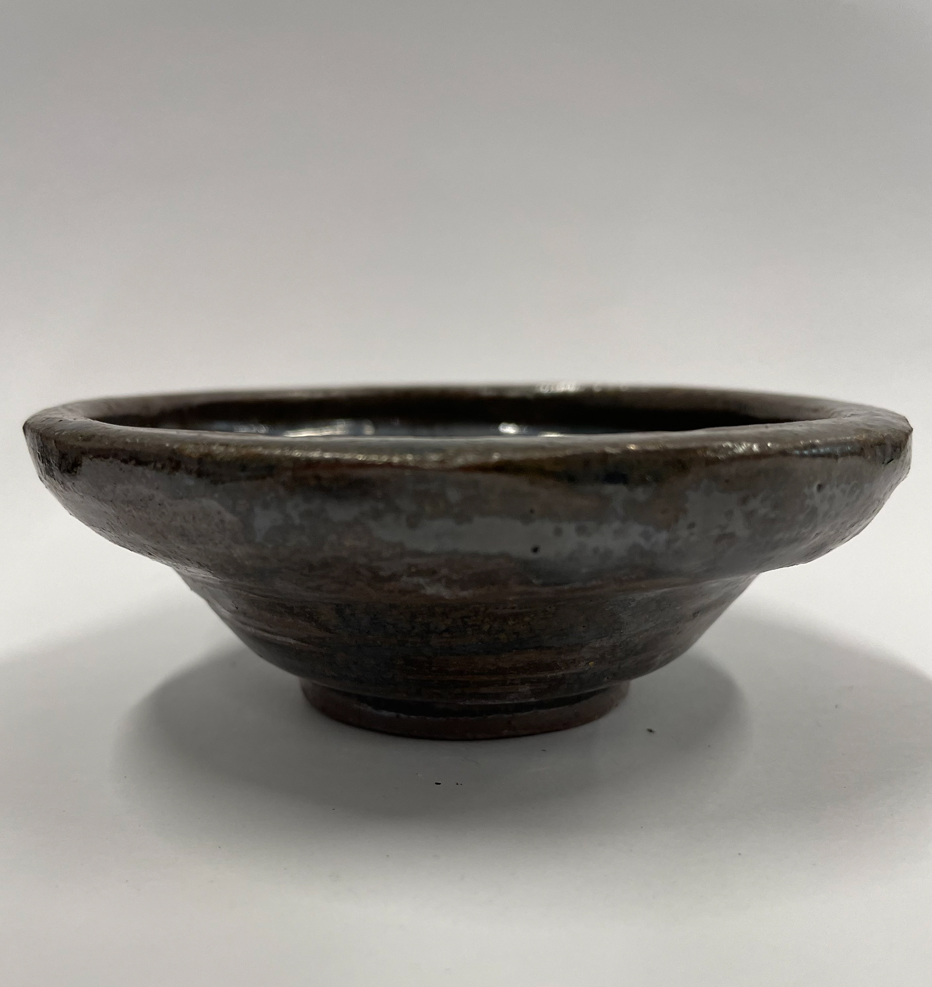
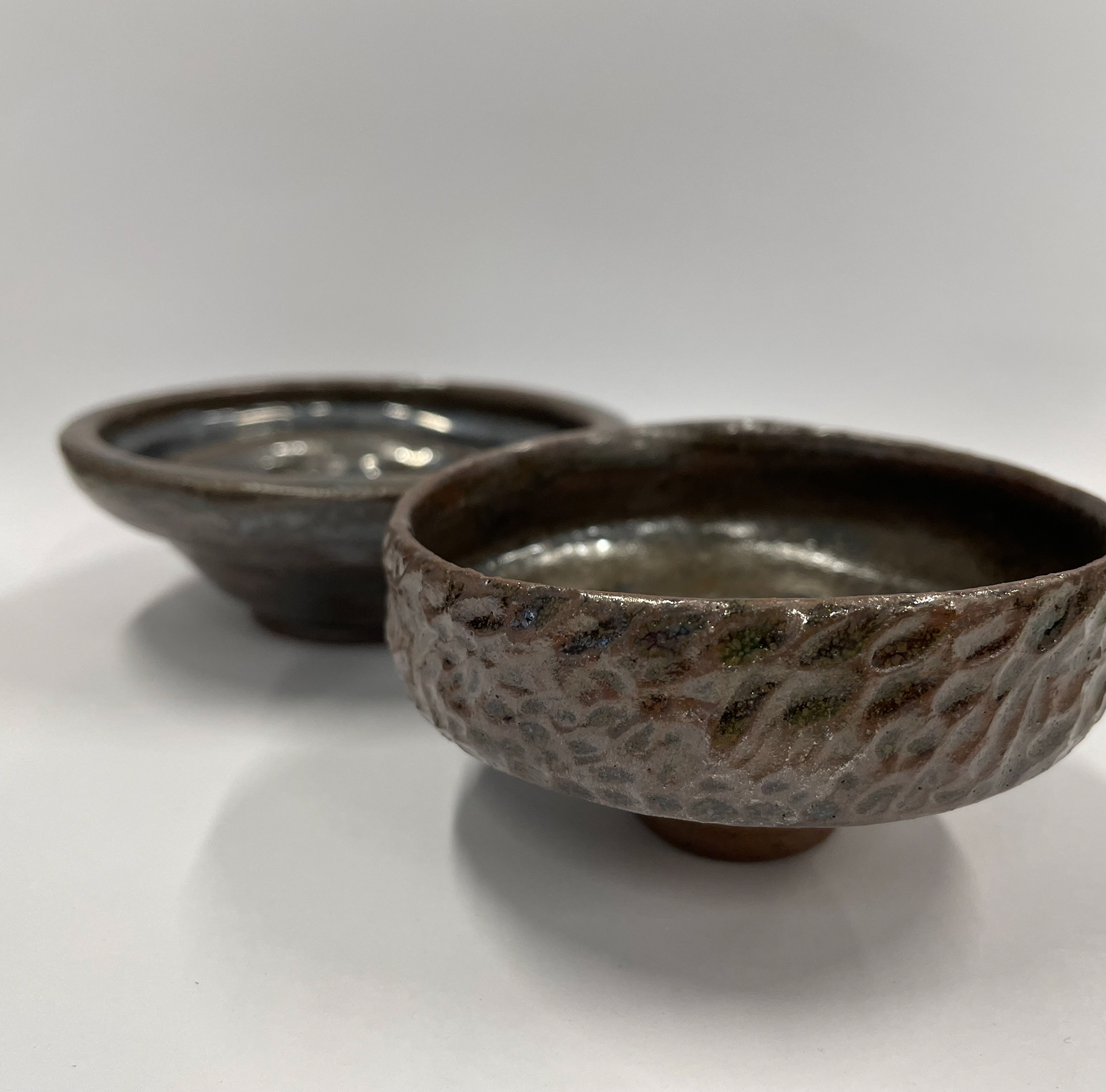
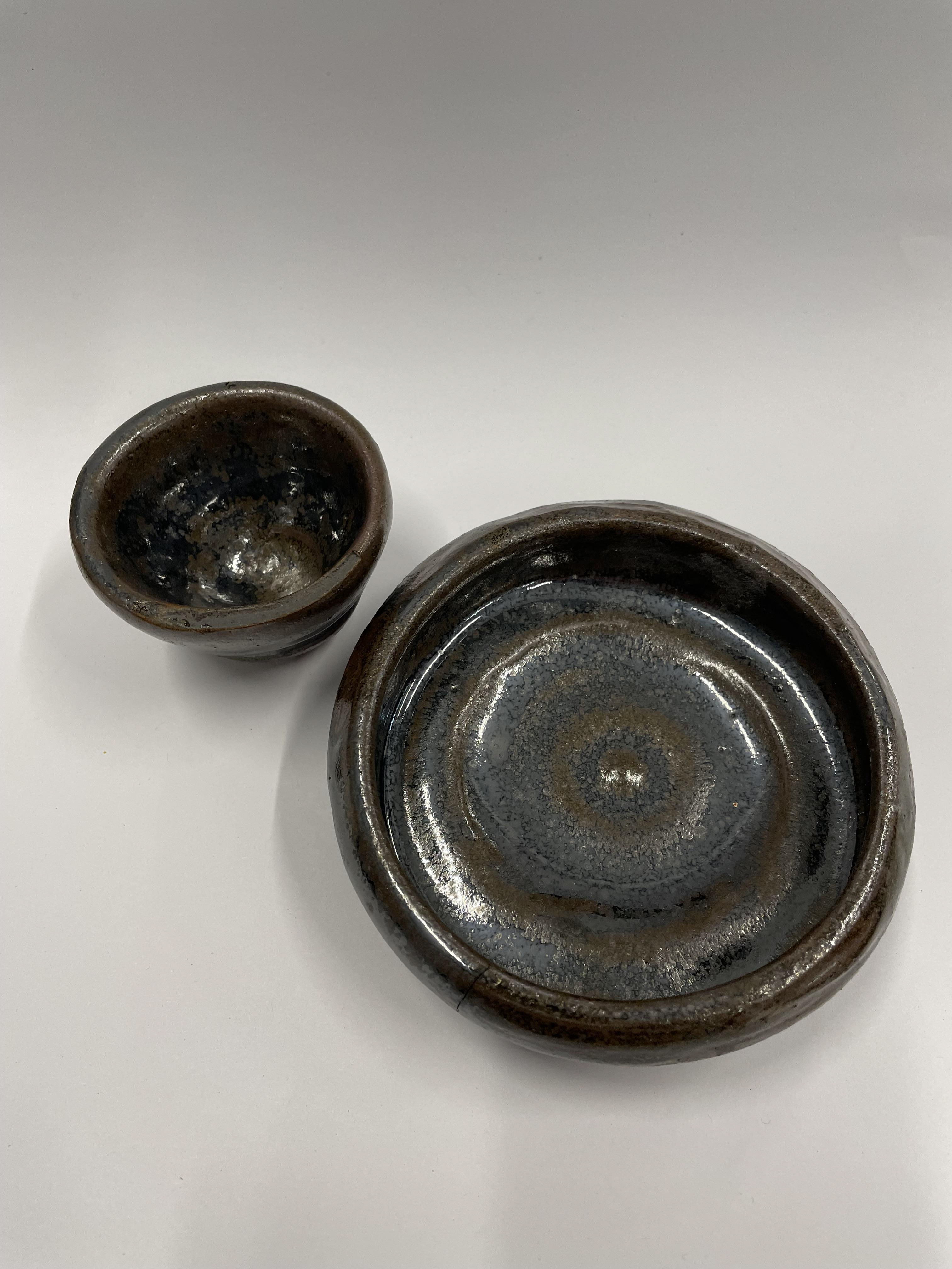
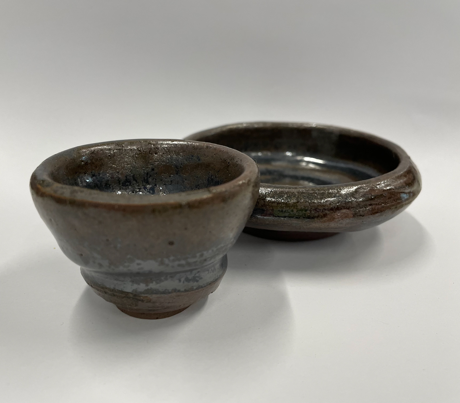
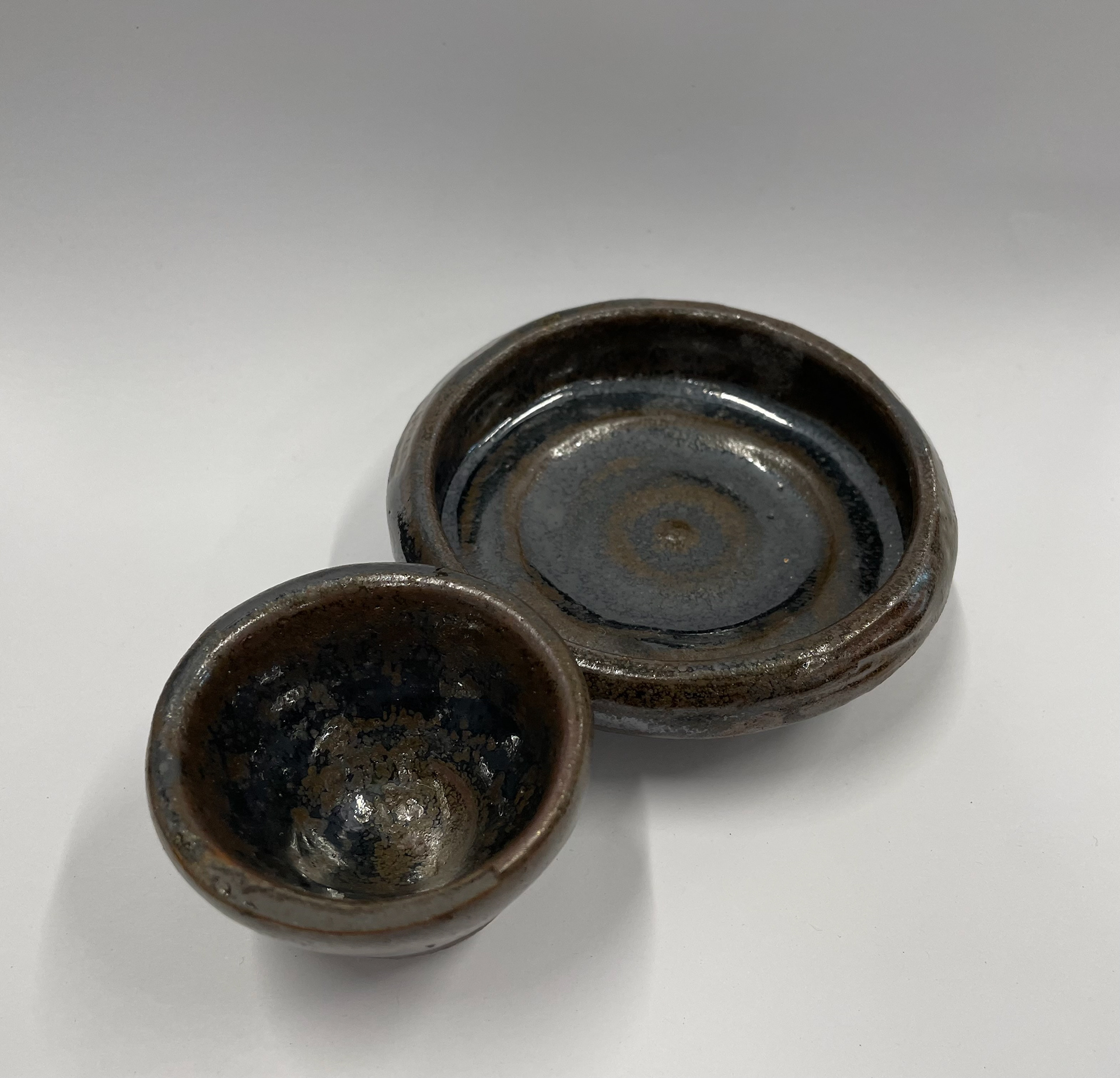
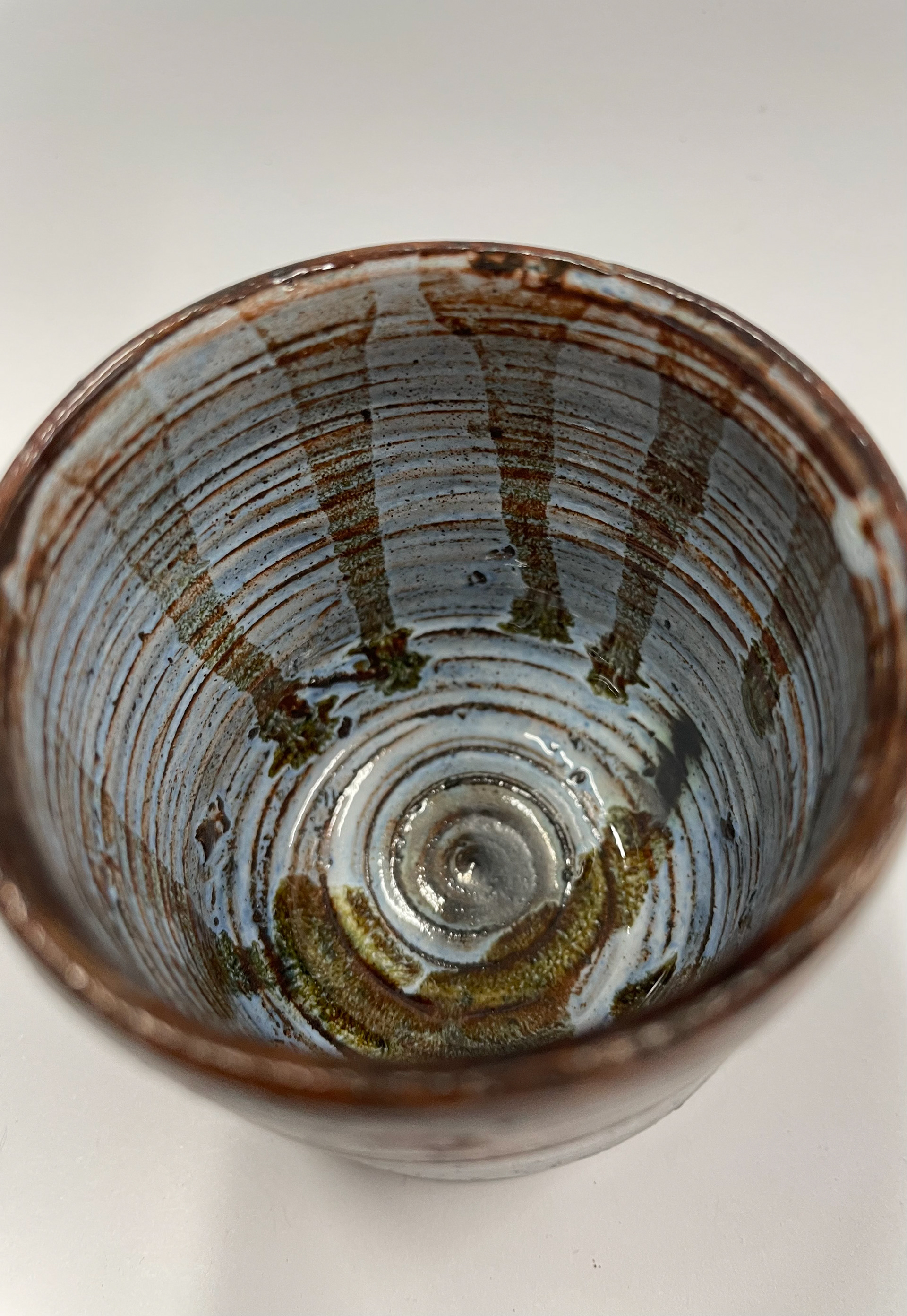
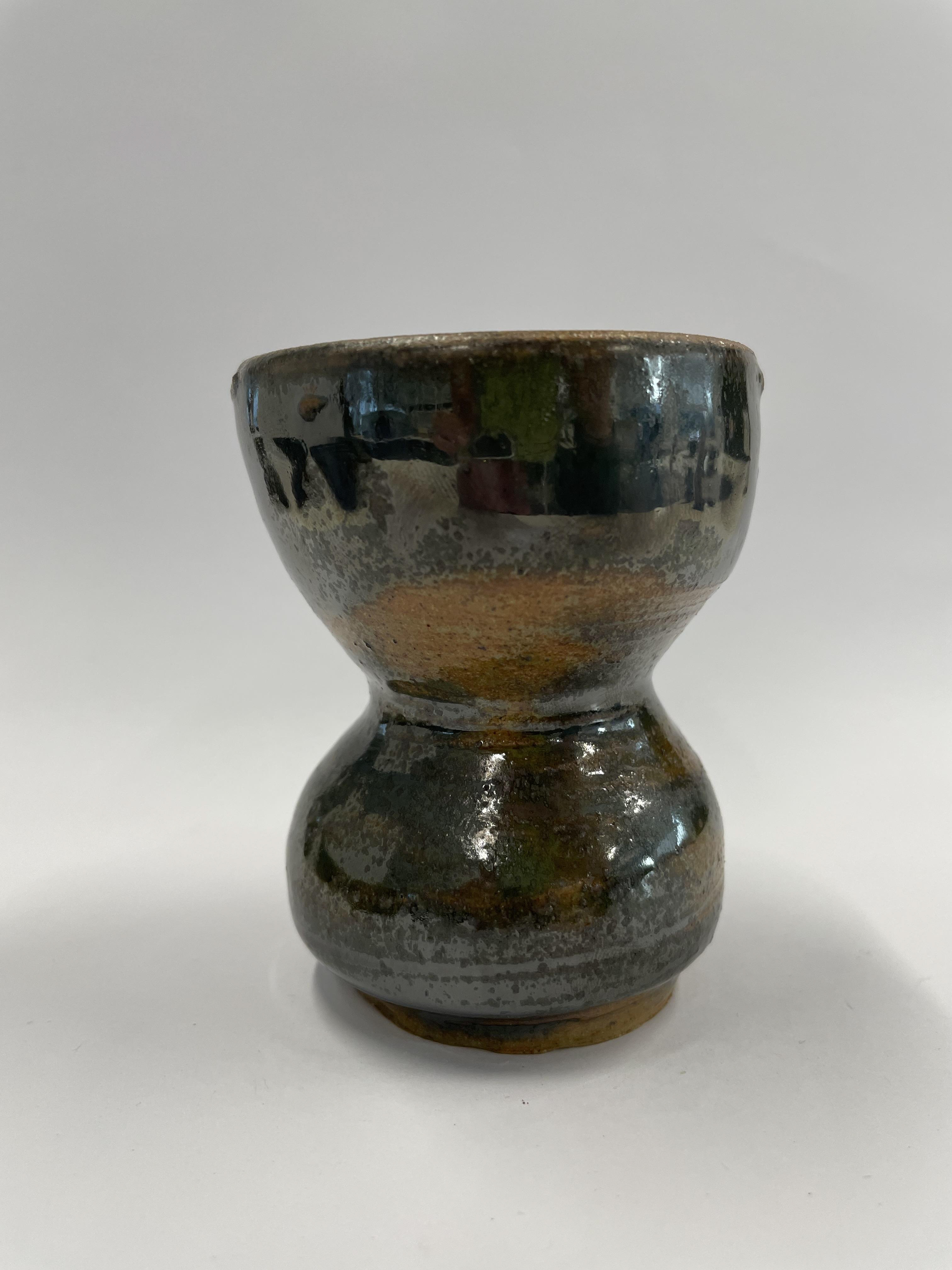
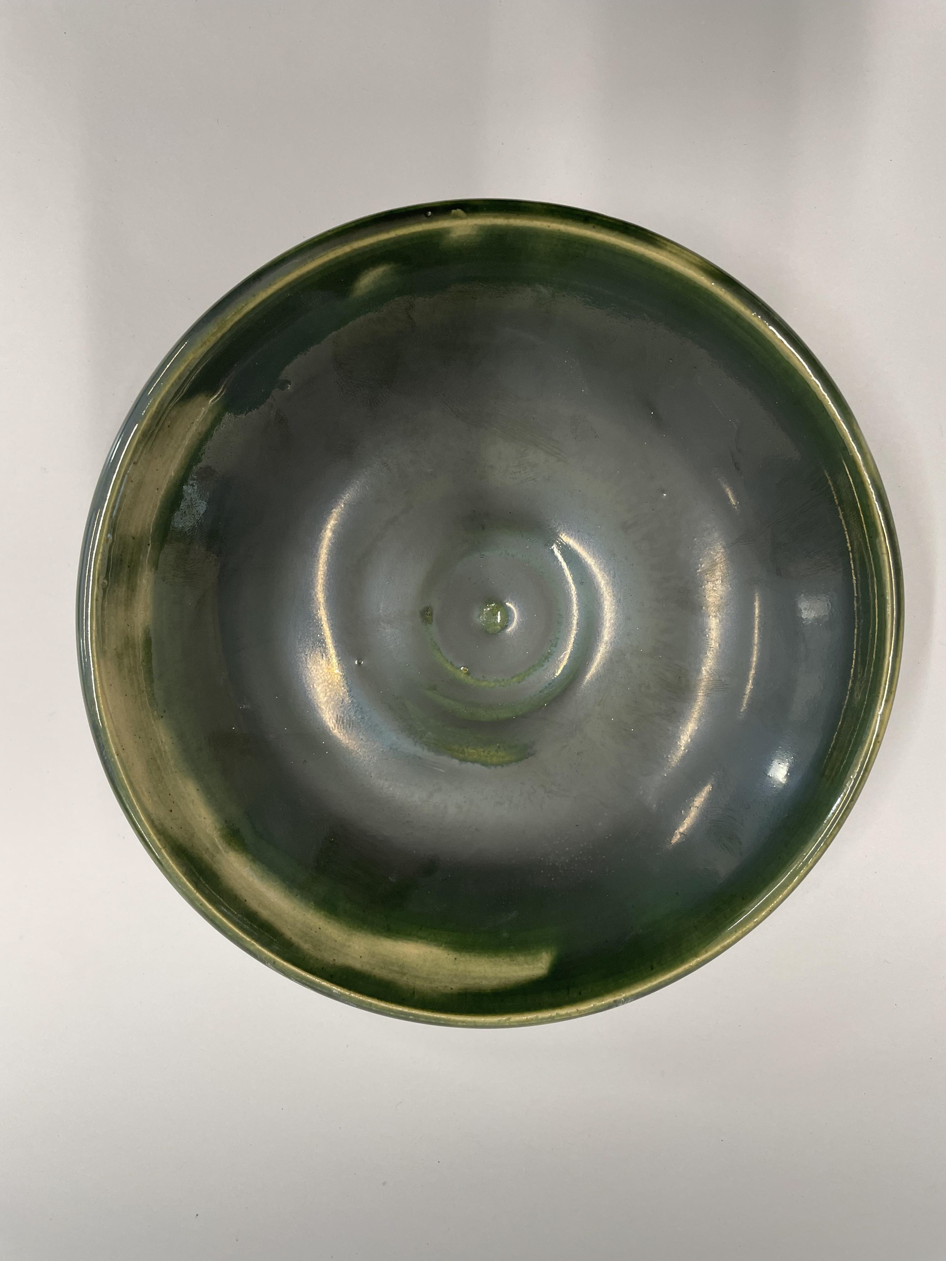
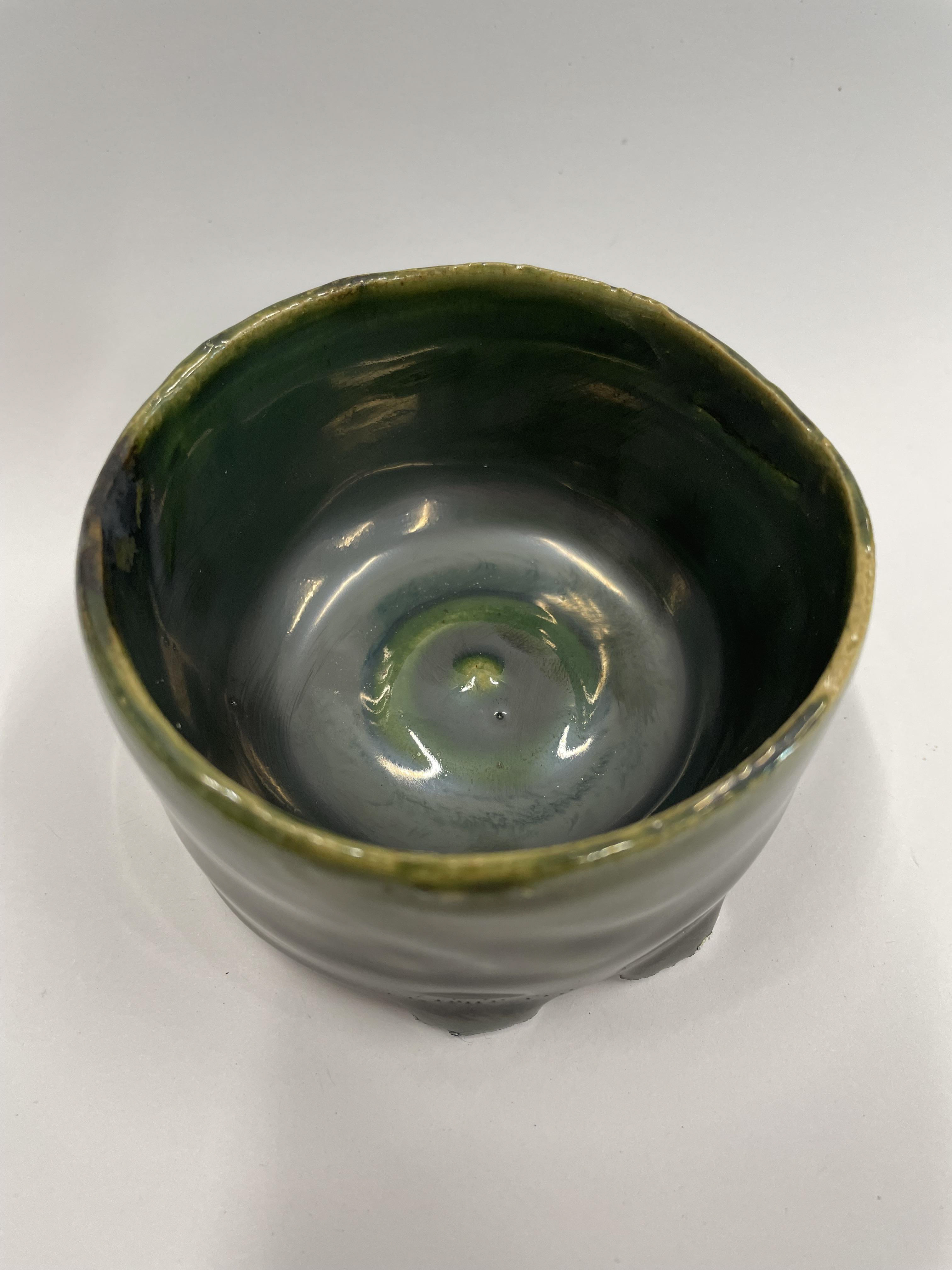
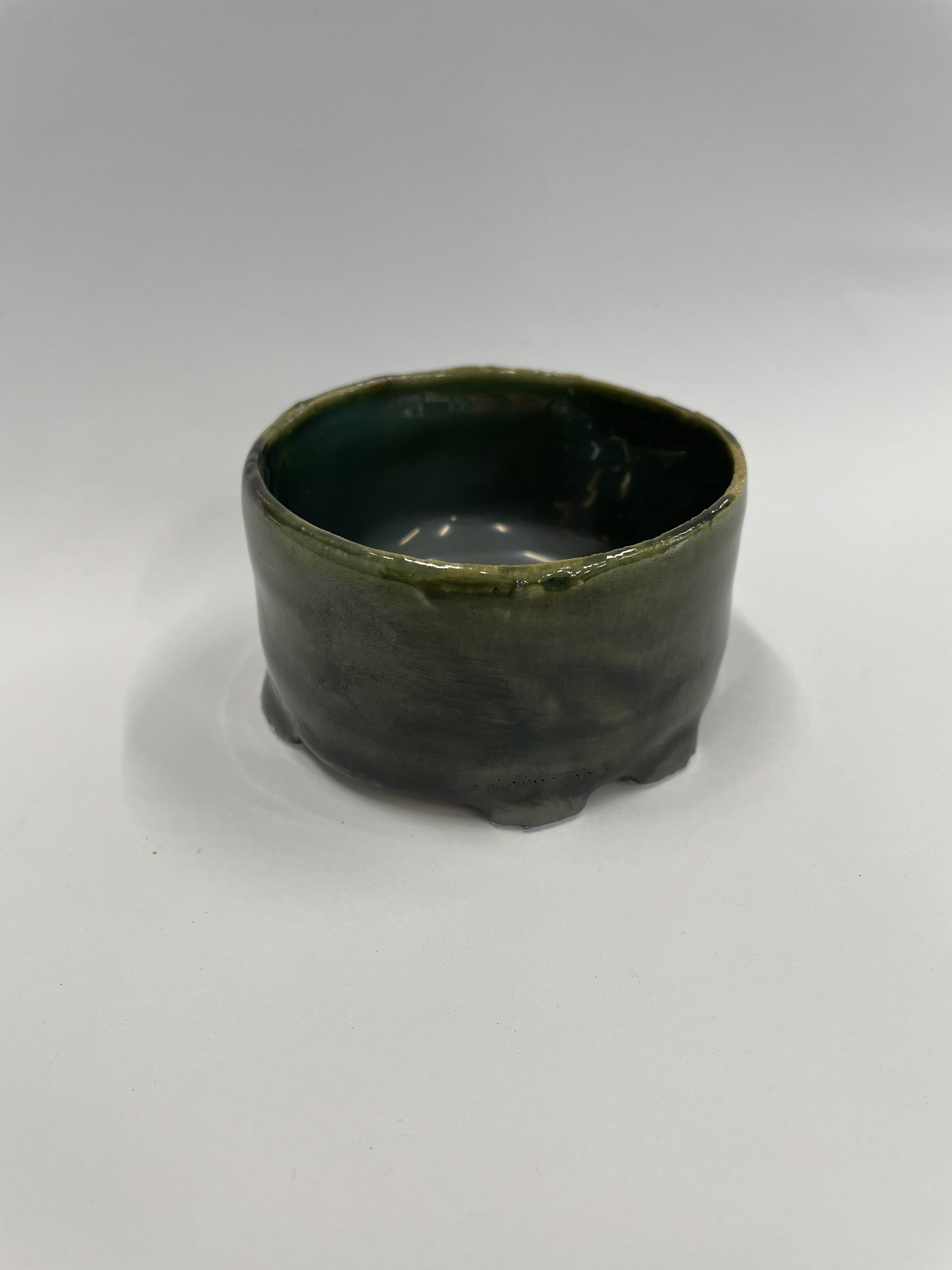
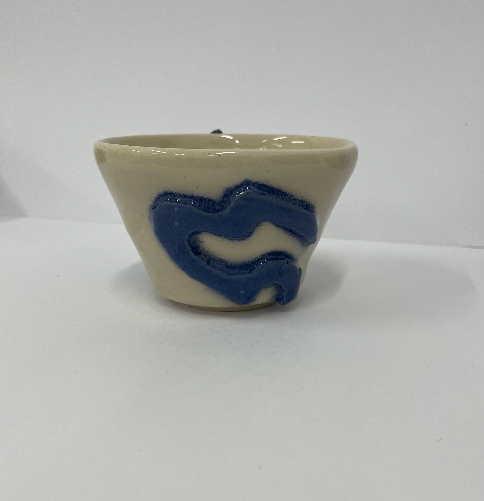
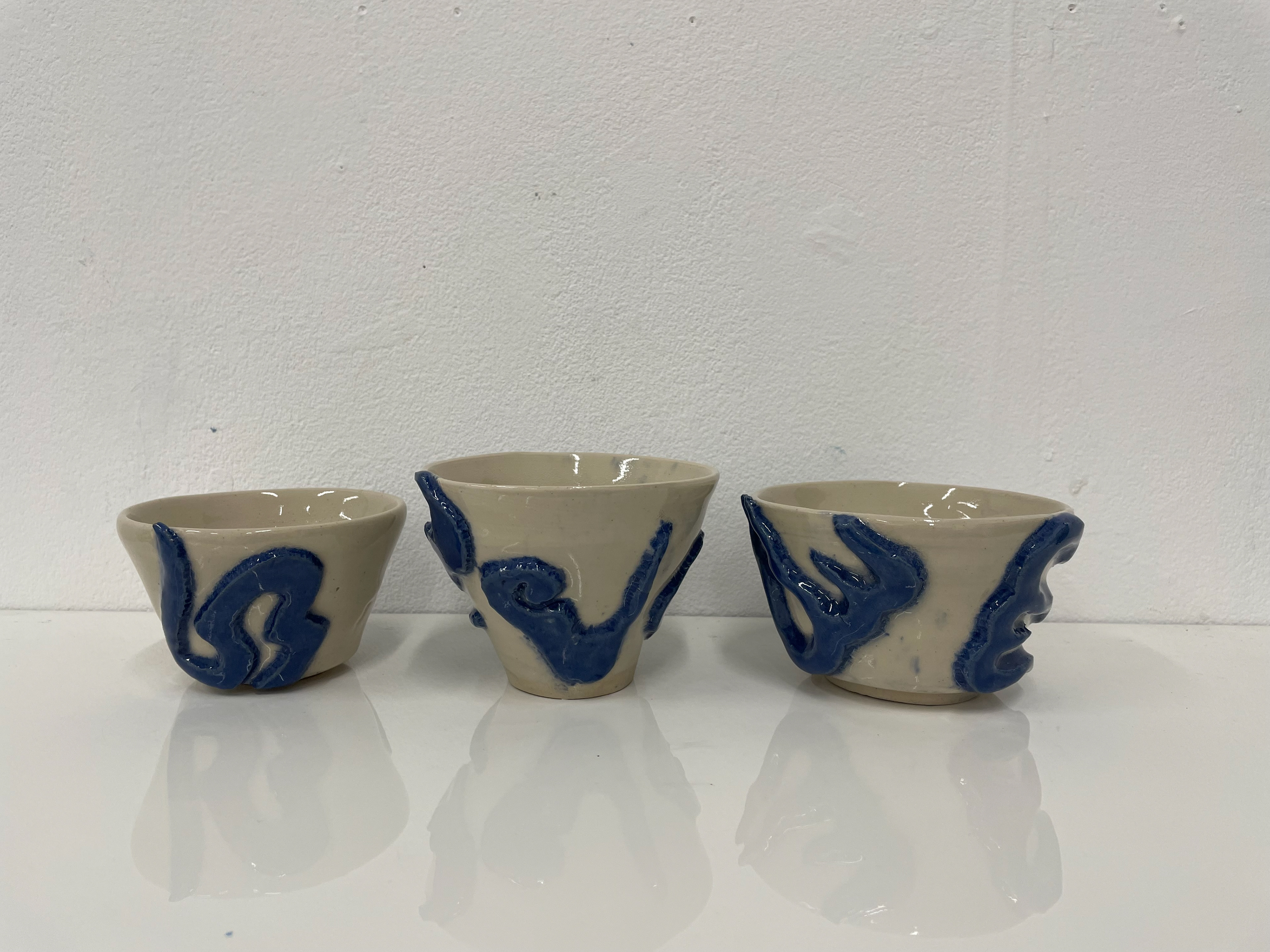
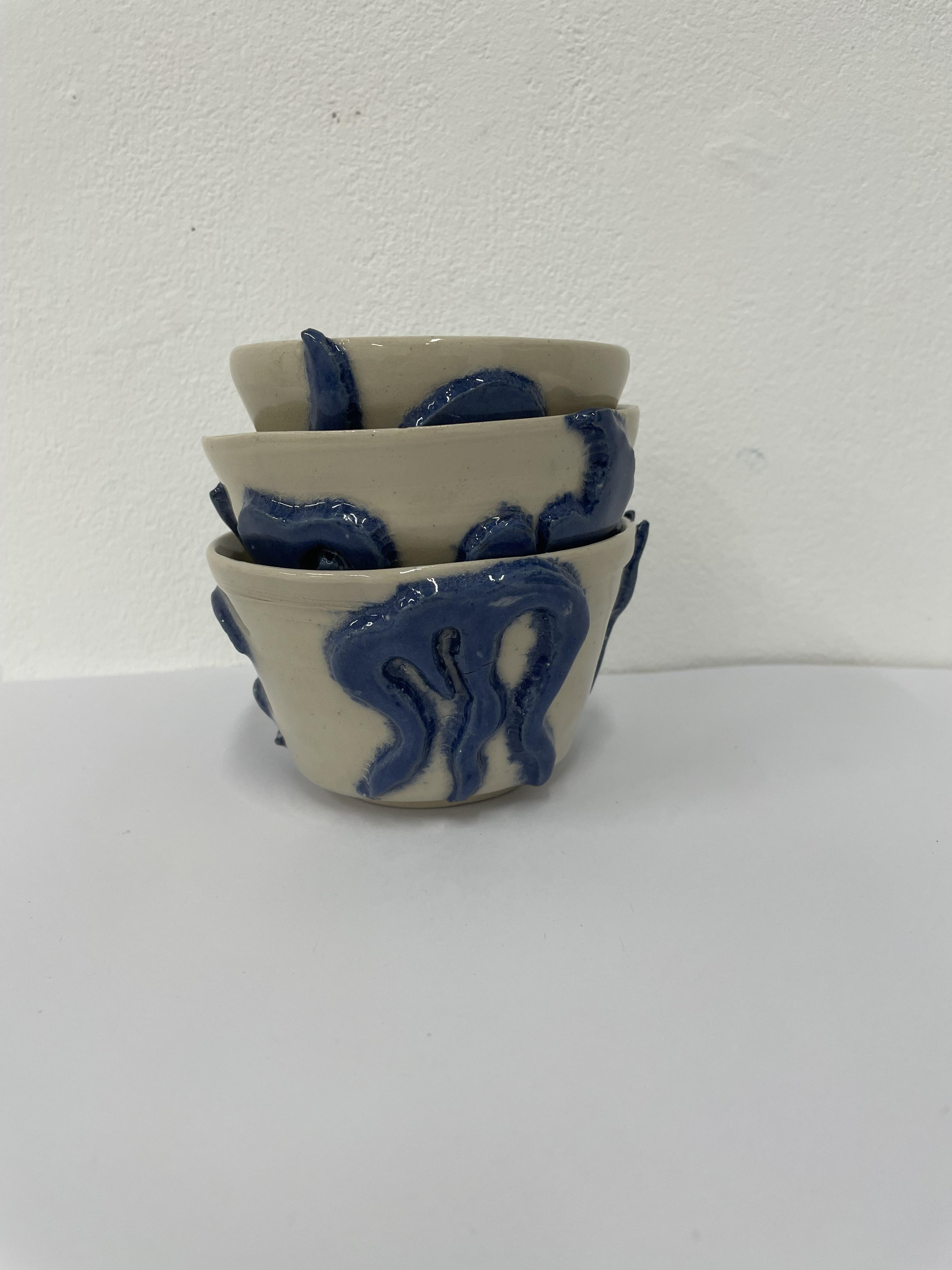
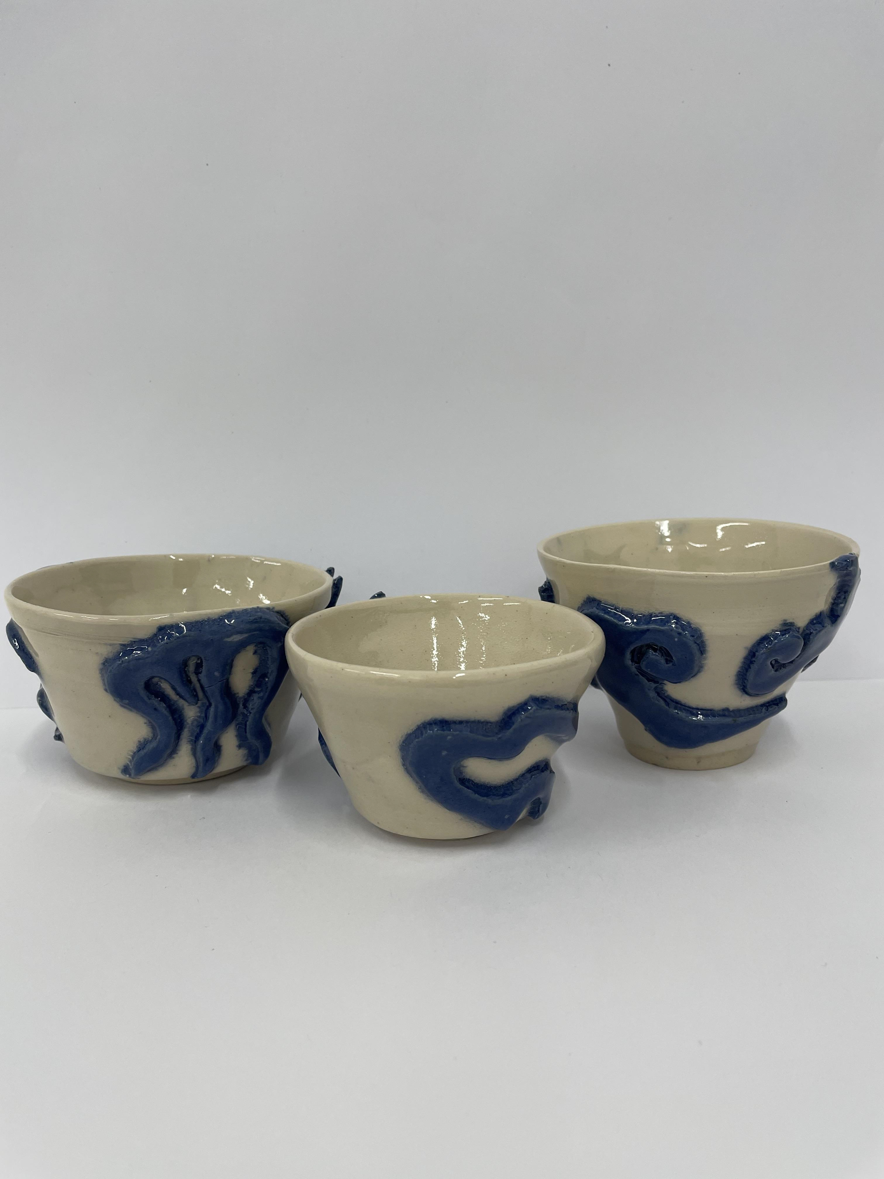
I looked at playing with the texture of the bowls, using a comb pushed into the sides to create equal symmetrical gaps. I experimented with different combs, which created different widths and depths for the bowls. I like the texture these created, especially as we used mixed clay, which exposes the grains in the lines, adding more character and texture to the bowls. I'm excited to see how these texture ridges react with different glazes, too.
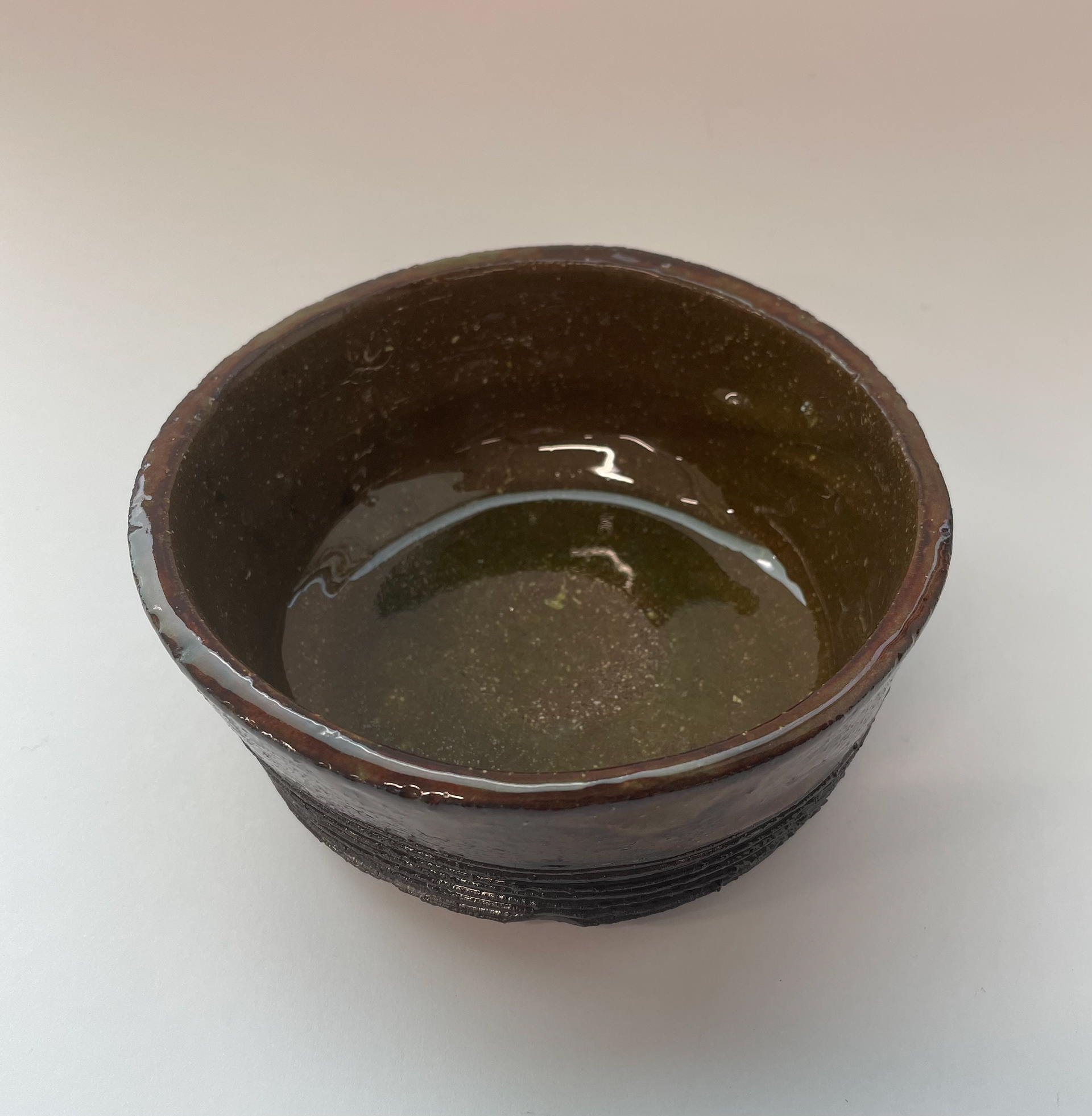
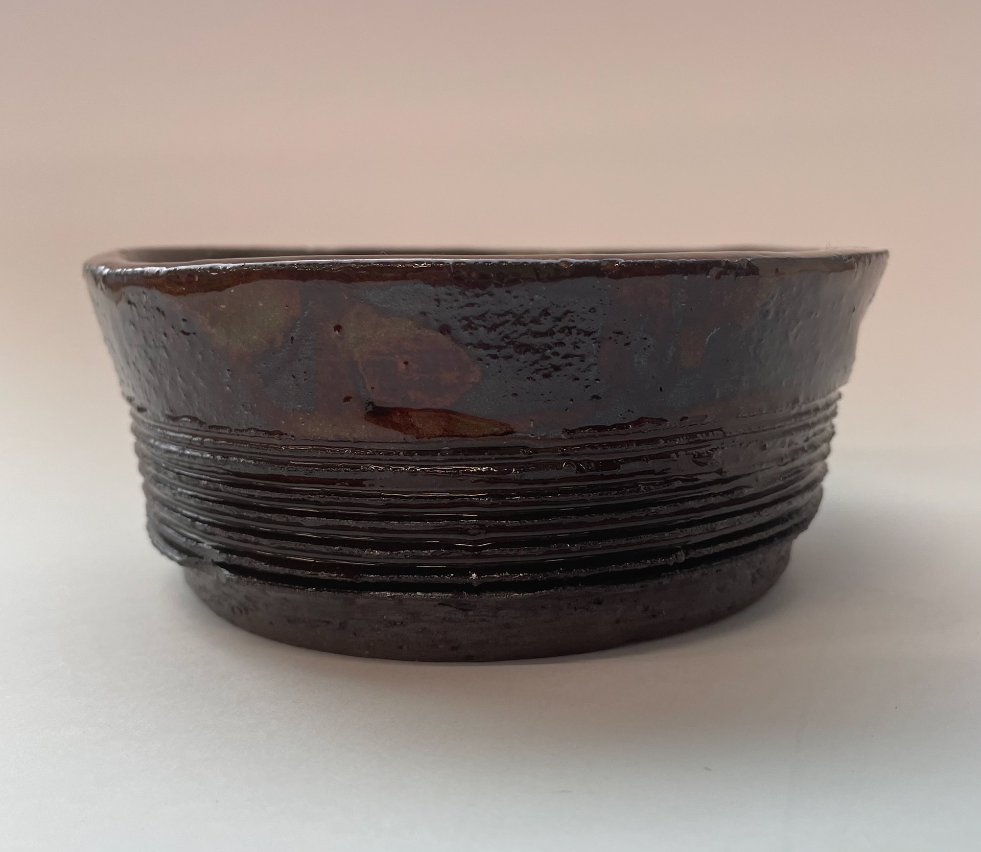
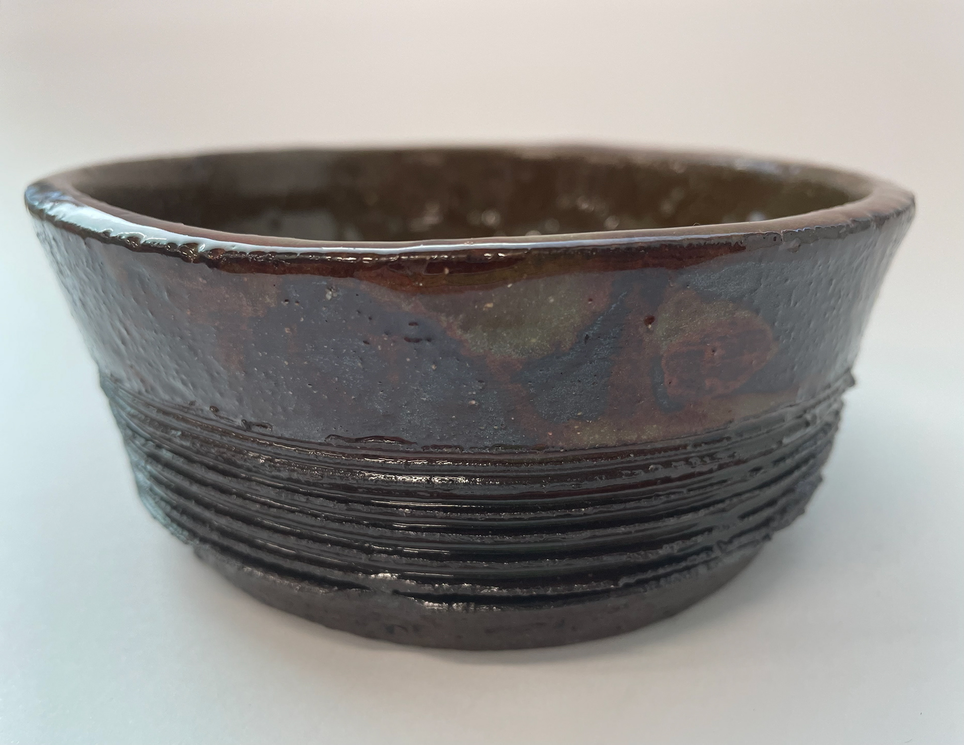
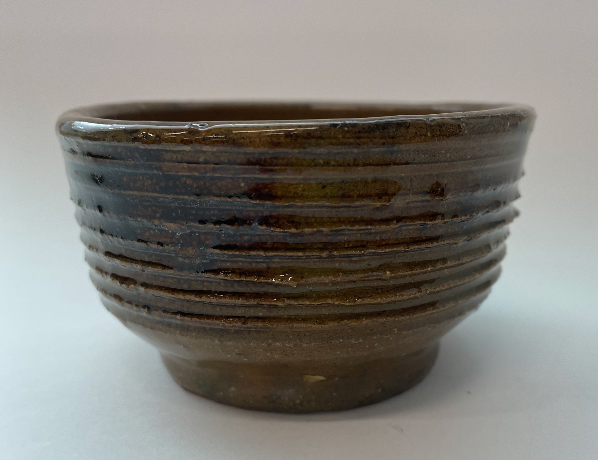
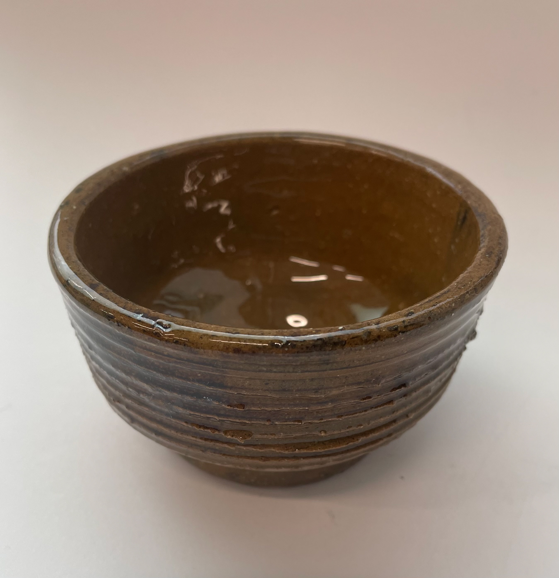
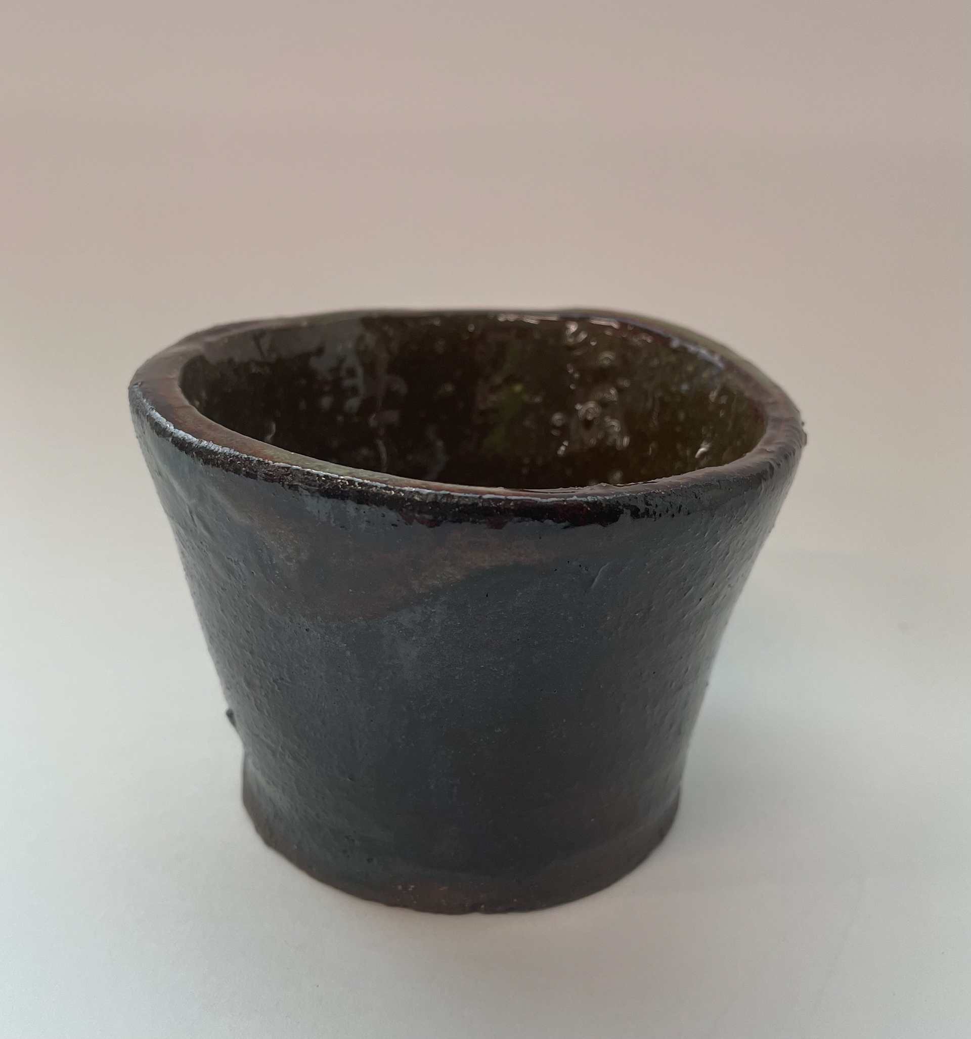
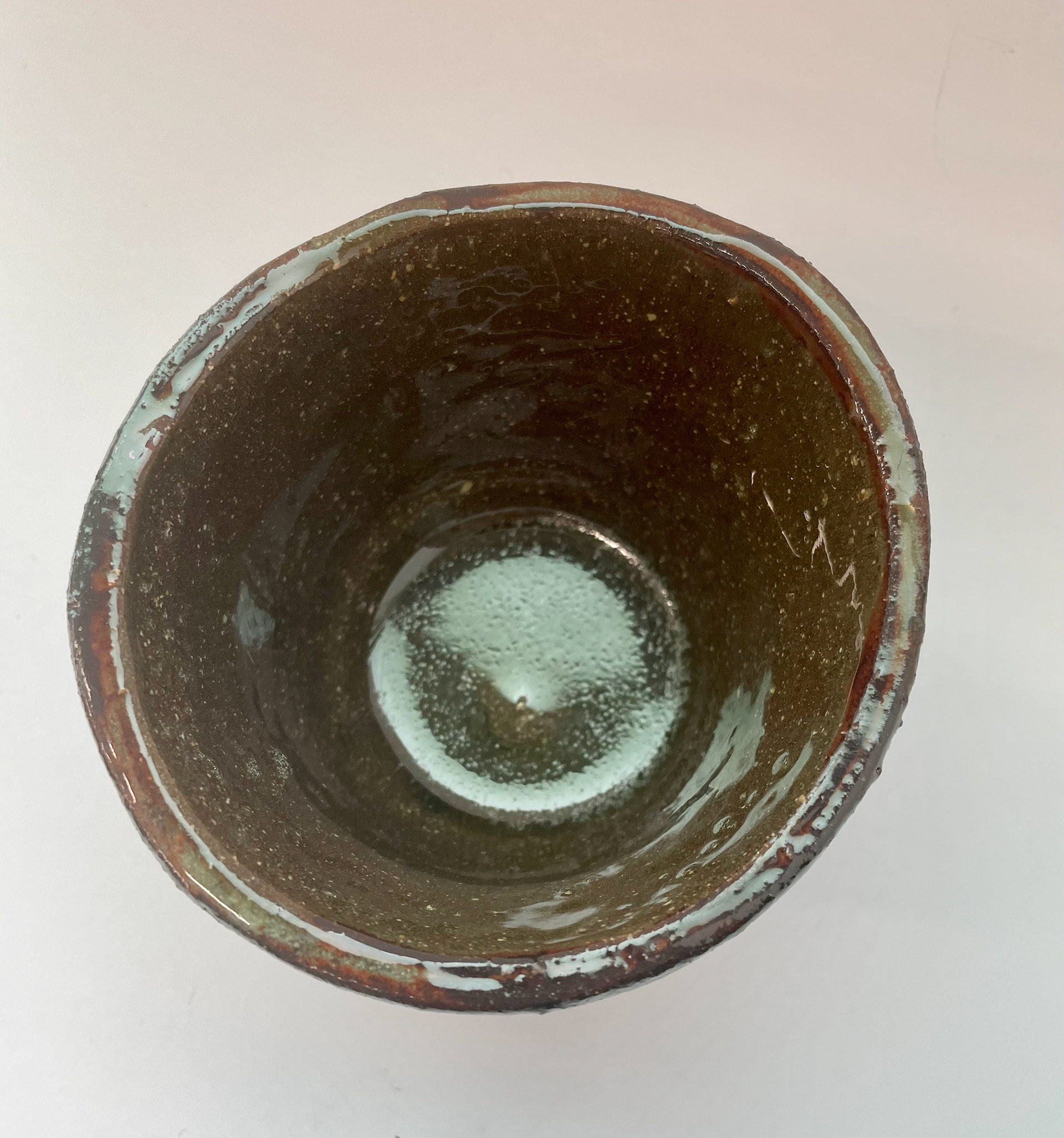
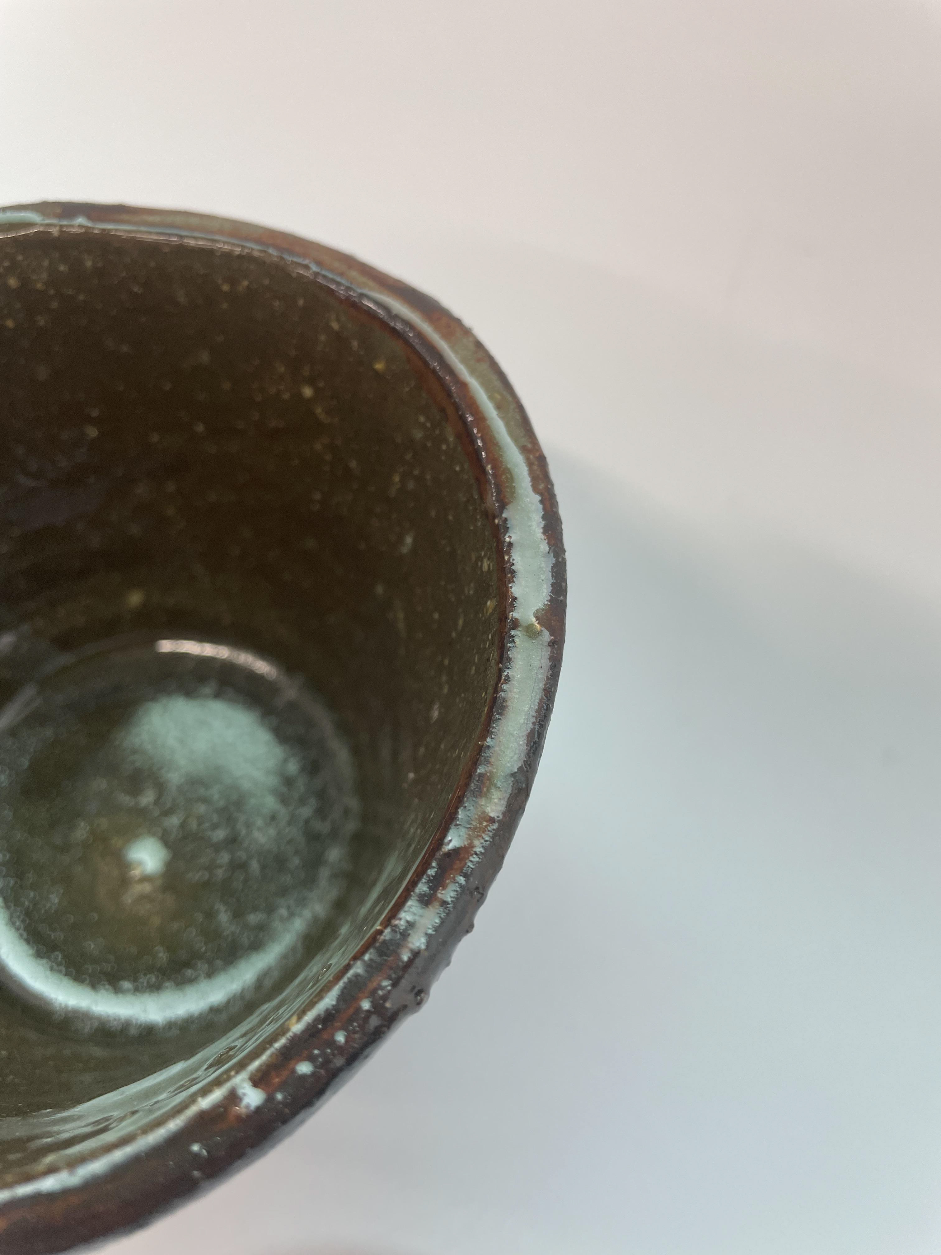
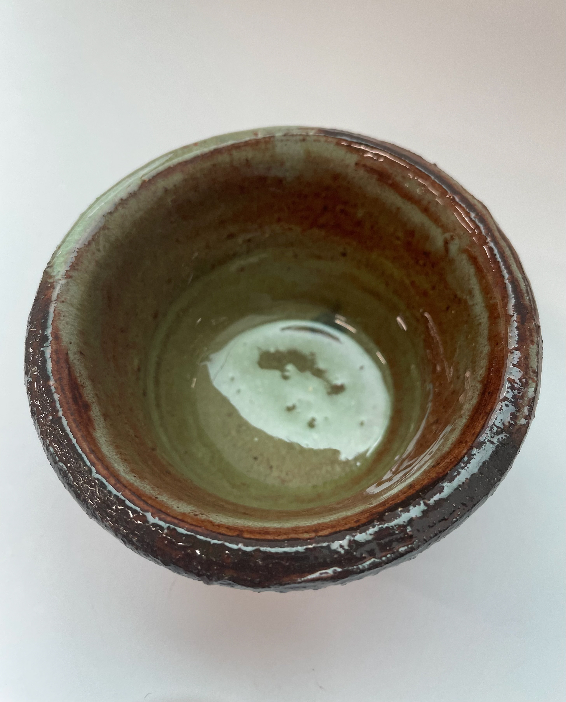
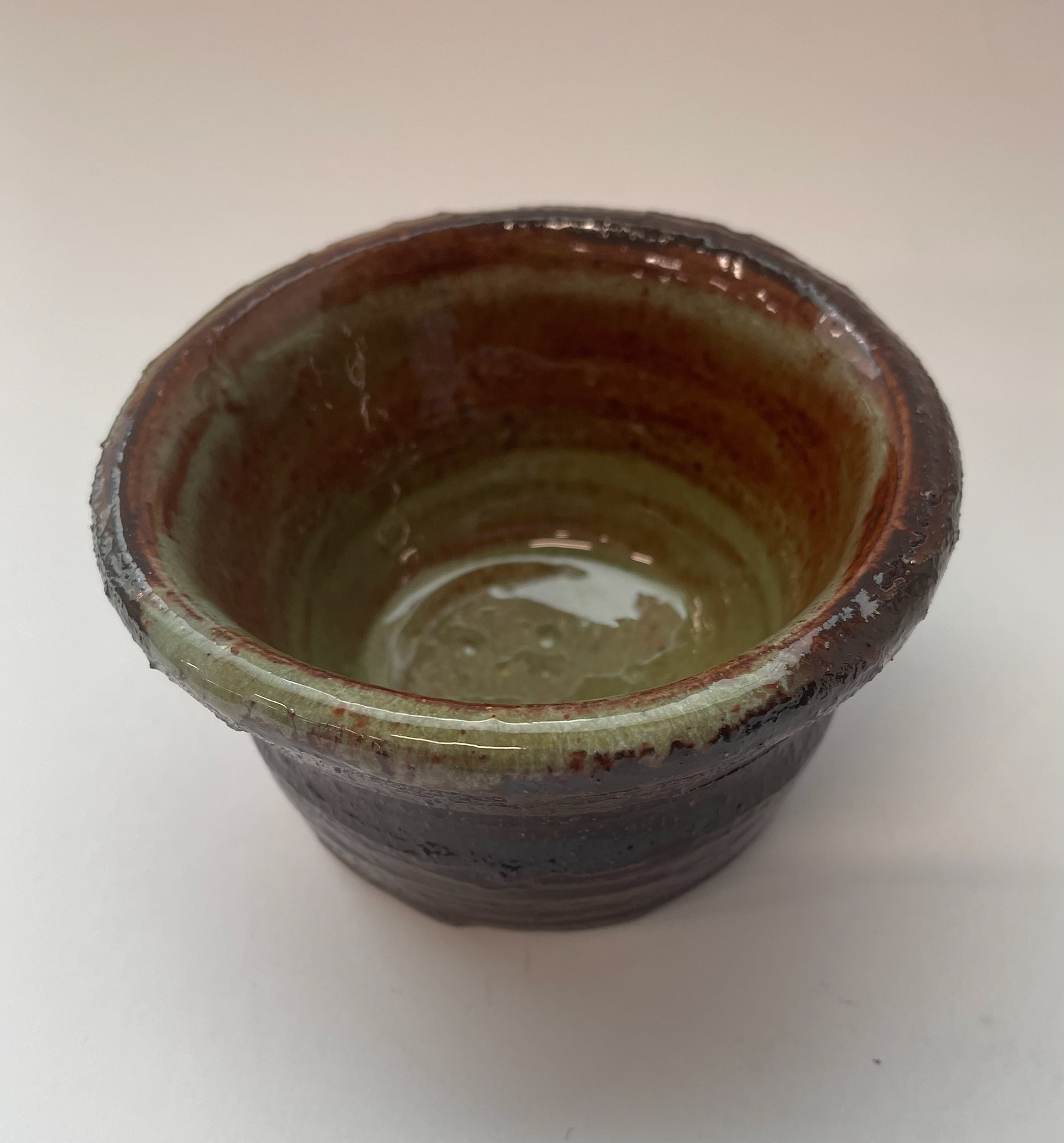
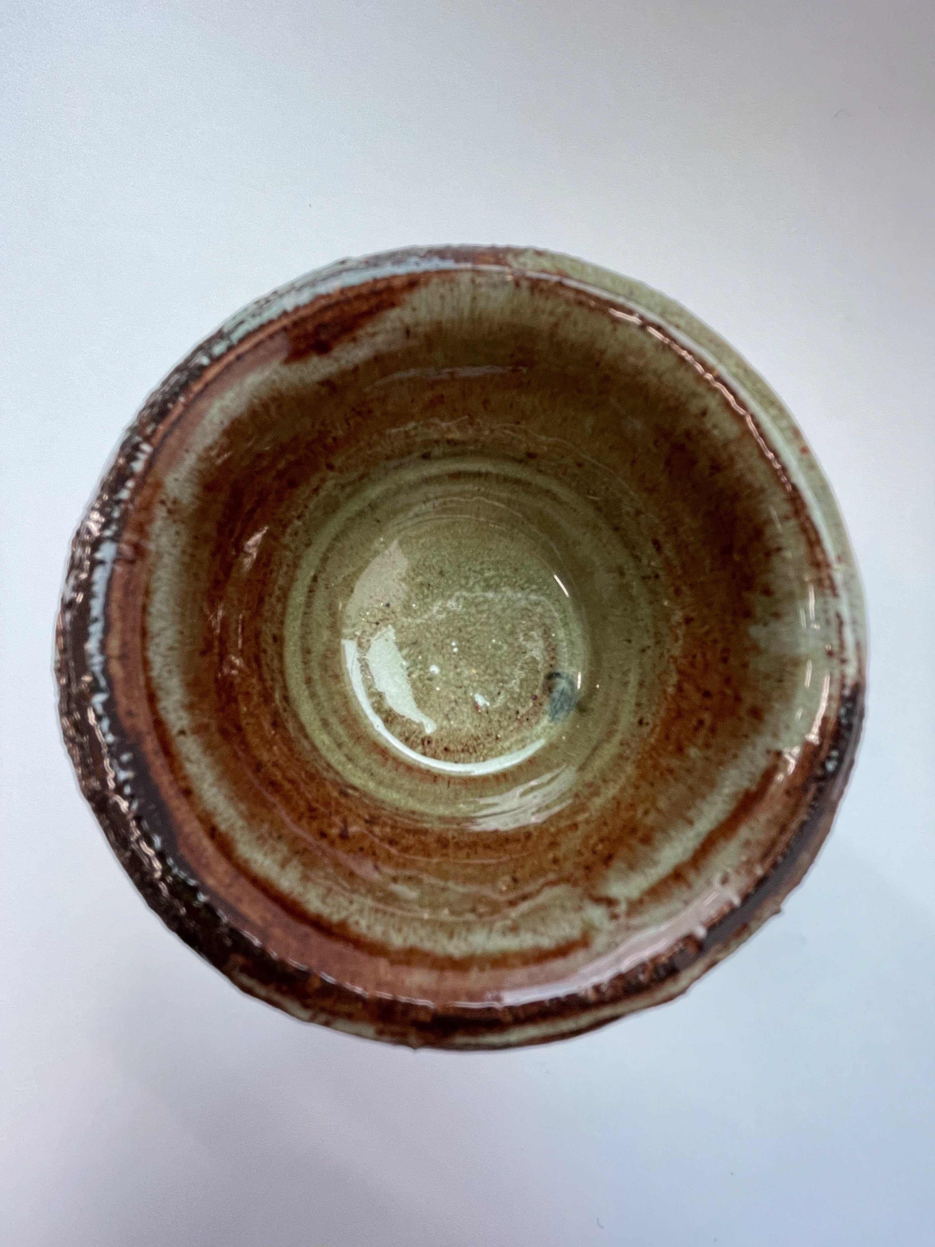
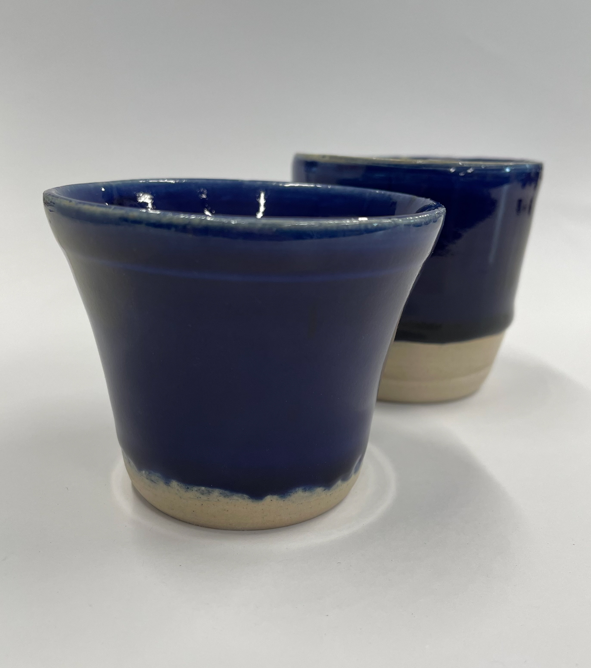
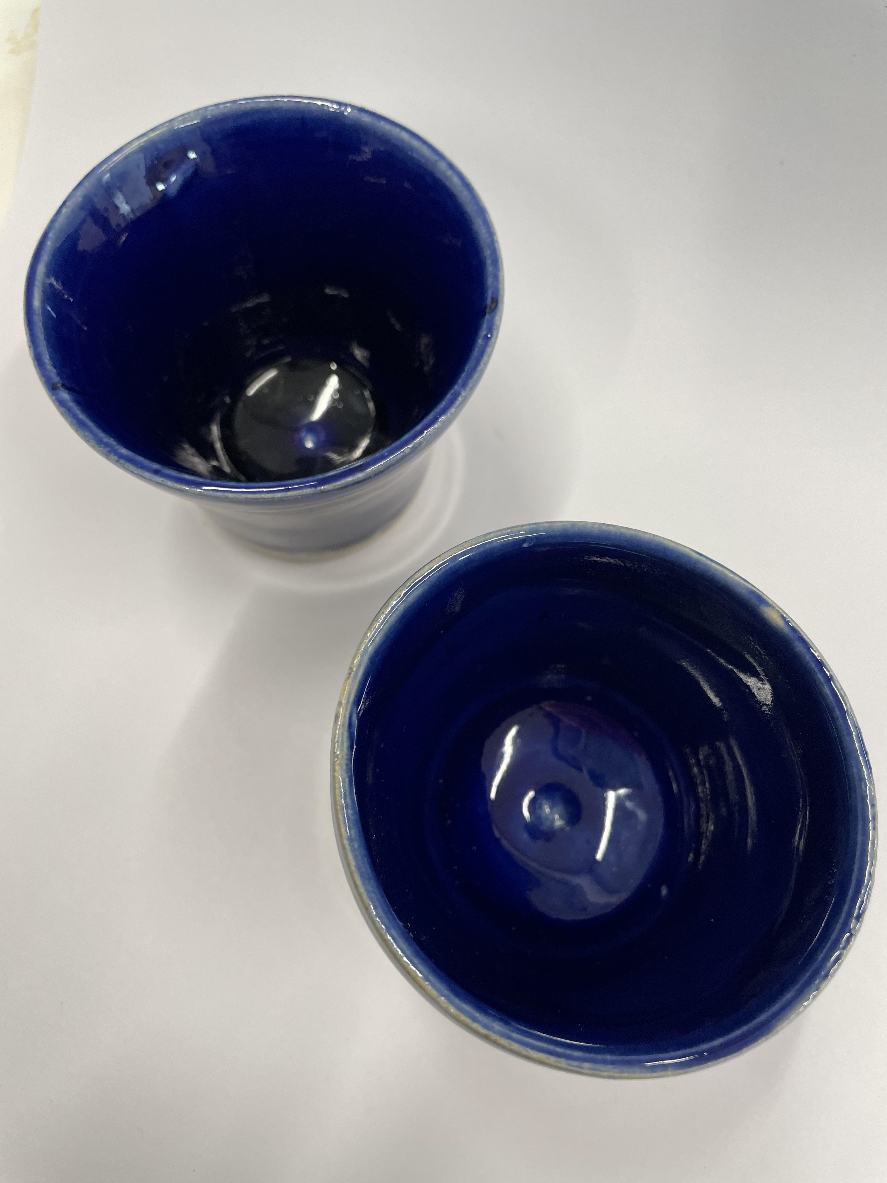
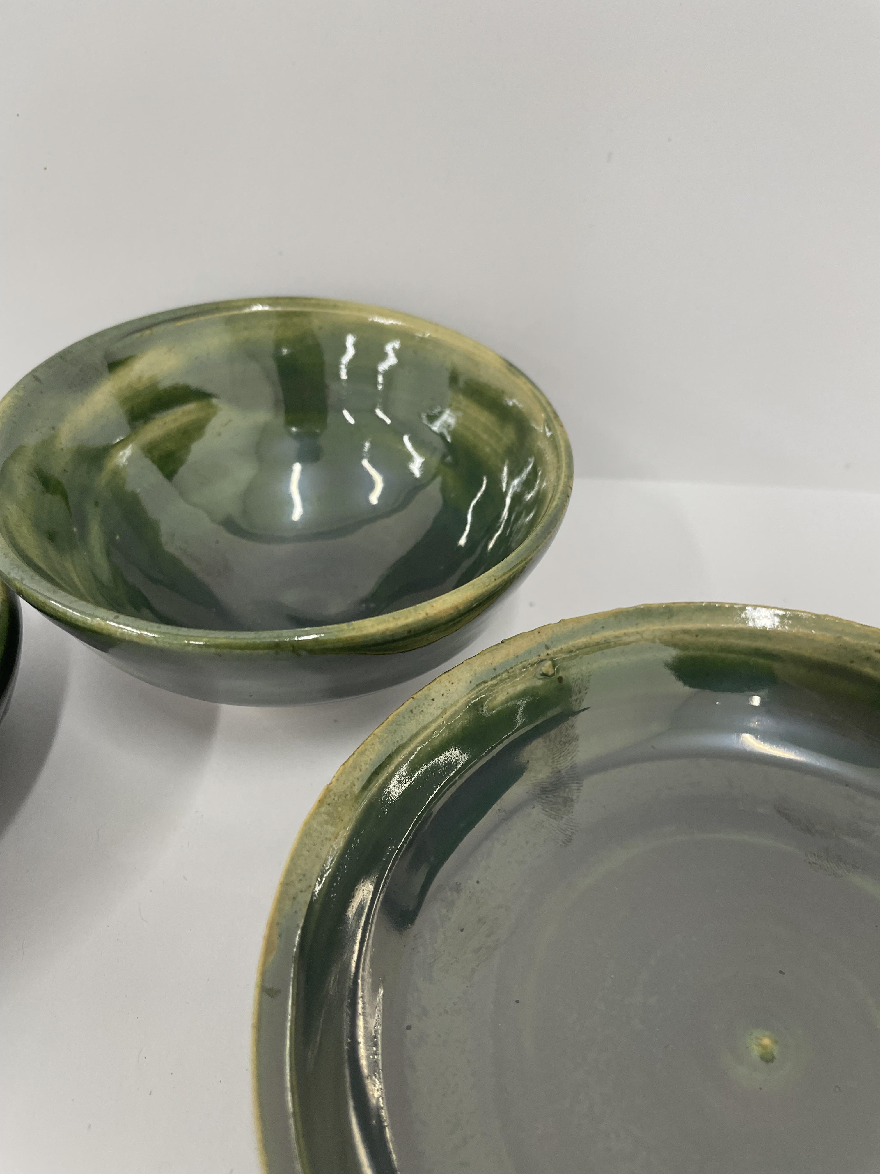
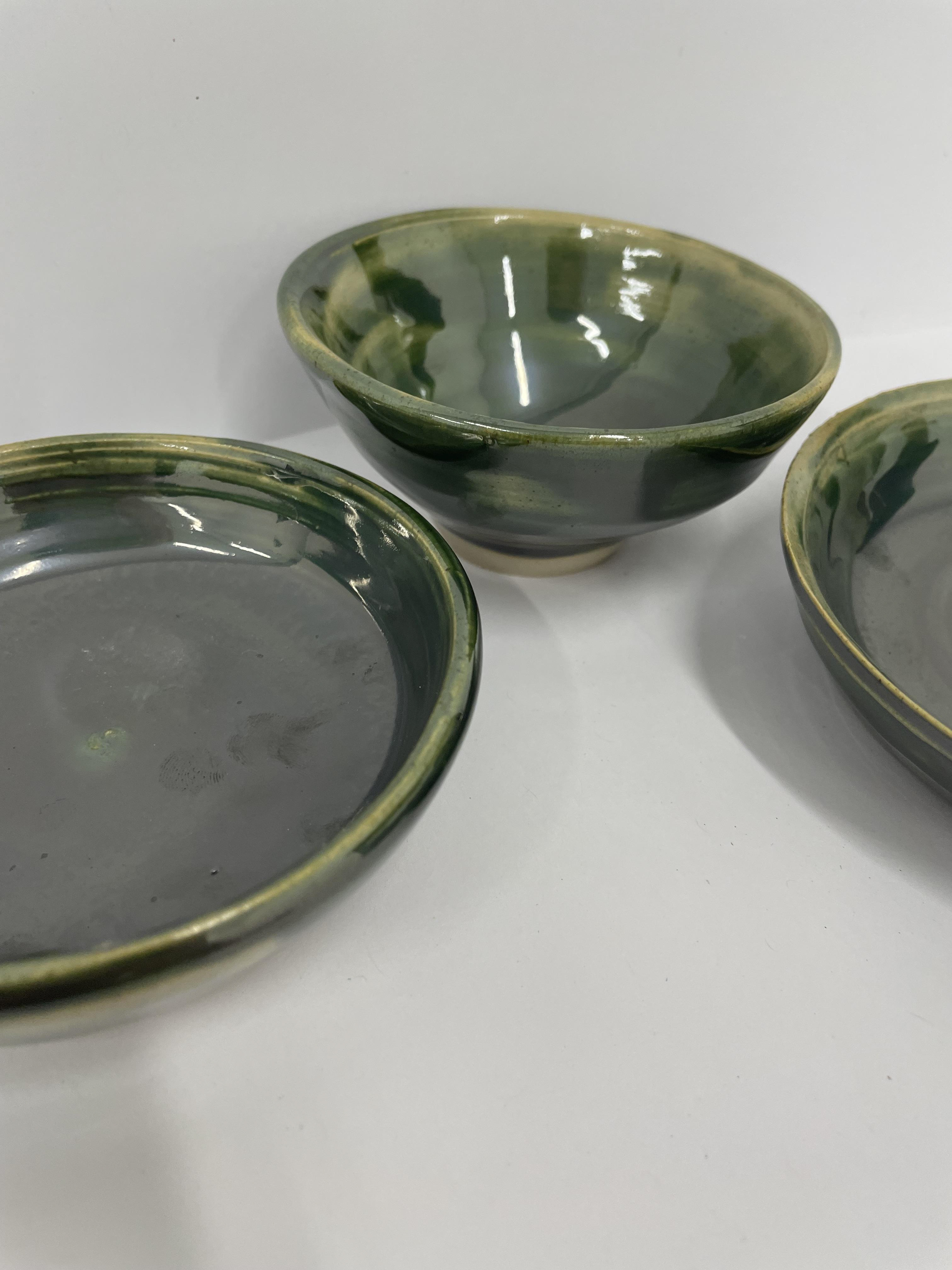
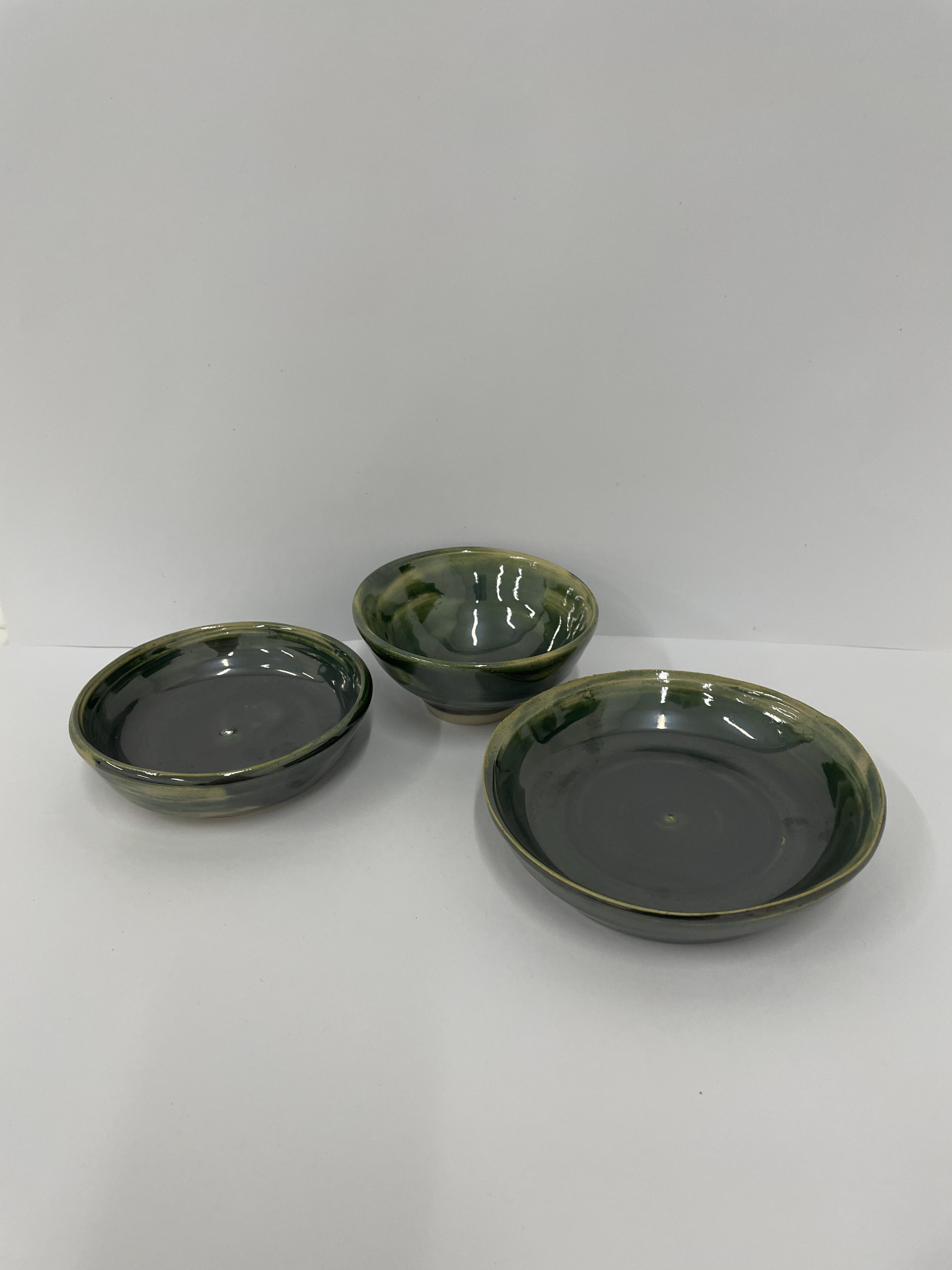
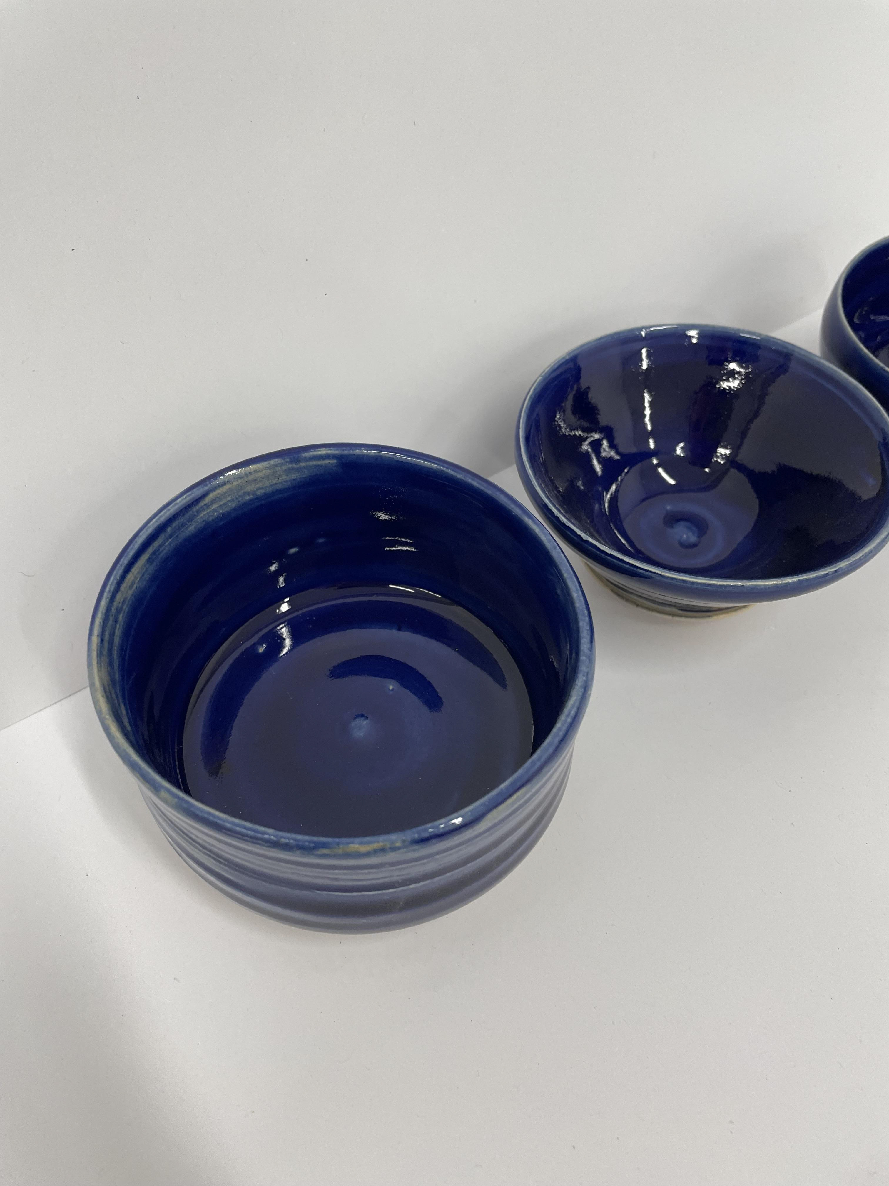
When creating a glaze for these pots, I used oxides and topped them with glazes. Cobalt oxide, copper oxide and chromium oxide are mixed with water to allow you to paint them on. These are on the base layer of the pots. Then they were dipped in clear glaze, honey earthware and tin shiny earthware glaze, allowing me to get an array of samples, test the glazes out, and look closely at the different effects and outcomes.
creating glazes
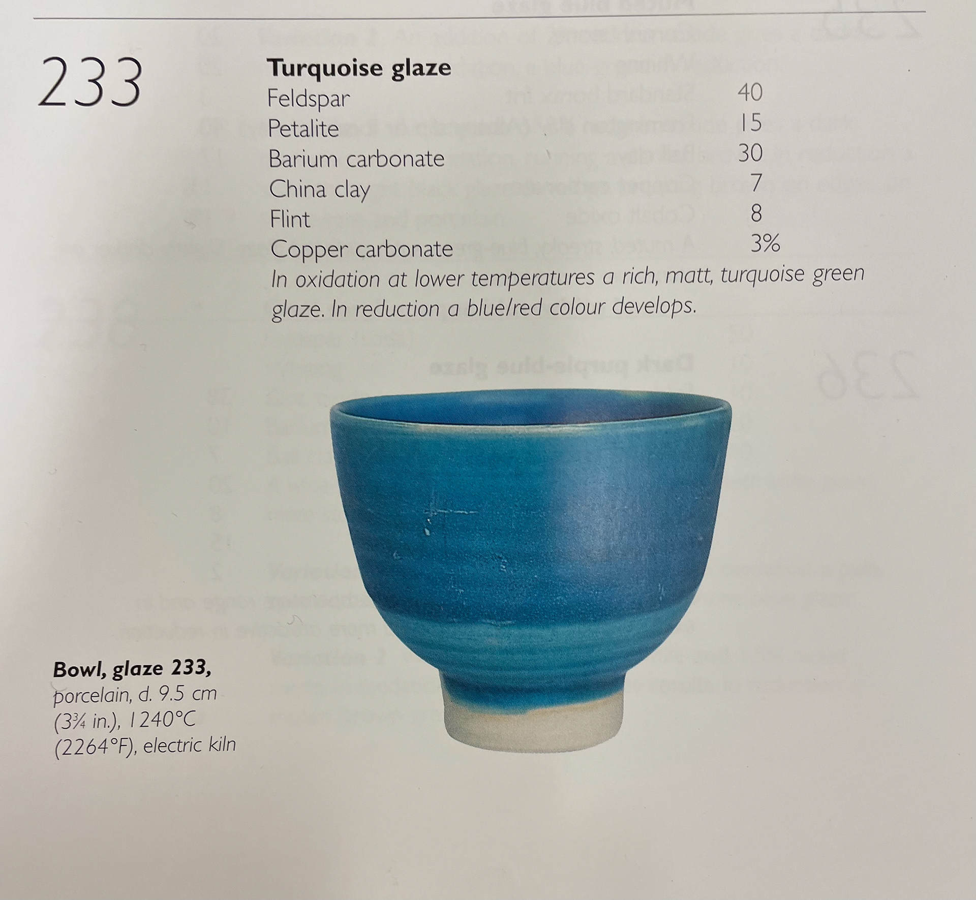
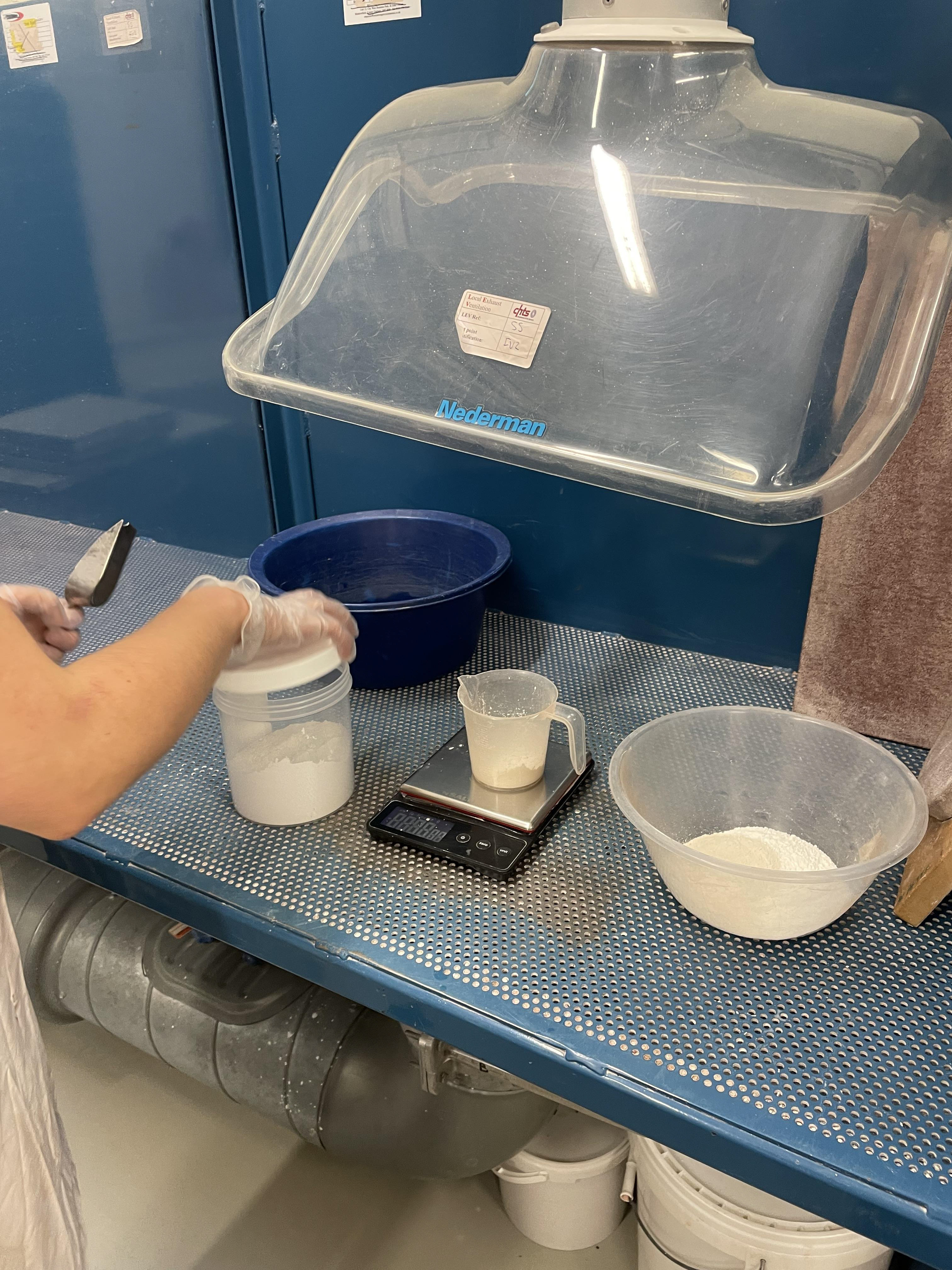
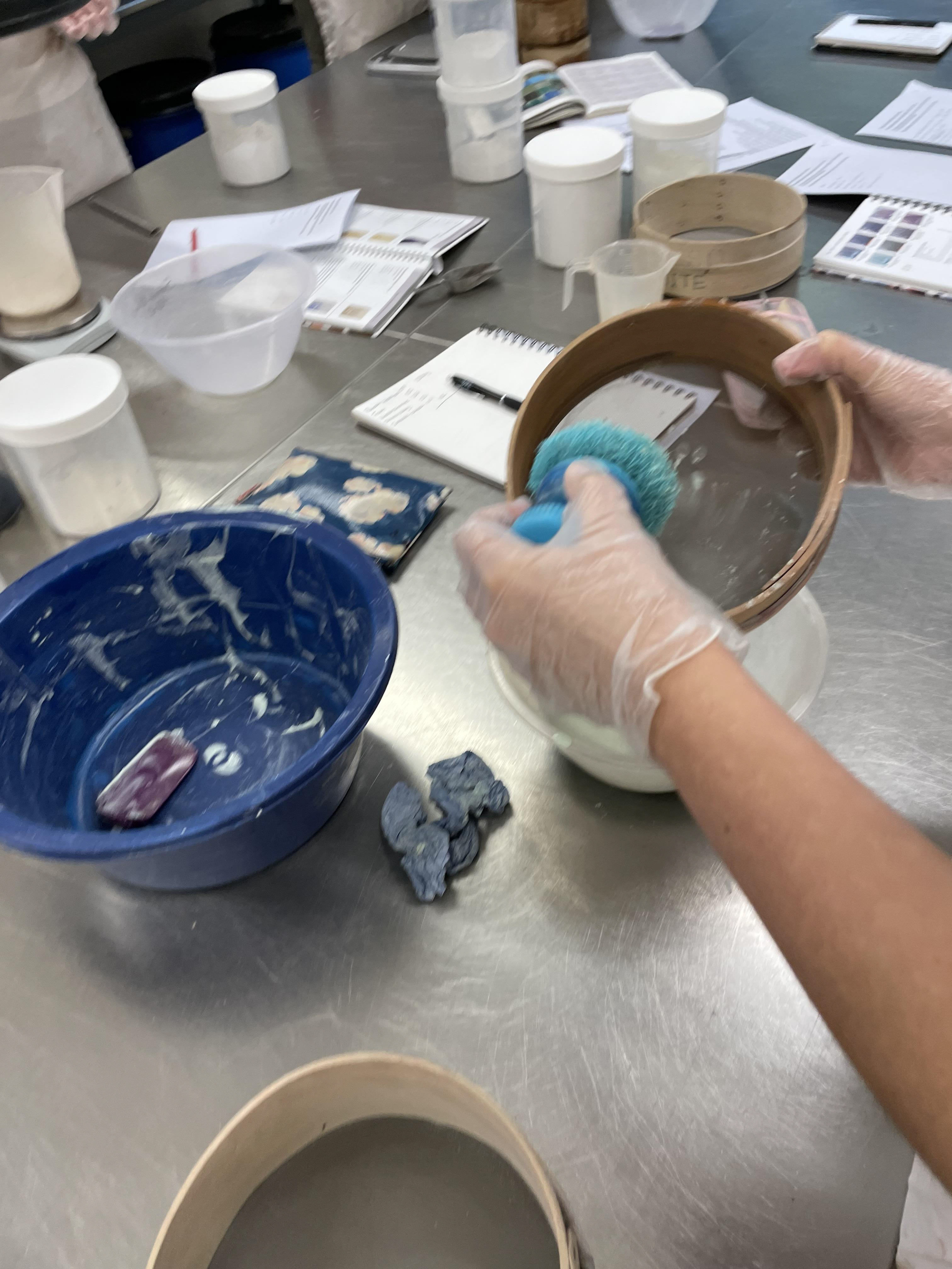
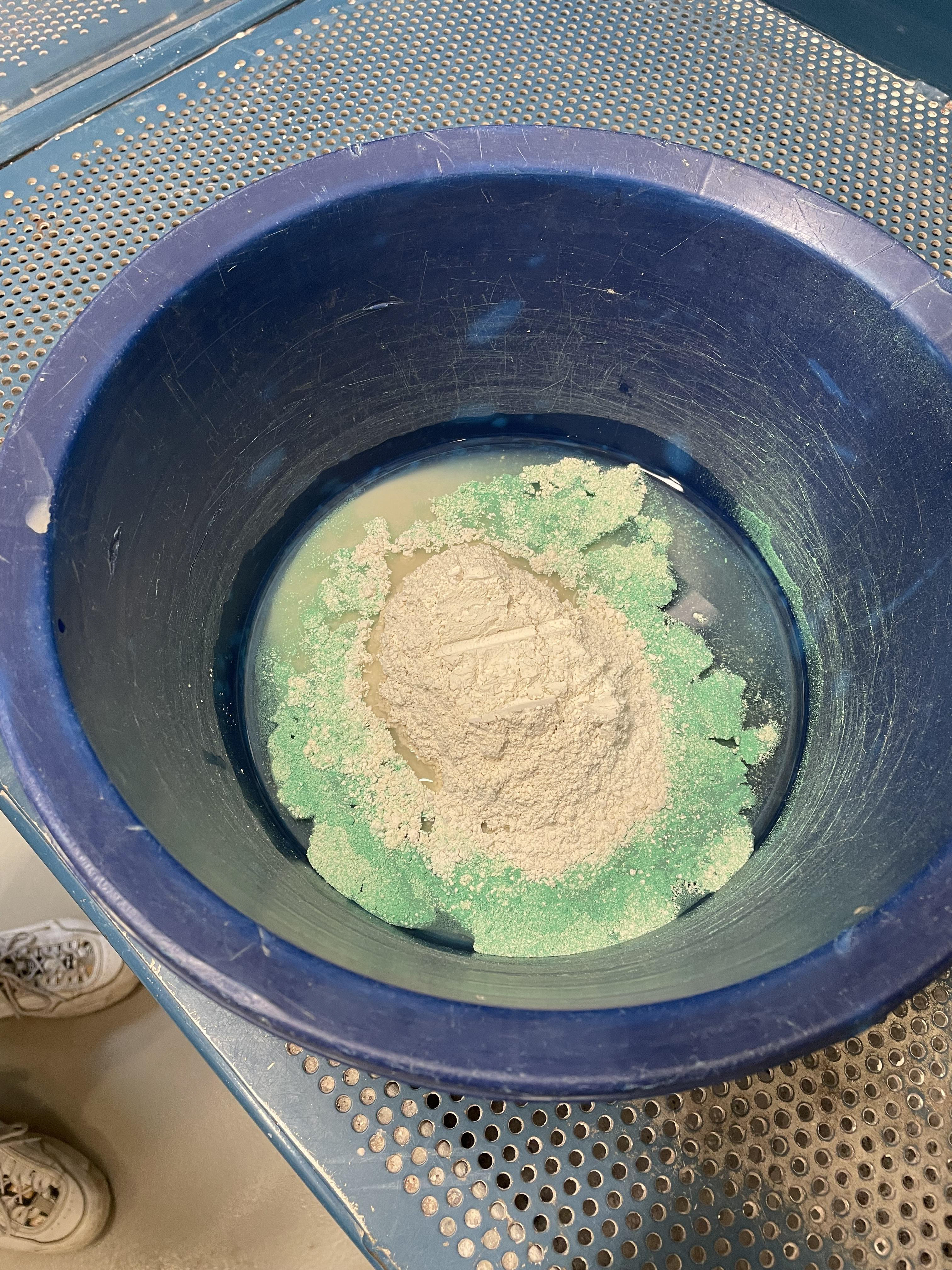
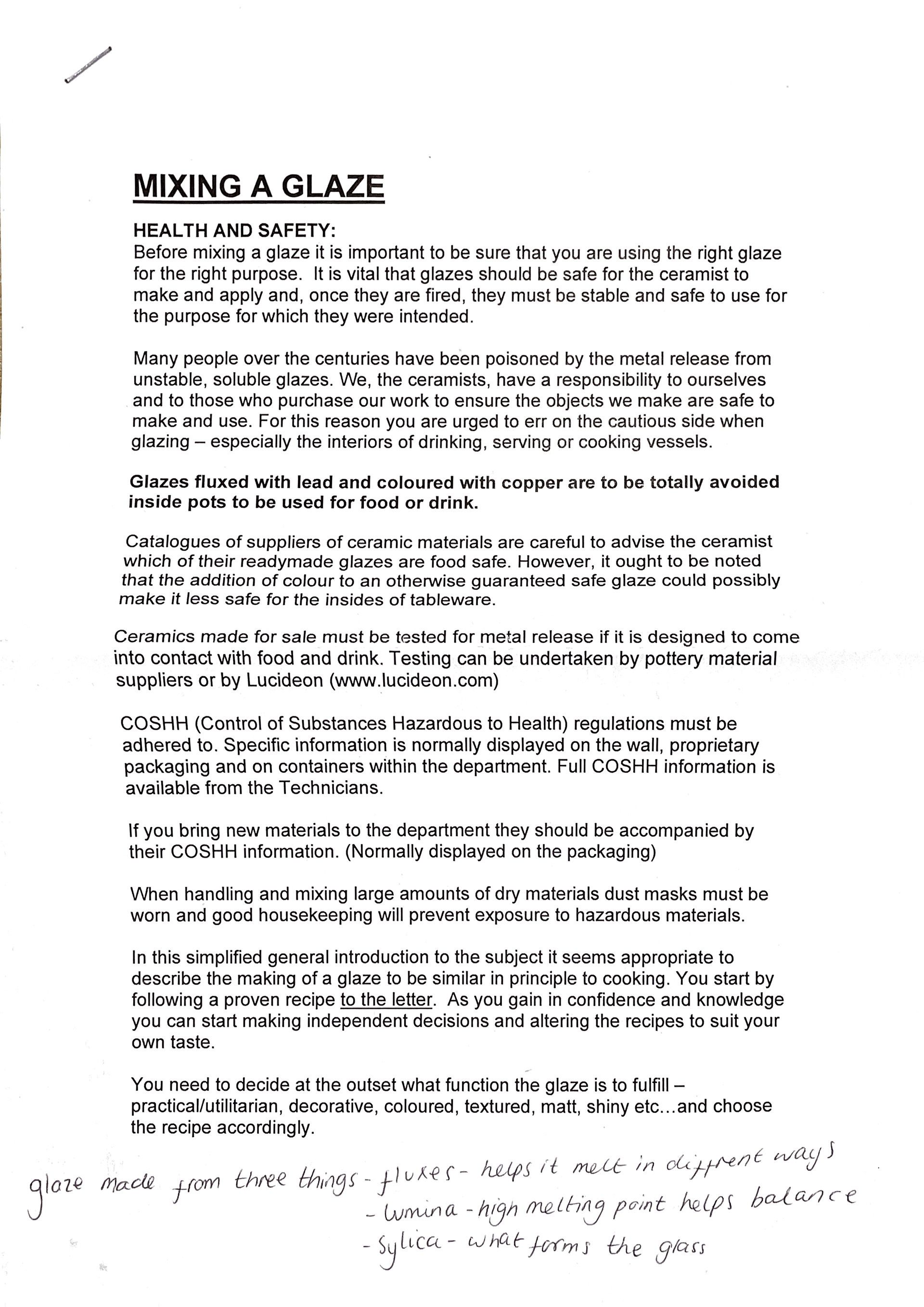
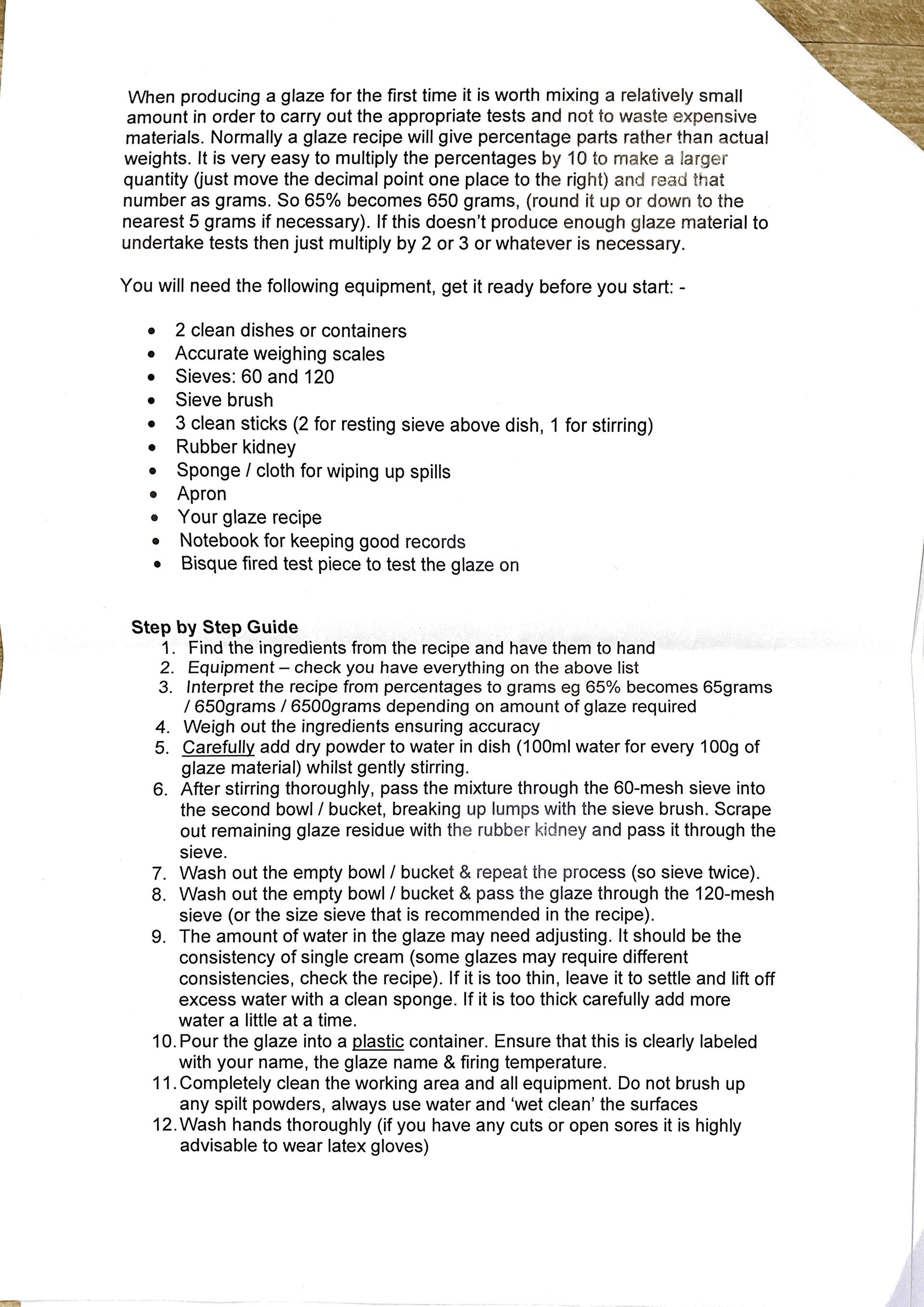
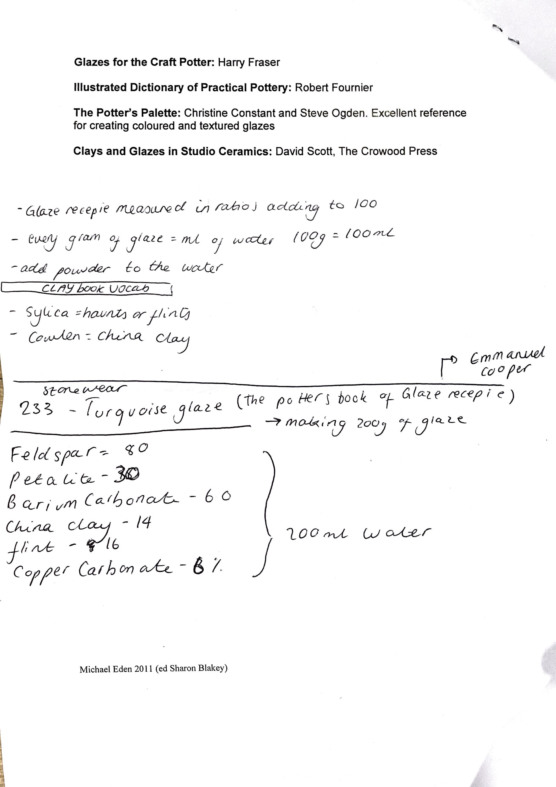
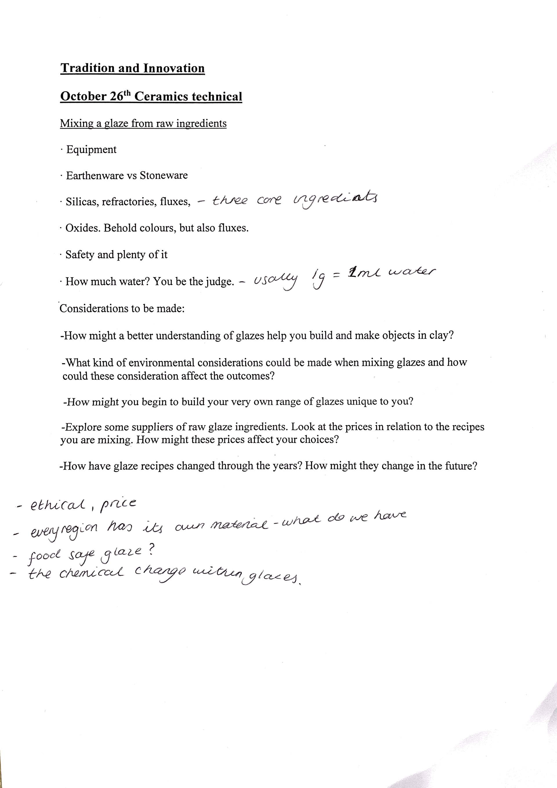
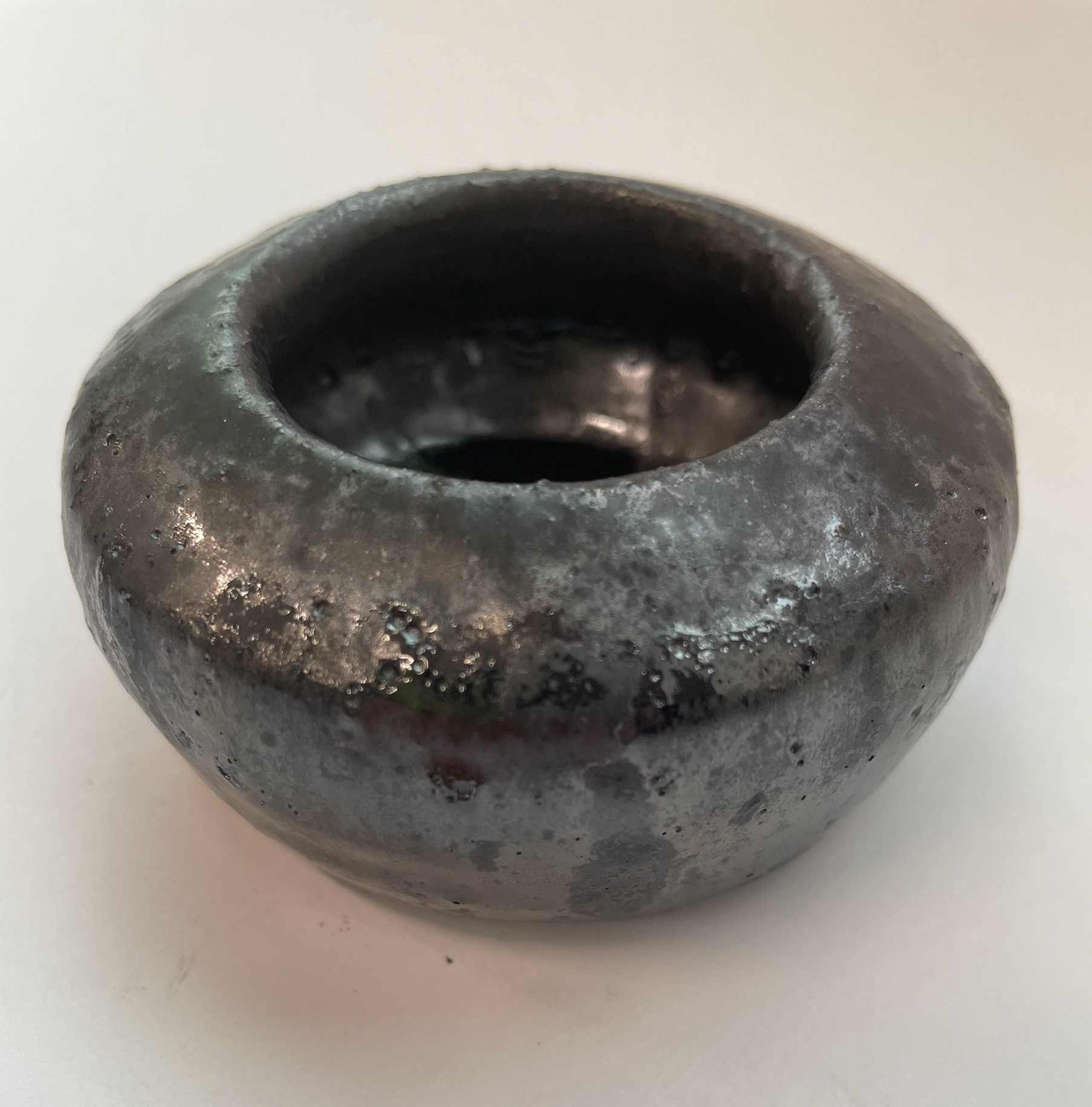
Creating glazes is a very interesting process. For following a recipe, you must ensure you are very accurate with your measurements and translate the measurement to how much glaze you want. I created a turquoise glaze recipe I found in the Potter Book of Glaze recipes by Emmanuel Cooper; we made 200 grams of glaze, so we had to change all the measurements to the total amount we needed. The process is easy to complete; however, many vital steps can ruin the whole process if forgotten. Marking what you have measured is key so you do not repeat putting in the quantities. Also, the health and safety steps of powered glaze are very dangerous for us to enhance. Therefore, we have to take precautions by having an extractor on and depending on what glaze ingredients you are using; some can be toxic and dangerous to the skin; therefore, glazes and extra precautions are needed. This is something that I want to explore further. I enjoy making my glaze and pushing it further, editing original recipes to create my unique glaze.
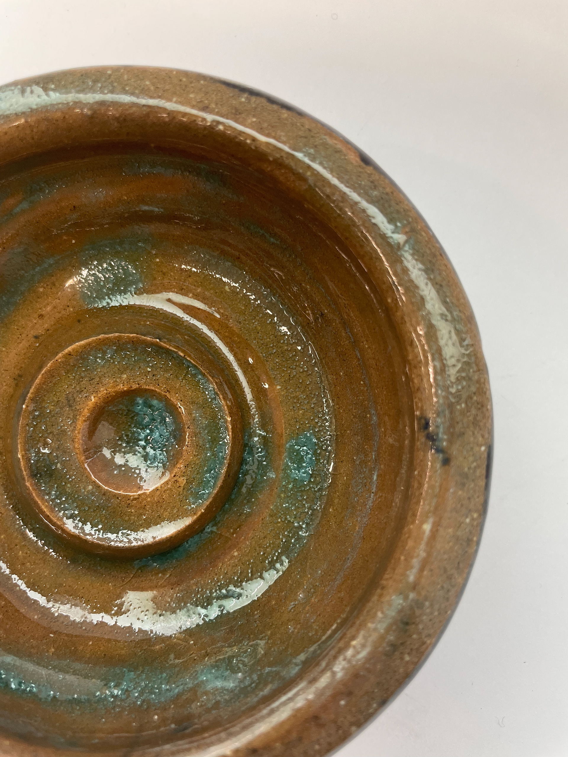
This glaze was a very interesting outcome it was very watery which meant that I had a very interesting application and I had to do a few layers of it to stick to the fired clay, due to its consistency it also meant that it pooled a lot on my pieces having an uneven application, however, I don't mind this effect as it's interesting to see it react with different textures of the clay.
tiles around the world
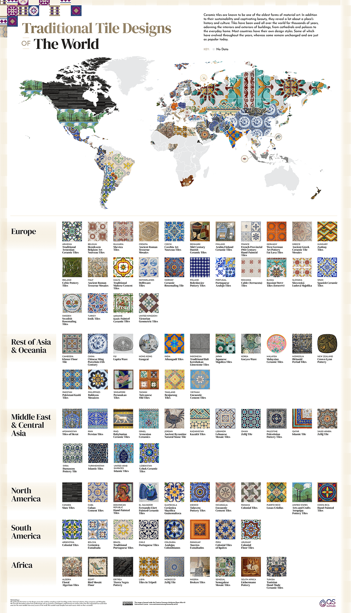
figure 5
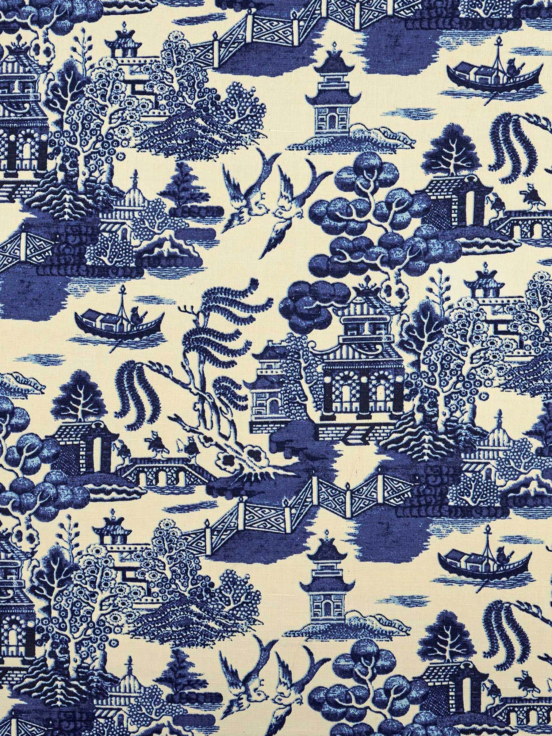
Tiles are used worldwide for decoration, buildings, hygiene and many other reasons. All around the world, different cultures have different tiles from materials, processes, and patterns. These all depend on the location of countries, the trends and traditions. Estimated to have first been used around 1000 BC, the earliest examples were found in China and Egypt. Tiles have innovated throughout the years.
Europe- in the 17th century, Europe saw a rise in delft tiles, influencing tile designs across modern Europe. Industrial advances and modern society made geometric and encaustic tile highly popular in Victorian England, influencing surrounding countries.
South America- South American tiles are heavily influenced by azulejos, a form of Portuguese and Spanish tiles decorated with glaze dating from the 16th century, filled with bold, bright colours. The South American azulejo evolved through the modernist era from plant-like to geometric patterns, with important buildings having more diverse colour pallets. It was seen that Brazilians were some of the first to use decorative tiles on the exterior of their buildings to protect them from the tropical humidity.
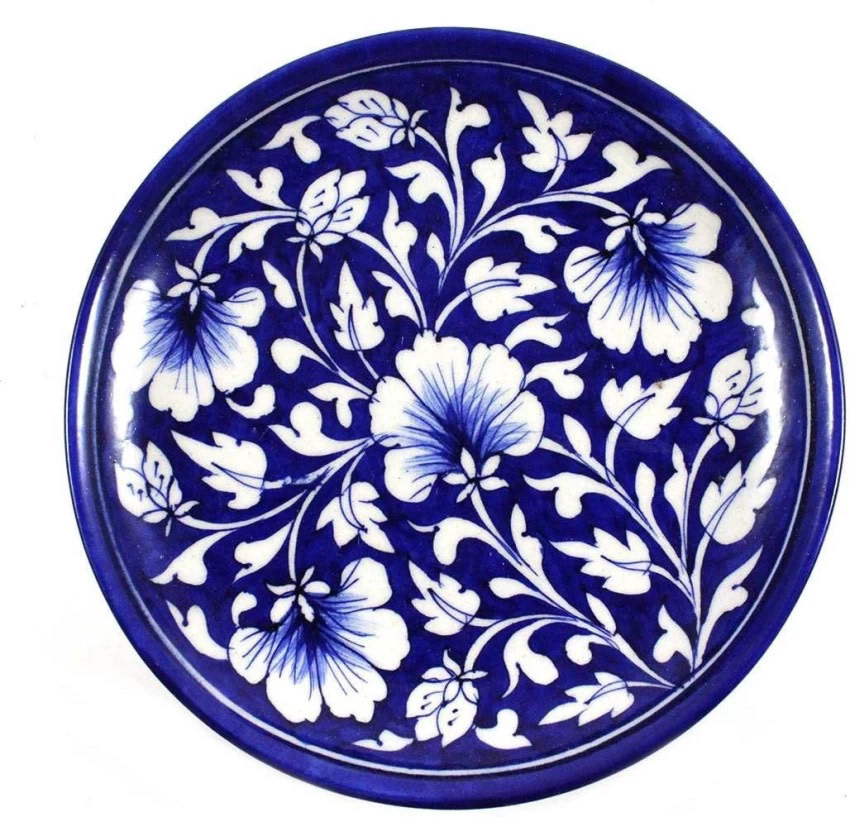
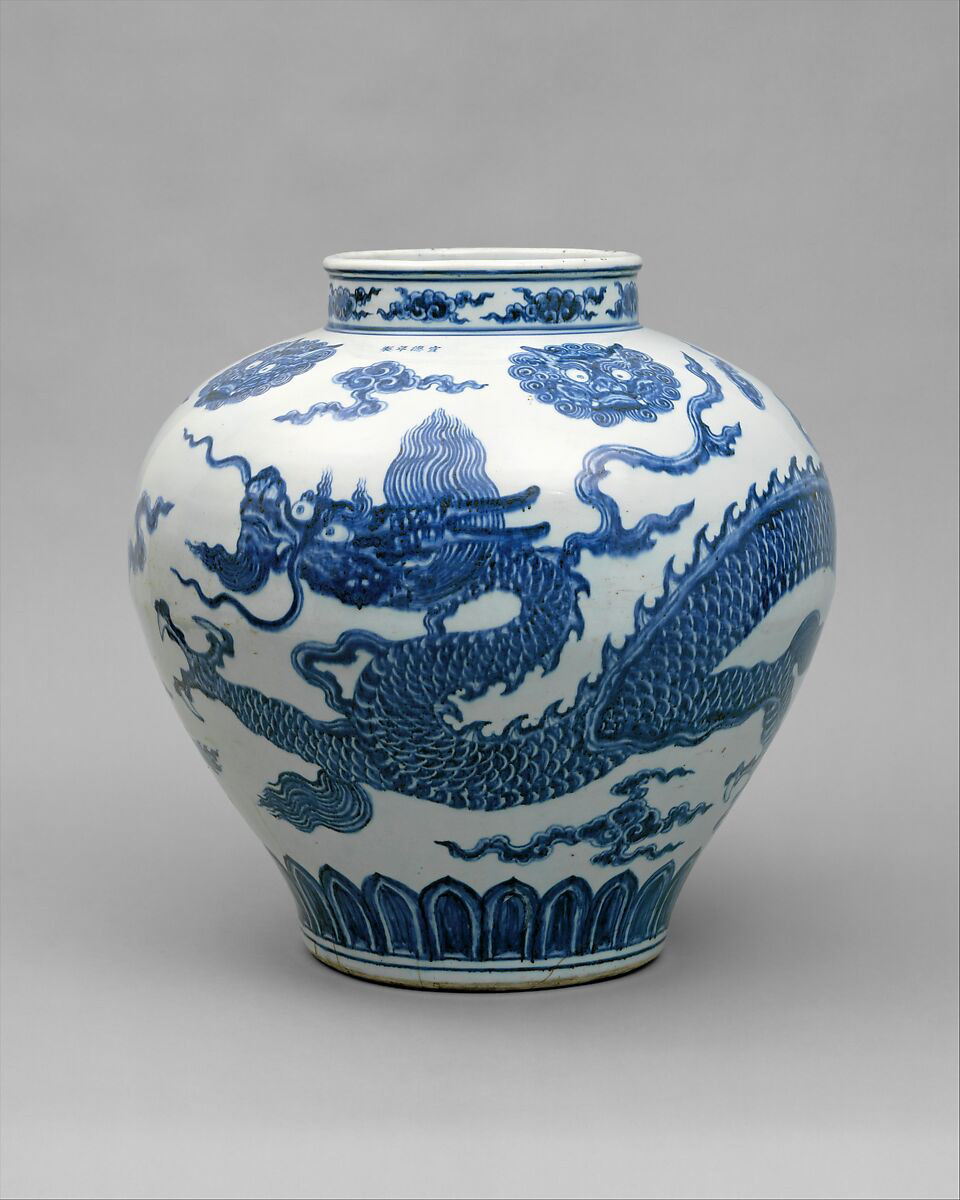
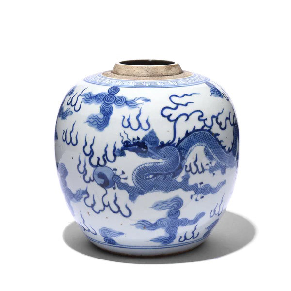
Asia- for thousands of years, China has been the leading country in producing mass tiles. Porcelain was the most popular material after the 17th century. It had a distinct ming porcelain, a unique blue and white design used in plates, tiles and bowls. Surrounding countries were heavily influenced by designs worldwide, from traditional Islamic designs to Victorian styles.
Chinese Ming Porcelain
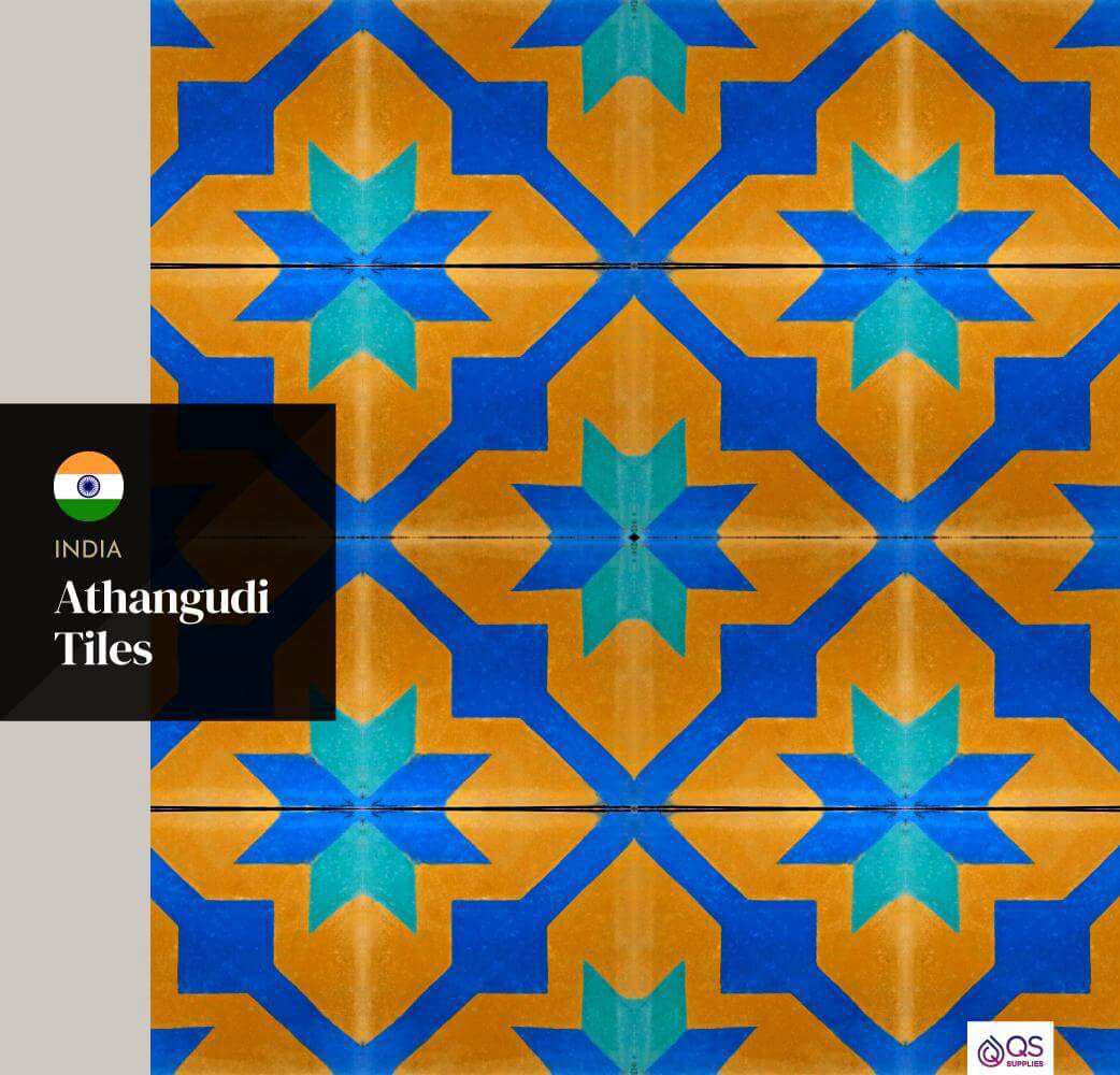
India Athangudi Tiles
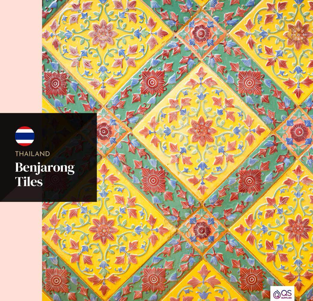
Thailand Benjarong Tiles
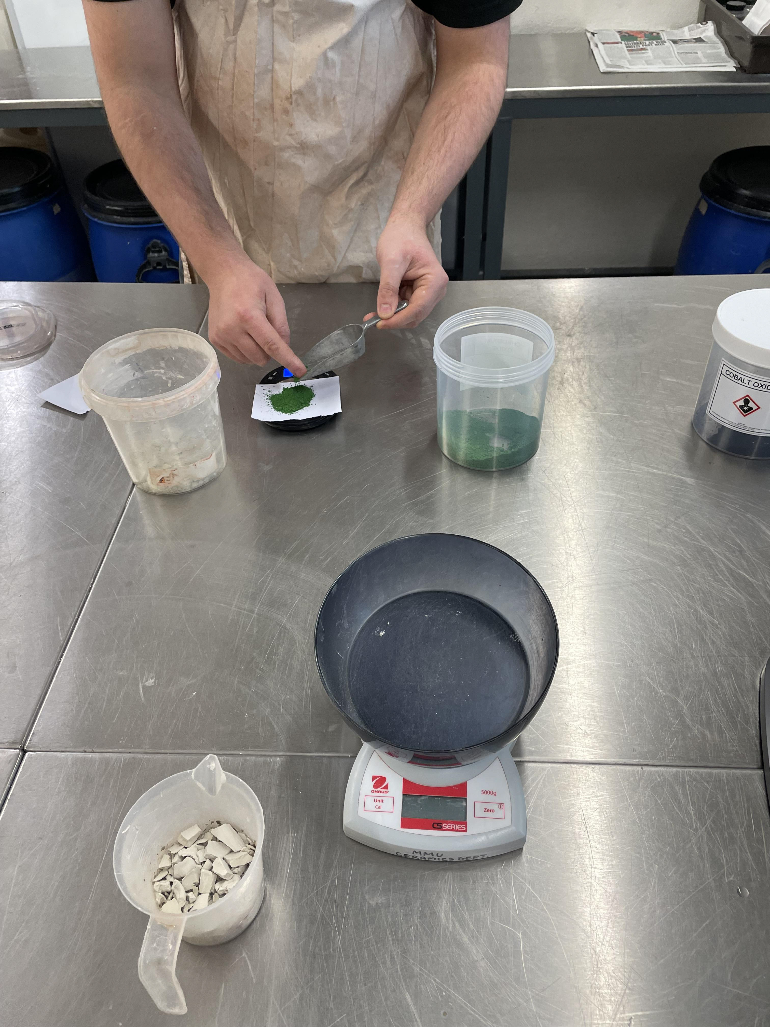
I also want to explore the colour pallet of the tiles, as I'm not using glazes to decorate my tiles. Colour clay is something that I need to explore more. Clay is coloured using oxides, and combining it with the clay, the more oxide you use, the more vibrant the colour. This is also applied to the slip you colour with oxides.
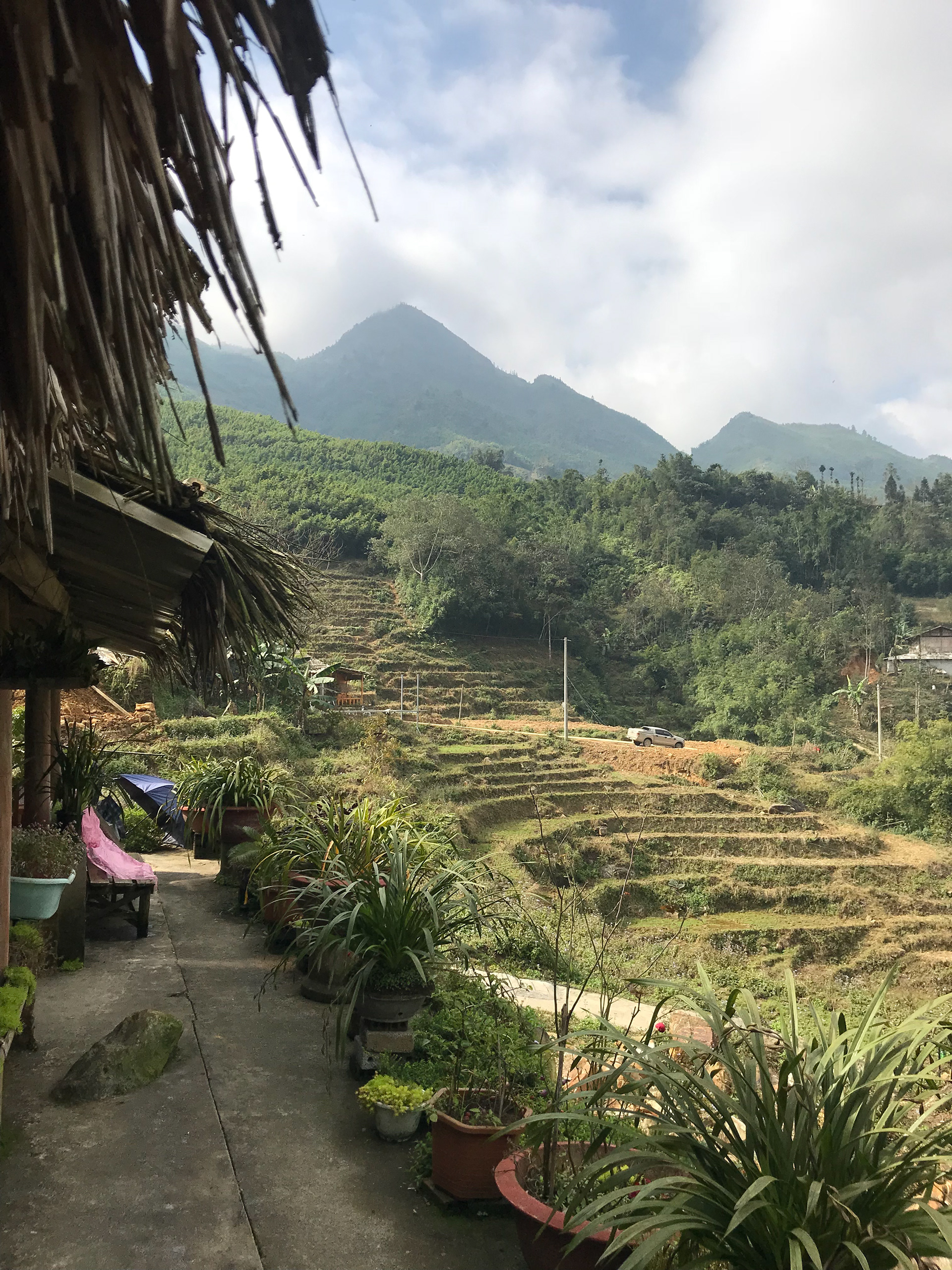
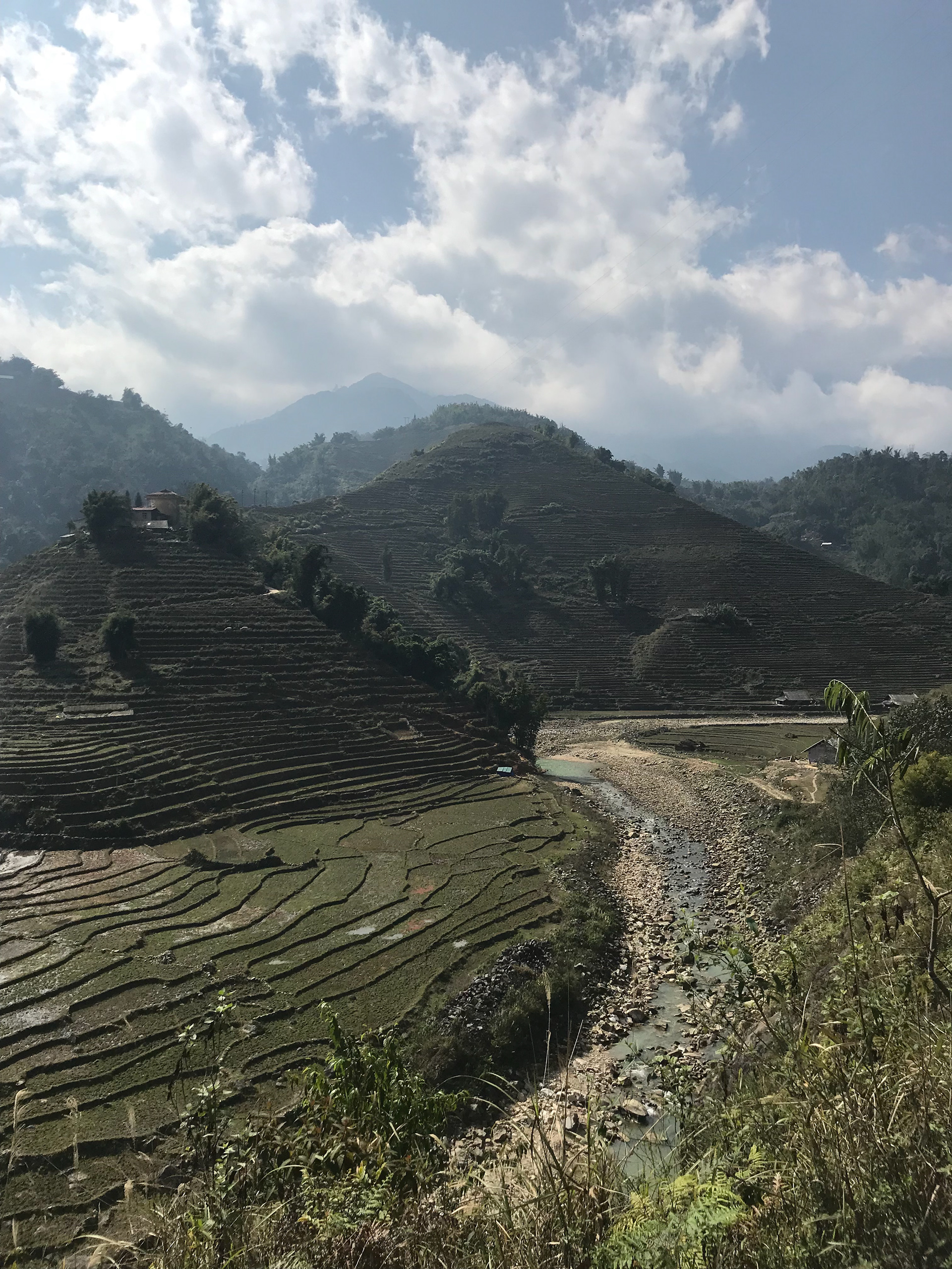
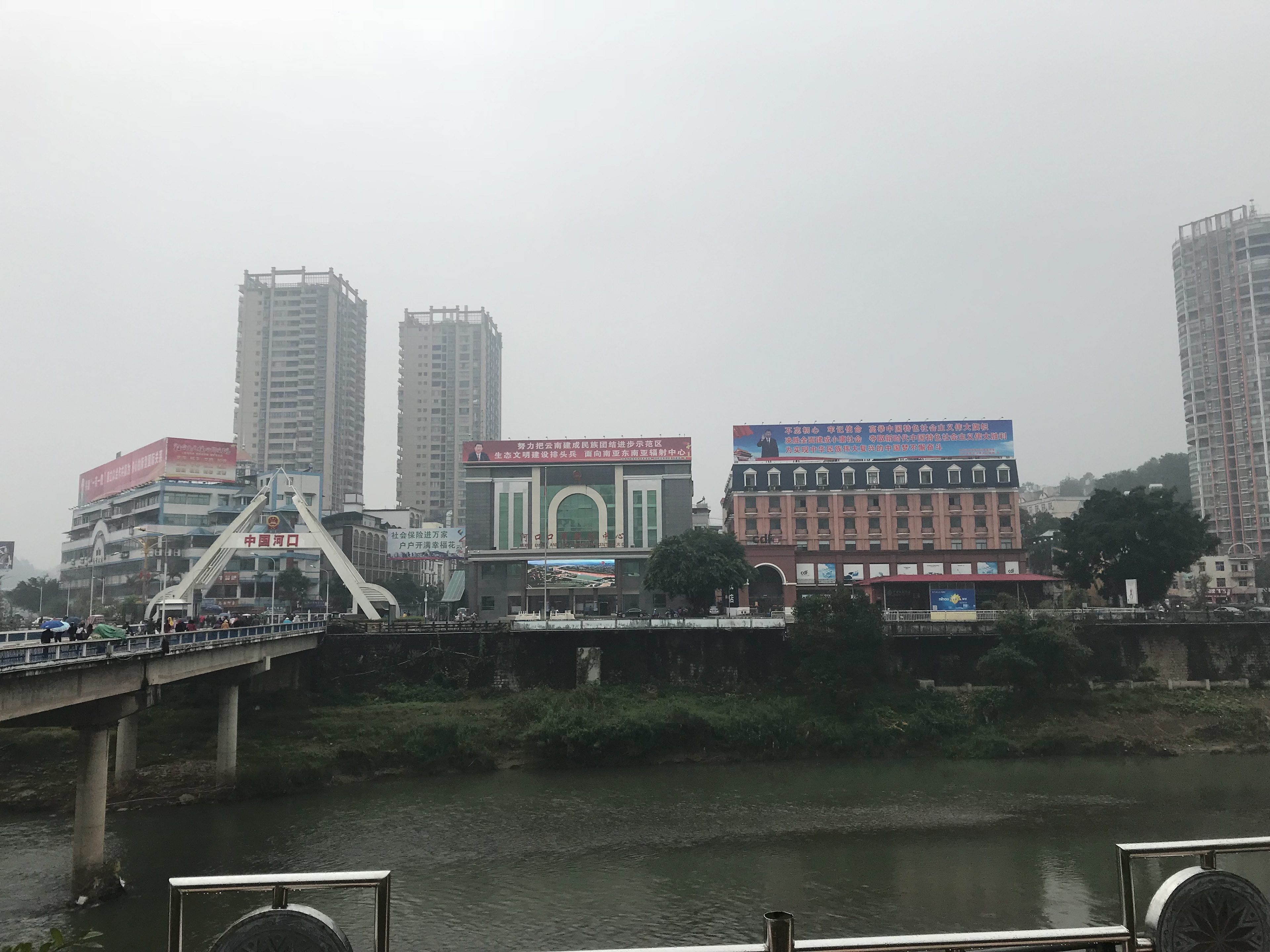
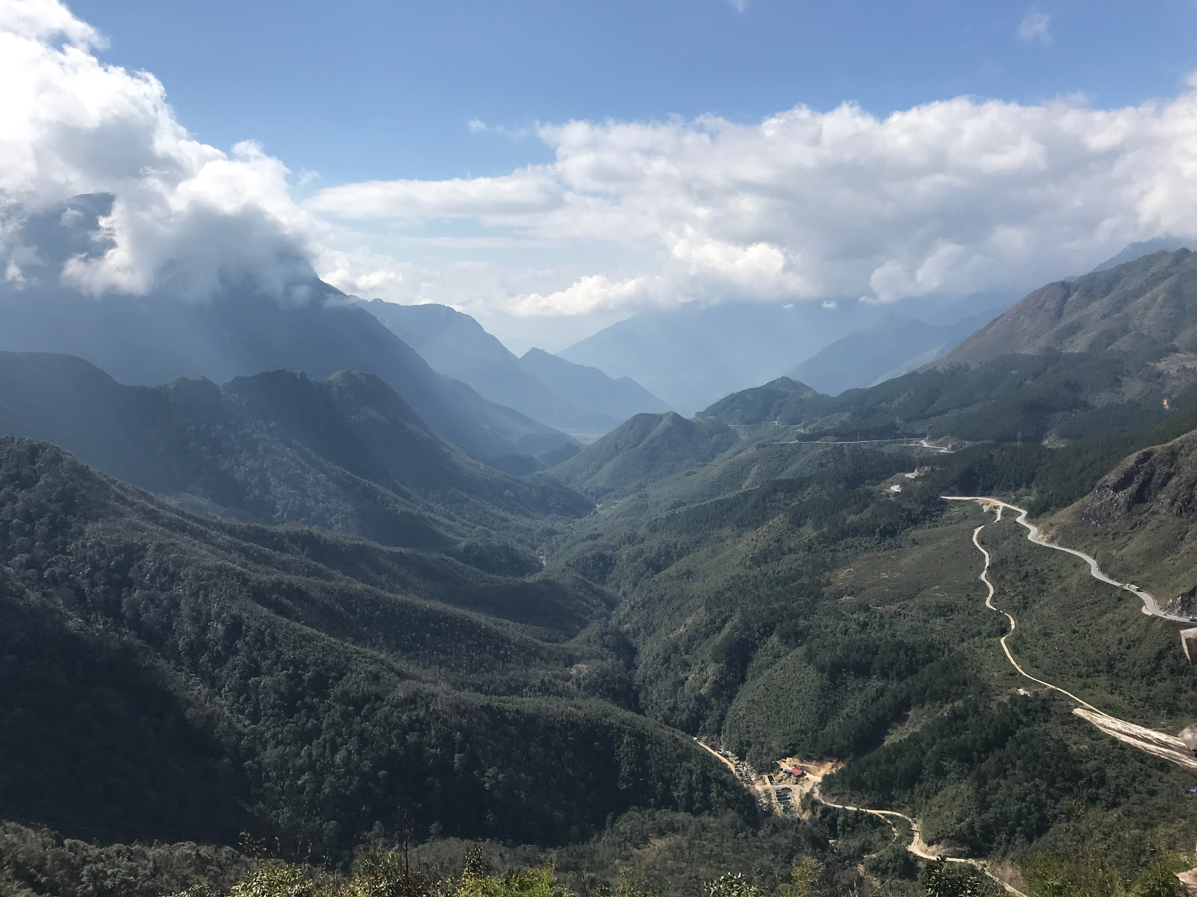
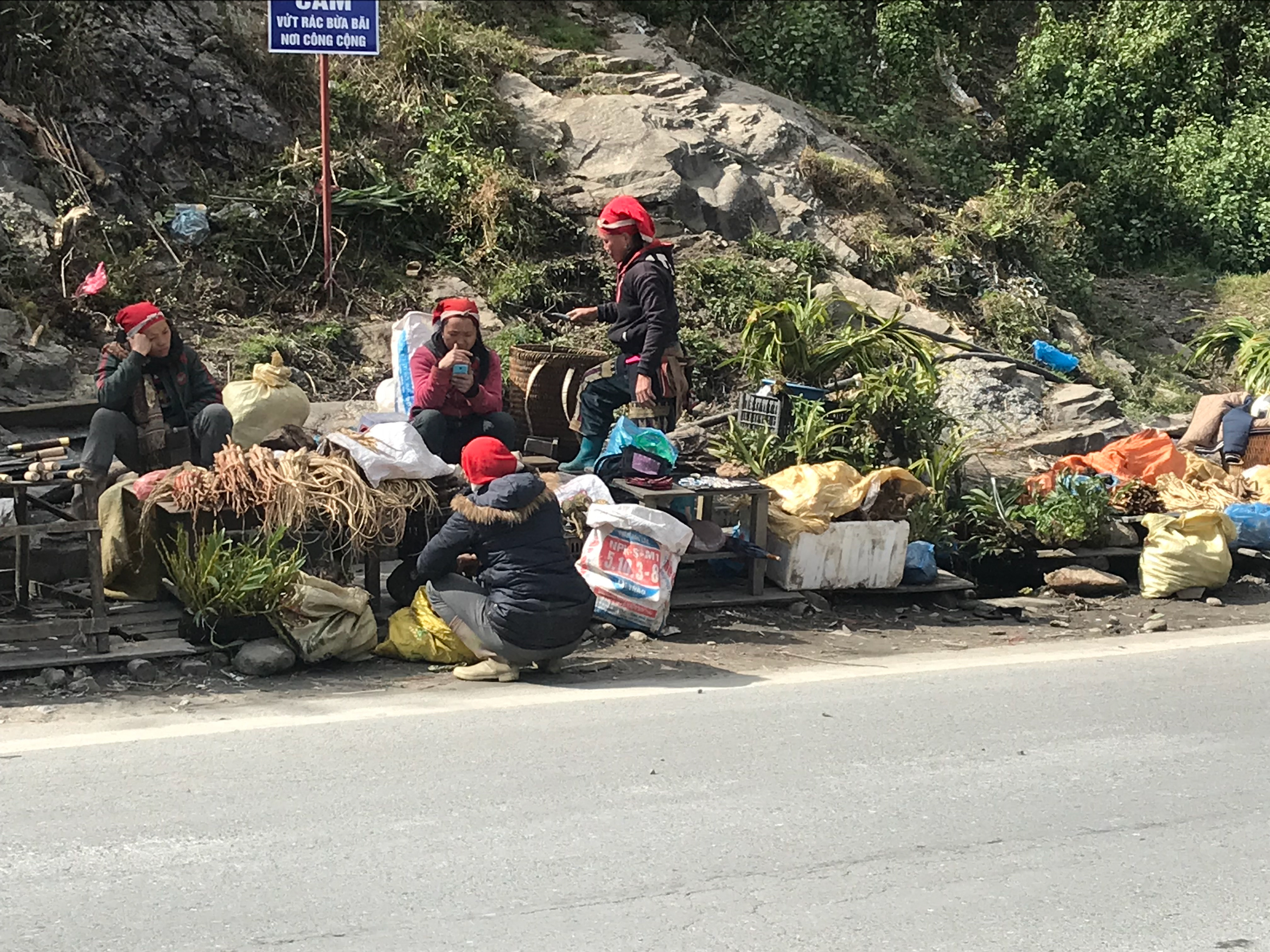
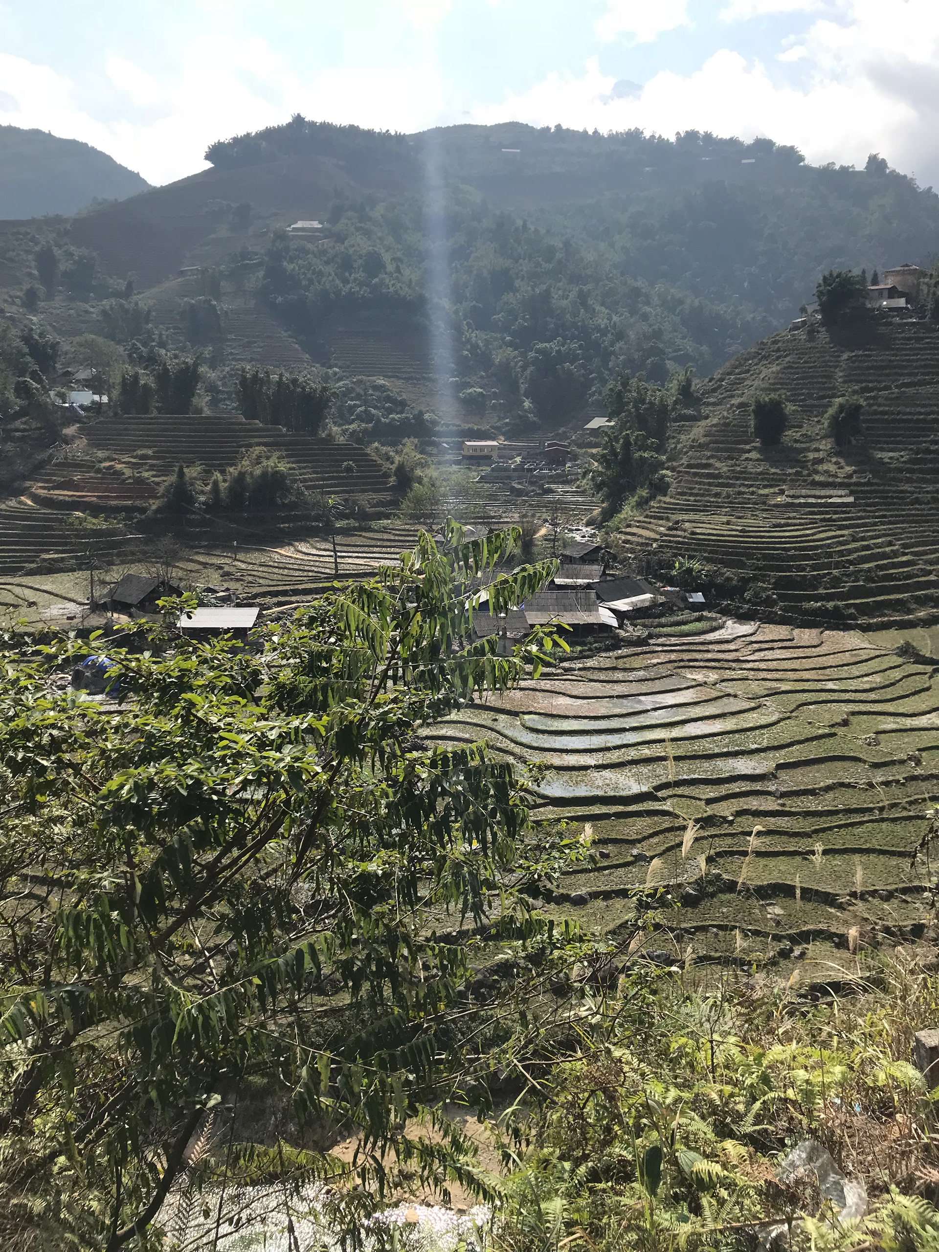
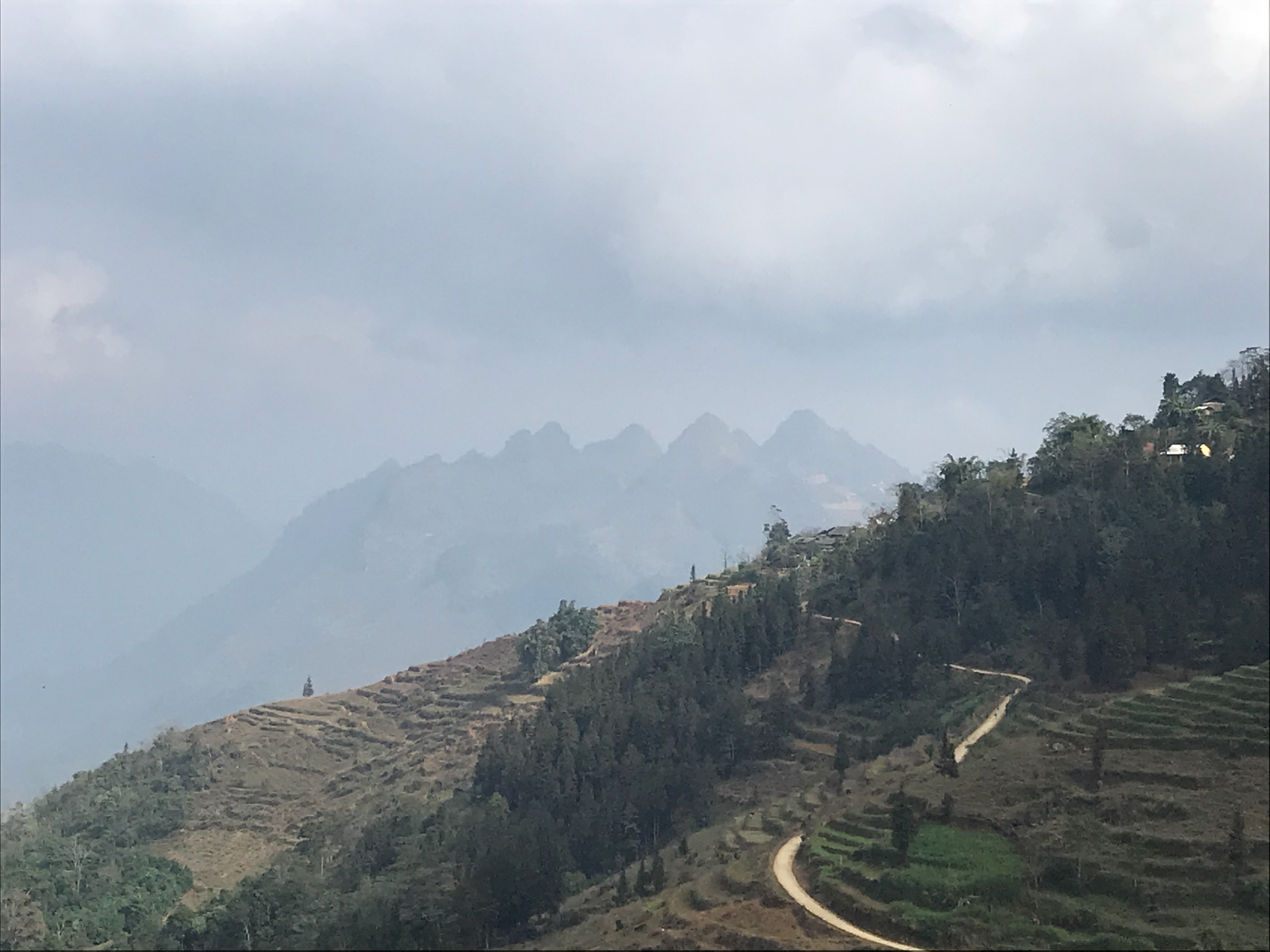
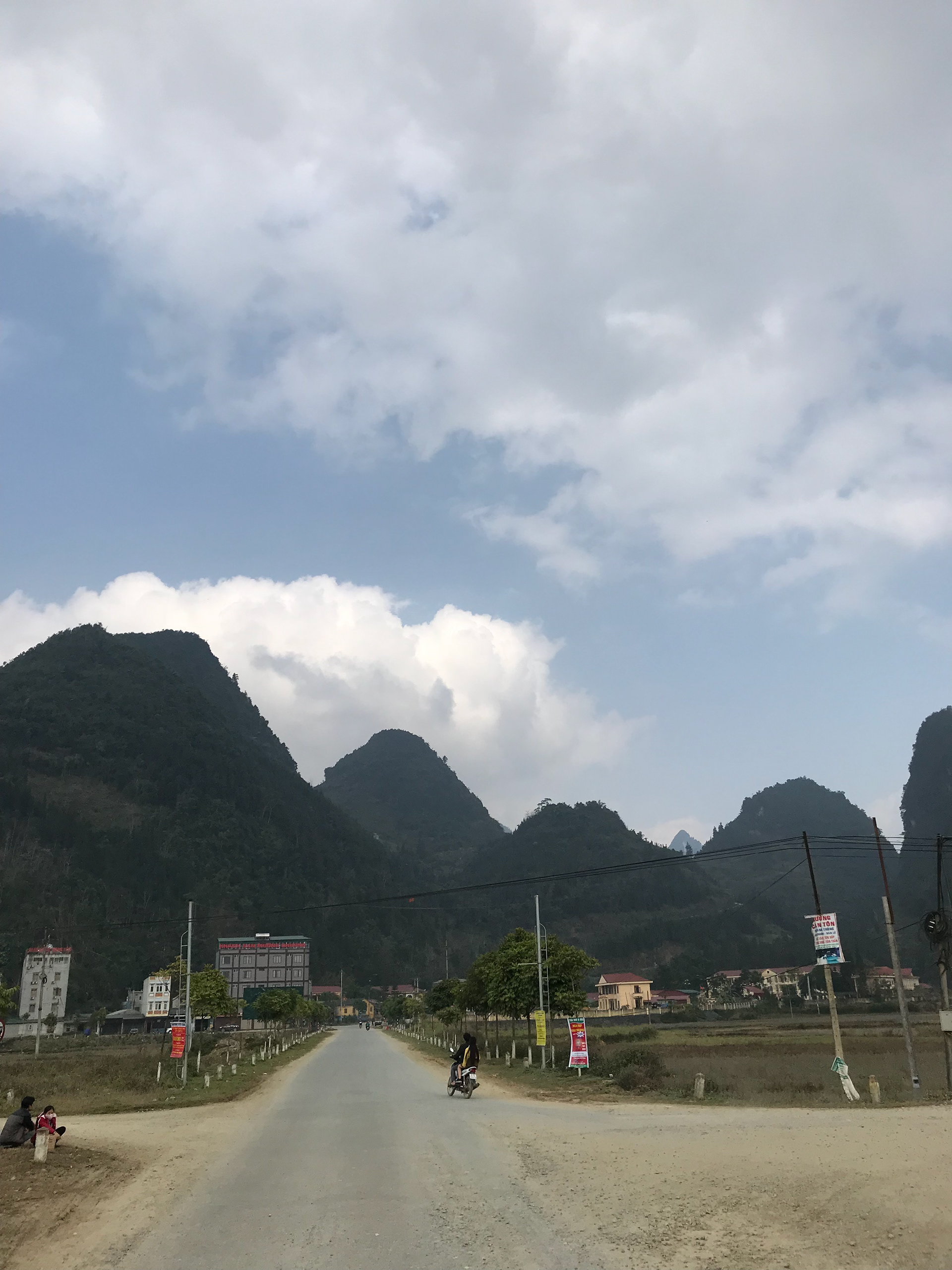
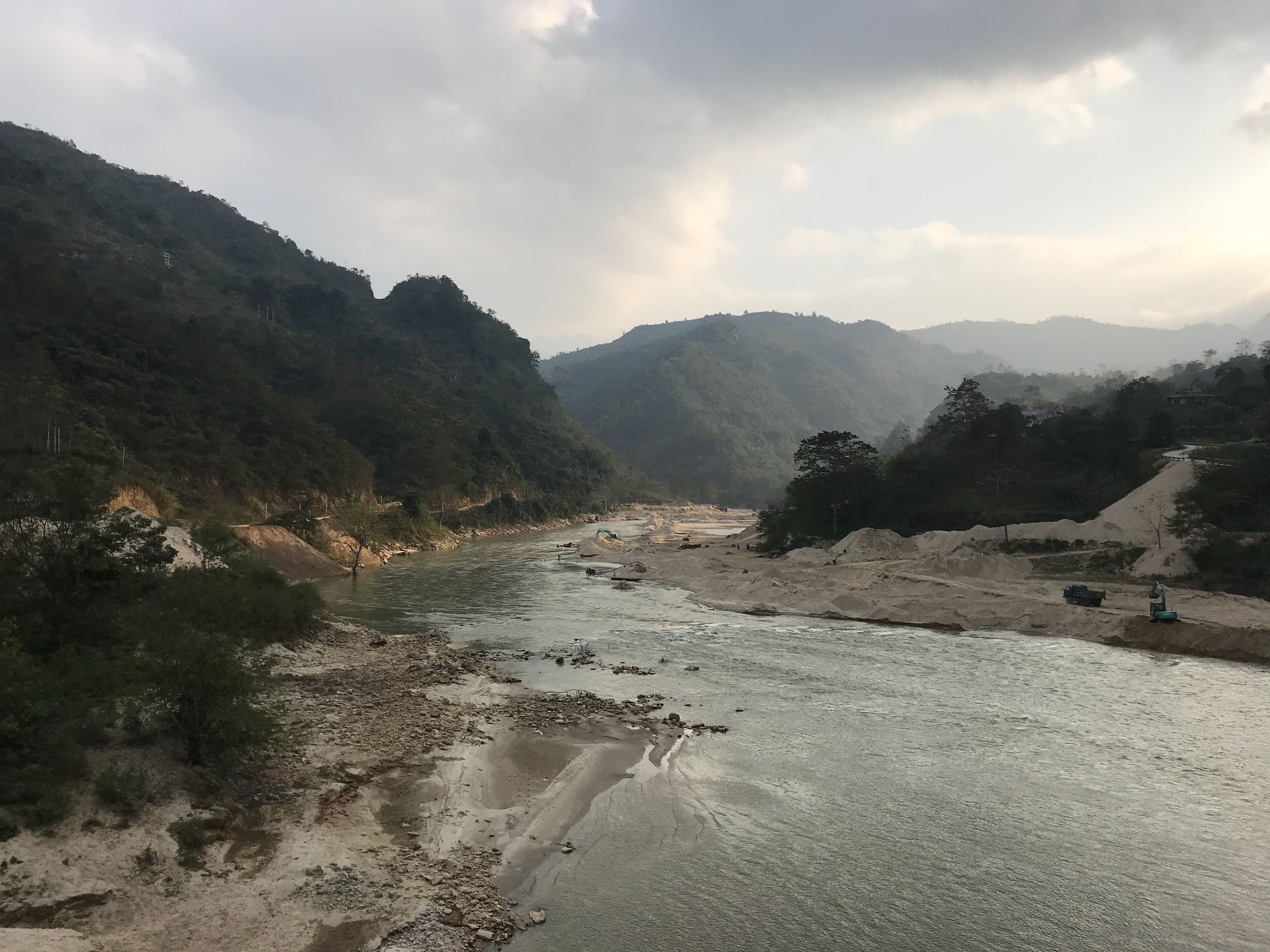
Vietnam- Hong Hai
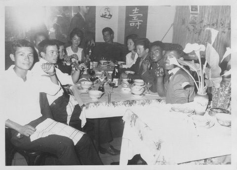
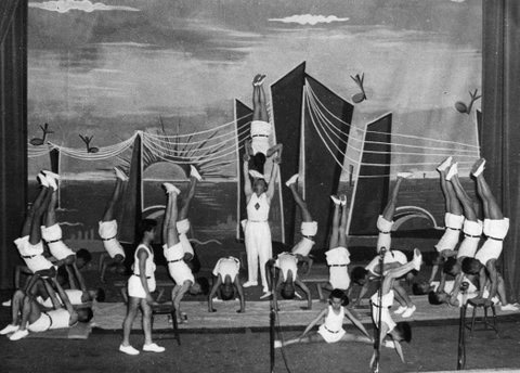
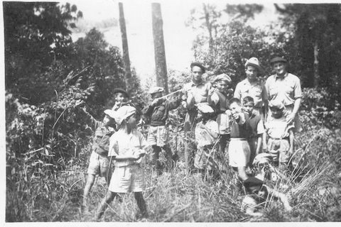
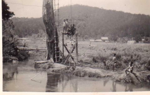
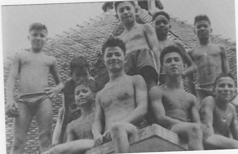
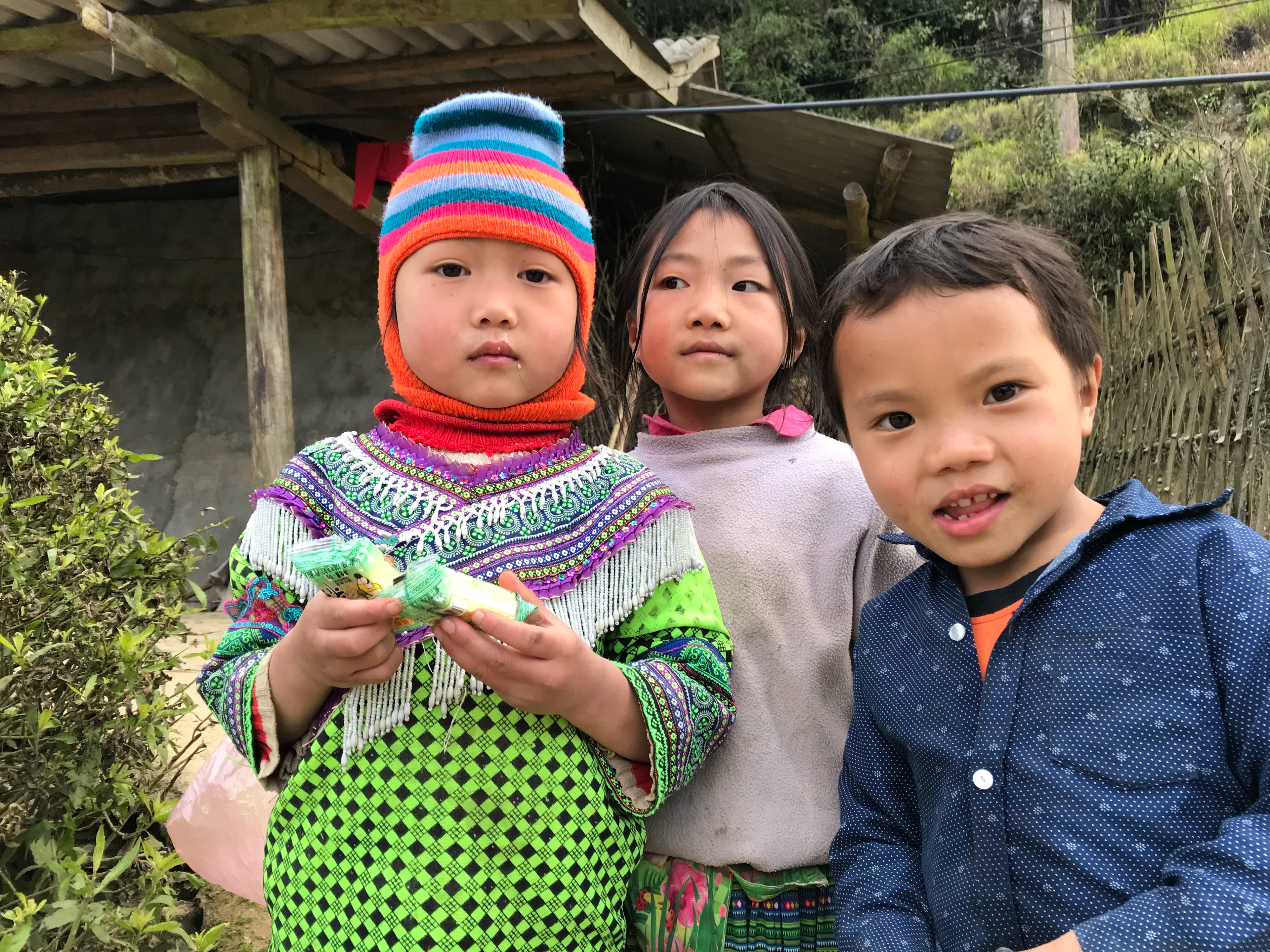
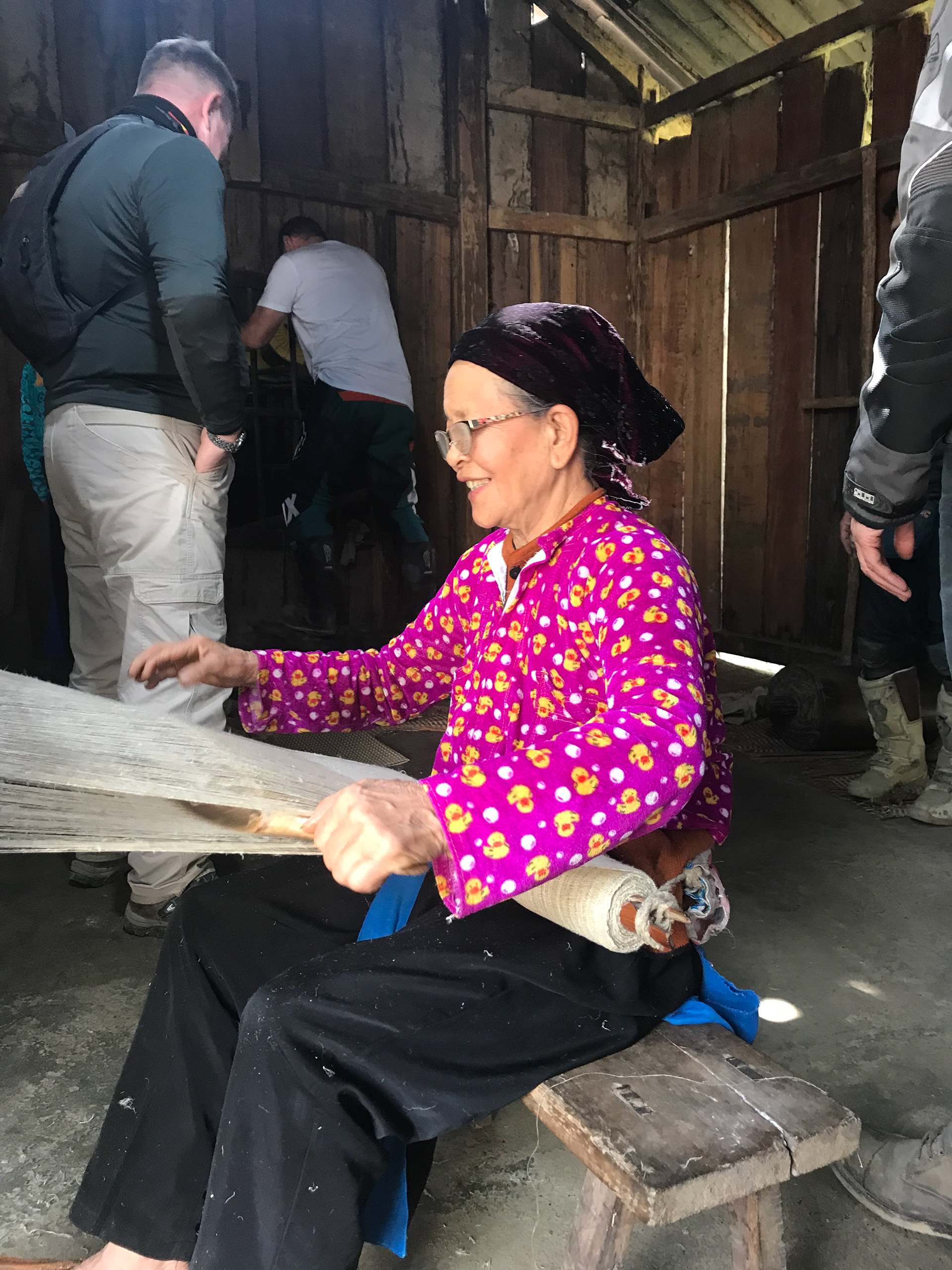
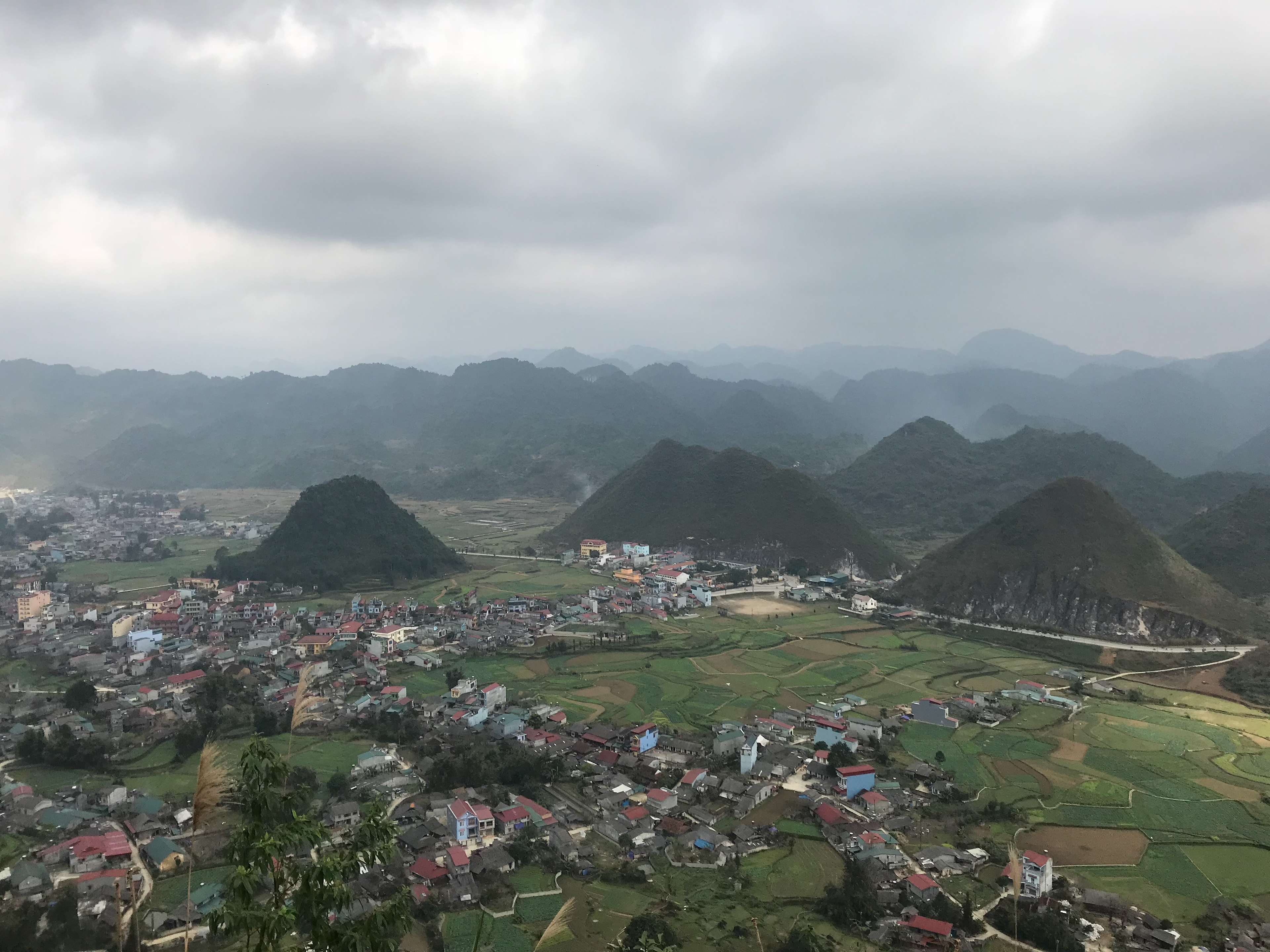
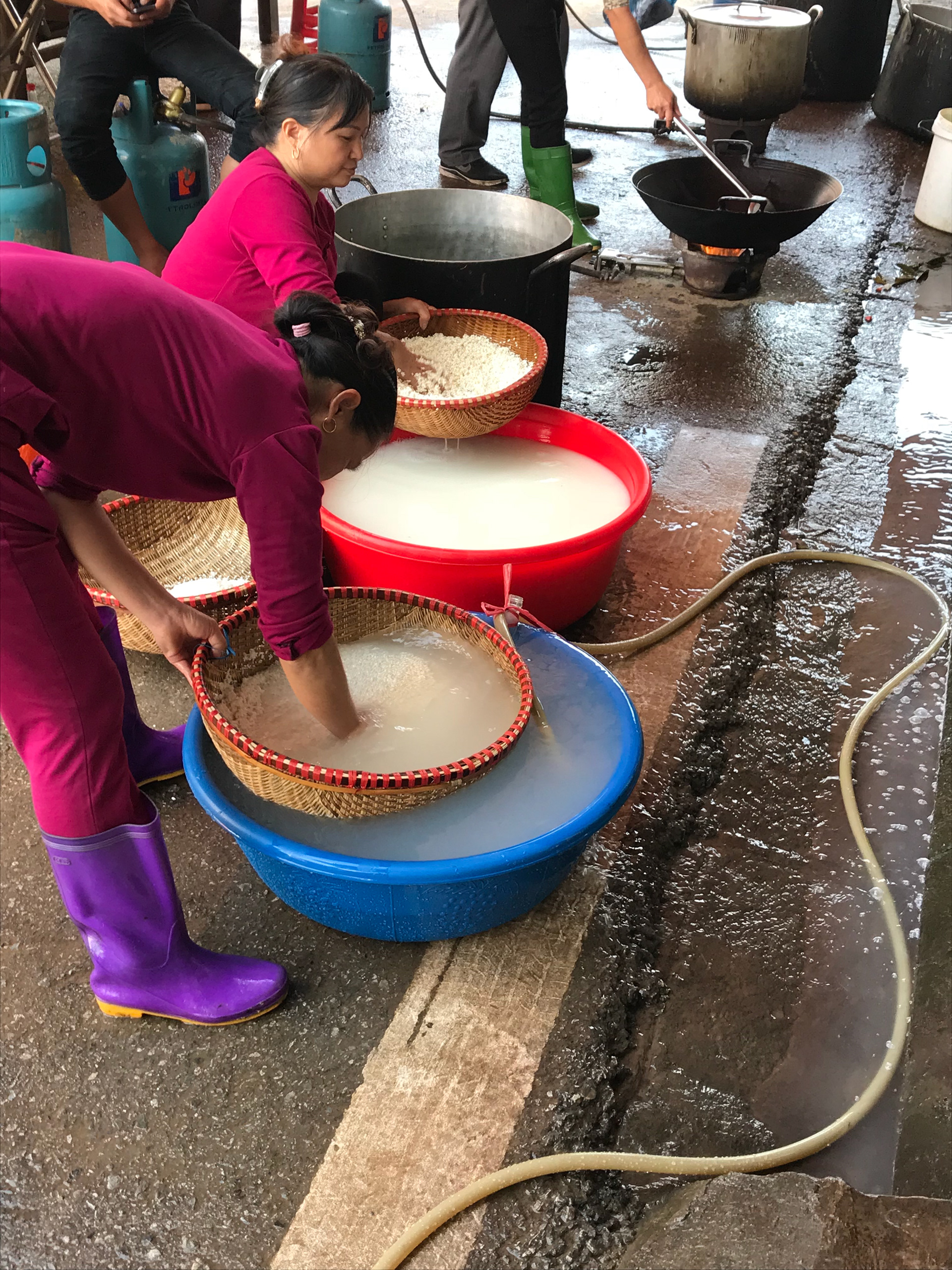
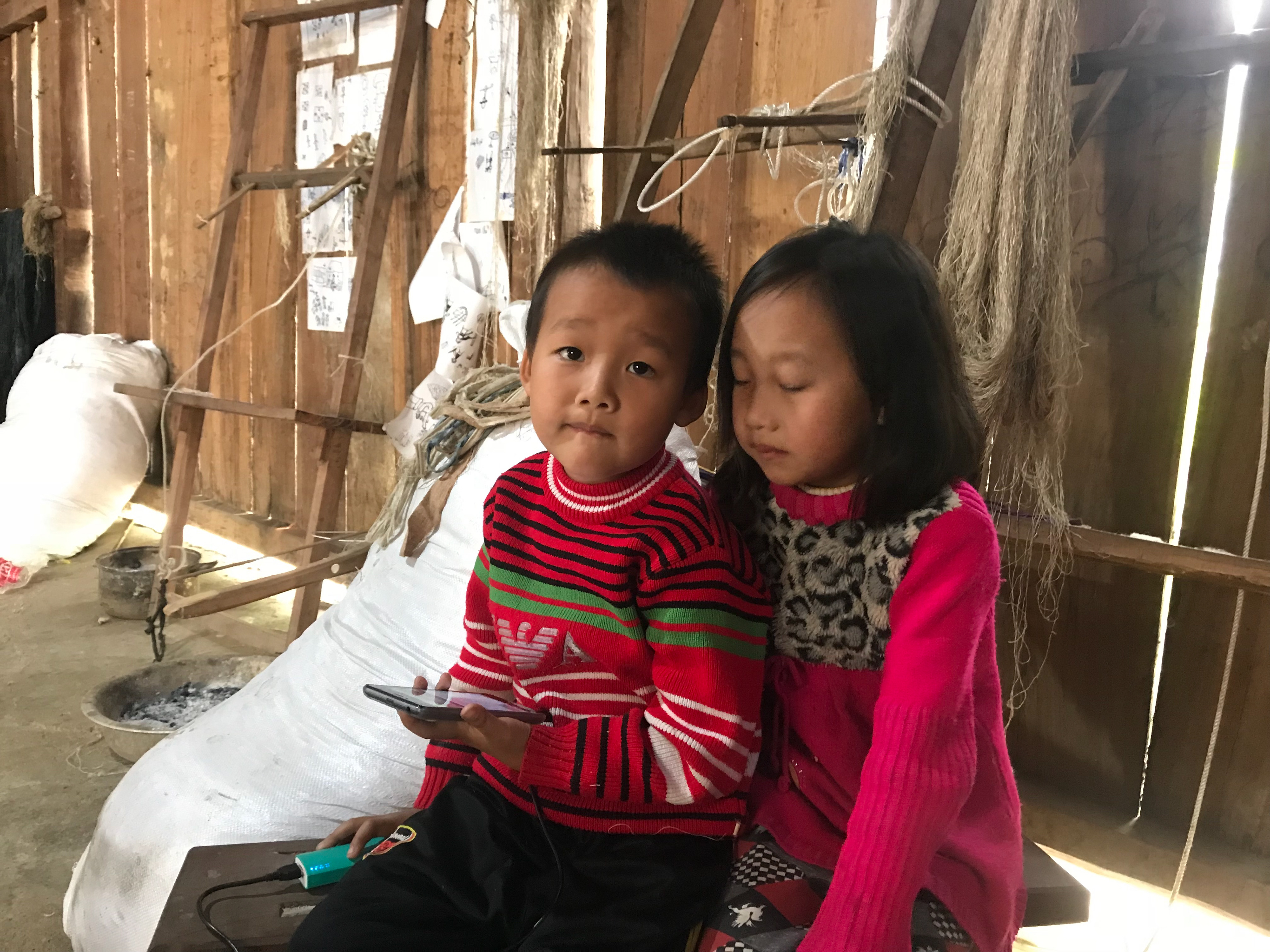
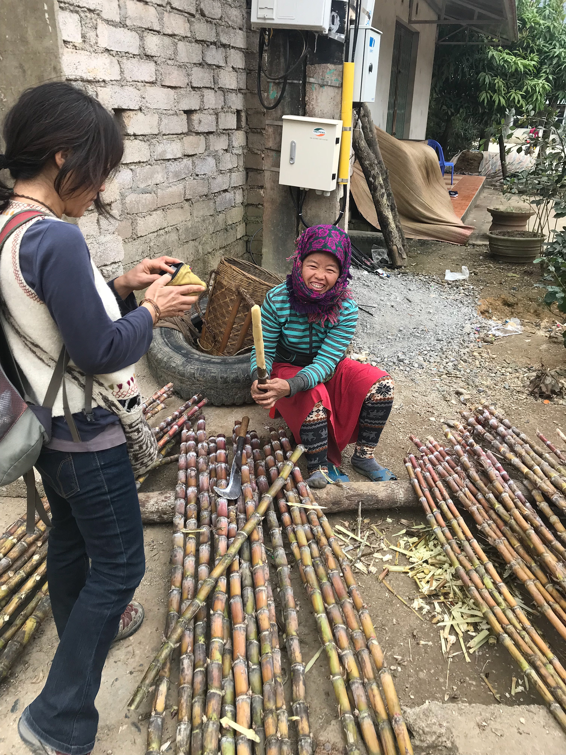
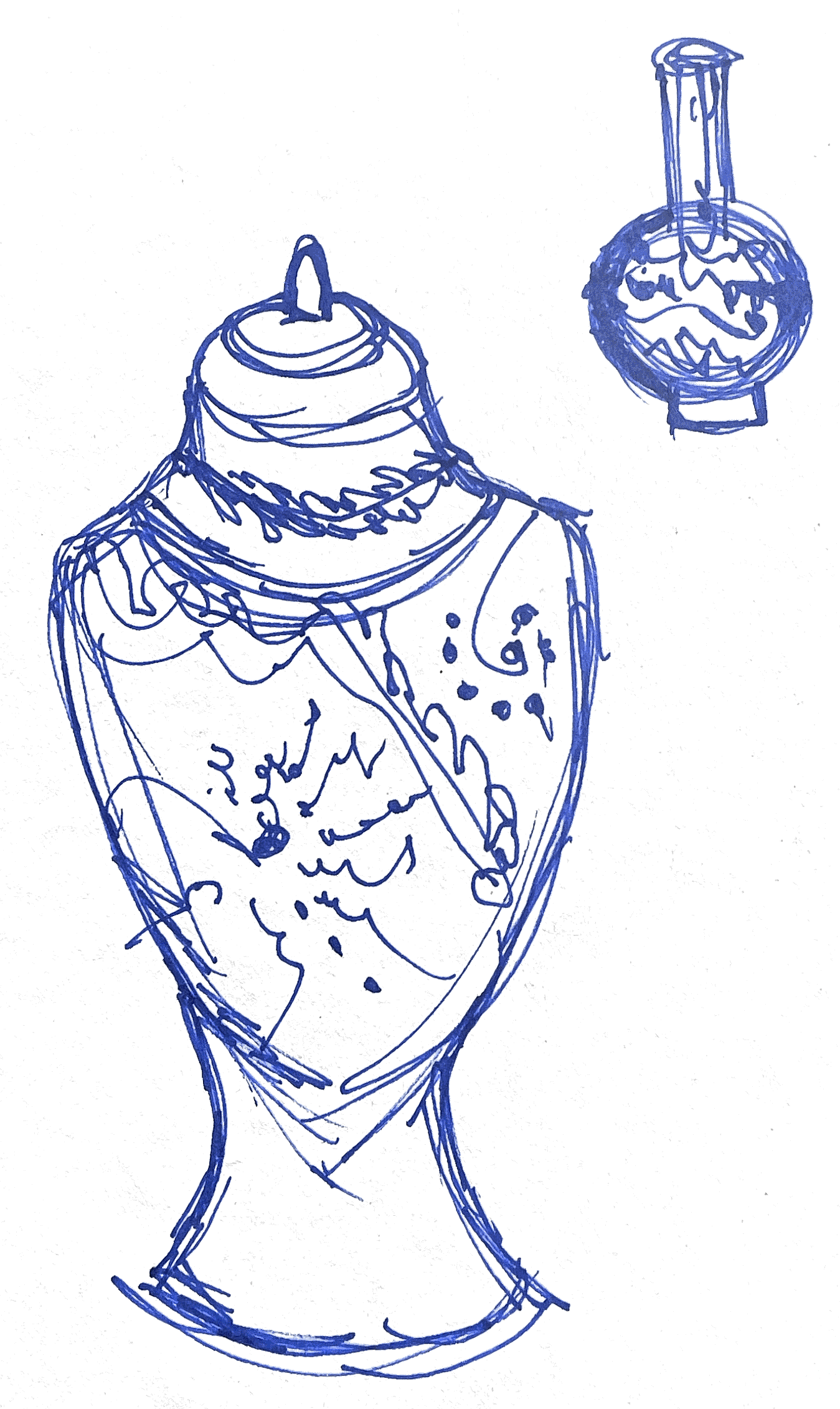
To progress in my work and create a central focus, I want to take a look into my heritage; being from a mixed background, I have lots of different cultures in my family. However, growing up in England, I have lost many of these connections. My grandad was born in Vietnam and was an orphan from the age of 11. He was then moved to France, where he raised his family and stayed there till this day. I want to look into the Vietnamese culture and explore and understand my heritage further. As I’m looking into tiles, I thought this was a good focus; I want to look into Vietnamese art and develop a narrative to be placed into my work that reflects my heritage and identity. Below are photos of my granddad’s childhood. I find the vast differences in our childhoods interesting, as we both had very different experiences. I hope this focus allows me to explore more and build a closer connection to my heritage. I also collected more recent photos of Vietnam from my father, who visited a few years ago; having this window into the culture is an inspiration for my work.


My focus for my work is encaustic tiles, and I started exploring these from around the world, seeing how different places have different influences, cultures and environments, which lead to different tile styles and patterns. This became a significant interest to me, seeing the different influences worldwide. It made me curious about the art and culture in Vietnam, how their tiles are created and the influence on their decorations.
Vietnam followed the encaustic tile technique that was popular in Europe; this was due to the French colonisation of Vietnam in the mid-1800s. With the invasion came their skills, techniques and traditions of tile-making. Since that time, the Vietnamese have continued to manufacture these encaustic cement tiles, using many of the old French designs along with some of their modern designs. The Vietnamese manufacturers export encaustic cement tiles worldwide and use them in many buildings in present-day Vietnam.
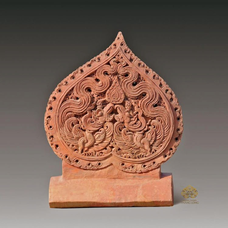
figure 6
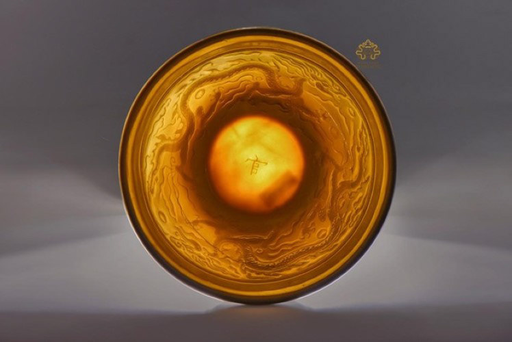
figure 7
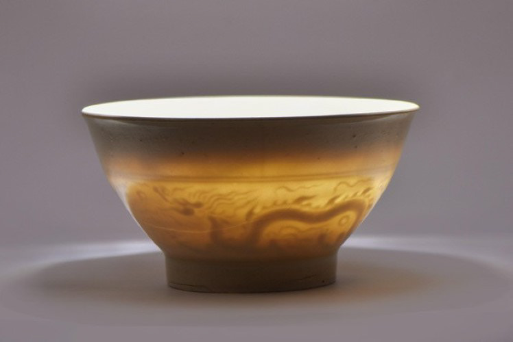
figure 8
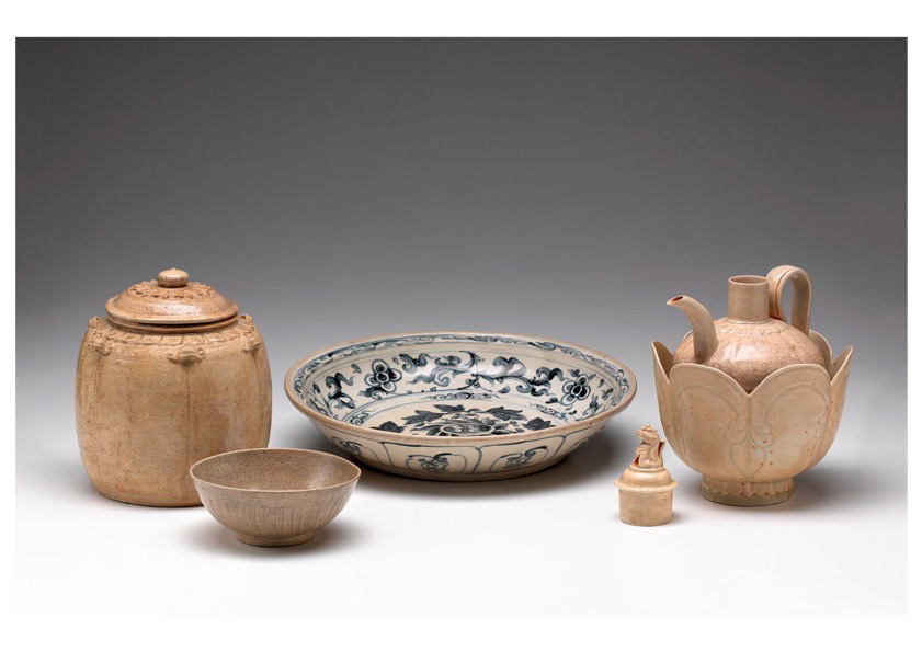
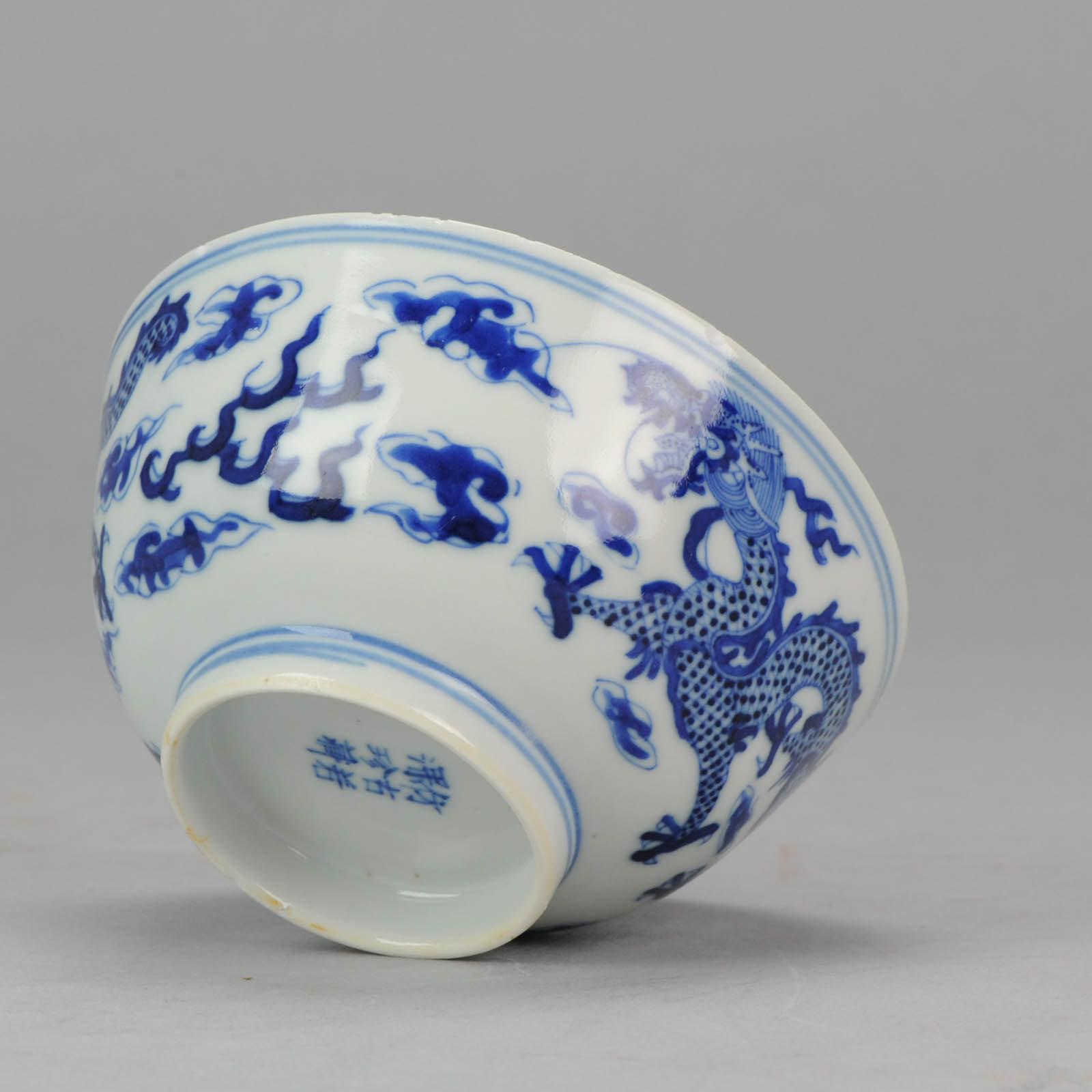
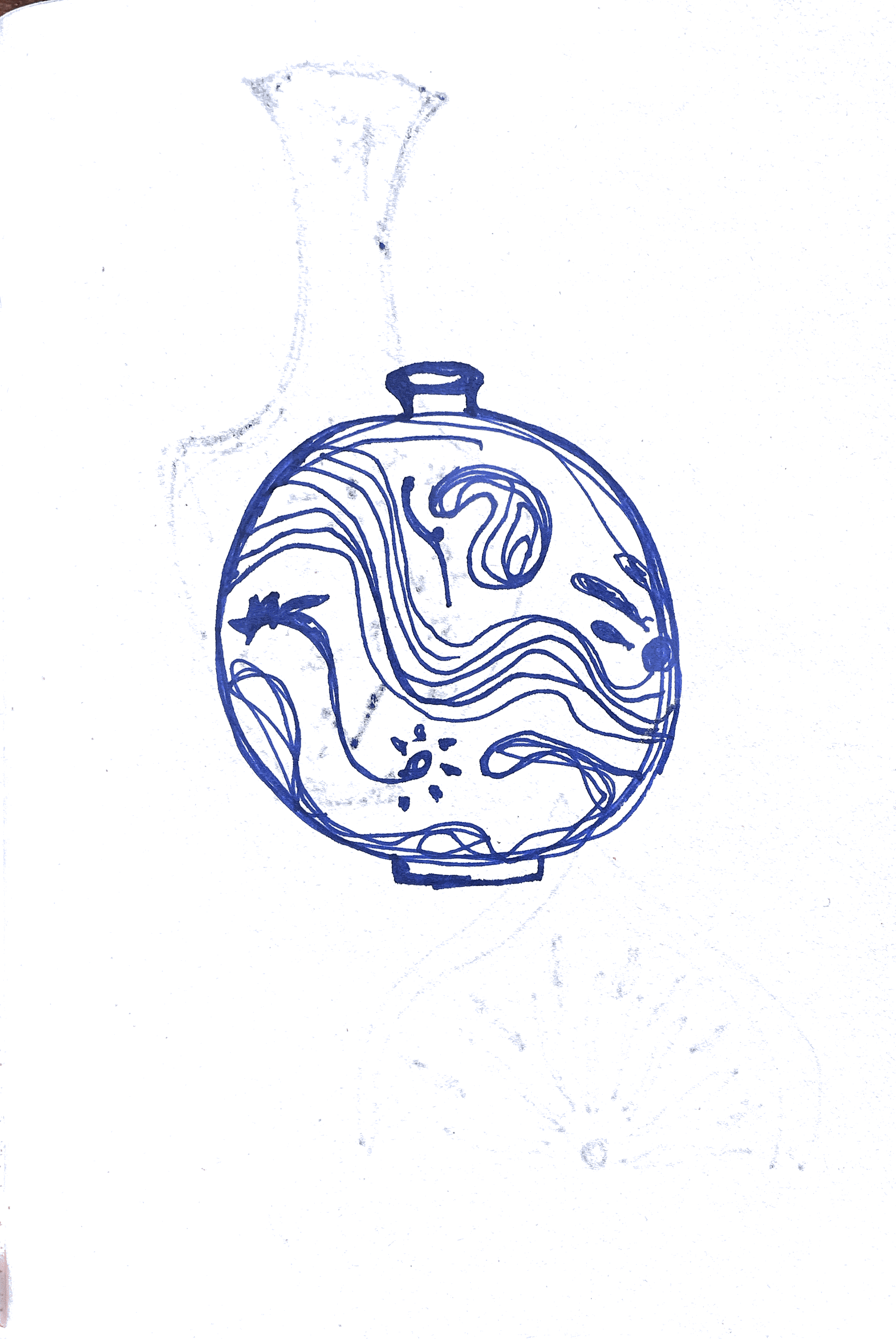
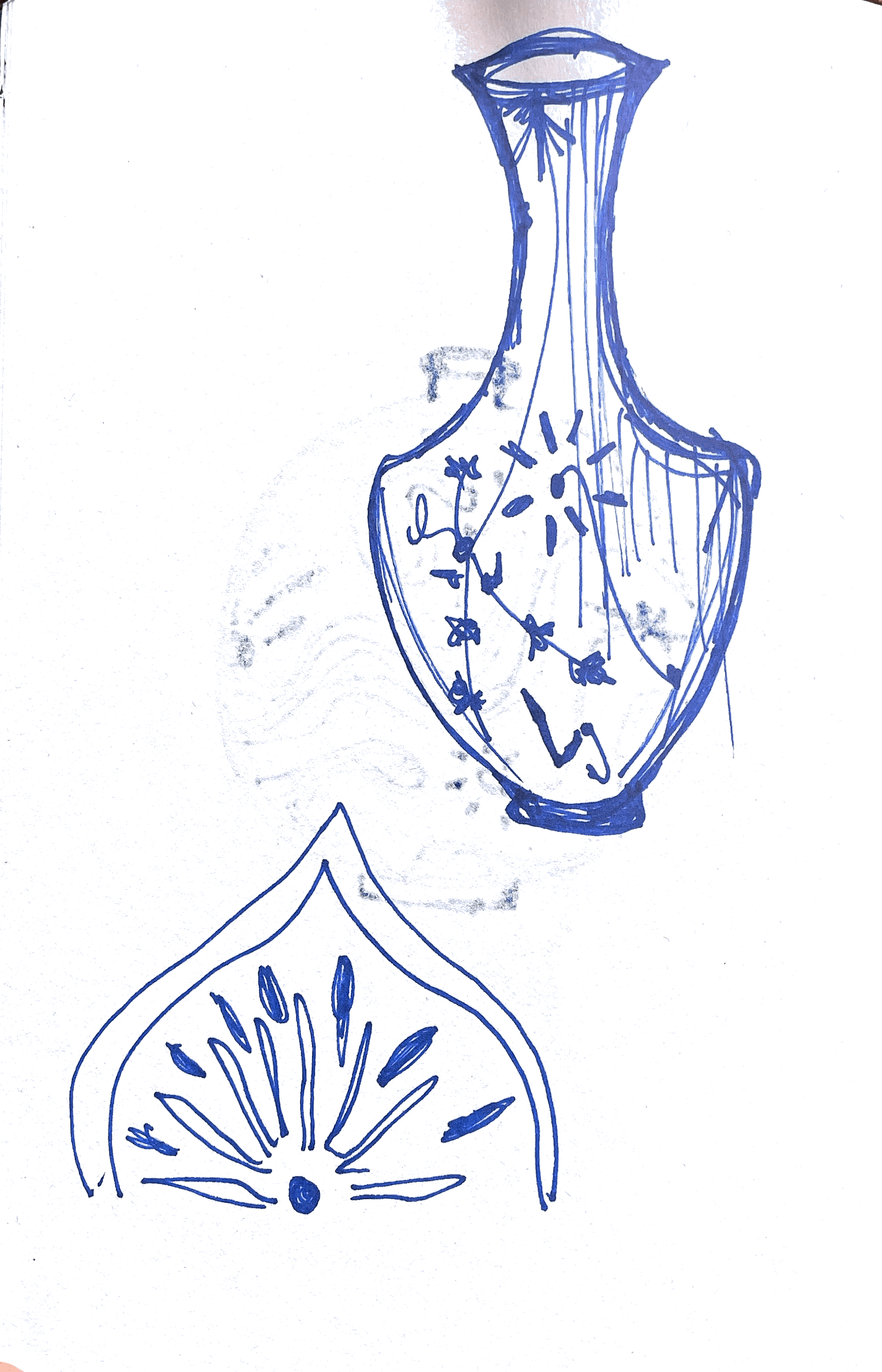
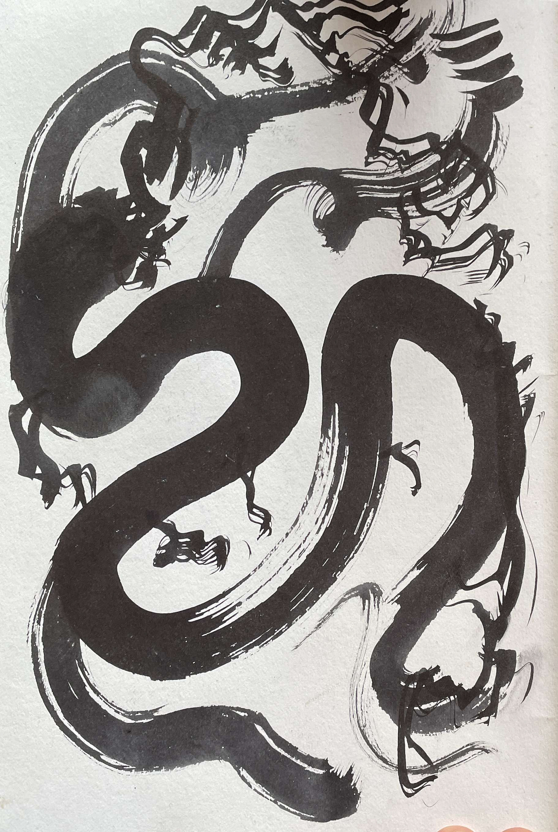
These are some other Vietnamese ceramics, all using bold, flowing, and curvature lines. The patterns on these pieces are very traditional to Vietnam, from the culture and their beliefs- decorating the pottery with spiritual symbols and native plants like lotus and orchids. In the piece of the "phoenix-themed Bodhi leaf", which was a found artefact, the phoenix and the dragon are the symbols of the royal family, in which the phoenix is often associated with the queen, reflecting the existence and blend of Buddhism and Confucianism.
The two translucent porcelain bowls painted with a dragon motif are national treasures, regarded by scientists as one of the rarest and most precious royal ceramics in the Thang Long Imperial Palace during the Le Dynasty’s Early Period (The early period (called Le So), from 1428 to 1527. This was period of prosperity and development of the Vietnamese feudal State and law)
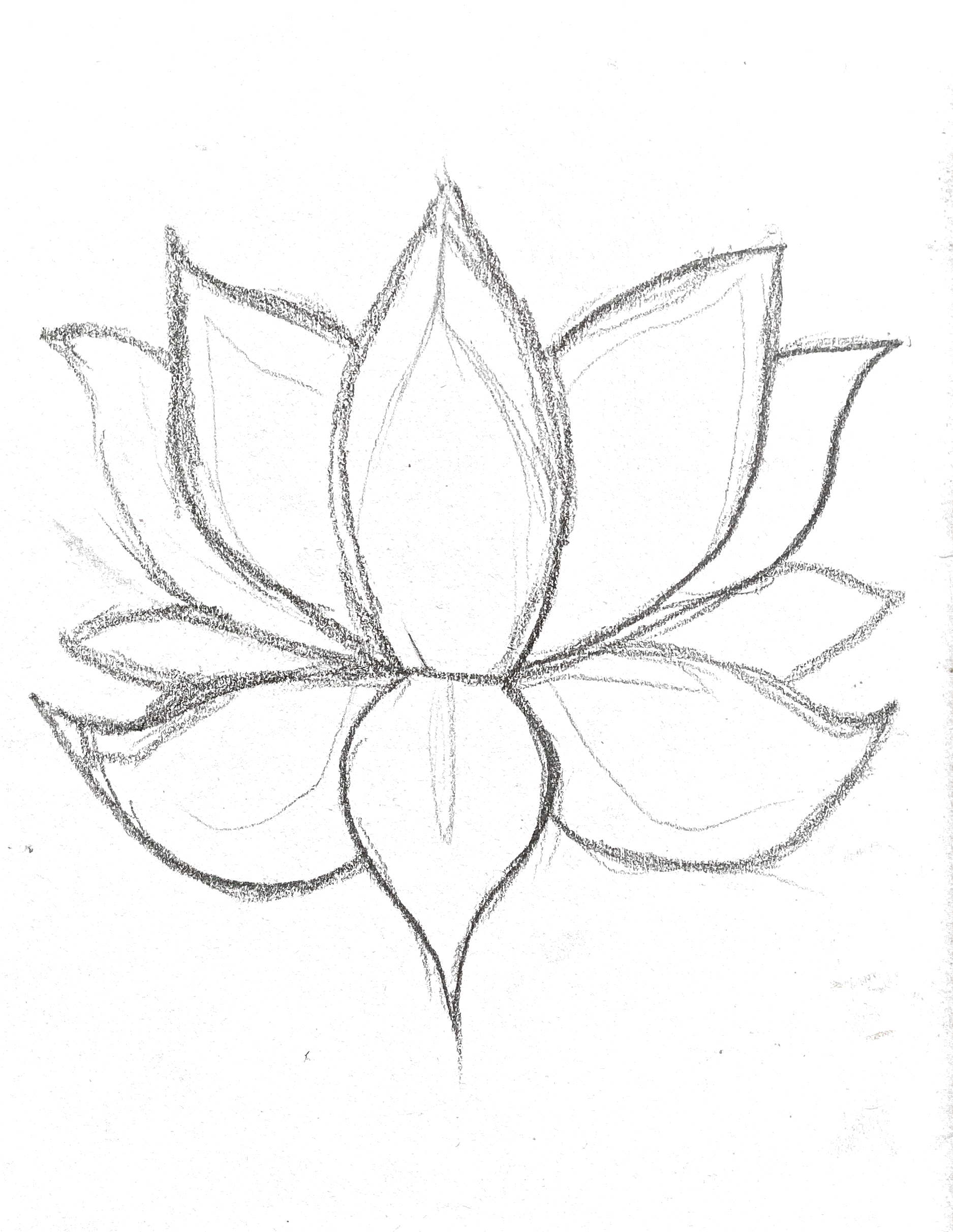
A lot of Vietnamese ceramics were influenced by the countries surrounding them. China had a big market for ceramics and had a significant influence. The source below discusses Vietnamese pots and their influences, showing their shape and decoration. Lots of the pottery holds very distinctive organic, gourd-like forms. The lotus flower is an archetypal Buddhist motif signifying spiritual purity because the lotus plant emerges from muddy waters, and the flower stalk rises upward toward the light. Buddhism became the state religion in Vietnam during the eleventh century.
figure 9
Dragons and Lotus Blossoms: Vietnamese Ceramics from the Birmingham Museum of Art 2011
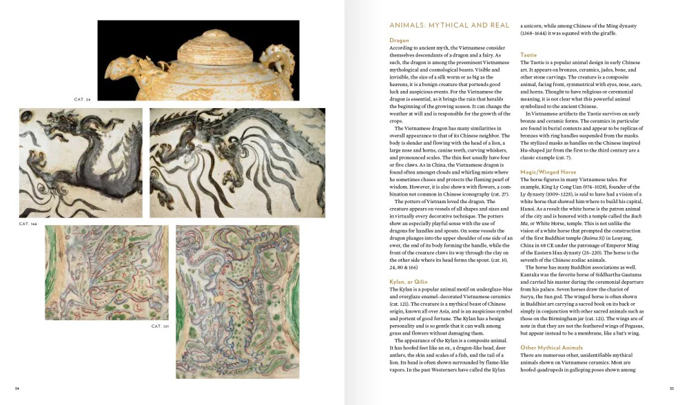
figure 10
Dragons and Lotus Blossoms:
Vietnamese Ceramics from the Birmingham Museum of Art
2011
Vietnamese Ceramics from the Birmingham Museum of Art
2011
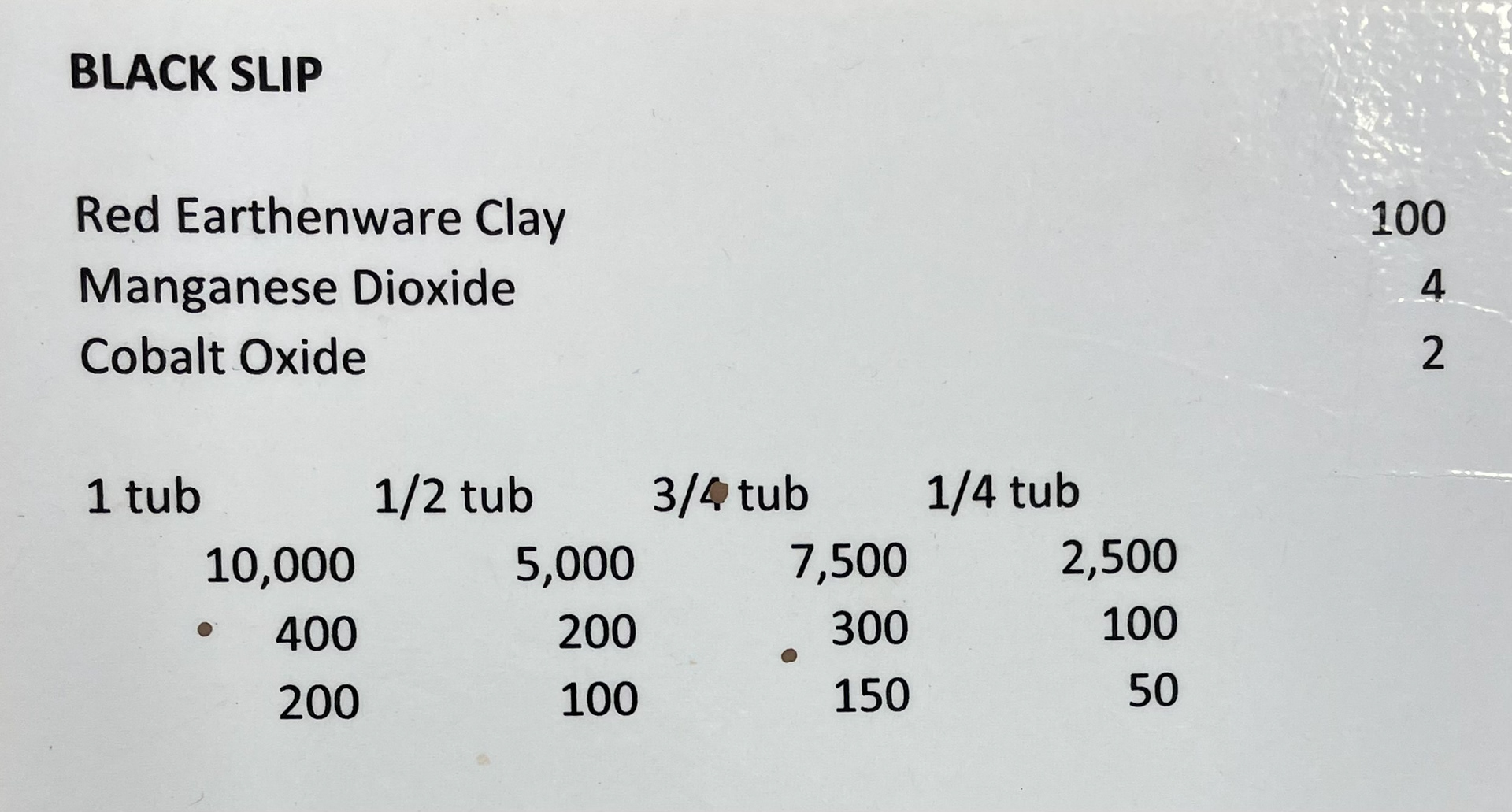
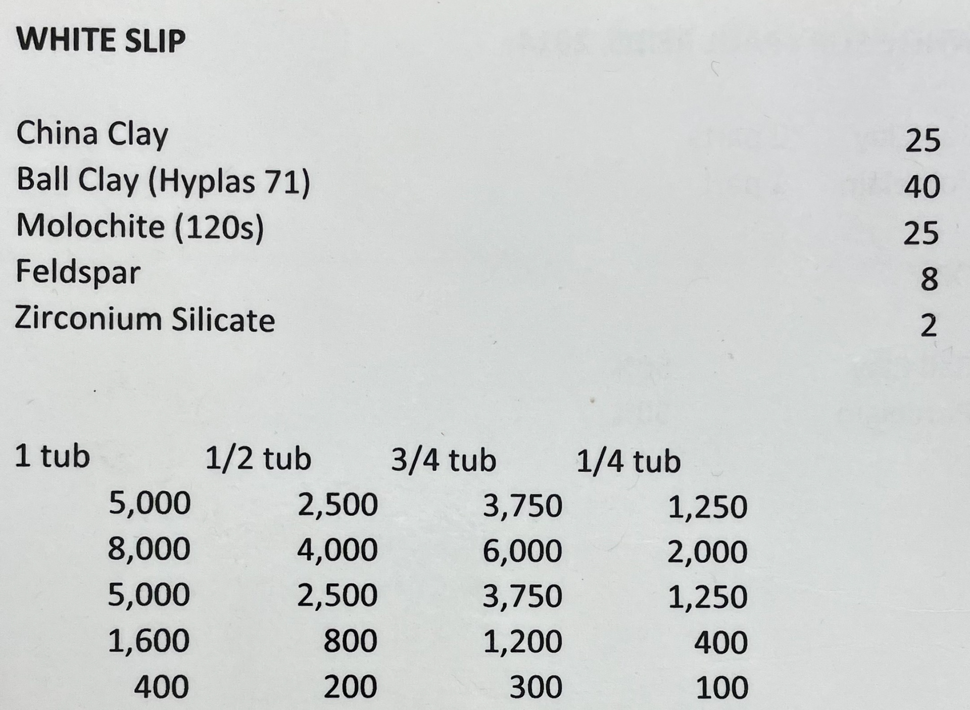
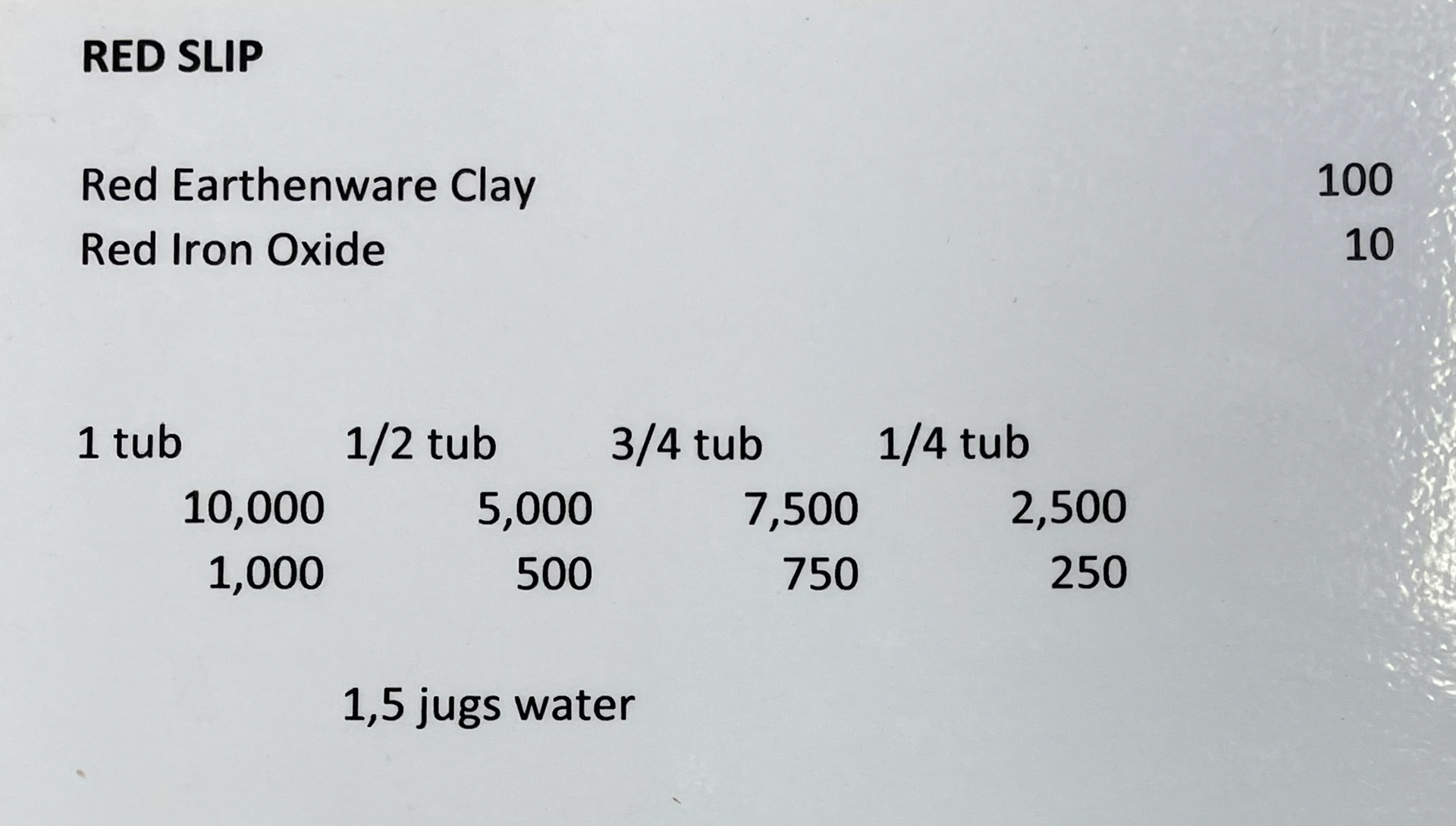
decorating with slip
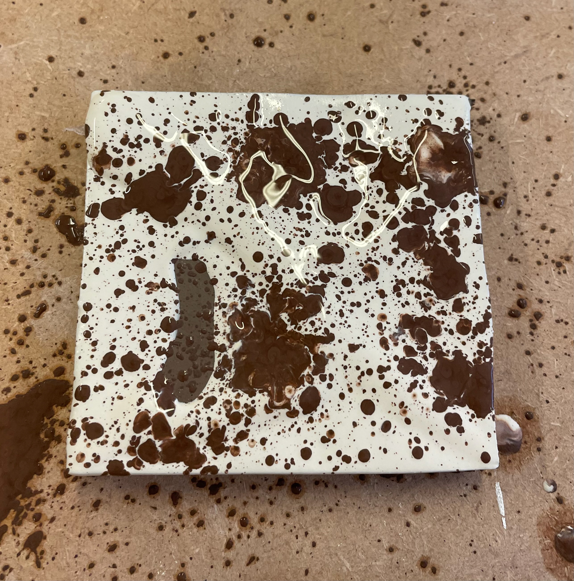
In this ceramic session, we were decorating using slip. A slip is made by mixing the ceramic powder in water and chemicals that help the powder disperse throughout the liquid and give colour. A slip is fluid but contains solid particles. This allows you to have a very free motion while using it, similar to paint but for clay. I applied the clay using a mixture of tools, including a bladder which holds the slip, and when squeezed, it realises the slip. I also experimented with a mixture of brushes. Using black and white slip for the harsh contrast, once fired, this will keep its colours; however, as it is still clay when a colour glaze is added on top, it will not retain the same colour but adjust to the colour of the glaze-in this instance with the white and black it will create lighter or darker versions of the colour glaze.
Below are the recipes for creating slips with the base powders and the oxidants that give colour.
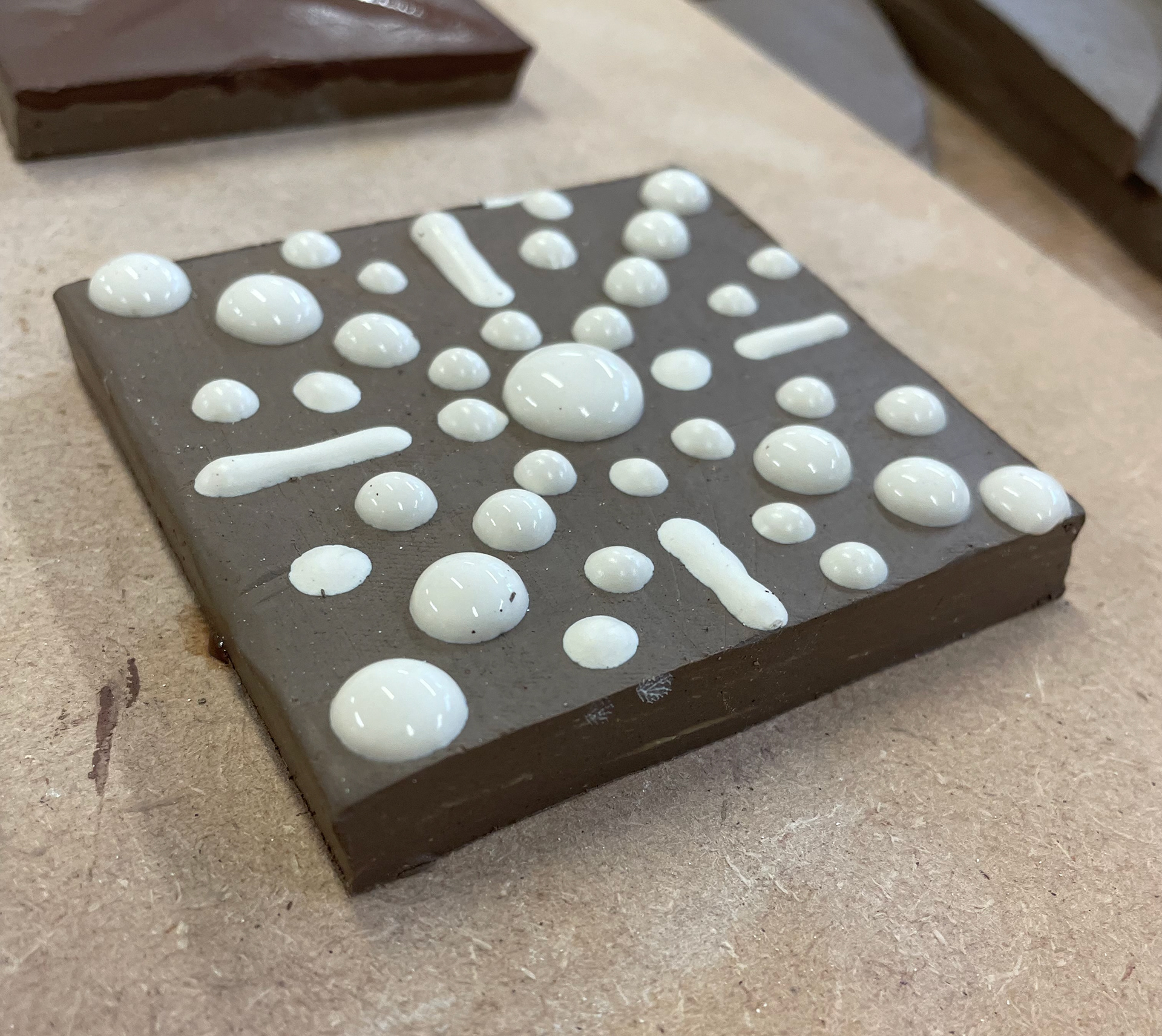
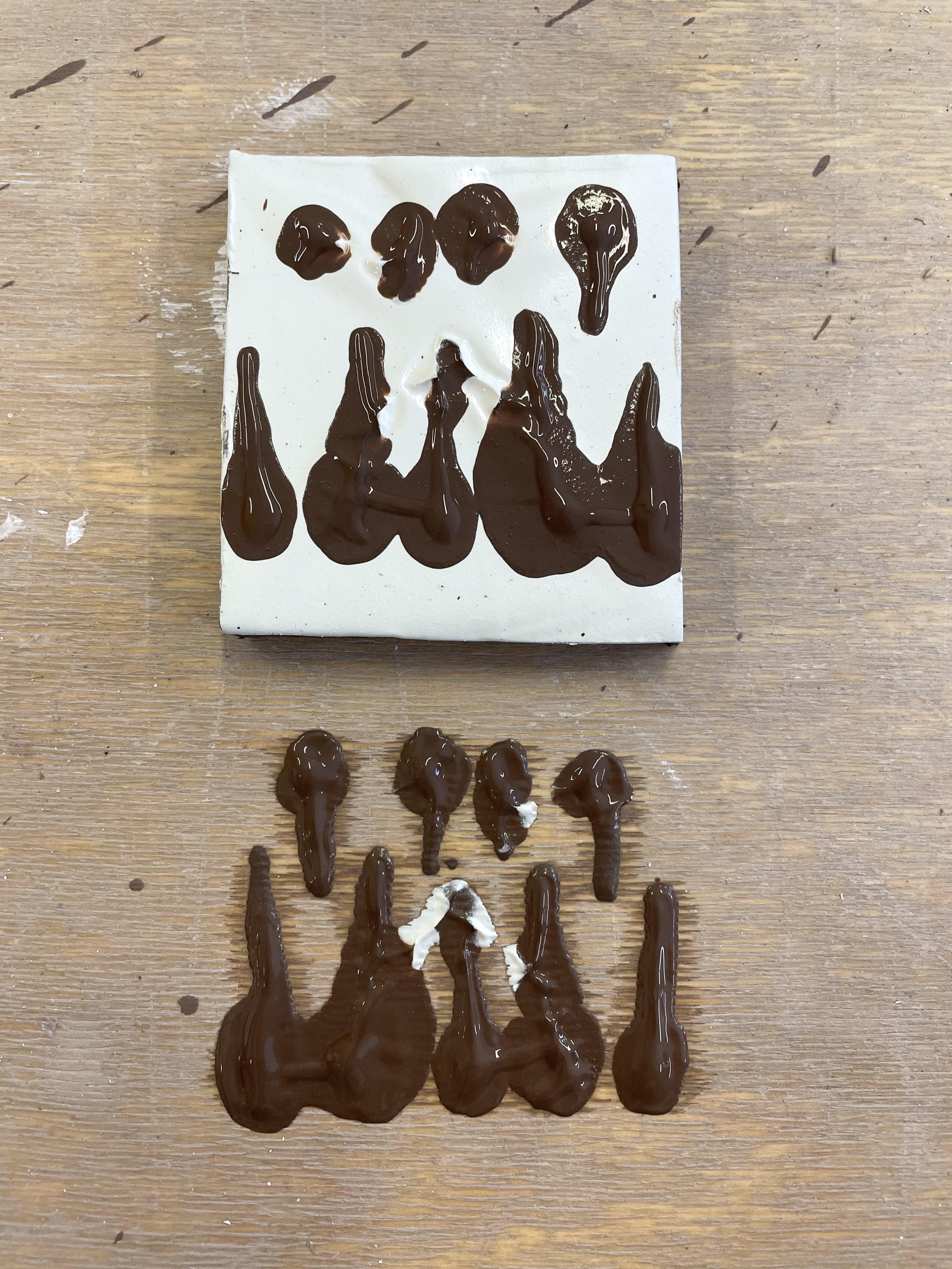
I experimented with as many techniques as possible to see what worked for me; as slip is thick and holds its form, you can create a raised bead of slip on the clay surface, giving it a rise and texture. I liked this effect, but it will be interesting to see if it decreases size due to being absorbed by the clay surface and if it stays in place whilst in the kiln. Dotting, feathering, marbling and transferring on the table were all the techniques I explored. Although I did like all my outcomes, I want to see their reaction to the glaze as this will completely change the look of the glaze. I'm not sure what to expect, but I'm excited to get them in the kiln and glazed so I can experiment.
I don't plan on using slip in this project, but it is still something I enjoyed exploring; I put all my samples in the kiln, and to much surprise, when they had been bisque fired, they hadn't retained their form. The slip layer had fired apart from the clay slab, leaving me with two pieces. As the slip was thin, it became very delicate and crumbled a lot. After finding this outcome exciting and talking to the technician, we could see an absolute reason, as no one else had the same reaction. However, we presumed the cause was the slab clay being too dry, meaning the slip couldn't be absorbed, causing separation.
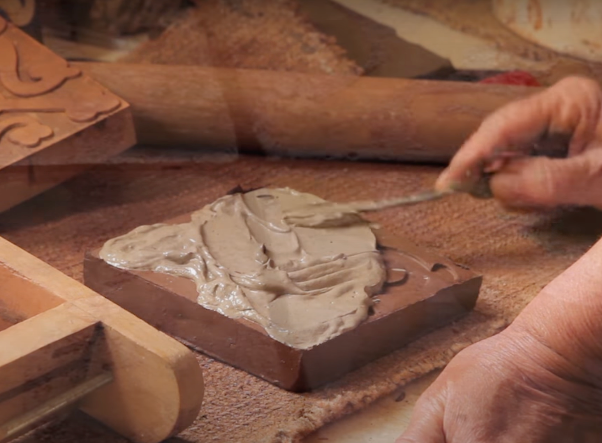
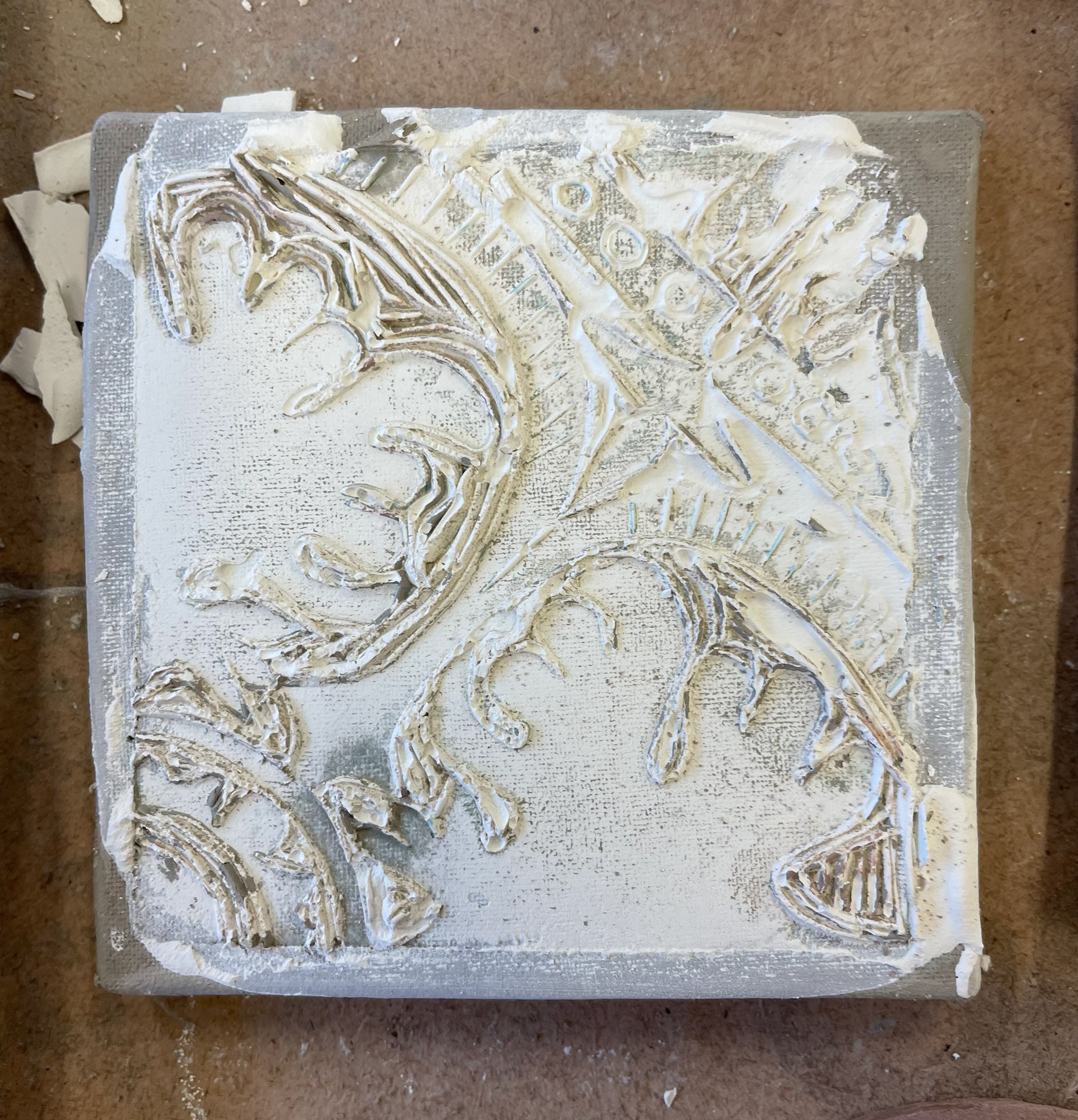
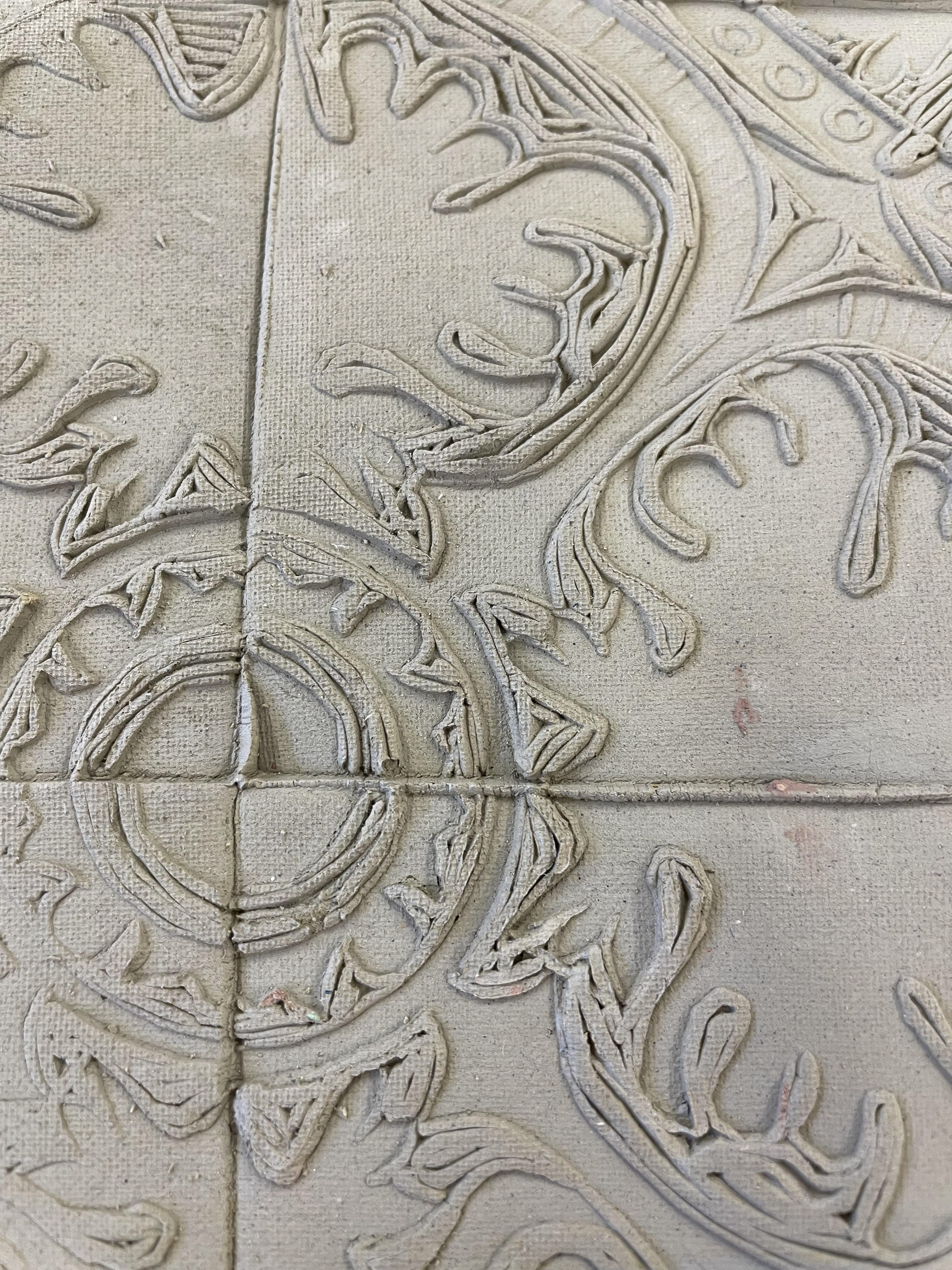
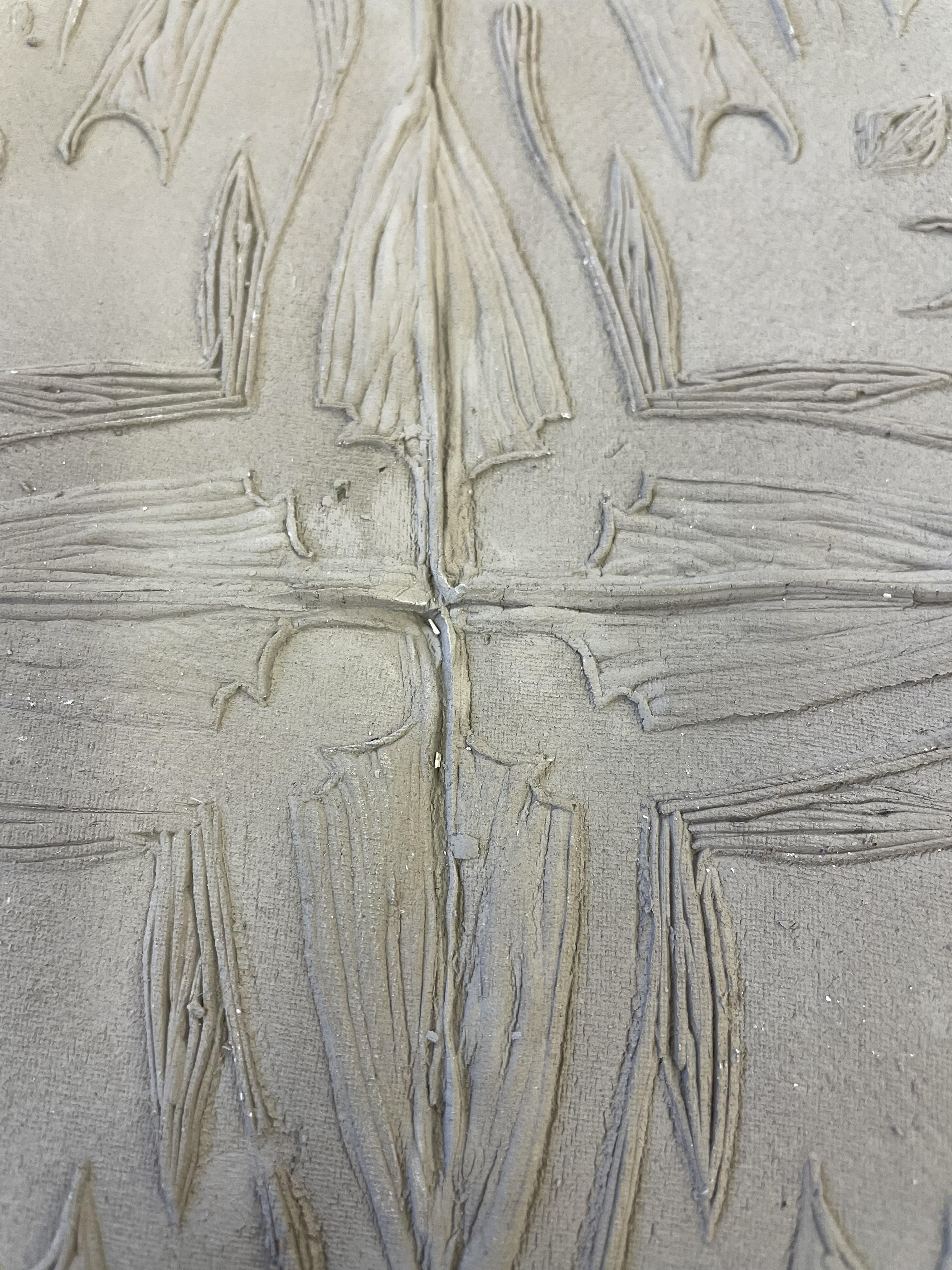
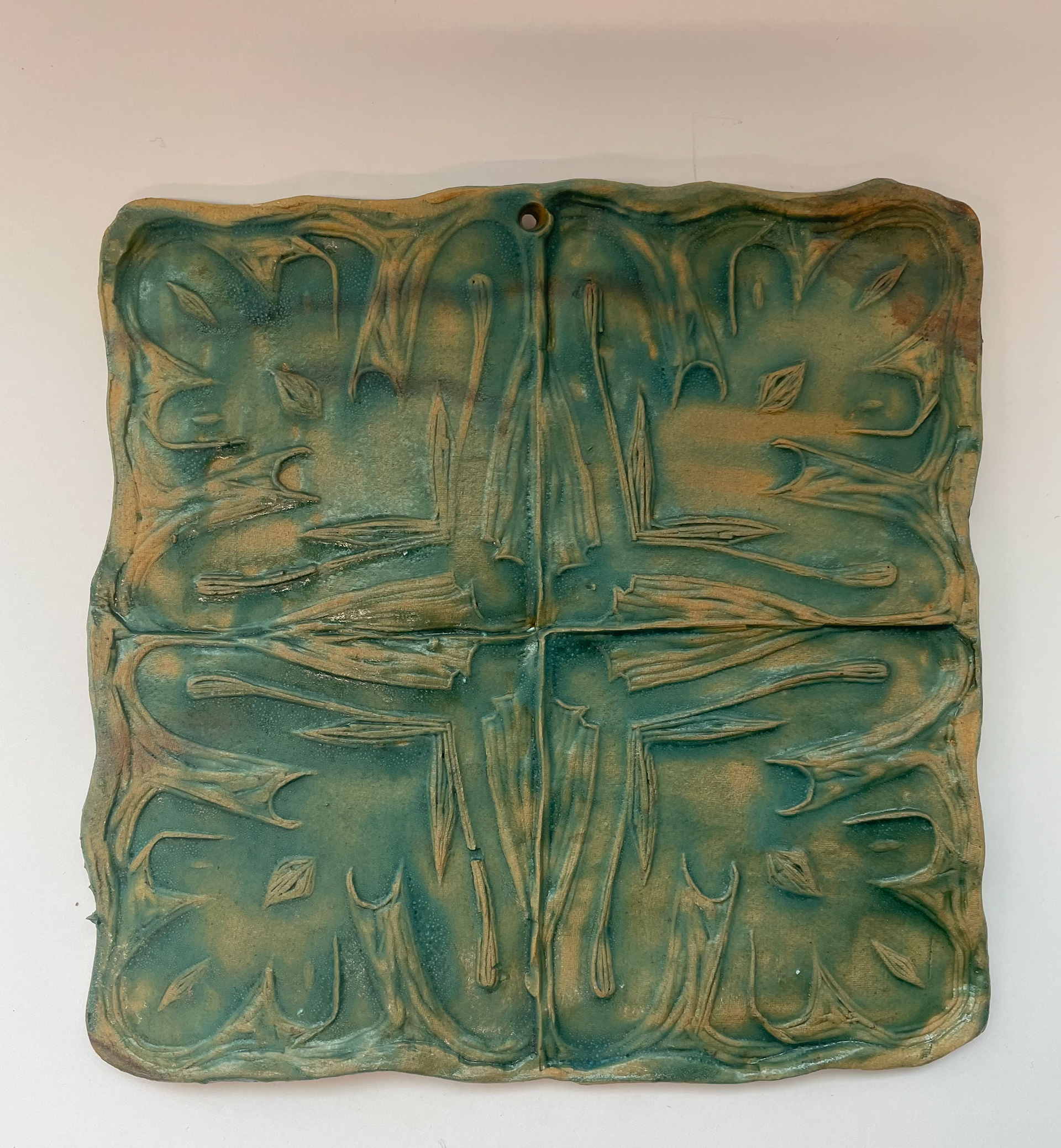
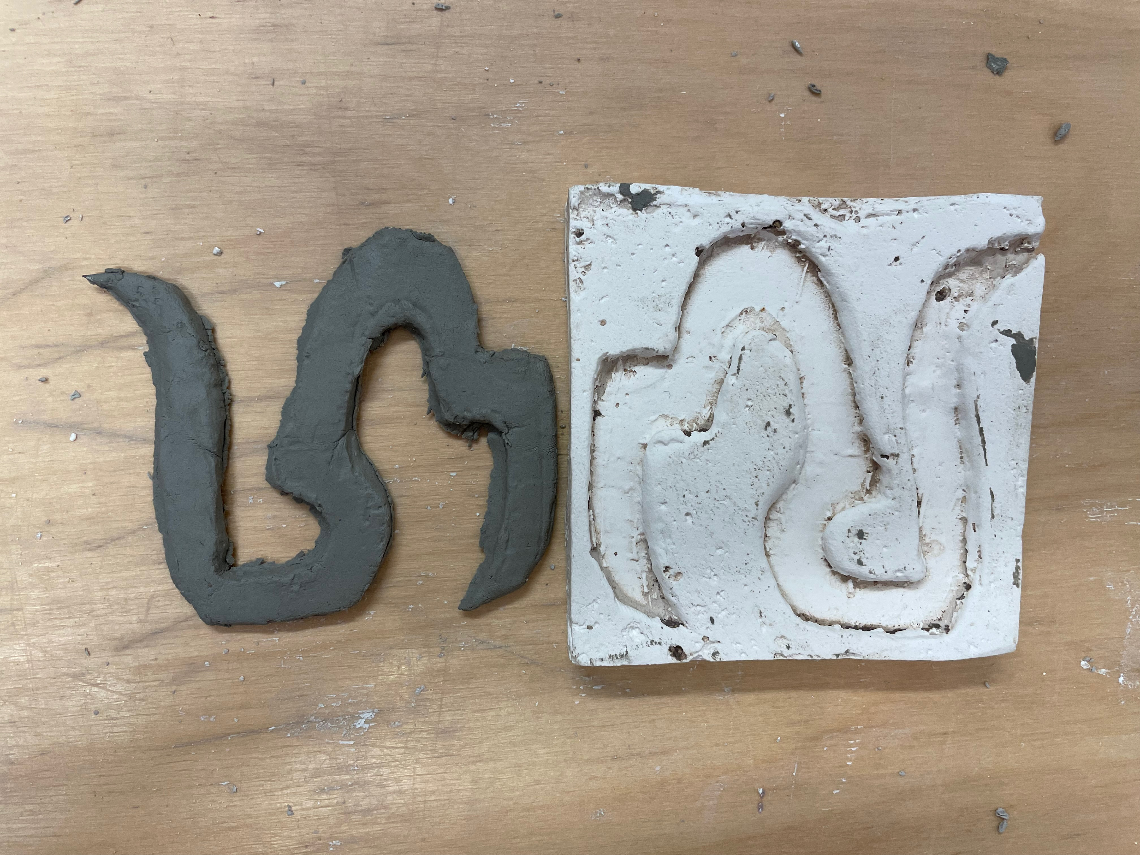
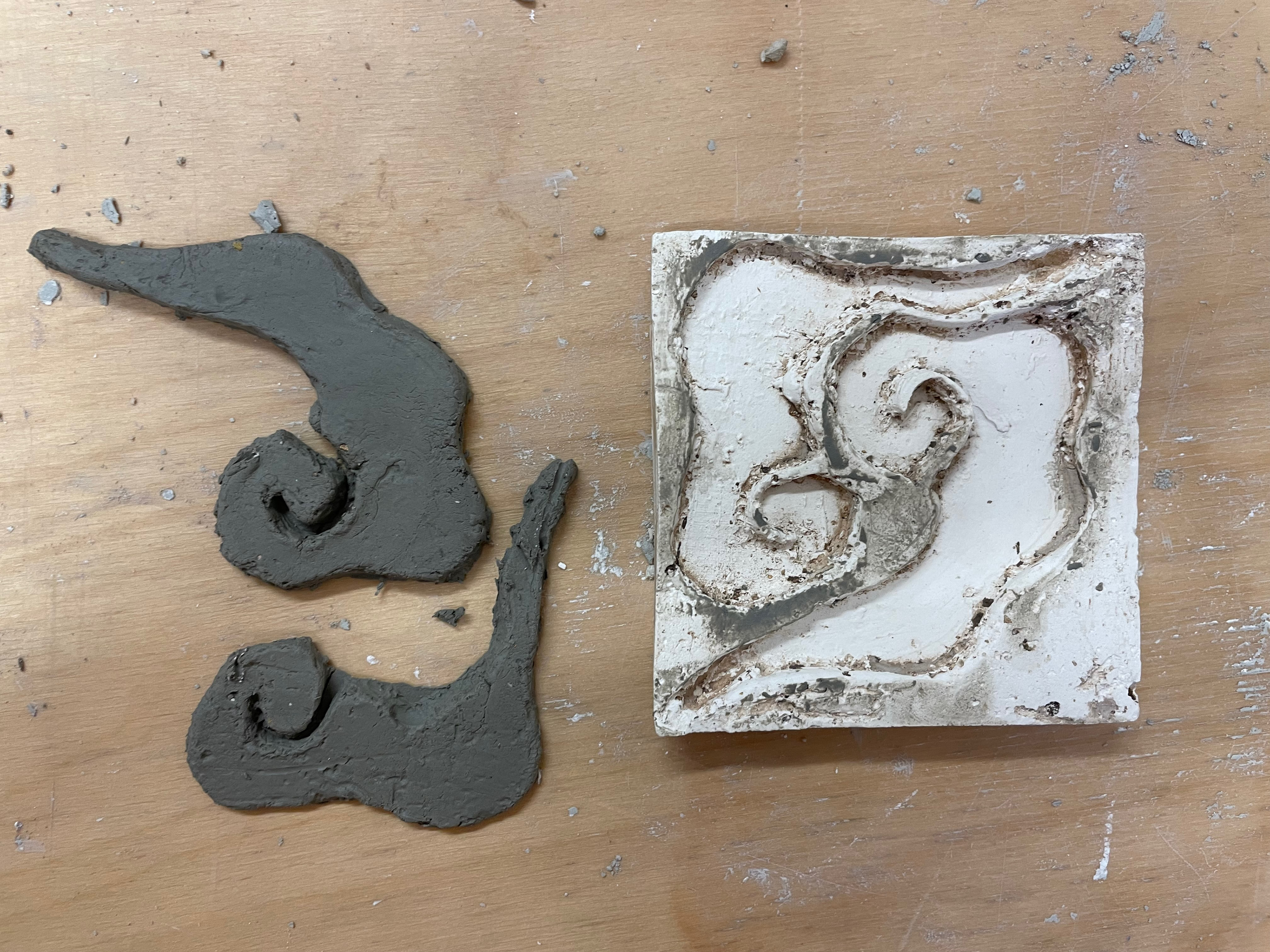
plaster tiles
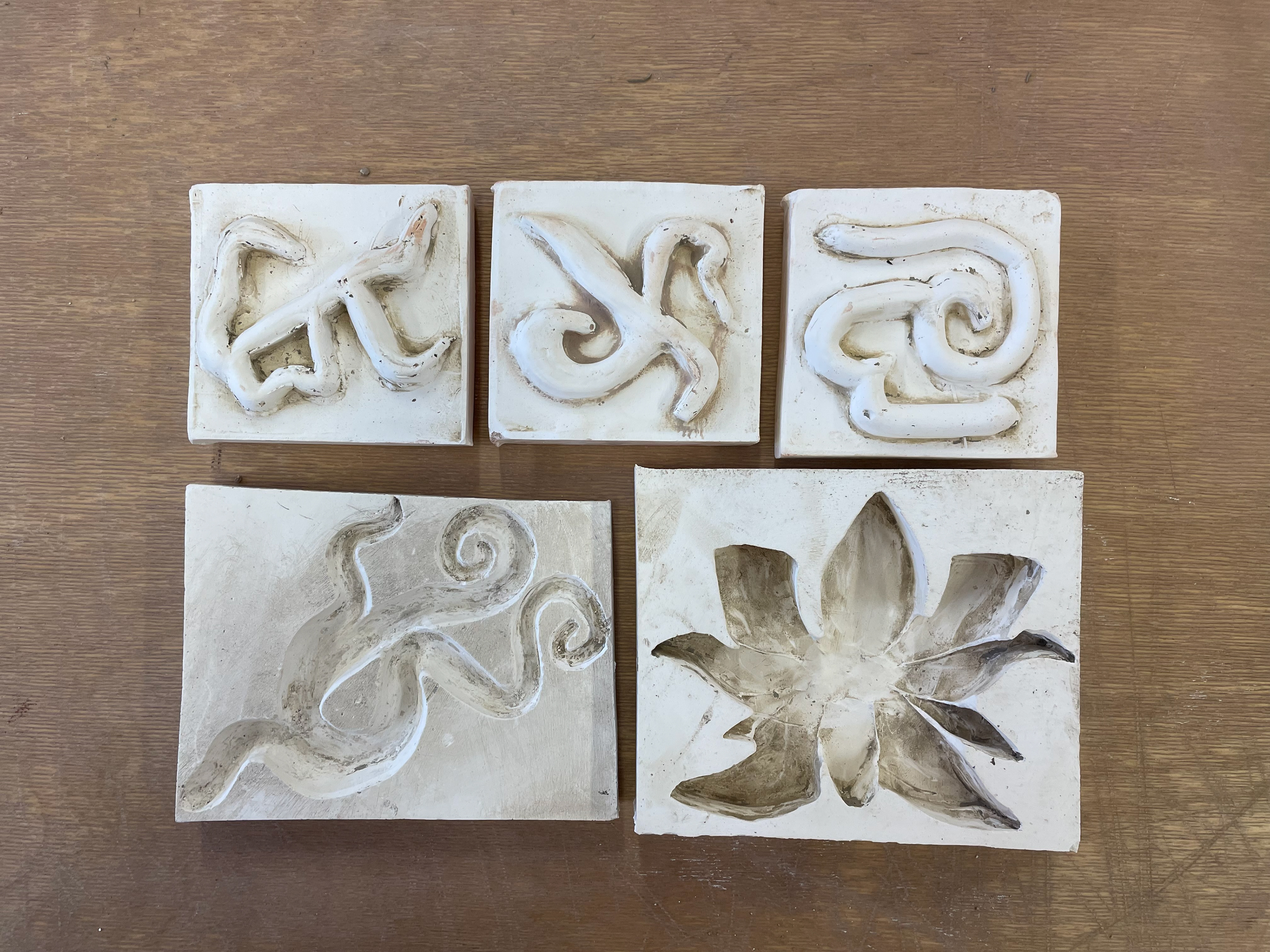
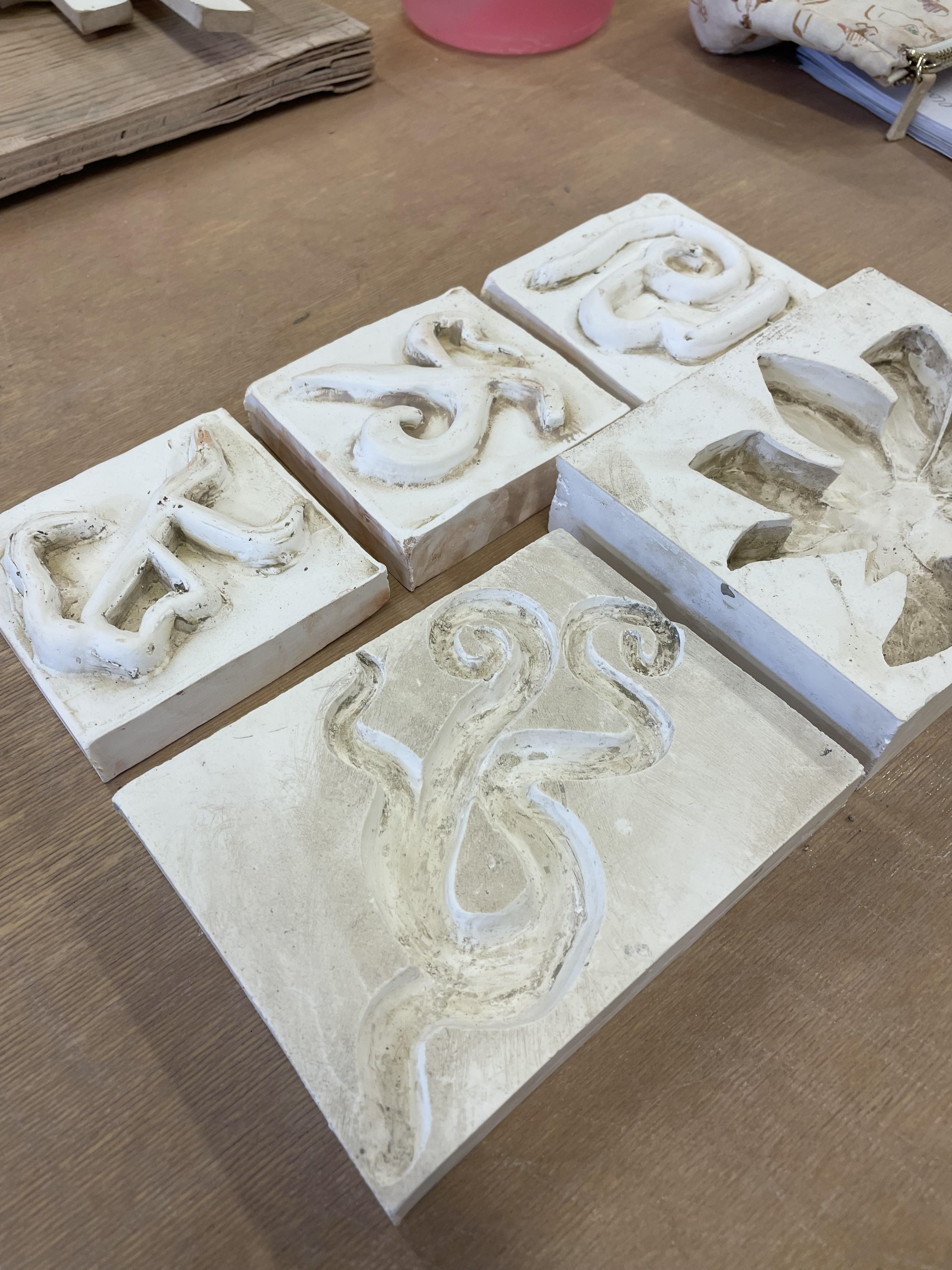
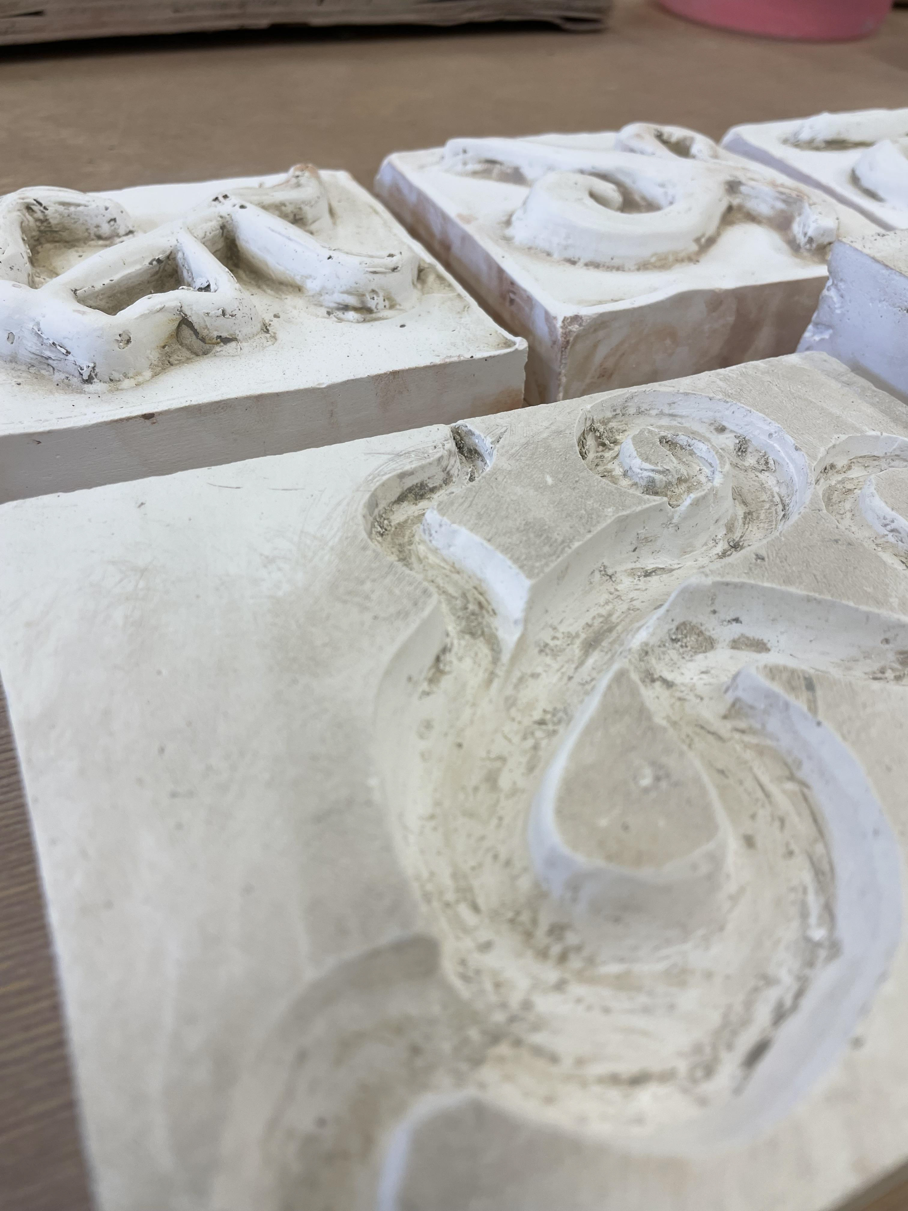

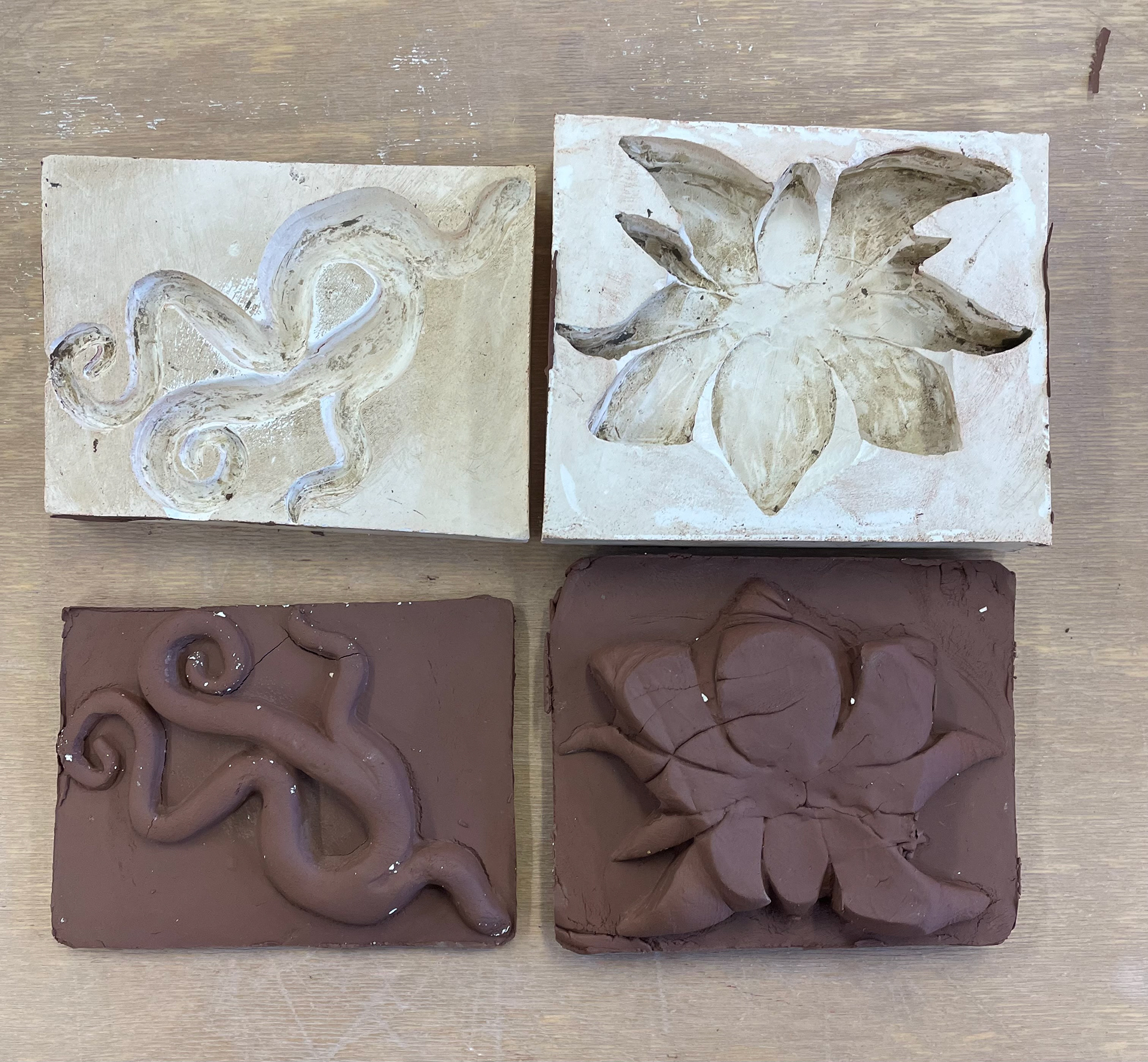
I wanted to replicate the encaustic plaster tile process when creating my plaster tiles. I carved out plastic clay for these tiles, and my carvings were all inspired by research looking into Vietnam. It took a while for me to decide and figure out if I wanted raised tile forms or forms that indented the pattern. Once I had my clay forms carved, I took them to the plaster room and began mixing the water-to-plaster ratio. Once this was ready and my clay was all set up, I proceeded to create a plaster mould of my clay tiles. As these were experiments, I was playing around with the different thicknesses of the plaster, which shapes were best to mould, and the overall outcome. Once set and dried, I was left with all my plaster moulds. I then created my tiles and fired them, applying glaze and oxidising them.
Overall, I wouldn't say I liked this process for the smaller tiles. My patterns were intricate; therefore, the tiles constantly broke while removing the clay from the plaster. I also realised whilst doing this process that I didn't want a press mould where the patterns are pushed into the clay, indenting it; I wanted my clay tiles to have raised designs and forms, which meant I would have to create a new set to accomplish this.
creating tiles in the traditional forms
crit week6
doing group feedback and explaining my work and ideas. I will then review the comments made and add where my weaknesses are to my work. This group critique was fascinating to see people who haven't been involved in my project perspective and see what they think my strengths are and what I need to develop. the questions asked for others to comment on were: 1. The strength of my submission so far
2. what aspect would you like to see more off
3. signpost what would help develop this project
Having a new audience to talk to about my work gives me fresh feedback to work on and creates a focus point for my work. These focuses are-
-exploring and experimenting more with glazes
-looking into specific materials
-looking into processes that perfect my ideas (tiles warping)
-develop more drawings
-think into initial ideas (planning drawing these)
looking at my project so far, I need to work on refining my work, thinking more specifically about what I want to focus on and my overall outcome. All this feedback is helpful, but creating a central focus, a direction in which my work can go on. I will take the discussions and feedback I received and work my way back through my project, looking at pieces I can improve on or get involved in. This will help me progress forward.
Meaning of colours in Vietnamese cultures
The significance of colours in Vietnamese culture is undeniable. Each colour in Vietnamese holds a distinct meaning, reflecting the country's rich traditions. Understanding these cultural nuances is crucial when delving into Vietnam's society:
Red: In Eastern societies, especially in Vietnam and China, red is considered a symbol of luck and prosperity. It is believed to bring financial success and happiness. This colour is often utilised in festive occasions, weddings, and celebrations, reflecting its deep-rooted significance as one of the Vietnamese lucky colours.
Black: In modern life, black, among popular colours in Vietnamese, is considered a symbol of sophistication, elegance, and refinement. This perception is most evident in fashion design, where black suits and dresses evoke a sense of power and mystique.
White: Often associated with purity and simplicity, white embodies the essence of Vietnam. A white lotus, for instance, symbolises Vietnam's inclination towards humility and nobility. Yet, in the realm of colour meanings in Vietnam, white also carries a sombre connotation - a representation of mourning and loss.
Blue: Blue in Vietnamese culture carries profound significance, symbolising intellect and refinement. This colour also conveys a sense of modesty, reminiscent of the blue attire worn by scholars in the past. This cultural interpretation of blue highlights its role in signifying knowledge and sophistication.
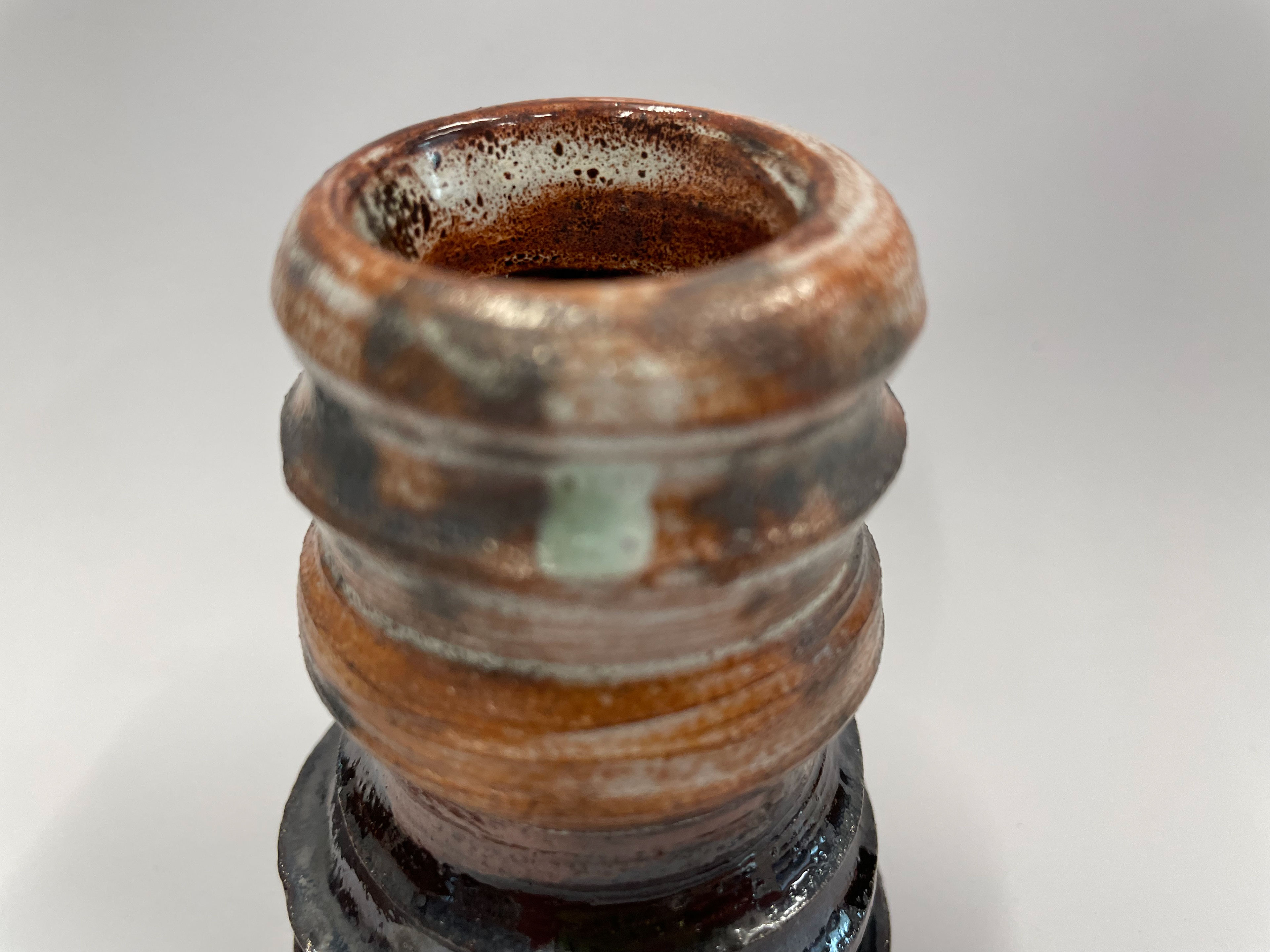
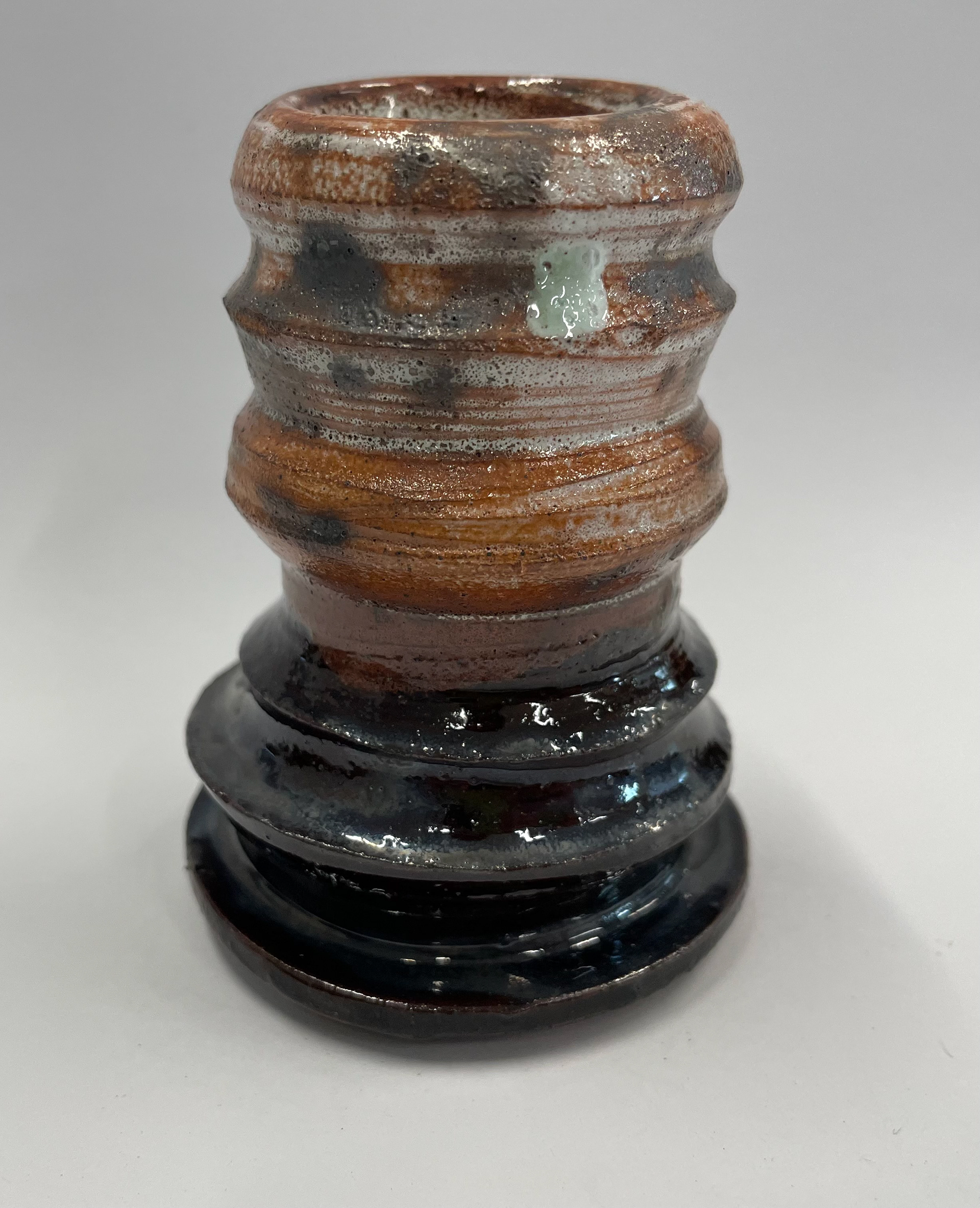
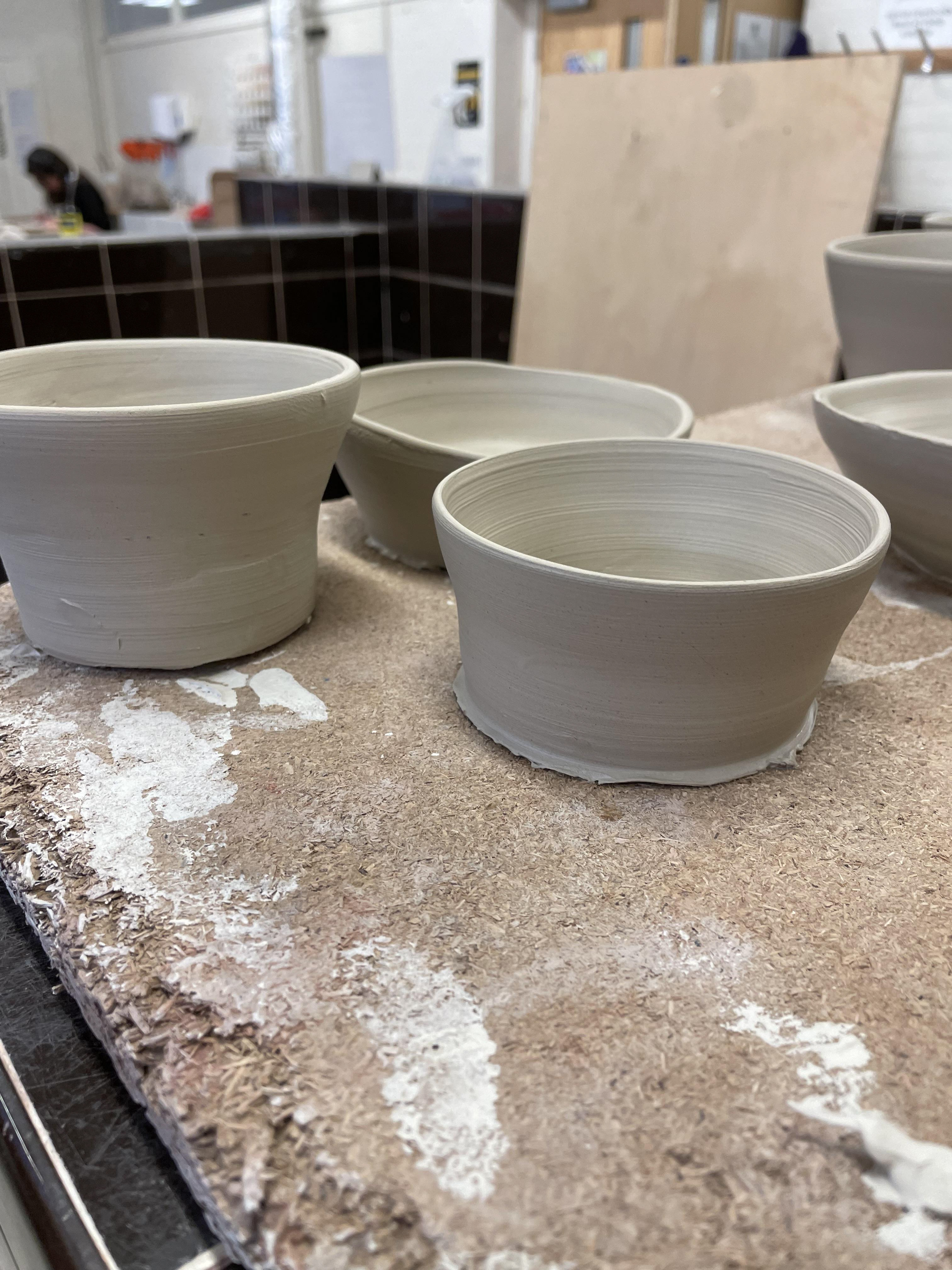
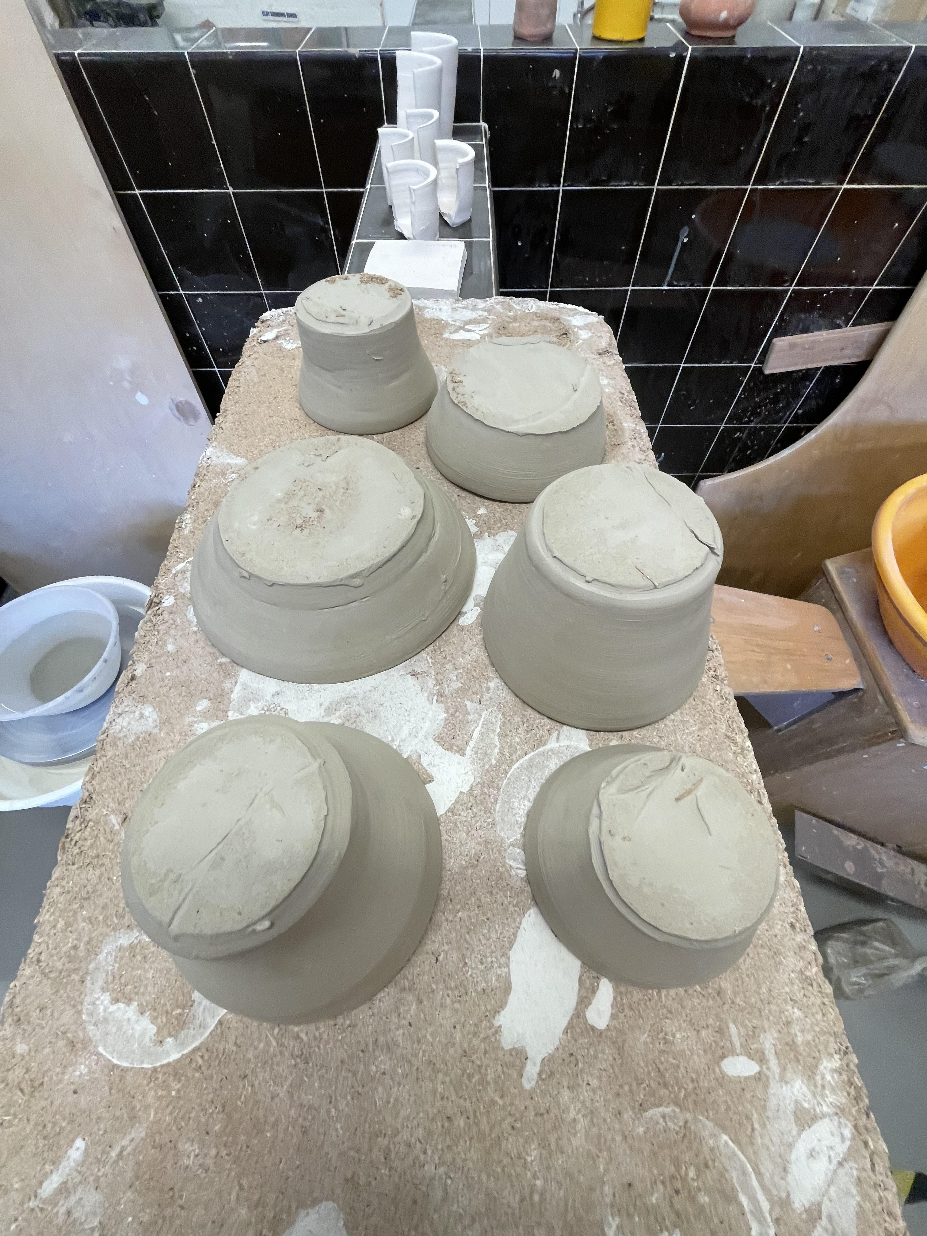
Comparing clays and developing my throwing
Throughout this whole project, I was constantly throwing, finding my techniques, my comfort, and my style, and I knew this was something I wanted to incorporate into my final piece. I have spent around ten weeks teaching and expanding my knowledge of throwing. To learn about the quality of clays and what I like to work with, I threw with every clay we had. Red clay, ivory clay, crack with grog.
Red clay throws very well and is one of my preferred throwing clays. It’s affordable and responds well to my movements. The only thing that needs to be considered is that once fired, it goes a darker red colour. You need to think about the reactions the glazes have to a dark undertone.
I wanted to use grog clay, a mixture of all clays. I wanted to see how it fired and worked with my throwing. Throwing with grog is my least favourite clay to throw. The roughness of the Grog makes it very hard to throw with, as when you add pressure to the clay, it cuts your hands up. However, I like the reaction between grog and glaze and how it catches on the small texture of the surface.
Near the end of the project, I decided to use ivory clay, as it is a lighter colour, and I thought it would work with my designs. When throwing this clay, I found it very different from the rest, being more elastic and plastic, making it more malleable. When fired, this clay also goes a perfect white colour, which attracted me to the clay as it allows the glaze to react on the plain clay surface. Allowing me to get the true glaze colours I intended for.
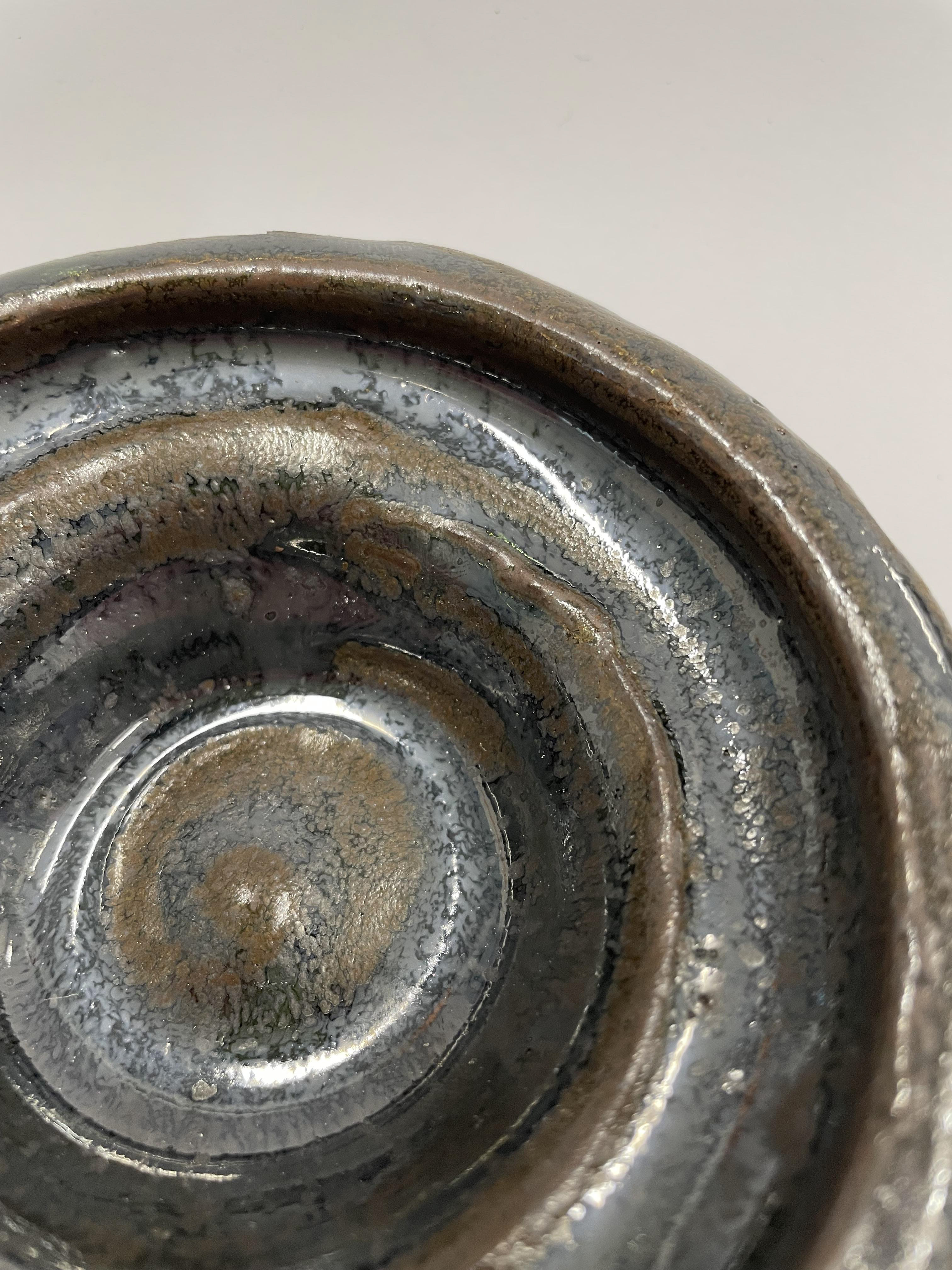
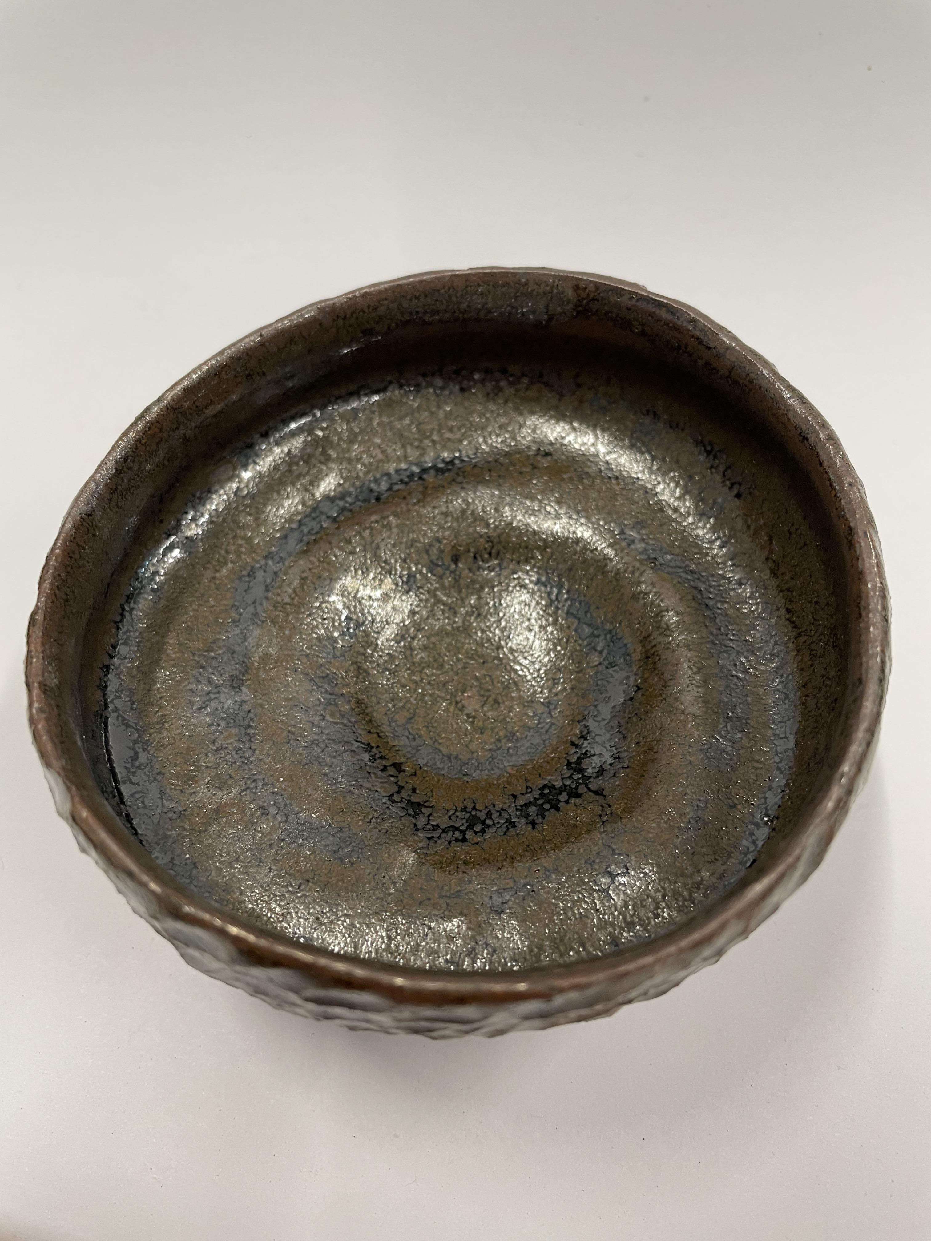
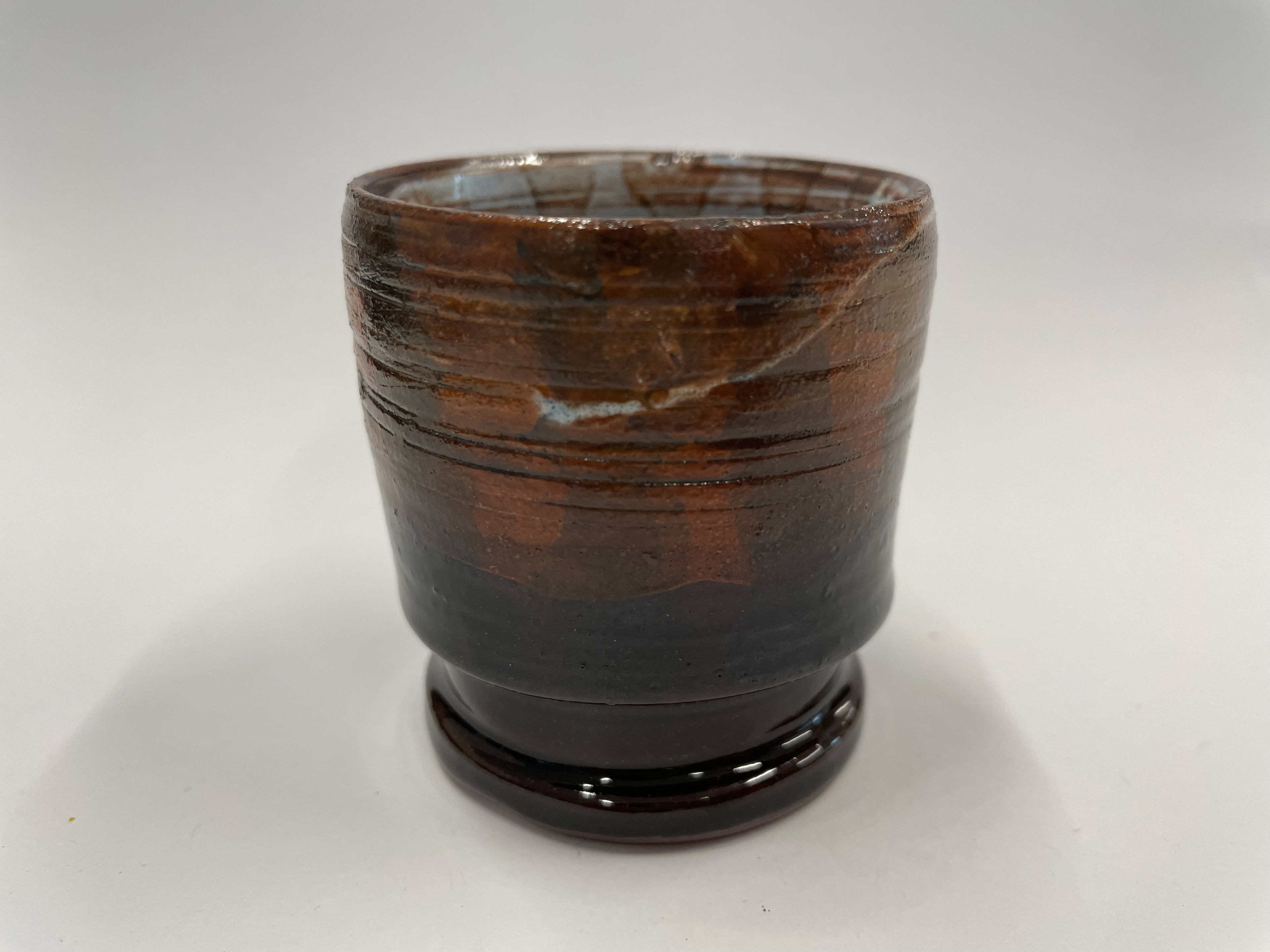
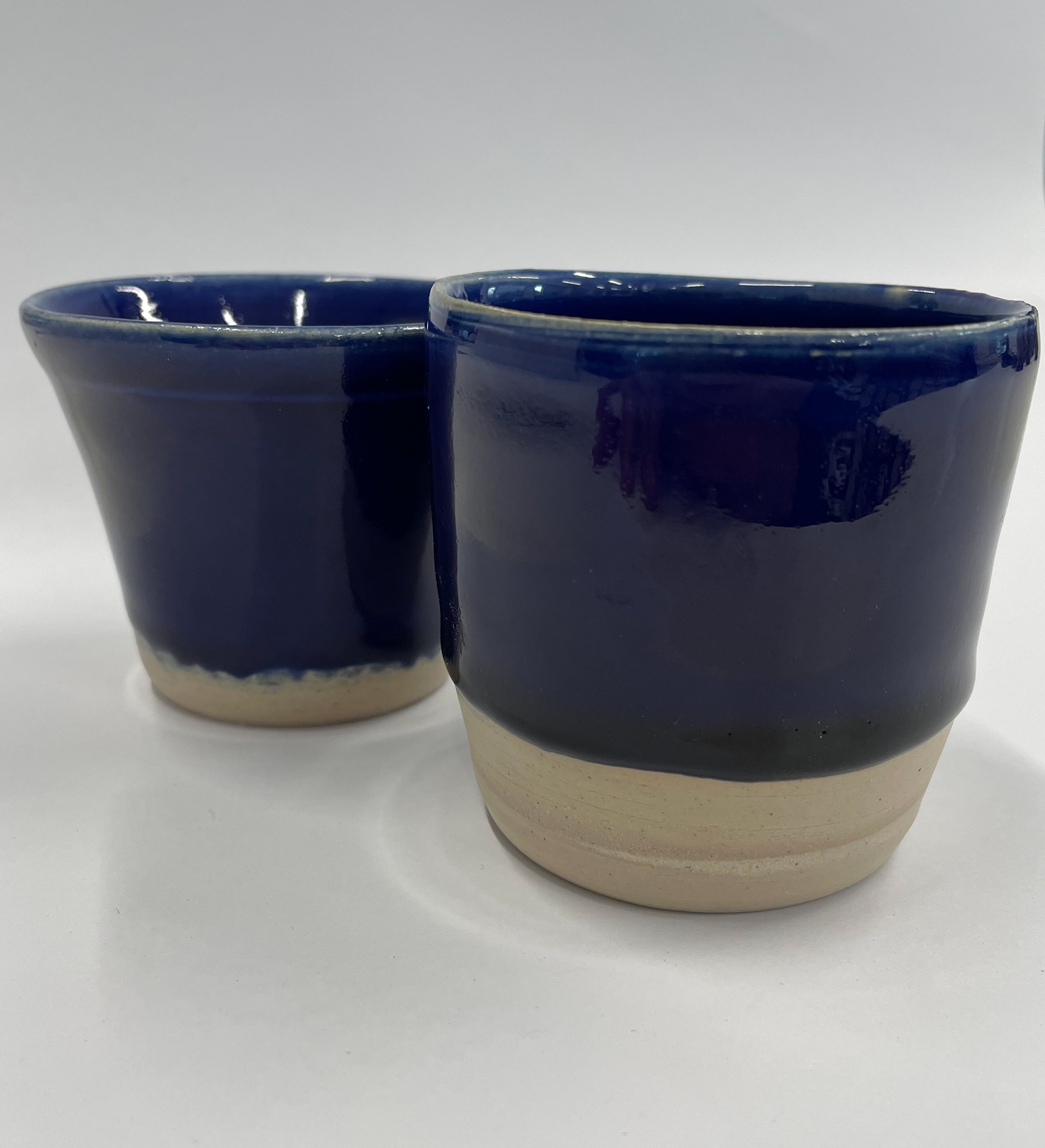
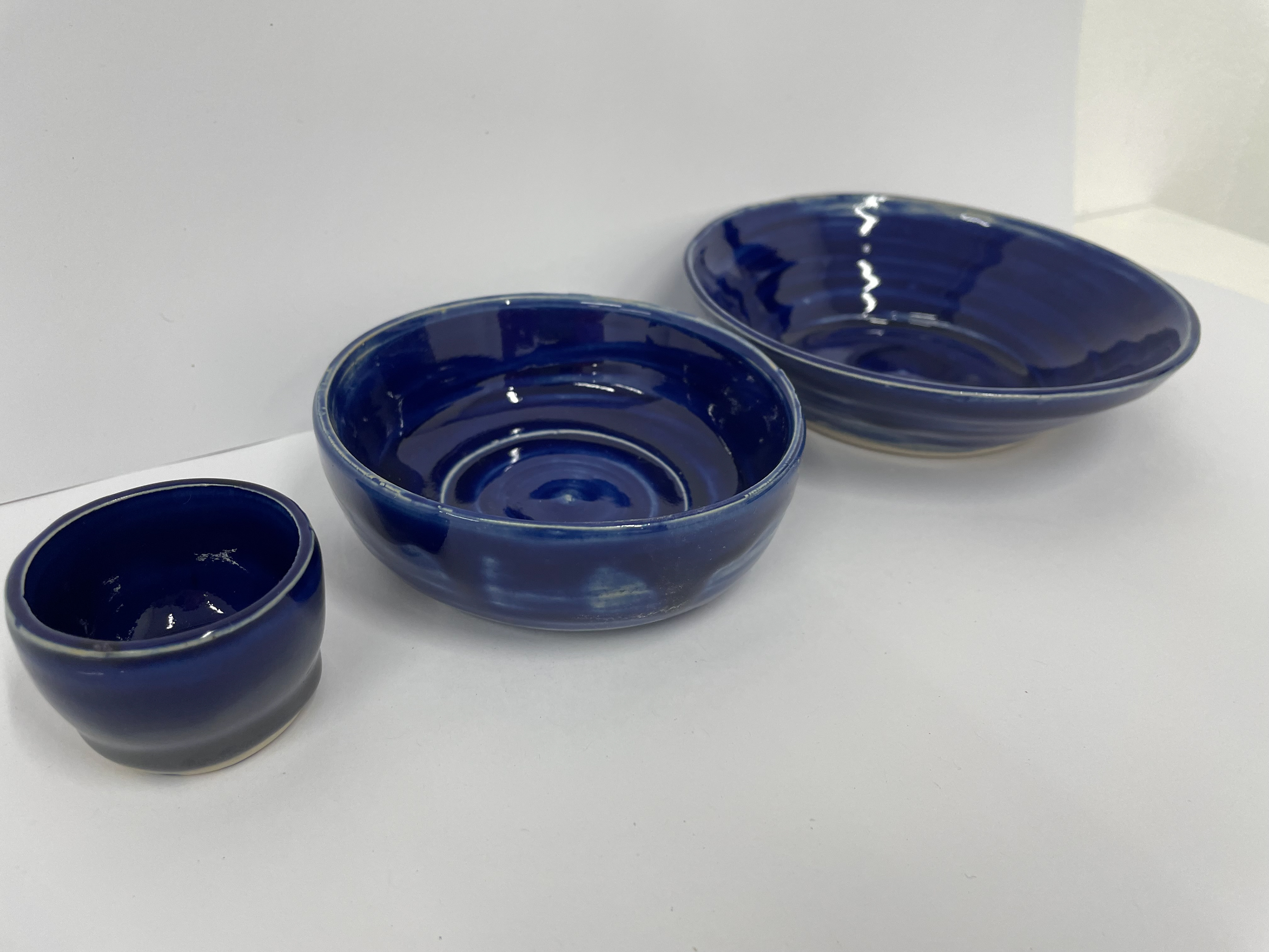
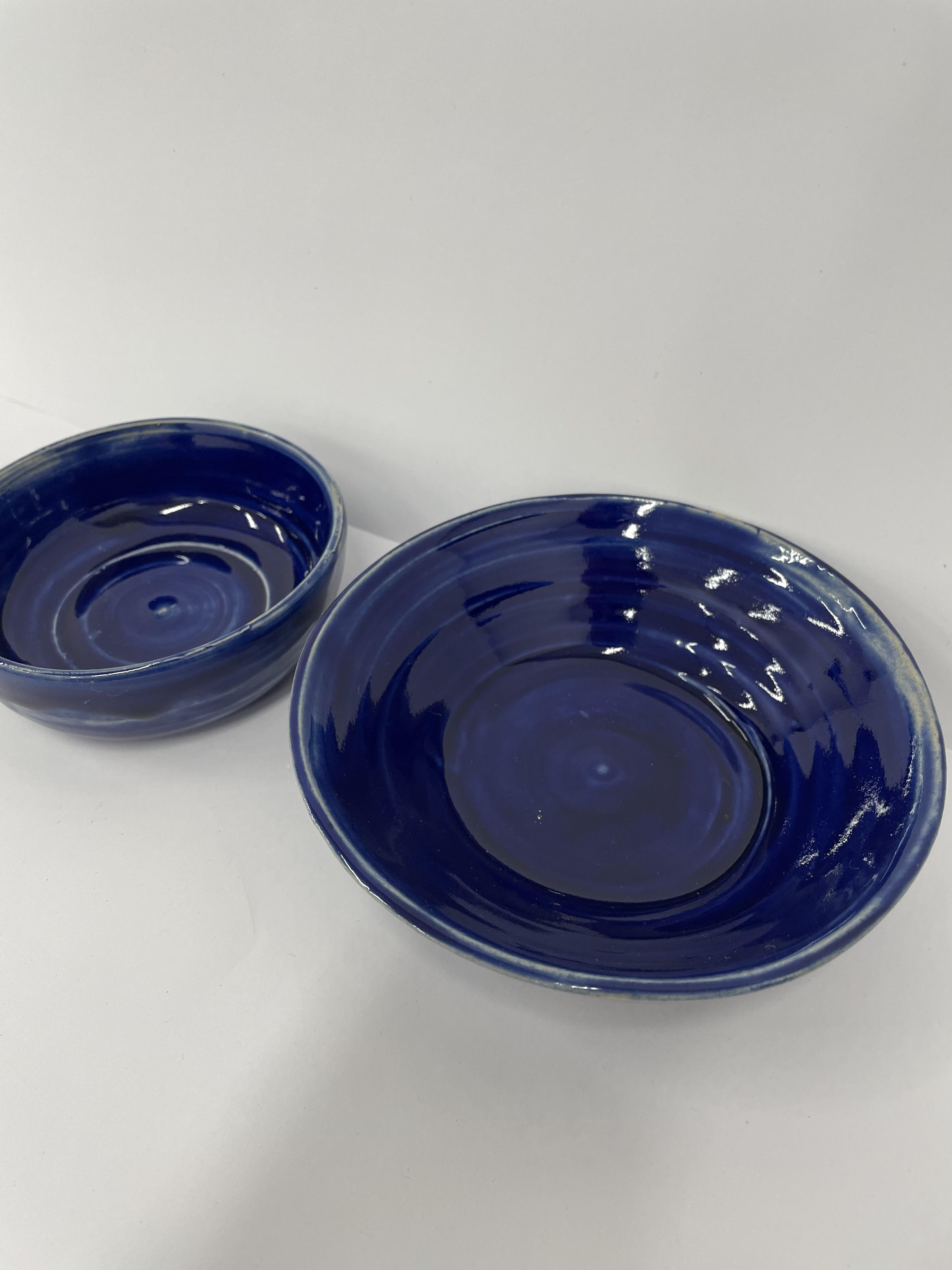
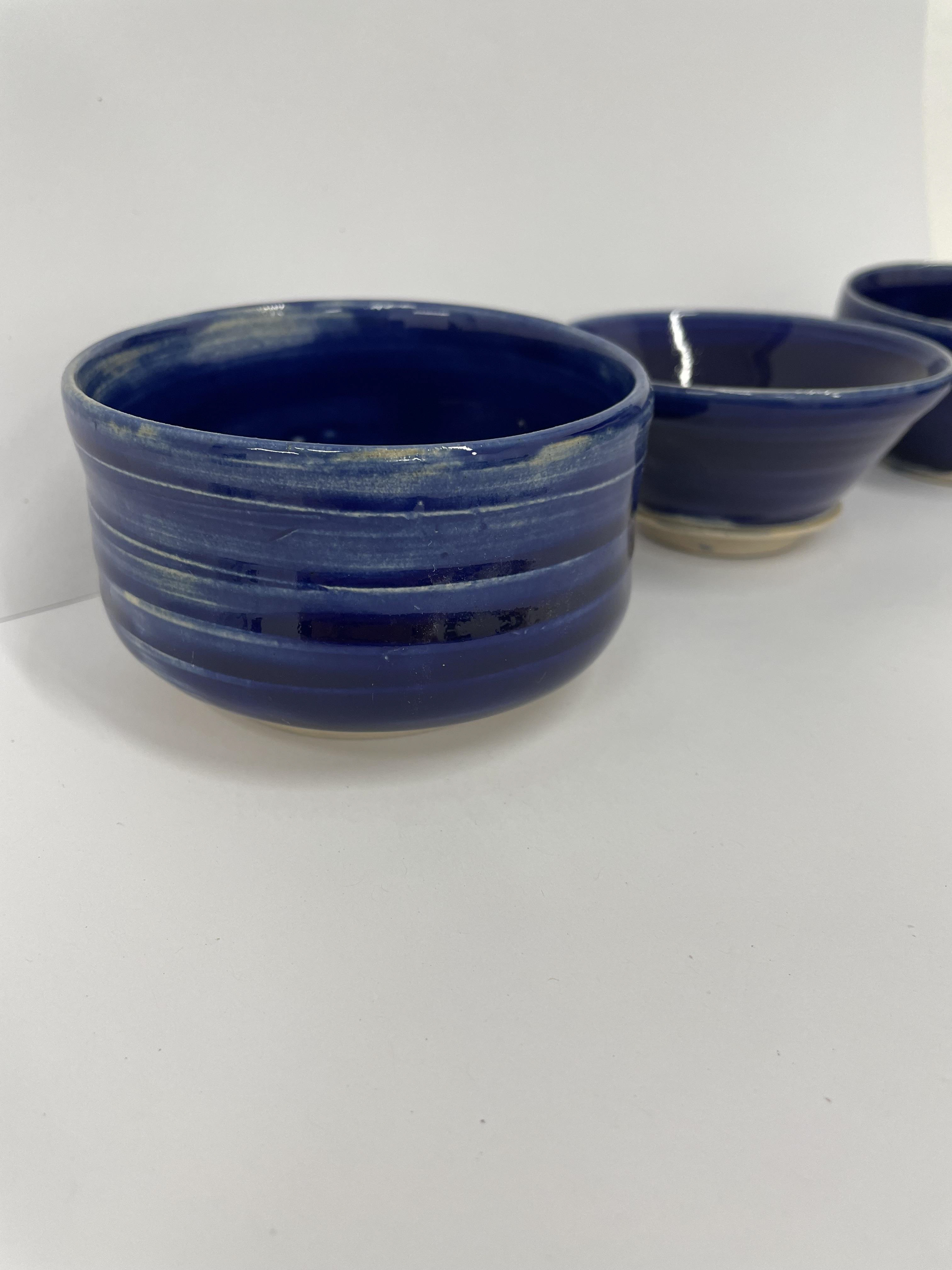
For these thrown pieces, I decided to experiment more with the glaze and become more comfortable with glazing. For the top pieces, I painted them with liquid oxides and then dipped them in a clear, honey or white glaze to see the different reactions. This is a technique I've used before but not enjoyed the outcome of. Therefore, for the remanding pots, I added the oxidised power to a pre-mixed clear stoneware glaze. I used 0.5g of cobalt oxide per 100ml of clear, shiny stoneware glaze for the blue-glazed pots. Mixing a powder with the glaze allows for a more saturated and even glaze. I used the same technique for the green pots: 1g of Chromium Oxide powder for every 100ml clear glaze. It's interesting to see the different applications and clays leading to different outcomes. Using ivory stoneware clay, which is pure white when fired, meaning the colour is more vivid and true than applying it to red or crank clay. For the green pieces, I painted some of the glaze on. This meant the application wasn't as uniform, and even as dipping the pots in. Therefore, they were a bit patchy once fired. This was fired in a reduced stoneware kiln, changing the glaze reactions and making the chromium oxide metallic. This is due to the thickness of the glaze being on the inside of the pot, as I didn't pour the glaze out fast enough, meaning it had a thicker layer of glaze, but also, being in the reduced kiln had an impact on making it metallic. All these pots and creations helped me build my confidence in throwing.
final process

For my final piece, I'm taking inspiration from my research in encaustic tiles; however, I'm interested in using plaster to create repeat designs, and I don't plan to make tiles. Throughout this whole project, I have been learning and practising throwing skills. Thinking about both these elements, I want to combine both to create my final pieces.
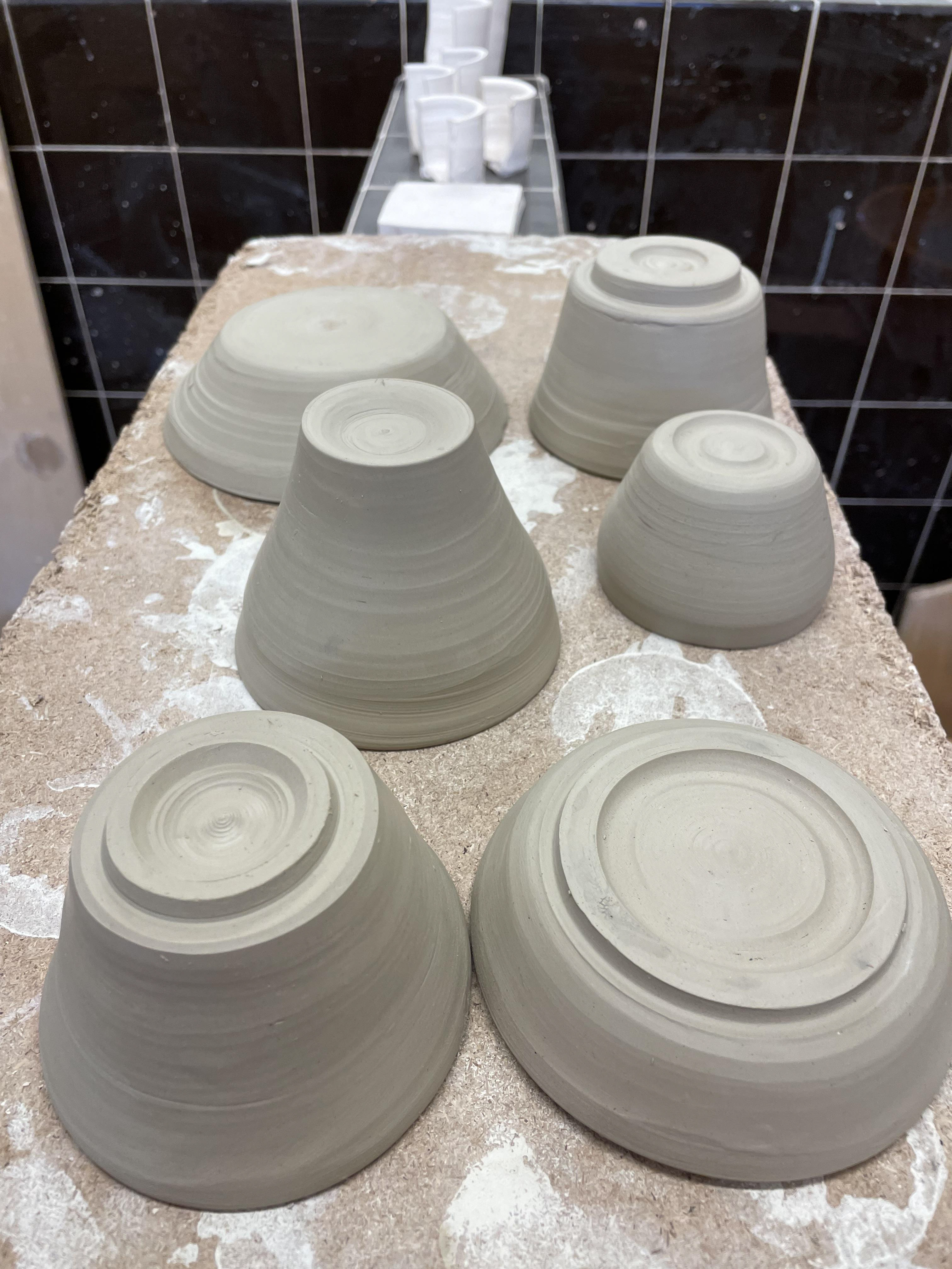
My thrown pots to be the vessels in my final piece. For these three pieces, I used ivory stoneware as I liked the pure white that it fired, too. I threw a few pots that all had similar shapes and sizes to one another, therefore allowing me to pick out my desired final vessels. Throughout this project, I have become more confident with my throwing; however, I also wanted to show my skill in trimming. I trimmed all of my vessels to make sure they were all even when standing and to show that there was a finished set. I think trimming the bottom of the pots makes them look more complete and uniform. It also allows you to get rid of any cutting marks.
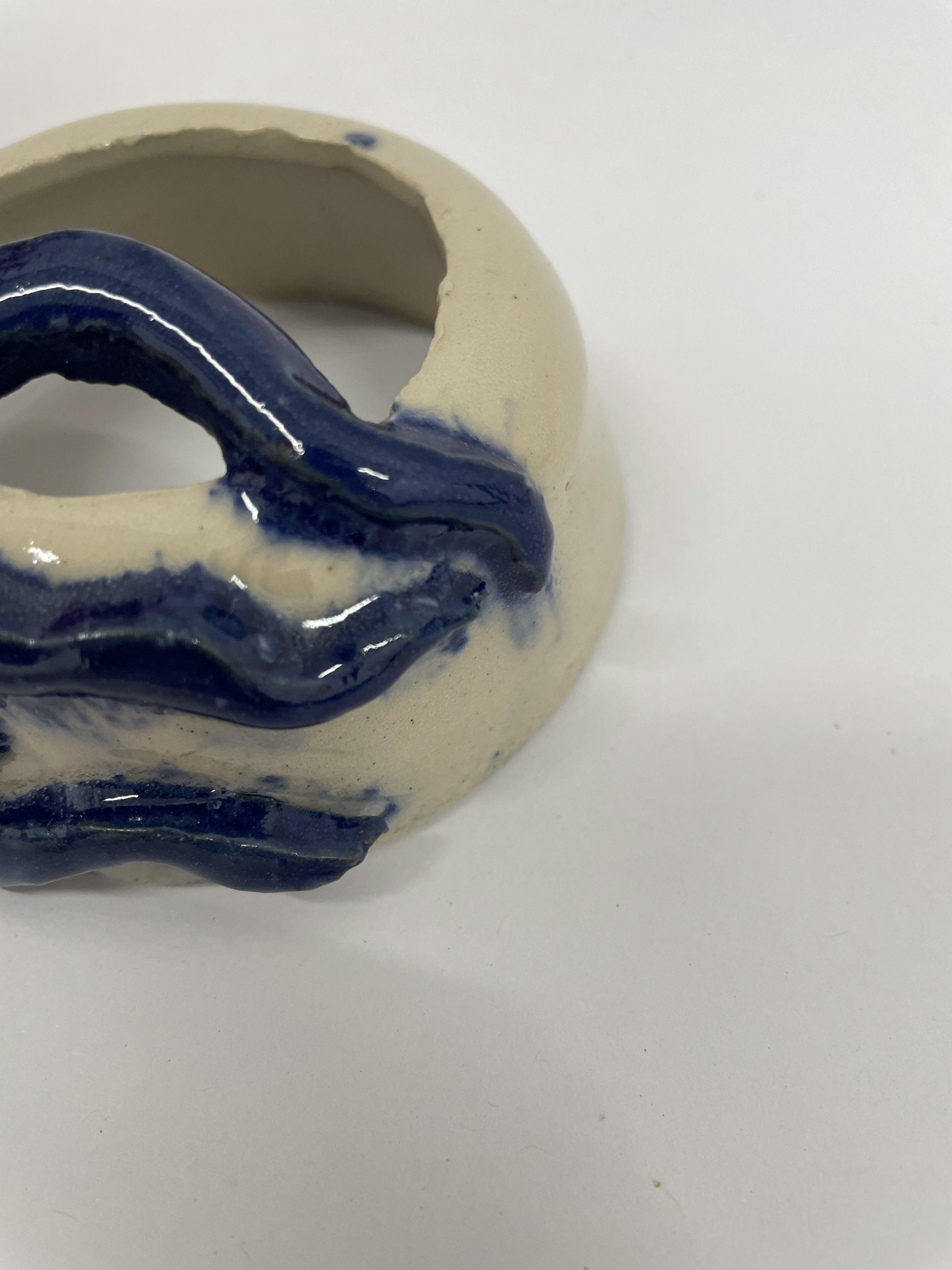
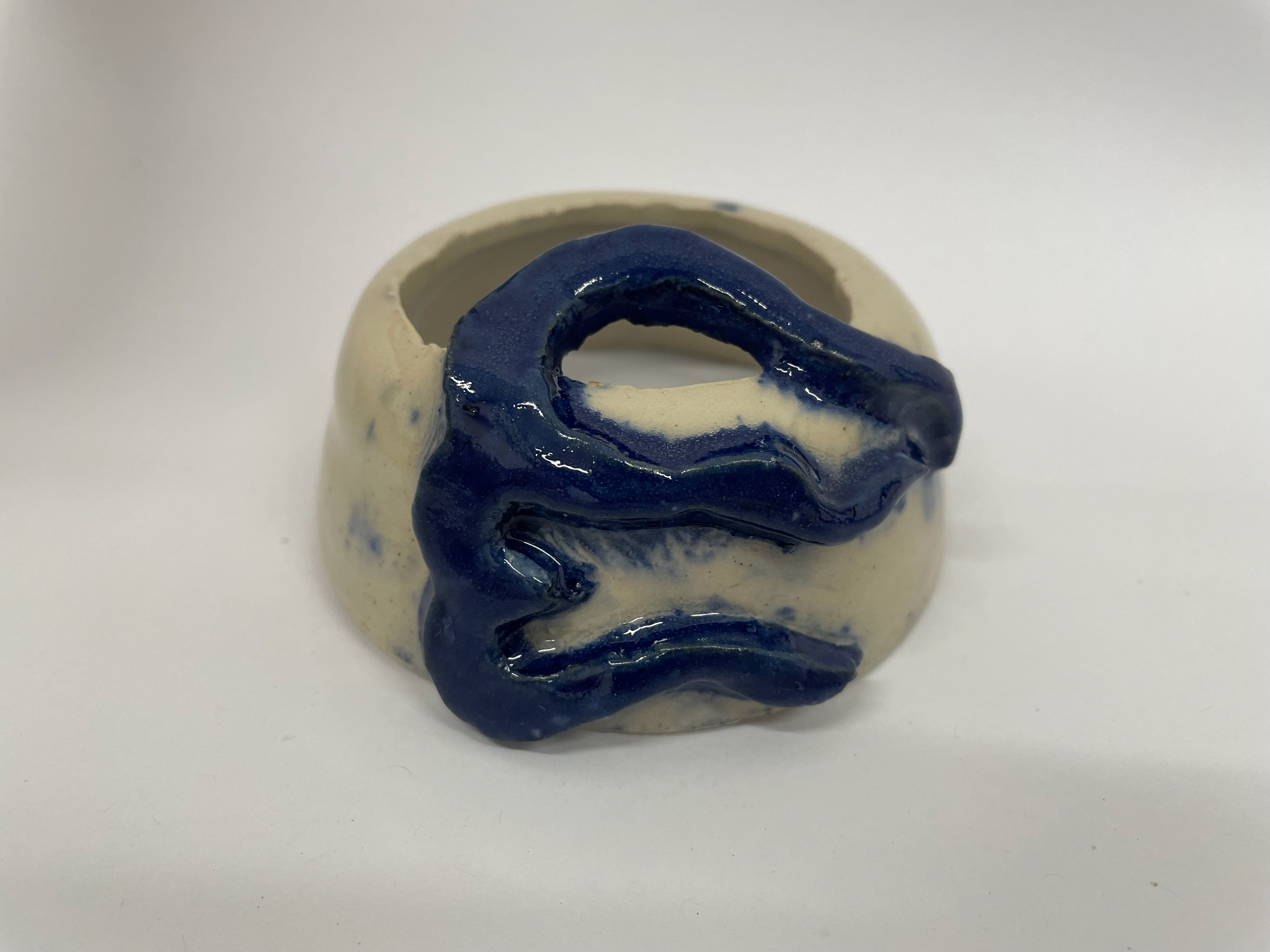
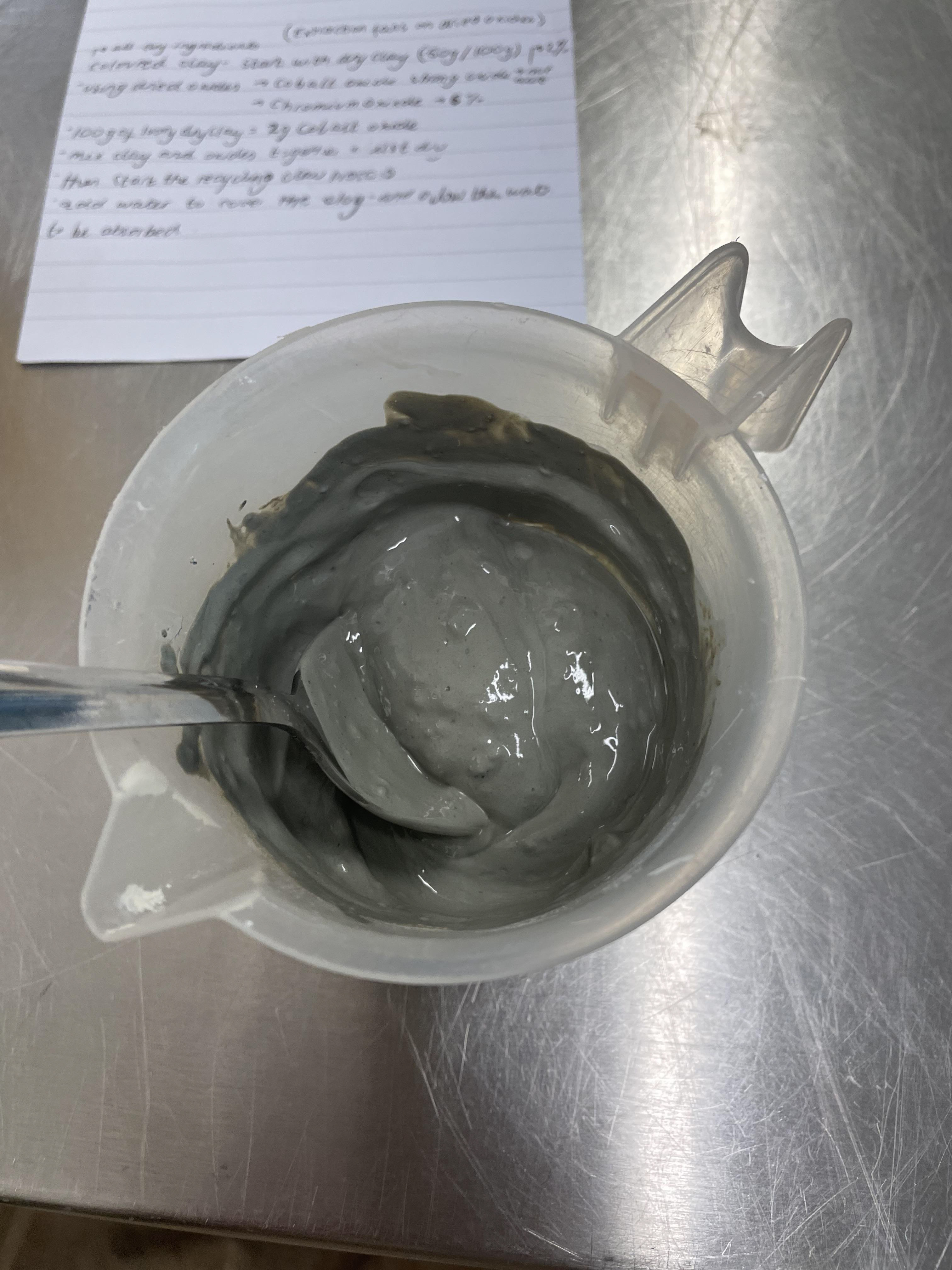
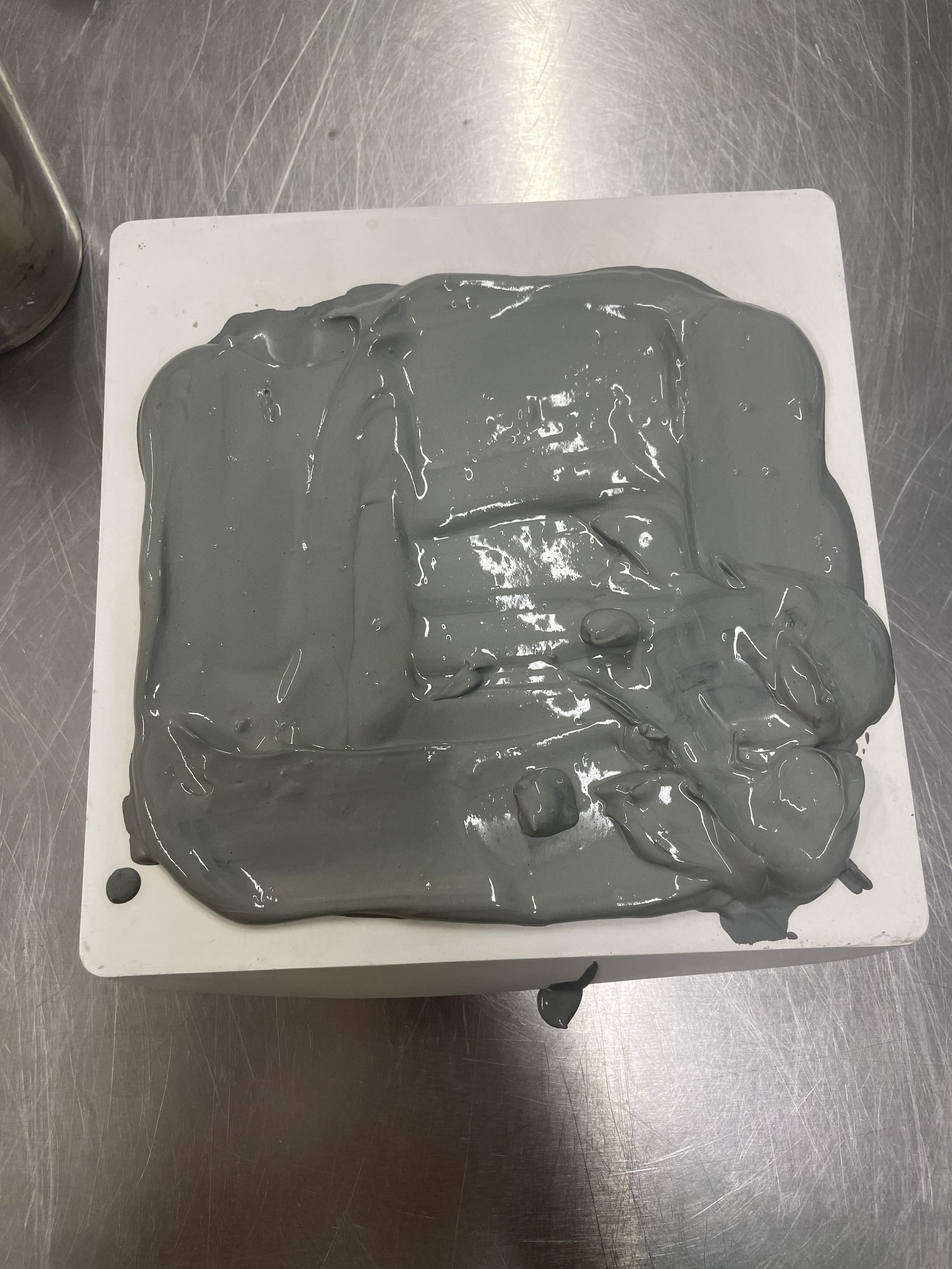
I used one of my failed thrown pots as a test piece to see the result of my colour clay and if the application was secure enough for my final vessels. Doing this as a trial run taught me a lot and was a physical example of the improvements and adjustments I needed to make. Being the first batch of blue clay that I made, I realised I had the cobalt oxide to wet clay ratio wrong to my preference. This blue was very dark, turning almost black; only in good lighting could you tell its actual colour by having this sample as an indicator. I then lowered the amount of cobalt oxide by 1/4; my amount of clay before was 1g per 100g of clay; now, I was using 0.75 per 100g, giving me the perfect shade of blue. It also allowed me to see that the blue clay stains the white if they are mixed. Not thinking that having blue clay on the white thrown vessels would be prominent showed me to be more delicate with my application and wipe away blue clay markings.
colouring clay and slip
final plaster moulds
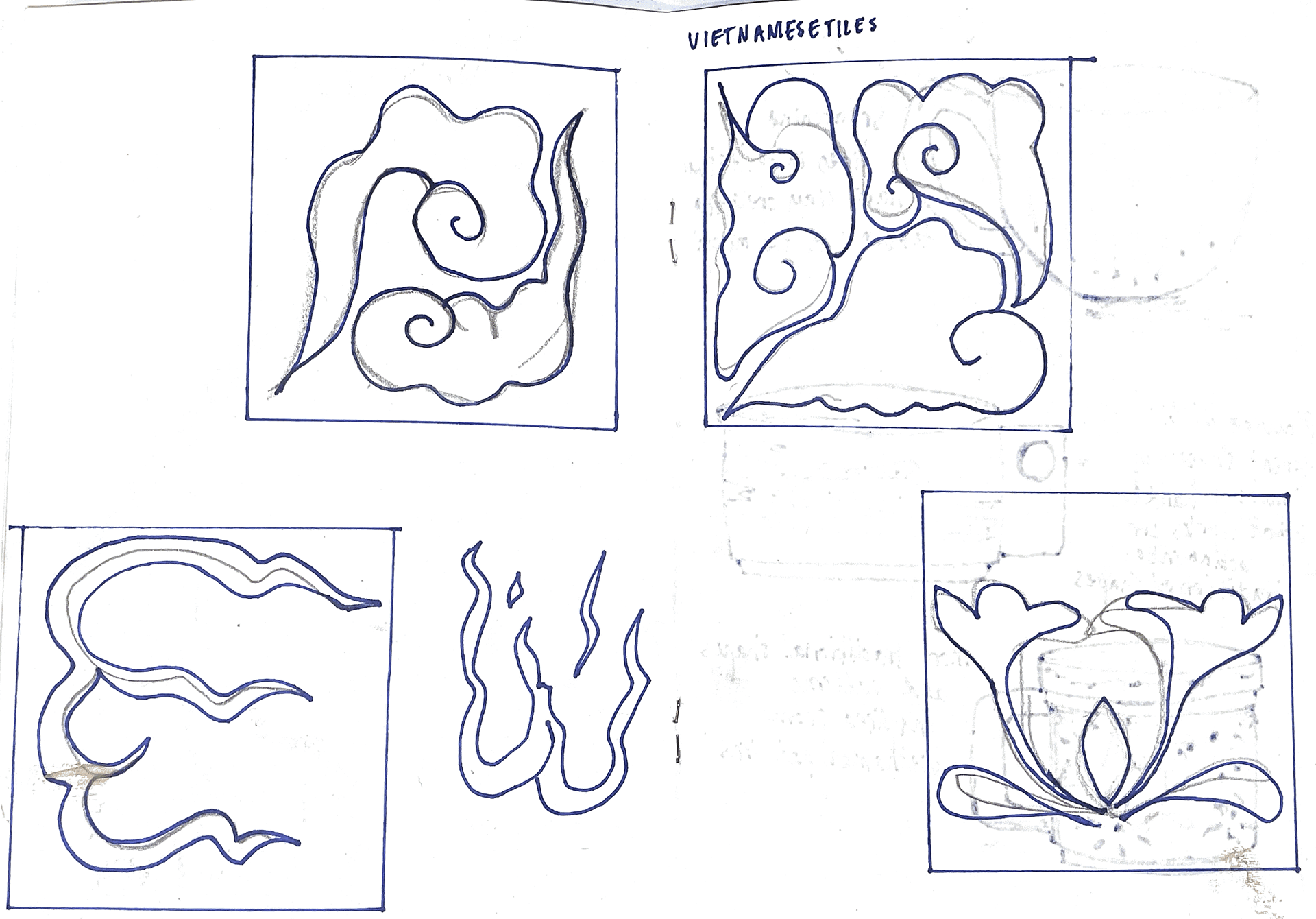
My research into Vietnamese patterns inspired my final tile designs. I base these patterns on the fact that they are very similar to the decorations on Vietnamese dining ware, which, when I'm with my granddad, we always eat our food out of. These patterns are significant to me and bring memories of sharing food and Vietnamese culture.
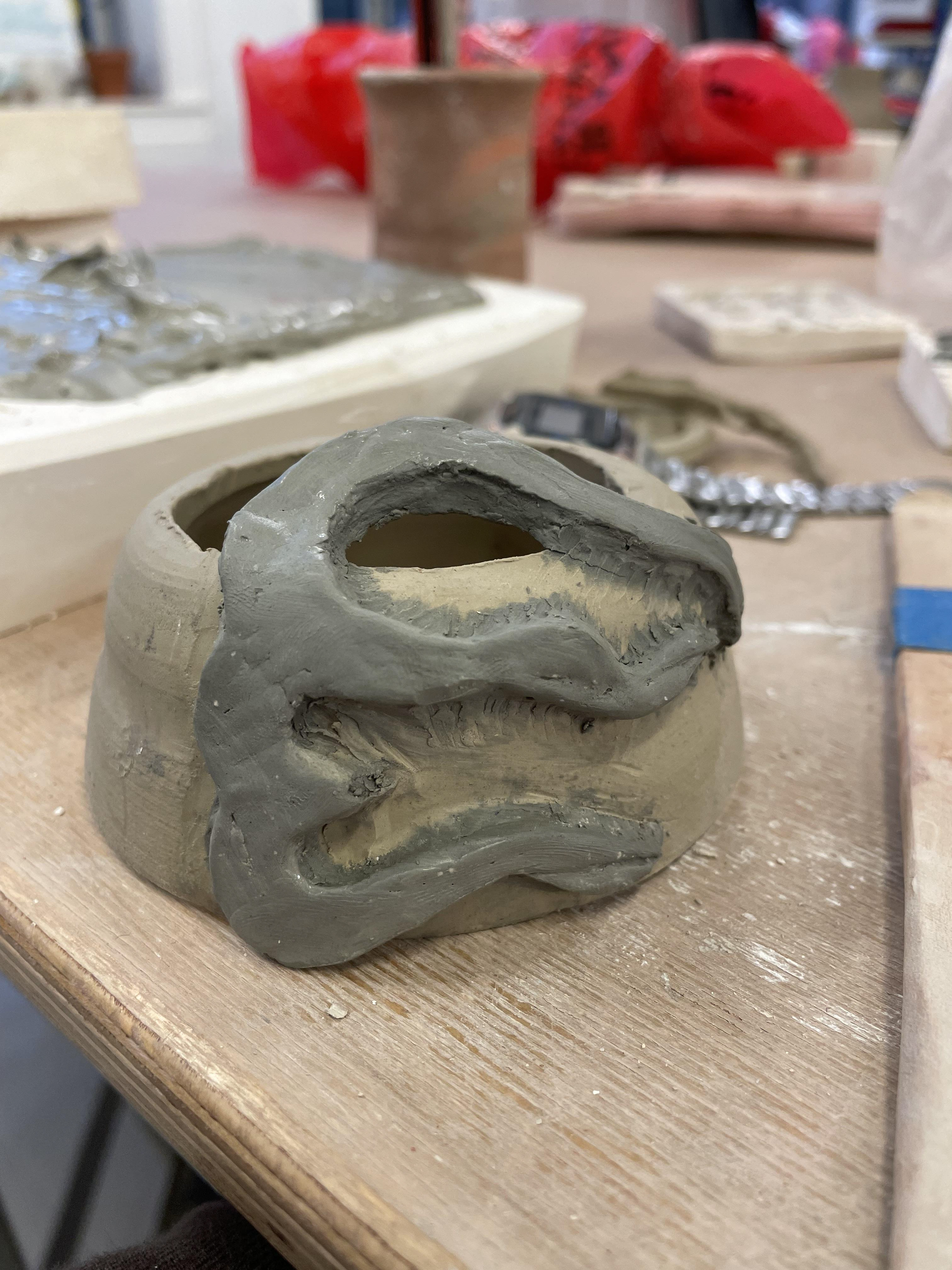
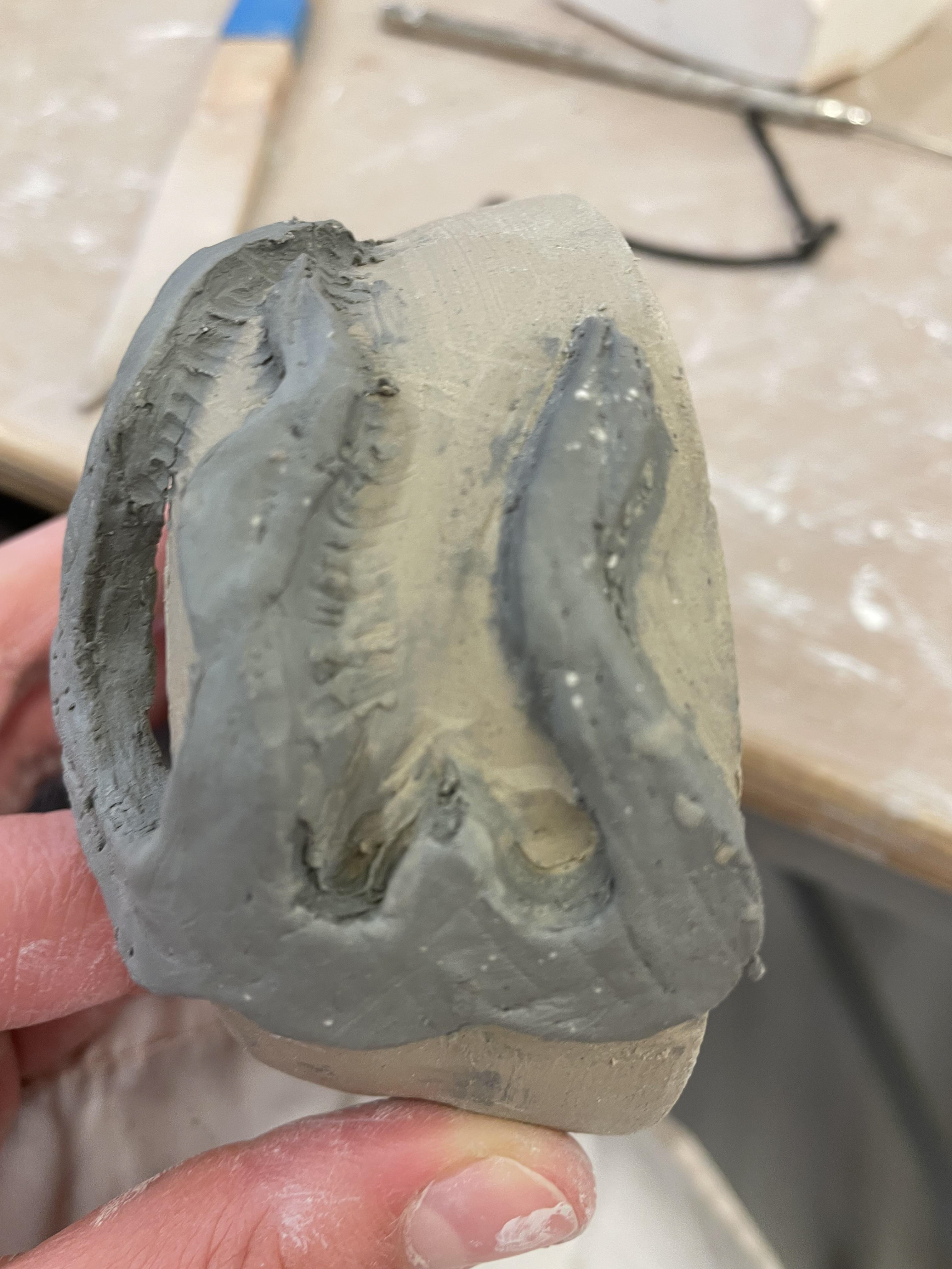
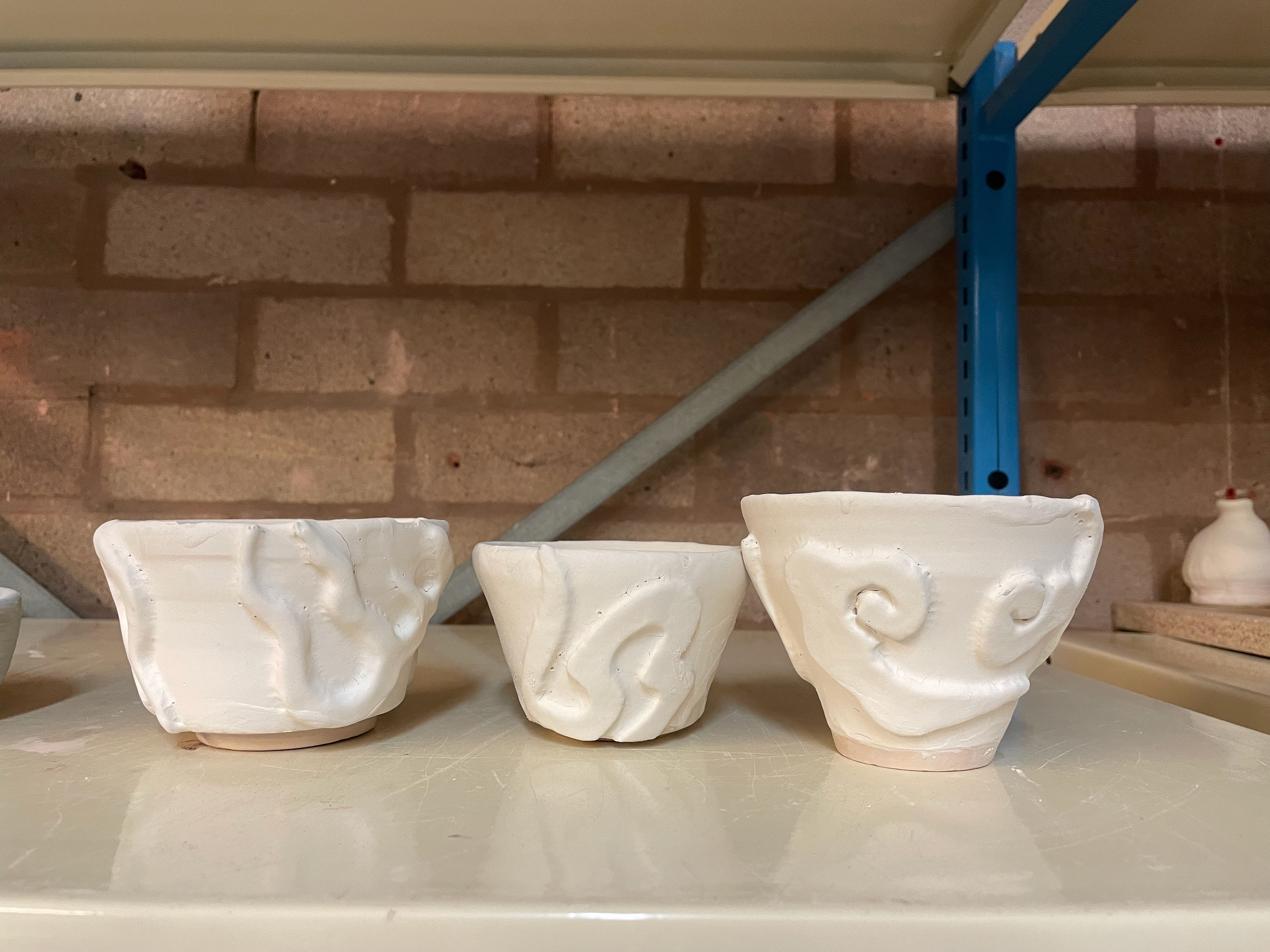
For my plaster moulds, I began by carving away the negative of my clay patterns. This meant that the moulds would create raised tiles when used. Carving out the patterns was a very intricate process as these tiles measured 8cm x 8cm, and I scaled them to my vessel sizes. Once dried, the plaster moulds were set to use; however, I found some difficulty as the clay I used was crank with grog, which meant my plaster tiles had a lot of uneven texture on the surface. This led me to grind the surfaces flat and proceed with my process. Using the blue clay I created, I pushed this into the moulds, filling out any part of the patterns. I then let this sit for a bit whilst it hardened a bit. Once it was a bit more leather clay, I used a wire cutter to escape off the tile layer, leaving me with just the infill of the patterns. Allowing the clay to sit in the moulds made it shrink a tiny bit, making it easier to peel out. Creating a mould meant that I had 2-3 exact repeated decorations for my vessels.
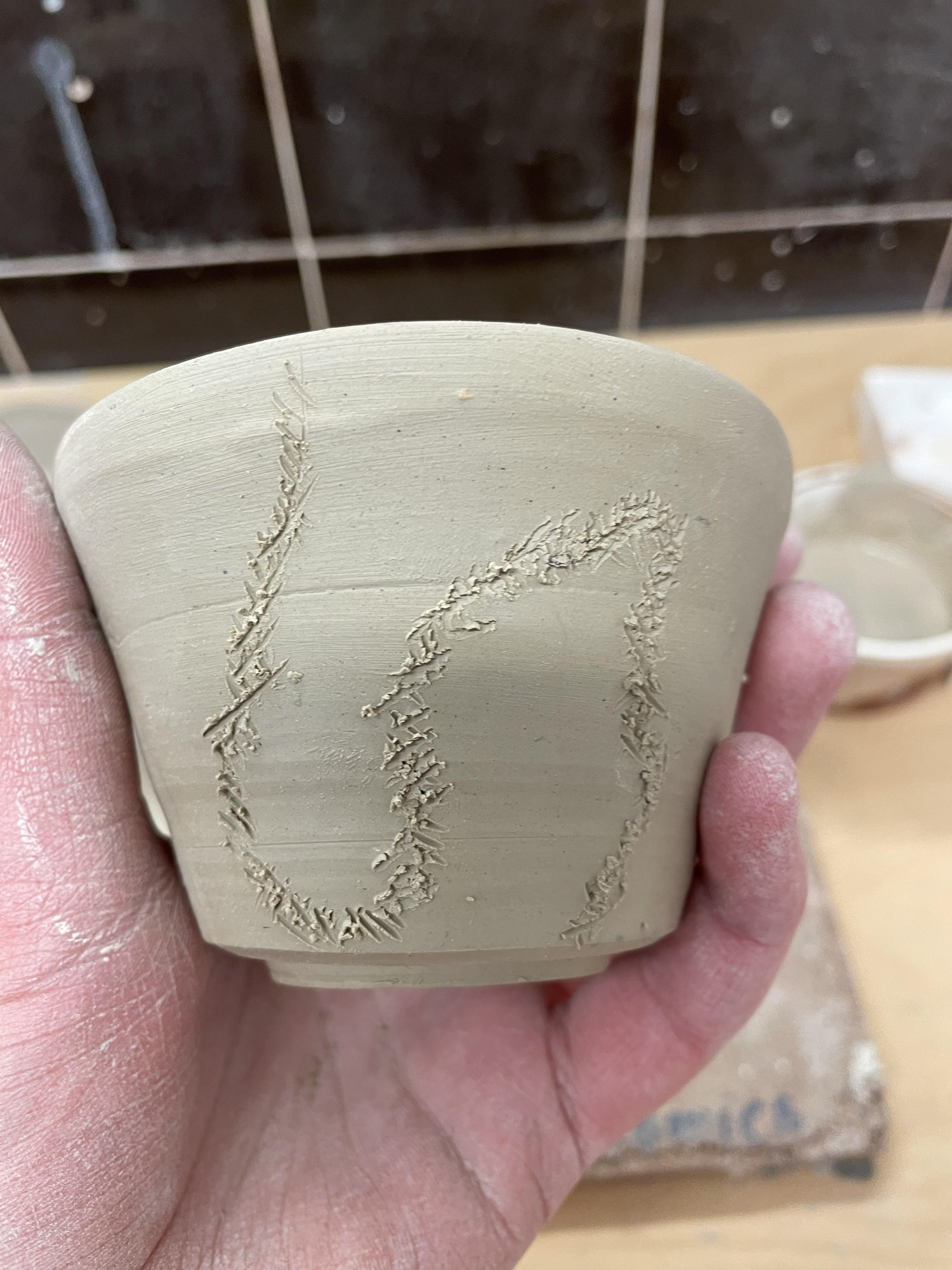
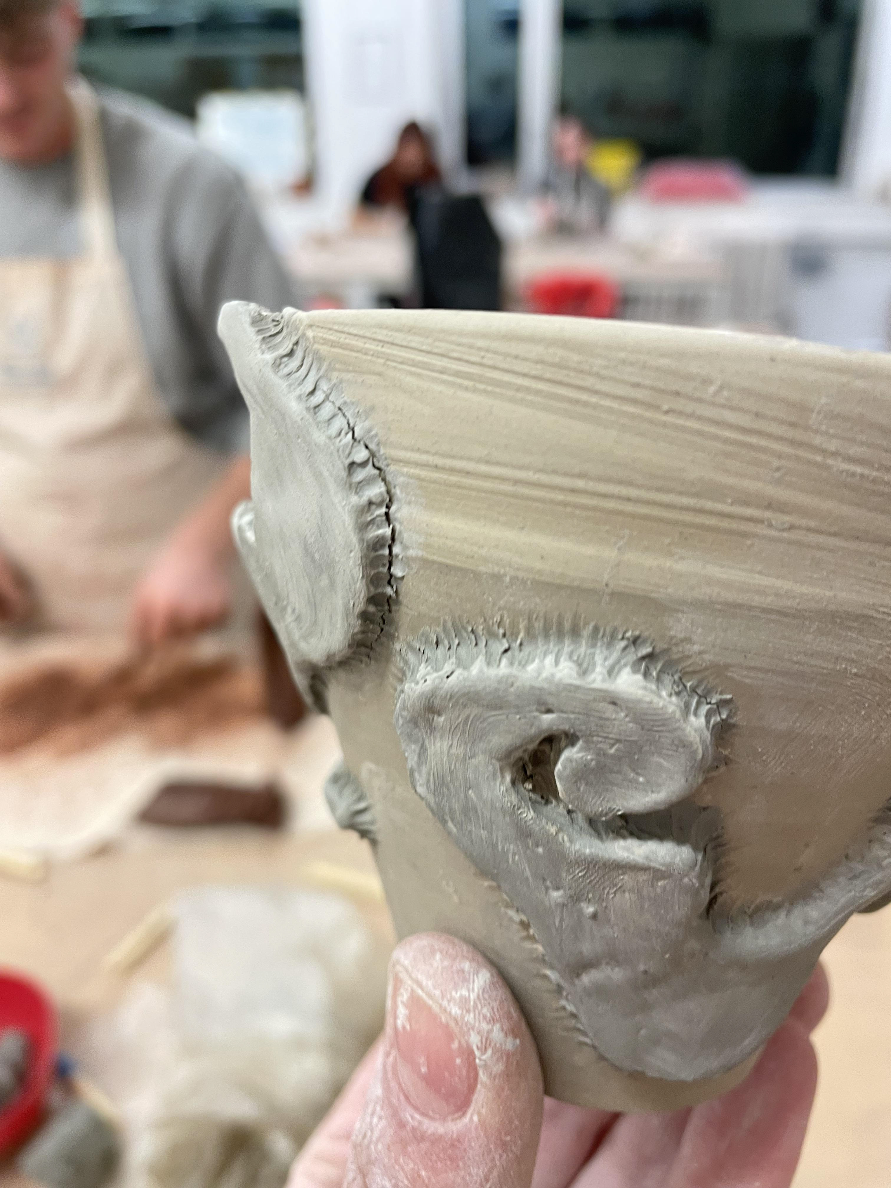
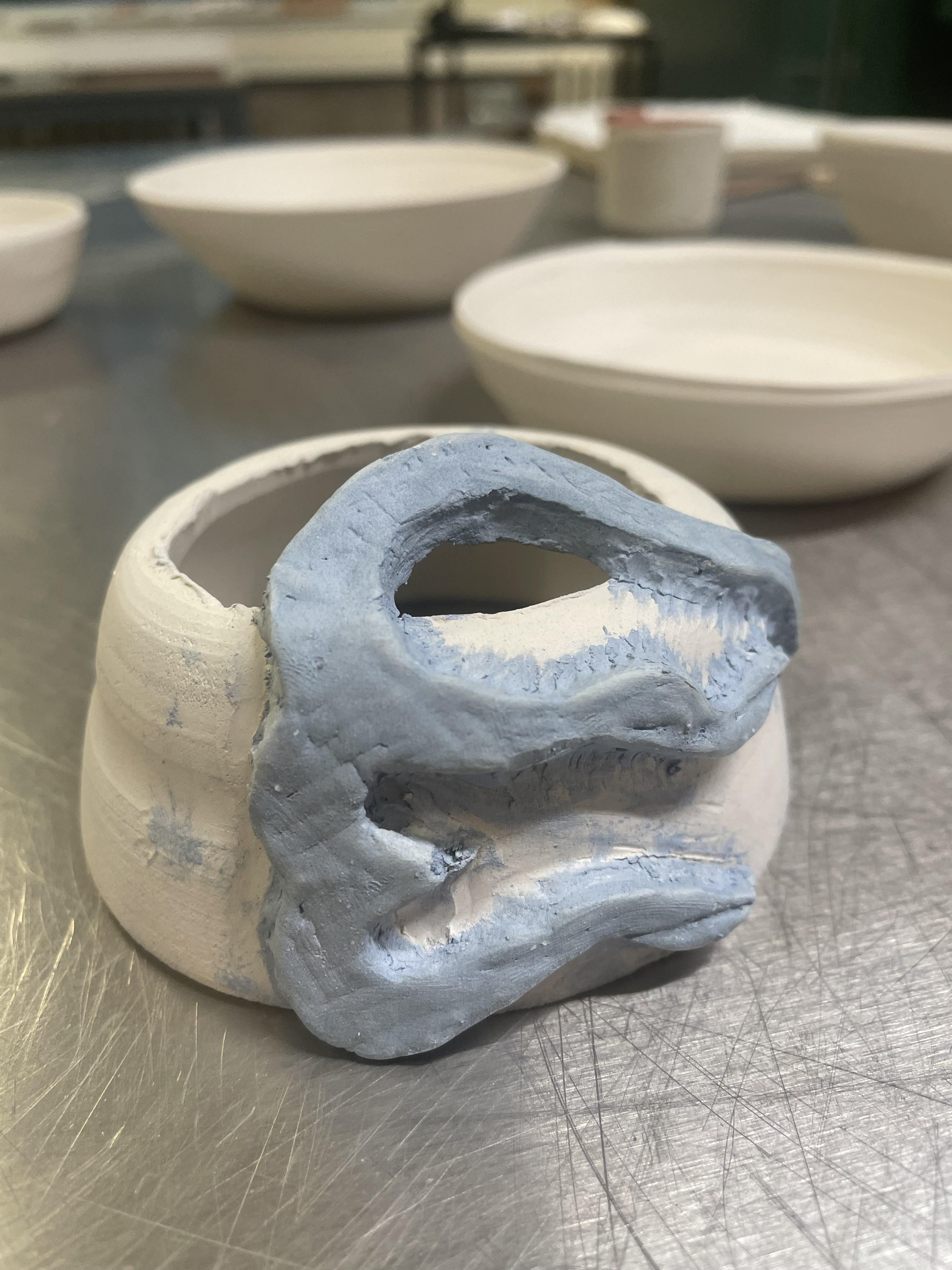
I applied my additions using a basic scoring technique, scoring where they were going to be applied and scoring the blue clay. I then made some ivory stoneware slurry to glue each addition firmly. Once all was attached, I used a small wooden tool to push and carve the sides down, giving it extra security. This was a challenge as I didn't time my process of certain elements. The thrown vessels and the plaster moulds were made on the same day; however, I forgot about the drying process of plaster, which took 3 days to dry, At this time, my clay dried more than leather hard, so I spent a while refreshing my clay, getting it back to the perfect state, allowing for a secure attachment.
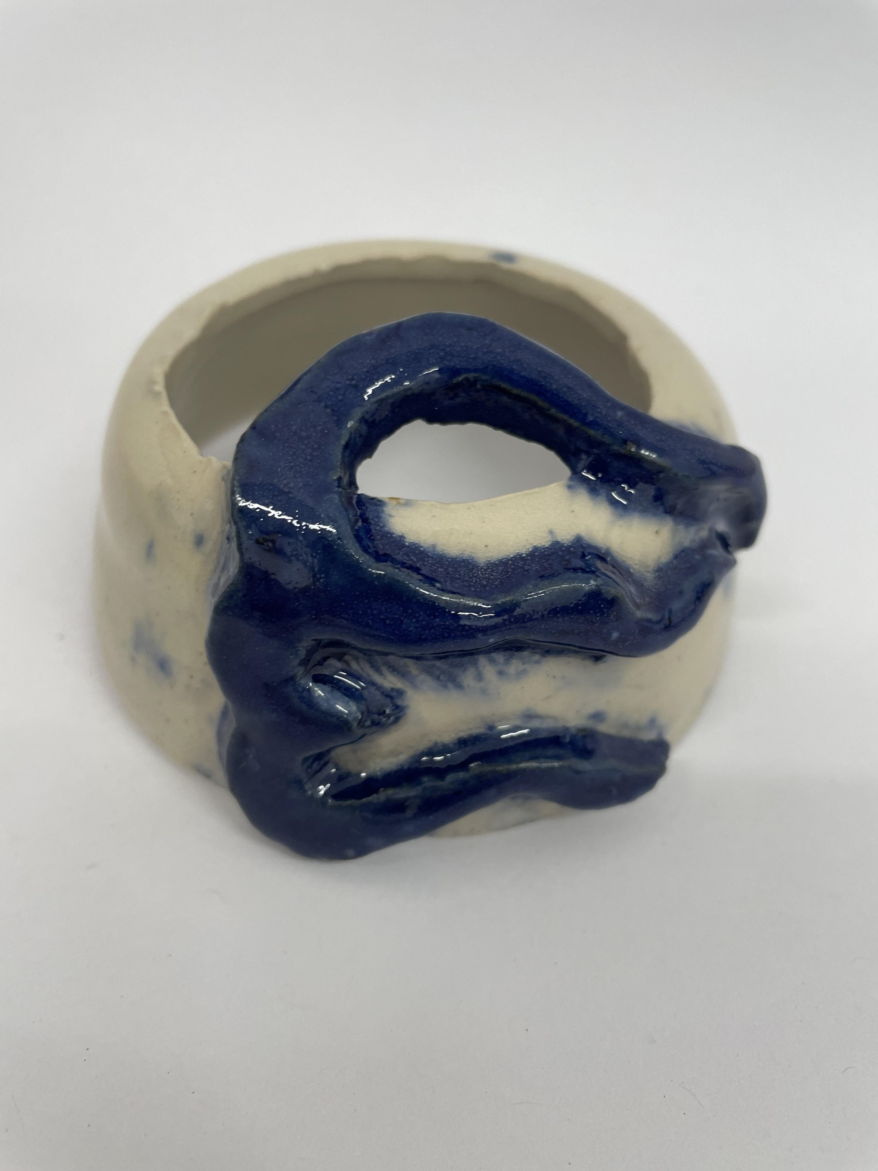
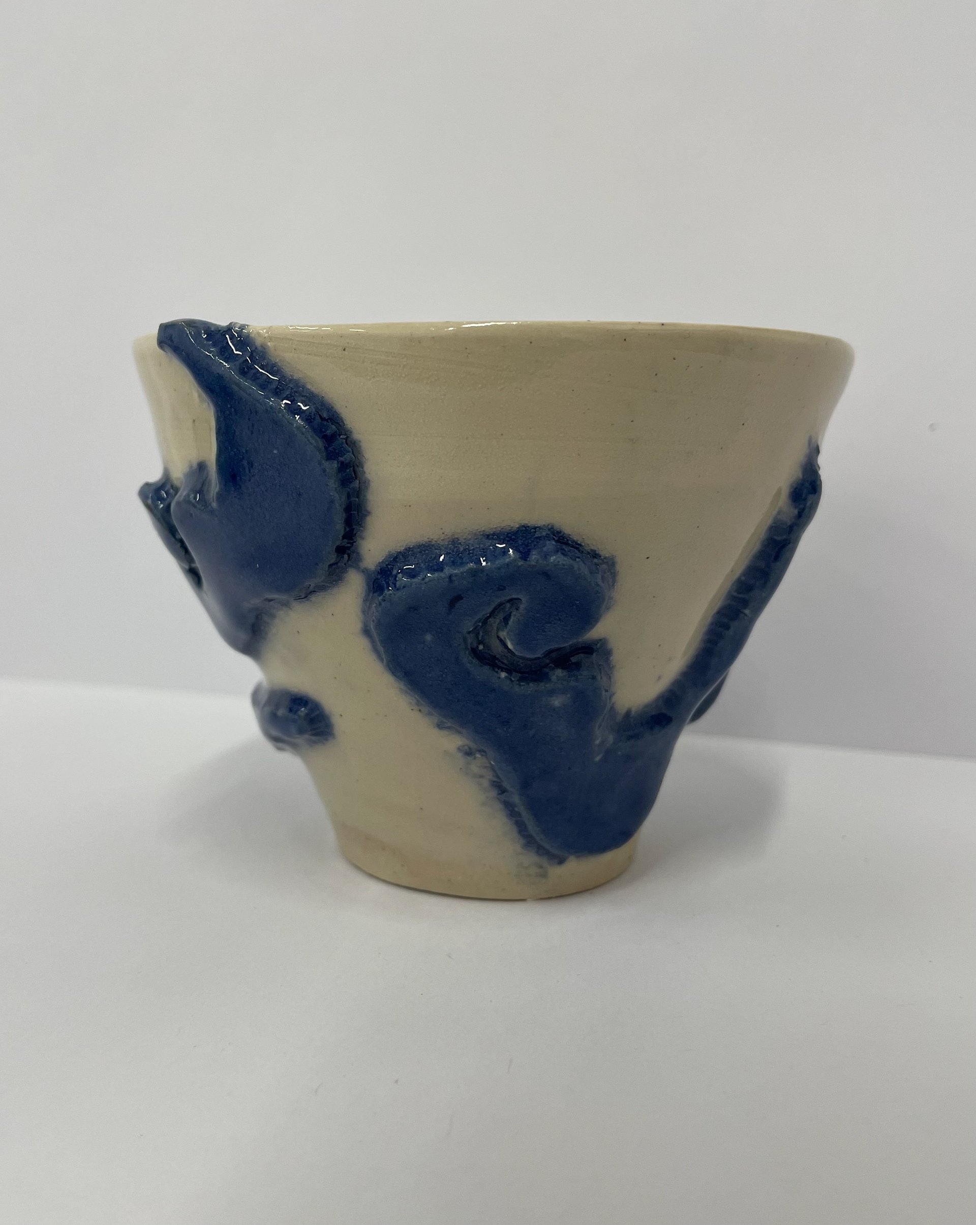
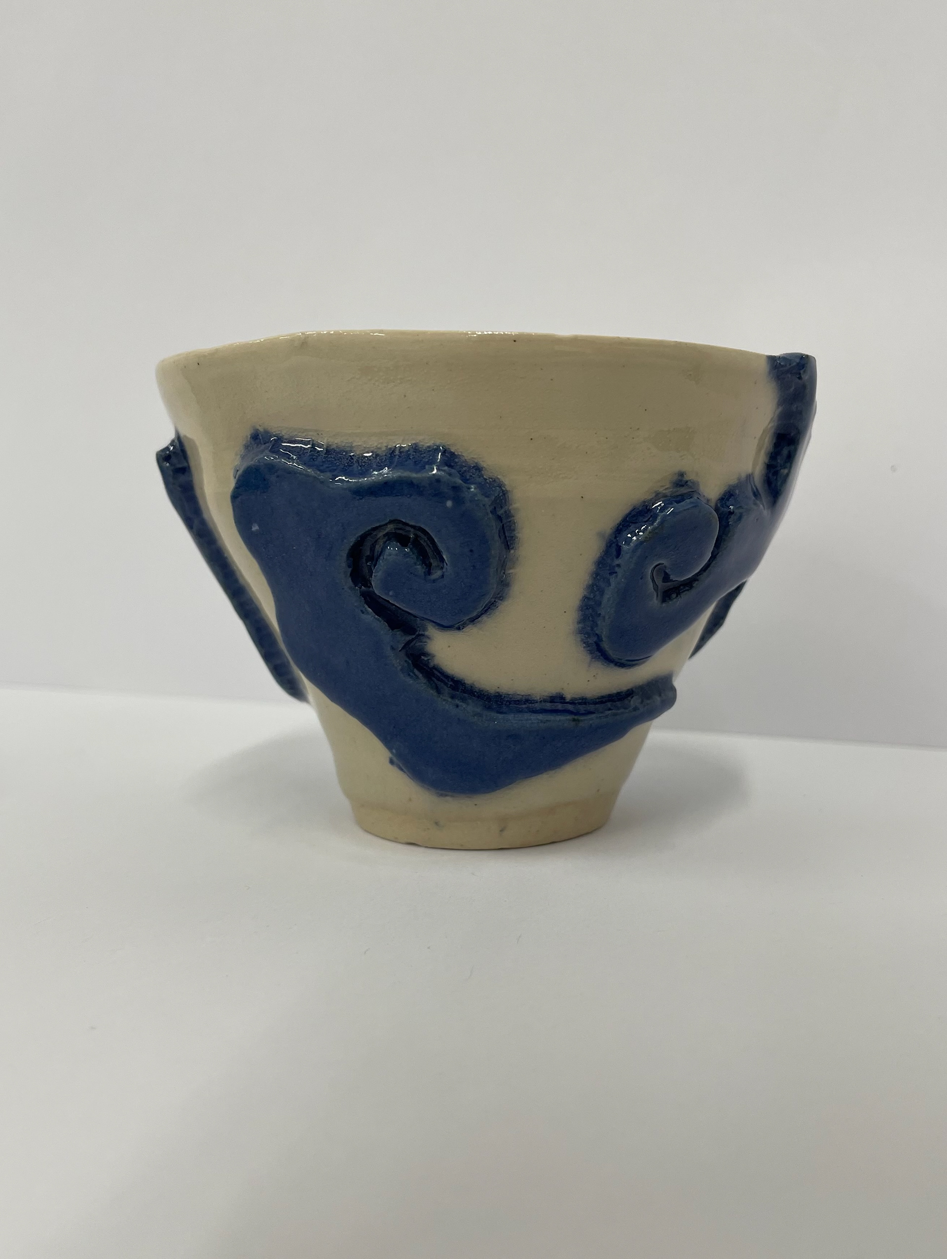
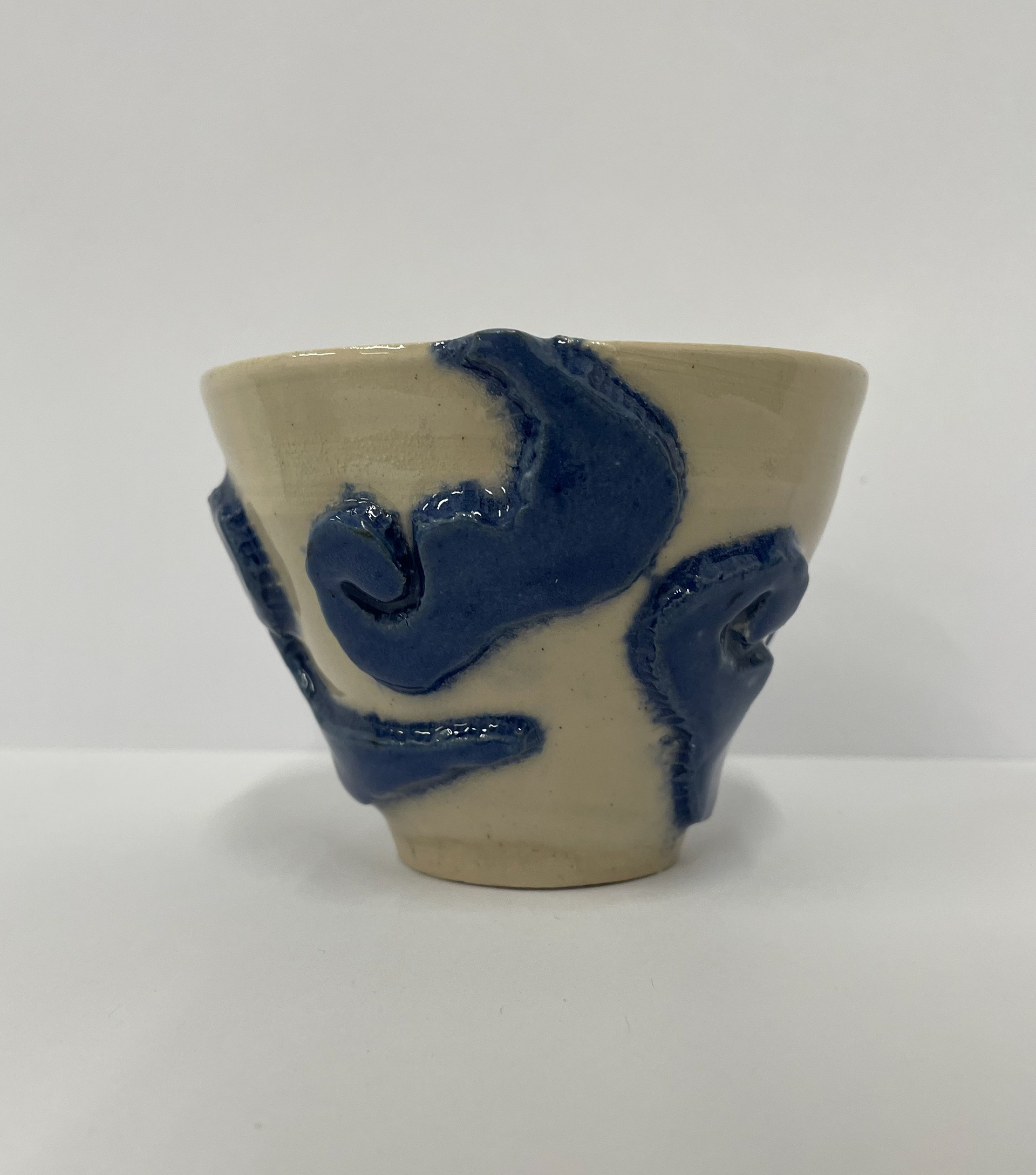
The bisque firing of my final vessels. It was interesting to see how my blue clay came out and the variation of blue once fired as I used the same batch of blue clay howe, although some were more vibrant than others. This could be due to placement in the kiln, meaning some got more heated, causing the oxides to react more.
I finished my pieces by glazing them in a clear stoneware glaze. By having a clear glaze when firing, the blue should pop out more and become more vibrant, especially with the contrast of the white ivory stoneware that I used to throw the vessels.
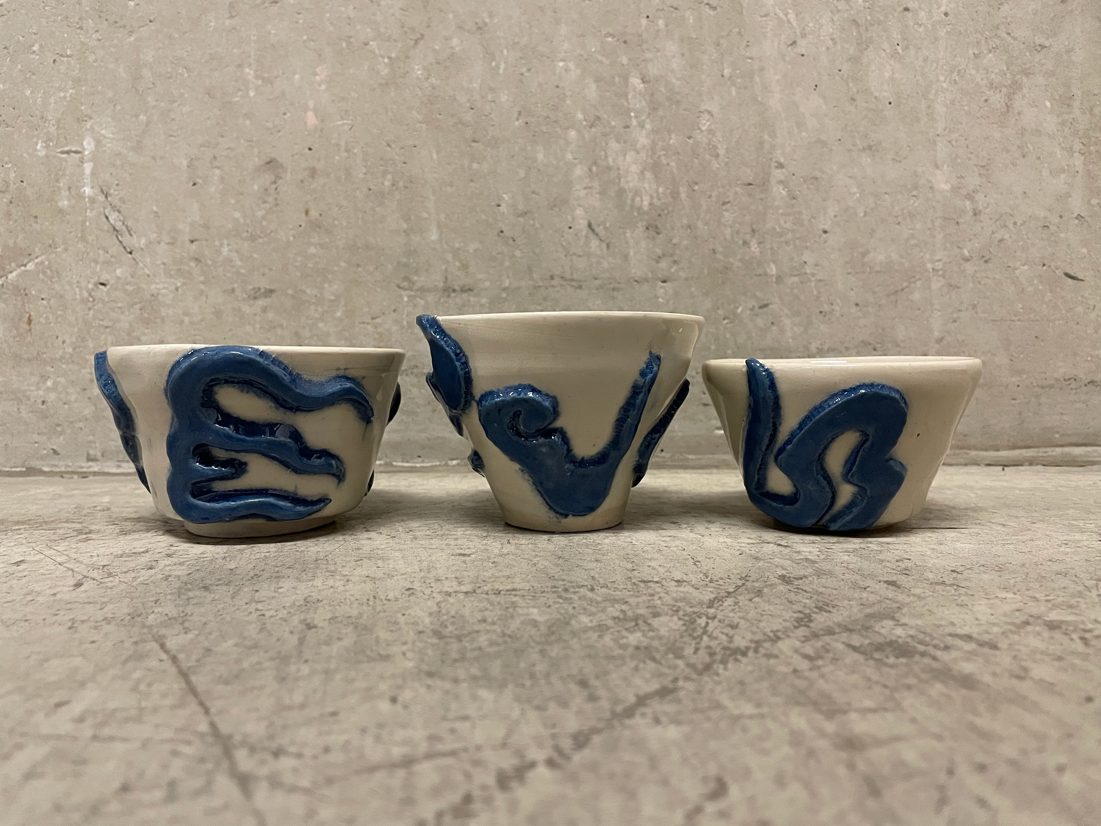
Pour Mon Papie
(for my granddad)
Pour Mon Papie is my final piece for tradition and innovation. I chose this name as it links with my heritage, and I was influenced and inspired by my Papie (grandfather). I enjoyed this project, and reflecting on my progress enabled me to proceed with my final piece.
My final piece is a set of three decorative vessels using throwing techniques I have taught myself over the last months to create the frame of my vessels. These are then decorated with blue ivory stoneware clay, which I coloured and used a plaster mould inspired by my research into encaustic tiles. The patterns on my vessels are all inspired by Vietnamese culture and memories. I wanted to focus a lot on the details surrounding my work. I chose three vessels to represent my siblings and deliberately didn't want them to be perfectly uniform, giving them different heights and widths to represent the differences and how independent we all are. I chose pretty classic symbols and patterns, which I then redesigned into my own. These symbols are ones that I remember being on our dining ware when eating Vietnamese food with my grandfather. This memory of all sharing and loving the food and celebrating the culture stands out, so I wanted this to be admired in my pots.
The colours are something I looked into. Blue-on-white vessels, usually using porcelain, are very common in Vietnamese ceramics. Wanting to mimic this and explore the significance of colours and their meanings in Vietnamese culture, I decided these colour palettes were the best for my vessels.
Throughout this project, I was learning so much, down to my ceramics and my techniques, building my confidence as a crafter but also down to building a more substantial interest in my heritage and having those critical conversations with those around me.
Pour Mon Papie
I'm enthusiastic about my process and the details surrounding my ceramic work, using a traditional encaustic tiling technique to create decorative additions to my vessels. The decorative additions are inspired by my Vietnamese heritage, drawing on the cultural forms, colour references and memories of my Vietnamese grandad.
My outcome is decorative thrown vessels enhanced with Vietnamese-inspired decorations created from the encaustic tiling process. Throughout this unit, I extended my skills and knowledge of clay by developing an understanding of the plaster moulds originally used in encaustic tile making. However, in innovating this process, I began using the encaustic tile-making process to create decorative additions for vessels rather than producing flat tiles. This was completed by carving my clay forms and creating a plaster mould of my chosen forms. Once these were dry, I could push my clay into the mould and apply repeated additions to my vessels.
Looking into my materials is also a big incentive for my work, enabling them to be precisely explored and allowing their personal qualities to reflect my objective, allowing the materials to attract my audience. Having this project explore my heritage is my main incentive for allowing me to connect closer. However, I found throughout this process; it enabled the conversation of those around me to stimulate the discussion of their heritage; this is something that I wish is reflected in my audience to be an inspiration and motivation for them to investigate their heritage, cultures and backgrounds and celebrate the diversity that surrounds us.
final peices in context
The function of my final pieces is to be decorative vessels that show off my heritage. Therefore, I have photographed them as they would be displayed at an exhibition. Having a plain background for them to stand out with good lighting showing off the forms and colours of the vessels would be the ideal set-up.
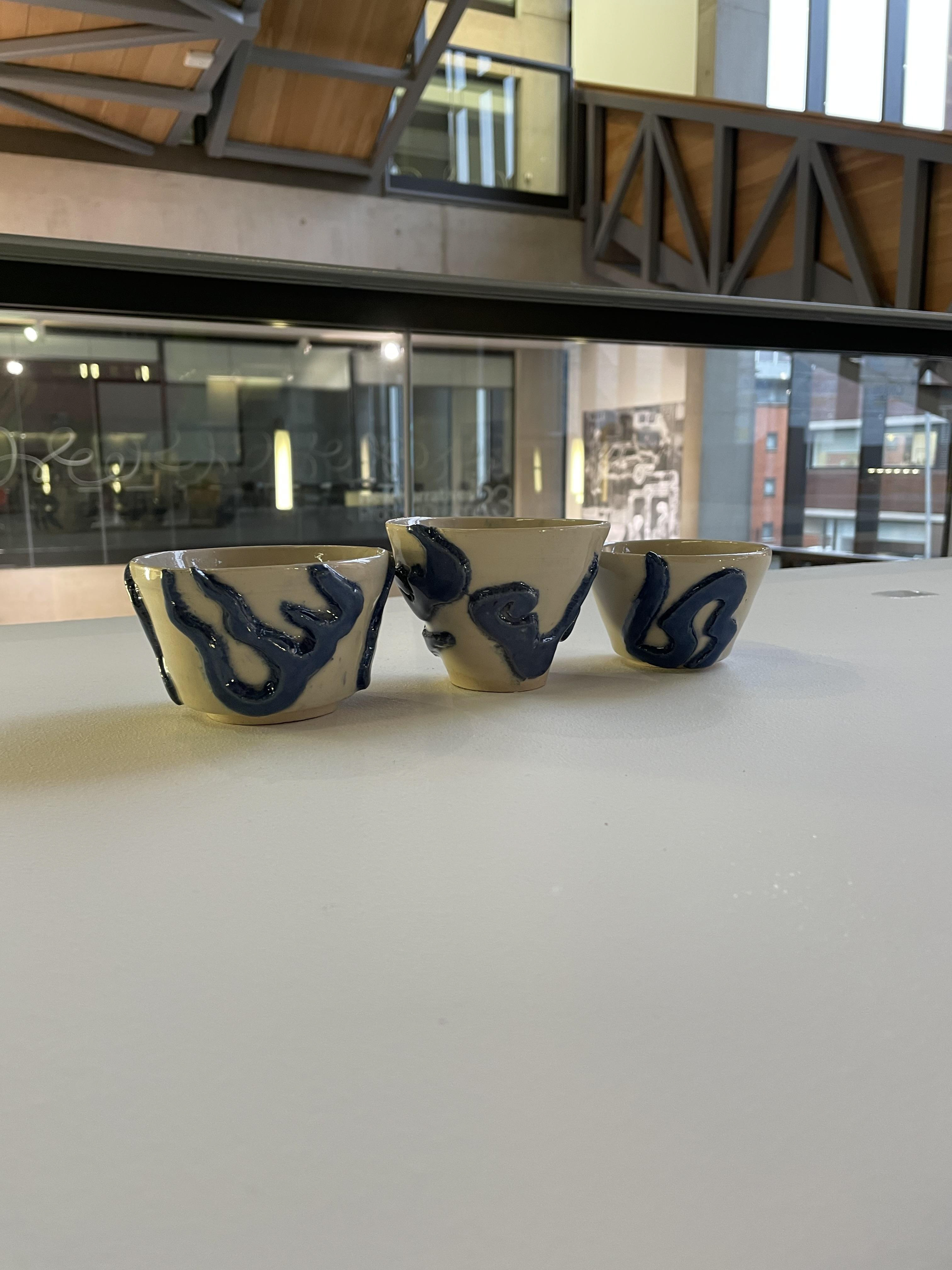
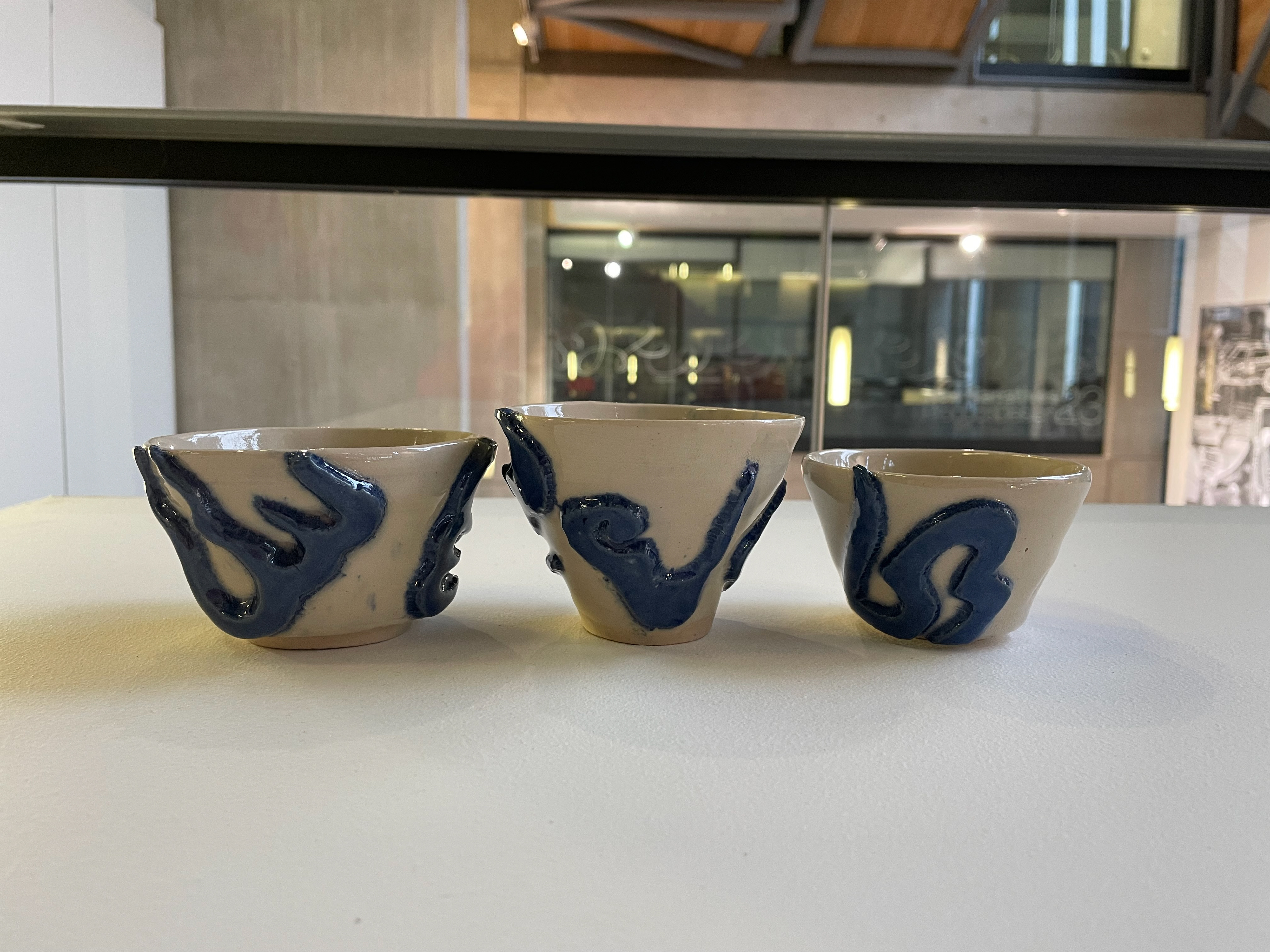
figure references
- figure 1 to 4 -500 Tiles by Lark Ceramics
- figure 6 to 8- https://hanoitimes.vn/the-secrets-of-thang-long-imperial-citadels-treasures-319878.html
- figure 9—10- Dragons and lotus blossoms: Vietnamese ceramics from the Birmingham Museum of Art by John Stevenson, 1944
references
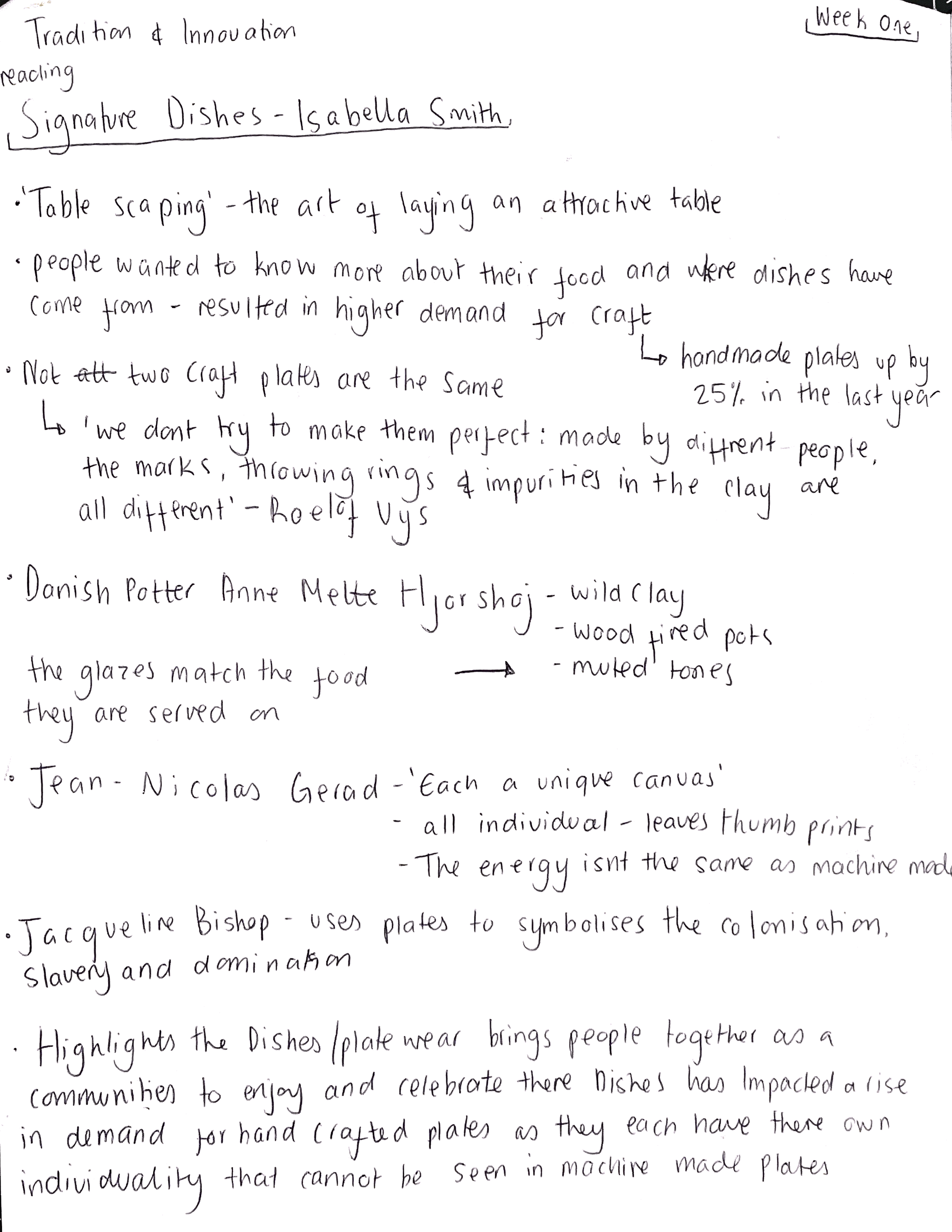
- Signature dishes by Smith, Isabella
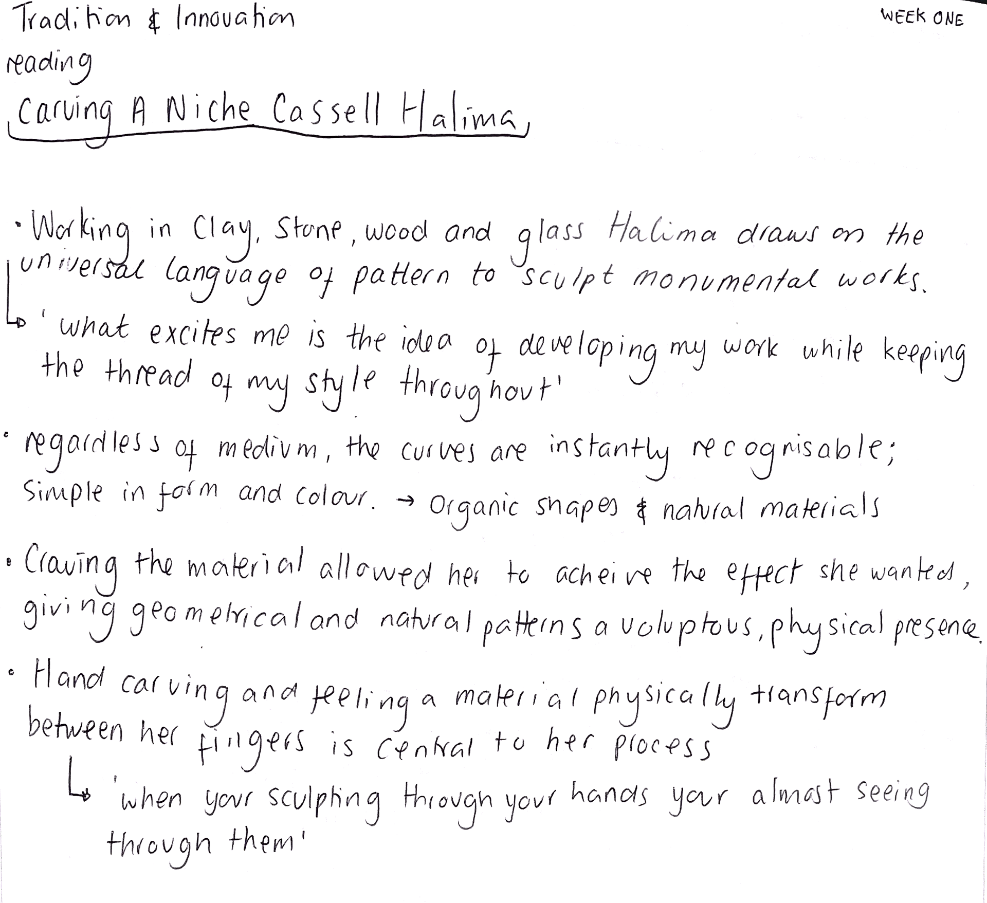
-carving a niche
- Potter Book of Glaze Recipes by Emmanuel Cooper