Shoreline Vessels
My Unit X project is inspired by the rich natural beauty of Brighton and my sense of place upon moving to my new city, Manchester. Bridging the gap between the industrial and organic worlds, I have created a collection of vessels that embody tranquillity and a connection to nature. Using marbled and layered clays, these pieces reflect the hidden depths found in natural elements like pebbles and stones, reminding me of home while I search for my new sense of belonging. Each piece is unique yet shares a common thread that runs through the entire collection. By giving out each vessel individually, I aim to foster a personal connection with the community. By offering my work freely, I strive to make art accessible to all, fostering a sense of place, inclusivity, and shared cultural experiences. Each vessel stands as a testament to the harmony between nature and our connections, bringing moments of serenity into everyday life.
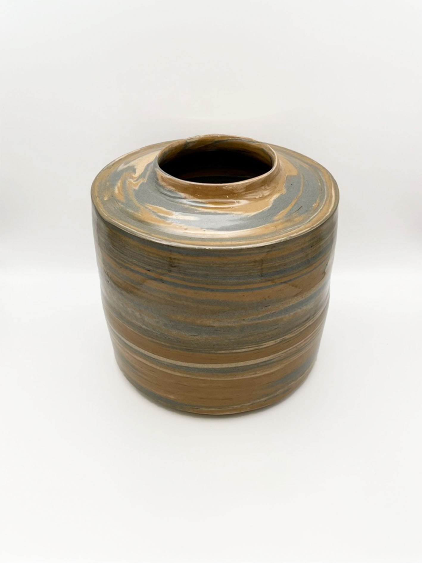
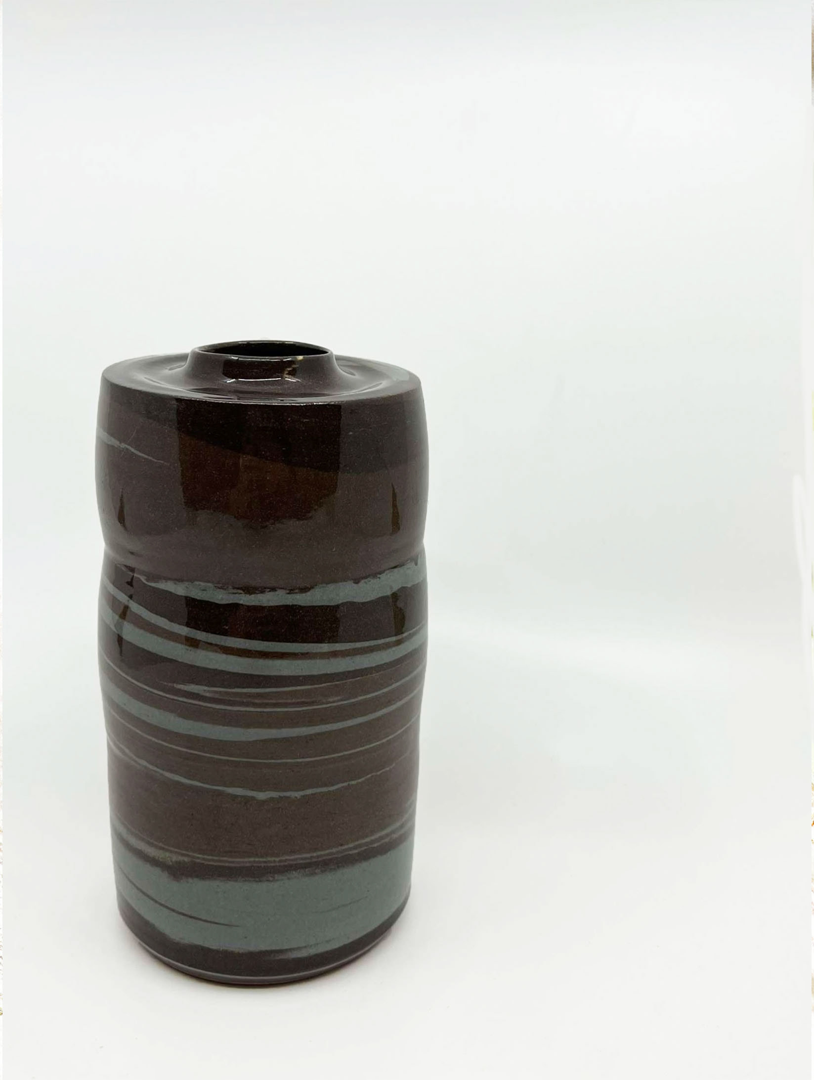
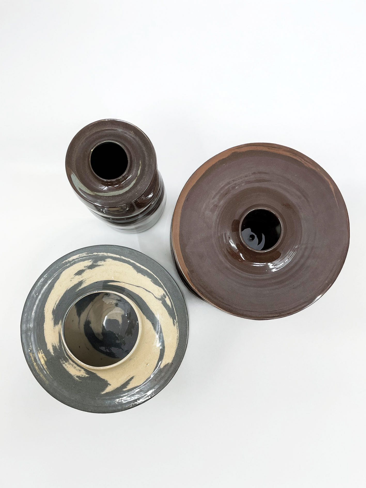
Shoreline Vessel One
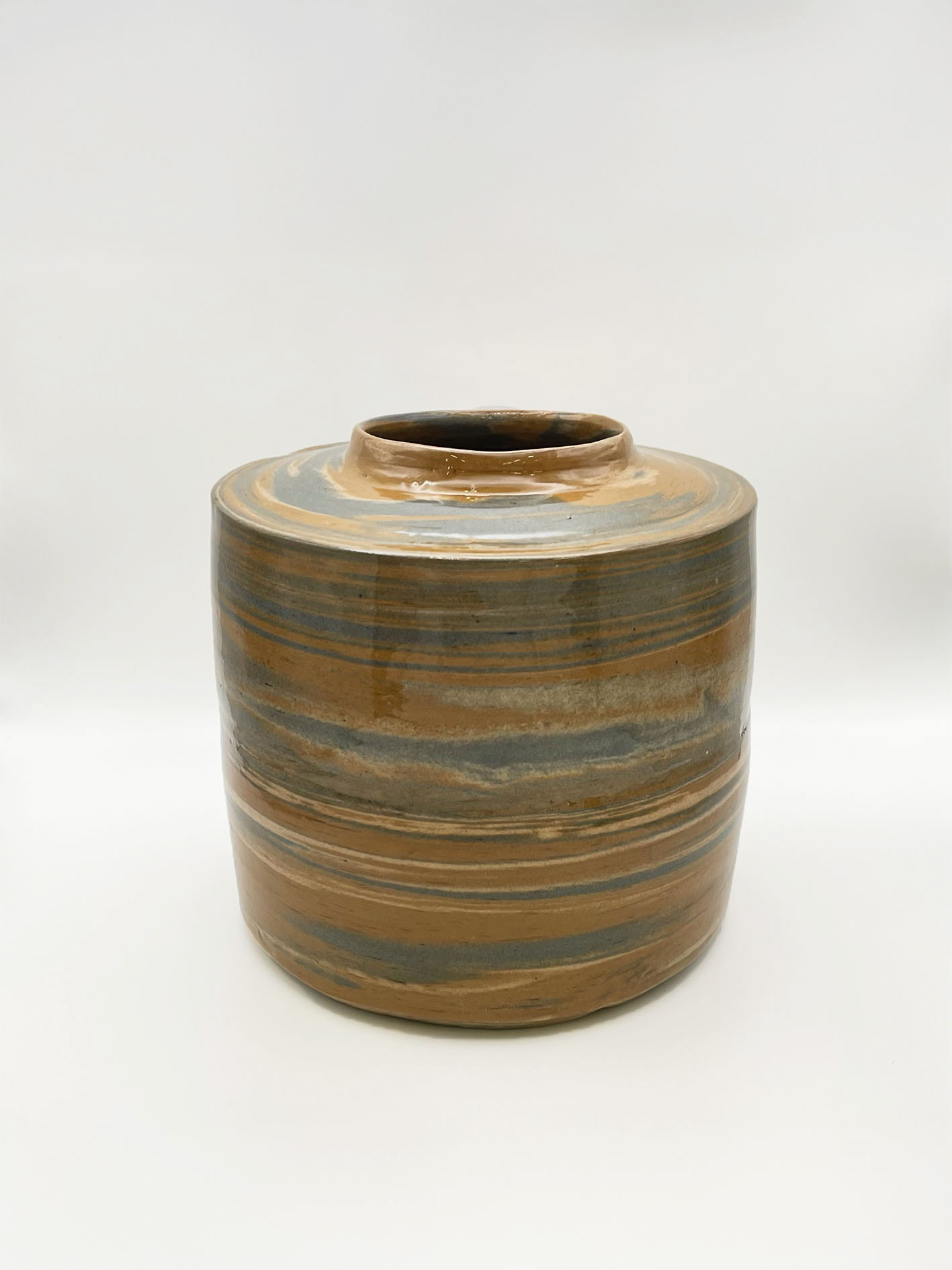
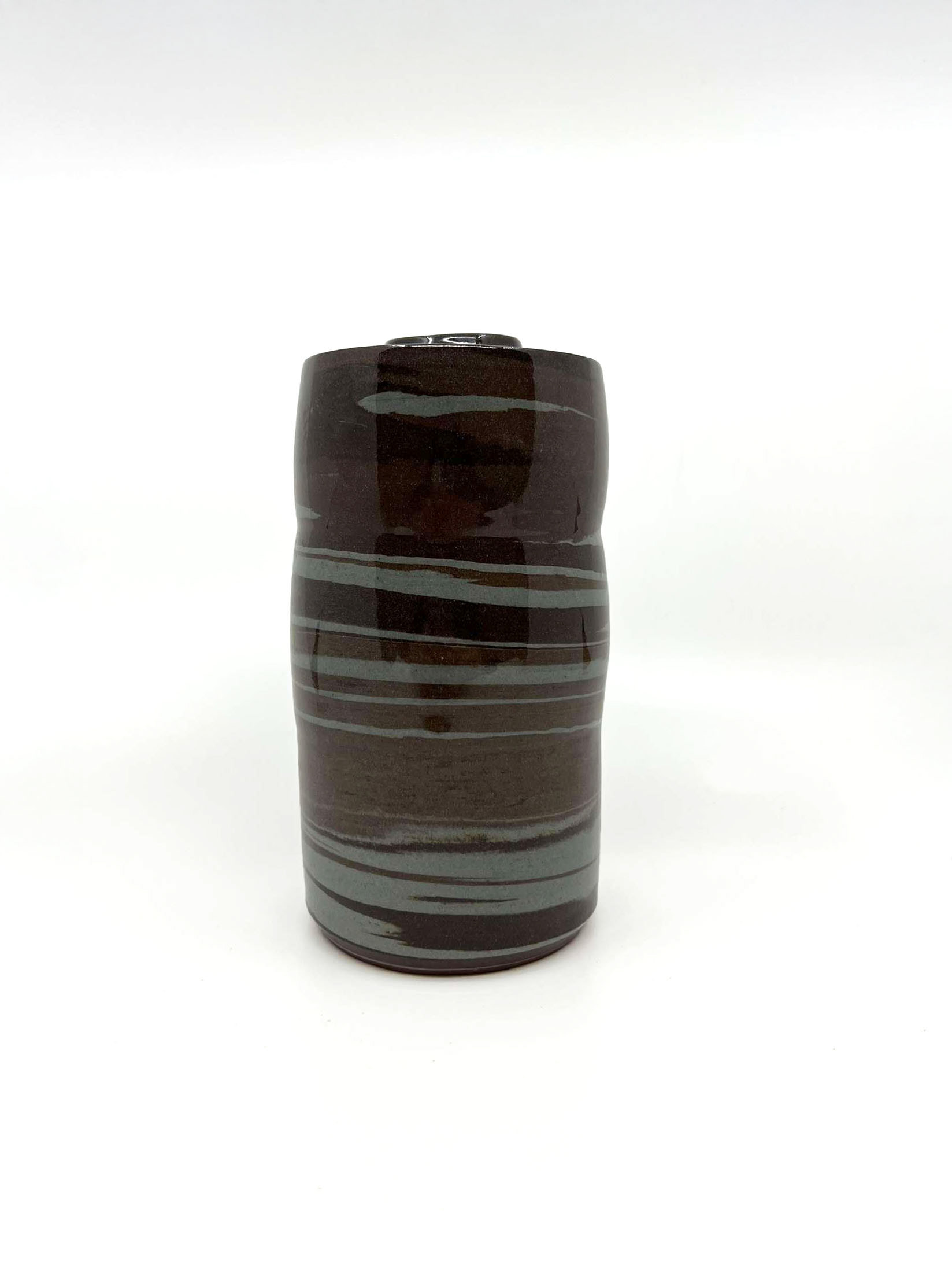
Shoreline Vessel Two
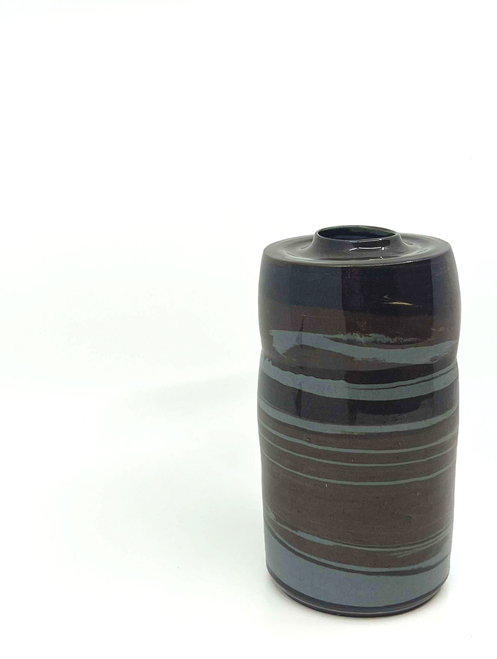
Shoreline Vessel Three
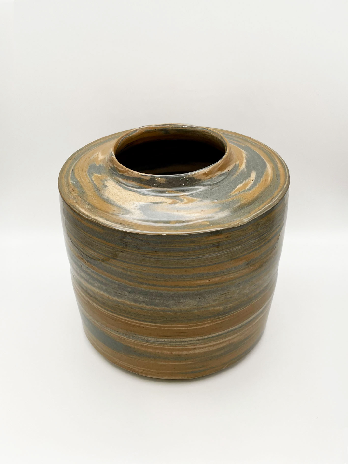
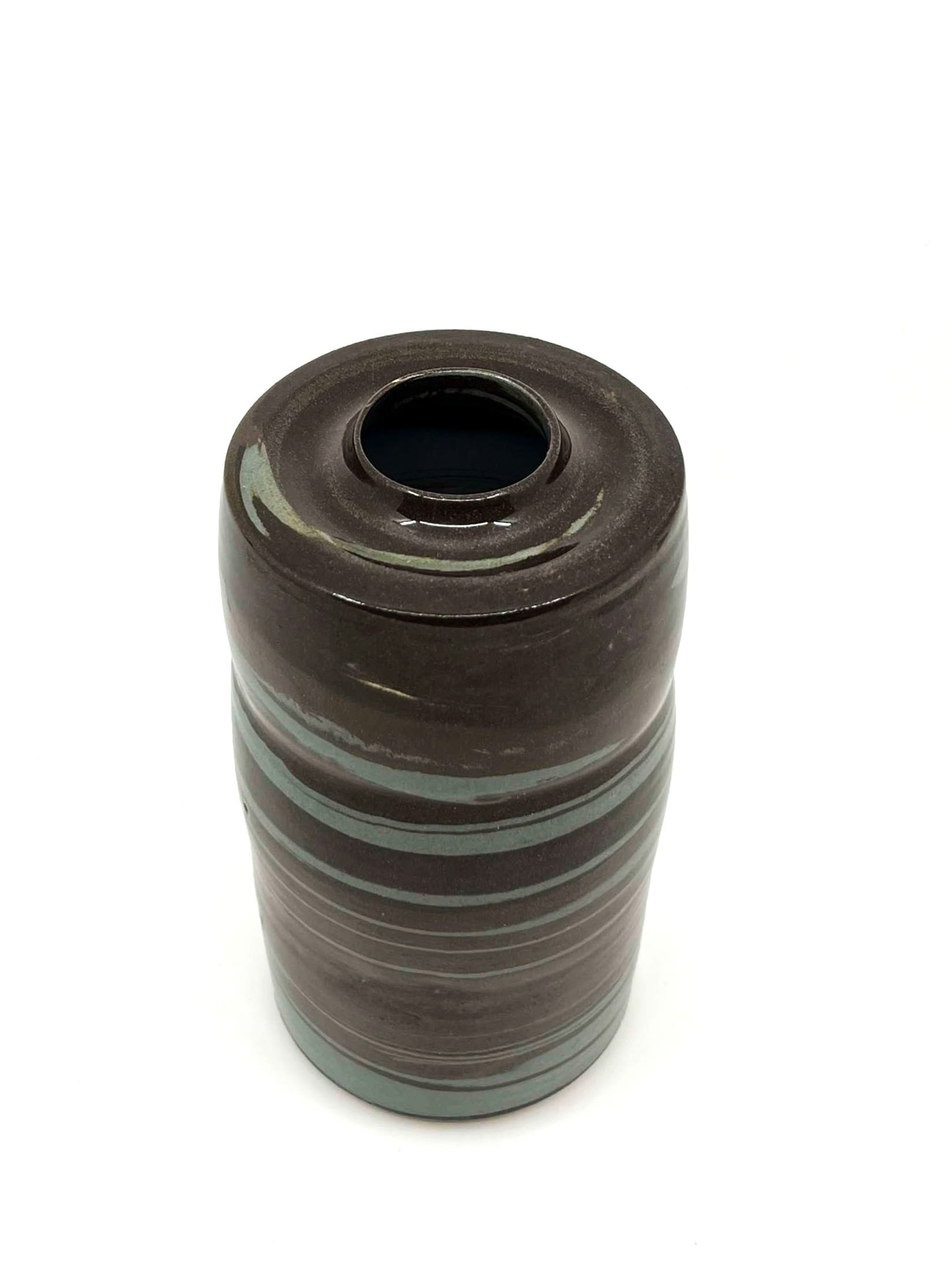
Shoreline Vessel Four
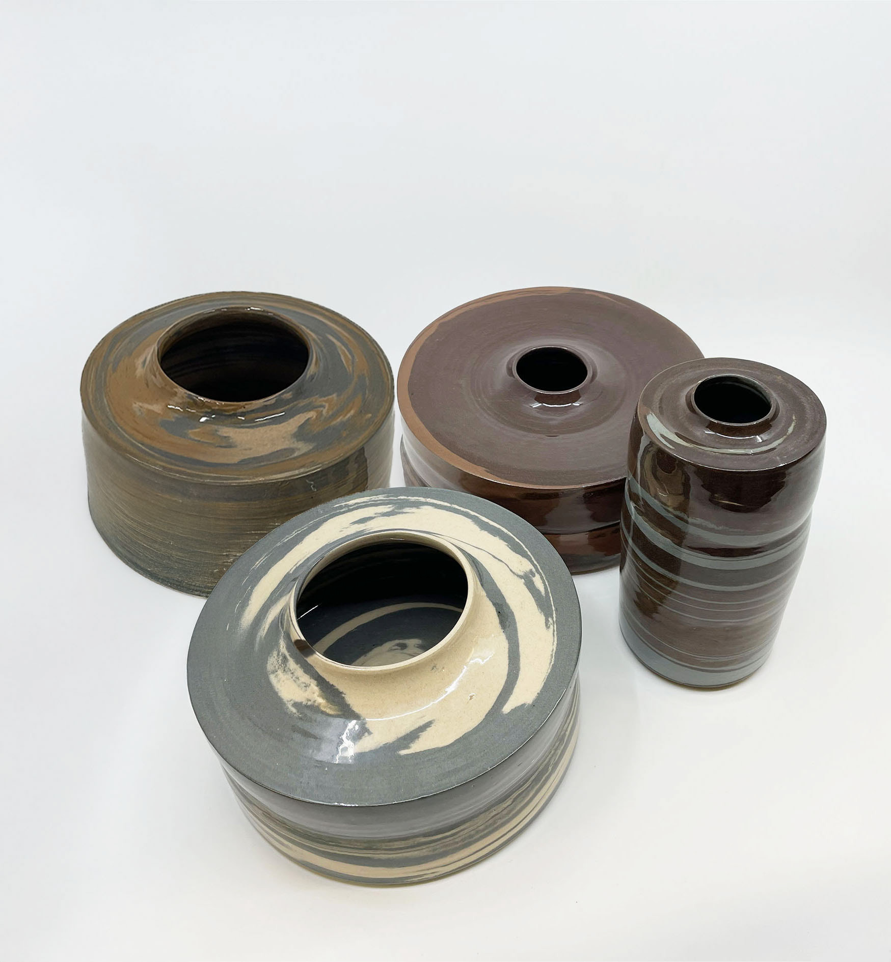
Collection Of Shoreline Vessels

Reflection
Throughout this project, I have explored my connection between my home in Brighton and my new home in Manchester, I have learned and gained confidence in my work and as a maker. I created a collection of four vessels representing the connection between nature, place, and people. I experimented extensively with different oxides to create coloured clay inspired by Brighton pebbles, throwing the pieces in two parts to form marbled vessels. As I only worked on a small scale previously, I decided throwing in two parts was the best way for me to achieve the desired forms and sizes, allowing me to step out of my comfort zone and for my vessels to create a bigger impact.
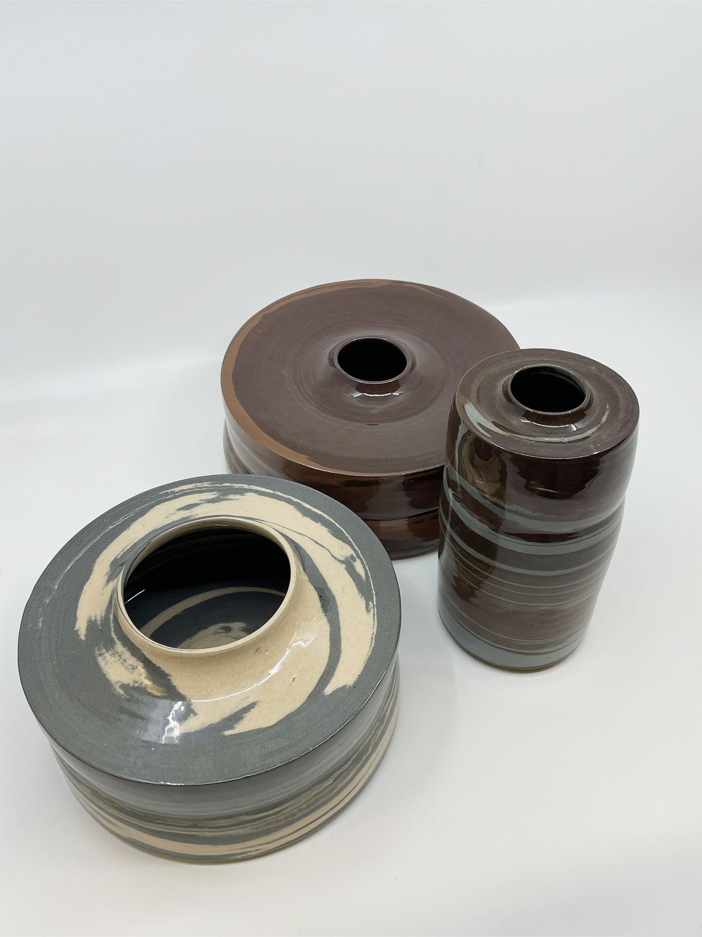
Vessels one and two were my preferred sizes, as they were the largest, and having a collection of vessels in varied sizes added vitality and impact to the concept, making them more aesthetic and diverse. For my next project, I aim to push myself further by creating even larger vessels. For the fourth vessel, although I thought it was large during throwing, it shrunk significantly during the drying and firing process. This vessel had the most noticeable shrinkage, and I'm unsure if this was due to my perception or due to the stacking method.
I focused on perfecting the forms of my vessels, and I'm happy with the outcomes, as each vessel has a unique form. This variety contributes to the idea of collective singularity, creating a cohesive collection of individual pieces. The wider, shorter forms seen in vessels two and three offer a sense of comfort, with their circular shapes adding to the diversity in height and form.
Reflecting on my fourth vessel, I believe it would have benefited from being thrown in two parts instead of three, pushing my skills in creating larger pieces. The colours used in my collection were darker than anticipated, and I was initially drawn to the browns and reds within the pebbles. However, I realised that focusing more on greys, blacks, and whites, like the flint stones of Brighton, would have been more fitting.
Each vessel in my collection was created using three different coloured clays, with varying amounts of oxides to achieve different shades. This approach worked well in some vessels, adding depth and mimicking the palette of pebbles. The rims and forms of my vessels are the standout qualities of my collection, with their structured, delicate, and simple tops and bases enhancing the professional quality. This project has solidified my understanding of collective singularity, allowing each vessel to stand on its own while being part of a cohesive collection.
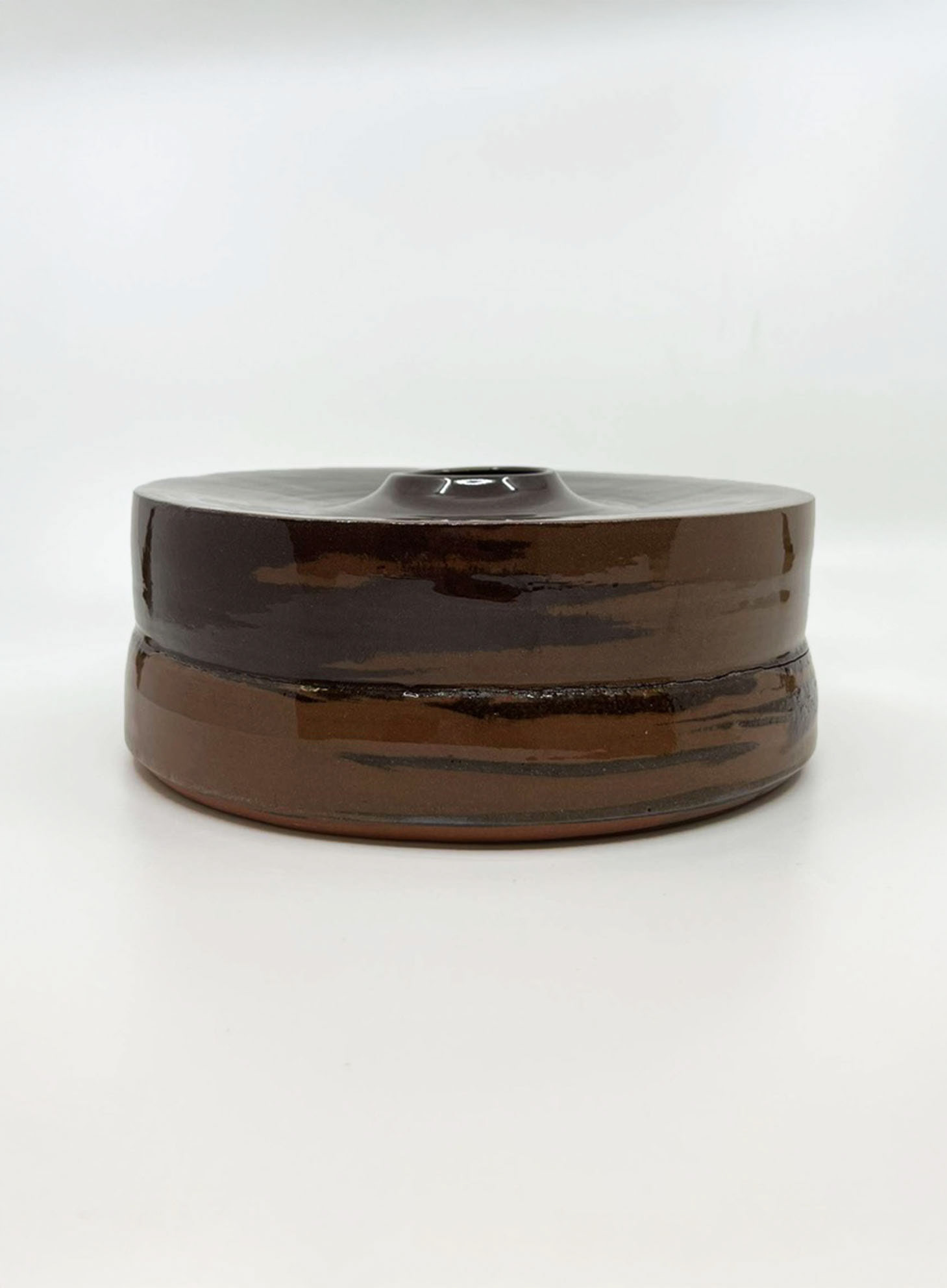
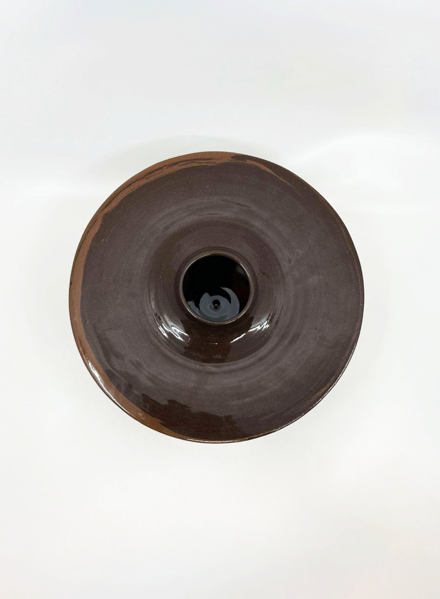
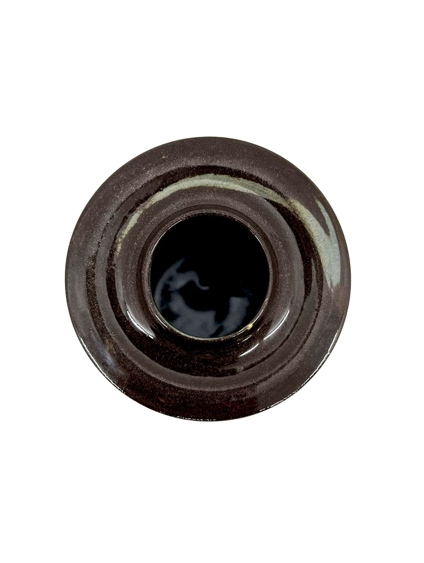
My first vessel, which I decided to give away as part of the free art initiative, was created using a mix of black nickel, magnesium, and grey clay. This combination resulted in an intriguing, marbled effect, with tight, defined lines of colour running throughout. I believe the extensive marbling occurred due to the time I spent centring the larger lump of clay, which was particularly challenging, wanting to get it perfect. The overall size and form of the vessel were good, and I felt the colours worked well together, effectively representing the pebble theme.
However, the vessel ended up being the heaviest in the collection. In hindsight, I could have used the excess clay to throw larger or I could have trimmed it further to make it lighter. A lighter vessel would have demonstrated greater confidence in my work and given it a more professional finish, showcasing my skills as a ceramist.
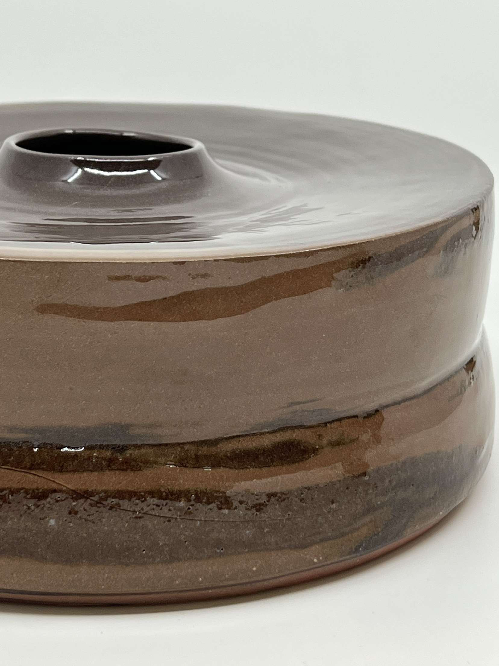
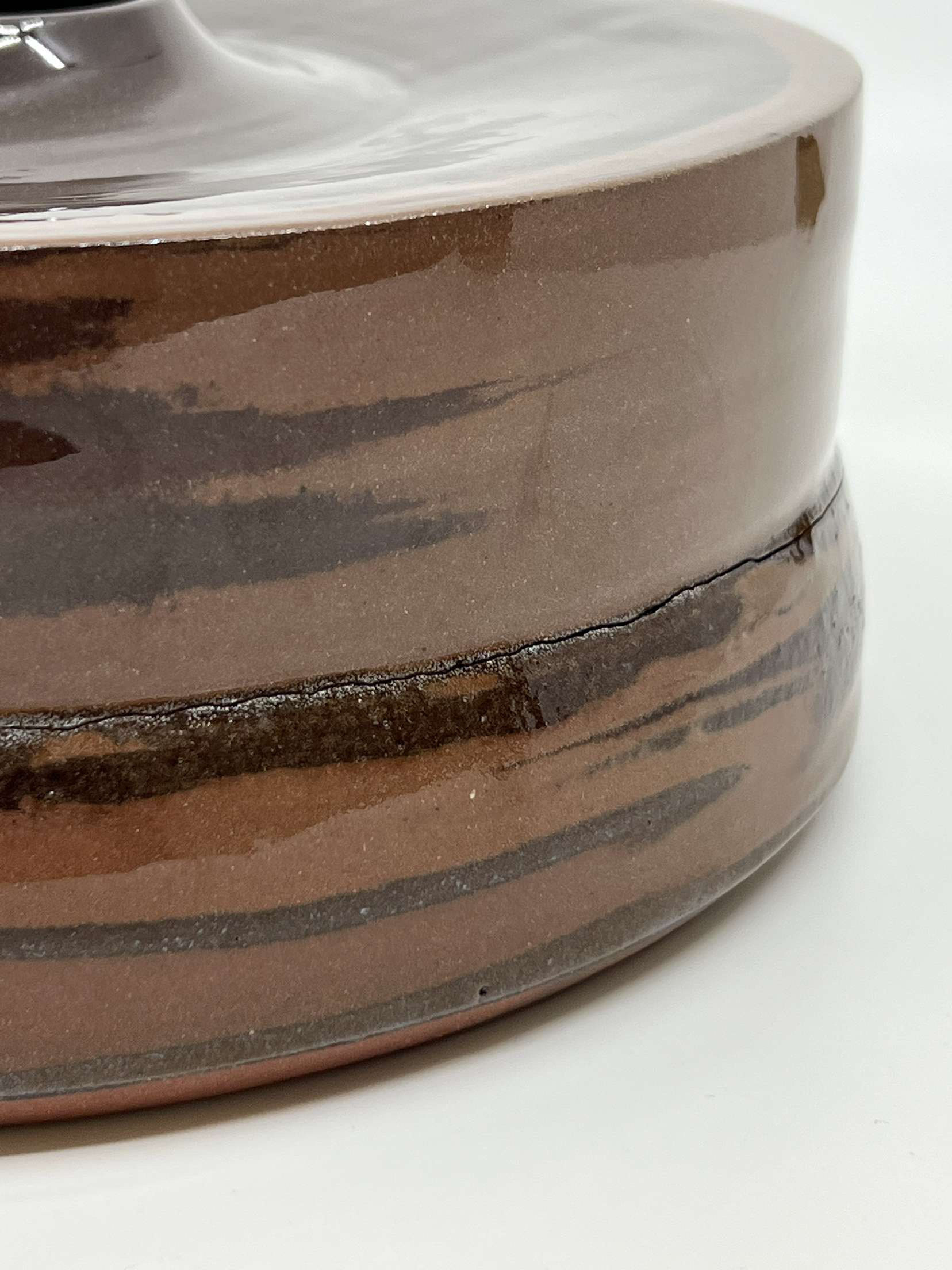
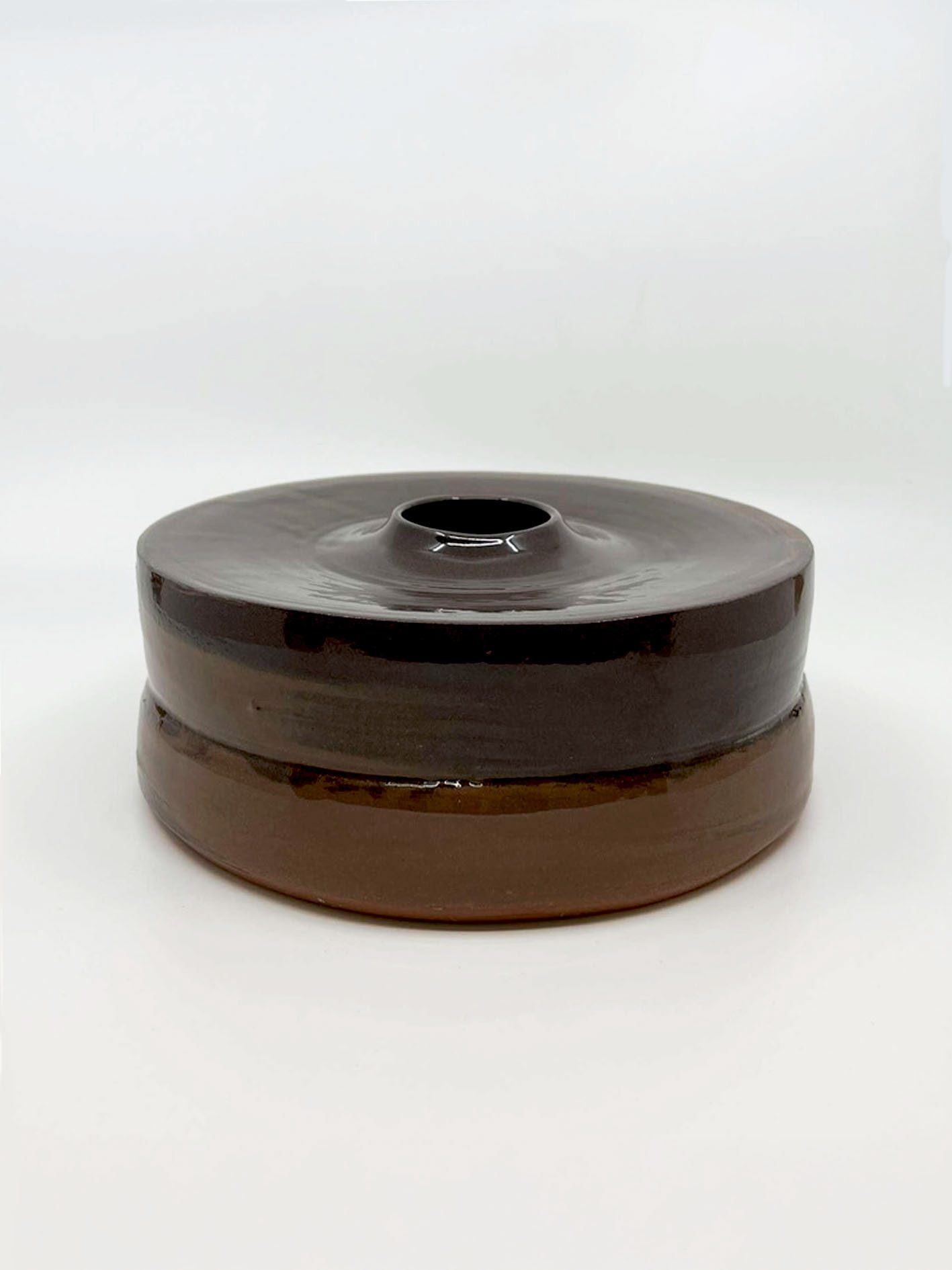
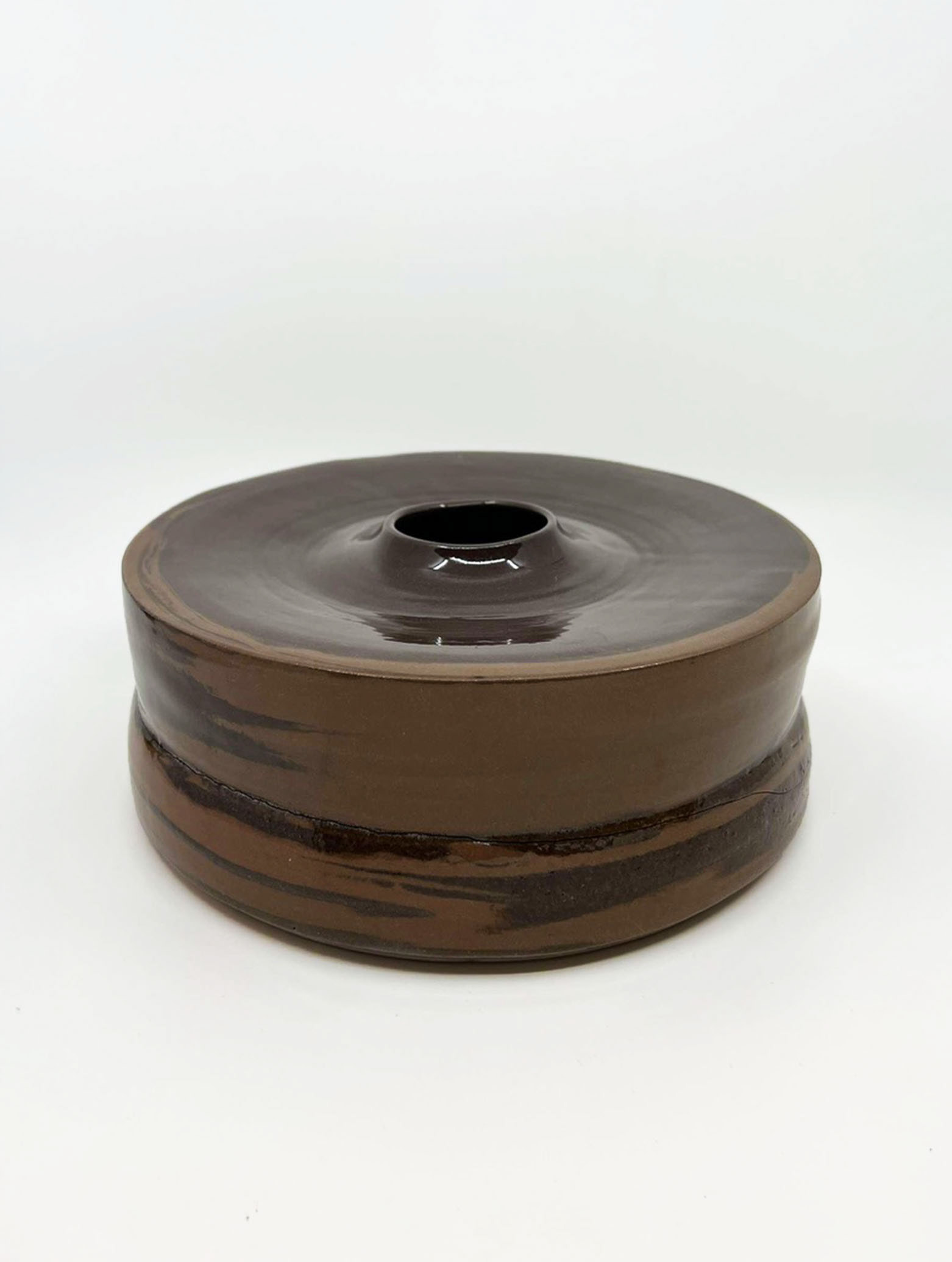
The second vessel was crafted with a mix of 5% black iron, 7% black iron, and 10% magnesium. Although I appreciated its size and the strong, wide stance it offered, the vessel did not achieve the colours I desired, and the marbling was minimal. Using two strengths of the same oxide aimed to create varying shades of reddish browns. However, the 7% clay turned out to be too dark, deviating from my intended colour palette. This experience has prompted me to consider using stains and bolder, brighter colours in future projects, moving away from the pebble-inspired palette to explore deeper hues reminiscent of Brighton.
The vessel also had a noticeable crack, which surprised me as I had not encountered such issues unless firing in stoneware. Several factors could have contributed to this, including the high magnesium content, the kiln position, and the joining process. These cracks render the vessel unsuitable for public distribution, emphasising the need to address these issues to prevent future occurrences. Despite this, I found the vessel’s small opening and rimmed top aesthetically pleasing, offering a juxtaposition between the large form and small details. This balance is something I aim to explore further in future projects, experimenting with different openings and their placements to create a cohesive, functional collection.
Overall, while my second vessel was the weakest in terms of individual strength and colour consistency, it provided valuable lessons. The challenges faced, such as the lack of bold colours and the presence of cracks, have guided me to refine my techniques and material choices. Moving forward, I aim to build on the scale and form of this vessel, ensuring a balance between visual impact and functional integrity. This reflection has reinforced the importance of continuous experimentation and adaptation in achieving a harmonious and professional finish for my ceramic works.
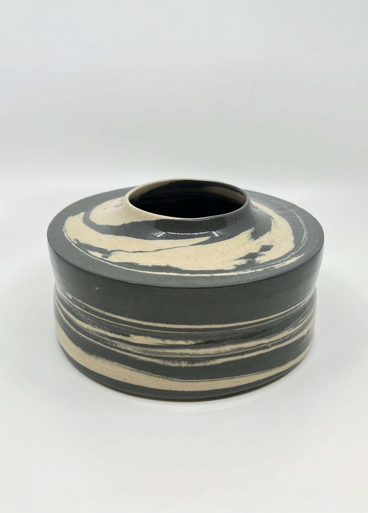
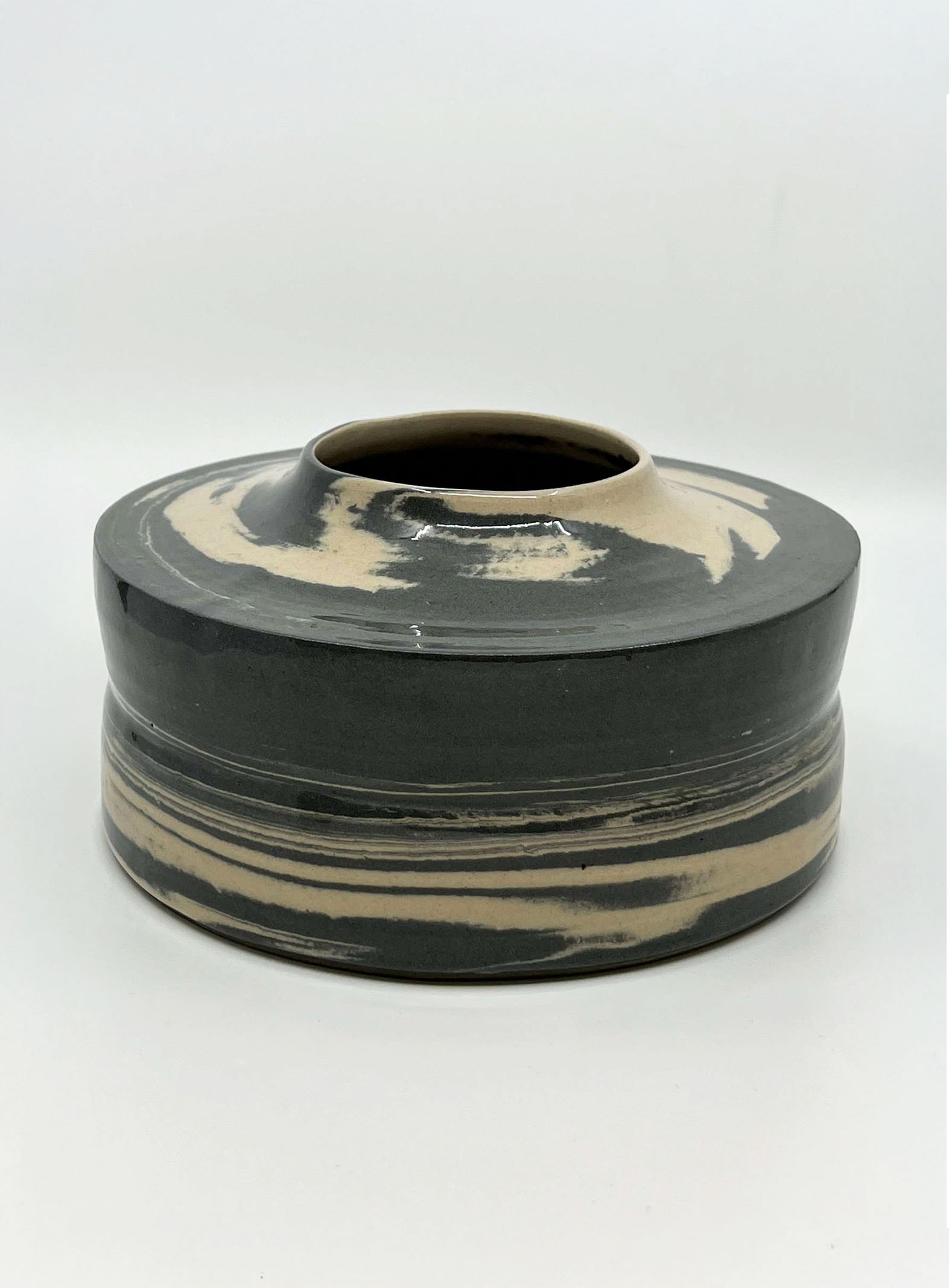
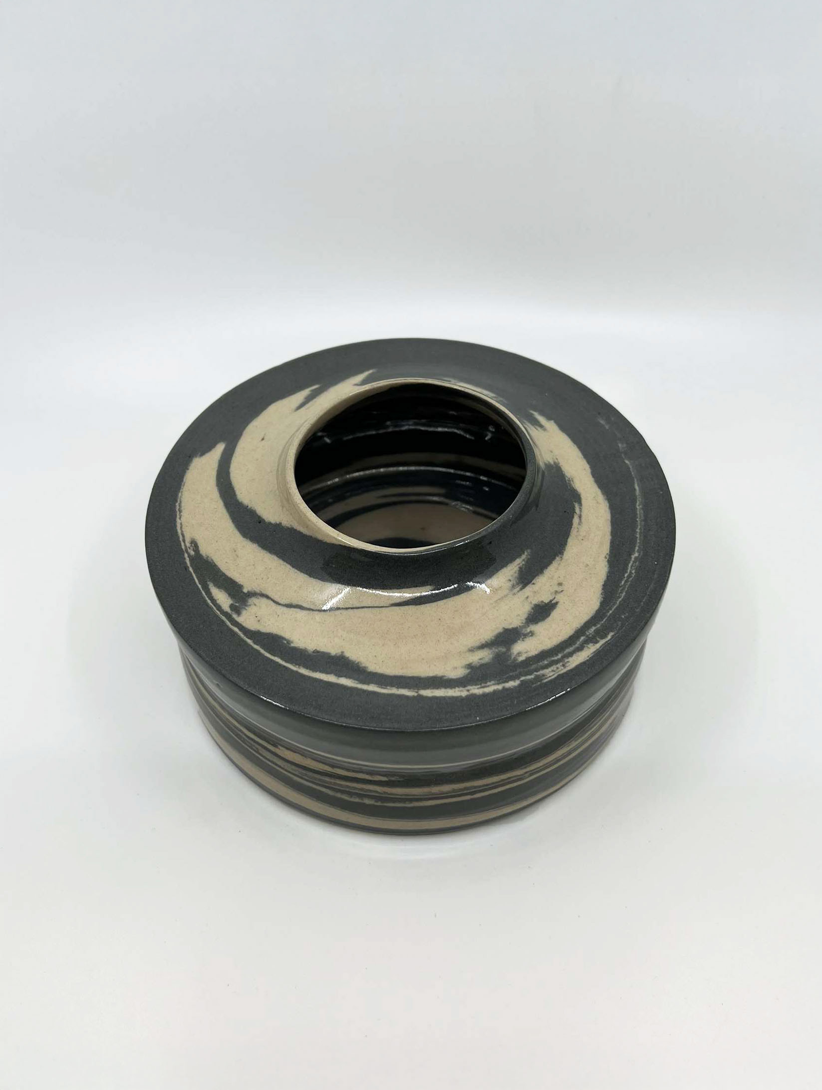
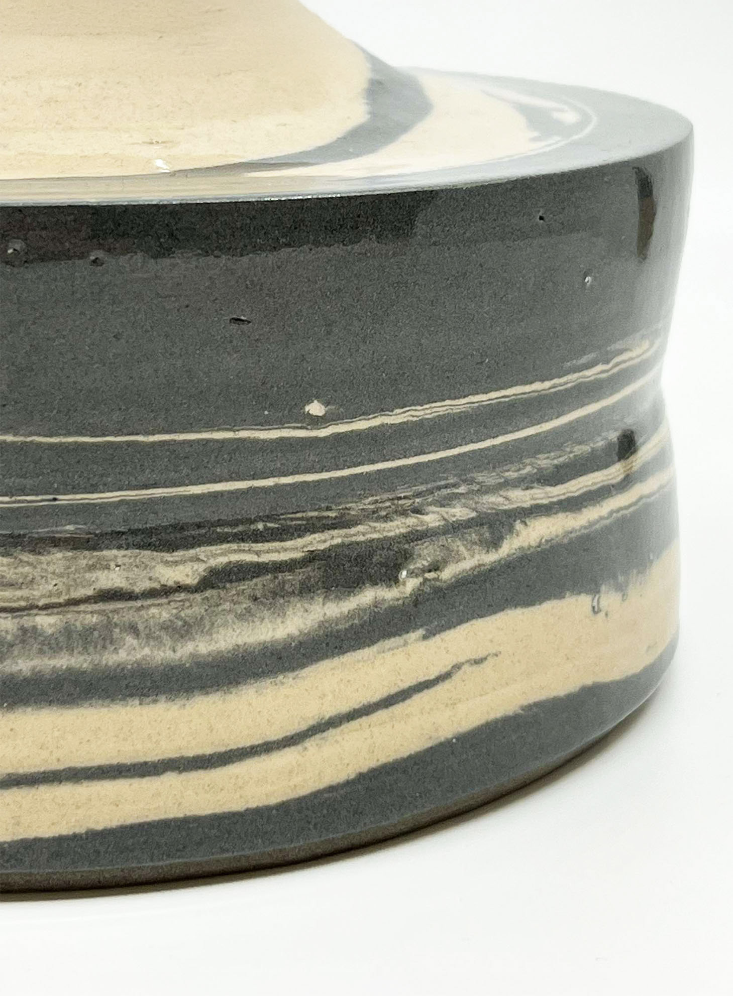
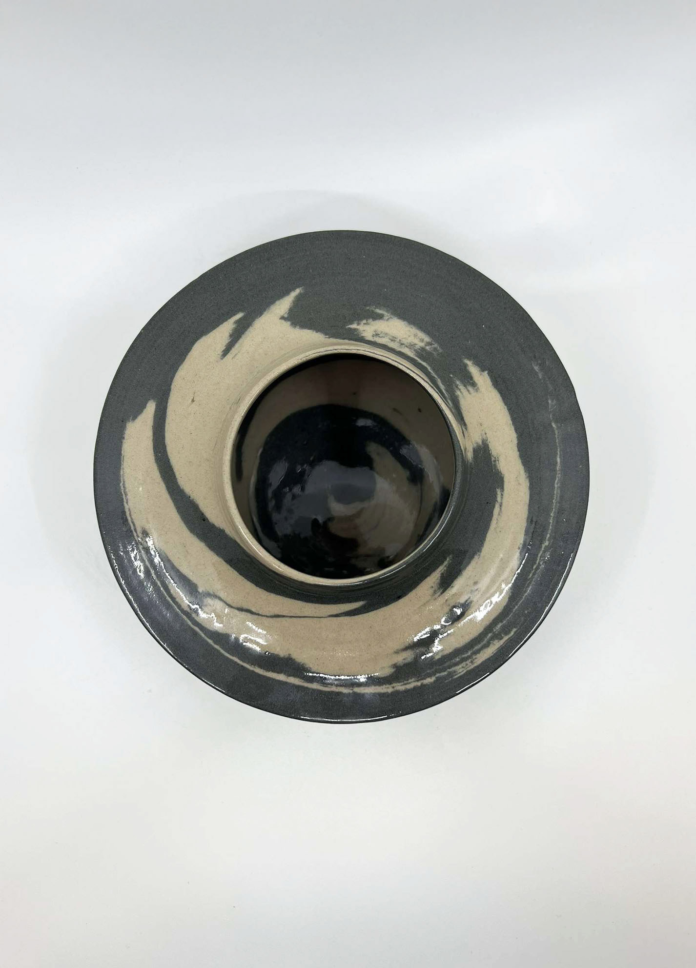
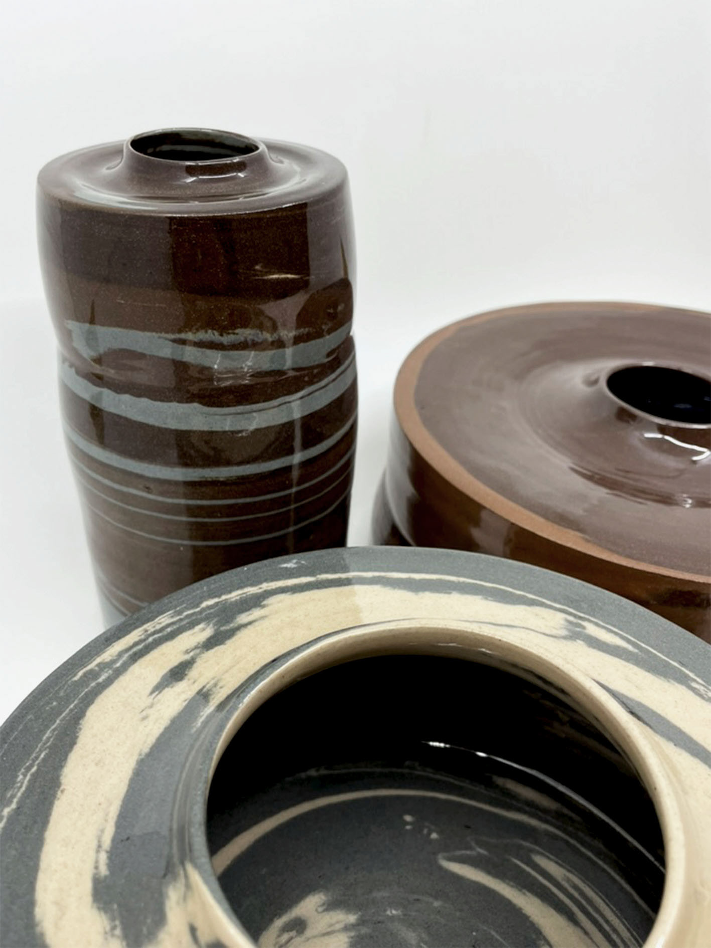
My third shoreline vessel is my favourite of the collection because it stands strong on its own and adds to the overall series. Created with two shades of dark grey and magnesium, the vessel features subtle marbling where the greys blend, with the magnesium adding a striking contrast of white. I particularly like the big sections of grey to white rather than thin layers. Although this vessel is slightly smaller than my second one, it maintains a sense of comfort and lightness that surprised many viewers. The attention to detail in this piece makes it the most professional and serves as a strong reference for what I want to achieve in my future work.
The colour scheme of this vessel best represents the pebbles of Brighton, incorporating greys, whites, and blacks reminiscent of flint stones. Moving forward, I aim to develop further collections using bolder colours inspired by the vibrant contrasts found in this piece. This vessel has inspired me to size up my work, making my pieces more impactful in terms of colour, form, and size.
For my next projects, I want to maintain high standards, ensuring every piece meets my expectations. For example, tiny stones mixed into my work from the previous throwers’ grit, which led to small imperfections after firing and glazing. These minor flaws highlighted the importance of thoroughly cleaning my wheel, tools, and surfaces to prevent contamination. This vessel reminds me of a large flint stone I would see on the shoreline, A clear glaze over it copying the reflections of the sea. I think for my next project, I want to really look further into my glazes as I don’t like fish. However, I also think that it does give it an inorganic feel, which isn’t what I want throughout my work. I think an exploration into further glazes, the application and the thickness of glazes will enable me to accomplish the finish I want with my work.
My fourth vessel was my tallest vessel and thinnest. This contrast of form is so fun and reflects a community of vessels; I think for this to really have an impact, I should have focused on creating more vessels. However, I really wanted to be proud of the work I made and consentient on details, which I don’t think I could have achieved with a large collection in this project. I did aim for five vessels. However, I got restricted with the kiln time and it all being ready in time for hand in, this is something I think I’ve really improved on this year: my timekeeping motivation, especially at the end of the project where I previously had burnt out, I was able to keep the momentum for my work and create my final pieces. This final piece is a mixture of two different red irons and grey clay. I find it fascinating that this grey clay is from the same batch as I used in my third vessel however, it being next to brown led it to have a bluer hue to it. I was fascinated by this as the other grey clay doesn’t have this same effect, being next to white. It could also be due to it being placed in the kiln, getting more head over developing the oxides. I think for this vessel, the browns are too dominating and dull, taking away from its organic form, I think in S and R, I will take away reds and browns and use lower quantities of clay to get a better representation of the colours I want.
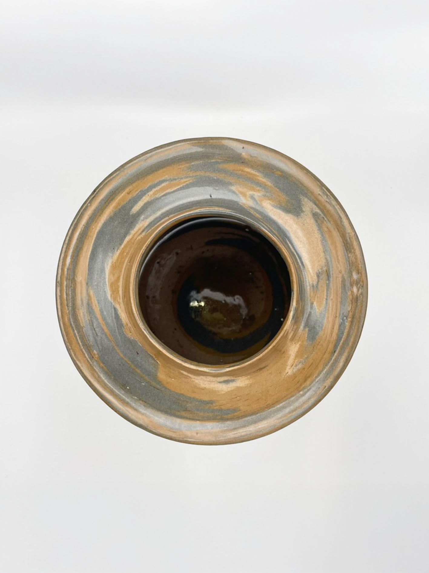
I do like the top of this vessel it follows the shape of the second vessel, dipping into the surface and then to the rim, and holds detail, making for a nice transition from body to rim opening. I would prefer if this piece was bigger, as I think that would add to the impact it has. Throwing this vessel into three sections highlights the profile of the pebble rib more. I used a pebble rib for all of my vessel bodies. I felt like this gave an organic form which directly informs my connection to nature and clay. I wanted to develop this connection and explore different ways this could be executed. One way I discussed was laser cutting a blown-up pebble profile. Therefore, I will be able to have the form of a pebble on a larger scale without my vessel body being too ridged, which overpowers the vessel.
Throughout this whole project, I have continually been learning about myself as a maker and about my practice. This project helped me highlight the type of maker I want to be and what outlining concepts are important to my work. I want to progress on this and develop myself as a maker. This includes my work and the products I produce, but also putting myself out there as a maker. I find it difficult to have confidence in my work, but as this project was about my home comfort, it was a fun project to get to know myself and what I want. I think this has made me think about what I want from my degree, and I have set myself standards for what I want to produce in my work. This project has led me to be more comfortable within my city, talking to more people about art and what I do in my work, but it also meant I was walking around exploring Manchester a bit more. I want to further look and focus on this as it is important for my development as an artist and directly links with the concepts inspiring my work.
Synthesis and Resolution
I want to continue exploring my Unit X project into Synthesis and Resolution; I want to push my boundaries as a creator within my making and concepts. I want to think bigger about my connection to Brighton, not limiting myself to just the physicals that comfort me. My connection to Brighton is important, and I aim to explore seeing it as a whole—emotionally, personally, and physically. I want Brighton to represent my sense of place within a new city.
I’m also enthusiastic about creating a larger collection because it will amplify the impact of my work through the collective singularity and allow for more public engagement by giving away free art. A bigger collection will help me connect and gain responses with the public in Manchester and generate more excitement around my work.
To create a larger collection, I need to think about my making process, as throwing is a timely process, which will limit the amount I'm able to make. Exploring and learning slip casting might help me achieve this, producing 5-10 different casts could speed things up, and the unique layering of coloured slips will maintain the marbled layered colour clay, therefore, their individuality, reinforcing collective singularity. I also want to explore further oxides and coloured stains to develop a vibrant colour palette that reflects Brighton’s essence. Instead of just using Brighton pebbles as inspiration, I think the colours were dulled, and the finish wasn’t to my standard. I want to incorporate bold, bright colours that represent the feel of Brighton.
I appreciate the consistent rims and clean, non-organic edges of my vessels; I think this perfectly captured the industrial structures that you see in an urban city, having this consistency on each vessel enhanced their collective impact. This juxtaposing with the more organic form of the vessel’s bodies I like however, I would like to explore not just using a pebble as a rib but think about creating a larger profile which I can use as ribs, giving a more powerful profile to the vessels. I want my vessel to be strong as a collection and to be impactful individually, and the clear glaze I used didn’t fully achieve that. While it mimicked the silky texture of pebbles and the capturing of the reflection on the sea, it lacked the more organic, natural elements. Understanding these elements better will guide my decisions on whether to change the finish.
I’m also passionate about engaging in community-based free art projects in Manchester. Involvement in these initiatives will help me integrate into the Manchester community, learning about people and key skills needed to create, share and produce free art. How can I help make art more accessible?