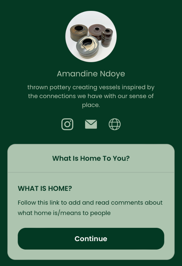
Final Proposal- What Is Home?
Free Art
As I reflect on my project, I realise that it has expanded far beyond my initial expectations. Originally, I started with two core concepts: the idea of free art and a sense of place. My belief that art should be accessible to all inspired the free art concept, and I initially thought I could seamlessly blend this with the sense of place concept in my final piece. However, as the project progressed, it became clear that the sense of place concept naturally blossomed, steering the direction of my work away from the free art idea.
This shift was challenging to accept, as I am deeply committed to the notion that art should be freely accessible. Despite this, I recognised that continuing to pursue both concepts simultaneously would dilute the impact of each. The scope and depth of my work on the sense of place and home have grown too significant to incorporate the free art concept without compromising the integrity of either idea.
Therefore, I have decided to focus solely on the sense of place for this project. This does not mean I am abandoning the concept of free art entirely. It remains a vital part of my artistic practice and something I will continue to explore in future projects. For now, however, I am putting the free art concept on hold to realise the potential of my current work fully. By doing so, I can ensure that each idea is given the attention and respect it deserves, allowing my project to achieve its fullest expression.
In summary, while my initial vision included blending free art with a sense of place, the natural evolution of my project has led me to prioritise this. This decision allows me to create a cohesive and impactful body of work that truly captures the essence of my journey and the significance of home. The free art concept will continue to be a part of my artistic journey, but for this project, the focus on a sense of place has proven to be the better natural direction for my work.
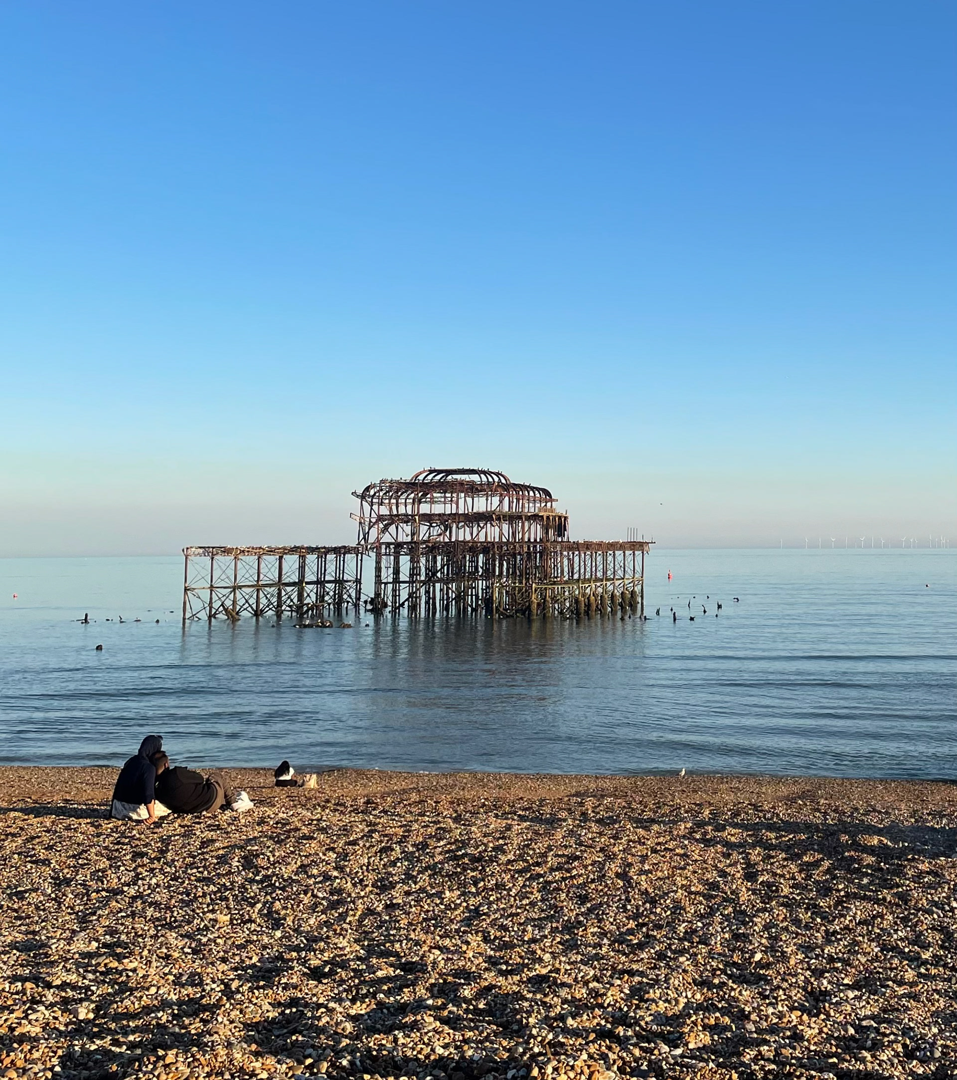
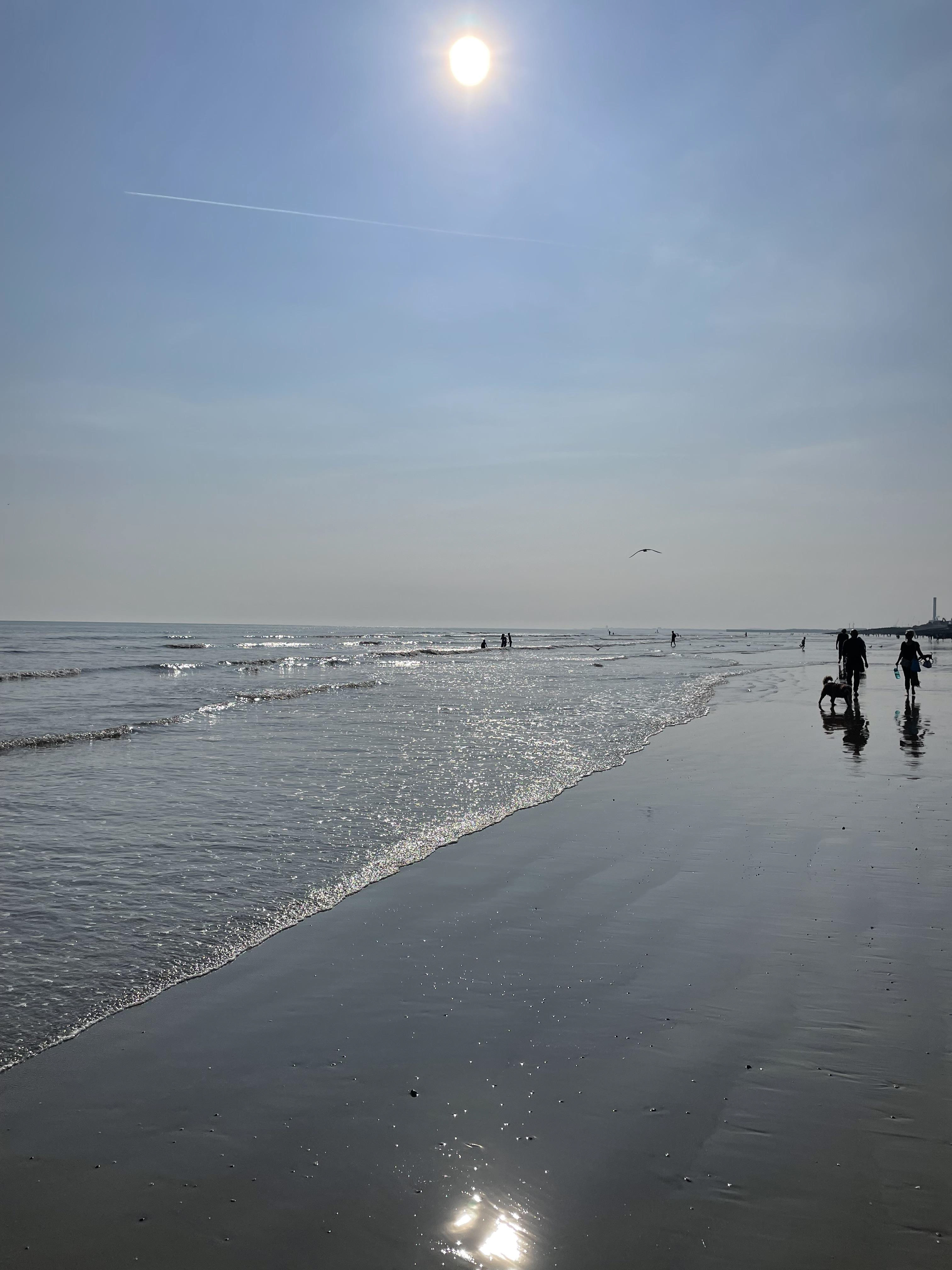
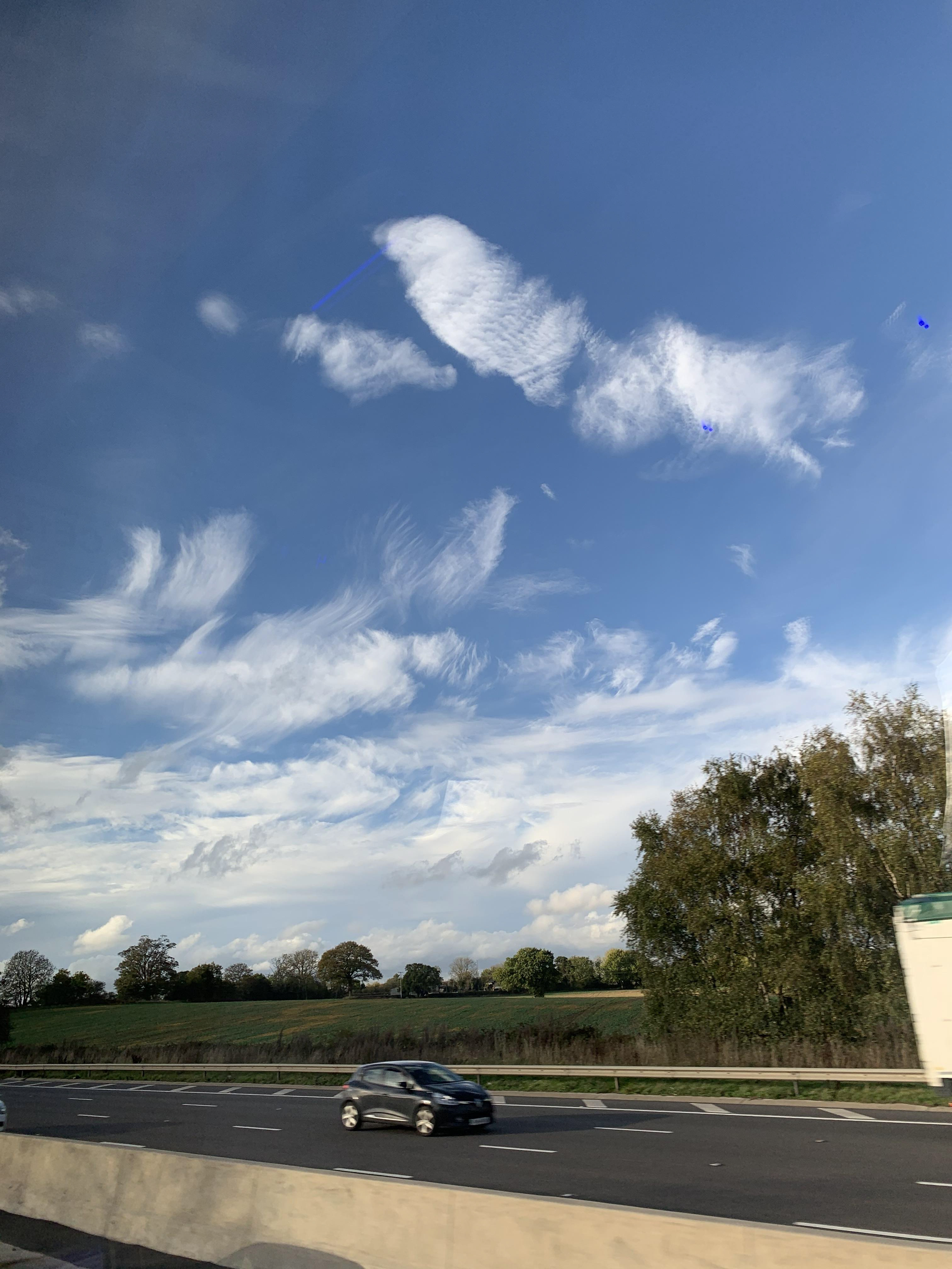
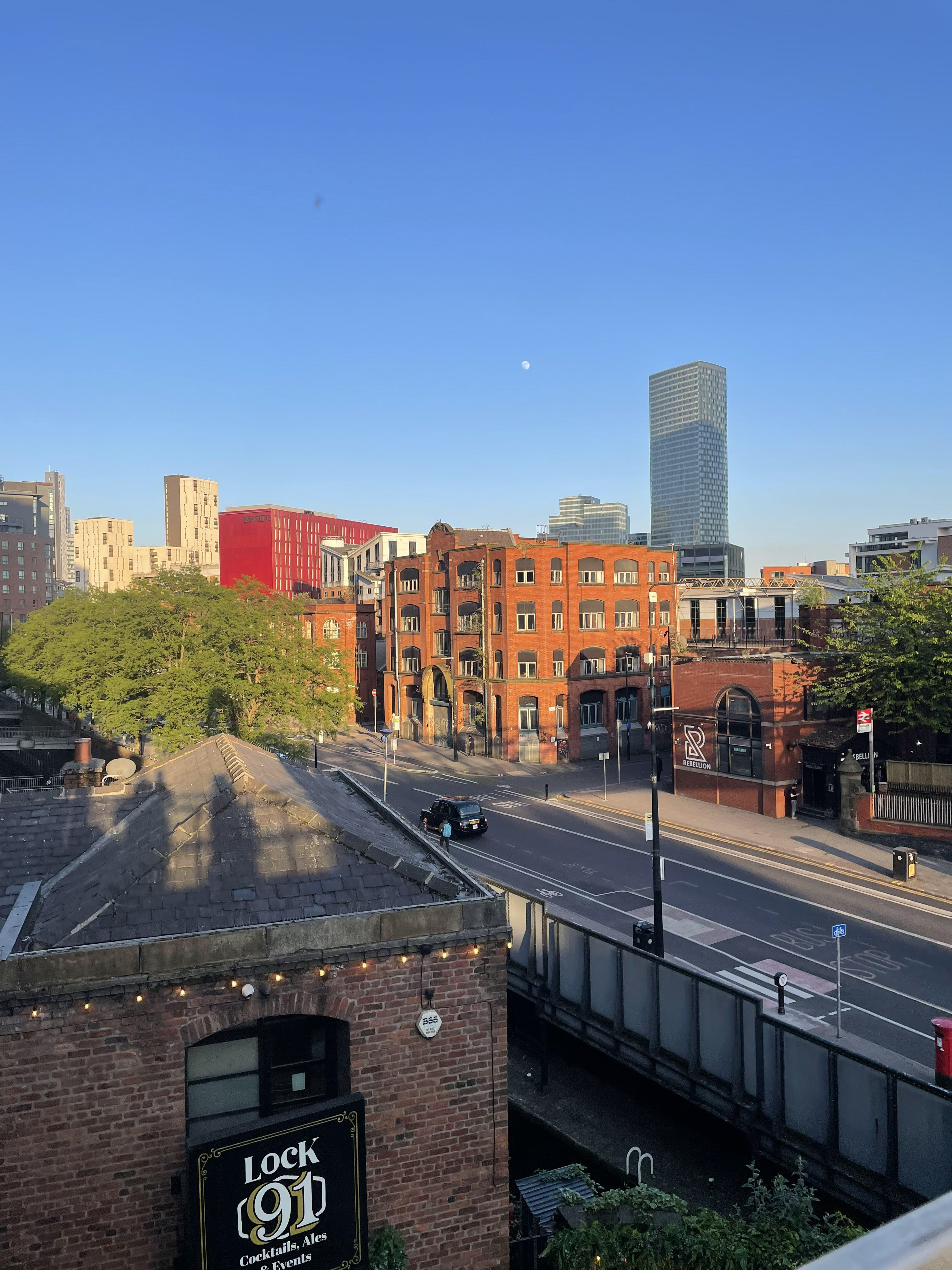
Pictures Of Brighton, To Manchester


What Is Home?
Throughout this project, I have developed and refined my concept. Initially, my focus was on the emotions and difficulties of moving away from home to find oneself in a new environment. This journey involves the challenges of adapting to a new place and the quest to establish a sense of belonging in a new home. Additionally, I explore themes of a sense of place, which refers to the emotional and psychological connections we form with specific locations. A sense of place encompasses the unique characteristics that make a location special and meaningful to an individual, including the physical environment, cultural context, and personal experiences associated with that place. Reflecting on this, I found myself asking, "What is home to me now?"
This question has become an extension of my exploration. Home is not just a physical space, it is a concept that encompasses emotional, psychological, and physical feelings. It is a place where our most basic needs for safety, shelter, and belonging are met, but it also holds deeper significance as a repository of memories, identity, and growth.
-Sense of place refers to the emotional and psychological connections we form with specific locations. It includes the unique characteristics that make a location special and meaningful to an individual.
-Relationships with family, friends, and our community give us a sense of place, a feeling of belonging and security.
-Memories we create, the feelings of safety and comfort, and how our home reflects our individual personalities and values all contribute to our sense of place.
https://www.ncesc.com/geographic-faq/what-are-some-examples-of-sense-of-place/
https://oracioncristiana.org/en/home-definition/
- Home is a collection of memories and attachments. It is where significant life events occur, shaping our identity and sense of belonging. Emotional memories and the attachment we form with our living environment play a crucial role in defining what home means to us.
-Home provides a sense of belonging and identity. It is a place where we feel accepted and understood, where our personal history and cultural background are acknowledged and celebrated.
-Home is often associated with feelings of comfort and security. It is a sanctuary where we can retreat from the outside world, relax, and be ourselves without fear of judgment.
For me, home represents a sense of comfort and security, a place where I can be myself and feel connected to my roots. It is where significant life events occur, shaping my identity and sense of belonging. However, moving away from home has brought its own set of challenges, leading me to realise that home is where I feel comfort, love, and joy, and that I can have multiple homes.
I believe the ideas of sense of place and home are concepts that the audience will be able to connect with, prompting them to reflect on questions such as "What is home?" and "What is a sense of place?" Enabling this reflection for my audience is important, as it mirrors my journey of exploration.
As I continue to delve into these ideas, I aim to translate them into my ceramics. Each piece in my collection will reflect different aspects of home, the difficulties of relocation, and the journey of finding a new sense of place and belonging. Through my work, I hope to convey the complexity of home and invite viewers to reflect on their own experiences and definitions of what home means to them.
Reflections And Development Of Samples
Final Outcome
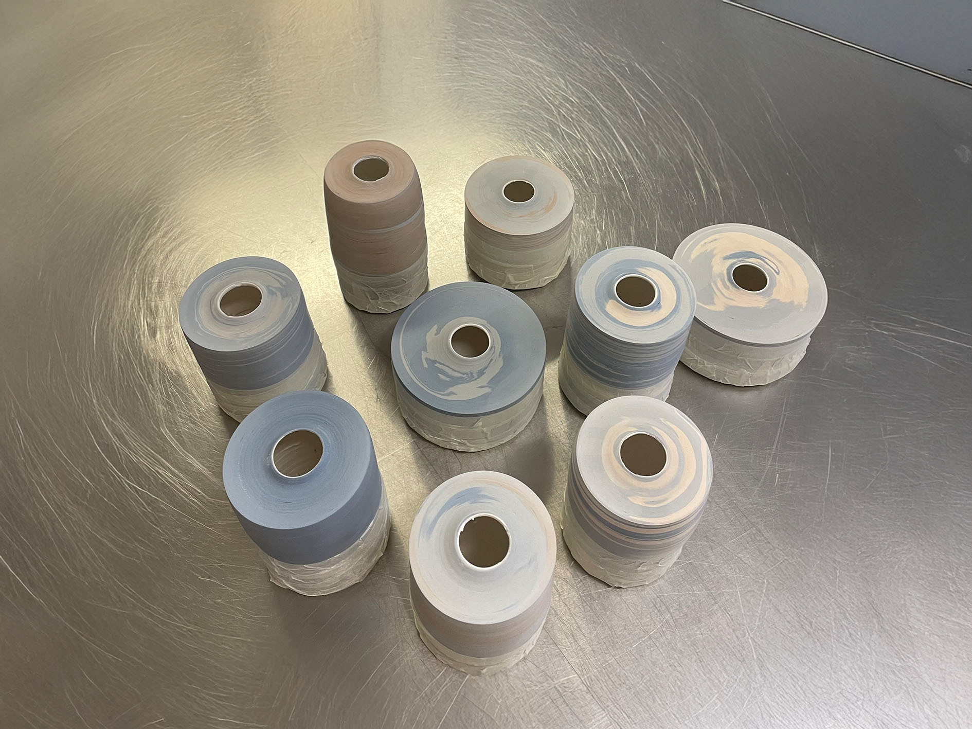
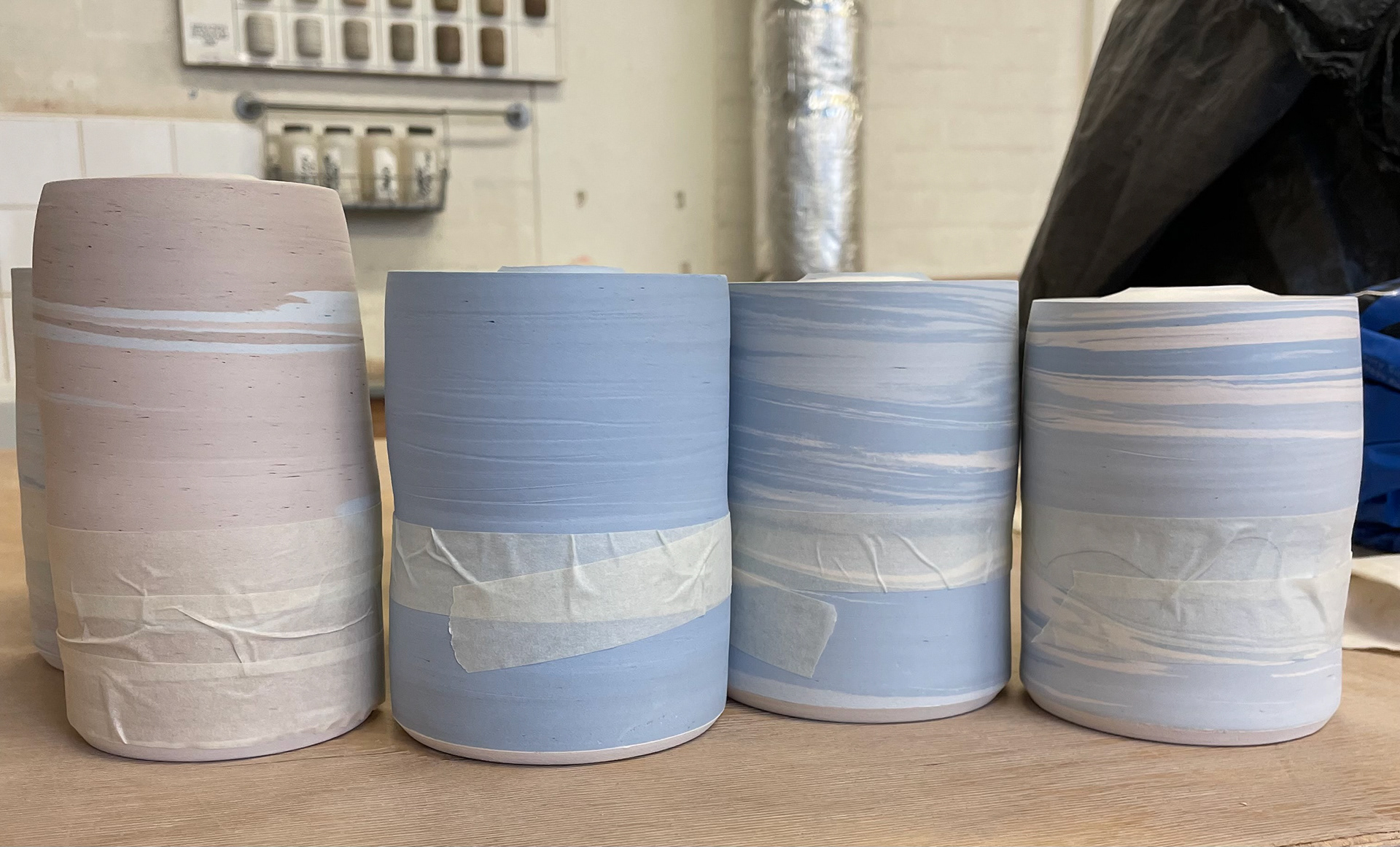
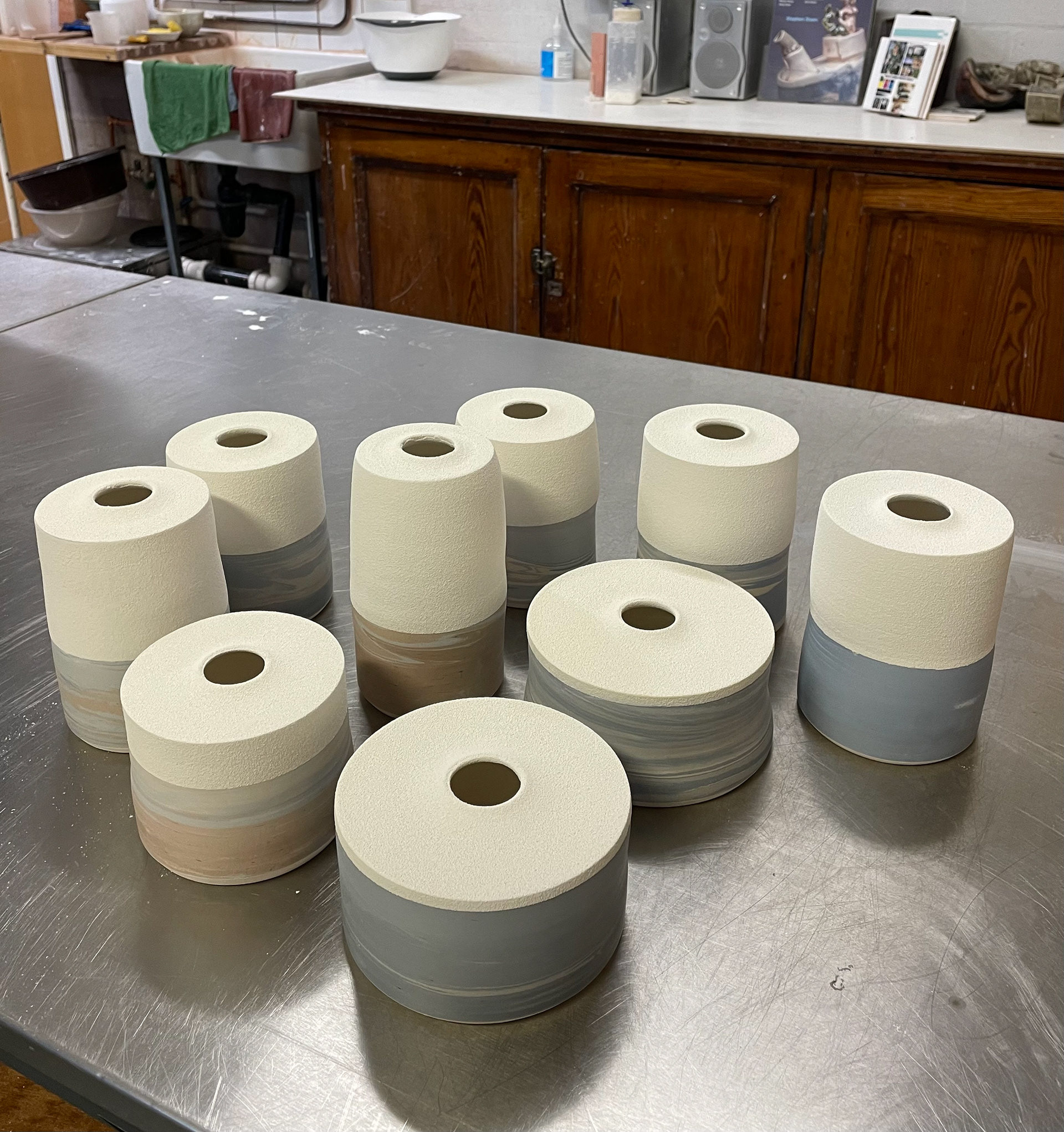
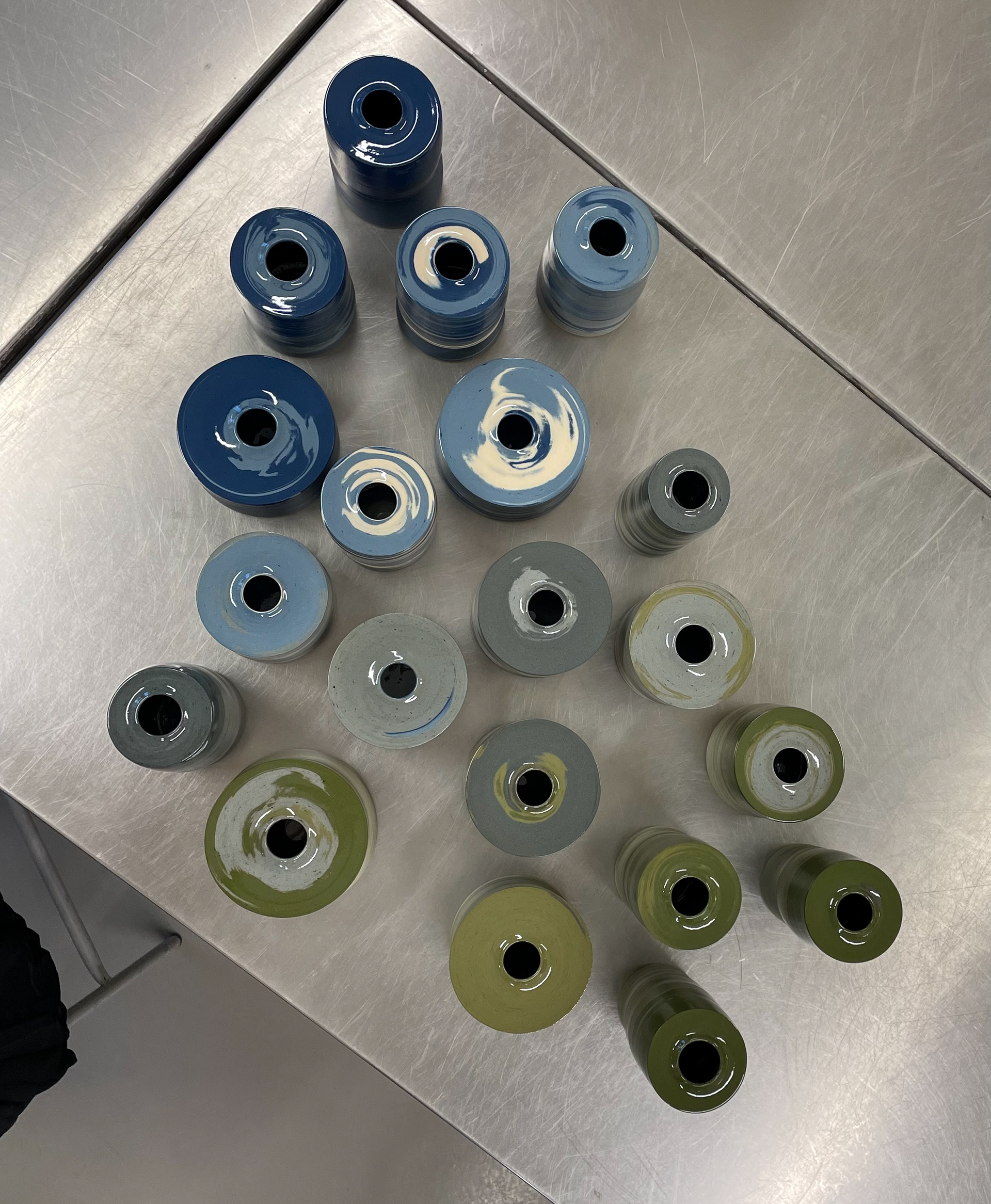
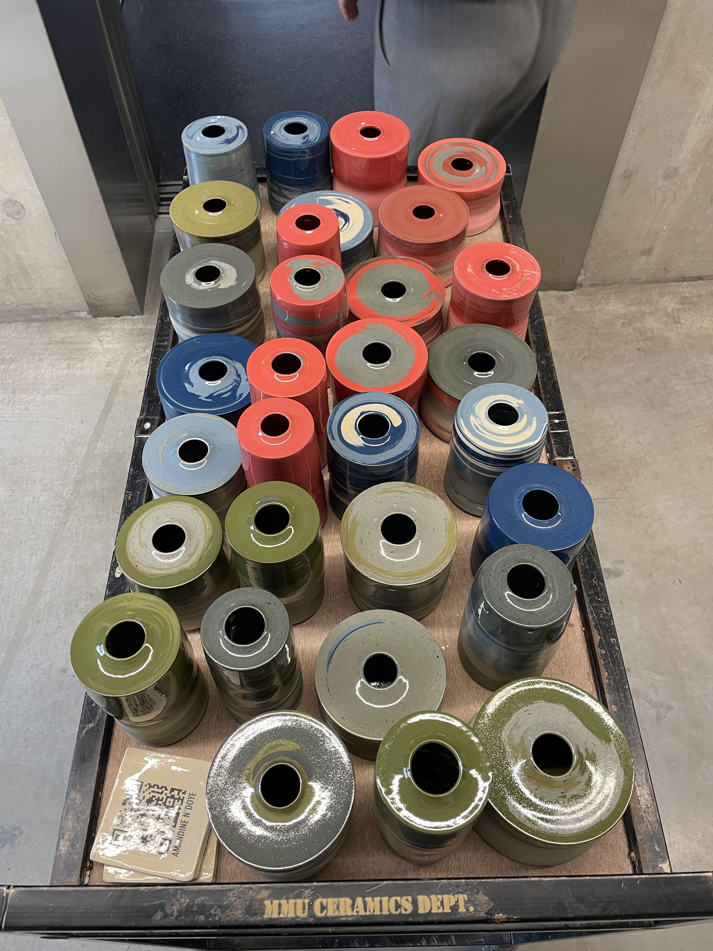
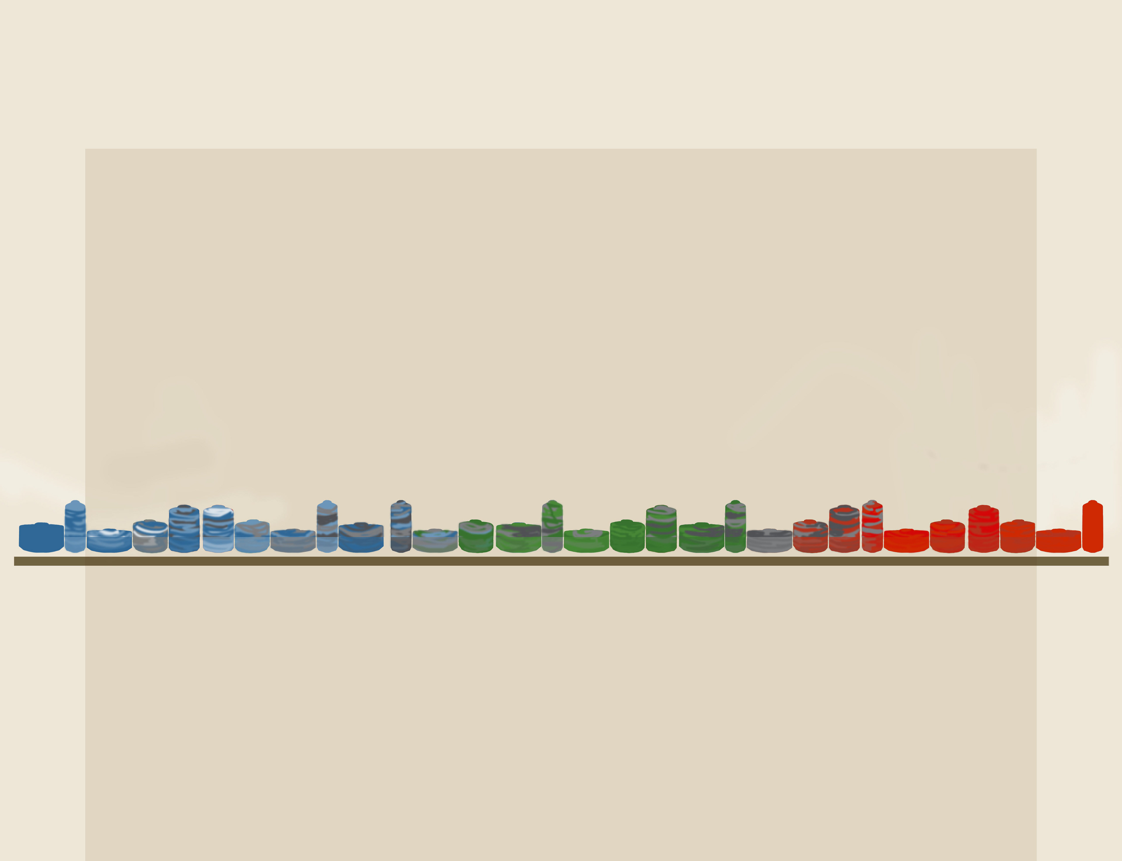
For my final outcome, I aim to create a collection of 30 vessels, one for each day in September, the month I moved, that symbolise my transition from Brighton to Manchester. This collection will be a vibrant representation of the colours and essence of both cities, capturing the natural scenery of Brighton and the industrial landscape of Manchester. Each vessel will be crafted from marbled, coloured clay, transitioning from the bright coastal colours of Brighton, blues, whites, to the muted, industrial tones of Manchester, greys, and brick reds. The vessels will vary in size and form, reflecting the diversity and uniqueness of each city. Despite these variations, each vessel will share common details that unify the collection, such as specific rims, weights and measurements. This collection aims to blur the lines between the natural beauty of Brighton and the industrial character of Manchester, creating a harmonious blend that represents my personal journey of finding my sense of place and the merging of these two environments. Additionally, these vessels are designed to be comfortable and evoke a sense of home, representing the comforts and familiarity that are important to me throughout this journey. Every element of the pieces has been thoroughly thought out to ensure a high standard of professionalism and finish.
In my project, the concept of home and home comforts is intricately tied to the creation of my vessels, as they are designed to evoke a sense of familiarity, warmth, and personal connection. Each vessel symbolises not only the physical transition from Brighton to Manchester but also the emotional journey of finding comfort and finding my sense of place and belonging in a new environment. By incorporating elements that represent the natural beauty of Brighton and the industrial character of Manchester, I aim to blend these two distinct environments into a cohesive narrative that reflects my personal experience. The vessels, with their varied forms and unified details, are crafted to provide a sense of place, offering comfort and a reminder of the familiar amidst change. This focus on home comforts ensures that each piece resonates with the viewer, conveying the importance of finding solace and identity in one's surroundings, and highlighting the emotional significance of home in my personal journey, but also gives the chance for my audience to reflect on this too.
The significance of my project being a collection lies in its ability to encapsulate the essence of my journey and transition. A substantial collection of 30 items is particularly meaningful as it mirrors the number of days in September, the month I moved away from home. This deliberate choice of quantity not only symbolises the passage of time but also reflects the depth of my experiences during this pivotal period. The number 30 holds profound significance, representing a complete cycle of days that encapsulates the emotional and physical journey of moving away from home. By curating a large collection, I aim to illustrate the complicated nature of my journey, showcasing the diverse emotions and memories associated with this transition. Additionally, having a large collection mirrors the ideas of security and family, as each item is individual but within the collection serves as a tangible representation of the stability and support that the home provides.
The collection will have a range of sizes, shapes, and forms, reflecting the diversity of what home means to different people. A larger collection also allows for a greater emotional connection for the audience, as viewers can find pieces that resonate with their own experiences and feelings about home. The variety within the collection can evoke a wide range of emotions, from comfort and security to nostalgia and longing. Collectively, I hope these items narrate the story of my transition and the continuous process of redefining what home means to me, emphasising the importance of family and the sense of security that comes with it.
Final Process Plan
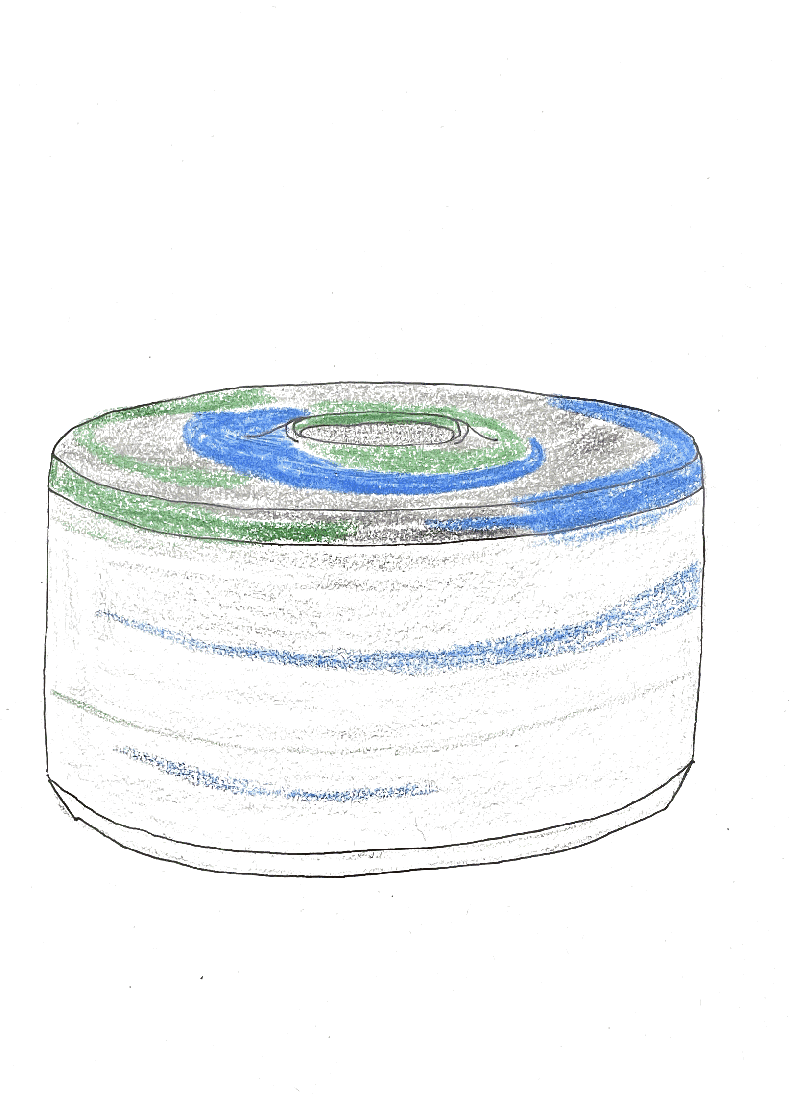
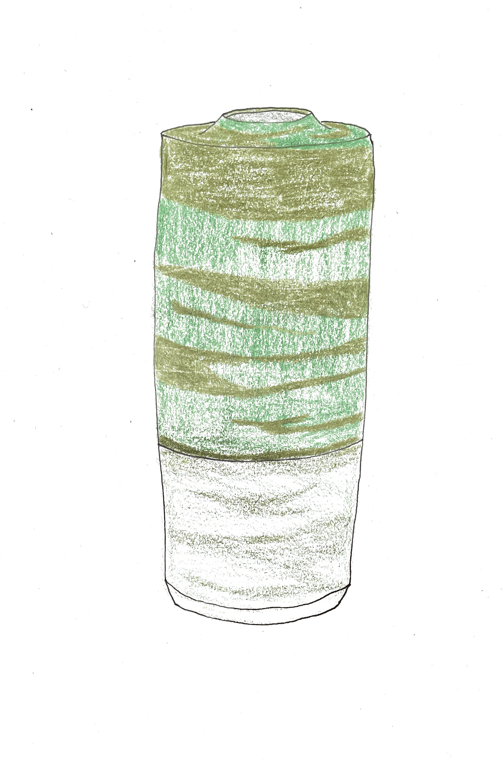
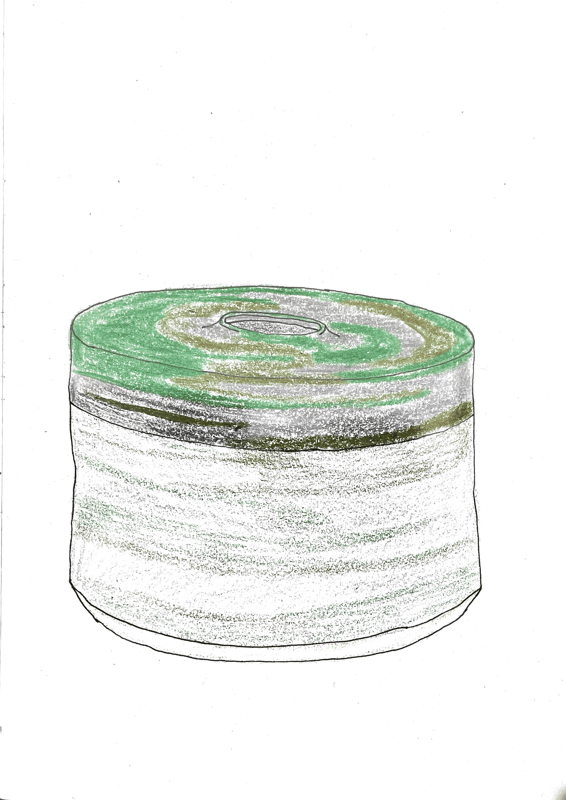
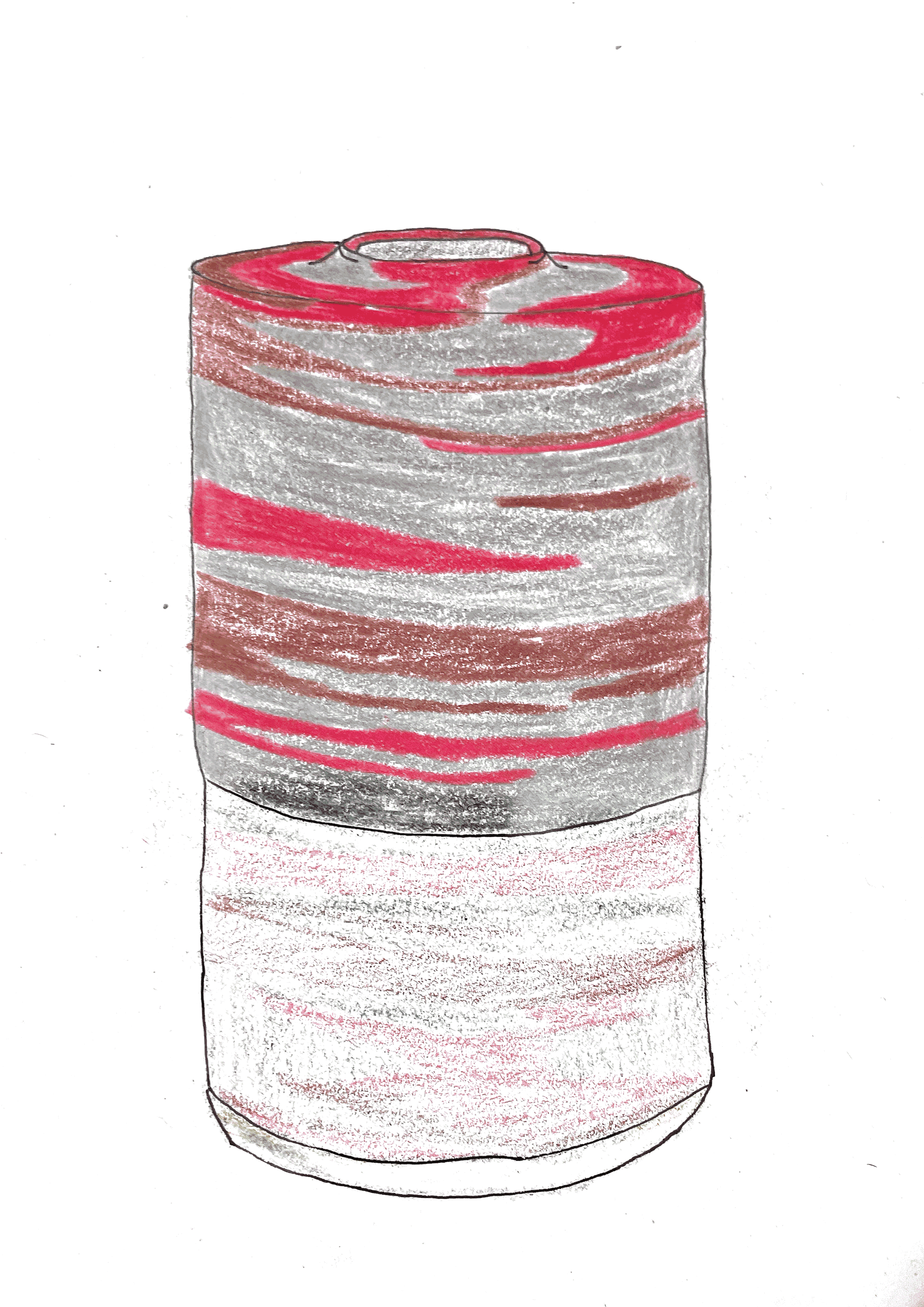
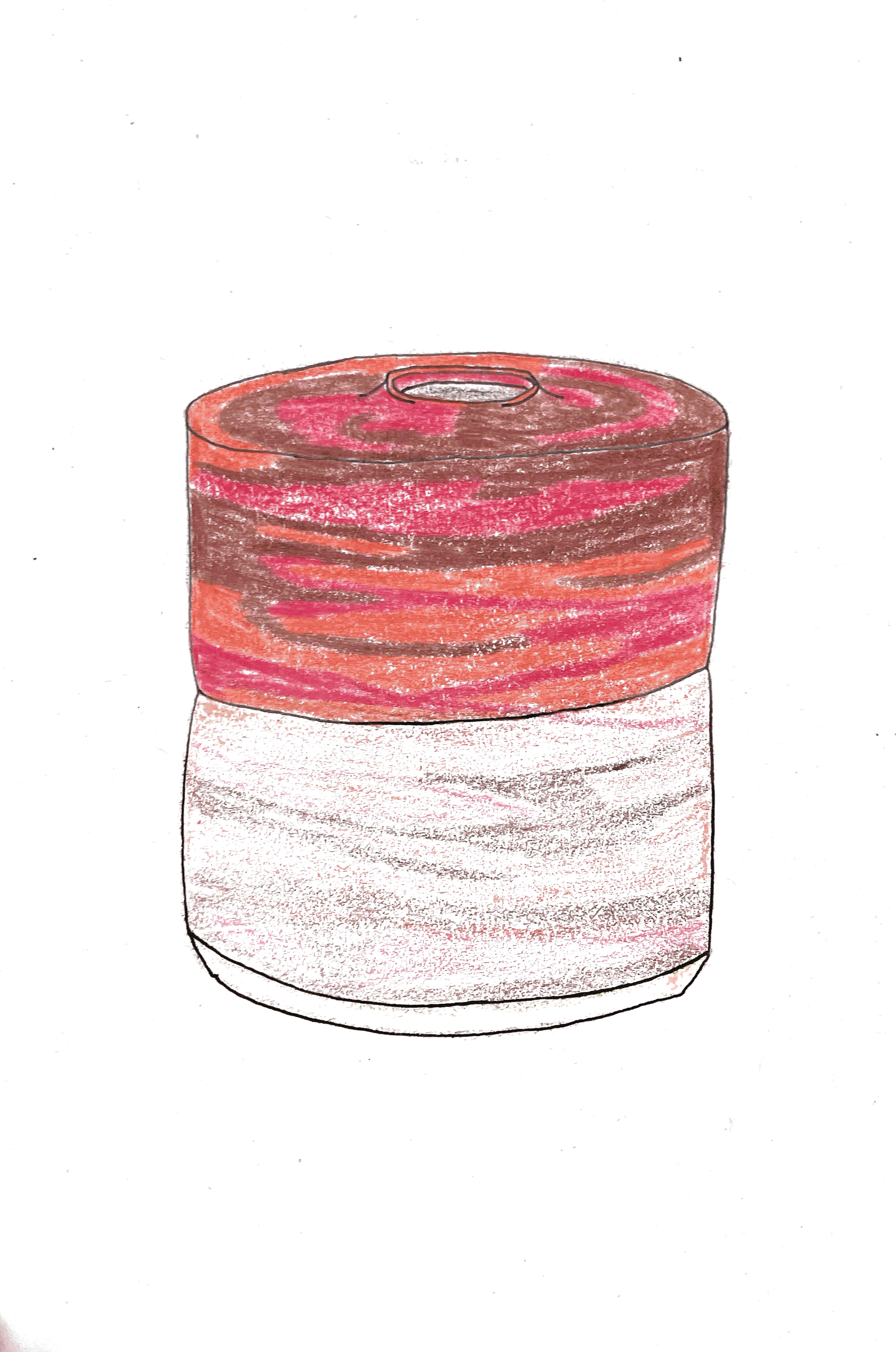
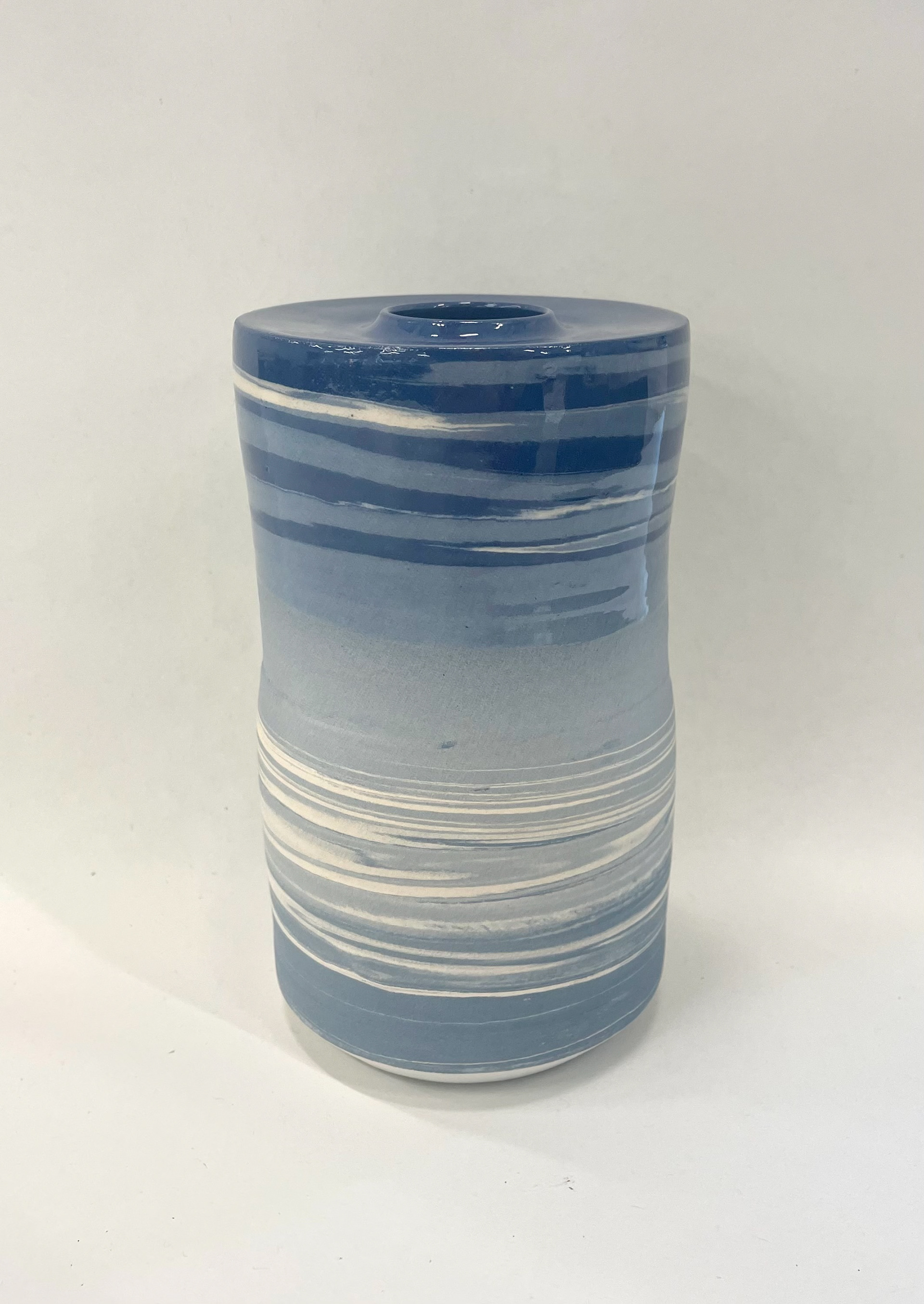
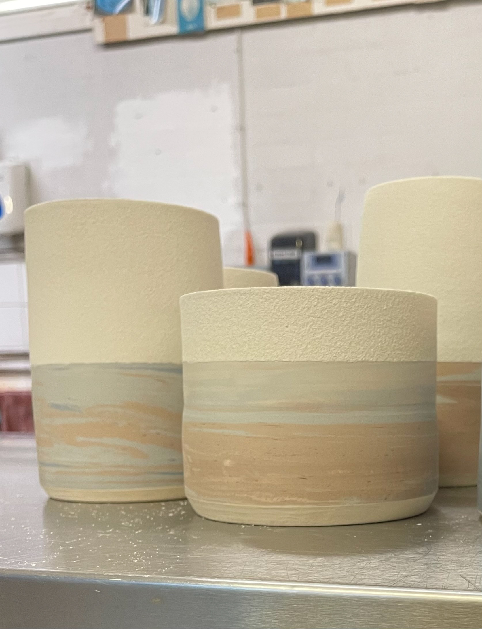
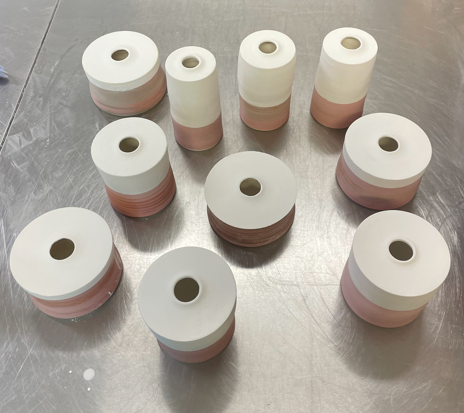
The collection begins with blue hues, symbolising my seaside home in Brighton. The colours then transition into greys and greens, reflecting my journey north through motorways and countryside. Finally, the last 10 vessels feature reds and greys, representing Manchester's red brick and industrial landscape.
I plan to create the vessels in sets of 10 per colour. In the first week, I will throw, trim, and build the blue vessels. While these are in the kiln, I will start on the green set, simultaneously preparing the clay for the red vessels. Once the green set is in the kiln, I will begin the red vessels. This schedule allows me to glaze and apply transfers to all the vessels in the final week, ensuring they are finished simultaneously.
I need to consider drying times and realistically assess how long it takes to make each vessel. By giving myself five weeks, I have the flexibility to address any issues, replace vessels if needed, and avoid feeling pressured by time.
Timetable 17th March- 9th May
Having a timetable for my final piece process is crucial. I aim to make 30 vessels, so I ensured I have enough time by allocating 5 weeks for this project. Starting with a clear plan helps me manage my time effectively, ensuring that each vessel receives the attention it needs. The timetable allows me to break down the project into manageable tasks, set clear milestones, and allocate sufficient time for each phase: material preparation, throwing, trimming, building, firing, and finishing. Additionally, it provides a buffer week to address any potential mess-ups or unexpected issues. Planning around kiln firings is also essential, as each firing takes two days to complete. By scheduling these firings in advance, I plan to fire on Fridays, allowing a whole week of making and then the weekend for firing, making them ready for Monday, so I can maximise studio open times. This way, I can ensure that all vessels are fired and finished on time. Although I hope to stick to this timetable, there are many elements to my final process, and if a kiln firing is delayed or something happens, I can easily reallocate that time and work on another task in the meantime. While I haven't used timetables in previous projects, I've found it helpful for this one due to the limited time and all that I want to achieve. This organised approach helps me stay on track and ensures that I can deliver a well-crafted and cohesive final piece within the given timeframe.
What I Need to Prepare For
To successfully execute my project, I need to prepare thoroughly in several key areas. First, I must gather all necessary materials and supplies, including recycling and colouring my clay, and preparing tools like my rib, which I will laser cut. Next, I need to define the colour palette, sketch out various forms and sizes, and plan the unifying details that will create a sense of collective singularity. Additionally, I need to document the process by writing explanations of my making, photographing the creation of each vessel, and adding this to my portfolio. Managing my time with a clear timeline and setting milestones will ensure I stay on track, while estimating costs and time will support the financial aspects of the project. Planning the exhibition layout and considering how I want my work to be viewed and interacted with is crucial. By preparing thoroughly in these areas, I will allow myself time to create a final piece that has been thoughtfully considered in every aspect, taking into account any potential hurdles or setbacks, and giving myself enough time to address and resolve them.
-Coloured clay making 2000g batches each time
-Making my rib
-Working out my specific specs within the vessel's openings and bases
-Enough time to make and prepare for my vessels
Specific Specs
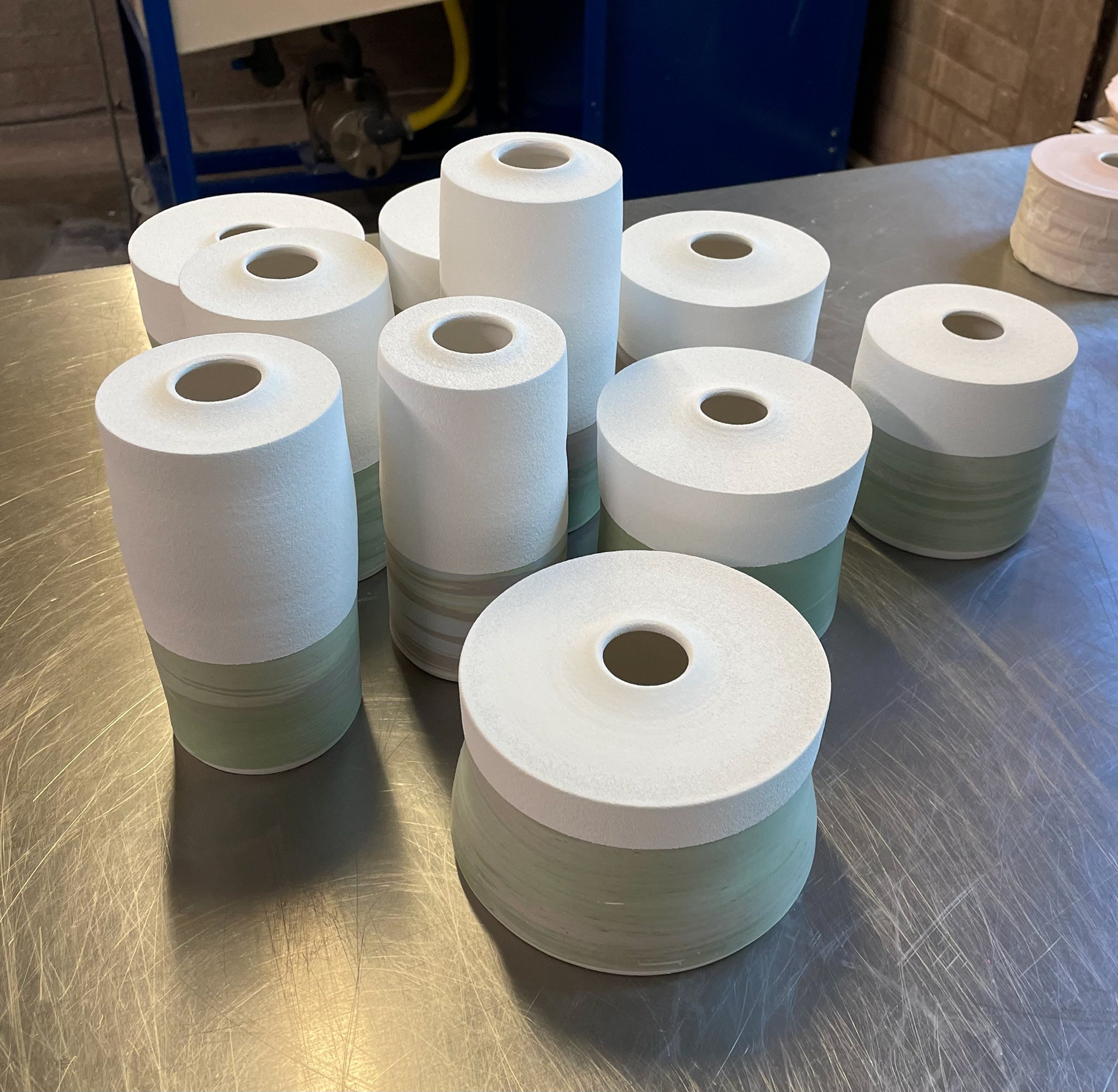
With my pieces, I think it is important for there to be some consistency. This not only makes them physically more aesthetic by having similarities, but also adds to the idea of collective singularity. Each vessel is very individual, but forms a collective within this. When thinking about what consistencies to have within my vessels, I found some key elements that would really uplift the smaller details. This added bit of detail shows the professional finish to my pieces and also reflects the time and care taken to make them.
I also think that having these consistencies and differences really relates to my concept of home and sense of place. When moving away, we seek familiarities and consistencies that remind us of our home. Although there will be differences, these consistencies are a comfort to us, and this is why I decided to create specific specifications to follow when making my vessels.
Reflecting on my personal experiences, home has always been a place of comfort and familiarity. It's where I find solace and a sense of belonging. The textures, colours, and objects within my home evoke memories and emotions that are deeply personal. As I create my vessels, I aim to capture this essence of home. The consistencies in my work symbolise the familiar aspects of home that provide stability and comfort, while the differences represent the unique experiences and changes that come with moving and adapting to new environments.
By incorporating these elements into my vessels, I hope to convey the idea that home is not just a physical space but a feeling of connection and identity. Each vessel, while unique, is part of a collective that embodies the concept of home and the sense of place. This approach not only enhances the aesthetic appeal of my pieces but also adds depth and meaning to my work, reflecting myself in my pieces.
Consistencies
Base-
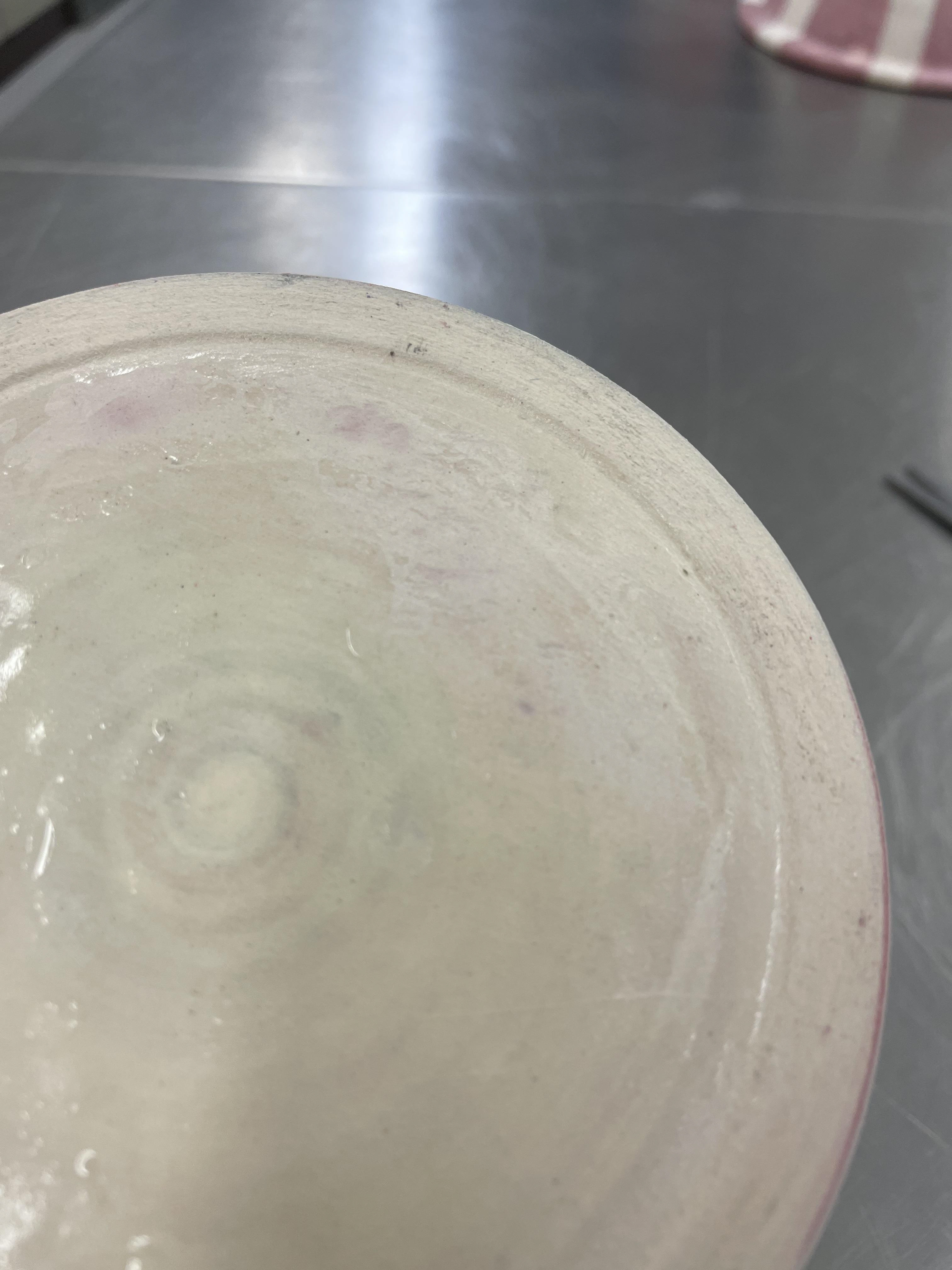
I want all my bases to be the same, having a similar depth and a 1cm foot. By maintaining this consistency, I will ensure I have enough space to transfer my QR code. Additionally, having equal flat bases allows for a much cleaner finish for my vessels.
Vessel Opening-
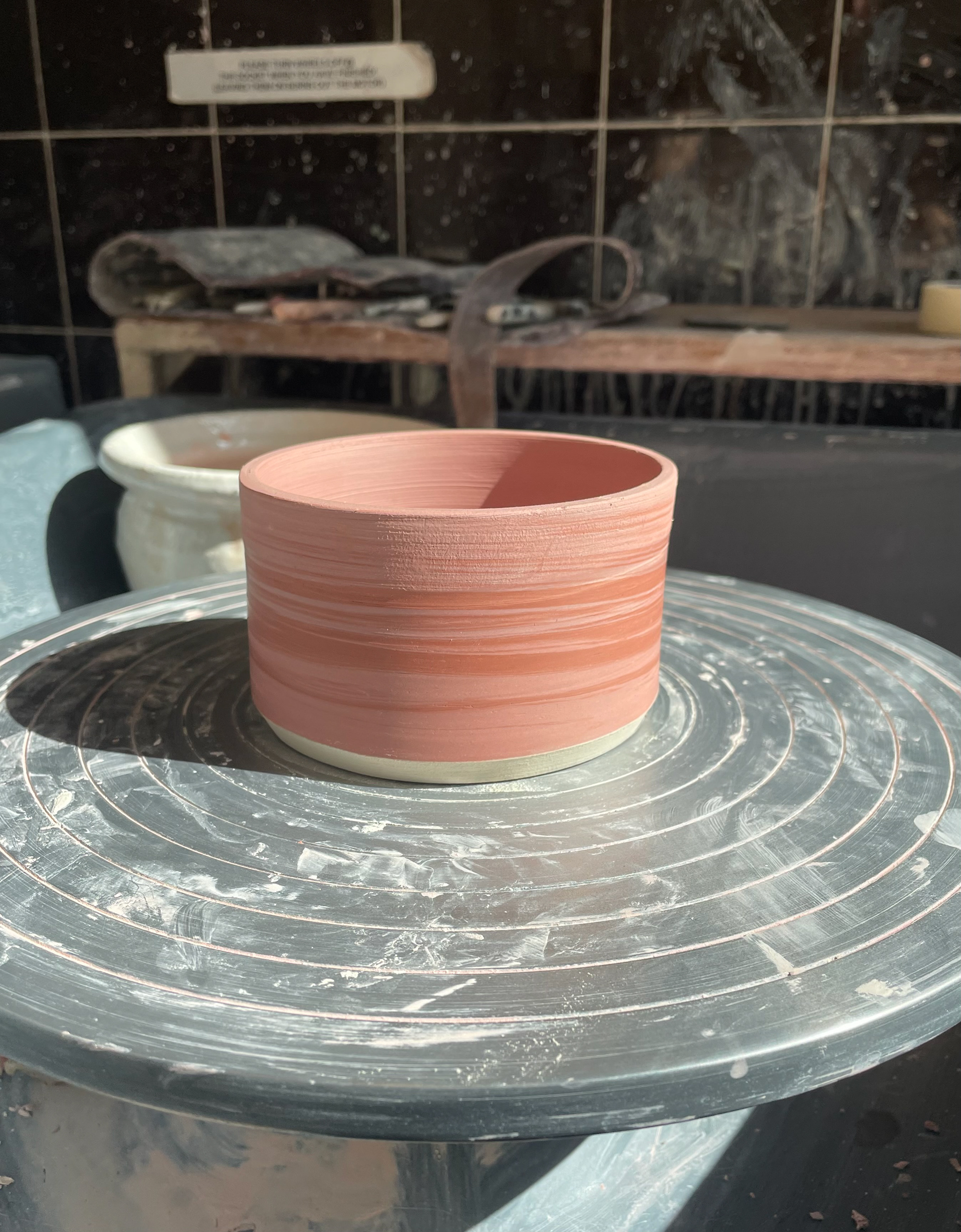
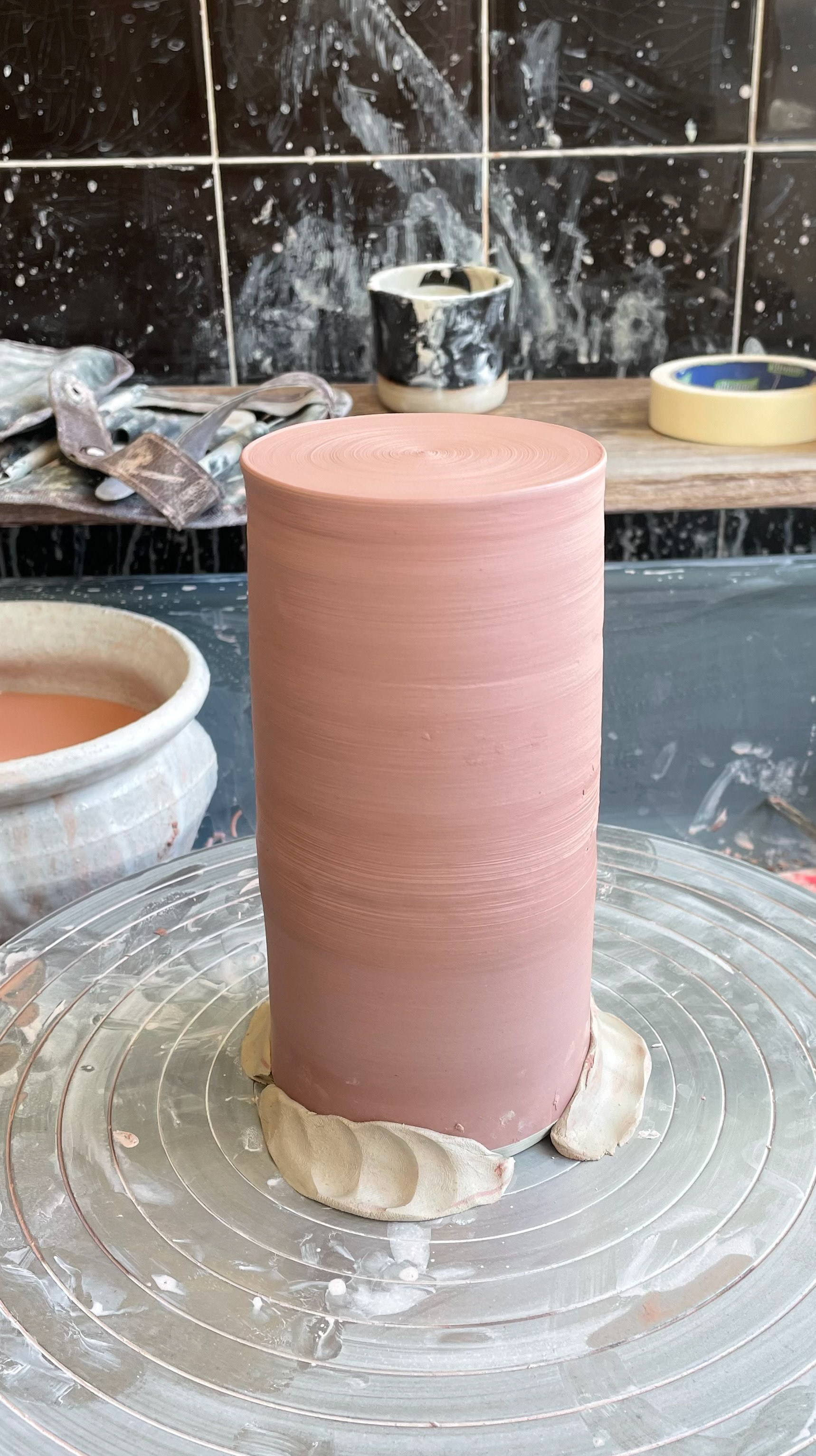
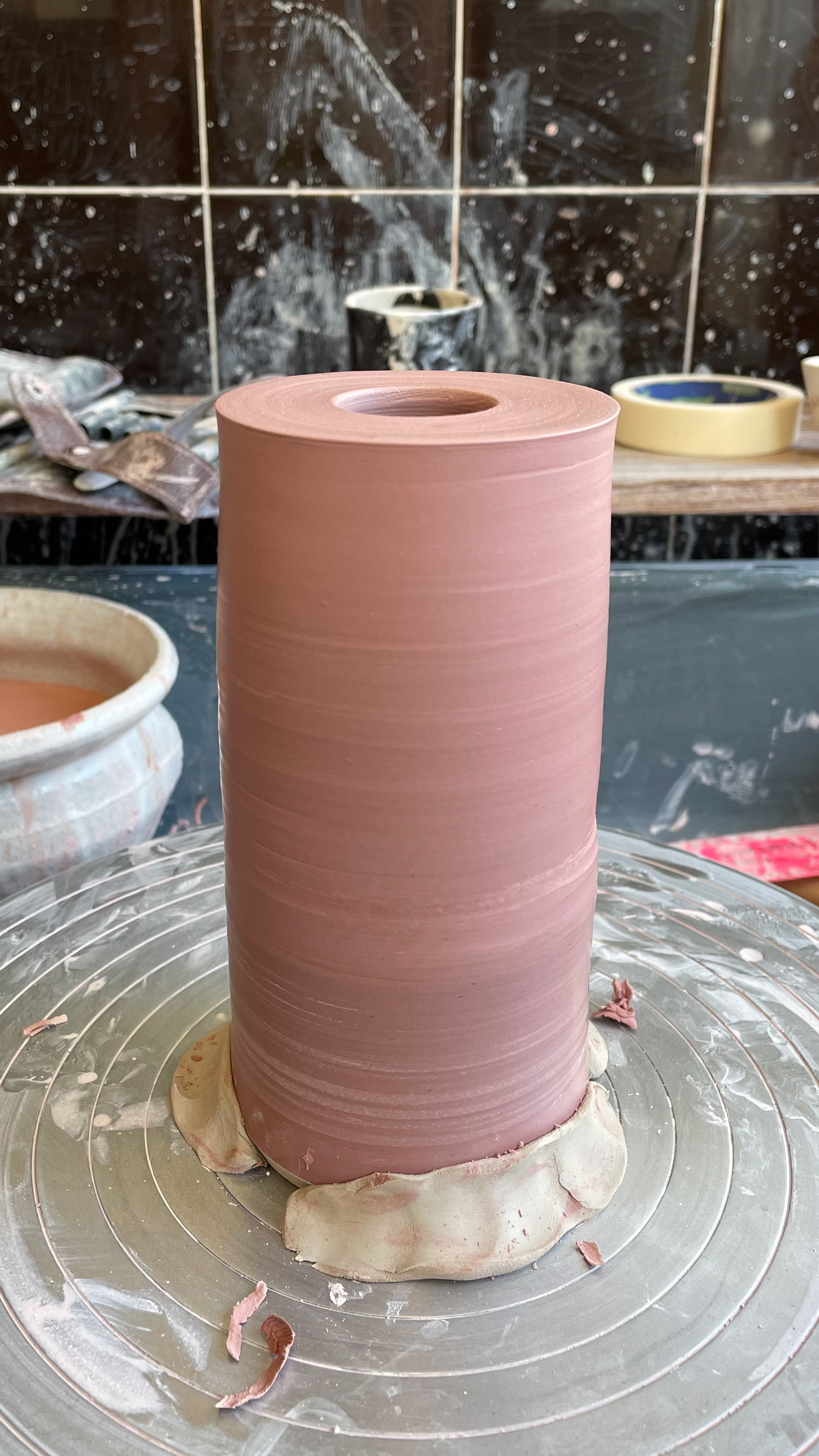
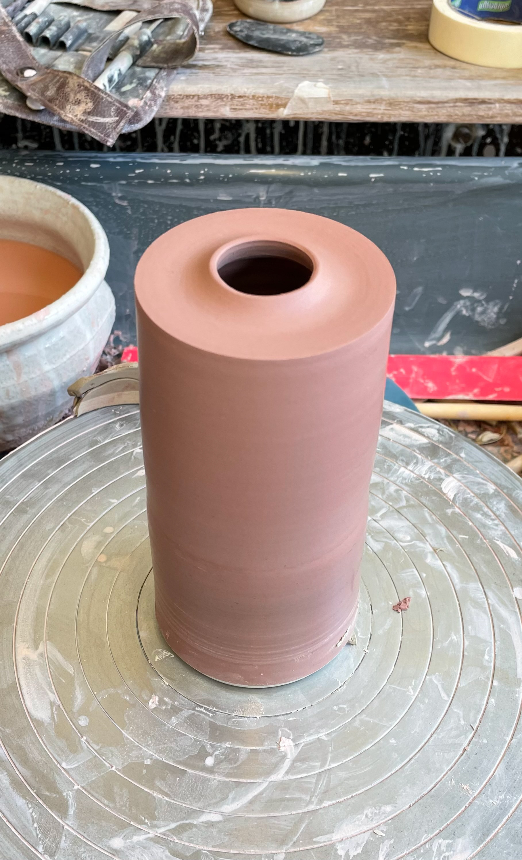
For my vessel openings, I reflected on previous samples where I made many of the openings too large for the vessel. I want these openings to be very delicate and sleek. Since I am working with a wide range of sizes, I needed a measurement that suited both wide and slim vessels. After some experimentation, I decided that a 3cm opening was the best size as it suited all forms. I believe that having the same vessel opening enhances the aesthetics of the vessels when viewed head-on or from above. These small consistencies elevate their look. However, I need to be careful to keep the 3cm opening consistent when pulling up the walls, as this will be the most challenging aspect.
Top and Bottom Rim-
For my rims, I want them to be very sharp and clean. For me, this is a reflection of Manchester's very clean, sleek architecture. To ensure this consistency, I created a laser-cut rim for the bottom rim, which angles the rim. This sharp, clean angle is consistent in all my vessels and perfectly suits the theme, incorporating my two homes into one piece.
Horizon Line-
For the horizon line, I aim to have a clear, straight line running around the pot. I decided to have this at the same height from the base of all my vessels, as I think it would be visually impactful. Having a bold, straight line running through my shelved vessels draws the eye in and maintains consistency within the collection.
White Base-
I decided to white slip all of my bases and rims. I thought this would allow me to better apply a QR code, as they will all have a muted background, making the QR code more readable and stand out more. Although this will be mostly hidden, I think it is just that little extra detail that will enhance my vessels.
Printed QR Code and Name-
I am printing and transferring a QR code and my maker's stamp. I decided to do both as transfers because I thought having a transfer QR code with a stamped name would not match well. I am choosing to have all these QR codes printed to the same size, around 3cm wide, to be placed in the centre of the base. This is due to the need for consistency, and I think it would look irregular having lots of different sizes based on the width of the base. By having them all the same size on each base, it is easier for me to print, gives a cleaner look, and is easier to transfer. I need QR codes and maker's stamps on all my pieces because, at some point, these pieces will be separated. Therefore, the QR codes act as a way of connection, and the stamp allows my work to be signed. As there is a chance these could be sold individually, having this on all the bases is key.
Glaze-
For my glaze, I want all my pieces to be glazed the same. I will use clear earthenware glaze for all my vessels, making sure to fully glaze the inside so they are fully functional. I haven't decided what to do with the glaze yet, but I want it to be the same for all of my vessels. This is due to having such dominant features- colour, pattern, and horizon line. I think a plain, simple, clear glaze is needed to enhance these details instead of hiding them. If I had inconsistent glaze on my vessels, I think it would overcrowd the overall look of my vessels, distracting the viewer from seeing the smaller details.
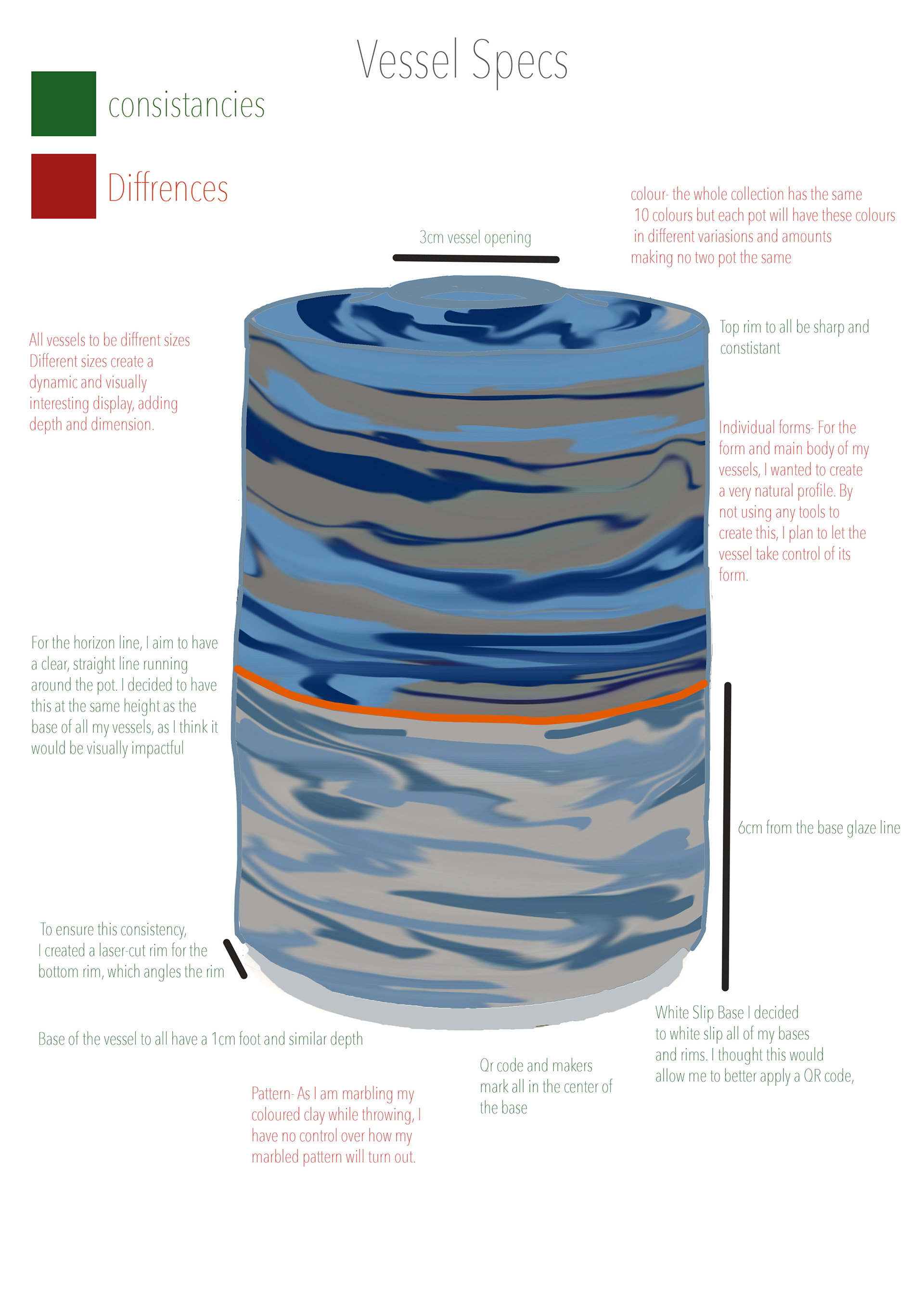
Differences
Size-
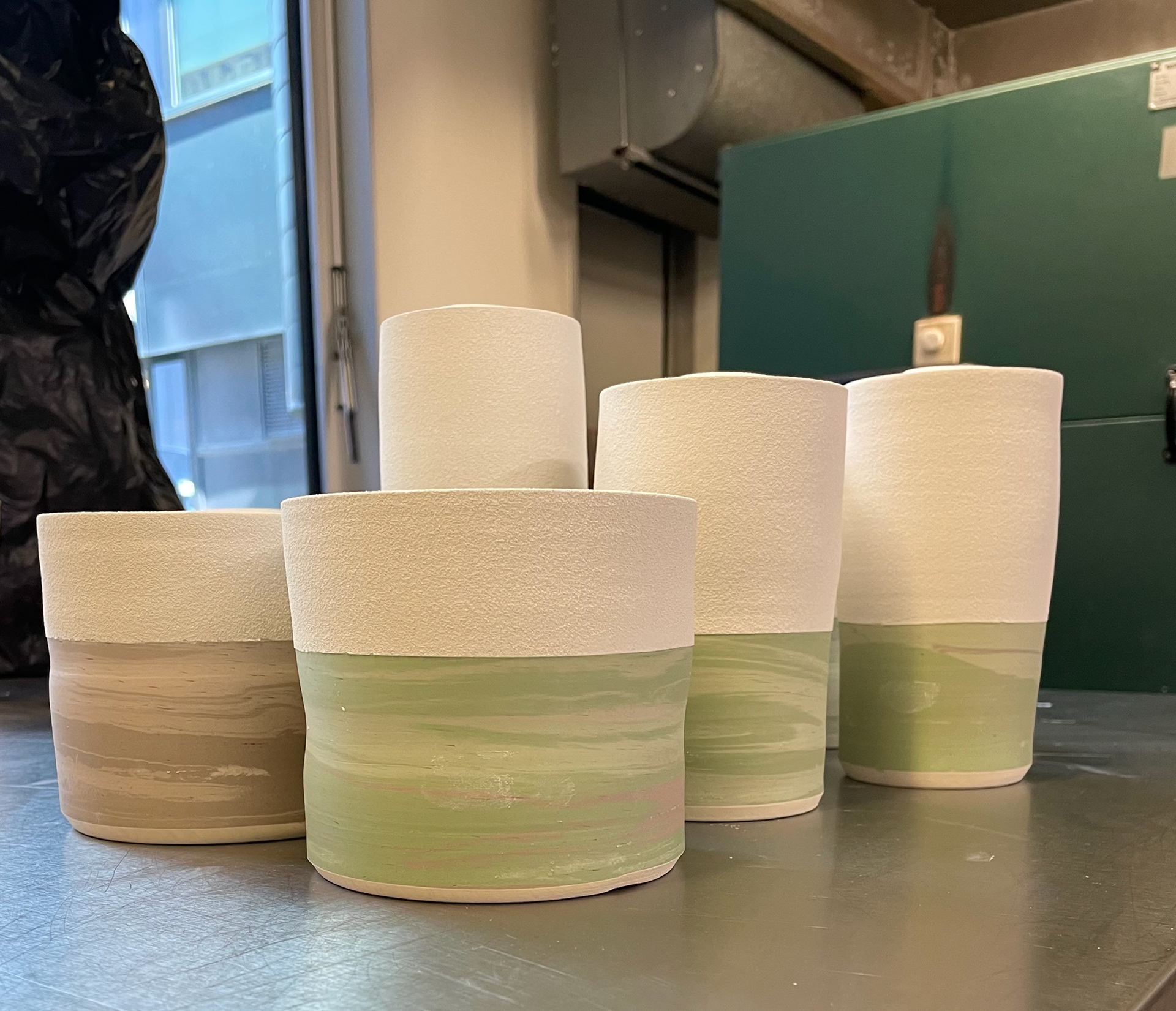
My vessels can look good, being all different sizes in a collection, for several reasons. Different sizes create a dynamic and visually interesting display, adding depth and dimension, which prevents the collection from looking flat or monotonous. Each vessel, while part of a cohesive collection, has its unique character, highlighting the craftsmanship and creativity involved. This individuality symbolises the diversity and complexity of the idea of home and place. Vessels of different sizes also serve various practical purposes, making the collection more versatile and adaptable to different environments. To ensure a level of consistency, each vessel with have 1000 grams of clay to be thrown with. This means that all my vessels will be roughly the same size, avoiding extreme differences between tiny vessels and huge ones. They will all be variations of the 1000-gram size, which helps maintain a cohesive look while still allowing for individual expression.
Form-
For the form and main body of my vessels, I wanted to create a very natural profile. By not using any tools to create this, I plan to let the vessel take control of its form. This will most likely take place when attaching the two pots together, as each attachment will be a little different. I wanted a more natural form for the body, reflecting the natural scenery of Brighton. This, combined with the very straight industrial rims, portrays my two homes, the two juxtapositions coming together harmoniously in one piece. This also extends the individuality of my vessels, with each piece being a bit wonky and warped, yet part of a cohesive collection.
Colour-
The colours throughout my vessels will all be the same, although some vessels might have the same three colours within them, no vessel will have the same amount, meaning that the colour distribution will be different on each one. This is a reflection of my journey, with colours fading out of the vessels symbolising me leaving that home. Although I will use the same colour recipes throughout, the colours will look different depending on what colours they marble with. I think having colours in each of my vessels reflects my playful personality and my journey.
Pattern-
As I am marbling my coloured clay while throwing, I have no control over how my marbled pattern will turn out. By having no control over this, each of my vessels' patterns will be unique, adding to their individuality. Some may have very tight, thin marbling, while others have bigger, chunkier marbling. This difference in how each one changes is important, symbolising the changes I made personally when moving and finding a home. I think this difference in pattern makes the vessels impactful and eye-catching.
New Rib
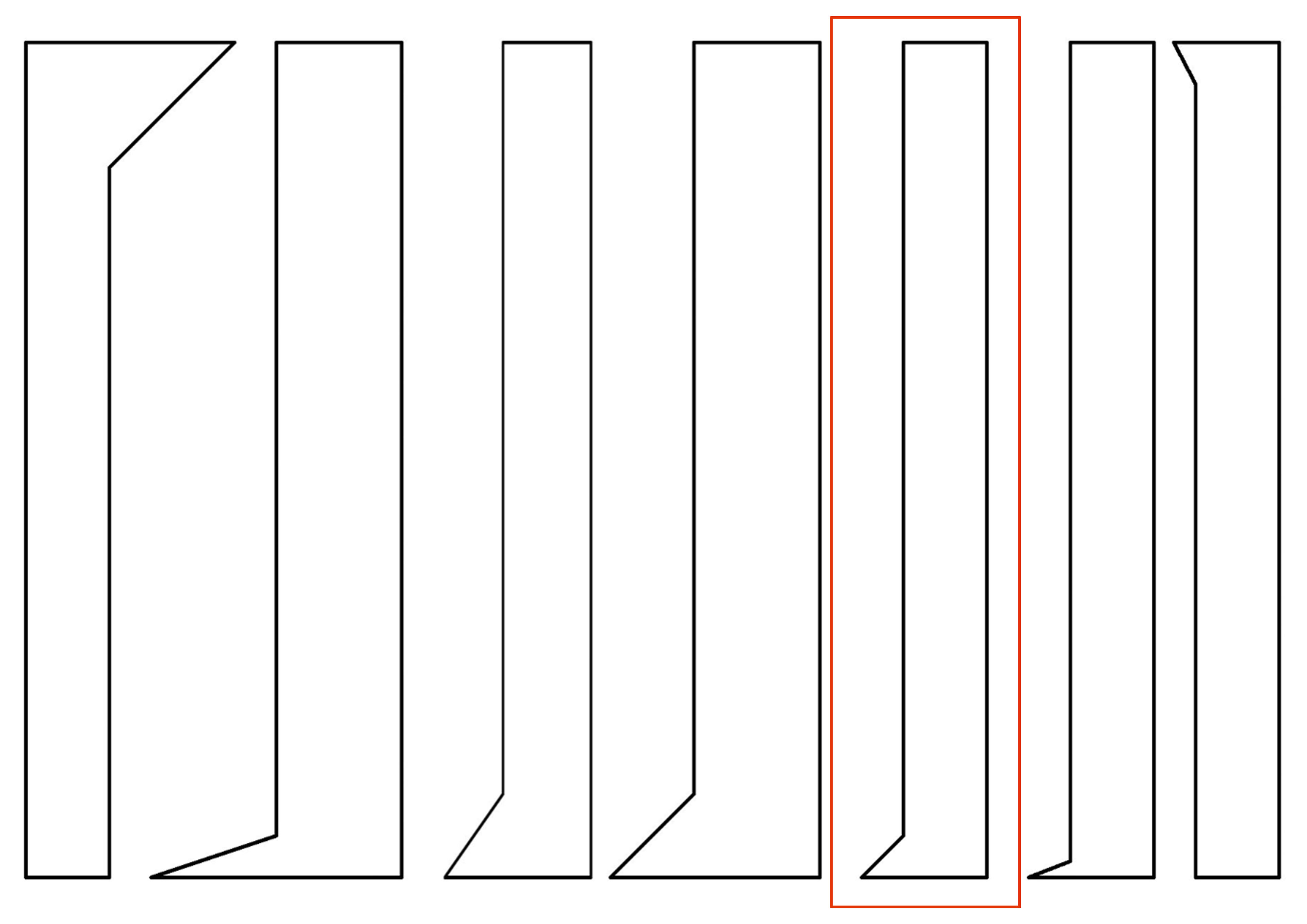
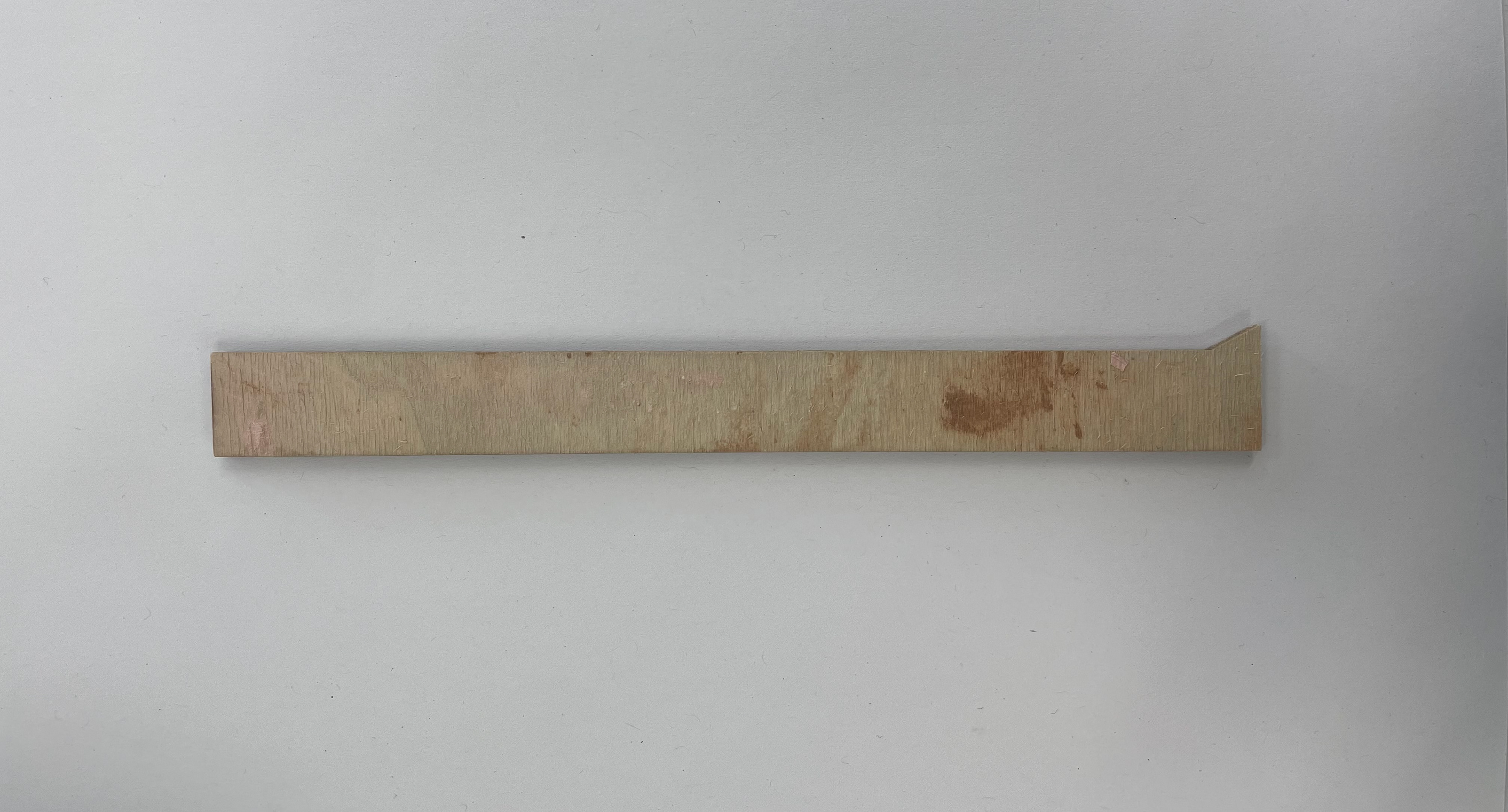
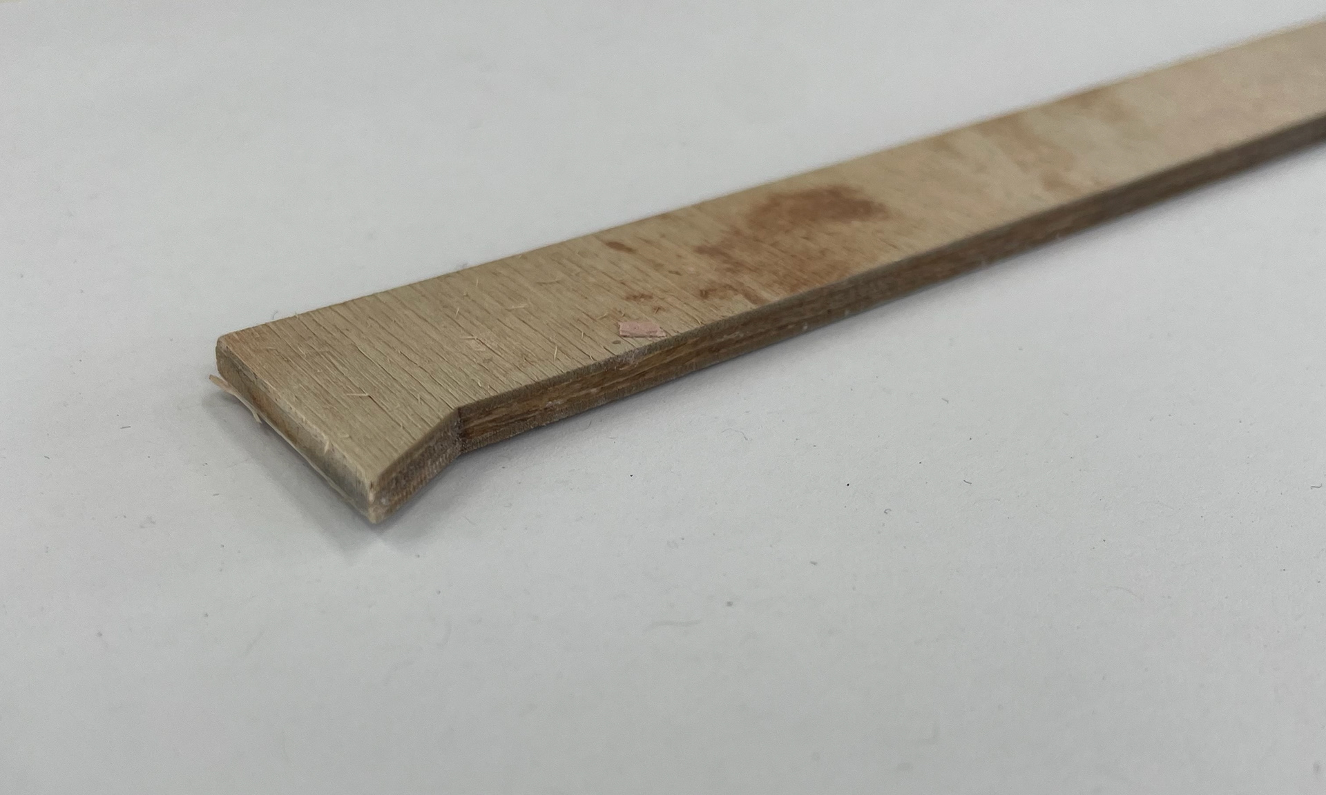
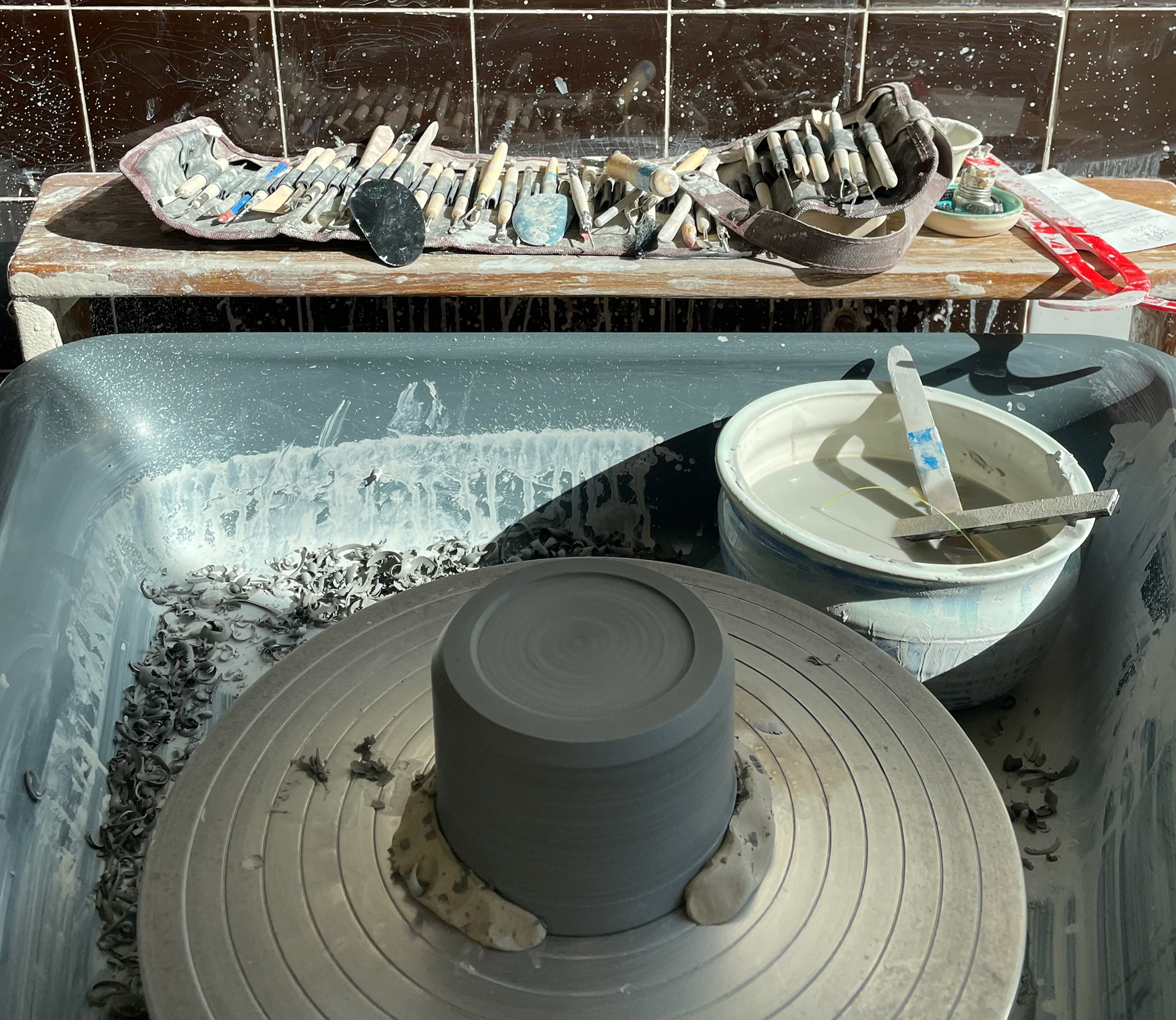
I laser-cut a new rib out of plywood because my previous rib was too wide and deep for trimming. After reviewing my previous mock-ups, I decided that I needed a shorter and more inclined angled rib. I chose this design (outlined in red), which is 3 cm wide and 16 cm tall. This rib serves as a much better fit for trimming the bases of my vessels.
Once ready, I sampled this rib on a simple thrown pot and liked its sharp, tailored angle. I decided that this was the perfect rib for my vessels. Due to its shorter width and depth, I knew it would work with all sizes of my vessels, which was the problem last time.
To confidently trim with this rib, I should ensure that I have enough clay at the base of my vessels and really compact them. This way, I won't be carving away clay that my vessels can't support.
Formative Review- Resolved Objects
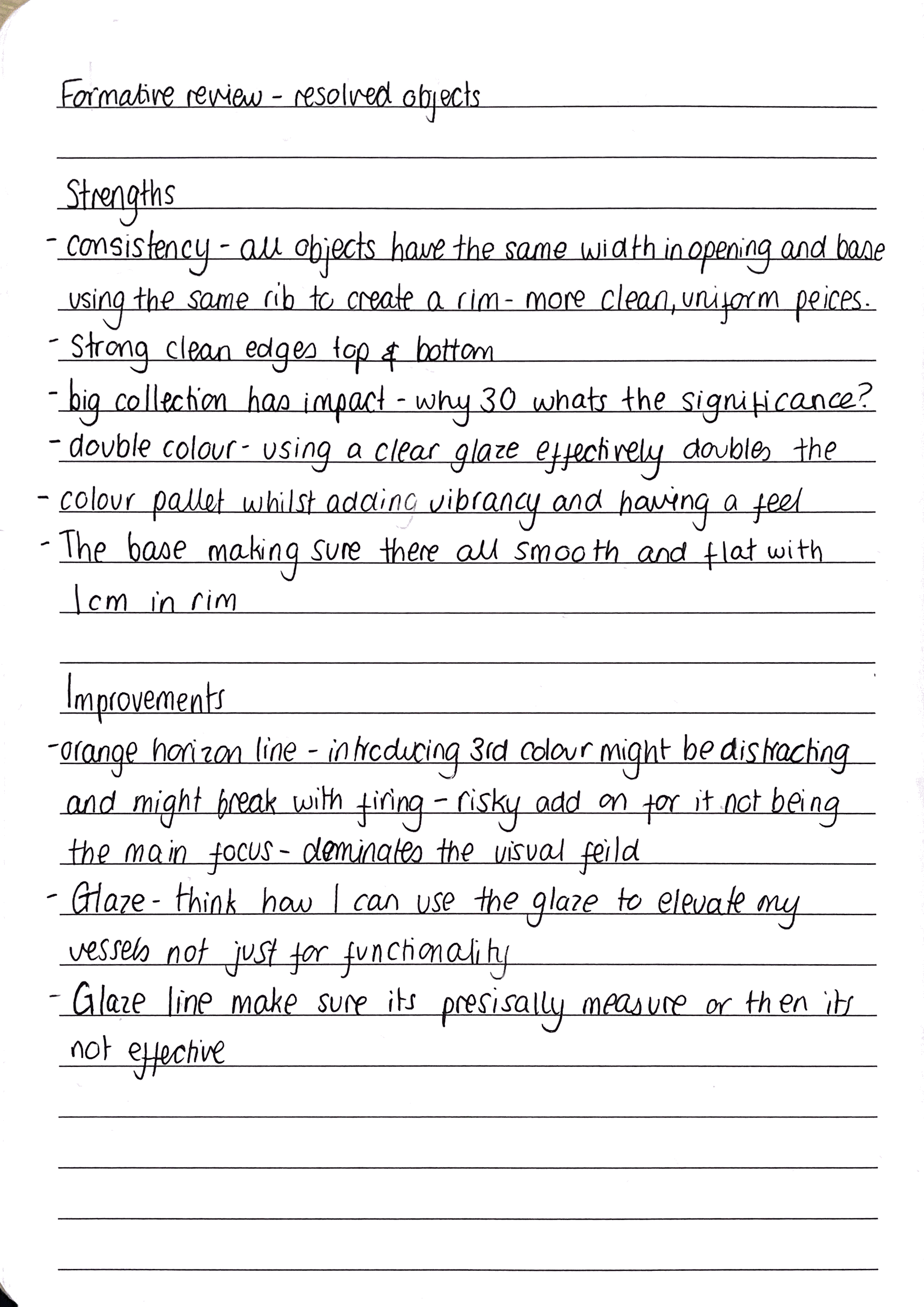
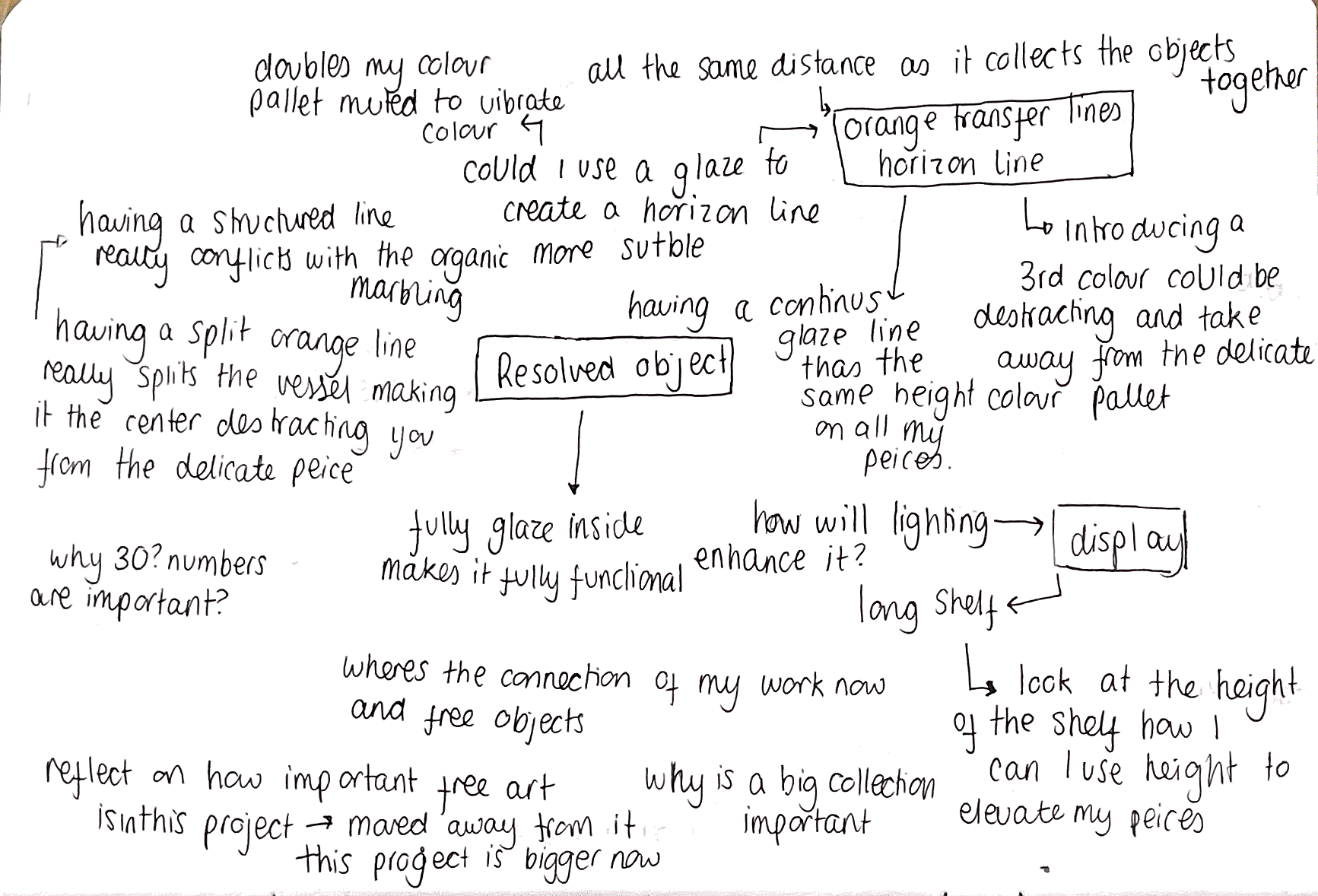
Reflecting on my formative review, we talked about my resolved objects, and although I didn't have all my pieces to show, I had a very clear vision of what I want my final pieces to look like. This formative review was incredibly useful in getting me to think about very specific details within my work and ensuring that my final piece is professional and up to my standards. Our main point of discussion was around my horizon lines, and upon reflection, I think I should take these in a new direction, perhaps by incorporating them more subtly through glaze. Suggesting that the horizon line concept could be more effectively integrated as having a bold orange line run through all my vessels might be too dominant, distracting you from the more subtle details. Maybe experimenting with different glazing techniques to achieve a more subtle horizon line. a more consistent and visually appealing finish, and carefully planning the arrangement of my pieces to enhance their collective impact.
Given that my work comprises such a large collection, I need to think about display and how I want people to interact with my vessels. It's crucial to show them to an audience in a way that allows them to fully appreciate the details and craftsmanship. This is something I need to develop throughout the making of my final piece.
Moving forward, I want to experiment with glazing lines that are at the same height on all pieces, and using clear glazes to double my colour palette without introducing new colours. I will also carefully plan the arrangement of my pieces to enhance their collective impact, considering the height and placement of shelves to ensure optimal viewing angles
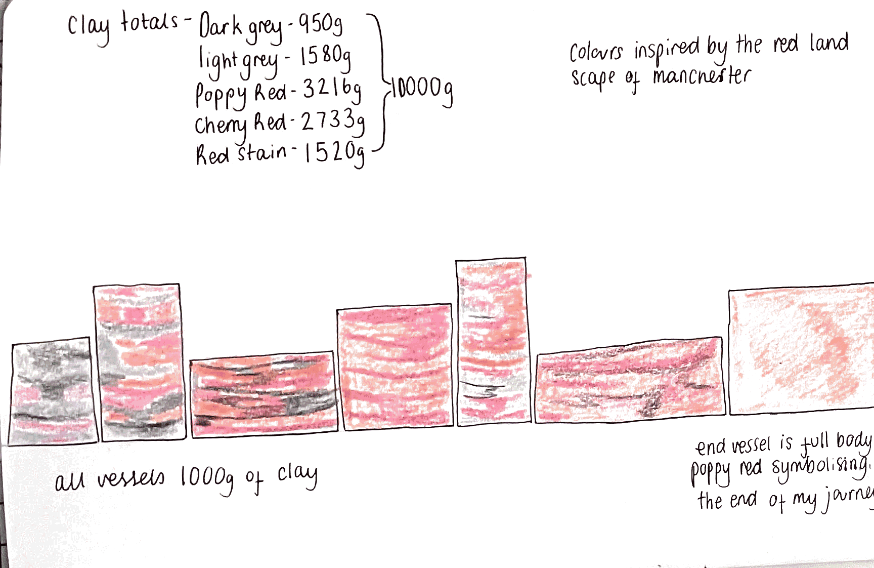
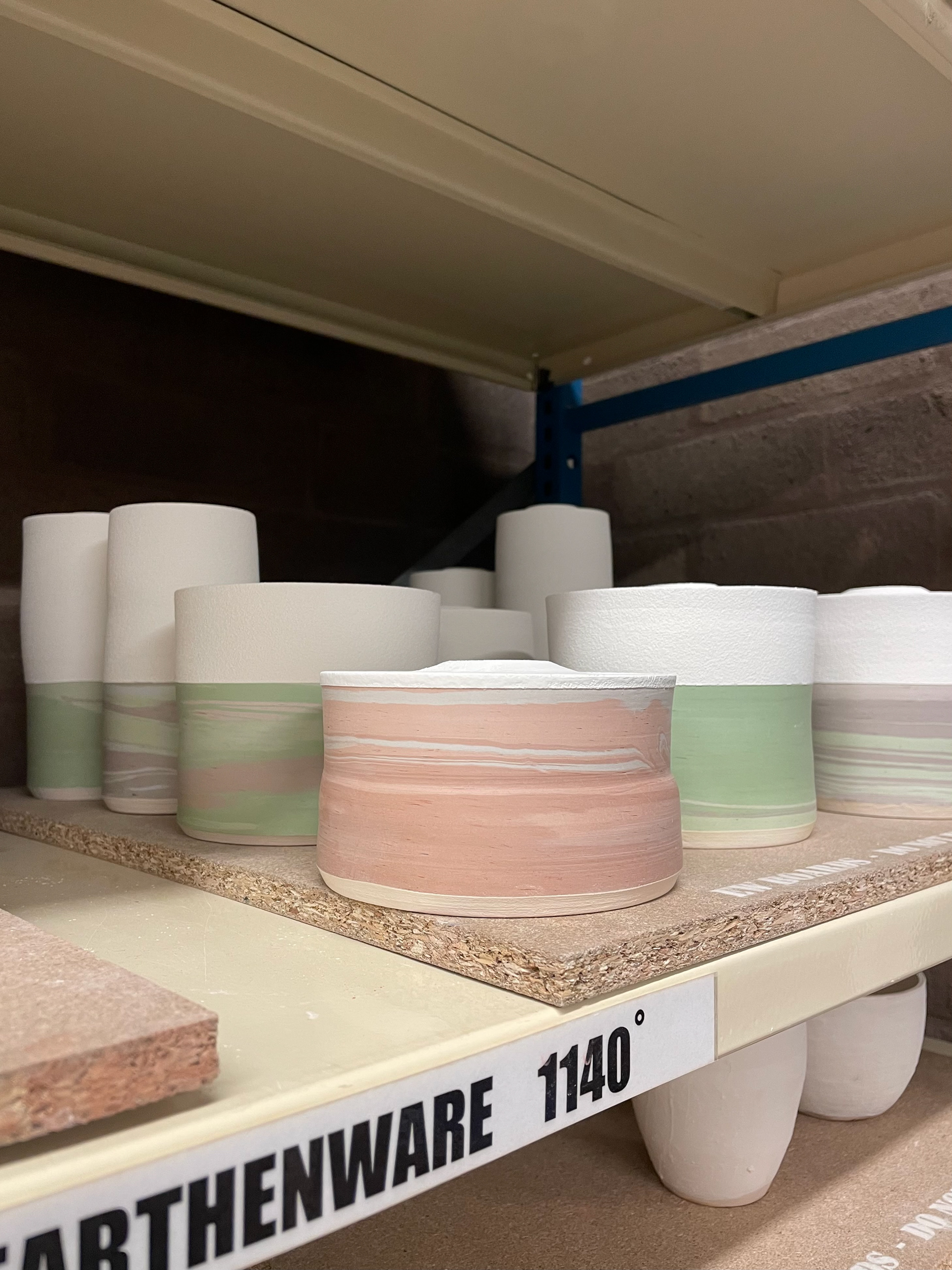
Final Clay Recipes
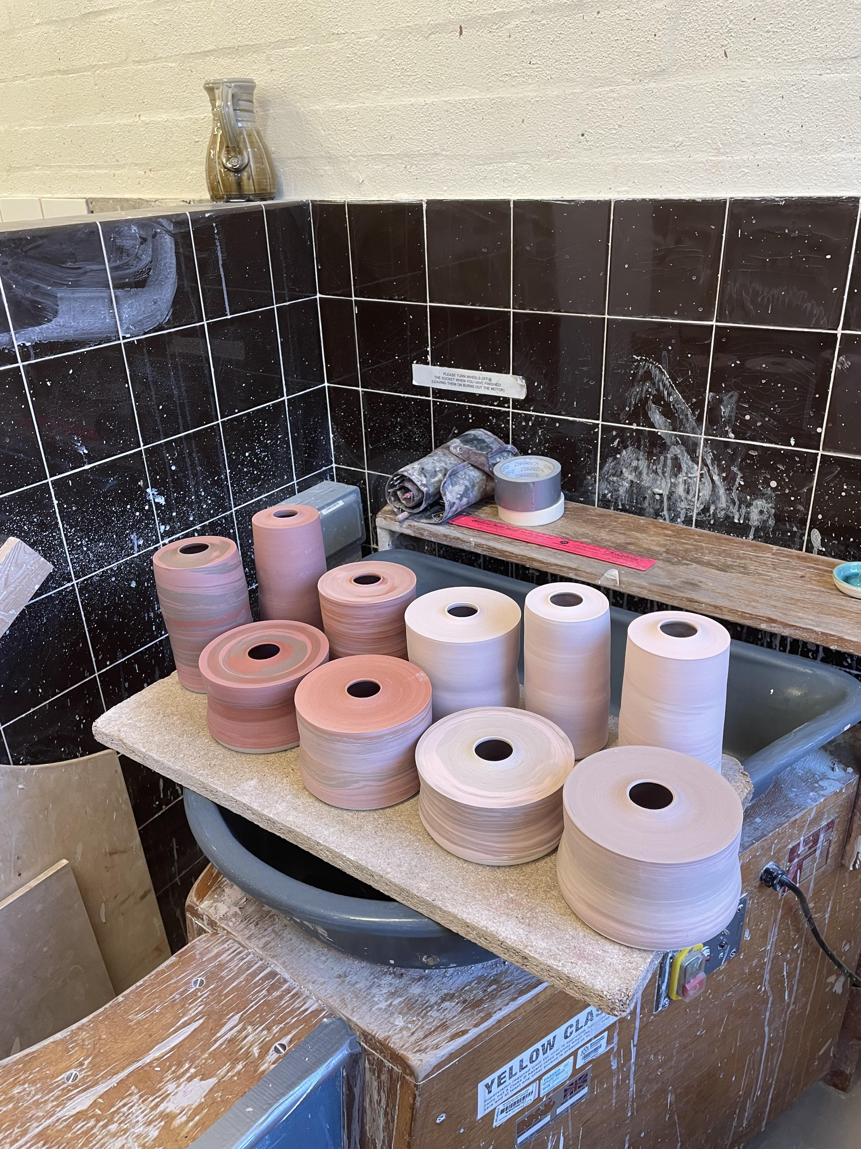
Due to my experimentation throughout this project and previous units, I was confident with my coloured clay. After testing which shades and hues would work best within my work, I chose eight colours that will gradient throughout my vessels, with key colours like light grey and dark grey that continuously flow throughout my vessels.
To make my coloured clay, I decided to work in batches of 2000 grams, as it is a more manageable amount of clay to work with. I will be making 15 batches of clay throughout this project. Although I cannot predict how my colours will come out perfectly, as many factors can change during their firing, I decided to batch-make my vessels, starting with all 10 blues, then 10 greens, and 10 reds. I thought this would be the best technique because if something changes during firing, hopefully, it would happen to the whole set, not visibly impacting a few colours, but all the colours by firing them together.
I decided to fire all my ceramics at earthenware temperature, 1110 degrees Celsius. From my experiments with previous projects, I found that firing at a higher temperature with oxides can burn and melt the oxide, leading to discolouration and a bumpy surface. Although my red stains work better being fired at a higher temperature, as they will be marbled with different oxide-coloured clay, I don't want to take the risk of the coloured clay being damaged for a more vibrant red colour, as it's only a slight change in hue.
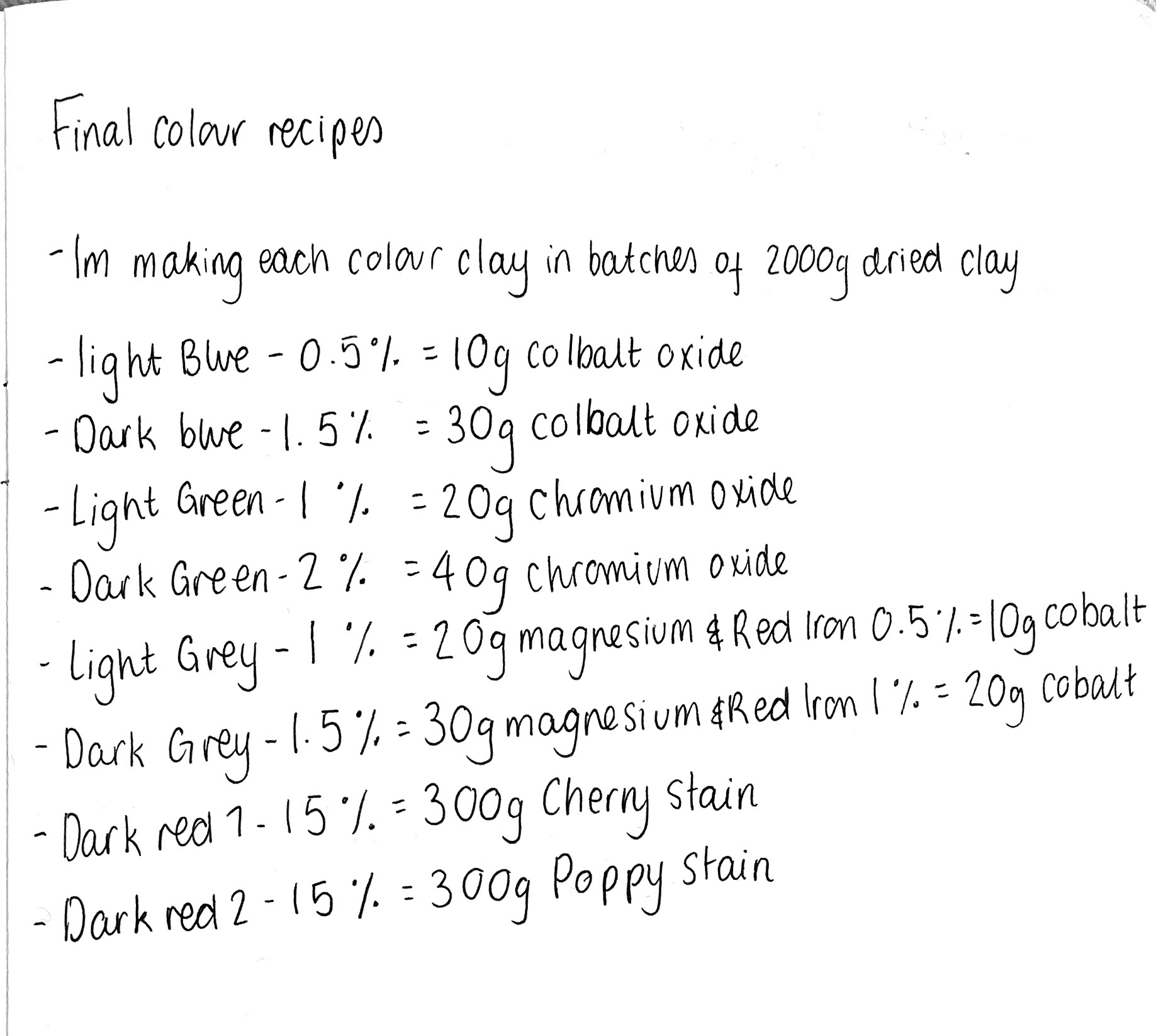
Although my method of batch-making vessels might lead to inconsistencies in colour, especially if there are variations in the firing process. And the decision to fire all ceramics at the same temperature might not be optimal for achieving the best results for each colour, particularly the reds, which could benefit from a higher firing temperature. I believe that my approach will ensure a cohesive and collective set of vessels, and I am willing to take the risk to maintain consistency across my work.


Processing Clay
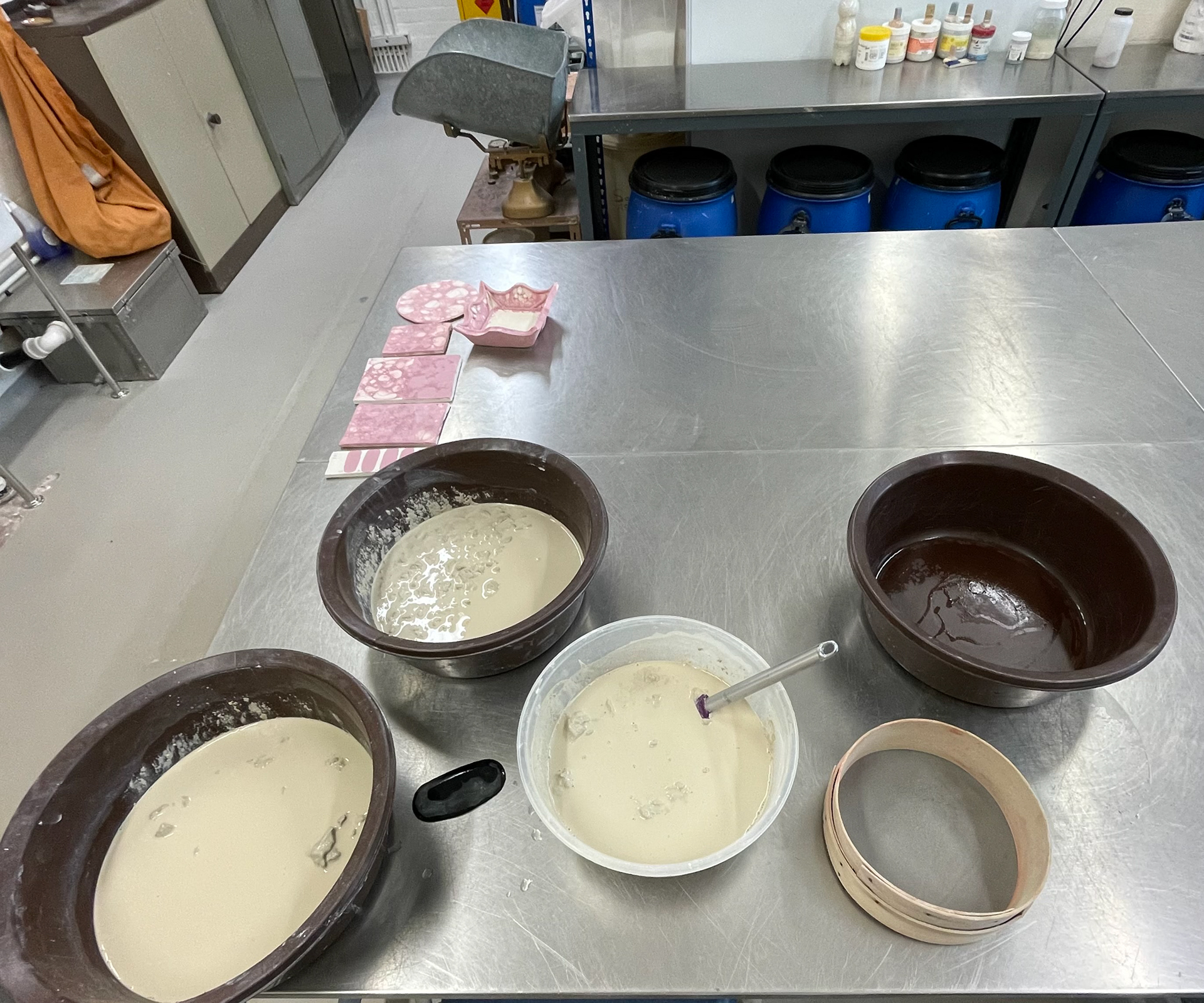
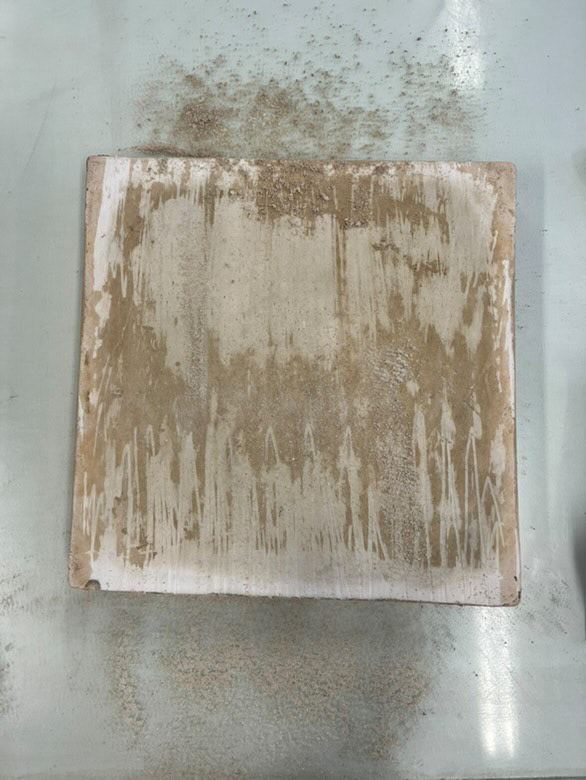
To keep my costs as low as possible and maintain a sustainable practice, I decided to use only recycled clay. However, during material testing, I found a lot of inconsistencies within the clay. Since it was made from other people's scraps, there was a lot of debris and dirt in the clay, affecting my work. Bits of grit would disturb the smooth surface, cause small holes, and create air bubbles, which could lead to cracking or other imperfections. To address this issue, I decided to add an extra step of sieving the processing clay. While effective in removing debris, this process adds considerable time to the recycling process. This raises the question of whether the benefits of improved clay quality outweigh the increased labour and time costs. I believe this process is necessary, as the benefits do outweigh the additional time required. Ensuring a professional finish for my vessels is paramount, and this step contributes significantly to the consistency and quality of my work. As illustrated in the top right photo, my sieve pan was full of debris that would have been difficult to separate from the recycled clay. This sieving process also results in much smoother clay, making it easier to mix in my oxides, which leads to more consistent colour mixes.
To improve the quality of my recycled clay, I use plasterboards to dry it out. However, I realised that the boards were dirty from previous use, which meant that placing my freshly cleaned recycled clay on them would reintroduce dirt and debris. Initially, I considered making a new plaster slab to ensure a clean surface, but this seemed wasteful given the abundance of unused plaster bats available. Instead, I decided to use a scraper to remove the top layer of the plaster moulds, revealing a fresh, clean surface. Although this process was time-consuming, as the dirt had penetrated the holes in the plasterboard, it was worth the effort to maintain the cleanliness of my clay and prevent any additional debris from contaminating it. This step is crucial, especially since I will be using the plasterboard repeatedly to recycle over 30,000 grams of clay.
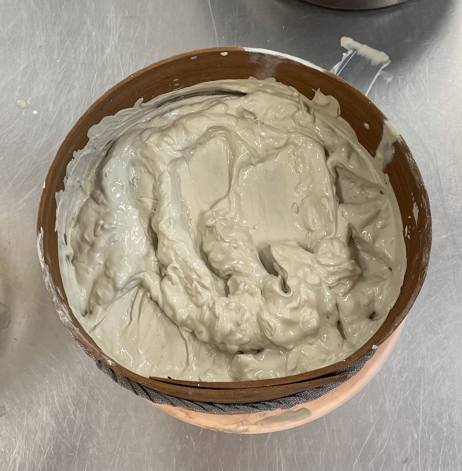
Recycling clay involves collecting clay scraps, breaking them into small pieces, and soaking them in water to rehydrate. Once the clay reaches a liquid consistency, I then add the required amount of oxides under an extractor fan, ensuring precise measurements. After thoroughly mixing, I lay the clay out on a plasterboard to dry. Once it reaches a workable consistency, I wedge it to remove air bubbles and ensure uniformity, evenly incorporating the oxides into the clay body. This process is crucial because it reduces waste and conserves natural resources, as clay is a renewable material. Economically, recycling clay is cost-effective, allowing me to stretch my materials further and save money on new clay purchases. Additionally, it minimises the environmental impact of clay production and disposal, reducing energy consumption and greenhouse gas emissions. This method not only enhances the sustainability of my practice but also ensures that the clay is of high quality, making it easier to achieve consistent colour mixes and a professional finish in my final pieces.
In my previous samples and units, I didn't recycle the clay, which led to many inconsistencies and debris that marred the appearance of my vessels. These imperfections resulted in holes, cracks, uneven surfaces, and flawed glaze finishes. By incorporating the additional step of processing all the clay through sieving, I found it a necessary enhancement that significantly elevated the quality of my final pieces. Although this extra process took some time, it was definitely worth it, as it provided me with smooth, workable clay free from imperfections, which is often a challenge with recycled clay.
This added step meant that I didn't need to fix any errors later on when the vessels were already delicate and difficult to handle. It also gave me confidence during the firings, reducing the risk of breakage or cracking. By using clean, processed clay, I was able to utilise my materials more efficiently and stay on schedule, avoiding the waste of materials and time that would occur if a vessel were ruined and had to be remade from scratch. Overall, this process elevated my pieces in terms of appearance, technique, and durability.
First And Last Vessel
As I planned my collection, I chose to begin and end with solid coloured vessels to create a clear visual and conceptual journey that reinforces my theme of searching for and settling into a new home. This decision allows my vessels to act as narrative markers, guiding the viewer through my personal transition, from familiarity, through complexity and uncertainty, to finally finding my new home.
Aesthetically, this progression strengthens the unity of my collection, making it feel intentional. The contrast between the solid vessels and the marbled ones highlights the transformation process, ensuring that each piece contributes to the overall storytelling rather than standing alone. It also introduces a sense of movement and evolution, rather than a static arrangement of forms.
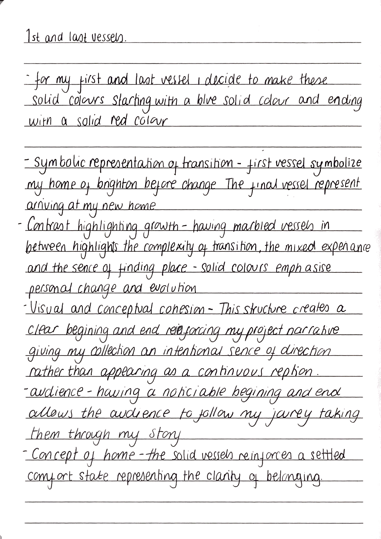
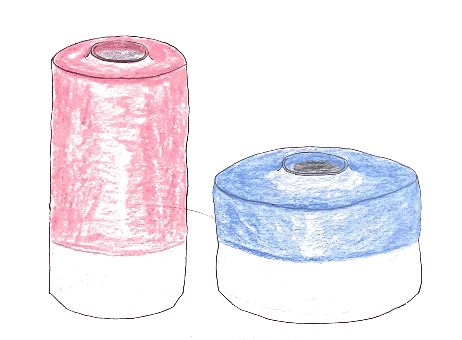
From a storytelling perspective, the marbled clay between the solid vessels represents the blending of experiences, emotions, and identities that occur during change. The final solid vessel signifies clarity, showing that while transitions can be complex, there is always a moment of arrival, a place that truly feels like home. Through this thoughtful placement, I can elevate my collection beyond the physical vessels, creating something that resonates on a deeper emotional level.
Additionally, I hope this structured approach invites the viewer to engage with my work reflectively. I want them to consider transformation, movement, and belonging, mirroring their own experiences of transition. In this way, my collection is more than just a display of ceramic forms, it becomes an exploration of personal and collective narratives.
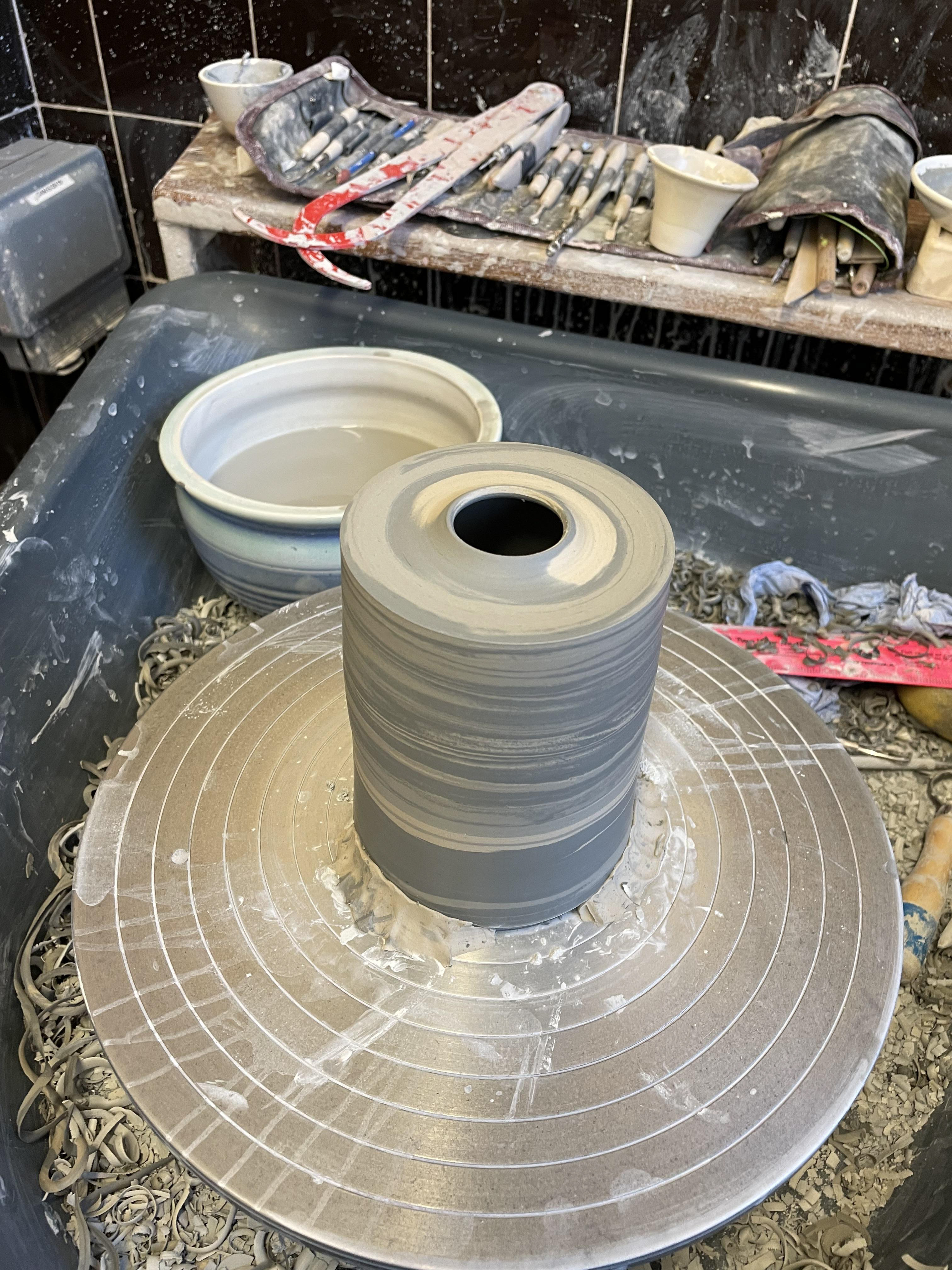
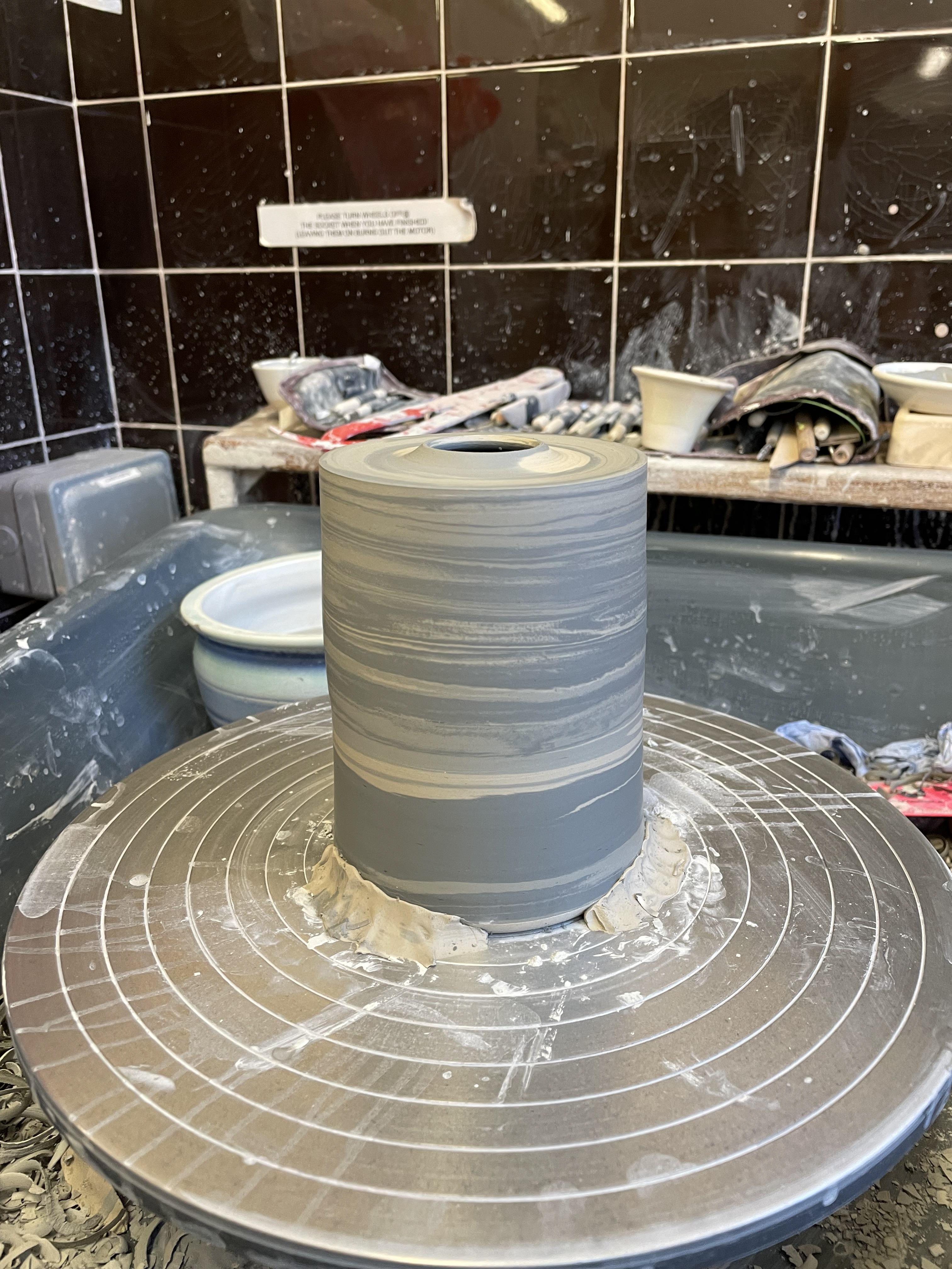
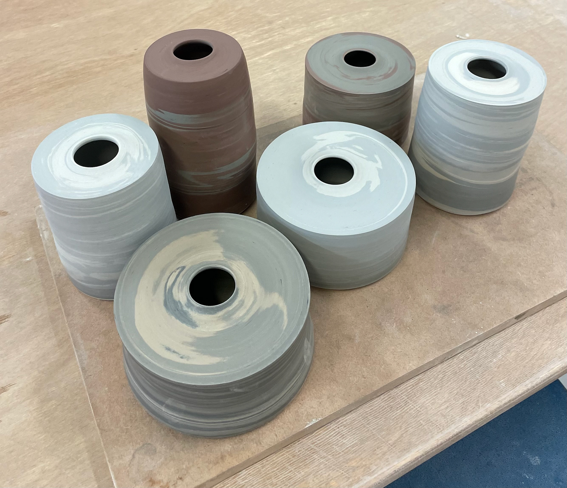
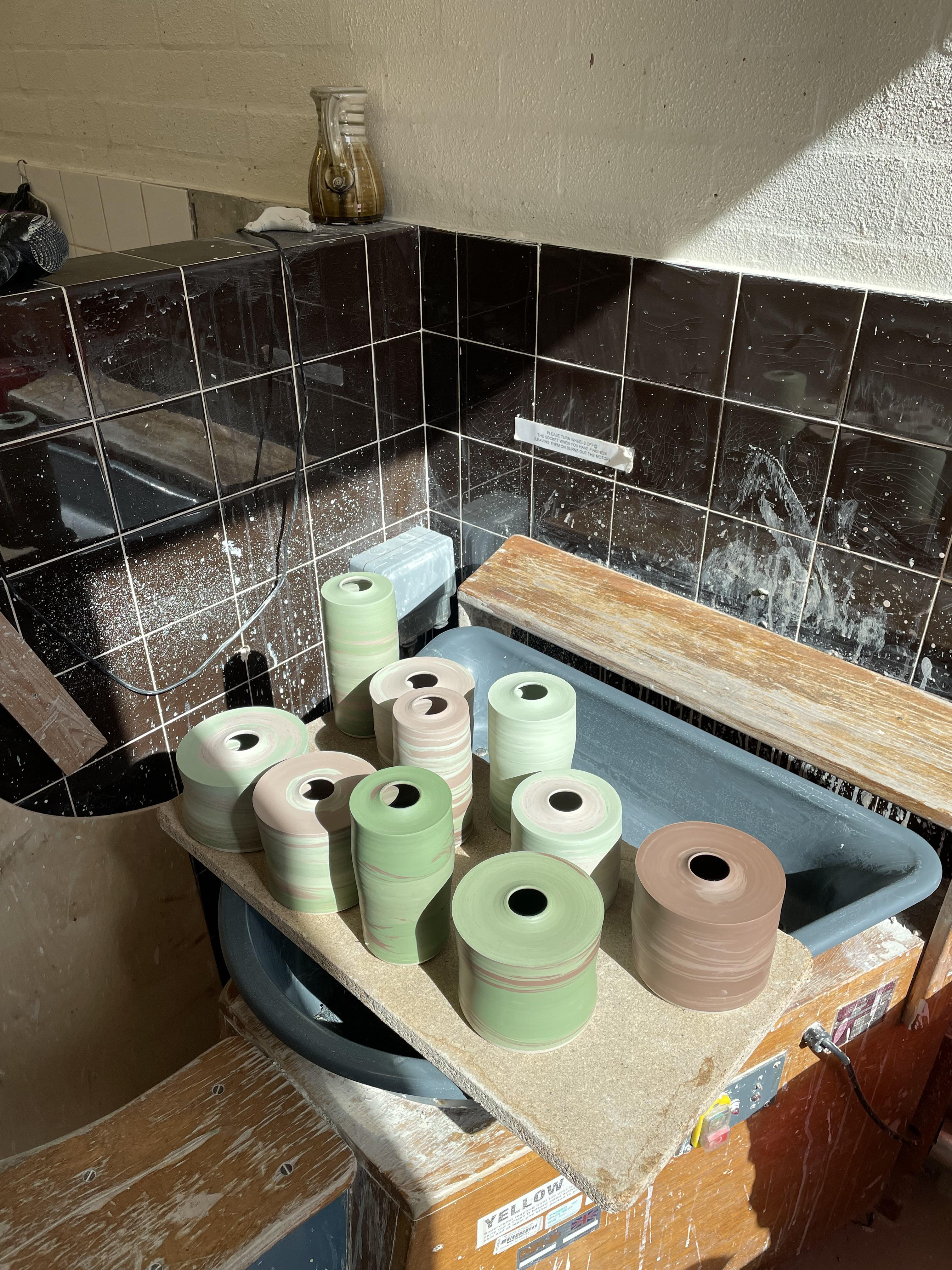
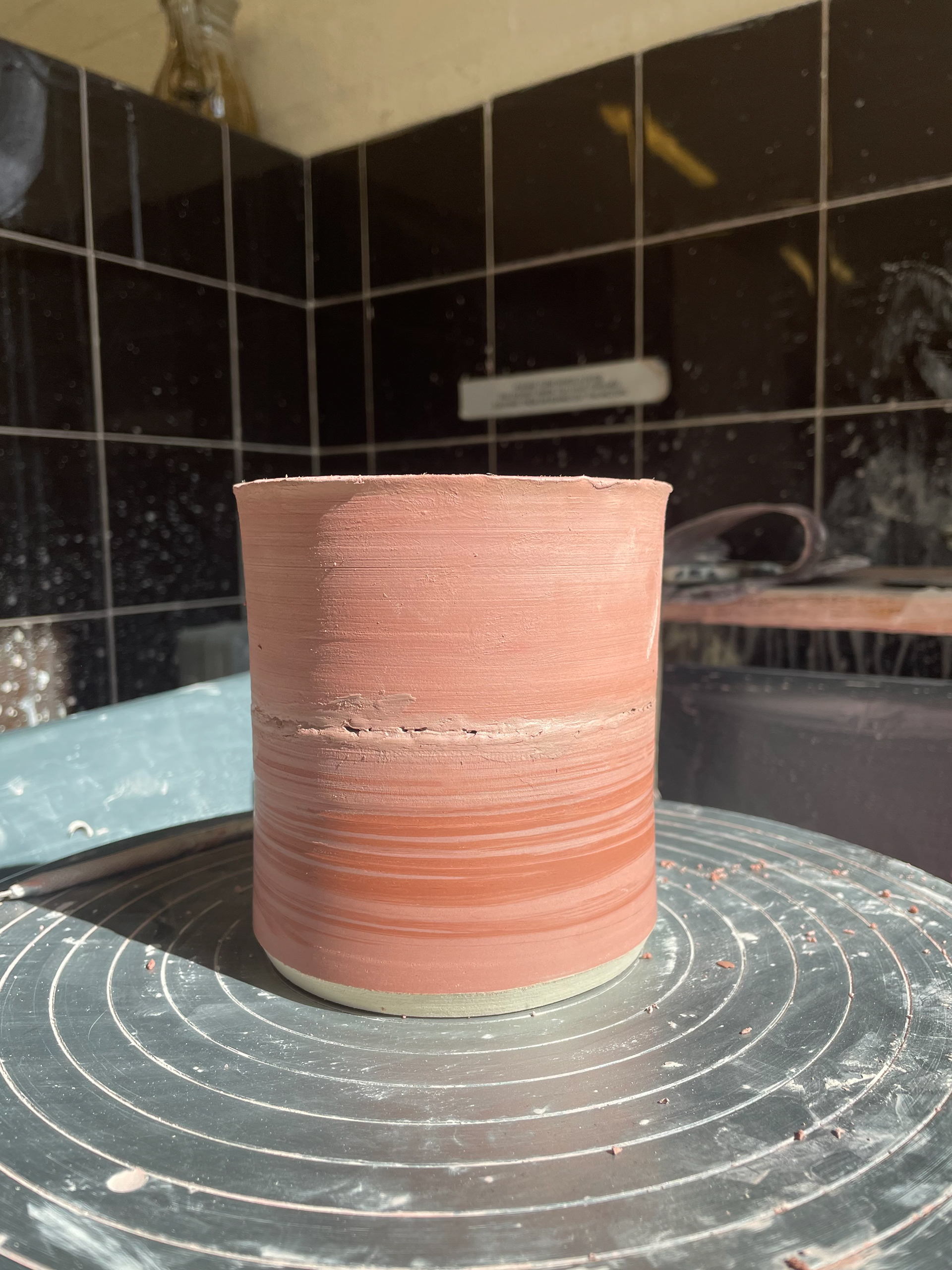
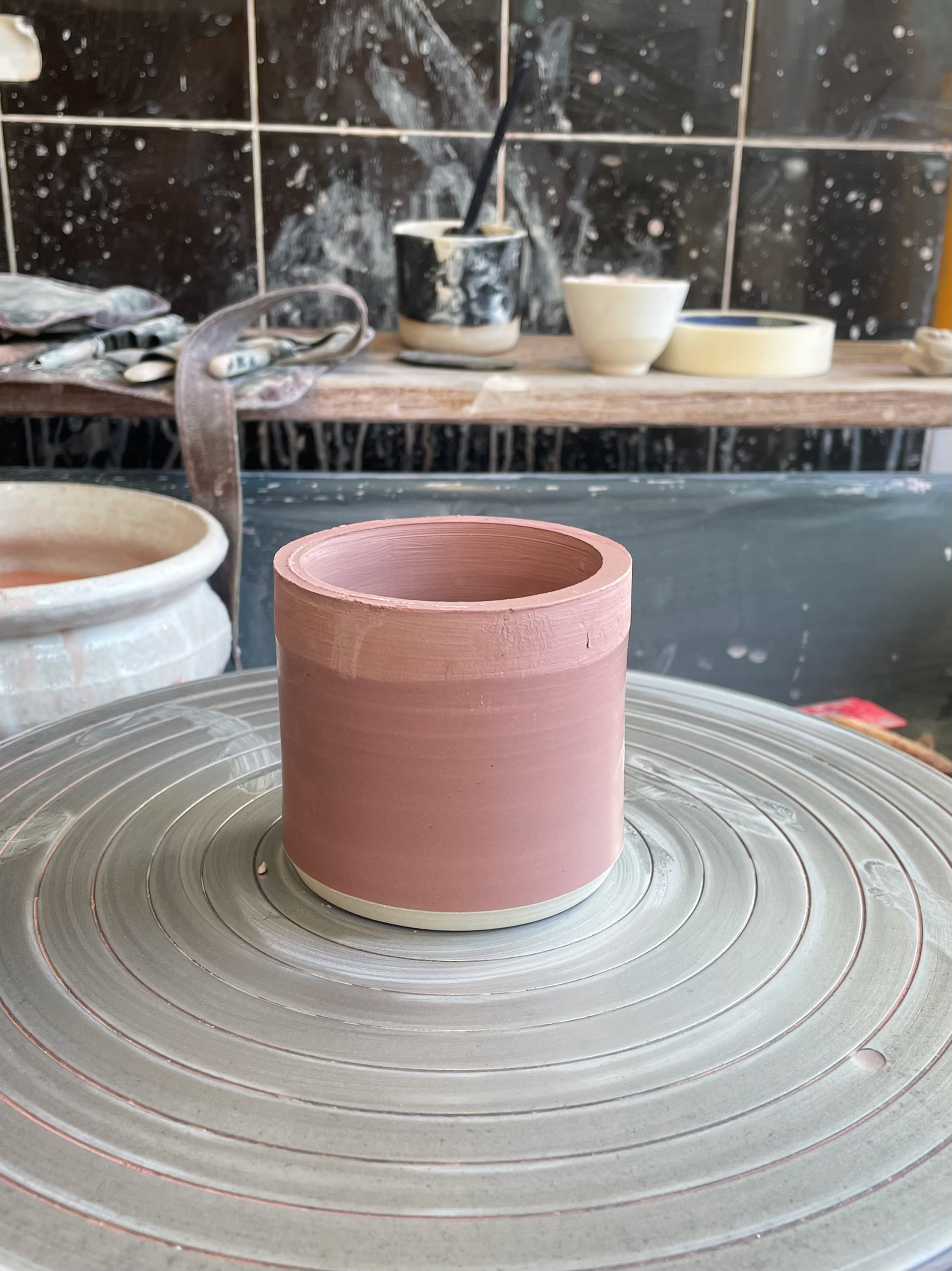
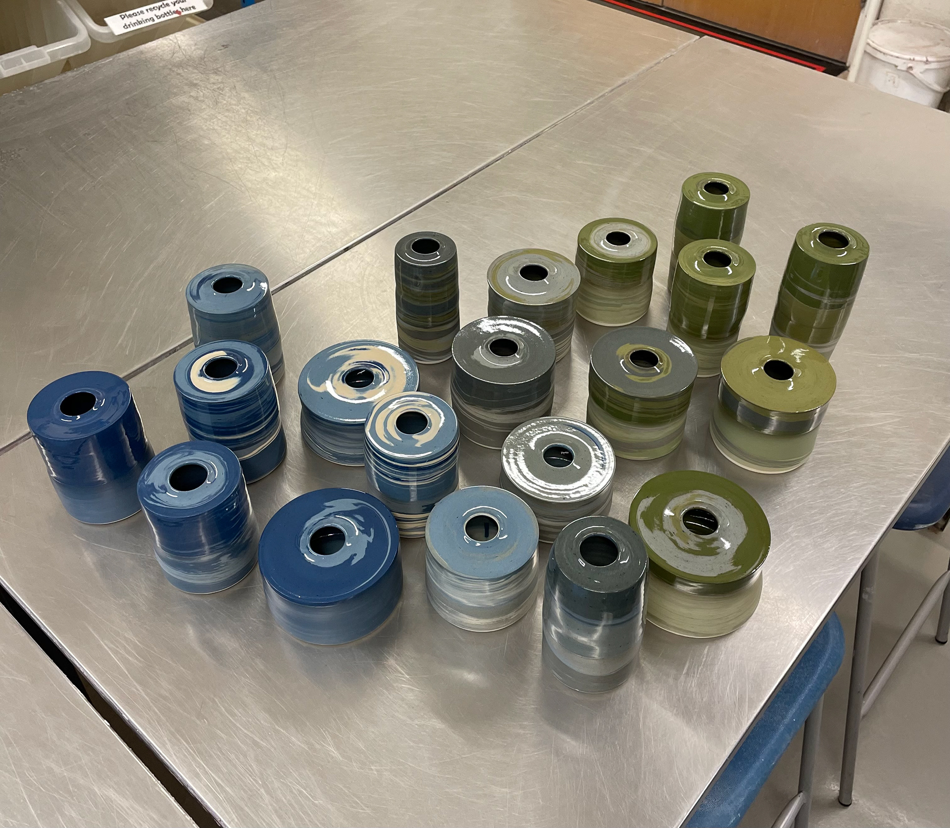
Blue Vessels
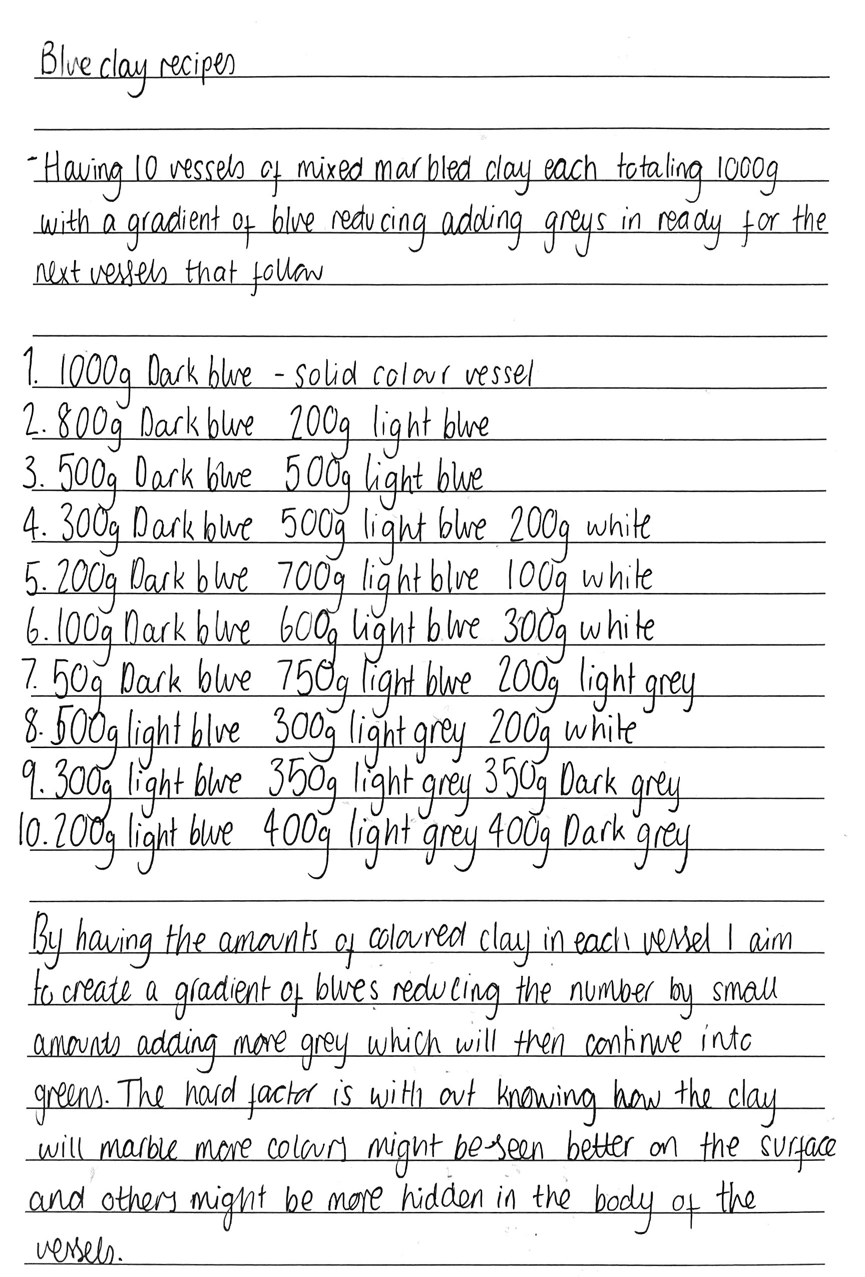
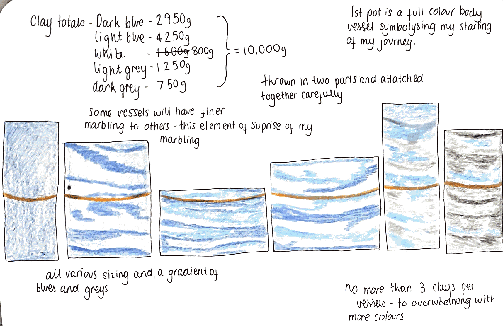
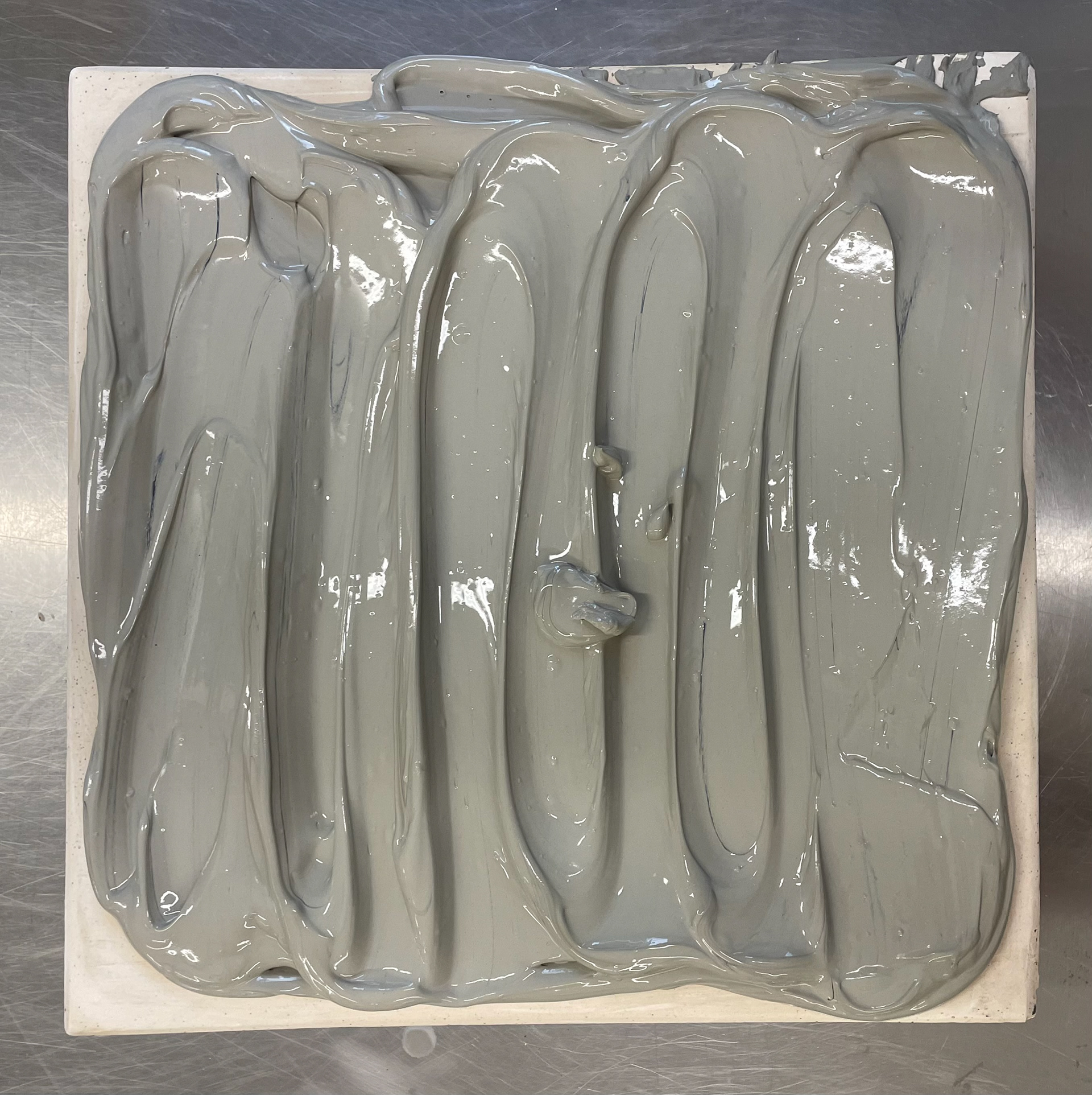
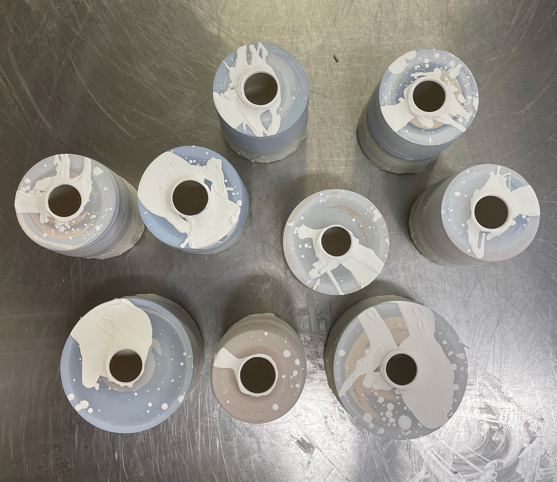
For my first set, I started with my 10 blue vessels, using 1000g of clay for each vessel and combining different coloured clays to reach the total weight. I began by planning the colours I wanted to use for my blue pieces, choosing dark blue, light blue, white, light grey, and dark grey clay. I then mapped out each vessel, deciding on the colours and the amount of each coloured clay to use. I aimed to start with solid blue, followed by a mix of blues and white to represent the bright scene. Gradually, I added small amounts of grey, increasing this amount to symbolise my journey away from the beach. I decided not to use more than three colours per vessel, as I believe too many colours in one vessel can be overwhelming.
I am building 1000g vessels in two parts. I started by measuring out all of my clay, dividing the coloured clay amount above by two, then arranging the coloured clay together in a ball, ready to throw my pots. As shown in the photos above, I create 20 balls of clay arranged each of which is a mix of two to three different colours, reflecting the preparation process for my pottery.
It took me a total of six days to recycle clay, weigh my clay, throw my pots, and build 10 vessels. Due to the many different aspects of my vessels, it is a long process. However, I can balance this by preparing for my next 10 green vessels while some steps are finishing, such as drying clay, getting leather-hard, and different elements drying within my building. By having this method of balancing different steps, I can continuously work and prepare for the next steps, allowing me to stay on top of my workload and not fall behind. Although this was challenging for me, as I am not very organised and tend to be forgetful, having my timetable and notes of what I need to complete each day helped me stick to my making plan.
Green Vessels

When preparing and distributing my clay to the right amounts, I start by prepping all the clay I will be throwing together. This allows me to check if my colour distributions are balanced and decide how to stack each clay. Although I cannot control how the clay is marbled, stacking each coloured clay gives me an idea of where each colour will be placed (top, middle, bottom).
If I have a significantly smaller amount of one clay, I always place it in the middle. This ensures that it will be in the vessel's middle, where it is most visible. Once I have weighed each clay, I thoroughly wedge it. This process reduces air bubbles and distributes the oxides better in the clay.
Once my coloured clay is set in its portions, I wedge it once more to merge the colours together. Since I am working with three different clays, I need to eliminate any air bubbles that could damage my thrown pieces. Wedging it once more ensures that all colours are ready to be thrown.
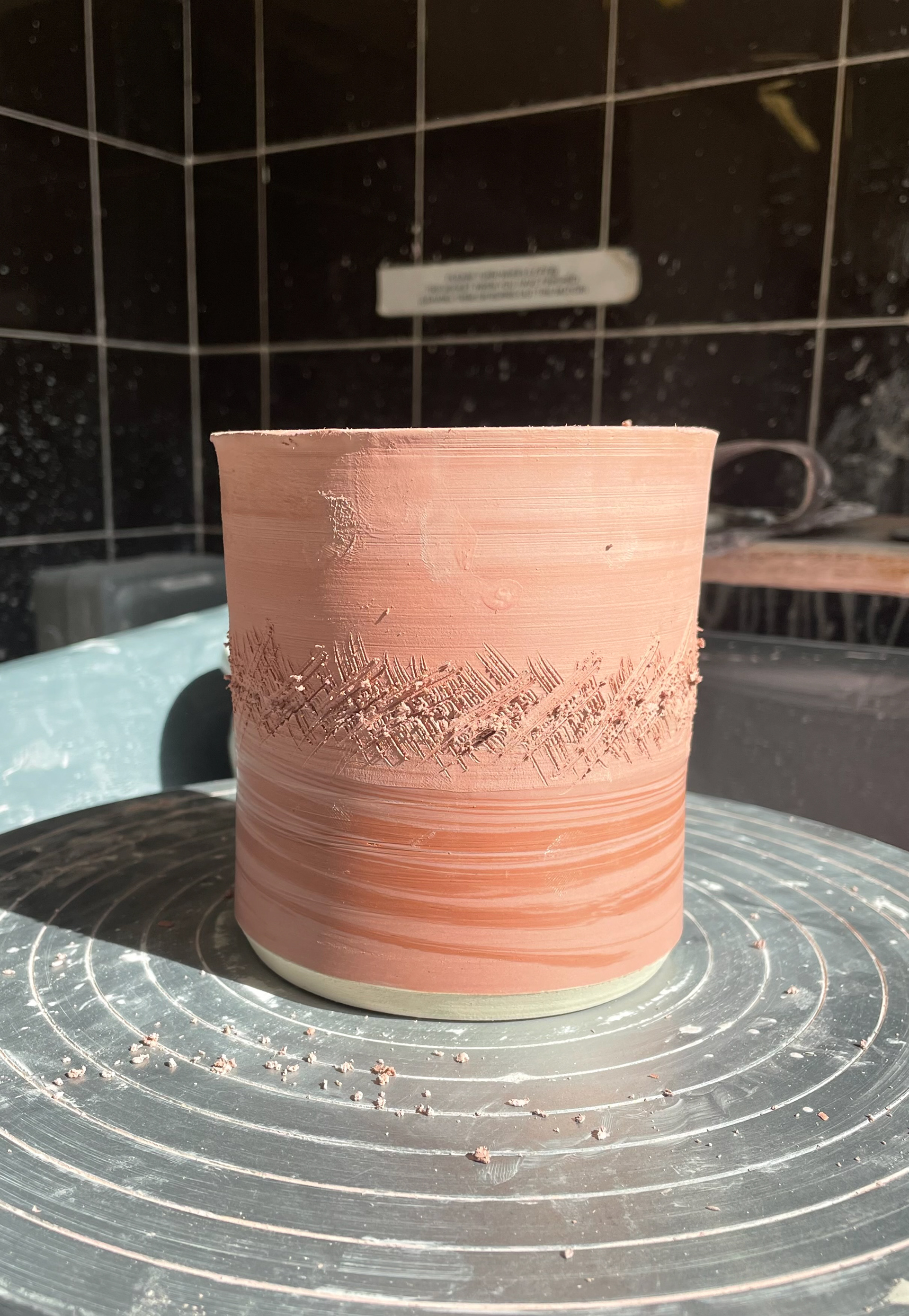
When throwing the two sections together, I begin by scoring both edges and using a slip made from dried trimmings to attach them. It's important to get the top part as level as possible, so I prep my pots by grinding the tops to ensure a smooth, level surface. Once the sections are attached, I thoroughly score through the joining line in different directions to ensure a solid bond.
After creating an opening at the top of the vessel, I use a paintbrush and a thin wooden smoothing tool on the inside to clean up and join the attachment line from within. Smoothing over the attachment line allows for a stronger bond and ensures the glaze can be applied properly, decreasing the chances of cracking on the inside.
Once all 10 vessels are thrown, I check each one and add any final touch-ups before letting them fully dry for two days in preparation for firing. So far, I haven't encountered any issues with cracking, as I aim to make all my vessels the same thickness. Although I use a hair dryer throughout my process, especially when applying slip and attaching the two pots together, I try to let the vessels dry out simultaneously. This consistent drying time significantly reduces the chances of cracks.
During my sampling phase, I found it challenging to maintain the same moisture level in the two halves of the pots. This made attaching them difficult, as one half would always be more leather-hard than the other. To overcome this in my final process, I purchased a large plastic storage box that perfectly captures the moisture, allowing me to control the drying process much better.
As a result, I can leave my thrown pots over the weekend, ready to be trimmed, and this has made my process much more flexible.
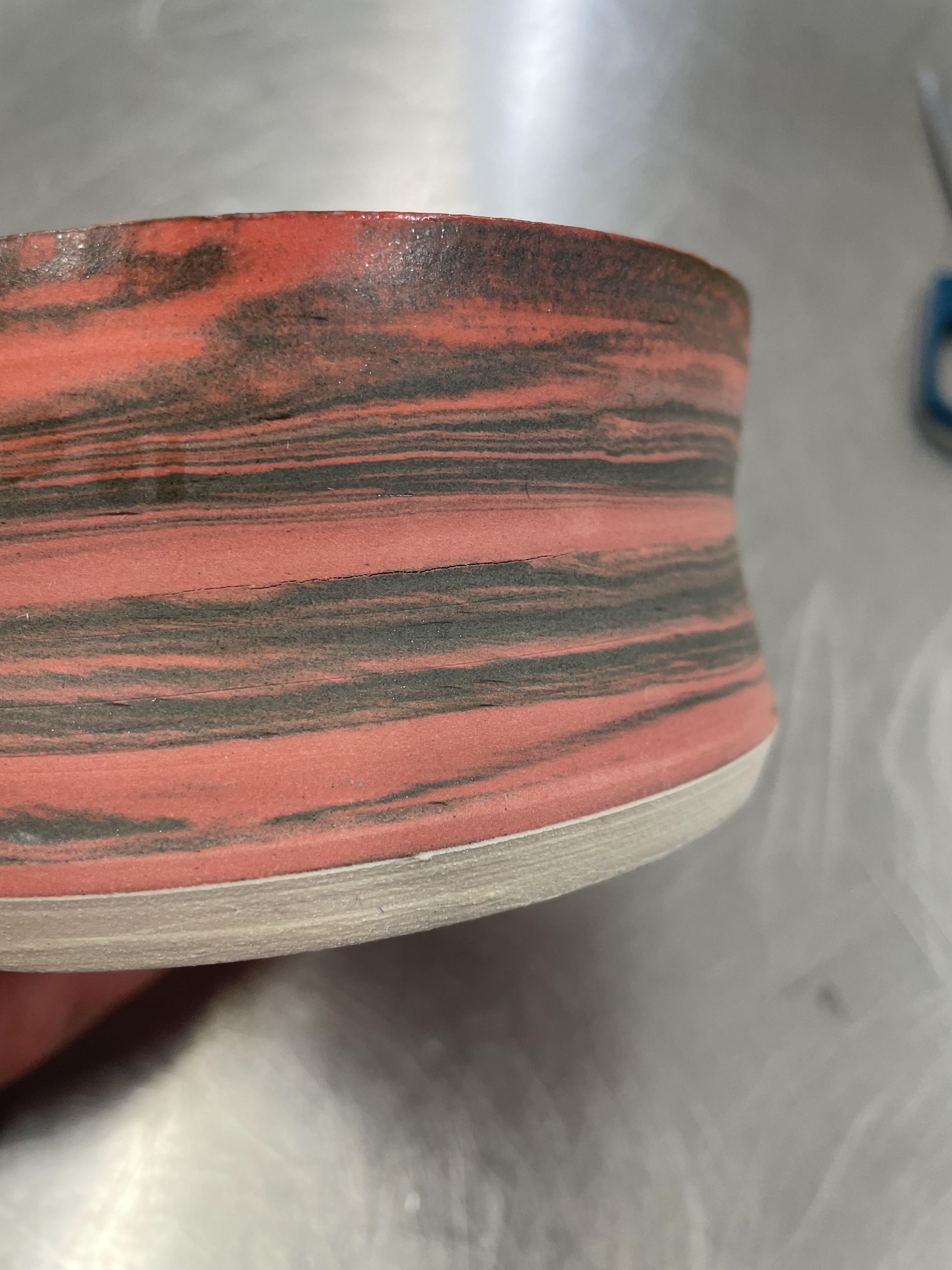
Red Vessels

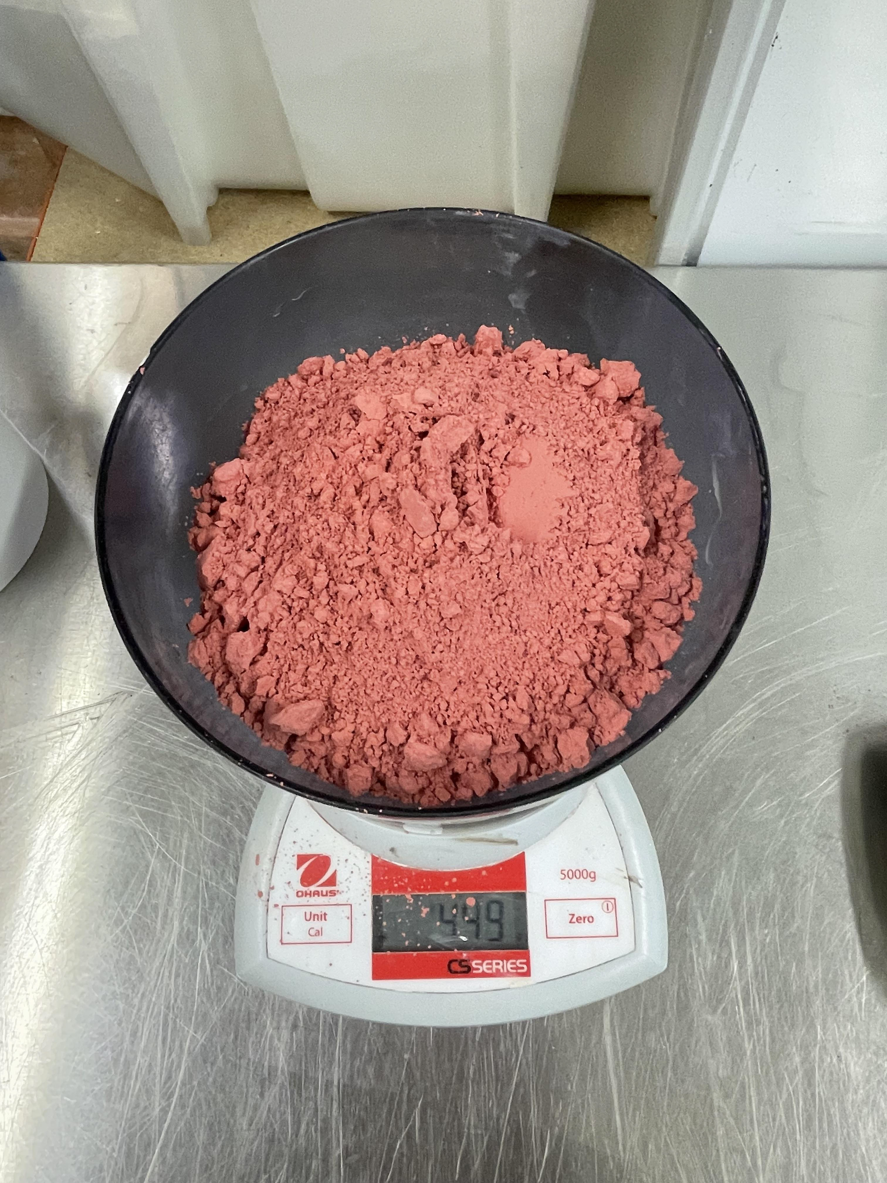
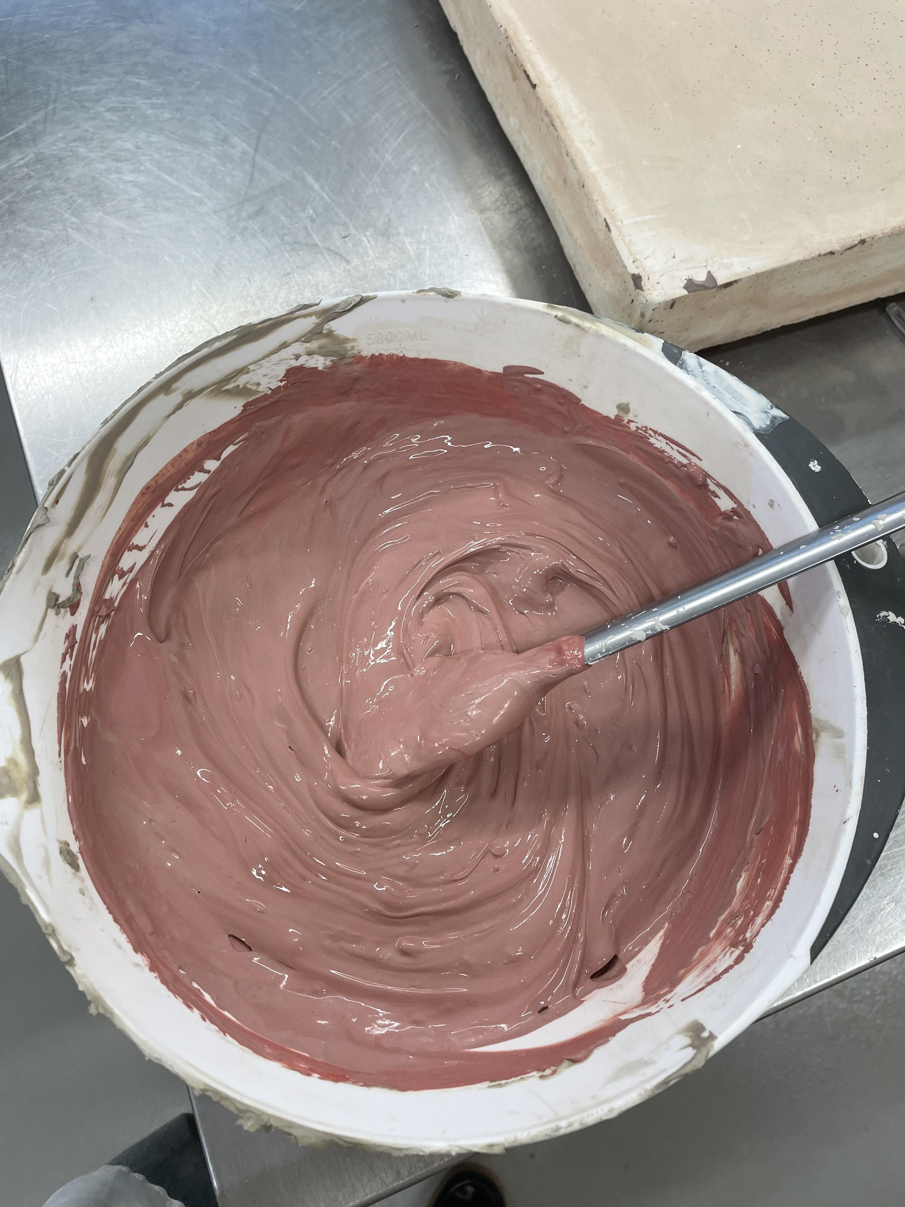
For my set of red vessels, I used red stains to create vibrant colours, specifically poppy and cherry red. When using stains, you need a much larger amount to achieve bold colours. I used 15% stain for both colours to ensure a strong, vivid hue. However, due to the large amount of coloured clay required, I had to use approximately 450 grams of each stain, which was costly at £75 per 500 grams. This meant I had to be very precise and careful in my making process, as there wasn't much room for mistakes.
Mixing this amount of stain into the clay was challenging. I had to ensure there were no air pockets within the clay and added a significant amount of water to achieve the right consistency. It was a risk to proceed with the red colours without extensive experimentation, but due to the cost and the size of my vessels, I couldn't afford to experiment much. By choosing to use these colours for my final set, I was able to build confidence in my making process and the resulting vessels.
I found it most challenging to measure each pot's width to ensure they matched perfectly. If the widths were too large for each other, I wouldn't be able to attach them properly, resulting in a weak pot. Using callipers to constantly check the width of my pots allowed me to adjust them to the perfect fit. Although some of my pots weren't perfectly matched in width, it was okay, as this could be mended during trimming.
This meticulous process of measuring and adjusting is crucial for several reasons. Ensuring the pots fit together perfectly strengthens the overall structure and durability of the vessels. It also contributes to the aesthetic consistency of the collection, making each piece look cohesive and well-crafted. The attention to detail in this step reflects the care and precision required in the creative process, reinforcing the importance of patience and thoroughness
When making the openings for my vessels, I spend a significant amount of time ensuring they are perfectly centred. I found this challenging, constantly adjusting my vessels to find the centre. Although I'm not sure why this was so difficult for me, I knew it was worth the effort to get each vessel centred so the opening would be perfectly aligned.
To create the centred opening, I measure from the centre point 1.5 cm on each side, marking this up, and then use a pin tool to cut out the circle. This allowed me to make sure that each of my vessels had a 3 cm opening. Once cut, the clay falls into the vessel, which can be challenging to retrieve, especially with taller vessels, requiring delicate handling. I then pull up the walls of the opening, which proved difficult to get them all the same height. Different widths of the base have varying amounts of clay, affecting the pull. I constantly referred back to other thrown vessels to compare and ensure consistency. I had to be careful when pulling as well, due to this extending my 3cm opening. I needed to make sure that the walls weren't flaring out, to keep this manageable, I hardly pulled my walls up, instead making a slight slope that flowed into the vessel. Not only did this help with controlling my pulling, but it gave a much better look to the vessels, making them much more sleek and delicate in the opening.

The top of the vessels also had to be at the right moisture level. In some cases, I allowed them to become too leather-hard, making it challenging to pull the walls as the clay was too dry, leading to cracks and uneven pulls. To address this, I rehydrated the tops before trimming them, placing a cloth over the top to prevent them from dehydrating too quickly. Once satisfied with the opening, I allowed it to dry before re-trimming to reveal the marbled pattern beneath and cleaning up any marks.
Although attaching and trimming my vessels was a lengthy process, averaging one hour per vessel, it became faster with each pot I made. This critical time strengthens my pots, reveals their patterns, attaches, and builds my vessels. It's an essential step that cannot be rushed, so I allocate lots of time to complete it, giving myself two days to build and trim all ten vessels.
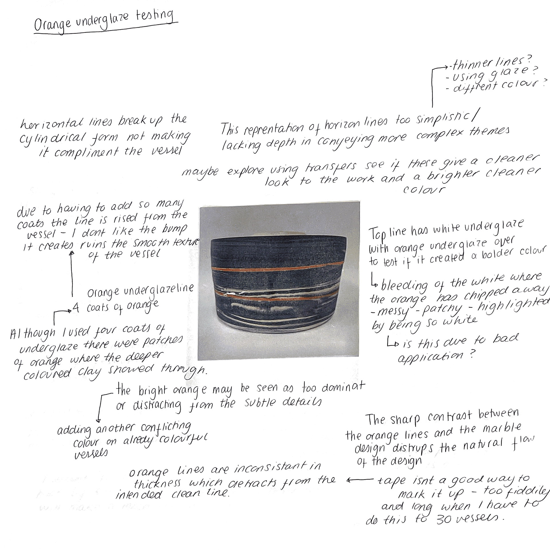
Horizon Line
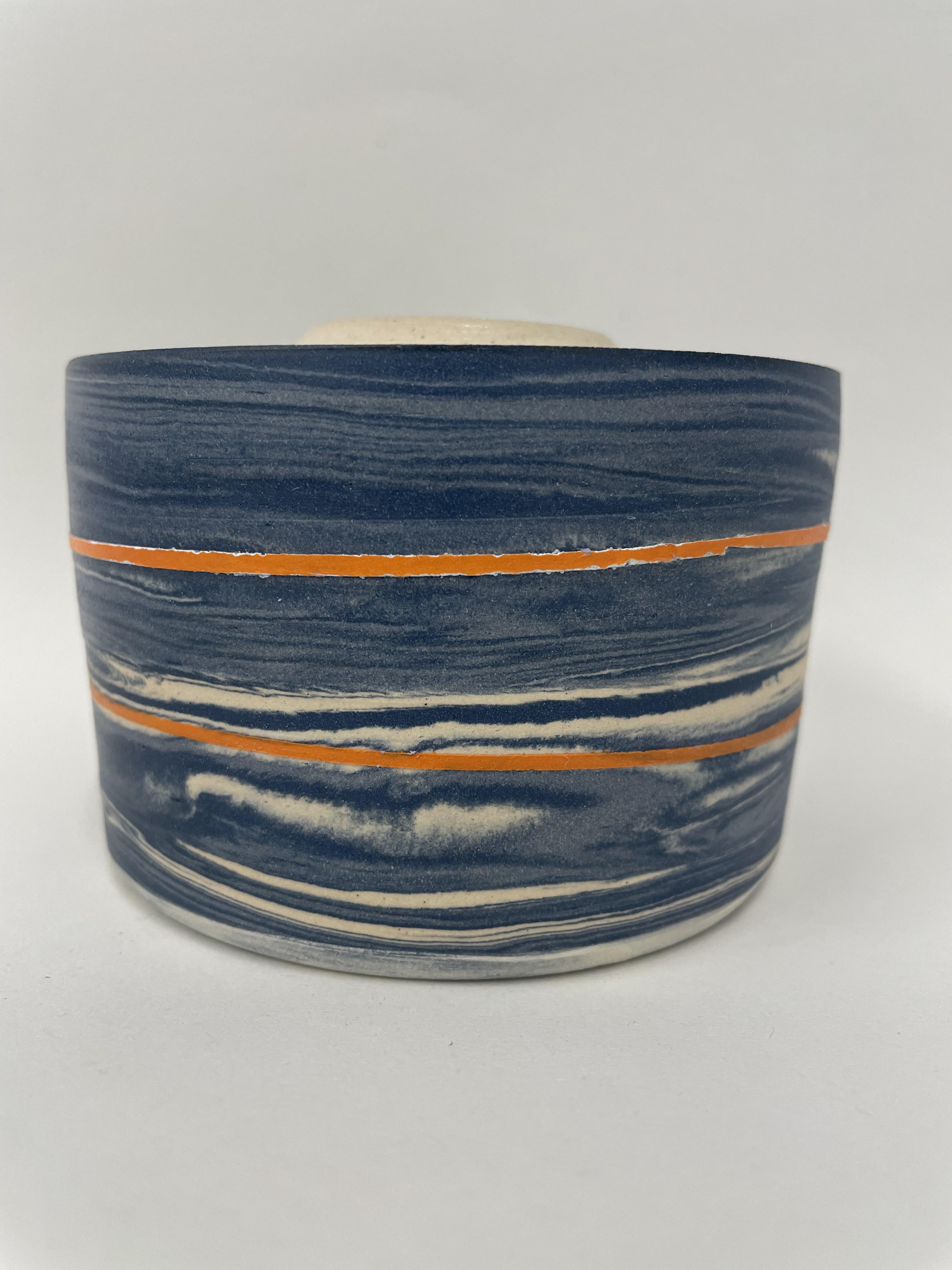
During my formative review, we discussed horizon lines and how the physical orange line on my vessels affected their appearance. Reflecting on this, I decided that I didn't like the bold orange line. Although it demonstrates a horizon line, it feels too much like a physical representation. A bold orange line detracts from the delicate details of the vessel, creating a harsh contrast that disrupts the piece. Additionally, the bold orange line adds another colour to my already vibrant, multi-coloured vessels, making it seem unnecessary and distracting.
I considered transferring the line with an orange transfer, but this would add difficulty in ensuring 30 orange lines are perfectly straight and evenly levelled on a glazed surface. Due to this, I reflected back on my practice of finishing glazes and was drawn to my split glaze technique. This technique involves applying half the glaze to the vessel's surface, which automatically creates a horizon line. The slip glaze within the vessel is much more subtle and gives the illusion of a horizon.
Using this split glaze also enhances my colour palette. The glazed coloured clay creates deeper, more intense colours, while the unglazed portion provides a more sensitive, natural effect to the coloured clay.
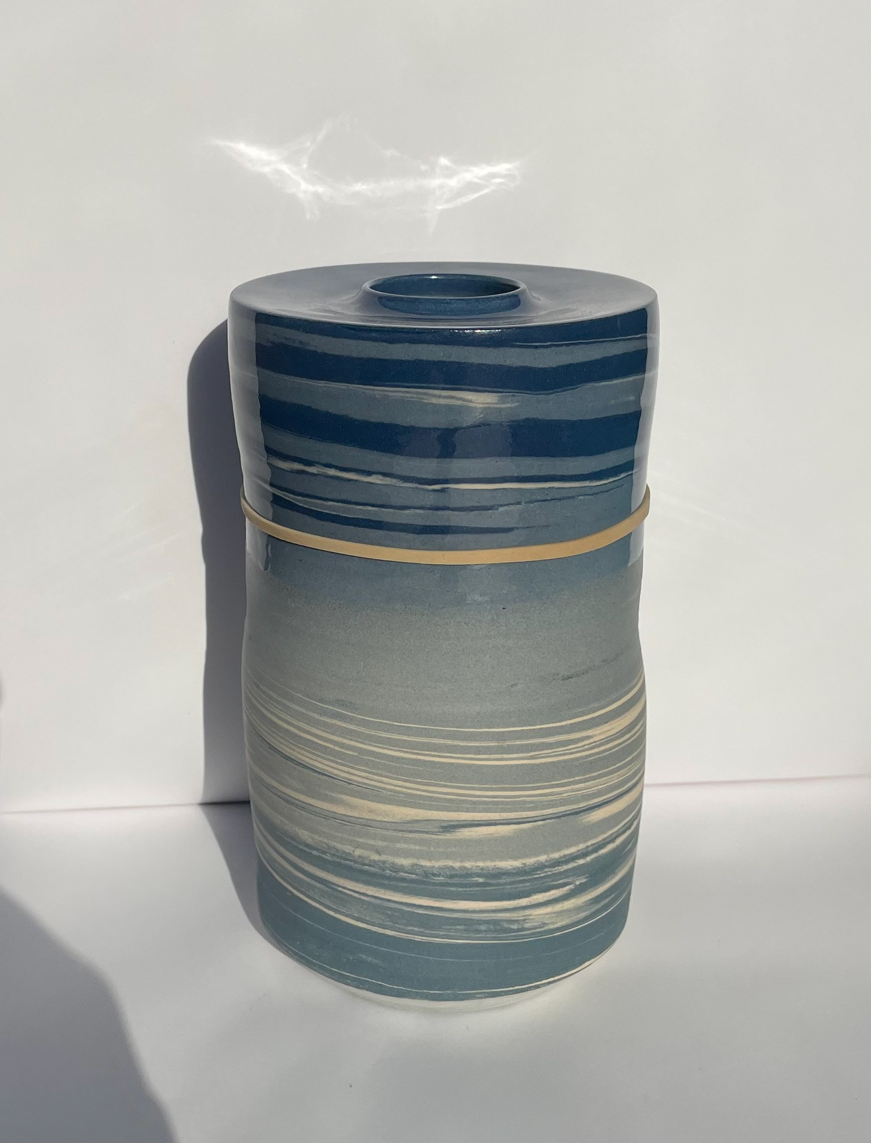
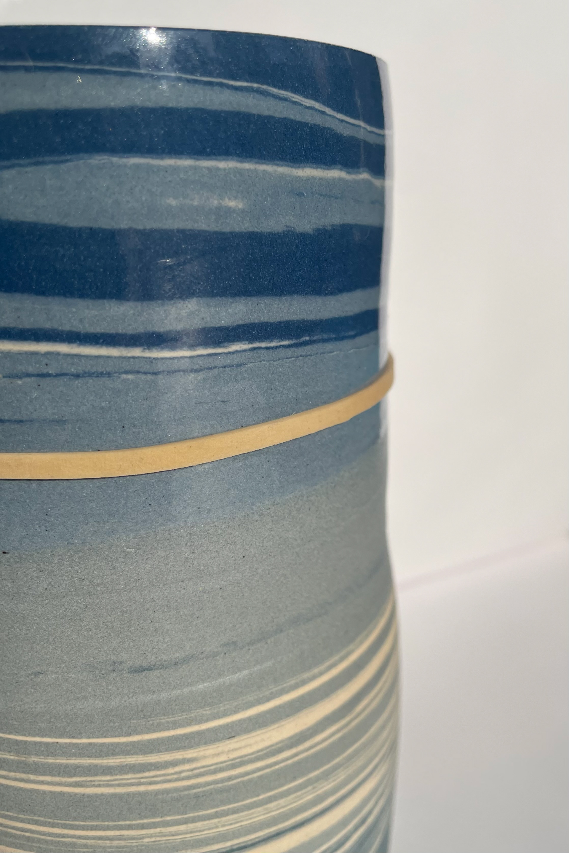
Using a rubber band to see how an orange horizon line will look on a split glaze vessel
-Too busy
-Distracts from the details
-Too obvious horizon line
- Another conflicting colour adding to the already busy vessels
-Not delicate
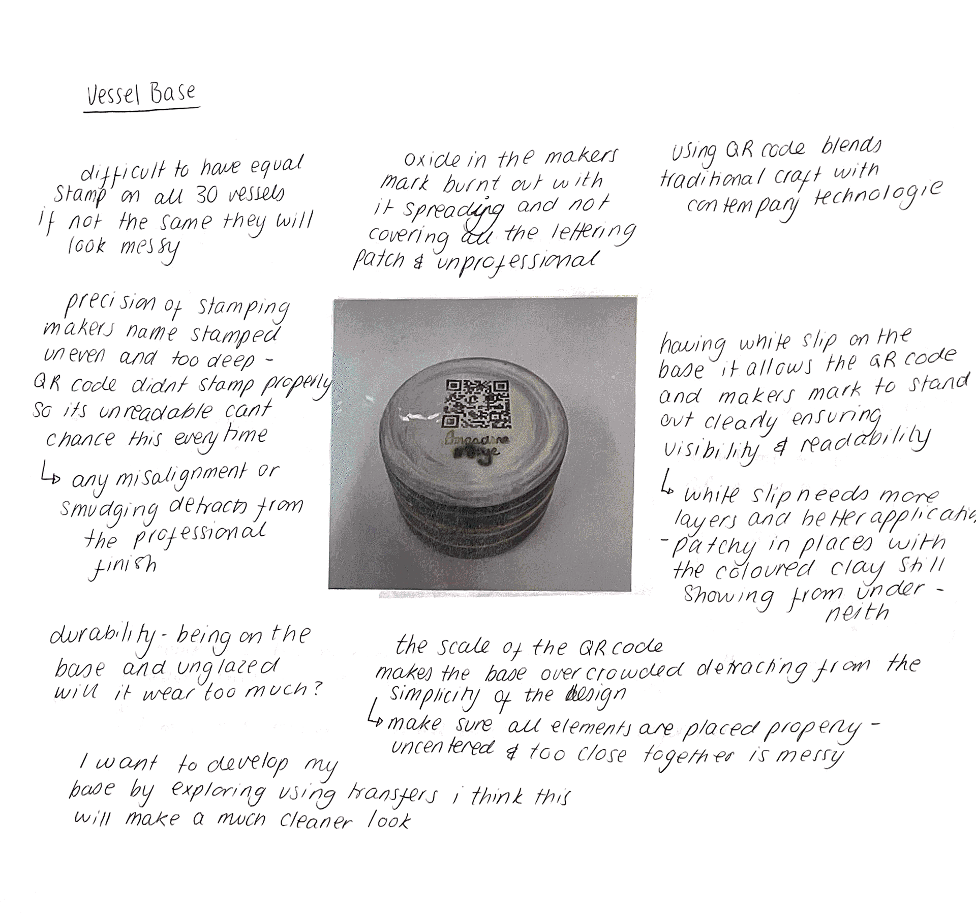
Vessel Base
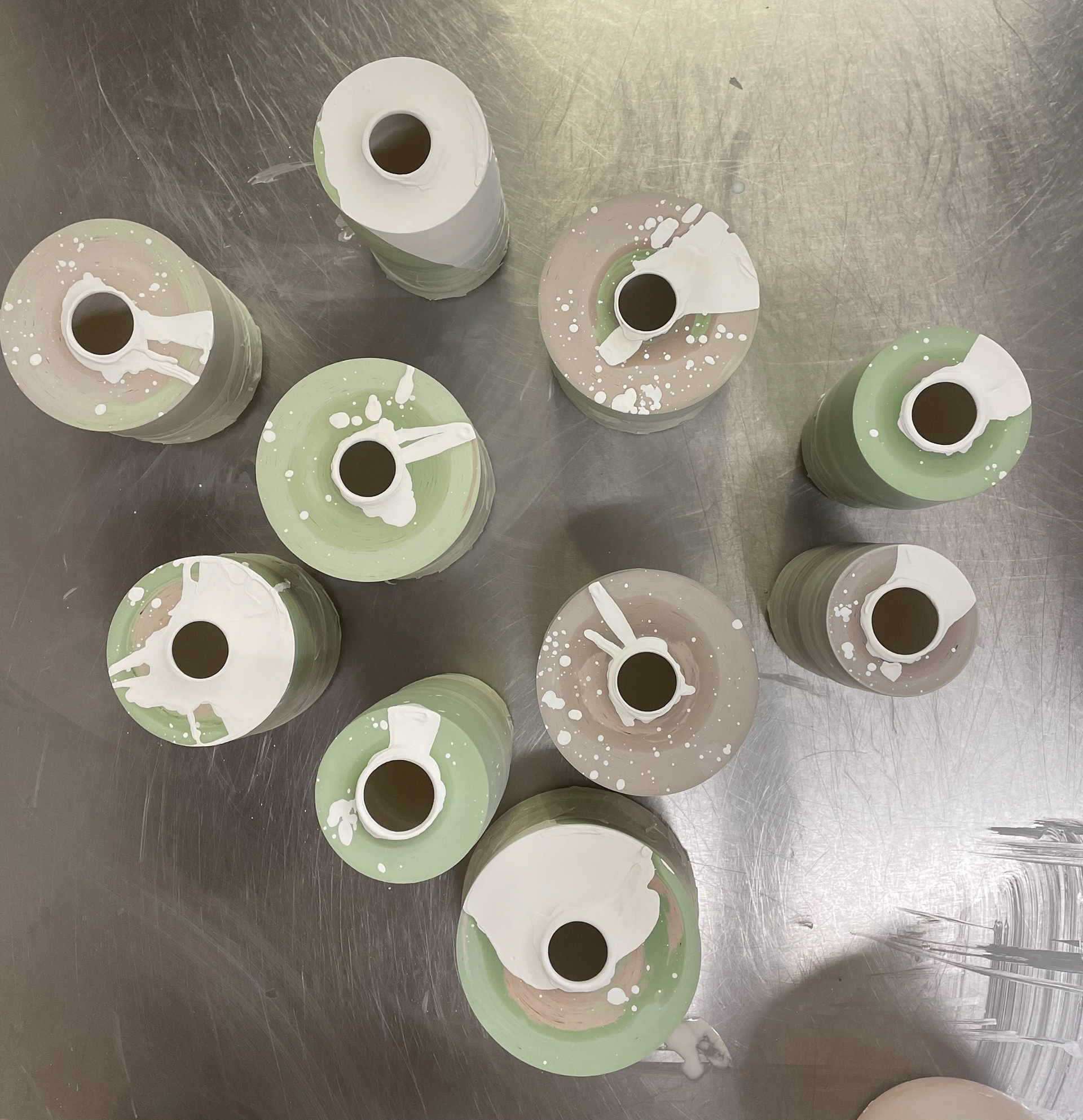
For the base of my vessels, I decided to white slip them after being trimmed, applying around 4-6 layers of slip depending on the coloured clay base. I chose this approach because it provides a uniform base compared to having marbled coloured clay, which I found made it difficult to read my QR code and maker's mark. The varied colours interfered with the clarity and readability of these important details. By white slipping the entire base and the rims of the vessels, I achieve a clean base of white that enhances the overall aesthetic. Using black transfers for my QR code and maker's mark on this white background makes them pop out more, creating a striking contrast that ensures they are eye-catching and easily readable.
Although applying multiple layers of slip and waiting for each layer to dry before reapplying takes time, I believe the overall finish is worth it. This method gives my work a more professional appearance and ensures that the important details stand out clearly.
I attach the vessel to the wheel and paint it directly on the wheel. This allows for a much cleaner and more even application of the white slip
I did find it difficult as I would slip the bases and then build my vessels. This joining of vessels meant that slip would drip down to the base, colouring and ruining the white slip base. To fix this, I found that it was best to clean them up when the vessels were fully dried. If done wet, it would smear the colour further around the base. However, when cleaning it up, when dried, it would be dry enough that I could just scratch the area off gently with a tool. If any repainting of white slip was needed, I would do it now in the final touch-up of the vessels, being very careful and precise.
Finish Glaze
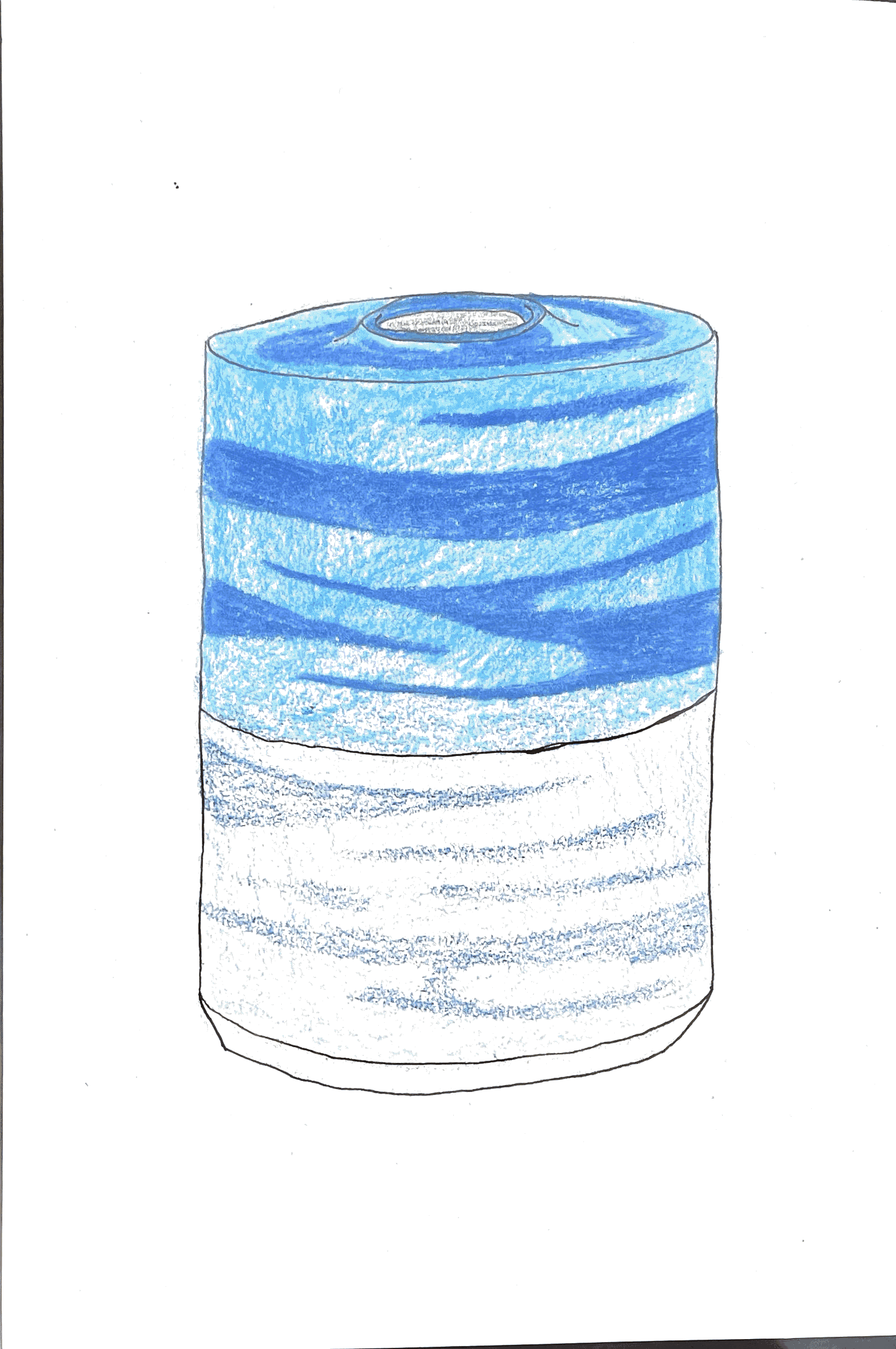
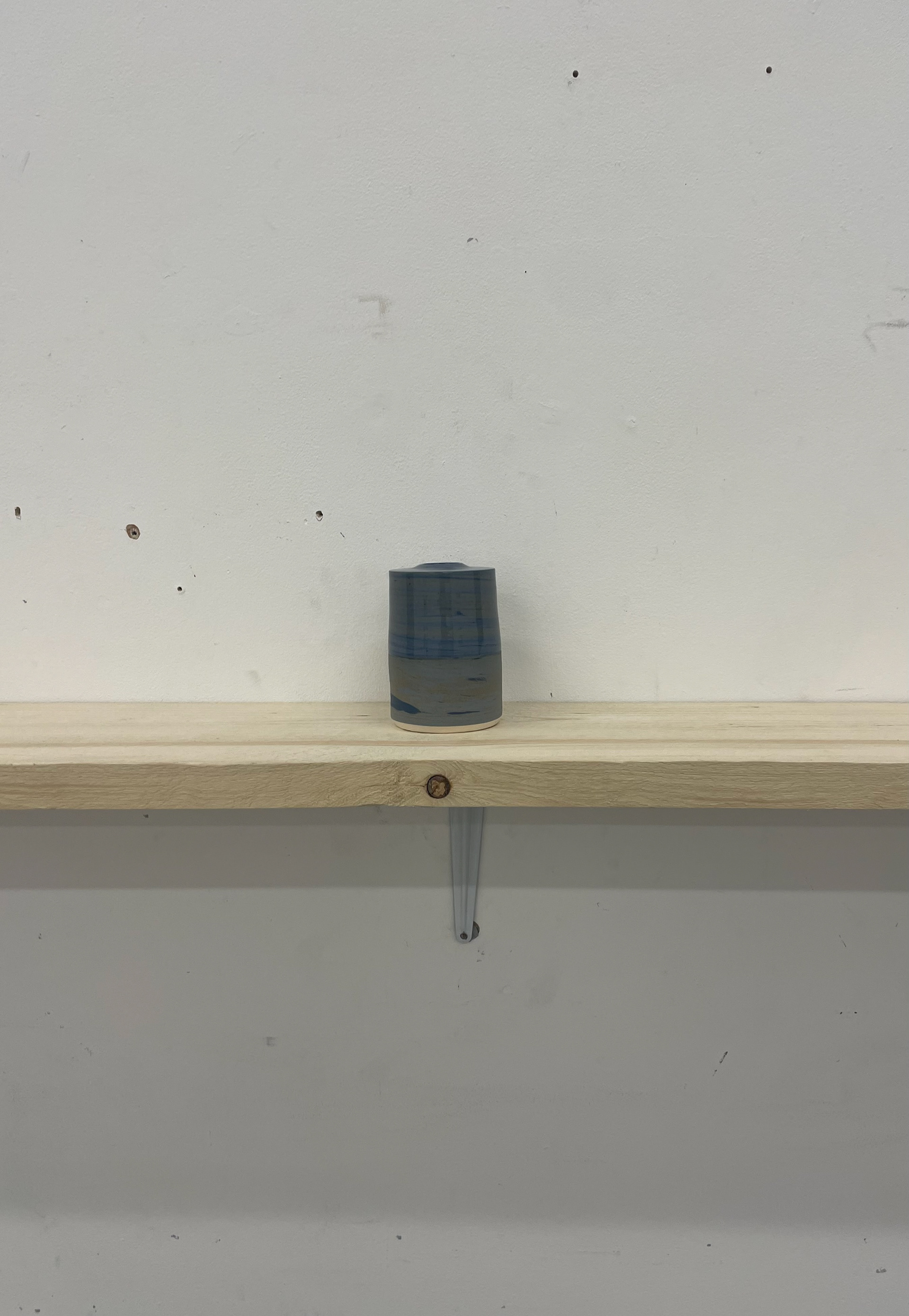
For my final glazing, I decided to apply a split half-glaze on the outer surface with clean, shiny earthenware. This decision was influenced by the concept of horizon lines. I fully glazed the inside of my vessels to ensure they are fully functional if needed. I aimed to create a continuous split glaze line across all my vessels, maintaining consistency.
I chose to glaze my vessels 6 cm up from the bottom. This measurement holds personal significance as I lived with six people in my Brighton home, and currently live with six people in Manchester. This number represents the people who have made my experience of home better and provided comfort, which is meaningful to me as a maker.
Measuring the 6 cm precisely was challenging, as any deviation would disrupt the continuous line I intended to create. To achieve this, I measured the height and then masked off the line with tape, constantly checking to ensure it was straight and consistently 6 cm throughout. I also masked the rest of the vessel that I didn't want to glaze, making it easier to avoid cleaning off excess glaze and reducing waste.
For glazing, I used a spray gun to achieve a consistent application, resulting in clean, precise lines without bubbles or inconsistencies on the surface. I also wet and cleaned my vessels to remove any dust that could affect the glaze
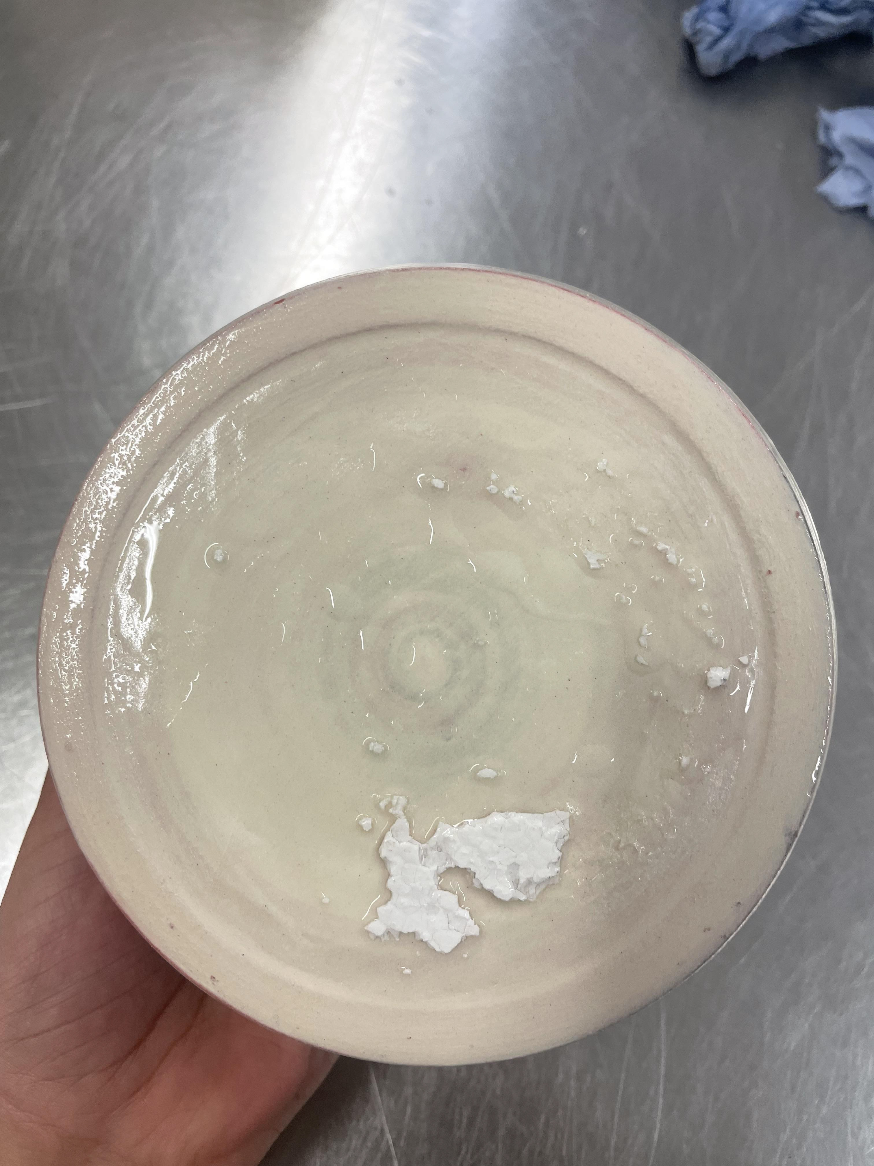
When glazing my final red vessels, I followed the same process as my previous 20 vessels. For the inside, I poured the glaze in and then poured it back into the glaze bucket. After glazing, I noticed the glaze had cracked inside, suggesting it was applied too thickly. If fired, this could lead to the vessels cracking or breaking. I believe the glaze batch was too thick, rather than my application, as I followed my usual process and have never experienced cracks before.
Rudy suggested rinsing them with water to remove the thick glaze without redoing the entire process. However, this removed too much glaze, leaving an inconsistent finish. Although this is inside, I want my glaze to be even on all vessels. Therefore, I decided to fully remove the glaze and redo them with watered-down glaze. This hasn't damaged the vessels but has prolonged my process, as I need to let them dry for a day before glazing again. This delay is frustrating and puts me behind schedule, but it's worth the time to avoid damaged vessels, which is a risk I can't take.
Additionally, using clear glaze effectively doubles my colour palette. My current palette is very muted and contemporary, which provides a sophisticated and understated look. By introducing a clear glaze, I can add vibrancy and boldness to the existing colours without introducing new hues. This technique allows the underlying clay and oxides to shine through, creating a dynamic interplay between the muted base and the vibrant glaze. The clear glaze enhances the depth and richness of the colours, making the vessels more visually striking while maintaining a cohesive and contemporary aesthetic.
The contrast between the glazed and unglazed sections of my vessels is a reflection of the industrial city of Manchester and the more natural scenery of Brighton. The glazed sections represent the shiny, polished surfaces of the city, while the unglazed sections evoke the raw, organic textures of the natural environment. This juxtaposition highlights the duality of urban and natural landscapes, creating a visual narrative that connects my work to these two distinct places. The subtle horizon line serves as a metaphor for the boundary between these environments, emphasising the transition from the industrial to the natural
When I first saw my vessels out of the kiln, I was shocked by their glaze finish. The unglazed parts had a stained finish rather than the raw, unglazed surface I expected. This panic over my final vessels' finish made me rethink all of my glazing, as I wasn't sure I was happy with it. I began planning how I was going to remake 10 vessels in the limited time I had left.
Therefore, I went to see CJ about my blue-finished vessels to talk about the finish. After talking to CJ, I realised that my vessels weren't wrong, they just didn't come out as I expected. When looking at my sample, I realised it was the exact same finish, but because I used different strengths of oxide, the colour was a lot fainter. Although I had this panic about my pieces, I was able to understand why I was panicked. With proper lighting and seeing them as a whole collection, I realised I was really happy with the finish. The slip glaze being a stable line throughout all of them was really impactful, and the stained unglazed section allowed for a lovely surface texture.
This taught me that I cannot jump to the worst conclusions and need to trust myself as a maker. Seeing my work as a whole, rather than picking one piece to criticise, was crucial in appreciating the overall impact and beauty of my collection
I encountered difficulties with my red outer glaze, particularly due to challenges in the application process. I have always preferred using a spray gun for my outer glaze because it provides consistent coverage, clean edges, and an even application, resulting in a more refined finish compared to hand glazing. However, when it came time to glaze these vessels, the pressure in the spray booth at the university had dropped, making it impossible to use the spray gun. Given the time constraints, I had to find an alternative to ensure the pieces were glazed on schedule.
To work around this issue, I opted for dip glazing, as it was the most efficient method under the circumstances. However, once all my vessels were glazed, I was dissatisfied with the finish, the glaze was too thick and had inconsistencies, affecting the overall quality. Once the spray booth regained pressure, I decided to wash off the initial glaze, allow the vessels to dry for a day, and then reapply the glaze using the spray booth the following day.
The next day, I remained optimistic about my glazing process, hoping to achieve a smooth and even application. However, upon arriving at the studio, I found that the spray booth pressure had dropped again, leaving me with no choice but to dip glaze my vessels. Given my previous experience where the glaze was too thick and inconsistent, I took extra care this time, thinning the glaze slightly to improve application and ensure a more refined finish.
Since my vessels were taped up, the dipping process was straightforward, allowing for a clean division between glazed and unglazed areas. I also adjusted my technique, being more mindful of how I shook the vessels afterwards to minimise drips and prevent uneven coverage. Each piece was dipped in clear earthenware glaze, and I dedicated time to cleaning the surfaces, using a knife and carefully rubbing away excess glaze to achieve the most consistent finish possible.
Glaze Damage
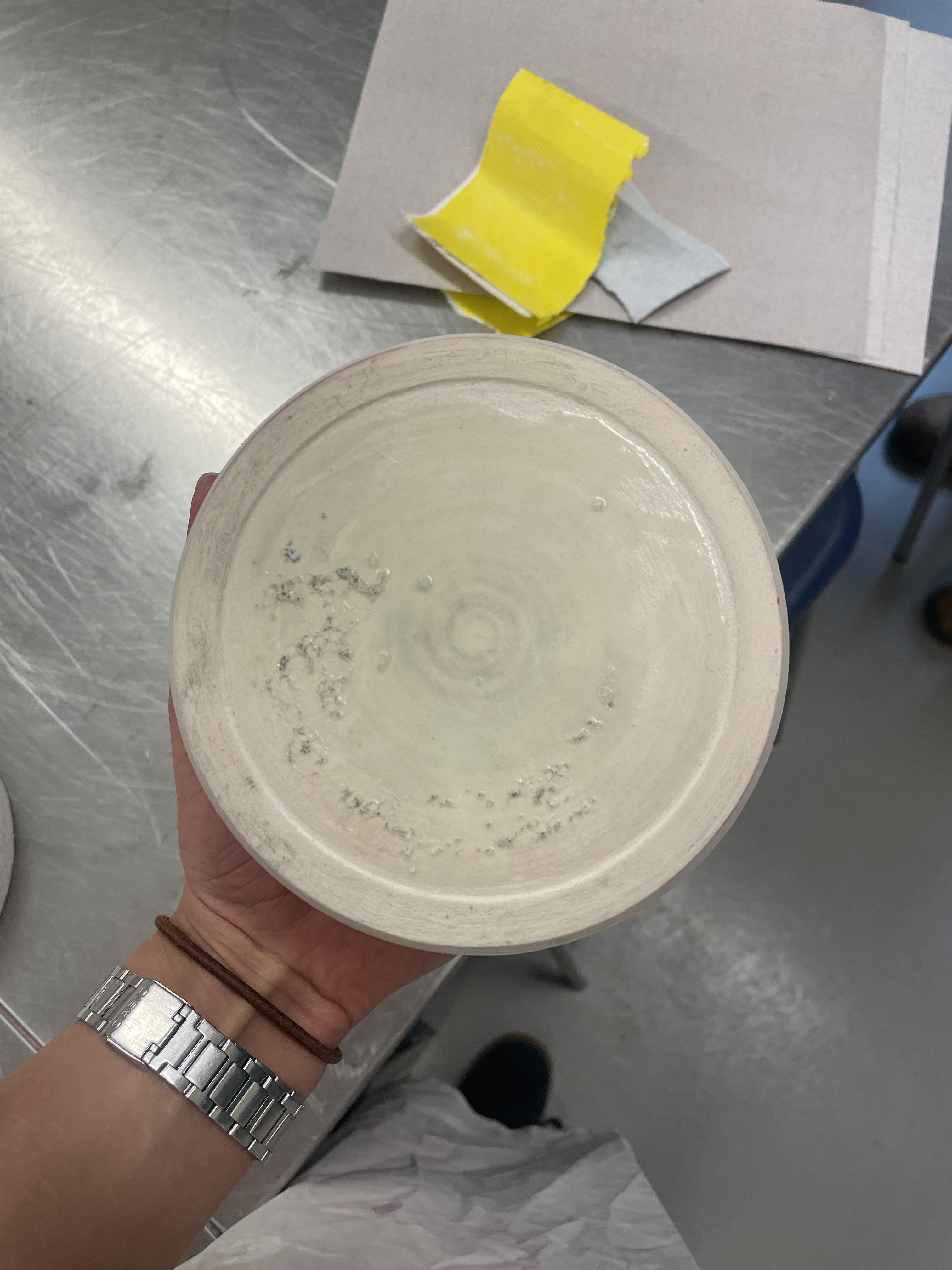
When my vessels came out of the kiln, I was disappointed to find that one of them had too much glaze on the base, causing it to stick to the kiln shelf. As a result, a significant amount of kiln shelf material was left attached to the bottom of the vessel. Fortunately, only one piece was affected.
This happened because I had applied a thicker layer of glaze as a precaution, my green vessels previously didn’t have enough glaze on the base, which made it difficult to apply QR codes.
To fix the damaged vessel, I began by carefully chipping away the larger chunks of kiln shelf using a knife. Once most of the material was removed, I used wet and dry sandpaper to smooth out the remaining glaze and damaged areas. Although this process affected the area where the QR code would go, the bigger issue was that the uneven base made the vessel wobbly on flat surfaces, something I was not satisfied with.
After an extensive amount of sanding, I had only made a slight improvement. I soon realised that fully levelling the base would require a lot more time, time I simply didn’t have.
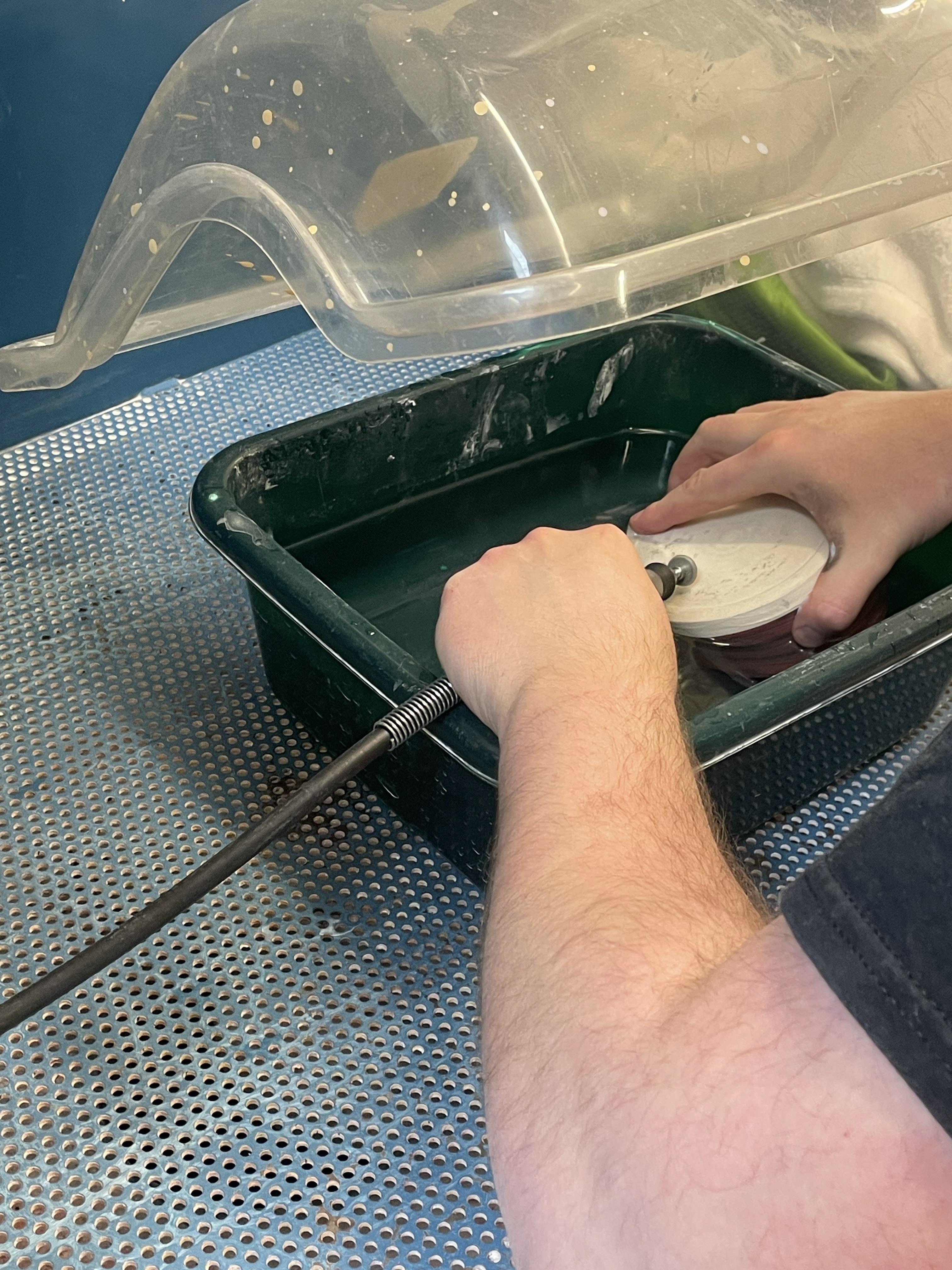
When discussing this with Rudi, he suggested using a Dremel to sand away the glaze drips from the base of my vessel. This method is much more efficient and cleaner than manual sanding. However, since we were at university, Rudi had to carry out the process himself. The vessel needed to be sanded while submerged in water to reduce harsh vibrations, which helps prevent cracking.
Rudi was able to remove the glaze drips successfully, with only minimal impact on the base. The only noticeable issue was some patchiness where the white slip had been sanded off, revealing the coloured clay underneath. Despite this, I was initially very happy with the result, the vessel was now stable and no longer wobbled.
However, upon closer inspection, I noticed a small crack. Although minor, it appeared at an already delicate joint, likely caused by the stress of the sanding process. I was disappointed with this outcome, especially because this vessel had a unique glaze, only the top was glazed due to its height, making it the only one of its kind in the collection.
Luckily, I had made 31 vessels in total, so I had a spare. Although the replacement is not the same size or form, it’s a red vessel made from mixed clay, which still fits well within the collection. This experience taught me the importance of careful handling during post-firing processes and the value of having backup pieces.
QR Code
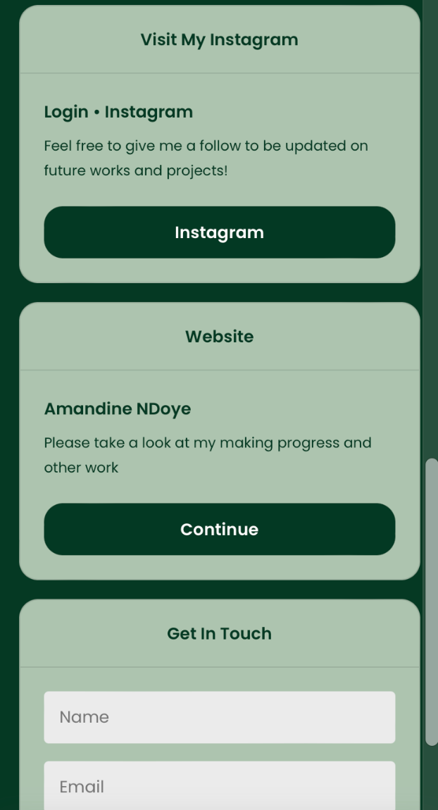
I realised the need to change and update my QR code because it was directing users to a page of links that were no longer relevant to my final projects due to my shift in direction with free art. Previously, the link allowed people to fill out a survey about what home means to them, whether they have moved away from home, and their personal feelings about finding free art. Given my change in direction, I still wanted to incorporate a QR code within my work. I found that having a QR code allowed people to interact with my vessels, and I really liked the idea of building a community around my pieces. A QR code facilitates this by enabling people to contact and interact with me and others through a vessel.
To update my QR code, I decided to change the links to reflect my work's focus on journeys and home. My piece is not only a reflection of my journey but also the vessels' journey, transforming from lumps of clay into colourful pieces. I have witnessed their journey of being made, and I believe that having a platform to allow people to see where my vessels go enables my audience to interact with the vessels' journey of finding "home." This piece is a collection, a family of vessels that unite as one. They are all individual but part of a family. I think having the concept of being able to follow the journey of each of these vessels after they leave me adds a deeper connection to the piece, enabling the owner to see where the rest of the family has migrated to and where they will end up.
By having this, I hope not to have just 30 vessels in the same home. As a maker, I don't know where these pieces will end up, but over time, as they continue to be passed down, given away, or lost, I think it will create an interesting story for each vessel. Being able to follow where they have been and where they are going allows for a more meaningful connection to each one. Following and reconnecting with each vessel is a powerful concept that I believe my vessels will achieve.

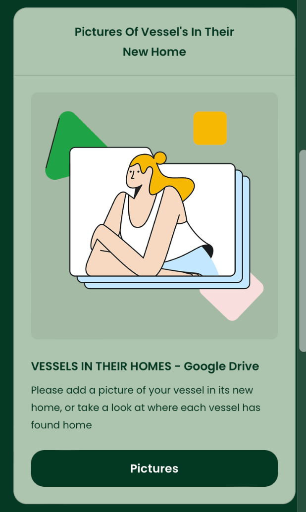
On my Linktree, I added two main links. One is for a Google Docs where people can upload pictures of their vessels in their homes. By having the QR code permanently on the base, I hope that this document allows many people to add their pictures and will become an ongoing community of sharing images. It also allows people who see my vessels to look at different homes and see where the vessels' journey continues, while keeping the vessels linked together. I really hope this becomes a platform where people can share and create a community around their vessels.
For my next link, I attached a Padlet with the question, "What is home?" This project is very personal to me, and I wanted to create a place where people could interact, write, read, and comment on others' ideas of home. Everyone has a different understanding and meaning of home, and I think it's important to showcase this. As people view my work, I want to encourage thinking and reflection, allowing them to relate to my personal experiences. By making this available to anyone who views my work, it transforms my ceramics into an experience rather than just objects.
My work revolves around community and how it is a key idea in the sense of place. Hopefully, by having both these interactive links, especially at exhibitions and grad shows, I open my work to this community, sharing views, thoughts, and enabling conversation. This makes my work an experience, walking you through the journey of finding home.
Transfers
Ceramic transfers involve creating designs on special transfer paper, which are then applied to the surface of a glazed ceramic piece. Once the design is in place, the piece is fired in a kiln, allowing the transfer to bond with the ceramic permanently. This technique is particularly beneficial for my work because it enables me to add detailed patterns, colour and images to my pieces precisely and easily. The ability to reproduce complex designs consistently and accurately makes ceramic transfers a good, reliable method for achieving high-quality, customised results. I
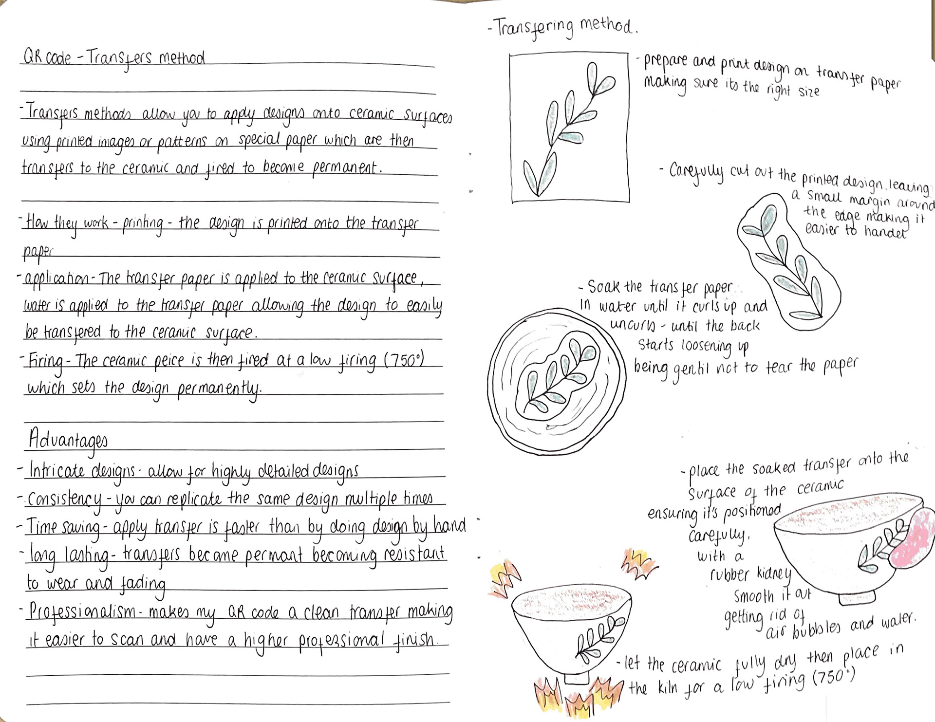
I decided to use transfers for my final pieces, even though this requires an extra firing. I believe the finish is worth it. When I previously experimented with stamps for my QR code and maker's name, it worked, but was inconsistent. Some QR codes were unreadable and took a long time to redo due to patchy, inconsistent depth. This led me to explore transfers, which are much cleaner and more concise, making all my vessel bases equal and uniform.
One challenge with transfers is that they need a glazed surface for easier application. This is tricky because I don't want the glaze to melt onto the kiln shelf and affect my final vessels. To address this, I need to ensure that when trimming the base, I create a deep enough foot. This will allow me to apply a thin layer of glaze, ensuring effective transfer without sticking to the kiln shelf.
My smallest vessel base is 6 cm, so I need to measure out my QR codes to fit these bases. I want all my transfers to be the same size and equal on all the bases to maintain unity within my collection. I also decided to transfer my maker's name along with the QR code, ensuring they are aligned with equal spacing between the QR code and the maker's name. This will create a consistent and professional look across all my vessels.
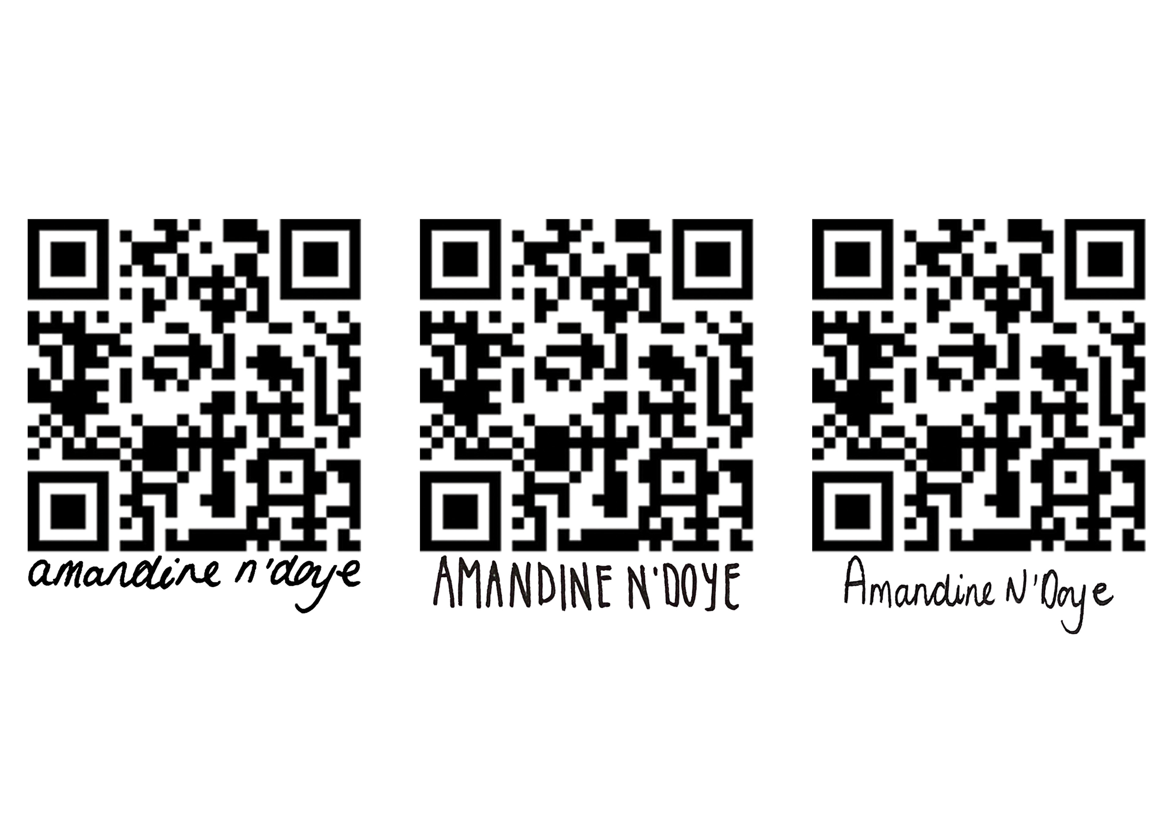
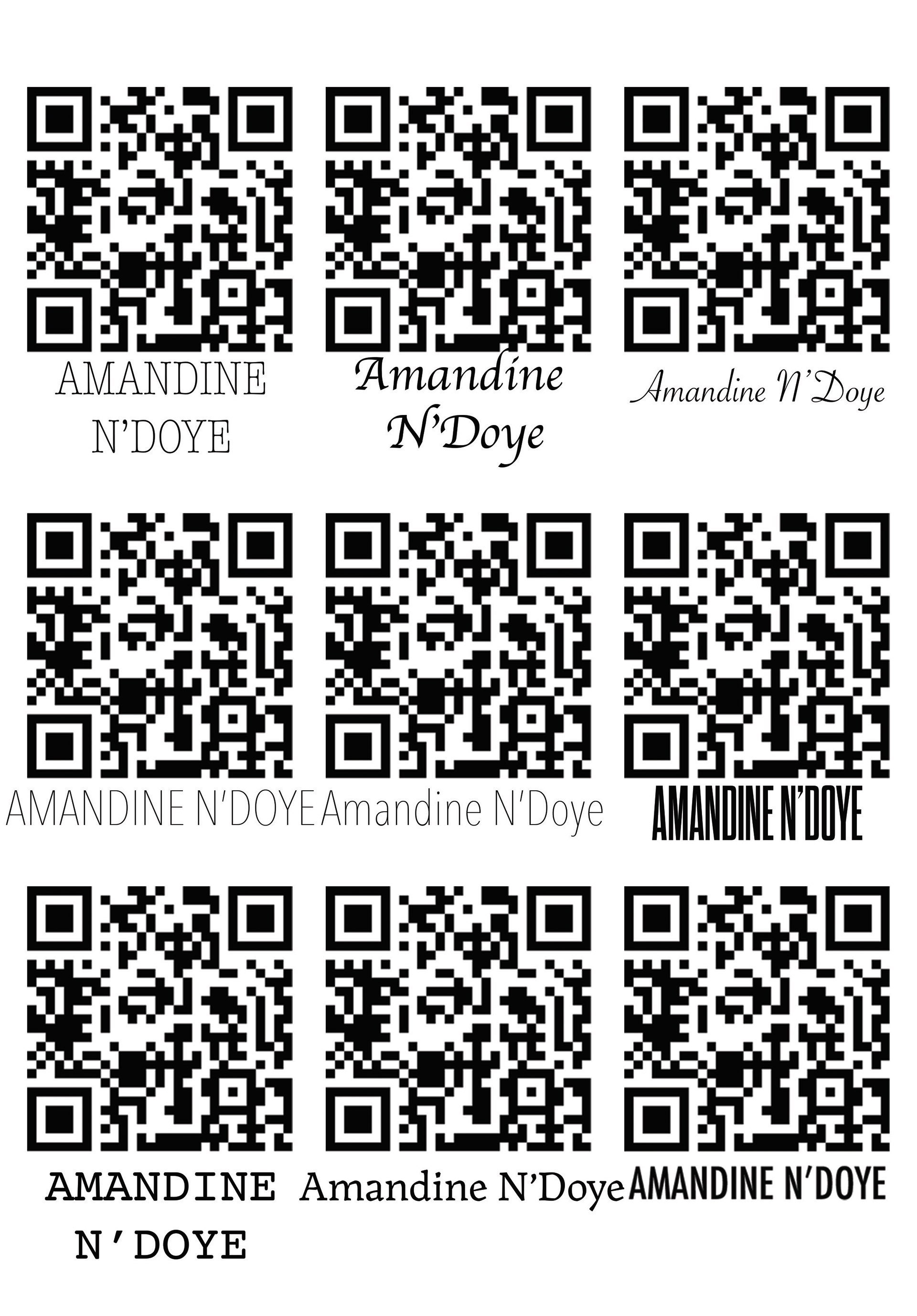
On Photoshop, I was applying different fonts. The font enhances the aesthetic appeal of my vessels, making them more attractive to customers. Additionally, it should complement the design elements and style of my products, creating a cohesive and visually pleasing look. Fonts also play a role in evoking emotions and setting the tone for my brand, helping to establish an emotional connection with my audience. By carefully selecting the font for my maker's mark, I ensure that my branding is effective, appealing, and memorable.

I decided to use a handwritten maker's mark for my work. I felt that this approach added a more personal touch compared to a digitally typed font, especially since my creations are deeply personal to me. By signing my work with my own handwriting, I enhance this personal connection.
Regarding the QR codes, I chose dimensions of 2.5 cm wide and 3 cm tall. After experimenting with different sizes, I realised that I didn't want an overly prominent transfer on the base of my vessels. My creations are very delicate, and a large QR code would detract from this delicacy, making the mark too bold and overwhelming. At the chosen size, the QR codes remain noticeable and readable without overpowering the base.
I straightened out the handwriting to ensure clarity but still retained the handwritten effect to avoid a perfect, overly polished look. This balance makes the mark easy to read while keeping the personal and authentic feel that is very important to me.
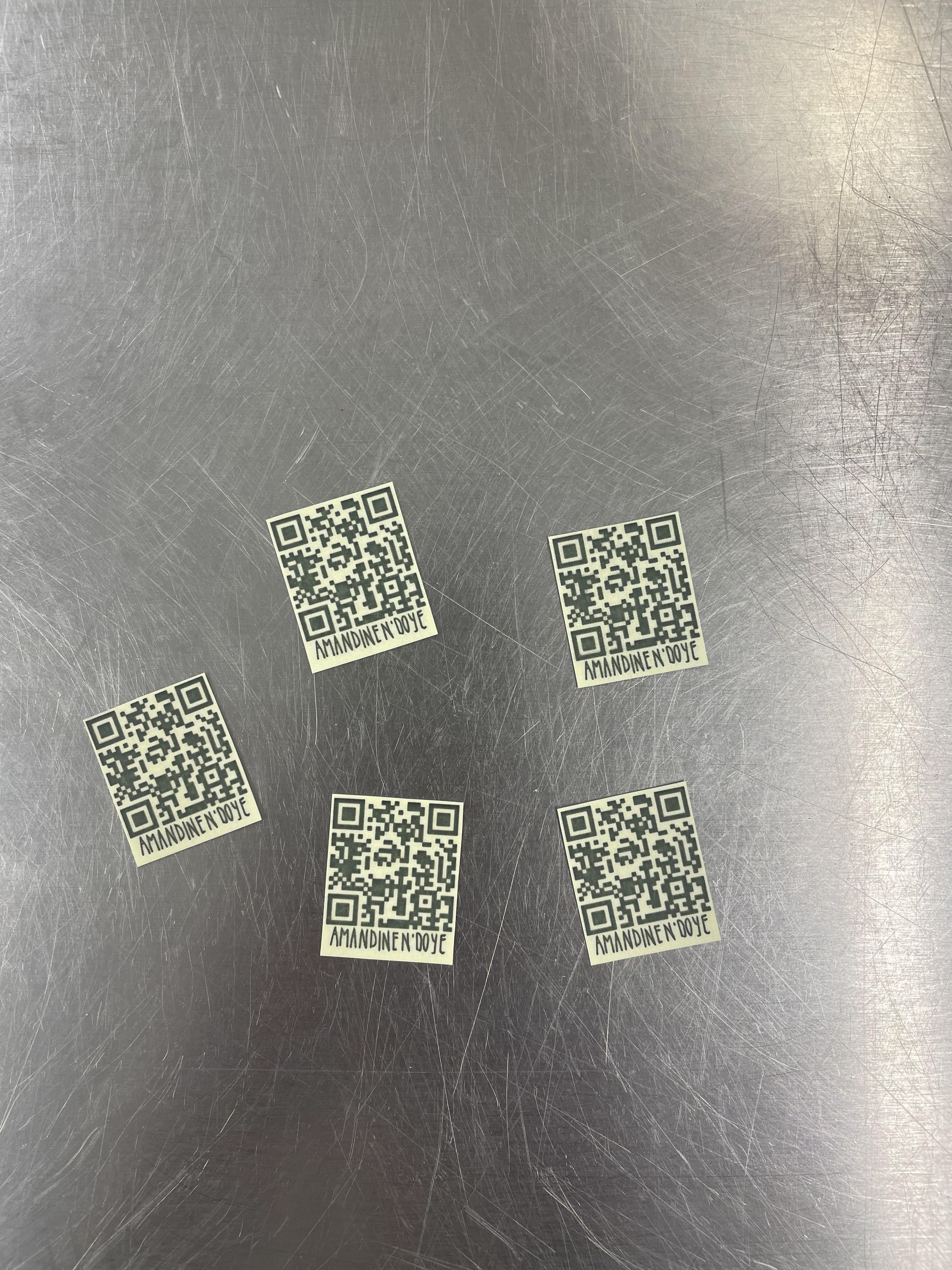
When printing my transfers, I used super gloss transfer paper. The downside is that it can leave a slight yellow hue around the transfers. To minimise this, I cut the transfers very close to the QR code, leaving no border. I hope this won't affect my work too much and that cutting them close will reduce the hue.
I aimed to make my transfers as central as possible, applying them by eye and using the painted marks from the white slip as a guide. I'm hoping they are as central as possible.
I also printed my QR code and maker's name together and transferred them as one piece. This sped up the process. In Photoshop, I ensured the spacing was good between them and that they were centred with each other.
I found applying the transfers to some vessels difficult. Once applied, some transfers kept lifting and, on some, would completely fall off. This was due to not having a completely smooth surface and the transfer having different contact points on the surface, most likely because of my glazing. I only did a really thin layer of glaze on the base so it wouldn't melt onto the kiln shelf. Therefore, a lot of it was absorbed into the clay body. Without enough glaze, my bases were rough due to the fired white painted slip being a bit gritty.
If the transfers aren't applied properly, it could lead to a patchy transfer with parts that don't make proper contact. To fix this, I went back over the ones falling off, adding lots of water and thoroughly using a kidney tool to secure them to the base. I also left them on the side overnight so I could check they were properly stuck after an evening. The ones that weren't, I redid with lots of water and smoothed out again.
I hope these come out of the kiln properly, especially the QR codes, as they need to hold all the information and be very specific to be usable.
QR Code Damage
Unfortunately, when my vessels came out of the kiln, I discovered that six of them had damaged QR code transfers. I was really upset by this outcome, as ceramic transfers are permanent once fired, there’s no way to correct or remove them after the final firing. The QR codes had become unreadable, which not only compromised their intended function but also disrupted the visual and conceptual cohesion of the collection.
These vessels now stand apart from the rest, not in a deliberate or meaningful way, but as inconsistencies. The damaged transfers make them feel unresolved and disconnected from the narrative I was trying to build through the series.
I realise there are several things I could have done differently. I could have tested the transfer process more thoroughly on similar clay bodies or forms before applying them to the final pieces. Additionally, I could have not applied them, taking the risk as I knew they would struggle to stick with minimal glaze, but I thought the risk was worth taking due to it being a finished, resolved piece, as I planned.
Although I cannot change the outcome now, I take some comfort in the fact that the QR codes were placed on the base of the vessels. This means the damage is somewhat hidden when the pieces are displayed, and doesn’t interfere with the overall form or glaze aesthetics. Still, this experience has taught me the importance of planning and testing when working with permanent processes in ceramics.
Who Is My Audience?
My ideal audience is likely those who appreciate handcrafted ceramics with deep personal and conceptual meaning.
Collectors & Enthusiasts – People who value ceramic artistry and unique handmade pieces.
Gallery Visitors & Curators – Those interested in narrative-driven artwork that evokes emotion and connection.
People Seeking Meaningful Decor – Individuals drawn to homeware that carries stories and personal significance.
Fellow Artists & Makers – Creatives who appreciate craftsmanship, technique, and conceptual depth.
By identifying my audience, I can take purposeful steps to showcase my work in ways that draw them in and create meaningful connections. Each segment of my audience engages with ceramics differently, so tailoring my presentation ensures my work resonates deeply.
Each piece I create captures different elements of these ideas, and the way I choose to display them plays a crucial role in reinforcing their narrative. By presenting my work on a long shelving unit, I introduce an element of journey, inviting my audience to experience the vessels in sequence. As they walk past each piece, they engage with the evolving forms, textures, and themes, mirroring the personal connections to home and travel that inspired my work.
Final Display
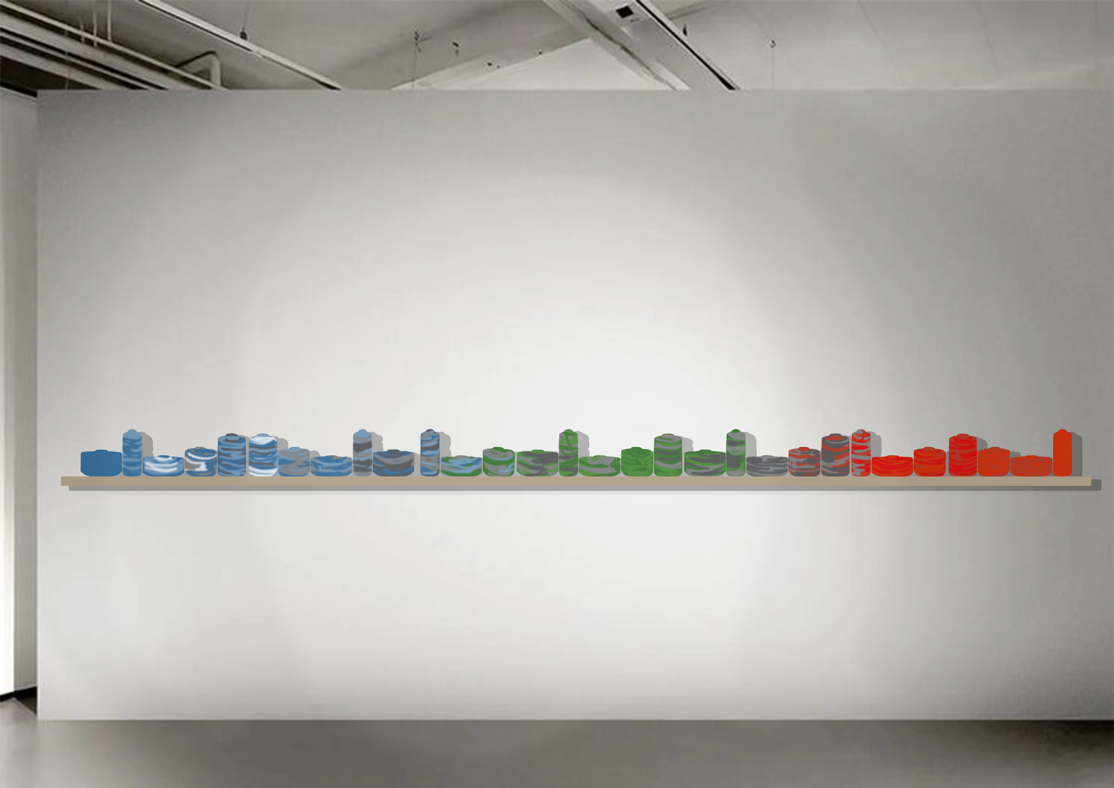
I want to display my 30 ceramic vessels on a 3-meter shelf because I believe it can be highly effective. First, the variety in colours, forms, and sizes of the vessels creates a visually stimulating and harmonious display that is eye-catching. This arrangement enhances the visual appeal of my pieces, drawing people in to look at the details of my work. By having my vessels in one long line, I can emphasise the split glaze, which represents my journey and reflections, enhancing the continuous horizon line.
Efficiently utilising the space ensures that each piece is visible and appreciated without overcrowding. Additionally, the collection allows me to tell a story, representing the physical journey I took when moving homes. This physical transition of vessels reflects my personal story, engaging the audience and allowing them to gain a deeper understanding of my work. Such a large display can serve as a conversation starter and physically draw people in, enhancing the overall aesthetic of the space and reflecting my personal journey throughout this project
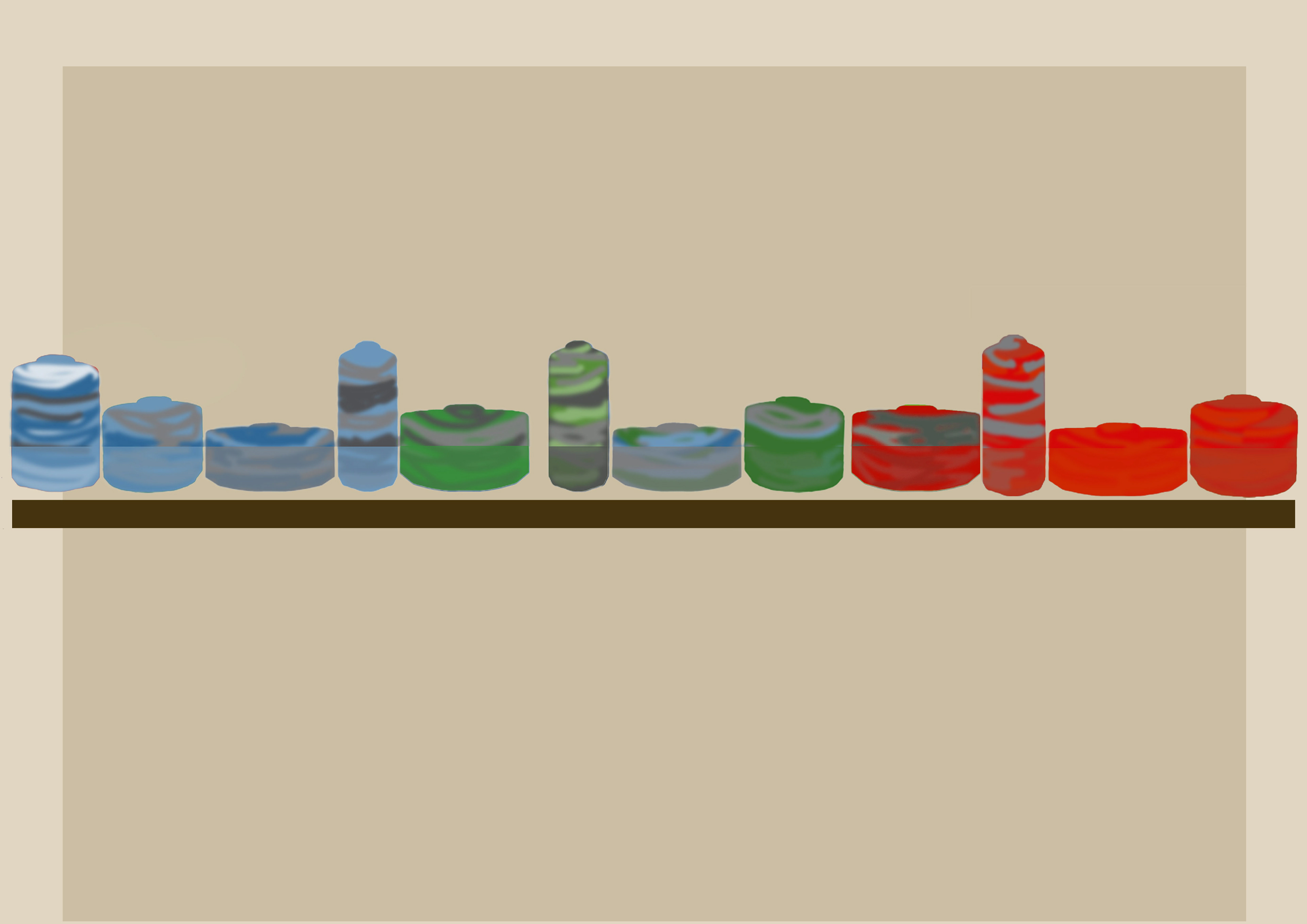
A mock-up I did on Photoshop to have an idea about the look of my vessels on a shelf. I think a long shelving unit is ideal, emphasising the journey and collection of vessels.
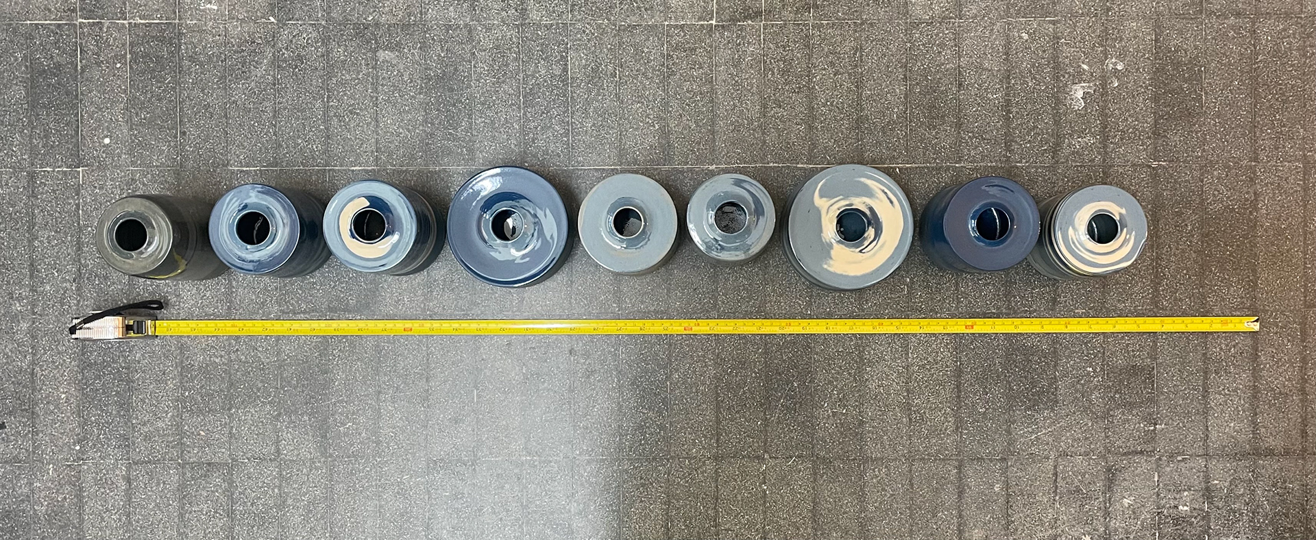
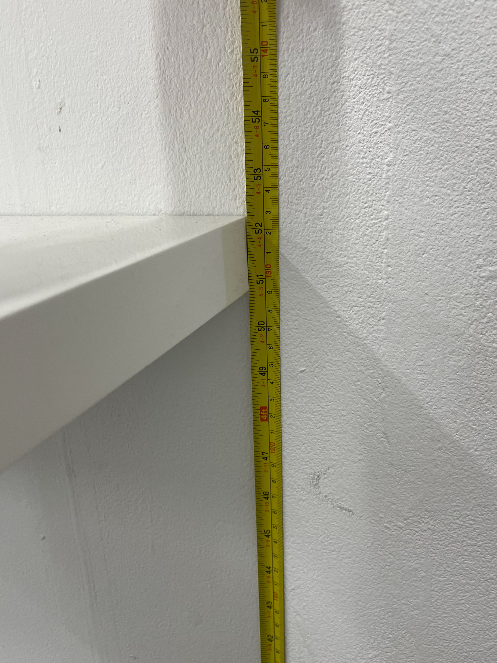
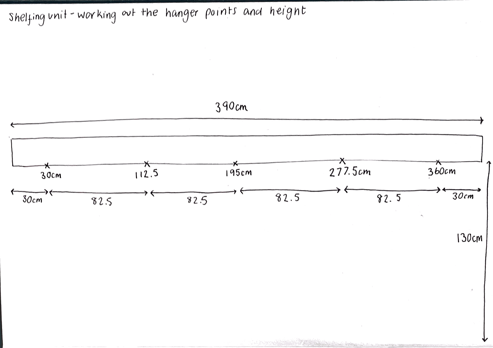
Using vessels that have come out of the kiln, I took a rough measurement to determine the required length of my shelf. Measuring 9 vessels at 100 cm indicates that each 10 vessels will need a 111 cm long shelf. Therefore, for all thirty of my vessels, I need at least 333 cm, give or take.
Without all my vessels fired, it's challenging to predict the exact length of the shelving unit, as each vessel is a different size and thus occupies varying amounts of space. To be cautious, I plan to source a shelf that is significantly longer than my measurements. This way, I can easily cut it to the right length and have the flexibility to adjust the spacing of the vessels.
The vessels I measured have a 0.5 cm gap between them, but I might change this spacing once all my vessels are fired. I want to experiment with different spacing to see what works best and has the most impact. Tight spacing might showcase the glaze lines better and create a more cohesive look, while larger spacing could emphasise the size and individuality of each vessel, creating a longer visual journey that accentuates the large collection.
Ultimately, sourcing a shelf that can accommodate these adjustments is essential. This will allow me to play around with the arrangement when setting up the display.
Average length per vessel = 9100cm=11.11 cm
Estimated shelf length=30×11.11 cm=333.3 cm
Interaction Of Vessels
When thinking about the display of my vessels, I also want to make an interactive element with my work, allowing my vessels to give the audience an experience. A long shelving unit enhances interaction with my vessels by creating a visual and physical journey for my audience. Instead of seeing all the pieces at once, this arrangement encourages movement, drawing people along the display as they engage with each vessel individually. This setup reinforces the themes of journey, home, and connection, mirroring the personal narratives embedded in my work. As viewers walk through the collection, they experience subtle variations in form, texture, and craftsmanship, allowing for discovery and deeper engagement. The linear arrangement also reflects transitions, much like travelling through places or memories, inviting my audience to interpret the work with their own experiences
Handling my vessels plays a crucial role in audience interaction, allowing people to physically connect with the textures, forms, and meanings embedded in each piece. By incorporating both glazed and unglazed surfaces, I create a contrast between the natural and industrial, encouraging viewers to experience these tactile differences firsthand. The smoothness of a glaze evokes refinement and protection, while the raw, unglazed areas provide a direct connection to the material’s organic essence, reinforcing the craftsmanship behind each vessel. I made intentional decisions about the size and shape of my pieces to ensure they feel comfortable in the hands, designing them to sit naturally in the palm and offer a sense of familiarity and ease. This careful consideration transforms my ceramics into more than objects, they become pieces that invite physical and emotional engagement. To deepen this interaction, I incorporated QR codes on the bottoms of my vessels, encouraging viewers to pick them up, scan, and access additional content related to my process, personal narrative, or broader themes. This digital layer enhances the tactile experience, making handling an essential part of connecting with my work. Ultimately, these vessels are designed to bring comfort, offering a sense of home and personal reflection. Whether through texture, size, or interactive elements, I want my audience to not only see my work but truly feel and connect with it in their own unique way.
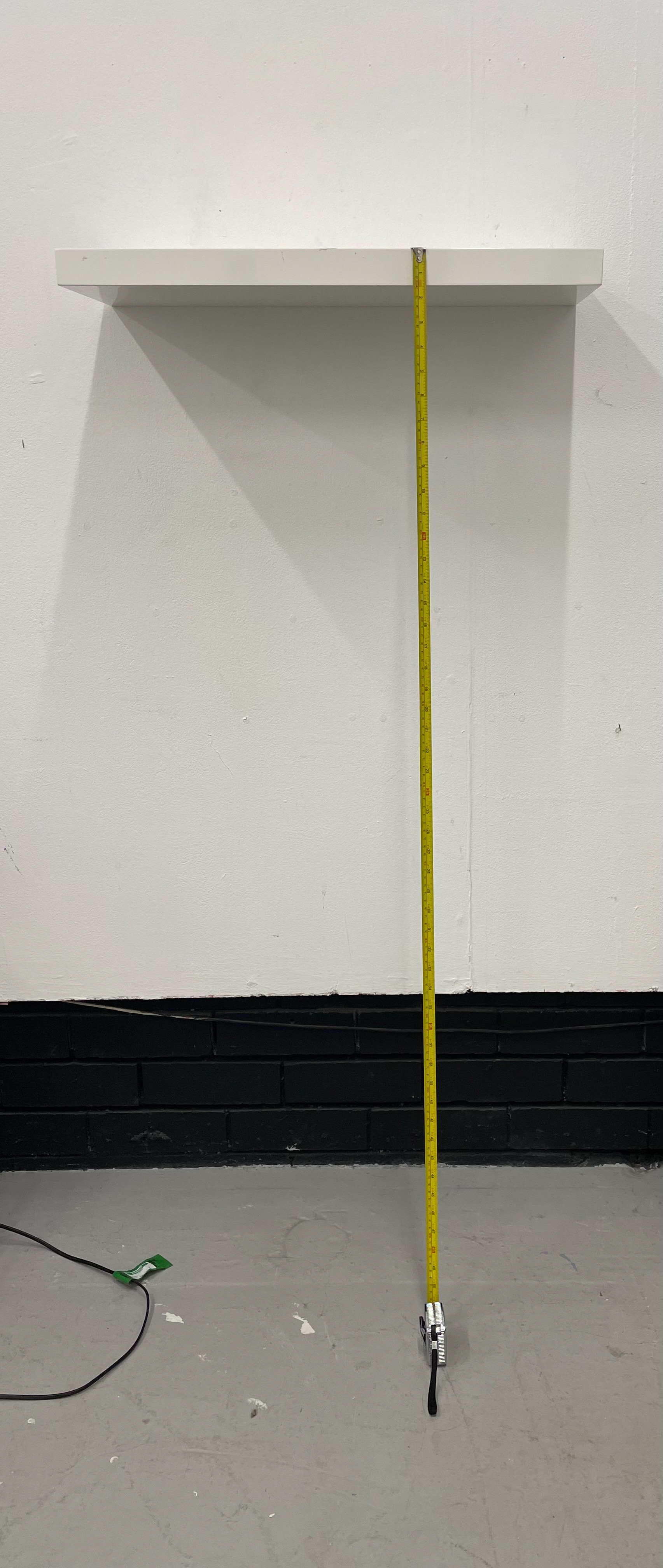
Height Of Vessels
Another element I have carefully considered is the height of the shelf, aiming to find the perfect balance that allows for both interaction and visibility of my vessels. When researching display techniques, I was particularly inspired by Edmund de Waal's work, though many of his pieces are displayed at higher levels to emphasise form. However, with my work, there are intricate details that need to be seen up close, making shelving height a crucial factor in how the audience engages with my vessels. If positioned too high, visitors may struggle to see intricate details or pick up pieces, while a lower shelf may feel less intentional, influence them to look like tableware, or cause discomfort when bending down. Placing vessels at waist-to-chest level mirrors the act of holding and carrying, reinforcing connections to home and journey. Additionally, shelf height influences lighting and perspective, helping textures, glazes, and details stand out while ensuring the work feels valued rather than simply placed.
I want my work to be at eye level, guiding people to follow the horizon line as they explore the collection. This presents a challenge, as everyone has different heights, and I need to ensure accessibility while maintaining the integrity of the display. To achieve this balance, I considered lowering the shelves slightly, ensuring that viewers can see the intricate tops of each piece clearly without the need to strain or look from awkward angles.
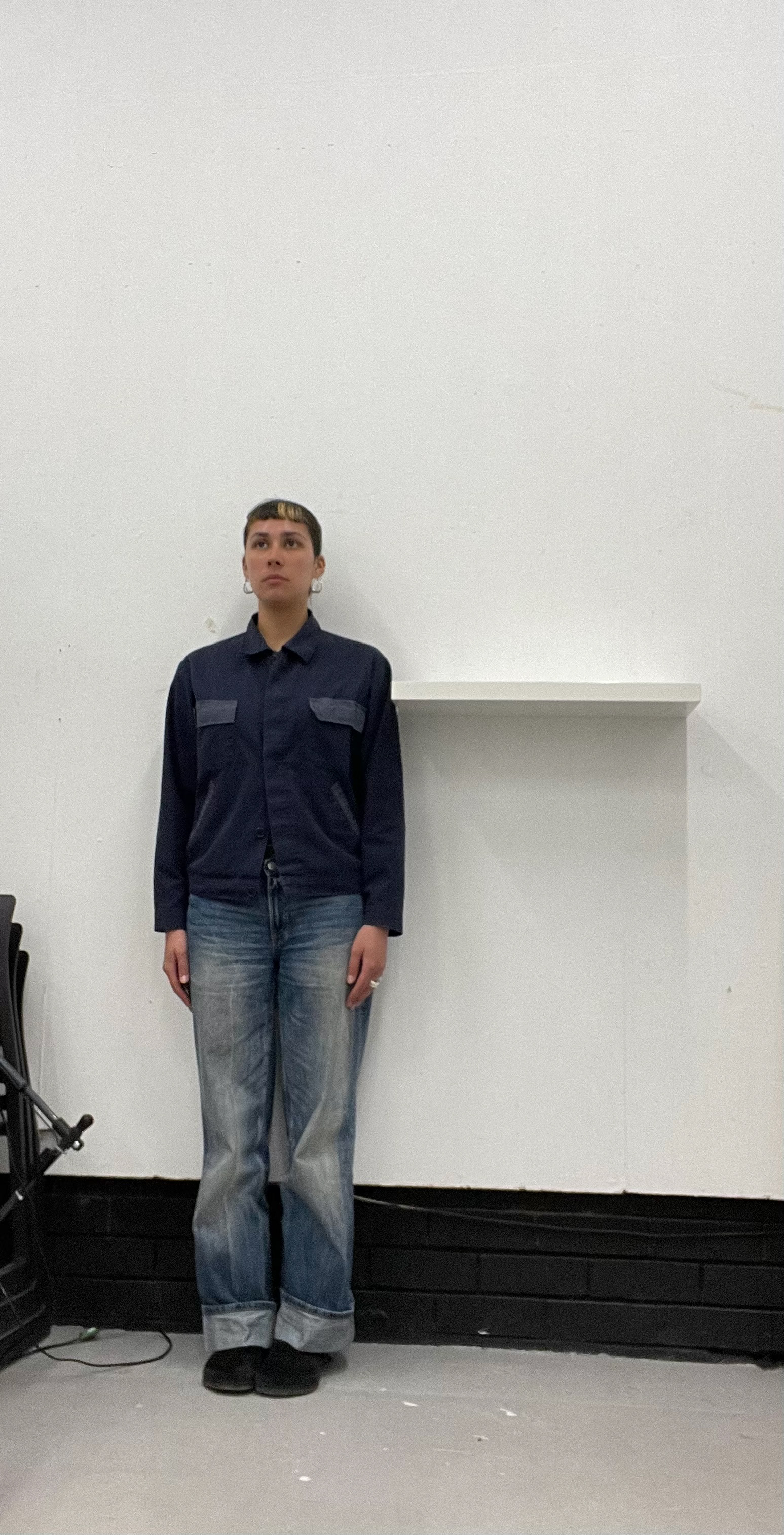
During my one-day exhibition, I experimented with shelf height and found the placement to be quite complementary, allowing people to engage closely with the details while still maintaining an overall view of the collection. The shelving unit used in that exhibition helped me determine what height works best, 132cm seemed ideal for my own perspective. However, since I am quite tall (as seen in the third comparison photo), I needed to consider how smaller viewers experienced the display. When asking others shorter than me for feedback, they struggled to see the tops of taller vessels, but when I lowered the pieces slightly to the base of the shelf, they were able to appreciate them fully.
Although I haven't tested a larger shelving unit at this adjusted height yet, I believe that placing shelves at around 129cm will improve interaction, ensuring that all viewers, regardless of height, can fully engage with and appreciate the vessels. By carefully adjusting the display setup, I enhance audience interaction and create a more immersive experience.
I don’t see my display as just a way to showcase my work, I view it as an extension of my collection, a crucial part of how my vessels are experienced. Every decision in my display has been carefully considered to ensure it elevates my pieces while fostering meaningful interaction. By integrating my display into the essence of my work, I ensure that viewers don’t just observe my vessels but interact, connect, and reflect on them in a way that is deeply personal and immersive.
Putting Up Shelf
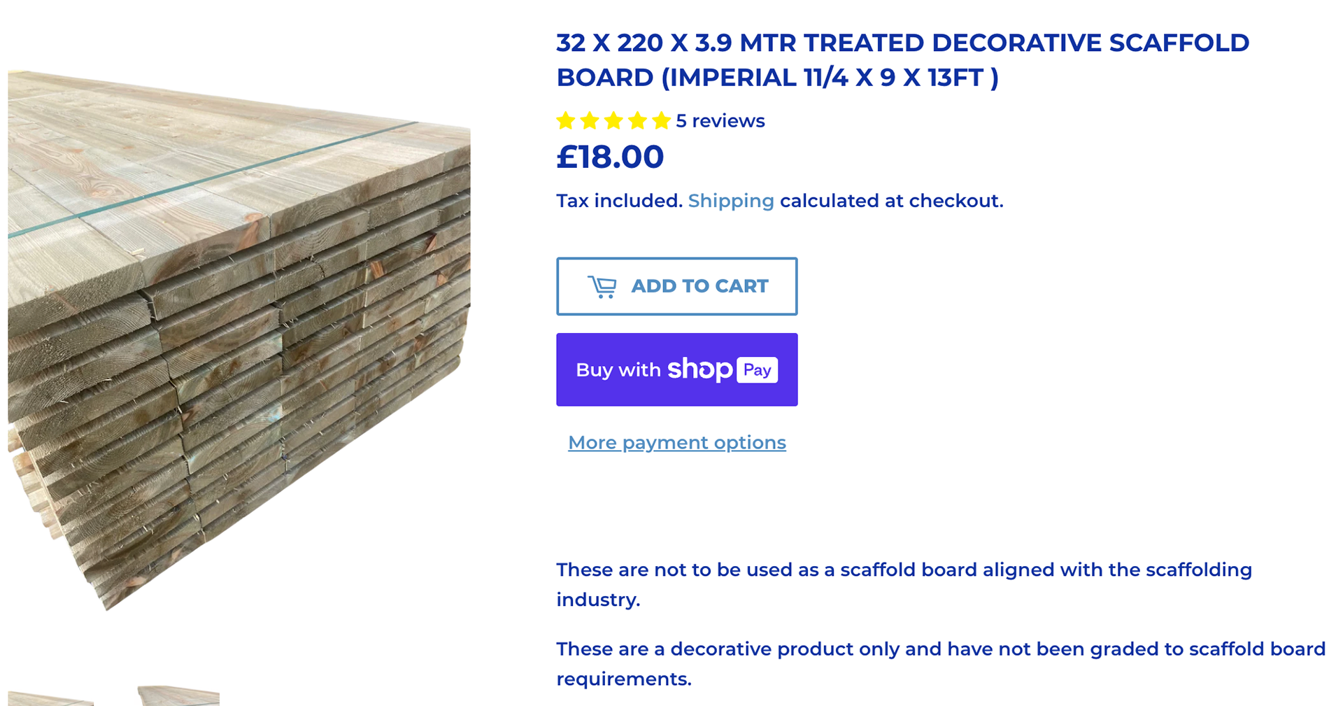
I chose a scaffolding board for my shelving due to its long, continuous length, which perfectly embodies the blend of natural and industrial elements. This choice reflects the duality of the two cities that shape my identity, Brighton and Manchester. The scaffolding board, with its rugged, industrial aesthetic, symbolises Manchester's urban landscape and its rich history of industry and innovation. At the same time, the natural wood grain and texture evoke the organic, coastal environment of Brighton. Additionally, using a scaffolding board is a more affordable option, making it a practical choice for my studio setup. By integrating these contrasting elements, the shelving becomes a metaphor for my personal journey and the harmonious coexistence of these two distinct yet interconnected places. This fusion of materials not only serves a practical purpose but also adds a layer of meaning to my workspace.
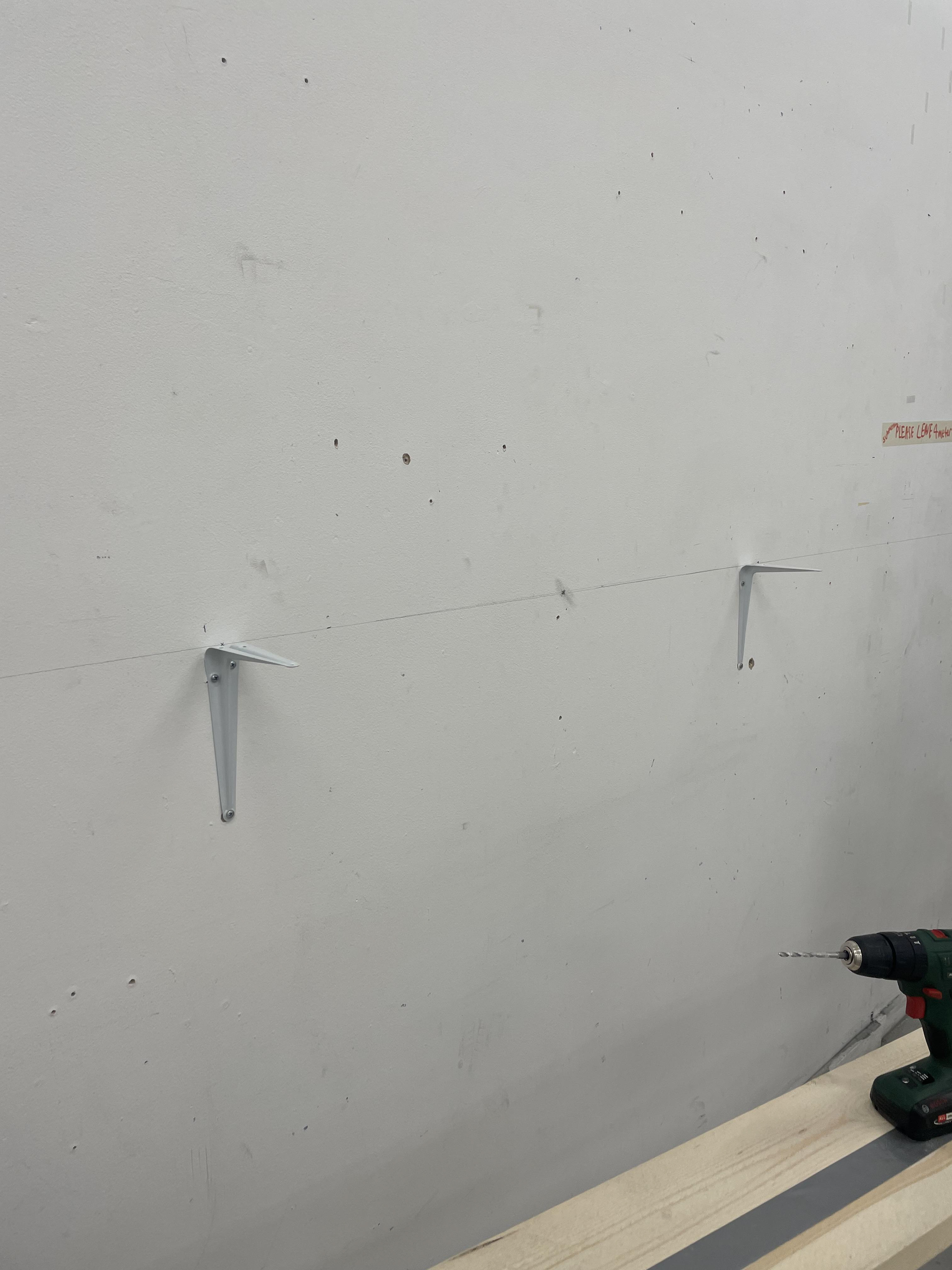
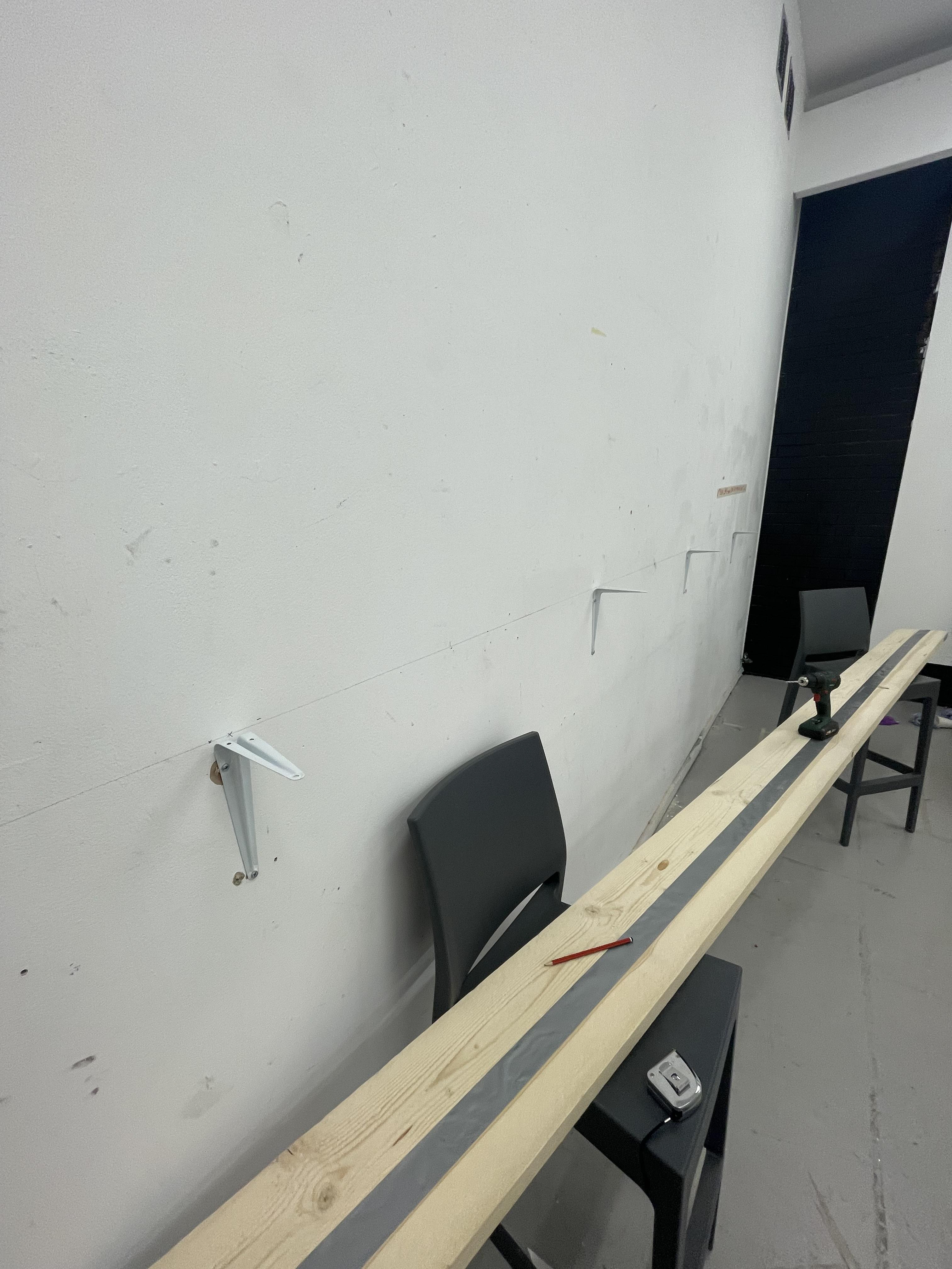
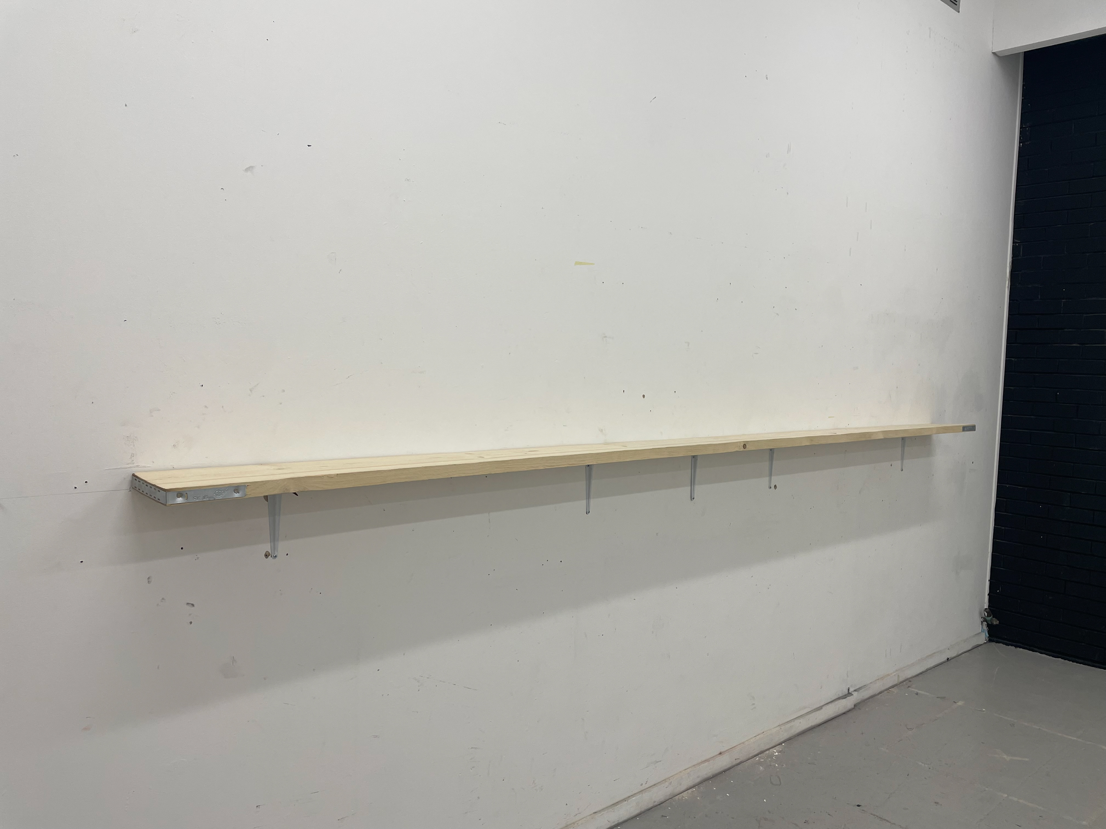
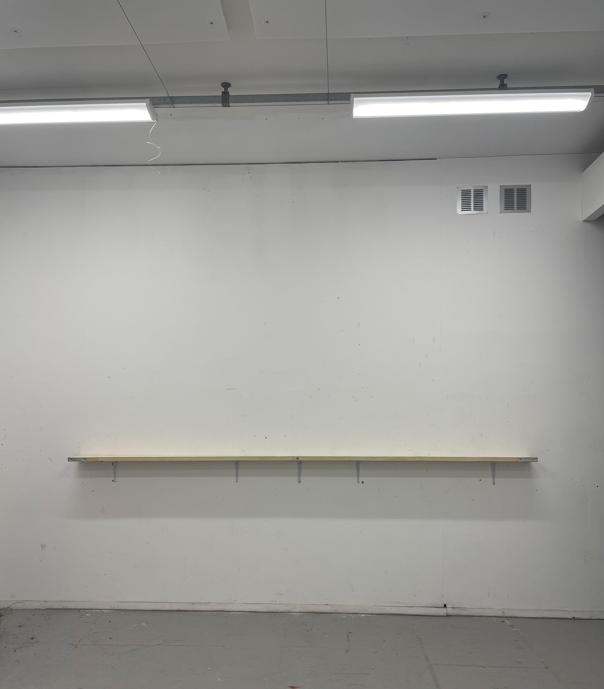
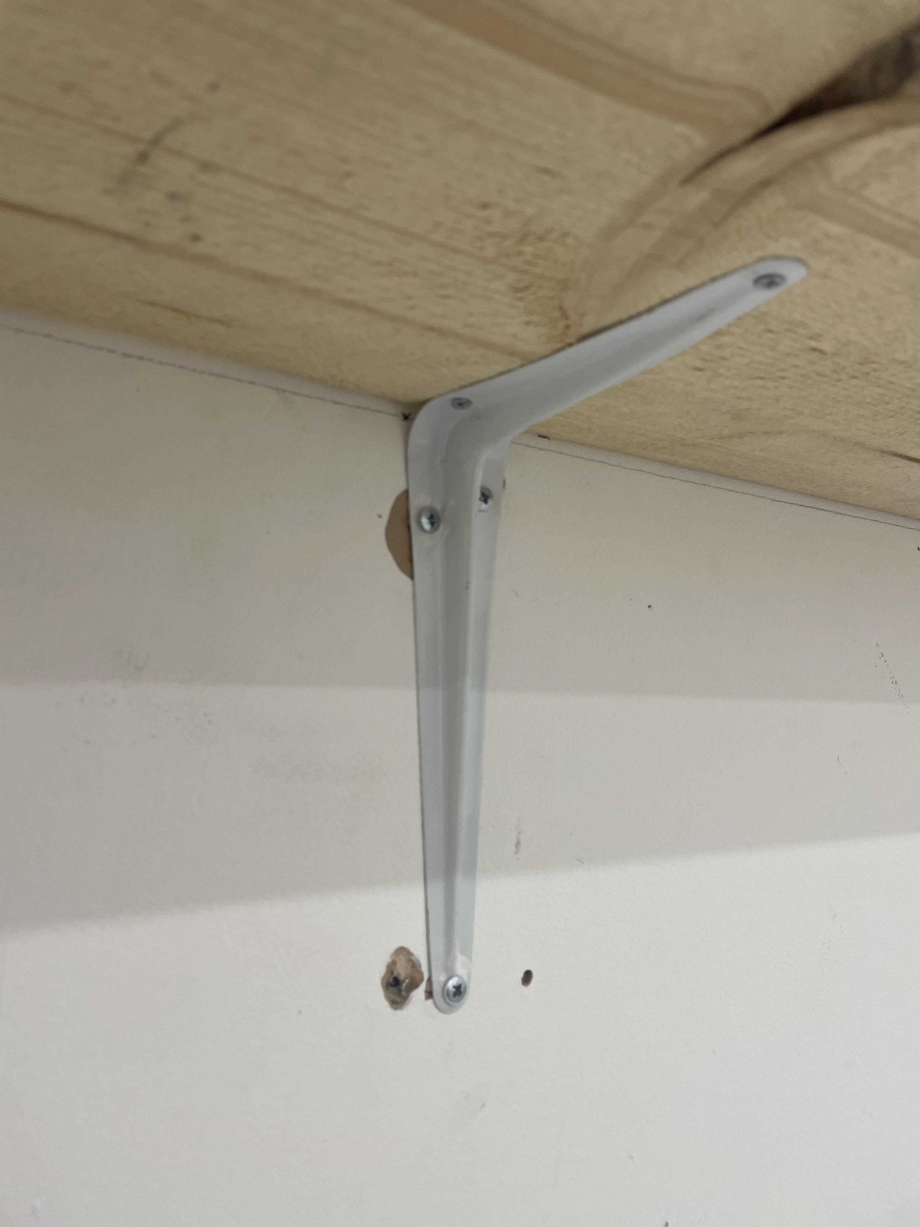
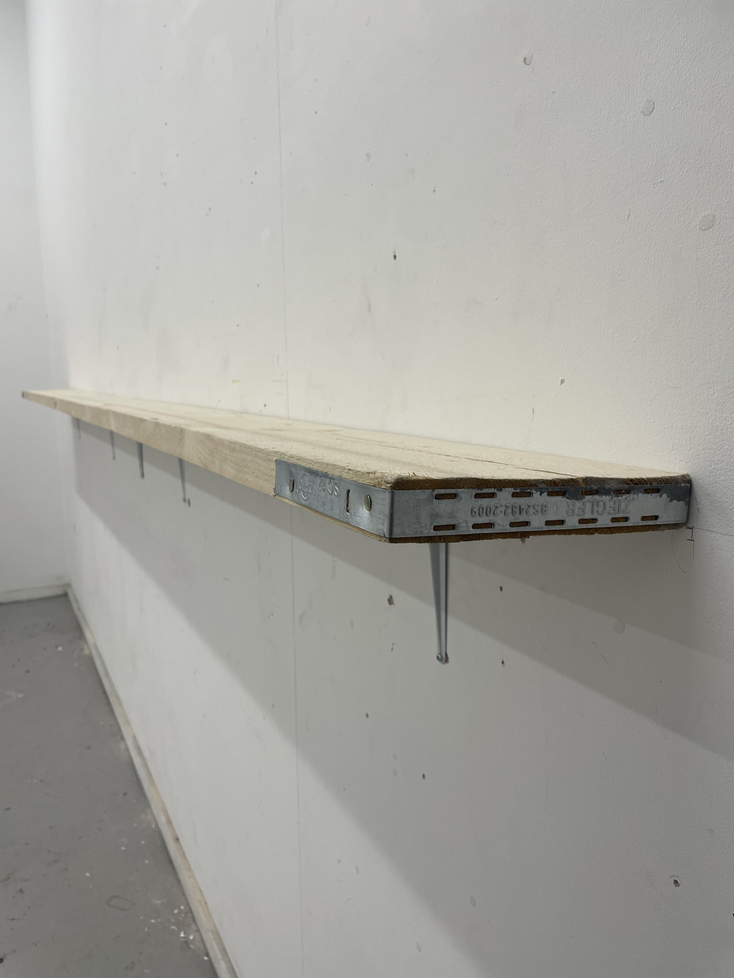
Putting up my shelf was quite a challenge, but it was essential to include it as part of my submission since it's a core idea within my practice. Due to its length and weight, I had to carefully plan and measure to ensure the shelf had enough support and was straight. Given the additional weight from my vessels, I used five wall brackets to provide adequate support.
The stud wall posed difficulties, as it contained metal supports that prevented drilling through them. However, it also had wooden noggins, which are support beams within the wall. I located these to drill into for additional support. I also used metal wall plugs to grip and provide extra support for the nails in the wall hangers.
Once all the wall hangers were aligned and in place, I double-checked with a spirit level to ensure they were all level. Then, I placed the shelf on top and drilled the wall hangers into the wall. To my surprise, everything was level and at the correct height of 130 cm from the floor.
These videos capture the final arrangement of my vessels, carefully curated for hand-in. I began positioning them from the centre of the shelving unit and worked outward to ensure a balanced and symmetrical layout. I anticipated a slight gap at the edges, so this method helped maintain a strong central focus. The vessels are arranged in a gradient, blue, green, and red, creating a visually compelling flow that immediately draws the eye. Seeing them all together for the first time was incredibly fulfilling. The display turned out exactly as I had envisioned, bold, cohesive, and impactful.
Although the shelving unit had a natural warp, which was beyond my control, the presence and arrangement of the vessels effectively minimised this distraction. Once the pieces were in place, the eye was drawn to the work itself, not the imperfections of the structure.
I filmed a walkthrough video of the display, which beautifully captures the sense of movement and narrative I aimed to convey. It evokes the feeling of looking out of a train window on the journey home, a key inspiration behind this collection. The varying heights and forms of the vessels add depth and individuality to each piece, while still maintaining a harmonious unity as a collective.
I also placed my artist statement at the beginning of the display, just before the blue vessels. This intentional positioning acts as a conceptual starting point, inviting viewers to engage with the story behind the work before continuing along the shelf, mirroring the journey motif that runs throughout the project.
Overall, I’m incredibly proud of the final result. The display captures the emotional and visual impact I hoped for, and it powerfully communicates the themes of movement, memory, and home.
Pricing
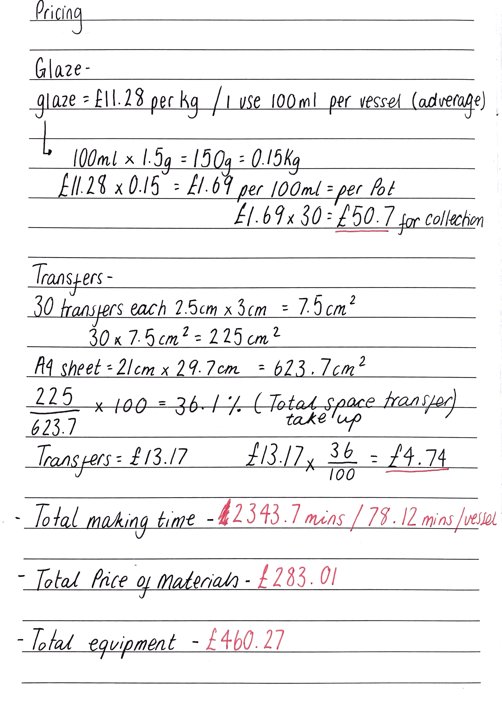
When considering how best to sell my collection of 30 vessels, I face the challenge of pricing and the difficulty of separating pieces that are inherently connected as a family. Each vessel represents a part of my journey from Brighton to Manchester, making it hard to split them up for individual sale. To address this, I have incorporated a QR code on the base of each vessel, allowing new owners to take pictures of the vessels in their new homes. This feature enables a virtual reconnection of the vessels, even when they are physically separated, creating a sense of community and continuity among the pieces.
Additionally, I am considering selling the vessels in sets of three, with each set including one vessel from the beginning, middle, and end of my journey. This approach maintains the narrative of my transition and keeps the vessels grouped as a family, which seems more cohesive and meaningful. Selling in sets also allows each piece to retain its connection to the overall story, providing buyers with a more comprehensive understanding of the collection's significance.
To ensure that each vessel is priced fairly and consistently, I will set a uniform price for all sets. This approach simplifies the pricing process and emphasises the equal importance of each vessel within the collection. By maintaining a consistent price, I can focus on the emotional and artistic value of the work, rather than differentiating based on size or complexity.
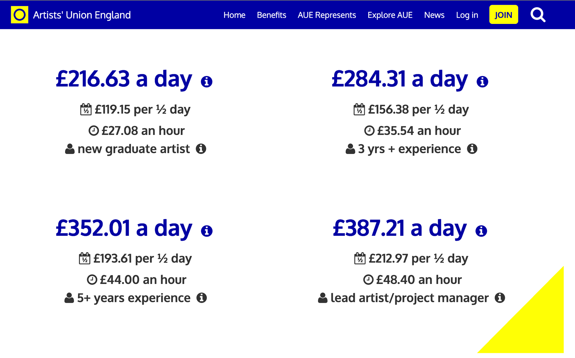
The Artist Union England recommends an hourly rate of £27.08 for a new graduate artist, which translates to £216.63 per day based on an 8-hour workday. By using this guideline, I can incorporate it into my pricing method to determine the cost of my vessels.
Making Time-
To accurately determine my pricing, I decided to record myself working using a timer, allowing me to easily track the average time required for each stage of the making process. By referring to my video footage, I was able to pinpoint the exact time spent on each step, ensuring I had precise and reliable data. This method proved incredibly useful in refining my understanding of production time, helping me establish accurate work durations for different processes. Understanding the time investment in each piece allows me to price my work in a way that values my effort and craftsmanship. Incorporating time tracking into my pricing calculations ensures that my work is valued appropriately, helping me set fair and sustainable prices while improving my overall process.

To ensure accurate pricing, I calculated my total making time by averaging different stages of the process. While some vessels took longer than others, I factored these variations into my averages to create a more balanced and realistic estimate. Throughout the project, I worked in sets of threes, producing 10 vessels at a time. By recording these timings and analysing patterns across multiple sets, I was able to determine the time required for each individual vessel and then extrapolate that data to estimate the total time for the full collection. My total making time for this project is approximately 2343.7 minutes.
Materials-
When determining my pricing, I needed to establish exactly how much material I used. For this project, I incorporated cobalt, chromium, red iron, and manganese oxides, alongside cherry and poppy stains. Additional materials included clear earthenware glaze, white slip, and ceramic transfers. Since I exclusively use recycled ivory stoneware as my clay body, I chose not to factor it into my pricing, as it is a free material.
Ensuring precise material costing is crucial, especially as I consider how my practice will evolve beyond university. While I currently benefit from subsidised or free materials, this advantage won’t always be available. Failing to track costs properly without access to discounted supplies could lead to underpricing my work, making it unsustainable in a professional setting.
To create a realistic pricing structure, I sourced material costs from well-known ceramic suppliers such as Scarva and Potclays, helping me gauge the actual market rates. Understanding these expenses allows me to price my work fairly, covering costs while valuing my time and craftsmanship. This approach ensures financial sustainability and reinforces my practice's integrity as I transition into selling my ceramics professionally.
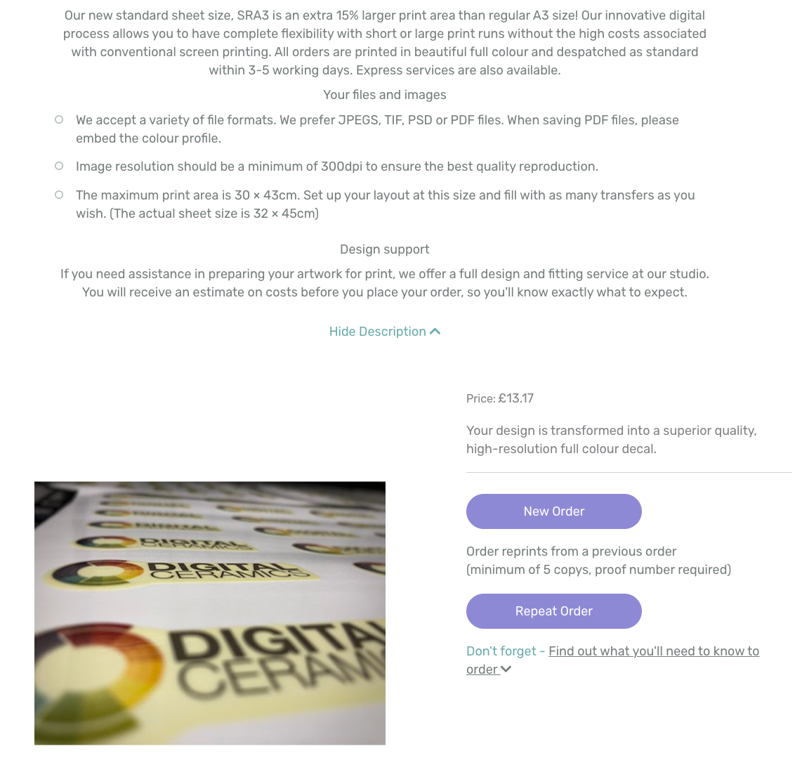
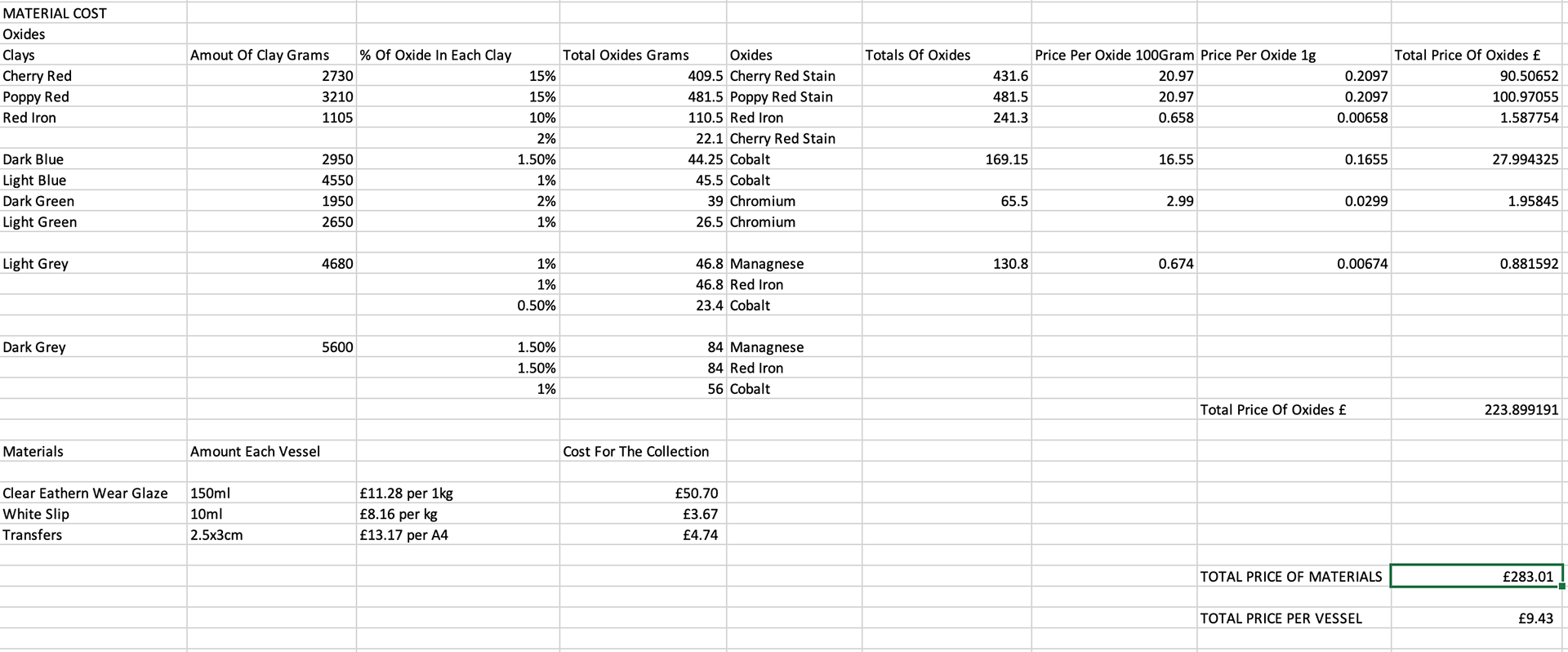
Equipment-
When calculating the pricing for my work, it's essential to account not only for materials but also for the equipment I used. While most of these tools will be reused across multiple projects, understanding their cost helps build a realistic financial model for my practice.
For this project, I utilised several key pieces of equipment, including a laser-cut rib, plaster block, sieves, wheel, kiln, and a spray gun booth. Each of these tools plays a significant role in shaping, refining, and finishing my ceramics. While their costs are spread across multiple pieces, factoring them into my pricing ensures I'm aware of the investment required to create each work.
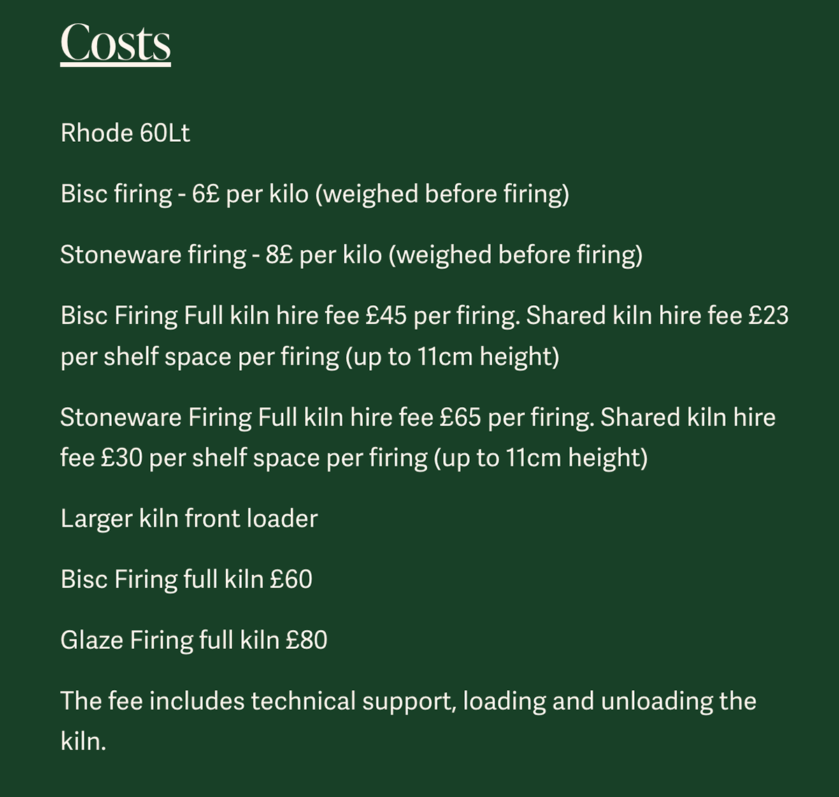

When looking at my collection, I see my vessels as a family. Selling them in sets of three not only reinforces the narrative of my journey but also encourages buyers to engage with the full story rather than isolated pieces. The choice of blue, green, and red introduces a striking visual harmony, with each colour carrying one part of my journey.
This thoughtful approach adds meaning to both the making and the selling process, giving buyers an opportunity to experience the collection as it was intended, interwoven, connected, and deeply personal.
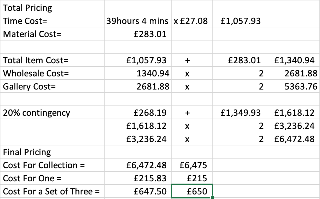
Context Video
I want to create a context video that reflects my journey and the two places I call home. This video will explore what home means to people, focusing on my personal meaning of home. By using videos and pictures of both my homes, I aim to convey this concept effectively.
Video Ideas:
-Recording of a conversation on what home means.
-Pictures of the beach and Manchester showcase the contrasting environments.
-Time-lapse of me travelling between my two homes, illustrating the journey.
-Incorporating my vessels, exploring where they belong and their significance.
-Capturing horizon lines, emphasising the connection between different places.
Creating this context video is important as it will provide a deeper understanding of my work and the personal significance behind it. I hope to achieve a compelling narrative that resonates with viewers and highlights the impact of space and home in my artistic journey.
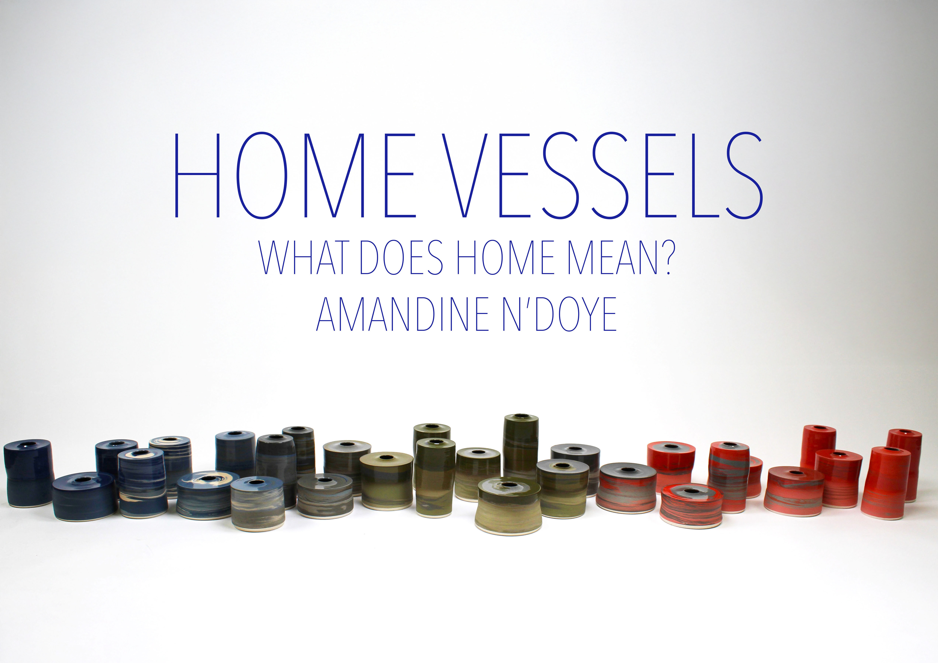
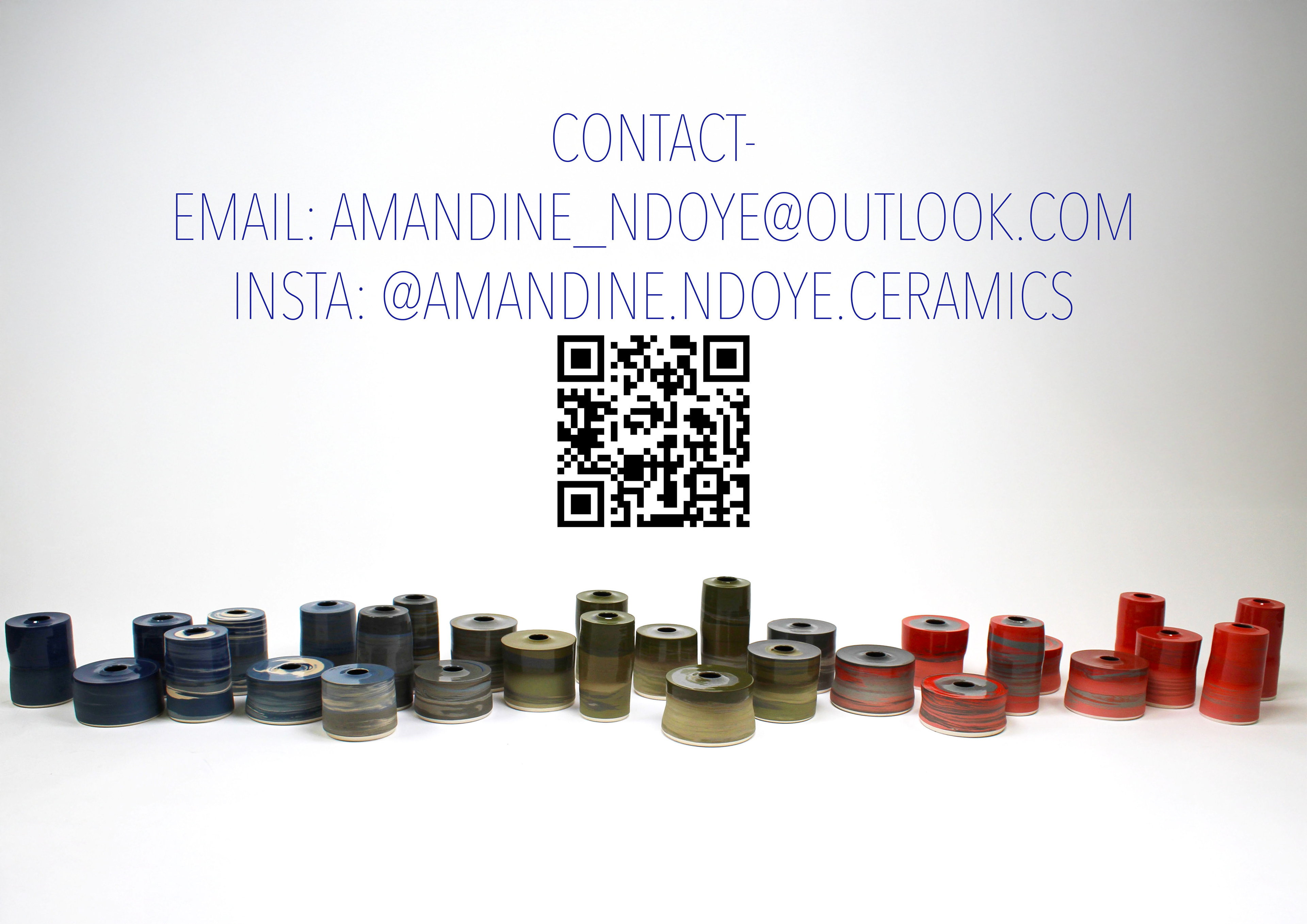
For this context video, I decided to include audio recordings of people who are close to me, asking them to answer a simple but deeply personal question: "What does home mean to you?"
I recorded two of my current housemates in Manchester, where I live now, and also both of my sisters, who I grew up with and who are central to my sense of home in Brighton. These four voices represent the two places I call home, and the people who shape those spaces for me.
By including these recordings, I wanted to highlight how the meaning of "home" is unique to each person, no two experiences are the same. This diversity of perspectives adds depth and emotional resonance to the video. These voice recordings will be cut and edited to get the best of people's ideas, as they are all over the time of 30 seconds longer than my context video can be.
To ensure accessibility and clarity, I’ll also be translating these voice recordings into subtitles, making it easier for the audience to follow and connect with each story
Mia Richardson's Response To 'What Is Home'
And Consent Form
Mercedes DeBardelaben's Response To 'What Is Home'
And Consent Form
Mathilde N'Doye's Response To 'What Is Home'
And Consent Form
Fleur N'Doye's Response To 'What Is Home'
And Consent Form
Final Photography Plan
Background: a neutral background that complements the vessels without distracting from them.
Lighting: Use soft, diffused lighting to avoid harsh shadows and reflections.
Arrangement: Arrange the vessels on the long shelf in my display. Ensure the arrangement reflects the journey and transition between the two cities.
Individual shots: taking individual shots showing each vessels close up.
Group shots: taking photos of each colour group
Wide Shots: Capture the entire collection to show the overall arrangement and how the vessels interact with each other.
Close-Ups: Focus on individual elements, details such as texture and glaze
Angles: Take shots from various angles (top-down, side) to provide a different view of each vessel.
Interactive Elements: include shots that show how QR codes work, and the handling of the vessels
Contrast and Brightness: Enhance contrast and brightness to make the details pop.
Consistency: Maintain a consistent editing style across all photos to ensure a cohesive look.
Portfolio Layout: Arrange the photos in your online portfolio to tell a story. Start with wide shots, followed by close-ups, and end with interactive elements.
Context photos: Take photos of vessels in context, by the water, the countryside side and in the city centre
Final Process Reflection
Throughout my final making process, I am incredibly happy with the work I produced. Every aspect of my vessels, from form to glaze to display, was carefully considered, ensuring that each element contributed to the story of my collection. I’m also pleased with my ability to stay on top of schedules and set tasks, allowing me to complete all 30 vessels while maintaining quality and intention.
Although this was a large collection, I took my time with each vessel, crafting them individually to ensure they remained impactful as a cohesive body of work. Moving forward, I want to trust myself more as a maker, recognising that if I don’t arrive at the right conclusion immediately, I can remain calm and adapt my approach rather than rushing to decisions. Some aspects of this process, like glaze choices and horizon lines, took longer to resolve, but I allowed time for thoughtful consideration. This project has taught me that simplicity can be powerful, and adding excessive elements or colour can sometimes diminish the aesthetic rather than enhance it. I’ve realised that I don’t need to add extra complexity to prove skill, instead, refining my core techniques enables me to create a large, intentional collection.
Beyond craft, this project allowed me to explore how ceramic vessels can hold emotion and narrative. Before this, my focus was primarily on functional objects, but now I see that ceramics can be more than utility. They can embody memory, comfort, and home. Each piece was designed to evoke familiarity and warmth, reinforcing themes that are deeply important to me as an artist. This process has grounded me, strengthening my confidence and direction as a maker. Moving forward, I want to continue along this path, using personal reflection to evolve my work and better understand what I want to express through my practice.